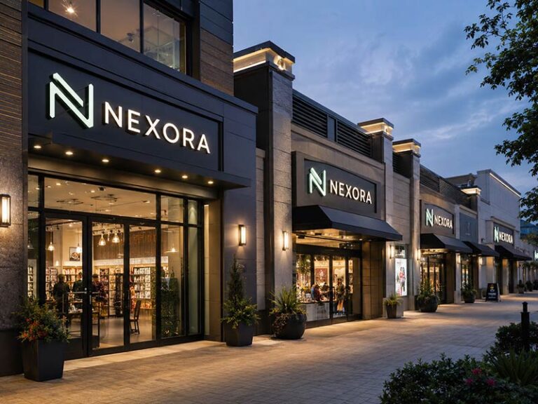
A storefront can have an attractive logo, good lighting, and a professionally finished façade yet remain surprisingly difficult to find. The problem is often not the design of the main sign. It is the direction from which people approach the entrance. A wall sign faces outward, while pedestrians usually walk parallel to the building. By the time they can read the sign clearly, they may already have passed the door.
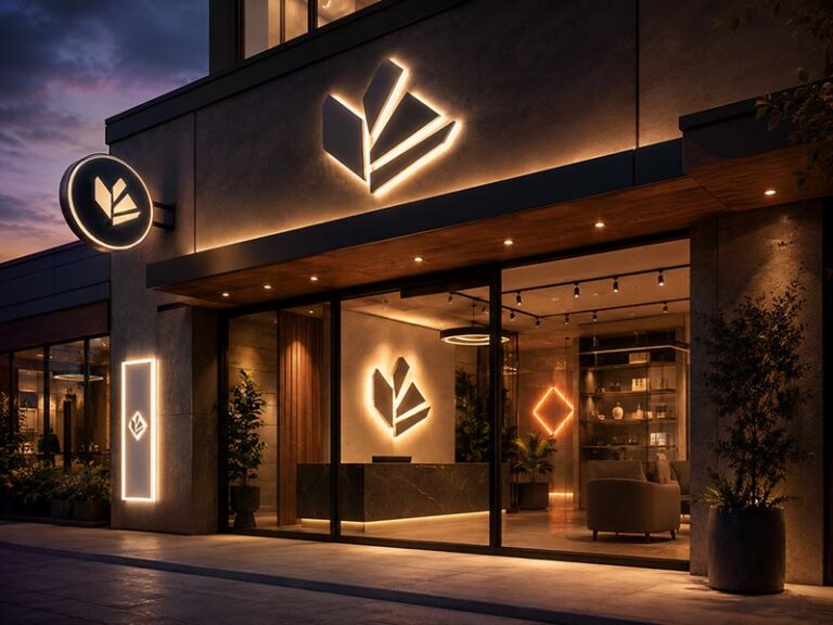
Blade signs solve this viewing-angle problem by projecting outward from a wall, canopy, column, or interior structure. Their faces sit across the direction of travel, placing the business name or symbol directly in the sightline of people approaching from either side.
Businesses that rely on walk-in visits, street recognition, entrance identification, or corridor wayfinding benefit most from blade signs. Retail stores, restaurants, cafés, bars, hotels, salons, clinics, offices, malls, and multi-tenant buildings are strong candidates, especially when their entrances are recessed, closely spaced, hidden by neighboring façades, or approached from the side.
The decision should still be based on the site rather than the industry name alone. A restaurant visible across an open parking lot may gain more from large channel letters. A small café on a narrow pedestrian street may gain more from a compact double-sided blade sign than from a much larger wall sign.
Consider the familiar shop that receives frequent phone calls saying, “I am outside, but I cannot find your entrance.” The owner may assume the logo is too small. In many cases, the real problem is simpler: the sign is facing the wrong direction.
What Is a Blade Sign?

A blade sign is a commercial sign mounted perpendicular to a wall, storefront, column, or corridor. It faces people approaching from either side rather than only those standing directly in front of the building. Most blade signs are double-sided and are used for storefront identification, entrance marking, pedestrian visibility, tenant identification, and indoor wayfinding.
What Makes a Blade Sign Different from a Wall Sign?
The main difference is the viewing direction. A wall sign faces outward from the building and is usually easier to see from across a road, parking lot, or open plaza. A blade sign projects away from the wall, often at an angle close to 90 degrees, so pedestrians moving parallel to the storefront can see it earlier.
A wall sign may be visually large but difficult to read from a narrow side angle. Letters become compressed, window reflections interfere with visibility, and neighboring awnings or façades may block the view. A blade sign places the logo or business name across the pedestrian’s line of travel.
The comparison below shows where each sign normally performs better:
| Sign Type | Best Viewing Direction | Common Viewing Distance | Main Purpose |
|---|---|---|---|
| Wall sign | From the front | 10–100 m or more | Building and storefront identification |
| Blade sign | From the left and right sides | 5–30 m | Side visibility and entrance location |
| Window graphic | Close front view | 1–10 m | Hours, services, promotions |
| Directional sign | Along a route | 2–20 m | Guiding visitors to a destination |
A blade sign should usually display only the information needed for quick recognition. A logo, short name, or familiar symbol is often enough. Telephone numbers, full addresses, opening hours, product lists, and long slogans reduce usable letter size and make the sign harder to understand while walking.
How Does a Blade Sign Improve Storefront Visibility?
A double-sided blade sign presents one face to people approaching from the left and another face to people approaching from the right. The sign can become visible before the storefront entrance comes into direct view, giving pedestrians more time to notice the business and decide where to stop.
The improvement is strongest in locations such as:
- Pedestrian shopping streets
- Downtown commercial districts
- Historic streets with narrow storefronts
- Rows of shops sharing one continuous façade
- Stores positioned behind columns or awnings
- Entrances recessed from the sidewalk
- Mall corridors and multi-tenant buildings
- Upper-floor businesses with a street-level entrance
Visibility still depends on size, mounting height, contrast, projection distance, and nearby obstructions. A projecting sign hidden behind a tree or mounted directly above a deep awning will not perform well, even when the graphic looks attractive in a front-facing drawing.
A useful site check should include photographs taken from both approach directions. Each photograph should be taken approximately 10, 20, and 30 meters from the proposed installation point where space allows. Mark the expected sign position and check whether trees, streetlights, neighboring signs, umbrellas, balconies, parked vehicles, or structural columns interrupt the view.
Lettering also needs enough contrast and open space. A dark sign face with light lettering is often readable in bright streets. A light face with dark lettering can suit softer façades and indoor corridors. Thin scripts, crowded words, low-contrast colors, and detailed graphics may look refined on a computer screen but disappear after installation.
Which Blade Sign Constructions Are Common?
Blade signs can be produced as flat panels, hanging signs, illuminated cabinets, shaped logo signs, or small indoor projecting signs. The correct construction depends on operating hours, wall condition, available projection, weather exposure, brand style, and expected viewing distance.
| Construction | Typical Materials | Common Application |
|---|---|---|
| Flat fixed panel | Aluminum, stainless steel, acrylic, PVC | Daytime retail and office identification |
| Hanging panel | Metal or composite panel with bracket | Cafés, boutiques, heritage storefronts |
| Illuminated light box | Metal cabinet with acrylic faces | Restaurants, hotels, bars, late-opening stores |
| Contour-shaped sign | Formed metal, acrylic, or layered materials | Logos with a recognizable outline |
| Dimensional sign | Raised letters, metal trim, layered acrylic | Premium retail and hospitality |
| Indoor projecting sign | Lightweight acrylic, aluminum, or PVC | Malls, hospitals, schools, office corridors |
Small storefront blade signs often have a face width or diameter of approximately 400–800 mm. Larger hotel, restaurant, or light-box signs may reach 900–1,500 mm or more when the building, mounting structure, and local sign rules allow it. Indoor corridor signs are often smaller because visitors pass closer to the sign.
Size should not be selected from appearance alone. A longer business name requires more usable face area than a short café name or graphic symbol. Reducing every word until it fits can create lettering too small to read.
Illuminated blade signs also require enough cabinet depth for light diffusion. A very shallow cabinet may show bright LED points or dark bands. A deeper cabinet may improve lighting uniformity but adds weight, wind exposure, shipping volume, and wall load.
Common lighting details include:
- Warm white, neutral white, or cool white LEDs
- Common color-temperature choices such as 3000K, 4000K, and 6000K
- Acrylic or printed faces with suitable light diffusion
- Single-color, RGB, or controlled lighting where required
- Rear, side, top, or bracket-routed wire exits
- Power supplies matched to the destination voltage
- Timers, dimmers, or controllers when needed
- Access for power-supply and LED maintenance
Lighting is usually worth considering for restaurants, bars, hotels, convenience stores, clinics, and other locations operating after sunset. A non-illuminated metal sign may be more suitable for daytime businesses, historic areas, or streets with lighting restrictions.
What Should Be Confirmed Before Production?
A blade sign projects away from the wall, so the bracket, mounting plate, anchors, wall material, finished weight, and projection distance all affect installation safety. The visible face is only one part of the finished product.
Before production begins, the following information should be confirmed:
| Project Detail | Information Required | Why It Matters |
|---|---|---|
| Finished size | Width, height, depth, and wall projection | Prevents clearance and proportion problems |
| Number of faces | Single-sided or double-sided | Changes the cabinet and internal structure |
| Installation surface | Concrete, brick, steel, timber, cladding, or another material | Determines bracket and fastener planning |
| Mounting height | Distance above the ground or floor | Affects visibility, clearance, and installation access |
| Bracket style | Fixed, decorative, hanging, column-mounted, or custom | Influences appearance and structural loading |
| Use environment | Indoor, outdoor, sheltered, coastal, or high-wind | Guides material and surface-treatment selection |
| Lighting | Non-illuminated, internally illuminated, halo-lit, or externally lit | Changes depth, wiring, and maintenance access |
| Electrical supply | Voltage, hardwired connection, plug, timer, or controller | Prevents installation delays |
| Wire exit | Rear, side, top, bottom, or through the bracket | Keeps wiring compatible with the site |
| Surface finish | Paint reference, powder coating, metal finish, or printed graphic | Supports brand-color consistency |
| Destination | Country, shipping method, and required arrival date | Affects electrical parts and packaging |
| Local restrictions | Maximum area, projection, brightness, and operating hours | Reduces redesign and permit risk |
Outdoor projects also need realistic consideration of rain, sunlight, wind, corrosion, drainage, and maintenance. The wall structure behind decorative cladding must be identified because thin cladding alone may not provide a secure fixing point.
Site photographs should show the entire façade, the proposed sign position, both pedestrian approach directions, nearby obstacles, and the installation surface at close range. A storefront photograph taken only from directly opposite the entrance is not enough for a projecting-sign review.
Local sign rules may limit sign dimensions, projection distance, mounting height, lighting brightness, operating hours, or heritage appearance. Approval should be confirmed with the property manager, landlord, local installer, architect, or relevant authority before final production drawings are released.
Which Businesses Benefit Most?

Blade signs benefit businesses that depend on physical visits, pedestrian discovery, clear entrance identification, or easy navigation inside a building. Retail stores, restaurants, cafés, hotels, salons, clinics, offices, malls, schools, and multi-tenant properties gain the most when people approach from the side, the storefront is narrow, or the entrance is hard to locate.
Which Retail and Food Businesses Benefit Most?
Retail stores, boutiques, cafés, bakeries, restaurants, bars, and specialty food shops are strong candidates because a large share of their visibility comes from people already walking along the street. A fascia sign may look impressive from across the road but remain difficult to read from ten or twenty meters down the sidewalk.
A projecting sign places the store name or logo in the normal direction of pedestrian travel. The benefit becomes greater when several storefronts share one continuous façade, especially where awnings, outdoor seating, trees, streetlights, or neighboring signs block part of the front elevation.
Retail and food businesses often need different blade sign styles:
| Business Type | Main Visibility Problem | Suitable Blade Sign |
|---|---|---|
| Boutique | Narrow frontage among similar shops | Shaped metal panel or dimensional logo sign |
| Café | Relies on passing foot traffic | Compact round or square double-sided sign |
| Bakery | Needs quick product recognition | Icon-based panel with short wording |
| Restaurant | Entrance may blend into a busy street | Illuminated double-sided light box |
| Bar | Most visits occur after sunset | Internally illuminated projecting sign |
| Specialty store | Business category is not obvious | Logo plus one short product term |
| Convenience store | Requires day-and-night recognition | Bright, high-contrast light box |
| Bookshop or gallery | Needs character without excessive brightness | Painted metal or hanging blade sign |
The strongest designs are usually simple. A café may use its logo and the word “COFFEE.” A bakery may use a bread symbol and a short name. A restaurant should avoid placing a full menu, telephone number, address, opening hours, and several food images on a small projecting face.
A person walking past a storefront has only a limited moment to recognize the sign. Large lettering, open spacing, clear contrast, and one obvious message normally perform better than detailed graphics.
Operating hours also affect the choice. A bakery that closes at 4:00 p.m. may not need internal lighting. A restaurant serving until midnight usually benefits from an illuminated sign. Lighting should follow the actual period when visitors need to find the entrance.
Before selecting a sign, record:
- Storefront width
- Entrance position
- Pedestrian approach direction
- Average operating hours
- Existing street lighting
- Distance from sidewalk to wall
- Nearby awnings, trees, and outdoor seating
- Available wall projection
- Local limits on sign size and lighting
A blade sign becomes especially valuable when the main storefront is less than approximately one shop bay wide or when neighboring shops create a long, visually similar building line. The exact size still depends on the site, but the sign must remain readable before a pedestrian reaches the door.
Which Hotels, Salons, and Clinics Benefit Most?
Hotels, salons, spas, dental offices, clinics, and wellness practices often need more than simple brand exposure. Visitors may already have an appointment or reservation, but they still need to identify the correct entrance without calling the front desk.
These businesses often occupy:
- Mixed-use buildings
- Converted houses
- Upper floors
- Shared commercial properties
- Recessed storefronts
- Hotel courtyards
- Side streets
- Buildings with several similar doors
A blade sign can mark the exact point where a visitor should enter, turn, or stop. For appointment-based services, better entrance recognition may reduce late arrivals and repeated phone calls asking for directions.
The sign style should match the service environment. A clinic normally needs clean lettering, strong contrast, and a calm appearance. A boutique hotel may use brushed metal, warm illumination, or dimensional details. A salon can use a more expressive logo shape, while a spa may prefer a restrained finish and softer light.
| Business Type | Main Requirement | Useful Design Direction |
|---|---|---|
| Hotel | Clear entrance with a premium appearance | Metal cabinet, warm white illumination |
| Salon | Strong brand recognition from the sidewalk | Custom-shaped logo sign |
| Spa | Calm and refined visual identity | Matte metal finish or soft illumination |
| Dental office | Easy identification for appointments | Clean rectangular sign with high contrast |
| Medical clinic | Professional and readable entrance marker | Simple lettering with limited colors |
| Wellness studio | Visibility in mixed-use buildings | Double-sided panel near the main entrance |
| Veterinary clinic | Fast recognition for arriving pet owners | Clear name and recognizable animal icon |
For healthcare locations, readability should come before decorative detail. Thin script lettering may look elegant in a logo file but become difficult to read from a moving vehicle or from the opposite side of a sidewalk.
For hotels and late-opening wellness locations, color temperature matters. Warm white lighting around 2700K–3500K often creates a softer atmosphere. Neutral white around 4000K can suit clinics and modern offices. Cooler white may provide a sharper appearance but can feel harsh when brightness is too high.
The sign should also work with the rest of the arrival path. A blade sign may identify the property from the street, while door lettering, building numbers, lobby signs, and directional signs guide visitors after entry.
Which Offices and Shared Buildings Benefit Most?
Professional offices, coworking spaces, law firms, real estate agencies, schools, hospitals, shopping malls, and multi-tenant buildings benefit when visitors need to identify one destination among several similar entrances or corridors.
In these locations, a blade sign is often a wayfinding tool rather than an advertising sign. Its purpose is to reduce hesitation and help people move through the building without stopping at every doorway.
A coordinated sign system may include:
- Street-level projecting identification signs
- Building entrance directories
- Corridor blade signs
- Department markers
- Room signs
- Directional arrows
- Reception wall logos
- Floor identification signs
Indoor blade signs are especially useful in long corridors. A flat door sign is readable only after a person reaches the door. A projecting sign can be seen farther down the corridor, allowing visitors to identify departments or tenants while walking.
Consistency becomes important when several signs are installed in one property. The following items should follow a common standard:
| Item | Recommended Control |
|---|---|
| Face size | Keep the same width and height within one sign family |
| Mounting height | Use one approved height unless site conditions differ |
| Projection | Keep signs aligned along the corridor |
| Typeface | Use one readable font family |
| Color system | Follow property or brand standards |
| Icons | Use one visual style |
| Directional arrows | Keep shape and stroke consistent |
| Room or tenant codes | Follow one numbering method |
| Packaging labels | Match every sign to the installation location |
Schools and hospitals may need signs for departments, entrances, rooms, and circulation routes. Shopping centers may need one projecting sign for every tenant. Office buildings may use a smaller set for reception areas, elevators, meeting rooms, and shared services.
For multi-location businesses, production records are also important. Each finished sign should have an identifiable specification covering size, material, paint color, artwork version, mounting-hole position, bracket shape, lighting configuration, packing label, and destination. Accurate records make later replacement or expansion orders easier to reproduce.
How Can a Business Judge Whether a Blade Sign Will Help?
A blade sign is most likely to help when several site conditions occur at the same time. Industry alone is not enough. A restaurant with a large open parking lot may need large front-facing channel letters. A small office on a pedestrian street may benefit greatly from a compact projecting sign.
A practical scorecard can help evaluate the site:
| Site Condition | Score |
|---|---|
| Most people approach from the left or right | 2 |
| The entrance is recessed or partly hidden | 2 |
| Several businesses share the same façade | 2 |
| The storefront is narrow | 1 |
| Walk-in visits are important | 2 |
| Visitors often call for directions | 2 |
| The business operates after dark | 1 |
| The front sign is blocked by trees, awnings, or columns | 2 |
| The building allows a projecting sign | 2 |
| The wall has a suitable structural mounting area | 1 |
A total of 10 points or more usually indicates a strong reason to investigate a blade sign. A score of 6–9 suggests a possible benefit, but sign position and viewing angles need closer review. A score below 6 may mean a wall sign, window graphic, monument sign, or directional sign would solve the problem more effectively.
The scorecard is a planning tool rather than an engineering rule. Local regulations, wall condition, pedestrian clearance, wind exposure, landlord approval, and installation access still need confirmation.
A useful site review should answer five questions:
- From which direction do most people approach?
- At what point does the main storefront sign become readable?
- Can people identify the correct entrance before passing it?
- Does the business need visibility after sunset?
- Can the wall safely support the proposed bracket and sign?
Take photographs from both ends of the street or corridor. Include one image from approximately 10 meters away, one from 20 meters, and one from the farthest useful viewing point. Mark the proposed sign location on each image.
A blade sign is usually worthwhile when it solves a measurable problem: people cannot see the business from the side, visitors miss the entrance, neighboring storefronts look too similar, or indoor navigation is unclear. When no visibility or wayfinding problem exists, adding another sign may only increase cost and visual clutter.
Which Locations Need Blade Signs?

Blade signs are most useful where people approach parallel to a storefront, entrance, or corridor rather than facing it directly. Pedestrian streets, narrow commercial roads, recessed shops, historic districts, malls, mixed-use buildings, hotels, hospitals, and multi-tenant properties are common locations. The strongest need appears when the main sign cannot be read until a person has already reached or passed the entrance.
Which Pedestrian Streets Need Blade Signs?
Pedestrian streets are one of the best locations for blade signs because people usually walk beside the building line. A wall sign may face the opposite side of the street, but a person only five or ten meters away may see it from a narrow angle. Lettering becomes compressed, glass reflections increase, and nearby storefronts compete for attention.
A projecting sign turns the business name or logo toward the direction of travel. A double-sided sign gives visibility to people approaching from both ends of the street.
Blade signs are especially useful on streets with:
- Continuous rows of adjoining storefronts
- Narrow sidewalks close to the building
- High pedestrian traffic
- Outdoor tables, umbrellas, or merchandise displays
- Trees, streetlights, and parked bicycles
- Deep awnings or canopies
- Several signs installed at similar heights
- Limited space for large front-facing signs
- Frequent evening activity
- Shops with short decision times, such as cafés and boutiques
The viewing distance should match the street. A sign on a narrow pedestrian lane may only need to work from 10–20 meters. A sign on a wider commercial street may need to remain recognizable from 20–40 meters. The goal is not always full text readability at the farthest point. A recognizable logo shape or brand color can attract attention first, followed by readable wording as the person gets closer.
A practical street check can be completed before design begins:
| Checkpoint | Recommended Observation |
|---|---|
| First visibility point | Where does the proposed position first appear from each direction? |
| Useful reading point | At what distance can the business name be read comfortably? |
| Entrance decision point | Where does a person need to decide whether to stop or turn? |
| Obstructions | Are trees, awnings, street furniture, or other signs blocking the view? |
| Existing sign height | Are neighboring signs creating one crowded visual line? |
| Daylight condition | Does direct sunlight or window reflection reduce contrast? |
| Night condition | Is the street bright, dim, or unevenly lit after sunset? |
| Pedestrian speed | Are people strolling, commuting, or moving quickly? |
Photographs should be taken from both directions at approximately 10, 20, and 30 meters where the street allows. Mark the proposed sign location on each image. A sign that looks correctly positioned in a front-facing façade photograph may disappear behind an awning when viewed from the side.
The sign face should remain simple. A short business name, logo, or one category word normally performs better than several lines of text. On a street where people are walking rather than standing, recognition is more important than presenting complete company information.
How Do Hidden or Recessed Entrances Benefit?
Blade signs are highly effective when the entrance is not aligned with the main building frontage. Recessed doors, courtyard entrances, side passages, upper-floor businesses, shops behind columns, and entrances under deep canopies often remain invisible until a visitor is very close.
A projecting sign can mark the exact place where a person should stop, turn, or enter. It works as a visual anchor between the street and the doorway.
Common locations include:
- A restaurant entered through a narrow side passage
- A salon located on the second floor
- A clinic sharing one entrance with other offices
- A hotel entrance set behind a covered driveway
- A retail store positioned behind an arcade or colonnade
- A café located inside a courtyard
- A studio reached through a lobby or staircase
- A shop whose door sits several meters behind the façade
Entrance setback is an important measurement. When the door is only 0.5–1 meter behind the storefront line, a small projecting sign near the entrance may be enough. When the entrance sits 2–5 meters inside a passage or courtyard, one blade sign may not fully solve the route. A second doorway sign, arrow sign, floor marker, or lobby directory may be required.
The message should match the stage of the journey:
| Sign Position | Recommended Message |
|---|---|
| Street edge | Business name, logo, or entrance symbol |
| Passage entrance | Name plus a clear directional arrow |
| Stair or elevator point | Floor number and destination |
| Building lobby | Tenant name and room or suite number |
| Final doorway | Full identity, opening hours, or appointment details |
Trying to place every piece of information on the street-facing blade sign usually creates small lettering and poor visibility. A better approach is to give each sign one clear task.
For example, a second-floor dental office may use:
- A double-sided blade sign at street level with the clinic name
- A small arrow reading “Entrance” beside the doorway
- A lobby directory with the floor and suite number
- A door sign confirming the final destination
The sign position should be selected according to the decision point rather than the most visually balanced spot on the façade. If visitors repeatedly walk past the door, moving the sign closer to the point where they need to turn may be more effective than increasing the face size.
Are Malls and Shared Buildings Suitable?
Malls, hotels, office buildings, hospitals, schools, transport facilities, and mixed-use properties are suitable because people move along corridors and need to identify several destinations without standing directly in front of every door.
A flat wall or door sign is mainly visible when a person reaches the room. A projecting sign can be seen farther down the corridor, allowing people to identify shops, departments, or services while moving.
Blade signs can be used for:
- Mall tenant identification
- Hotel facilities and meeting rooms
- Hospital departments and clinics
- School offices and classroom zones
- Office tenants and shared services
- Restrooms and elevators
- Reception areas
- Restaurants inside hotels or malls
- Parking payment points
- Pick-up counters and service desks
Indoor signs normally require less weather protection than outdoor signs, but installation still needs careful planning. Signs mounted above walkways should not create head-clearance problems or obstruct sprinklers, cameras, lights, exit signs, air-conditioning vents, or maintenance panels.
A coordinated indoor system should control:
| Item | Planning Requirement |
|---|---|
| Mounting height | Keep signs aligned unless ceilings or door heights vary |
| Projection distance | Make signs visible without narrowing the usable corridor |
| Face size | Match viewing distance and corridor width |
| Letter size | Confirm readability before approving production |
| Color contrast | Separate information clearly from the background |
| Directional arrows | Use one arrow style throughout the property |
| Icons | Keep line weight and visual style consistent |
| Lighting | Avoid excessive brightness in close indoor viewing |
| Installation points | Confirm structure behind ceilings, panels, or decorative walls |
| Location labels | Match every packed sign to its final installation area |
A long corridor with signs mounted at different heights and projections can look disorganized even when each sign is well made. Before production, prepare an elevation or location schedule showing the sign code, room or tenant name, finished size, mounting height, projection, arrow direction, and installation position.
Multi-tenant projects also need a plan for future changes. Tenant names may change while the bracket and sign position remain. A replaceable face or standardized cabinet can reduce later replacement work. Hotels, hospitals, and office buildings may benefit from keeping common brackets and face sizes while changing only the printed or fabricated identification panel.
What Site Conditions Should Be Checked?
A blade sign should be selected after reviewing visibility, structure, clearance, lighting, weather, and local sign restrictions. The same sign can perform well at one location and poorly at another because the surrounding conditions are different.
The site review should begin with four measurements:
- Distance from the wall to the main walking path
- Available projection from the wall
- Proposed mounting height above the ground or floor
- Useful viewing distance from both approach directions
Additional information should include the finished sign size, wall material, façade condition, entrance position, operating hours, nearby obstacles, electrical access, and installation method.
| Site Condition | What to Record | Why It Matters |
|---|---|---|
| Approach direction | Left, right, both sides, or mainly frontal | Determines whether a blade sign is needed |
| Walking path | Distance between pedestrian traffic and the wall | Affects projection and face size |
| Entrance setback | Distance from building line to doorway | Shows whether extra direction signs are required |
| Wall substrate | Concrete, brick, steel, timber, cladding, or glass system | Determines mounting preparation |
| Available projection | Maximum usable distance from the wall | Limits cabinet and bracket depth |
| Mounting height | Planned distance above the pavement or floor | Affects visibility and clearance |
| Nearby obstacles | Awnings, columns, trees, balconies, lights, or existing signs | Influences final position |
| Weather exposure | Sheltered, fully exposed, coastal, or high-wind | Guides materials, sealing, and bracket structure |
| Operating hours | Daytime, evening, or 24-hour use | Helps decide whether illumination is needed |
| Electrical route | Rear entry, side entry, bracket route, or remote power | Prevents exposed or poorly placed wiring |
| Maintenance access | Ladder, lift, internal access, or removable face | Affects cabinet and service design |
| Property rules | Allowed size, position, lighting, and appearance | Reduces approval and redesign problems |
A simple location score can help decide whether further blade sign planning is worthwhile:
| Location Condition | Score |
|---|---|
| Most people approach from the side | 3 |
| Main storefront lettering is difficult to read from the sidewalk | 2 |
| Entrance is recessed, hidden, or shared | 2 |
| Several businesses have similar façades | 2 |
| Walk-in visits are important | 2 |
| People often miss the entrance | 3 |
| Evening visibility is needed | 1 |
| A suitable mounting area is available | 2 |
| Local rules allow projecting signs | 2 |
| Nearby objects block the front sign | 2 |
A score of 12 or more indicates a strong location for a blade sign. A score of 7–11 suggests that a blade sign may help, but position, size, and sign type should be reviewed carefully. A score below 7 may indicate that a wall sign, window graphic, monument sign, canopy sign, or freestanding directional sign would work better.
The score does not replace local approval or structural review. Projecting signs create leverage on the mounting surface, especially when the face is large or positioned far from the wall. Outdoor installations must consider finished weight, bracket length, wind exposure, mounting plate size, anchor points, and the supporting structure behind decorative cladding.
A blade sign may not be suitable when:
- The sign would project into an unsafe walking or vehicle area
- The wall lacks a reliable structural fixing point
- A deep awning blocks the complete face
- The property prohibits projecting signs
- The available mounting position is too high or too low
- The sign would compete with required traffic or emergency signs
- Lighting could disturb nearby residences
- People mainly approach from directly in front of the building
- A freestanding sign already provides clearer identification
The best location is not necessarily the center of the storefront. It is the position where people first need help recognizing the business or finding the entrance. A good site review should follow the route a visitor actually takes—from the far end of the street or corridor to the final doorway—and place each sign where a decision must be made.
Which Blade Sign Type Should You Choose?

Choose a blade sign according to viewing direction, operating hours, installation environment, wall structure, available projection, brand style, and maintenance access. A double-sided illuminated light box suits a restaurant open at night, while a non-illuminated metal panel may be better for a daytime boutique or historic storefront. Sign type should follow the actual location rather than appearance alone.
Is an Illuminated or Non-Illuminated Blade Sign Better?
An illuminated blade sign is usually worth considering when the business operates after sunset, sits in a dim corridor, or needs to remain visible during early-morning and evening hours. Restaurants, bars, hotels, convenience stores, cinemas, clinics, entertainment venues, and 24-hour facilities often gain more from internal lighting than daytime-only stores.
A non-illuminated blade sign is often enough for bakeries, galleries, design studios, daytime cafés, schools, offices, and stores in well-lit pedestrian areas. Metal panels, layered acrylic signs, dimensional logos, and painted hanging signs can remain highly visible without adding electrical parts or maintenance work.
Operating hours provide a simple starting point:
| Operating Condition | Recommended Direction |
|---|---|
| Closes before sunset | Non-illuminated sign is often sufficient |
| Open until 8:00–10:00 p.m. | Illuminated sign is usually worth reviewing |
| Open late at night | Internal illumination is strongly recommended |
| Located in a brightly lit mall | Non-illuminated or low-output lighting may work |
| Located on a dim street | Illuminated double-sided sign is usually more effective |
| Located in a residential area | Brightness and operating hours should be controlled |
| Located in a historic district | Non-illuminated metal or externally lit sign may be required |
Internally illuminated light boxes are common because one cabinet can light both faces. The light source, face material, cabinet depth, and internal spacing must work together. A shallow cabinet may appear more refined in a drawing but can produce bright LED points, dark edges, or uneven bands after production.
Common color-temperature options include:
| Color Temperature | Visual Effect | Common Use |
|---|---|---|
| 2700K–3000K | Warm and soft | Hotels, cafés, restaurants, spas |
| 3500K–4000K | Neutral and balanced | Retail, clinics, offices |
| 5000K–6000K | Bright and crisp | Convenience stores, modern commercial sites |
| RGB or RGBW | Color-changing | Bars, entertainment, events |
Brightness should match the surrounding light. A sign that looks balanced in a factory may appear too bright on a dark residential street or too weak beside large illuminated storefronts. Dimming, timers, and separate control systems can help when brightness requirements change through the day.
Before selecting illumination, confirm:
- Daily opening and closing times
- Street or corridor lighting level
- Nearby residential windows
- Local limits on brightness and operating hours
- Available power source
- Voltage at the destination
- Wire-entry position
- Power-supply location
- Timer, dimmer, or controller requirements
- Maintenance access after installation
A non-illuminated sign is not automatically a lower-quality choice. In many locations, good contrast, a clear silhouette, and a strong surface finish provide better results than unnecessary lighting.
Are Single-Sided or Double-Sided Signs More Suitable?
Most storefront blade signs should be double-sided because people usually approach from both directions. One face is visible to traffic coming from the left, while the opposite face serves traffic coming from the right.
A single-sided sign is suitable when only one direction matters. Common examples include a sign at the end of a corridor, a sign beside a one-way entrance, a wall where the rear face is completely blocked, or an indoor sign positioned against a column.
| Site Condition | Recommended Face Type |
|---|---|
| Two-way pedestrian street | Double-sided |
| Mall corridor with traffic from both ends | Double-sided |
| Hotel hallway ending at one destination | Single-sided may be enough |
| One-way vehicle entrance | Single-sided may work |
| Sign mounted beside a boundary wall | Single-sided |
| Recessed entrance visible from both sides | Double-sided |
| Hanging sign in a courtyard | Usually double-sided |
Double-sided construction affects more than the number of printed faces. The cabinet, internal frame, LED layout, wiring, face-retaining method, bracket, and total weight all need to support two viewing sides.
For an illuminated cabinet, both faces should have similar brightness. Uneven LED spacing may create one brighter face and one darker face, especially when the cabinet is shallow. Internal components should not cast visible shadows through the acrylic.
The artwork should also be checked on both sides. A simple business name can normally be repeated without changes. Directional arrows, however, may need to point in different directions on opposite faces. A logo with an intentional forward direction may also need careful review before mirroring.
For hanging signs, movement needs attention. A completely loose panel can swing or rotate in wind, making the face difficult to read and placing repeated stress on the hanging points. Fixed brackets or controlled hanging systems are often safer for larger outdoor signs.
When reviewing a double-sided sign, confirm:
- Whether both faces use the same artwork
- Whether arrows must change direction
- Whether the rear face needs a different language or message
- Face-removal method for maintenance
- Cabinet thickness
- Total finished weight
- Bracket projection
- Wind exposure
- Cable and power-supply routing
- Packaging protection for both finished faces
A double-sided sign usually costs more than a single-sided one, but it may provide twice the useful approach visibility. Removing one face to reduce cost is rarely worthwhile when people clearly arrive from both directions.
Which Materials and Shapes Work Best?
Material choice should reflect weather exposure, required finish, cabinet weight, lighting method, brand style, and expected service conditions. No single material is suitable for every blade sign.
Aluminum is commonly used for cabinets, panels, frames, and brackets because it is lighter than steel and works well with paint or powder coating. Stainless steel provides a premium metal appearance and good corrosion resistance, but it may increase weight and manufacturing cost. Acrylic is widely used for illuminated faces, push-through graphics, dimensional logos, and layered sign details.
Common material options include:
| Material | Main Advantages | Main Limitations | Suitable Use |
|---|---|---|---|
| Aluminum | Lightweight, paintable, corrosion-resistant | Can dent if too thin | Cabinets, panels, frames, brackets |
| Stainless steel | Premium appearance, durable surface | Higher weight and cost | Hotels, luxury retail, high-end offices |
| Acrylic | Smooth face, good light transmission, many colors | Can crack under impact | Illuminated faces and dimensional logos |
| PVC | Lightweight and economical | Limited outdoor durability in some climates | Indoor or sheltered signs |
| Aluminum composite panel | Flat, lightweight, easy to print | Edges need careful finishing | Flat non-illuminated panels |
| Printed flexible face | Suitable for larger graphics | Less dimensional appearance | Larger light boxes |
| Wood or wood-effect material | Warm, traditional character | Real wood needs maintenance outdoors | Cafés, heritage stores, boutiques |
Surface finish also changes the result. Powder coating is widely used for outdoor metal parts because it provides a consistent color and durable surface. Painted finishes allow precise color matching. Brushed or mirror stainless steel suits premium interiors but shows fingerprints and surface marks more easily.
Shape should improve recognition rather than reduce usable space. Round signs work well with short names and simple symbols. Rectangular signs provide more room for longer wording. Contour-shaped signs can follow a logo outline but may require internal reinforcement around narrow sections.
| Sign Shape | Best For | Main Design Check |
|---|---|---|
| Round | Cafés, bakeries, salons, small boutiques | Logo must fit within a compact area |
| Square | Short names and centered logos | Corners need transport protection |
| Horizontal rectangle | Longer business names | Projection and bracket length may increase |
| Vertical rectangle | Narrow storefronts and tall logos | Letter arrangement must remain readable |
| Oval | Traditional or premium appearance | Text should not crowd curved edges |
| Contour shape | Recognizable logo silhouette | Thin sections need structural support |
| Custom emblem | Strong brand recognition | Fabrication complexity and weight |
Very detailed logo shapes often lose clarity when reduced to a small blade sign. Thin strokes, tiny gaps, narrow extensions, and small text may need adjustment. Production drawings should show minimum stroke width, finished dimensions, edge construction, and attachment points.
For outdoor use, narrow decorative parts should not project without support. Such areas may bend during transport, vibrate in wind, or break during installation. A slight simplification can preserve the visual identity while producing a stronger sign.
How Should Size, Depth, and Mounting Be Selected?
Blade sign dimensions should be based on viewing distance, business-name length, permitted projection, mounting height, wall structure, and nearby obstructions. Choosing a size only from a product photo often leads to lettering that is too small or a sign that projects too far from the façade.
Small pedestrian signs commonly use a face width or diameter of approximately 400–800 mm. Medium storefront signs may range from 800–1,200 mm. Larger hotel or restaurant light boxes may reach 1,500 mm or more when the wall, local rules, and installation conditions allow it.
These ranges are planning references rather than fixed standards:
| Viewing Situation | Common Face Range |
|---|---|
| Indoor corridor | 250–500 mm |
| Narrow pedestrian lane | 400–700 mm |
| Standard street storefront | 600–1,000 mm |
| Wide sidewalk or commercial street | 800–1,200 mm |
| Hotel or large building entrance | 1,000–1,500 mm or more |
Long names need more width. A short brand such as “NOVA” may fit a 500 mm round face, while “Riverside Family Dental Center” requires a wider rectangular format or a shortened storefront name. Reducing the lettering until a long name fits a small circle usually creates poor visibility.
Cabinet depth affects lighting, strength, weight, and projection. Small non-illuminated panels may be only a few millimeters thick, while illuminated cabinets may require considerably more depth for LED spacing and diffusion.
The full project should confirm four different dimensions:
- Face width
- Face height
- Cabinet depth
- Total wall projection, including the bracket
The total projection matters because local rules often limit how far a sign may extend beyond the façade. A 150 mm-deep cabinet installed on a 500 mm bracket can create a larger total projection than expected.
Mounting height should allow clear visibility without creating a hazard. The sign should remain above the required pedestrian clearance and below canopies, balconies, signs, or architectural features that block the face.
Bracket selection depends on:
- Finished sign weight
- Face area
- Cabinet depth
- Wall projection
- Wind exposure
- Installation height
- Wall material
- Number and position of anchors
- Fixed or hanging construction
- Decorative appearance
- Access for wiring
Concrete, brick, structural steel, timber framing, decorative cladding, and glass systems require different mounting plans. Thin cladding should not be treated as a structural wall. The supporting structure behind the finished surface must be identified before the mounting plate and anchors are finalized.
Before production, provide:
- Front and side photographs of the storefront
- Photos from both approach directions
- Close-up photos of the installation surface
- Wall-material information
- Finished sign size
- Maximum permitted projection
- Mounting height
- Indoor or outdoor environment
- Lighting preference
- Wire-exit location
- Destination voltage
- Local sign restrictions
- Installation method and available equipment
The right blade sign is not simply the most decorative or brightest option. It is the sign that remains visible from the required direction, fits the building, can be installed safely, performs during operating hours, and can be maintained without unnecessary work.
How Do You Know If a Blade Sign Is Right?
A blade sign is usually the right choice when people approach a storefront or entrance from the side and cannot recognize the location early enough. The decision should be based on traffic direction, useful viewing distance, entrance position, operating hours, wall structure, installation clearance, and local sign rules—not simply on whether a projecting sign looks attractive in a product photo.
Is a Blade Sign Better Than a Wall Sign?
A blade sign is not automatically better than a wall sign. Each type solves a different visibility problem.
A wall sign faces outward from the building. It usually performs well for people approaching from across a road, parking area, open plaza, or vehicle entrance. Larger channel letters or fascia signs can carry wider lettering and remain visible from a longer distance.
A blade sign faces along the street or corridor. It performs better for pedestrians moving parallel to the façade, especially where the storefront cannot be seen directly until someone is close to the entrance.
| Viewing Situation | Wall Sign | Blade Sign |
|---|---|---|
| Seen from across a parking lot | Strong | Limited |
| Seen while walking beside the building | Limited | Strong |
| Read from 50 m or more | Usually better | Often too small |
| Read from 5–30 m | Suitable | Usually very effective |
| Identifies a narrow storefront | May blend into the façade | Projects into the sightline |
| Marks a recessed entrance | May remain hidden | Can mark the turning point |
| Supports traffic from both directions | Depends on viewing angle | Double-sided format works well |
| Displays a long business name | More available width | May require shorter wording |
| Works inside a corridor | Often visible only near the door | Visible farther along the corridor |
Many commercial locations need both signs. A wall sign provides the main brand presentation, while a blade sign helps pedestrians find the entrance from either side. Window graphics can then carry opening hours, services, menus, appointment details, or promotions.
A practical field test can show which sign type is more useful:
- Stand approximately 30 meters to the left of the entrance.
- Walk toward the storefront at a normal pace.
- Record where the existing sign first becomes noticeable.
- Record where the business name becomes readable.
- Record whether the entrance can be identified before reaching it.
- Repeat the test from the right.
- Repeat after sunset when evening visibility matters.
A wall sign may be enough when the name becomes clear well before the entrance from both directions. A blade sign deserves closer review when the wall sign remains unreadable until the last 5–10 meters, disappears behind an awning, or requires pedestrians to turn their heads toward the façade.
The wording also affects the result. A short trading name or recognizable logo fits a projecting sign more easily than a long legal company name. A blade sign should normally communicate one clear identity rather than several messages.
For example:
- “RIVER CAFÉ” may work on a compact round sign.
- “Riverside Artisan Coffee Roasters and Bakery” may need a shortened storefront name.
- A clinic may use its short brand name on the blade sign and place the full practice name beside the door.
- A hotel may use only its logo emblem on the projecting sign when the symbol is already well recognized.
The right comparison is therefore not “blade sign versus wall sign” in general. The better question is: Which direction must the sign face to be seen before a visitor reaches the entrance?
Which Site Conditions Make It Worthwhile?
A blade sign becomes worthwhile when it solves a clear visibility or wayfinding problem. Industry is less important than site conditions. A small office on a busy pedestrian street may benefit more than a large restaurant facing an open parking lot.
Strong site indicators include:
- Most pedestrians approach parallel to the façade.
- The storefront is narrower than neighboring units.
- Several businesses share one continuous building line.
- The entrance sits behind a column, canopy, arcade, or deep recess.
- Visitors frequently call because they cannot find the door.
- The main sign becomes readable only after people have almost passed it.
- Walk-in visits are commercially important.
- The business operates after sunset.
- The location is inside a long mall, hotel, hospital, or office corridor.
- A suitable wall or structural fixing point is available.
- Local regulations permit projecting signs.
The following scorecard can help determine whether a project deserves further planning:
| Site Condition | Score |
|---|---|
| Most traffic approaches from the left or right | 3 |
| The main wall sign is hard to read from the sidewalk | 3 |
| The entrance is recessed, hidden, or shared | 3 |
| Several neighboring storefronts look similar | 2 |
| Walk-in visits are important | 2 |
| Visitors often miss the entrance | 3 |
| The business operates after dark | 1 |
| Trees, awnings, columns, or parked vehicles block the façade | 2 |
| A suitable structural mounting area exists | 2 |
| Local rules allow a projecting sign | 2 |
| The name or logo can remain simple and readable | 1 |
| Both approach directions need identification | 2 |
A score of 15 or more suggests a strong case for a blade sign. A score of 9–14 indicates a possible benefit, but sign position, shape, size, and lighting need closer review. A score below 9 may mean a wall sign, monument sign, window graphic, canopy sign, or freestanding directional sign will provide better value.
The score should be followed by a visibility test. Site photographs are useful, but photographs taken only from directly in front of the building can be misleading. Take images from realistic approach points.
| Photo Position | What to Check |
|---|---|
| 30 m from the left | First possible visibility and major obstructions |
| 20 m from the left | Logo recognition and face contrast |
| 10 m from the left | Name readability and entrance identification |
| 30 m from the right | Visibility for opposite-direction traffic |
| 20 m from the right | Conflicts with neighboring signs |
| 10 m from the right | Whether pedestrians can stop or turn in time |
| Directly opposite | Proportion with the façade |
| Close-up of wall | Surface, cladding, joints, and possible fixing points |
| Night view | Street lighting, reflections, and required brightness |
Mounting height also changes performance. A sign installed too low may create a clearance risk or be blocked by pedestrians and street furniture. A sign installed too high may sit above the normal field of view, especially on narrow streets.
The best position is often slightly before the entrance from the main approach direction. Centering the sign perfectly on the façade may look balanced in a rendering but fail to guide people at the point where they need to stop or turn.
Sign size should be matched to viewing distance and message length. Typical planning ranges include:
| Location | Common Face Size |
|---|---|
| Indoor office corridor | 250–450 mm |
| Mall tenant corridor | 350–600 mm |
| Narrow pedestrian lane | 400–700 mm |
| Standard street storefront | 600–1,000 mm |
| Wide commercial sidewalk | 800–1,200 mm |
| Hotel or large building entrance | 1,000–1,500 mm or more |
These figures are starting references rather than fixed rules. Local projection limits, structural conditions, brand proportions, lettering length, and required clearance may lead to a smaller or larger sign.
A 500 mm face carrying a short four-letter name may remain clear. The same face carrying three lines and twenty-five characters may fail, even when the overall panel size appears reasonable.
When Should You Avoid a Blade Sign?
A blade sign should be avoided when it adds cost without improving visibility, creates an installation risk, or conflicts with property and local requirements.
A projecting sign may not be suitable when people mainly approach from directly in front of the building. Car dealerships, warehouse entrances, roadside businesses, and stores facing large parking areas often gain more from front-facing channel letters, monument signs, or pylon signs.
It may also be unsuitable when:
- The façade has no reliable structural fixing point.
- The sign would attach only to thin decorative cladding.
- The allowed projection is too small for a readable face.
- A deep awning would hide the sign from both directions.
- The required mounting height would place it outside normal sightlines.
- Pedestrian or vehicle clearance cannot be maintained.
- The sign would interfere with emergency signs, sprinklers, cameras, lighting, doors, or ventilation.
- The landlord or property manager prohibits projecting signs.
- Heritage rules restrict cabinet shape, materials, colors, or illumination.
- Nearby residential windows make night lighting unsuitable.
- Wind exposure is high and the proposed wall cannot support the required bracket.
- The business name is too long for the available face area.
- Existing wayfinding already makes the entrance easy to identify.
| Unsuitable Condition | Better Sign Option |
|---|---|
| Visitors approach across a large parking lot | Large wall sign or channel letters |
| Building is set far back from the road | Monument or pylon sign |
| No suitable structural wall | Freestanding directional sign |
| Deep canopy blocks the projecting face | Canopy sign or front-edge lettering |
| Long business name needs large text | Horizontal fascia sign |
| Temporary tenancy | Window graphics or replaceable panel |
| Projecting signs are prohibited | Wall-mounted light box or flat panel |
| Entrance is already clearly visible | Strengthen the main wall sign |
| Vehicle traffic is the main audience | Larger front-facing roadside signage |
The wall condition deserves particular attention. A blade sign creates leverage because its weight sits away from the building. Increasing the projection distance increases the force applied to the wall and anchors. A sign that is easy to lift by hand can still place significant repeated stress on the mounting system during wind.
Decorative cladding, insulation systems, thin sheet metal, tiles, and façade panels should not automatically be treated as supporting structures. The installer needs to identify concrete, brickwork, structural steel, timber framing, or another reliable backing behind the visible surface.
Outdoor hanging signs also require caution. A fully loose panel may swing, rotate, strike the bracket, or place repeated stress on connection points. Controlled hanging systems may suit small signs in sheltered areas, while fixed brackets are often more appropriate for larger faces or exposed locations.
Lighting can also become unnecessary or harmful. A bright cabinet on a quiet residential street may create complaints without producing additional visits. A daytime gallery or office may achieve a better appearance with painted metal, brushed stainless steel, or layered acrylic.
Choosing not to use a blade sign is reasonable when another format solves the visibility problem more directly. The purpose is not to install more signage. The purpose is to make the business easier to find.
What Should You Confirm Before Ordering?
A reliable blade sign quotation requires more than a logo and an approximate width. Material, face count, cabinet depth, bracket construction, mounting surface, lighting, wiring, surface finish, packaging, and destination all affect production.
The following project details should be confirmed before a final quotation or production drawing is approved:
| Project Item | Required Information | Problem Prevented |
|---|---|---|
| Artwork | AI, SVG, EPS, PDF, or another vector file | Distorted logos and incorrect lettering |
| Finished size | Width, height, and cabinet depth | Poor proportion and site conflicts |
| Total projection | Distance from wall to outermost edge | Permit and clearance problems |
| Sign faces | Single-sided or double-sided | Incorrect cabinet construction |
| Installation position | Marked façade photo or elevation | Wrong bracket direction |
| Mounting height | Distance from finished ground or floor | Visibility and clearance issues |
| Wall material | Concrete, brick, steel, timber, cladding, or other system | Incorrect anchors and mounting plate |
| Environment | Indoor, sheltered outdoor, exposed outdoor, coastal, or high-wind | Material and sealing mismatch |
| Illumination | None, internal LED, push-through, halo, or external light | Wrong cabinet and electrical layout |
| LED color | Warm white, neutral white, cool white, RGB, or RGBW | Incorrect visual effect |
| Color temperature | Commonly 3000K, 4000K, or 6000K | Lighting mismatch |
| Voltage | 110V, 220–240V, or project-specific supply | Electrical incompatibility |
| Power connection | Hardwired, plug-in, timer, dimmer, or controller | Site installation delays |
| Wire exit | Rear, top, bottom, side, or through the bracket | Exposed or misplaced cables |
| Surface finish | Pantone, RAL, powder coating, paint, brushed metal, or print | Brand-color inconsistency |
| Bracket type | Fixed, hanging, decorative, column-mounted, or custom | Structural and appearance problems |
| Quantity | One location, sample, batch, or repeat program | Poor production and labeling planning |
| Destination | Country, city, shipment method, and required arrival date | Wrong power parts or packaging |
| Local rules | Maximum size, projection, height, brightness, and operating hours | Redesign after production |
Site photos should include:
- The full façade from directly opposite.
- The approach from the left.
- The approach from the right.
- A close view of the wall surface.
- The proposed fixing area.
- Nearby awnings, columns, lights, trees, balconies, and existing signs.
- The electrical supply position for illuminated signs.
- The route available for ladders, scaffolding, or lifting equipment.
For illuminated signs, cabinet depth must allow the LED system and face material to produce even light. A very shallow cabinet may create visible LED points or dark bands. Greater depth may improve diffusion but also increases weight, wall projection, wind exposure, and shipping volume.
For double-sided signs, confirm whether both faces use identical artwork. Directional arrows may need opposite orientations. Logos with a forward-facing symbol may also need review before one face is mirrored.
Packaging should be planned around the shape rather than treated as a standard carton decision. Projecting brackets, sharp corners, acrylic faces, painted edges, and contour-cut logos are vulnerable during international transport.
A suitable packing plan may include:
- Protective film on finished faces.
- EPE or foam around painted surfaces.
- Reinforced corner protection.
- Separate wrapping for brackets and mounting hardware.
- Labeled accessory bags.
- Reinforced corrugated cartons.
- Internal supports to prevent cabinet movement.
- A wooden crate for large, heavy, or fragile units.
- Project labels for multi-location deliveries.
- Packing photographs before shipment.
Production should not begin while the wall structure, final dimensions, sign position, electrical route, or property approval remain uncertain. Resolving those details after fabrication may require a new bracket, changed wire exit, smaller cabinet, revised face, or complete remake.
A blade sign is right when it can be seen from the required direction, read before the entrance, mounted safely, operated during the necessary hours, maintained without excessive difficulty, and approved for the property. When all five conditions are met, the sign becomes more than a decorative storefront element—it becomes a practical identification and wayfinding tool.
Planning a Custom Blade Sign?
A reliable blade sign starts with accurate site information. Share your logo file, required size, storefront photographs, mounting surface, indoor or outdoor location, lighting preference, quantity, destination country, and expected delivery date. Photos taken from both pedestrian approach directions are especially useful for checking visibility, projection, and entrance positioning.
iduoduo can review the artwork, sign structure, face material, bracket style, illumination, wire exit, mounting details, and packaging requirements before production. When some specifications are still undecided, the project can be evaluated from the storefront photos and intended use rather than relying on a standard product configuration.
For a quotation, send the available project information to iduoduo. The initial review can help identify missing dimensions, installation risks, and suitable construction options before the blade sign moves into drawing confirmation and manufacturing.