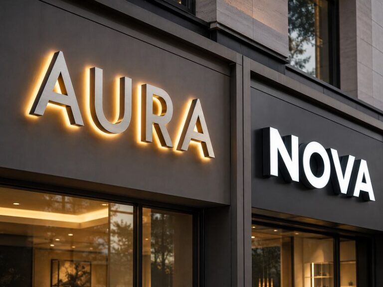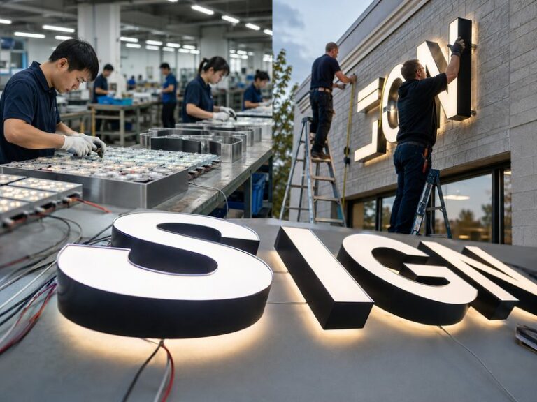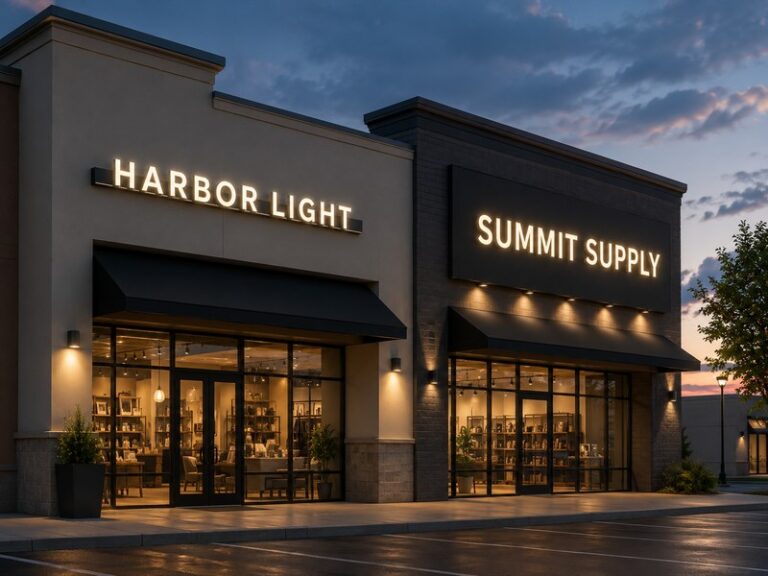

A channel letter can look excellent on a drawing, clean on the fabrication table, and still disappoint as soon as the LEDs are switched on. A dark corner inside an “R,” a dull center in an “O,” or a shadow running through a wide logo section can make an otherwise well-made sign look inconsistent from across a storefront or parking area. The difficult part is that these dark areas are rarely caused by one simple mistake. They usually appear when letter geometry, LED placement, depth, face material, electrical distribution, and testing conditions do not work together as a complete lighting system.
To prevent dark spots in channel letters, LED module spacing should be matched to letter depth, stroke width, face diffusion, and beam angle. Corners and wide sections need enough optical coverage, wiring must limit voltage loss, and completed letters should be illuminated and inspected before shipment. Uniform lighting comes from balancing optical, structural, and electrical conditions rather than simply increasing the number of LED modules inside the letter.
That distinction matters because adding more LEDs can sometimes create a different problem instead of solving the first one. Modules positioned too densely inside a shallow letter may produce visible bright points, extra heat, increased electrical load, and uneven contrast between neighboring areas. Good illumination is usually created much earlier, when the letter geometry, internal depth, LED system, face acrylic, wire routing, and expected viewing distance can still be adjusted. Once the sign is installed high on a storefront, these small engineering choices suddenly become very visible.
What Causes Dark Spots in Channel Letters?

Dark spots appear when one part of an illuminated channel letter receives less usable light than the surrounding face. Excessive LED spacing is a common reason, but poor corner coverage, narrow strokes, unsuitable letter depth, weak diffusion, voltage drop, wiring imbalance, and failed modules can produce similar symptoms. Reliable troubleshooting therefore starts by reading the visible lighting pattern and checking the complete optical and electrical system instead of assuming that every dark area requires additional LEDs.
What Is a Dark Spot in a Channel Letter?
A dark spot is a visibly dim area on the illuminated surface of a channel letter. It may appear as a small shadow between two LED modules, a dark band along a stroke, a weak corner, a dull center inside a wide letter, or a complete section that does not visually match the rest of the sign. What matters is not simply whether every LED is operating. The real question is whether the light reaching the finished face is sufficiently balanced after it has spread, reflected, and passed through the diffuser.
The shape of the dark area often gives useful clues about its source. Repeated dim bands at consistent intervals frequently point toward poor module spacing or insufficient beam overlap. A weak outer corner can indicate that the LEDs follow the centerline of the stroke without properly covering the bend. When one complete character looks darker than neighboring characters, the cause may be electrical rather than optical. A progressively dimmer section toward the end of a long cable run can also suggest voltage loss, while a random isolated patch may indicate a failed LED module or connection.
| Visible Lighting Pattern | Common Cause to Investigate | First Practical Check |
| Dark bands between module rows | Excessive LED spacing | Compare spacing with depth and beam spread |
| Weak corners | Poor geometry coverage | Check module position and orientation |
| Dim center in a wide stroke | Insufficient cross-width coverage | Check whether multiple LED rows are needed |
| One whole letter looks dim | Electrical imbalance | Measure voltage at the letter input |
| Bright dots with dark gaps | Shallow depth or weak diffusion | Check face distance and diffuser |
| Brightness fades along the run | Voltage drop | Check cable length, current, wire size, connections |
| Random isolated dark patch | Module or connector fault | Test affected LED and connection |
A useful diagnosis therefore begins with the illuminated face rather than the open back of the letter. Modules can look perfectly regular while the face is removed, yet produce obvious brightness differences once the diffuser is installed. Experienced sign engineers look at the finished lighting pattern first and then work backward through geometry, optical distance, materials, wiring, and individual components until the cause is identified.
How Do Dark Spots Differ From Hot Spots?
Dark spots and hot spots look like opposite defects, but they usually belong to the same broader problem: the light is not being distributed evenly before it reaches the visible face. A dark spot receives too little useful light, while a hot spot receives too much concentrated light or allows the physical position of an LED module to show through the acrylic. Both can appear inside the same channel letter, particularly when the letter is shallow and the modules sit close to the illuminated face.
This is one reason that simply adding more LEDs is not always a good repair strategy. Increasing module density may improve a shadowed region, but it can also make individual modules more visible, increase power consumption, raise internal temperature, and create bright lines beside areas that remain relatively weak. In other cases, reducing module quantity to eliminate visible dots can create new dark areas between the remaining modules. The correct target is controlled overlap rather than maximum module count.
A well-designed channel letter allows adjacent light fields to overlap before they reach the diffuser. The face should appear like one continuous illuminated surface instead of a collection of separate light sources hidden behind acrylic. In most retail, hospitality, restaurant, office, and commercial building applications, this balanced appearance is more valuable than maximizing raw brightness. A slightly less intense but smooth letter normally looks more professional than an extremely bright letter covered with visible points, bands, or shadows.
Are Dark Spots Always Caused by LED Spacing?
LED spacing is one of the most common reasons for uneven illumination, but it is not the only one. The same visual symptom can be caused by letter geometry, face color, insufficient diffusion, unsuitable beam characteristics, wiring loss, poor electrical distribution, module failure, or a mismatch between the LED system and the internal depth. This is particularly important during troubleshooting because adjusting the wrong variable can add cost without correcting the underlying problem.
Consider two letters using the same center-to-center module spacing. A wide, simple “H” may illuminate evenly because the geometry gives the light enough room to spread. A curved “S” using the same spacing may show dark sections where the stroke changes direction and width. The numerical specification is identical, yet the real optical conditions are different. A custom logo with narrow lines, enclosed counters, or sudden transitions can create even greater variation despite using exactly the same LED product.
Face material can create another difference. A highly diffusing white acrylic can blend individual LED sources effectively, while a darker or more saturated translucent face may absorb more light and reveal weak areas that were previously hidden. Electrical conditions can also imitate an optical problem. If LEDs farther from the power source receive lower operating voltage, that region may become visibly dim even though the physical layout is correct. For this reason, iduoduo treats LED layout, face construction, wiring, power, and nighttime lighting uniformity as connected parts of the channel-letter system rather than separate production tasks.
Which Letter Areas Are Most Prone to Dark Spots?
Corners, narrow strokes, broad strokes, enclosed counters, tight curves, and abrupt changes in width are among the areas most likely to reveal uneven lighting. Straight vertical or horizontal strokes are comparatively easy to illuminate because modules can follow a regular path. A letter such as “M,” “R,” “S,” or a detailed logo may contain several completely different lighting conditions within one character, so a repeated module pattern that works in one section can fail in another.
Wide sections create a particularly common challenge. One LED row can provide reasonable edge illumination while the center of the face remains visually weak. In such cases, simply reducing the spacing between modules along the same row may not be as effective as changing the row arrangement. A second row, staggered layout, or different module orientation can provide more balanced cross-width coverage without concentrating excessive brightness in one narrow line.
Corners require similar judgment because LEDs do not radiate light equally in every direction. A module may be physically close to a bend while its most useful light travels away from the corner. For complex channel letters, experienced engineers often divide the design into lighting zones instead of applying one repeated rule everywhere. Narrow strokes, broad fills, inside corners, outside corners, counters, curves, and large logo sections can each receive a layout that suits their geometry while still producing one consistent appearance when the finished sign is viewed from the street.
How Do LED Spacing and Letter Depth Affect Lighting?

LED spacing and letter depth work together because depth controls how much distance the light has to spread and overlap before it reaches the face. Shallow letters give the light less space to mix, while deeper letters provide more optical distance. Spacing should therefore be considered together with LED beam angle, face diffusion, stroke width, output, and letter geometry rather than treated as one fixed measurement that can be copied from project to project.
How Should LED Spacing Change With Letter Depth?
As the distance between the LED and illuminated face becomes smaller, module spacing generally becomes more demanding because neighboring beams have less room to overlap. With greater depth, light has more distance to spread, reflect, and mix before it reaches the acrylic. This basic relationship explains why a spacing pattern that works well in a deep exterior channel letter may create obvious light points or dark bands when the same layout is copied into a shallow interior logo.
Depth cannot be considered alone because increasing it introduces other consequences. A deeper metal return uses more material, adds weight, changes the side appearance, affects packaging volume, and may not suit a small interior installation. A shallow letter can look cleaner and lighter but may demand more careful optical design. The useful engineering target is therefore not the deepest possible letter or the tightest possible LED spacing. It is the combination that gives stable illumination while meeting the appearance, size, installation, and cost requirements of the project.
| Engineering Input | Useful Unit | Main Effect on Lighting |
| Letter depth | mm | Determines available light-mixing distance |
| Minimum stroke width | mm | Limits LED and wire placement |
| Maximum stroke width | mm | Helps determine number of LED rows |
| Module spacing | mm center-to-center | Controls overlap between adjacent light fields |
| LED power | W per module | Influences load, brightness, and heat |
| System voltage | 12 V or 24 V where applicable | Influences current and voltage-drop planning |
| Face thickness | mm | Affects diffusion, transmission, and rigidity |
| LED-to-face distance | mm | Strongly affects visible points and blending |
These measurements are much more meaningful than a general statement that every channel letter uses the same LED spacing. In practice, the correct layout changes with module optics, font structure, acrylic characteristics, depth, letter size, and target brightness. iduoduo’s engineering records also recognize that adding more LEDs does not automatically improve quality: spacing that is too wide can produce dark areas, while an unnecessarily dense arrangement can increase heat, power consumption, and visible bright points.
Which LED Beam Angle Provides Better Light Coverage?
LED beam angle describes how widely a module distributes its light, and it becomes especially important when the available letter depth is limited. A wider optical distribution can improve coverage between neighboring modules in a shallow channel letter because more light reaches sideways before it arrives at the face. A narrower beam may work well in another structure, particularly where greater depth already gives the light enough space to expand and blend.
A simplified geometric relationship can help illustrate the principle: the approximate coverage radius increases as the distance between the LED and face increases and as the beam angle becomes wider. Real LED modules do not create perfect geometric cones, so this relationship should never be used as an exact production formula. Lens design, internal reflection, return color, acrylic diffusion, LED output, and surface geometry all change the final result.
The practical lesson is that beam angle should be selected together with letter structure rather than after everything else has been fixed. When designers first choose an LED module and then force every future letter to work around that module, they can create unnecessary constraints. A better approach begins with the logo geometry, target depth, stroke widths, face material, and viewing environment. The module can then be selected and positioned to suit the actual optical problem instead of treating LED specification as a standard component that never changes.
How Do Narrow Strokes Affect LED Placement?
Narrow strokes create one of the most common conflicts between graphic design and physical manufacturing. A line that looks elegant and perfectly legible on screen may leave too little internal room for LED modules, connectors, wires, and sufficient optical distance once it becomes a three-dimensional letter. This problem frequently appears in script fonts, handwritten logos, thin serifs, compact symbols, and detailed brand marks.
When a stroke becomes too narrow, several compromises can appear at once. The module may need to sit very close to the face, increasing the risk of visible bright points. The side walls can block part of the beam, creating edge shadows. Wire routing can become crowded around bends, and the module may not fit at the orientation needed to light a tight corner. These limitations cannot always be solved by increasing LED quantity because the available physical space remains the same.
Common engineering responses include enlarging the entire sign, widening selected strokes slightly, choosing a smaller suitable module, adjusting letter depth, simplifying a difficult internal detail, or using another lighting construction for extremely fine elements. The right solution depends on the importance of the detail to the brand identity. Making a small geometry adjustment before fabrication is usually easier and less expensive than discovering after assembly that a narrow section cannot achieve acceptable illumination.
How Should Corners and Wide Areas Be Illuminated?
Corners and wide sections should be treated according to their local shape rather than forced into the same LED pattern used along straight strokes. At an inside corner, the module path may need to change direction before the stroke turns so enough light reaches the bend. At an outside corner, a module sitting physically close to the edge may still provide poor coverage if its strongest output is directed toward the center of the letter rather than the corner face.
Wide strokes require equally deliberate planning. If one section of a logo is more than twice as wide as neighboring strokes, a single central LED row may produce a bright line through the middle while the outer portions remain weaker. Adding another balanced row or using a staggered pattern can produce better overall uniformity than simply placing more modules along one centerline. This is one reason the internal layout of a high-quality letter may look irregular when the face is removed.
For complex logos, lighting zones provide a practical framework. Narrow single-row strokes, medium-width areas, wide fills, sharp corners, internal counters, and rounded transitions can each receive an arrangement suited to their geometry. The viewer never judges whether the internal modules form a perfectly repetitive pattern. The viewer judges whether the final illuminated face looks smooth. iduoduo’s optical engineering process therefore considers logo geometry, stroke width, letter depth, diffuser characteristics, LED beam angle, viewing distance, ambient light, and reflective surroundings together when developing the final lighting layout.
Which Face Materials Help Prevent Dark Spots?

A channel-letter face needs to transmit enough light for useful brightness while diffusing the individual LED sources strongly enough to create a continuous illuminated surface. Acrylic color, thickness, diffusion, light transmission, letter depth, and LED output must therefore be considered together. A face that performs well in a deep white letter may show dots, bands, or weak zones when used with a different color or a much shallower construction.
How Does Acrylic Diffusion Affect Light Uniformity?
Diffusion is one of the main reasons dozens of individual LED modules can appear as one continuous illuminated letter. A suitable diffusing face spreads incoming light across a wider area, reducing the visual difference between locations directly above a module and locations between modules. Without enough diffusion, the face can reveal the internal LED pattern, making the sign look like rows of bright points rather than a smooth piece of illuminated branding.
There is always a trade-off because stronger diffusion can also reduce the amount of light that reaches the viewer. A face that scatters light very effectively may require more LED output to achieve the same apparent brightness as a more transparent material. The objective is therefore not maximum diffusion or maximum transmission. It is an appropriate balance between smoothness, brightness, color, depth, and energy use.
This becomes especially important in shallow letters because the acrylic has less distance from the LED modules. There is less internal space for neighboring light fields to blend before they reach the face, so the diffuser has to do more optical work. For that reason, testing a material only under normal room lighting provides limited information. iduoduo’s material controls include acrylic thickness, color, light transmission, and diffusion, with illuminated components evaluated in their powered condition rather than judged only by their daytime appearance.
Which Face Colors Need More LED Coverage?
White and lightly tinted translucent faces are generally easier to illuminate evenly than dark or heavily saturated faces because stronger pigments can absorb a greater portion of the available LED output. A dark red, blue, green, or other saturated material may therefore look weaker under the same LED arrangement used behind white acrylic. However, increasing LED quantity is only one possible response and is not automatically the best one.
If additional modules are placed too close to the face, the total brightness may increase while visible LED points become worse. In another project, a module with different optical distribution or a more suitable face material may produce a better result with similar electrical load. Increasing letter depth can also improve blending where the physical design allows it. The correct response depends on whether the problem is insufficient total light, poor distribution, weak diffusion, or a combination of those factors.
Color also needs to be evaluated both during the day and after illumination. A material can visually match a corporate color when unlit yet change noticeably once light passes through it. LED color temperature can influence the apparent tone as well. For brand programs, approving the face material and light source as a pair provides more reliable control than selecting each item independently. This is particularly important when replacement materials or later production batches are introduced.
Is Higher Light Transmission Always Better?
Higher light transmission may produce a brighter sign, but it does not automatically produce a better-looking sign. A highly transmissive face with insufficient diffusion can expose the LED modules behind it, creating dots, stripes, or visible transitions between adjacent light sources. In premium retail, hospitality, office, or architectural signage, a slightly lower-output face with smoother illumination often looks better than an extremely bright face that reveals its internal lighting system.
Material evaluation should therefore consider transmission and diffusion together. Thickness, surface consistency, daytime color, illuminated color, outdoor UV performance, and compatibility with the chosen LED spectrum are also relevant. The most useful face material is not simply the sheet with the largest transmission value on a specification page. It is the material that produces the required visual brightness and brand color while hiding the individual modules at the intended installation depth and viewing distance.
This distinction also helps explain why two apparently similar white acrylic sheets can produce noticeably different results. One may transmit more total light but provide less optical blending. Another may scatter light more evenly but require slightly more LED power. The correct choice depends on the project. For channel letters, visual uniformity, durability, color stability, structural thickness, and efficiency need to be balanced instead of allowing one material property to dominate the decision.
How Should Face Material and Letter Depth Be Matched?
Face material and letter depth should be evaluated as one optical system because they jointly determine how much opportunity the light has to mix before reaching the viewer. A shallow letter positions the face closer to the LEDs, increasing the risk of visible points, bright bands, and dark gaps. A deeper letter gives the same light more space to spread and reflect, although deeper construction also adds material, weight, packaging volume, and visual thickness.
When the design requires a shallow profile, engineers may compensate with better diffusion, wider optical distribution, tighter module control, or a combination of these adjustments. When more depth is available, the layout may become more forgiving, but the result still needs testing because face color and LED type can alter the outcome. There is no single depth that automatically guarantees even lighting across every letter style.
Material substitutions deserve particular attention. A prototype may be approved using one white acrylic formulation at a specific depth, yet a later sheet with similar daytime color may have different transmission and diffusion characteristics. The same module arrangement can then look different after illumination. Repeat projects therefore benefit from recording face thickness, material reference, LED model, LED color, letter depth, module layout, and illuminated sample images rather than relying on broad descriptions such as “white acrylic.”
How Do Wiring and Power Supply Affect Brightness?

Electrical design can create visible lighting differences even when the LED layout is correct. Long wire runs, high current, undersized conductors, weak connections, overloaded branches, or unsuitable power distribution can reduce the operating voltage reaching some modules. Whenever one letter, one side of a sign, or the end of a long run looks consistently weaker, the electrical system should be checked alongside LED placement and face diffusion.
How Does Voltage Drop Create Dim Areas?
Every electrical conductor has resistance, so some voltage is lost as current travels through the wire. The longer the cable and the greater the current, the more significant the effect can become. In a channel-letter installation, this often creates a recognizable pattern: the letters closest to the power source appear normal, while those farther away become progressively weaker. That pattern is different from random shadows caused by LED spacing or individual module failure.
The relationship between voltage and current can be illustrated with a simple example. For an ideal 120 W load, a 12 V system draws approximately 10 A, while a 24 V system draws approximately 5 A. If both systems experienced an illustrative 0.6 V loss, that loss would equal 5% of 12 V but only 2.5% of 24 V. This does not mean 24 V is automatically the right choice for every project, but it shows why operating current matters when engineers plan conductor size and wire length.
| Example for a 120 W LED Load | 12 V System | 24 V System |
| Ideal current | 10 A | 5 A |
| Example voltage loss | 0.6 V | 0.6 V |
| Loss as percentage of system voltage | 5% | 2.5% |
| Main planning consideration | Higher current | Lower current for same power |
A larger power supply alone does not solve voltage drop if the actual problem is cable resistance, branch length, wire size, or poor connectors. The voltage needs to remain within the acceptable range at the operating LEDs, not only at the output terminals of the power supply. iduoduo’s electrical engineering documentation therefore considers LED load, system voltage, wire length, voltage drop, control requirements, and installation conditions together when configuring illuminated signage.
Which Wiring Layout Keeps Brightness Consistent?
Consistent brightness is easier to achieve when electrical load is divided into sensible branches rather than forcing an entire large letter set to depend on one unnecessarily long feed. Different characters rarely consume identical power because their illuminated areas vary. A narrow “I” may contain only a few modules, while a wide “W,” “M,” or large logo symbol can use several times that quantity. The wiring arrangement should reflect the actual electrical load rather than treating every character as an identical unit.
A practical electrical drawing can record the system voltage, module wattage, estimated load per letter, load per branch, conductor length, conductor size, connector type, power-supply location, controller position, and wire exit points. This information improves manufacturing consistency and also makes later troubleshooting easier because technicians can understand how the sign was intended to be powered instead of tracing an undocumented network of wires after a problem appears.
Connection quality matters just as much as cable length. A loose joint, unsuitable connector, or damaged wire can create additional resistance and local voltage loss even when conductor size is theoretically sufficient. Power supplies also need suitable capacity for the real operating load instead of being selected only because their printed maximum wattage is slightly above the calculated LED total. A stable system considers continuous operation, distribution, service access, and the way the sign will actually be installed.
Do Long Wire Runs Increase Dark Spot Risk?
Long cable runs increase the possibility of uneven brightness when the electrical design does not compensate for the additional resistance. This is particularly relevant to large building signs, remote-power installations, raceways, and projects where the power supply cannot be positioned close to every letter. The visual clue is often gradual rather than random: modules or letters become progressively weaker as the distance from the power feed increases.
Several engineering responses are available. The conductor size can be increased, the run can be shortened, another feed can be added, the LED load can be divided into more branches, the power supply can be relocated, or another compatible system architecture can be selected. The best solution depends on the building, the letter set, the service location, the LED system, and the installation method. There is no benefit in selecting one corrective action before the actual cause is measured.
Voltage should therefore be checked under operating load at relevant points in the circuit. A power supply can show its expected output while remote modules receive less because the loss occurs along the cable and connections. This kind of measurement is especially useful when a sign has good optical layout but one section still looks consistently weak. It prevents technicians from moving LEDs unnecessarily when the real issue sits elsewhere in the electrical system.
Is 12V or 24V Better for Long LED Runs?
A 24 V LED system can operate at lower current than a 12 V system delivering the same power, which can make voltage-drop management easier in some longer-run applications. That does not make 24 V universally superior. The LED modules, power supplies, dimmers, controllers, and accessories all need to be compatible with the selected operating voltage, and project specifications or service requirements can make 12 V more appropriate in other cases.
The correct sequence is to select an LED system suitable for the optical design, calculate the total load, divide the sign into practical electrical branches, estimate conductor length and current, determine suitable wire sizes, select power supplies with appropriate capacity, and verify voltage during powered testing. Changing only the power-supply voltage without considering module compatibility is not a safe or technically valid shortcut.
System availability and maintenance also matter. A project may use a voltage architecture already standardized across multiple stores, making consistency and spare-part availability more valuable than changing the design for one installation. Large international projects may also require different power-supply inputs or certified components for different markets while keeping the low-voltage LED system consistent. The best electrical system is therefore the one that provides stable module operation, manageable voltage loss, practical serviceability, and compatibility with the complete sign specification.
How Should Channel Letters Be Tested for Dark Spots?

Channel letters should be tested with the intended face installed and the complete electrical system operating. Inspection should include face uniformity, corners, broad strokes, color, letter-to-letter brightness, wiring, power stability, flicker, and abnormal heat. Testing before packing is important because moving LEDs, changing wiring, or replacing components is far easier inside the factory than after a completed sign has been installed several meters above a storefront.
What Should Be Checked During a Lighting Test?
A useful lighting test needs to answer two separate questions: does the sign operate correctly, and does the sign look correct? A letter can technically be operating because every module switches on while still showing dark bands, visible LED points, poor corner coverage, or inconsistent brightness. Functional operation is therefore only the first stage of inspection, not proof that the optical design is acceptable.
Powered inspection should look at the entire visible face, corner coverage, narrow strokes, wide sections, module visibility, dark areas, hot spots, color, color temperature, letter-to-letter brightness, flicker, connector stability, power-supply behavior, and abnormal temperature. Testing with the face removed can confirm that LEDs are functioning, but it cannot demonstrate how the acrylic diffuses the light. The final optical inspection should be carried out with the real production face in place.
Halo-lit letters require additional consideration because their appearance depends partly on the mounting surface. Wall distance, wall color, texture, reflectivity, and surrounding ambient light can all change the halo. A white smooth wall can produce a very different result from dark stone or textured brick. Where practical, a factory test should reproduce the intended stand-off distance and viewing conditions closely enough to reveal major problems before the product leaves production.
How Are Dark Corners and Hot Spots Detected?
Dark corners, bright points, and uneven bands are easier to detect when the completed letters are powered in controlled lighting. Strong factory lighting can mask moderate brightness differences because the viewer’s eyes are already adapted to a bright environment. Lower ambient light makes contrast changes more visible, particularly around tight corners, enclosed counters, broad fills, and transitions between narrow and wide strokes.
Inspection should begin at close distance so local defects can be identified. The observer can look for visible LED points, edge shadows, dark bends, uneven diffusion, light leaks, and overly bright zones. The next step is to move farther away and judge the full letter or complete word. A minor local irregularity that seems obvious from 300 mm may disappear at the real viewing distance, while several small variations can combine into a noticeable dark band when seen from the street.
Photographs and videos are useful for recording results, especially for international projects where the client cannot visit the factory. However, cameras automatically change exposure and can make differences appear larger or smaller than they look to the human eye. Visual inspection should therefore remain part of the process. iduoduo’s Channel Letter final inspection includes LEDs, light color, dark areas, faces, backs, wire exits, waterproofing, and drainage, allowing optical defects to be checked alongside the mechanical construction.
Do Letters Need Near and Distance Viewing Tests?
Near and distance viewing tests are both useful because they reveal different types of defects. Close inspection shows visible LED points, edge leakage, acrylic scratches, local shadows, surface defects, and small hot spots that may matter for reception logos or interior signs. Distance viewing makes it easier to compare complete characters and identify one letter that appears weaker, darker, brighter, or visually heavier than the rest of the sign.
The meaningful viewing distance depends on how the finished sign will be used. A reception logo may normally be seen from only a few meters away, while storefront channel letters can be viewed from across a road or parking area. Large building signage may need to remain visually consistent at much greater distances. A test performed only from arm’s length cannot fully represent those conditions.
Full-set testing is especially useful for large commercial signs. Individual letters can appear acceptable when inspected separately on different worktables, yet their brightness may look inconsistent once they are arranged into the complete brand name. The production team should therefore judge both individual construction and the visual relationship between neighboring characters. iduoduo’s QC approach similarly gives large Channel Letters additional attention for overall proportions, distance appearance, lighting uniformity, segmentation, and installation structure.
What Does a 72-Hour Pre-Shipment Test Reveal?
An extended powered test can reveal problems that do not appear during a short switch-on inspection. A few minutes of operation can confirm that the LEDs illuminate, but it may not expose an intermittent connector, unstable module, power-supply problem, controller fault, abnormal temperature rise, or early component failure. Longer operation gives these weaknesses more opportunity to appear while the product is still inside the factory.
iduoduo’s illuminated products undergo 100% lighting inspection followed by a documented 72-hour pre-shipment test. The process is used to observe LED stability, power-supply stability, control functions, flicker, early failures, color differences, local dark areas, abnormal temperature rise, and wiring connections. When a problem is detected, the affected component or connection can be corrected and the product checked again before packing.
A 72-hour test should not be described as a lifetime guarantee because no pre-shipment inspection can predict every future installation or environmental condition. Its practical value is reducing avoidable early failures and giving the production team time to identify problems under continuous operating conditions. This becomes particularly valuable in international projects, where a small component fault discovered after installation can create far more labor, travel, access, and replacement cost than the same issue discovered before shipment.
How Can Dark Spots Be Prevented in Repeat Projects?

Repeat projects stay more consistent when the approved lighting result is converted into controlled production information. LED model, color, module spacing, letter depth, face material, wiring arrangement, power configuration, and approved illuminated appearance should be recorded. When an important LED, acrylic, electrical, or structural component changes, the lighting should be checked again instead of assuming that the previous optical result will automatically remain unchanged.
What Lighting Data Should Be Saved After Approval?
A successful prototype becomes much more valuable when the factory knows exactly what created the approved appearance. A photograph of the finished sign alone cannot explain the LED model, module spacing, face specification, depth, branch wiring, or other variables that determined the result. If those details are not recorded, later production can gradually change even when everyone believes they are repeating the same design.
Useful repeat-production information includes final artwork, overall dimensions, individual letter dimensions, narrowest and widest stroke widths, letter depth, face material, face thickness, LED model, operating voltage, color or color temperature, module spacing, number of LED rows, module layout, power-supply specification, branch wiring, mounting distance for halo-lit designs, illuminated photographs, testing video, and any approved sample reference.
These records become particularly valuable when production continues for months or years. The technician who created the first sample may not produce the later batch, material suppliers may change, and new stores may use different overall dimensions while retaining the same branding. iduoduo’s documented optical records can include LED model, LED color, color temperature, module spacing, letter depth, face material, mounting distance, controls, test photographs, powered videos, and approved samples, creating a stronger foundation for repeat production.
How Do You Keep Brightness Consistent Across Letters?
Brightness consistency does not mean installing the same number of LED modules in every character. Different letters contain different illuminated areas and different optical challenges. A narrow “I” can require only a small number of modules, while a wide “M,” “W,” or large logo symbol may require significantly more coverage. Forcing identical internal layouts into these very different shapes can actually make the completed sign less consistent.
The correct target is balanced visual output. Each character can receive a layout suited to its geometry while still following the same broader standards for LED type, face material, depth, color, electrical system, and target appearance. A wide character may require additional rows, while a narrow character may need fewer modules positioned carefully enough to avoid visible bright spots. These different internal solutions can still produce a visually consistent word.
Letters should also be inspected together because human perception evaluates the entire logo, not isolated electrical loads. A narrow character can appear brighter because its illuminated area is concentrated, while a broad rounded character may appear visually weaker even if its module count is higher. For important branded programs, an approved first production set can act as a reference so later batches can be compared under similar lighting conditions before packing and shipping.
How Are Different Production Batches Kept Consistent?
The same drawing does not automatically produce the same illuminated appearance. Production batches can vary because of changes in acrylic formulation, LED model, LED bin, color temperature, face thickness, paint batch, internal surface condition, power supply, wiring, or module arrangement. A channel-letter program therefore needs control of both dimensional information and the components that influence daytime and nighttime appearance.
This becomes particularly important for chain-store and franchise projects. Ten locations may be produced during the first rollout, with another group ordered several months later. If the later batch uses a different face material or LED color temperature, the new stores can look noticeably different from the earlier locations even though the CAD file is unchanged. These differences become more visible when multiple stores are photographed or compared as part of the same brand system.
Repeat orders should therefore reference approved materials, LED specifications, color range, letter depth, module layout, electrical configuration, surface finish, and QC images. If a critical component is discontinued, its replacement should be treated as an engineering change rather than only a purchasing change. The realistic objective is not to claim that every raw-material batch is physically identical, but to control the factors that materially affect appearance and performance so later production remains close to the approved standard.
What Should Be Rechecked When LEDs or Materials Change?
Any change that can affect light generation, transmission, reflection, electrical delivery, or heat management deserves another review. Important changes include the LED model, wattage, beam pattern, operating voltage, color temperature, acrylic type, acrylic color, face thickness, diffuser performance, internal finish, letter depth, power supply, wiring architecture, and control equipment.
A replacement LED may have the same nominal wattage as the original while using a different lens that spreads light more narrowly or more widely. A replacement acrylic can look almost identical in daylight yet transmit and diffuse light differently after illumination. Even changing the electrical arrangement can alter brightness if the new branch configuration changes the voltage reaching remote modules. Product similarity on a purchasing sheet does not necessarily mean identical optical performance.
For repeat commercial projects, a practical rule is to retest a representative illuminated sample whenever a critical component affecting the light path or operating condition changes. This is especially useful for shallow letters, difficult brand colors, complex logos, large architectural letters, and multi-store programs where nighttime consistency matters. Rechecking one representative unit before full production is usually much easier than discovering after installation that an entire batch no longer matches the originally approved lighting appearance.
Dark spots in channel letters are rarely prevented by one universal LED spacing rule or by simply adding more modules. Uniform illumination comes from treating the letter as a complete optical, structural, and electrical system. Geometry, internal depth, LED distribution, acrylic diffusion, power delivery, wiring, and powered testing all influence what the viewer finally sees. When these variables are reviewed together before production and verified again before shipment, the finished sign has a much better chance of delivering the smooth, balanced nighttime appearance expected from professional commercial signage. For iduoduo, this engineering approach is especially important on custom logos, repeat store programs, unusual face colors, shallow constructions, and projects where lighting consistency has to be reproduced across different sizes and production batches.
Frequently Asked Questions
What is the most common cause of dark spots in channel letters?
There is no single cause in every project, but insufficient light overlap is one of the most common starting points to investigate. This can result from LED modules being spaced too far apart, unsuitable letter depth, poor corner placement, or inadequate coverage across wide strokes. The visible pattern should always be checked first because an entire dim letter or gradually fading run may instead indicate voltage drop or another electrical problem rather than poor LED spacing.
How far apart should LED modules be in channel letters?
There is no reliable universal spacing number because suitable module spacing depends on LED beam characteristics, letter depth, stroke width, face diffusion, module output, and geometry. Shallow letters generally require more careful spacing because the light has less distance to spread before reaching the face. The safest approach is to develop spacing from the actual module specification and construction, then confirm the layout using a representative illuminated sample rather than copying one measurement across unrelated projects.
Can adding more LED modules eliminate dark spots?
Adding modules can help when the existing layout genuinely lacks sufficient coverage, but more LEDs do not automatically create smoother illumination. In shallow letters, excessive module density can produce visible hot spots, additional heat, higher electrical load, and overly bright areas next to remaining shadows. Before adding LEDs, check whether the real problem is spacing, beam direction, stroke geometry, face diffusion, letter depth, voltage loss, or a failed module so the correction addresses the actual cause.
Can voltage drop make part of a channel letter look darker?
Yes. Voltage drop can reduce the operating voltage reaching modules farther along a cable run, which may cause part of the sign to appear weaker than sections closer to the power source. Long wire runs, high current, small conductors, excessive load on one branch, and poor connections can increase the problem. Measuring voltage at relevant points while the sign is operating helps distinguish an electrical brightness problem from shadows caused by LED placement or optical design.
Does acrylic thickness affect channel letter illumination?
Acrylic thickness can influence both optical behavior and structural performance, but thickness should not be evaluated alone. Face color, transmission, diffusion, LED-to-face distance, and module output all influence whether the finished surface looks smooth. Two acrylic sheets with similar daytime appearance can behave differently when illuminated, so a change in face material or thickness should be checked with the actual LED system whenever nighttime appearance or repeat-order consistency is important.
How do you test channel letters for dark spots before shipment?
The letters should be powered with the production faces installed and inspected for dark areas, hot spots, weak corners, visible LED points, letter-to-letter brightness, color consistency, flicker, wiring stability, and unusual heat. Viewing at both close range and a realistic distance is useful because the two positions reveal different defects. iduoduo also uses 100% lighting inspection and a 72-hour pre-shipment powered test to observe early LED, power, wiring, control, and illumination problems before packing.
How can repeat channel letter orders maintain the same illumination?
Repeat consistency depends on saving more than the artwork. Important records include the LED model, color or color temperature, module layout, spacing, face material, face thickness, letter depth, power configuration, wiring arrangement, and approved illuminated appearance. If an important LED, acrylic, or electrical component changes between production batches, a representative unit should be tested again. This helps prevent a later order from matching the dimensions of the original sign while producing a noticeably different nighttime appearance.