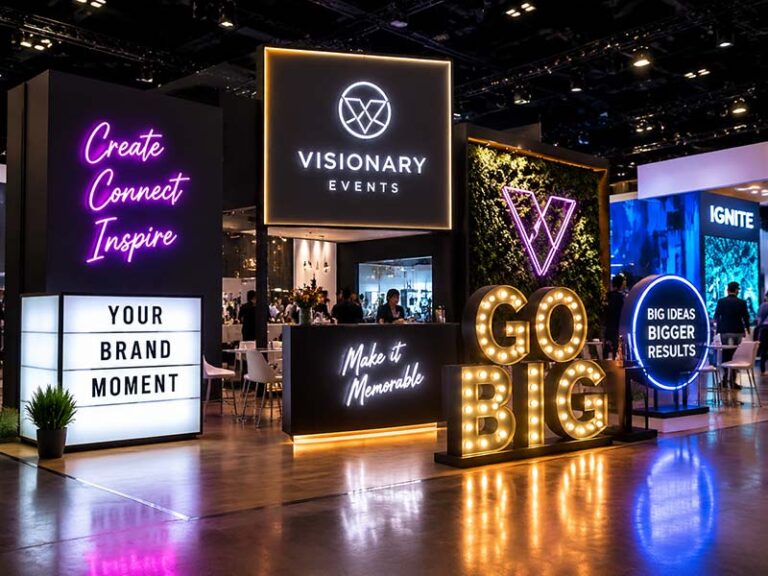
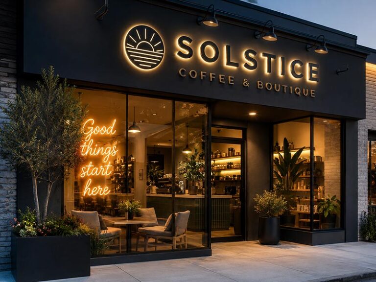
An exhibition booth has only a few seconds to tell passing visitors who the company is, what it offers, and whether it is worth stopping. An LED logo sign can help, but illumination alone does not guarantee visibility. A sign may look impressive in a dark showroom and still disappear under strong exhibition lighting. It may fit the artwork perfectly but be too heavy for the rented wall, too difficult to install during a short setup window, or too fragile for repeated international transport.
The best LED logo signs for exhibition booths are visible under bright hall lighting, suitable for the booth structure, easy to install, and strong enough for repeated transport. LED neon suits creative and compact booths, front-lit letters offer clear long-distance recognition, halo-lit logos create a premium appearance, edge-lit acrylic works well on counters, and LED light boxes reproduce complex full-color graphics.
The right answer therefore depends on more than product type. Booth size, viewing distance, logo detail, wall construction, cable routing, voltage, packing method, and the exhibition deadline all affect the final choice. A sign that performs well in a 10×10-foot booth may be completely unsuitable for a large island booth.
Many exhibition teams discover these details too late—sometimes while unpacking at the venue. The following guide looks at the decision from the booth floor backward, so the finished sign is not only attractive in photographs but also practical when the doors are about to open.
What LED Logo Sign Types Are Available?
The main choices for exhibition booths are LED neon signs, front-lit letters, halo-lit logos, edge-lit acrylic signs, and LED light boxes. Each option performs differently under hall lighting and places different demands on the booth wall, wiring, packaging, and setup team. Product selection should start with logo shape, viewing distance, mounting surface, transport frequency, and available installation time.
Do LED Neon Signs Fit Small Booths?
LED neon signs are often suitable for 10×10-foot booths, pop-up displays, product launches, and reception counters because the complete logo can usually be fixed to one acrylic backboard. A single-piece sign takes less time to install than individual illuminated letters and normally requires fewer wall fixing points.
Acrylic backboards are commonly made in clear, black, white, rectangular, or logo-contour shapes. Typical sign thickness ranges from about 15 to 30 mm, depending on the acrylic, LED neon flex, cable route, and backing structure. Small booth signs are often produced between 600 and 1,200 mm wide, although the final size should follow the available wall area and expected viewing distance.
LED neon works best for:
- Script lettering
- Rounded brand icons
- Simple line-art logos
- Short company names
- One- or two-color designs
- Social-media photo areas
Logo artwork with narrow gaps, small taglines, gradients, or several overlapping colors may need adjustment. A neon tube needs physical space to bend, turn, and maintain even illumination. Fine details that look clear on a screen may merge together when viewed from three to five meters away.
For stronger visibility under bright hall lighting, use a darker and less cluttered background. A white or colored neon logo can lose contrast when installed over a busy printed wall. Dimmer control is also useful because exhibition lighting can vary greatly between venues.
Are Front-Lit Letters Better in Bright Halls?
Front-lit letters are usually a stronger choice when the company name needs to remain readable across an aisle or from the opposite side of an exhibition hall. The illuminated acrylic face produces a larger area of light than LED neon tubing, helping bold letters stay visible under overhead fixtures, spotlights, and nearby video screens.
Front-lit letters are commonly built with acrylic faces and metal or acrylic returns. Booth applications often use shallower returns than permanent outdoor channel letters to reduce weight and packaging volume. A depth of roughly 30 to 80 mm is common for indoor exhibition projects, depending on letter height, LED spacing, face material, and logo construction.
Individual letters create a clean architectural look, but they require more planning. Each element needs accurate spacing, mounting holes, wiring, and a path to the power supply. An installation template should be included whenever letters are shipped separately.
For faster booth setup, the letters can be pre-mounted onto:
- A painted aluminum backboard
- A slim raceway
- A shaped acrylic panel
- Two or three labeled modular sections
Pre-mounting reduces on-site wiring and helps prevent uneven spacing. It also increases the size of each package, so the final section dimensions should be checked against vehicle doors, elevators, loading docks, storage rooms, and booth access points.
Front-lit letters are especially effective for block fonts and simple corporate logos. Very thin strokes may show hotspots or dark areas, while closely spaced letters can be difficult to wire neatly.
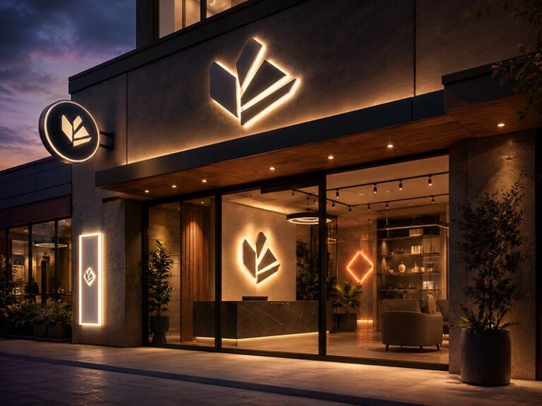
Do Halo-Lit Logos Suit Premium Booths?
Halo-lit logos suit booths designed around premium materials, controlled lighting, and a quieter visual style. Instead of illuminating through the front face, LEDs shine toward the wall and create a soft outline around each letter or logo element.
The front surface can use brushed stainless steel, polished metal, painted aluminum, titanium finishes, acrylic, or other decorative materials. Such finishes work well for hospitality, real estate, furniture, luxury products, finance, architecture, and high-end equipment brands.
The booth wall has a direct effect on the final glow. Smooth matte panels generally produce the most even halo. Fabric walls, rough textures, open truss, reflective graphics, or deeply grooved panels can break up the light and make the logo look patchy.
A gap of approximately 15 to 40 mm between the letters and wall is often used to create the halo, although exact spacing depends on letter size, LED output, wall color, and the desired effect. Larger gaps create a wider glow but expose more of the rear structure from side angles.
Halo-lit signs also need careful cable planning. Rear studs, spacers, wires, and power connections should be hidden behind the letters or routed into the booth wall. When rear access is limited, a shared backboard may be more practical.
In a very bright hall, halo lighting can appear weaker than expected. A darker booth area, controlled spotlighting, or dimmer surroundings help preserve the premium glow. For long-distance recognition, some projects use front-and-back illumination rather than halo lighting alone.
Are Edge-Lit Logos Good for Counters?
Edge-lit acrylic signs are well suited to reception counters, demonstration tables, product pedestals, display shelves, and compact branded areas. LEDs are installed along one or more acrylic edges, allowing engraved lines, printed details, or selected logo areas to catch and distribute the light.
Common counter signs range from about 300 to 800 mm wide. Larger sizes are possible, but long acrylic panels need enough thickness and support to avoid bending. Acrylic thickness may range from approximately 5 to 15 mm depending on sign size, engraving depth, base design, and handling requirements.
Edge-lit logos work particularly well for:
- Technology brands
- Software companies
- Medical devices
- Electronics
- Beauty products
- Automotive components
- Clean, minimal booth designs
The viewing distance is usually shorter than for a wall-mounted channel-letter sign. Fine engraved details can look sharp at one to three meters but may disappear from across a wide aisle. For that reason, edge-lit signs often support the main wall logo rather than replace it.
The base needs enough weight and width to prevent tipping. A narrow acrylic panel in a lightweight base can become unstable when visitors touch the counter or when cables are pulled. The cable should exit through the rear or bottom of the base and pass into the counter through a prepared opening.
Visible scratches can become more noticeable once the acrylic is illuminated. Protective film should remain in place until booth installation, and foam packaging should prevent contact with plugs, screws, brackets, and metal accessories.
Are LED Light Boxes Best for Full-Color Logos?
LED light boxes are often the best option for logos containing gradients, photographs, detailed illustrations, fine patterns, or several exact colors. Printed graphics can reproduce visual details that would be difficult or expensive to divide into neon tubes or separate channel letters.
Booth light boxes may use acrylic faces, printed fabric, tension fabric graphics, or thin printed panels. Slim wall-mounted models can be around 30 to 80 mm deep, while larger modular fabric light boxes may use deeper aluminum frames for strength and even light distribution.
A light box is especially useful when the sign needs to display:
- Full-color logos
- Product photographs
- Campaign graphics
- Detailed brand patterns
- Several product categories
- Changeable exhibition messages
Fabric graphics are useful for repeat exhibitions because the frame can be reused while the printed face is replaced. Replacement graphics also take less storage space than complete new signs. Acrylic-faced boxes provide a more solid appearance but require stronger protection against scratching and impact.
Even illumination is essential. Poor LED spacing can create bright bands, dark corners, or visible hotspots. Large light boxes should be tested from normal viewing distance rather than judged only from close-up photographs.
A light box can become visually busy when too much text is placed on the illuminated face. Keep the company logo large, leave enough empty space, and move detailed product information to separate panels or screens.
For some booths, combining two sign types produces a better result. A large light box can carry the campaign graphic, while front-lit or halo-lit letters create a stronger three-dimensional brand focal point.
| Sign type | Typical booth use | Common size range | Main advantage | Main risk to check |
|---|---|---|---|---|
| LED neon | Small booth wall, photo area, counter | 600–1,200 mm wide | Lightweight and quick to install | Fine details may merge |
| Front-lit letters | Main back wall, wide booth | 200–700 mm letter height | Strong aisle visibility | Wiring and letter spacing |
| Halo-lit logo | Premium feature wall | 200–600 mm letter height | Refined depth and material finish | Wall may not reflect evenly |
| Edge-lit acrylic | Counter, shelf, pedestal | 300–800 mm wide | Thin and modern | Limited long-distance impact |
| LED light box | Full-color wall graphic | 600–3,000+ mm wide | Accurate graphic reproduction | Large faces need even lighting |
No sign type should be selected from appearance alone. A practical comparison should include total weight, wall load limit, number of fixing points, power-supply location, cable length, packing dimensions, setup time, and expected reuse. A slightly simpler sign that installs in 20 minutes and survives ten exhibitions often offers more value than a complex sign requiring specialist installation at every venue.
Which Sign Fits Your Booth?
A suitable booth sign depends on usable wall area, aisle direction, viewing distance, wall construction, installation time, and how often the sign will travel. Small booths usually need one clear focal logo. Wider booths can support primary and secondary signs. Island booths need branding from several directions. Wall and counter signs also require different weights, depths, fixing methods, and cable routes.
What Works for a 10×10 Booth?
A 10×10-foot booth gives roughly 9.3 square meters of floor space, but the usable branding area is usually much smaller. Screens, shelves, sample displays, storage doors, counters, and printed graphics may leave only 1.5 to 2.5 meters of clear wall width for an illuminated logo.
One main sign is normally enough. Multiple glowing signs can make a small booth look crowded and pull attention away from products or staff conversations. A practical arrangement is one wall-mounted logo between 700 and 1,200 mm wide, supported by a smaller counter sign only when close-range branding is needed.
LED neon works well for a short brand name, script logo, icon, or simple one- or two-color design. Front-lit letters provide stronger recognition for industrial, technology, medical, equipment, and corporate brands. A slim light box is useful when the logo includes gradients, photographs, or a full campaign graphic.
Mounting weight matters because many 10×10 booths use fabric displays, portable aluminum frames, or rented modular walls. A complete LED neon sign with an acrylic backboard may be easier to handle than several wired channel letters. Where the wall is rigid, front-lit letters can be mounted directly or supplied on a shared backboard.
The bottom of the main logo is often positioned about 1,500 to 1,800 mm above the floor, depending on counter height and booth furniture. A sign placed too low may be hidden by visitors. A sign pushed too close to the top frame may look cramped.
Before ordering, mark the exact logo position on a front elevation and confirm:
- Clear wall width and height
- Wall material and load limit
- Screen, shelf, and counter positions
- Available fixing points
- Power outlet location
- Cable exit direction
- Maximum packed size for transport
A compact sign with clean contrast generally performs better than an oversized logo squeezed between other booth elements.
What Works for a 10×20 Booth?
A 10×20-foot booth offers more frontage, but a logo sized for a 10×10 display can look weak on a six-meter wall. The primary sign often needs to be between 1,200 and 2,400 mm wide, depending on the logo proportions, wall layout, viewing distance, and height restrictions.
A wider booth is commonly divided into two working areas. One side may contain product demonstrations, while the other side holds meetings or reception. The main illuminated logo should remain the strongest brand element. A smaller secondary sign can identify a product series, launch area, or counter without competing with the company name.
Suitable arrangements include:
- One wide set of front-lit letters across the back wall
- One large LED neon logo with a short illuminated slogan
- A backlit graphic wall with separate dimensional letters
- One main wall logo and one smaller counter logo
- Two matching logo signs for separate booth zones
Individual channel letters create a clean, permanent-looking finish, but installing eight or ten separate letters can consume valuable setup time. Pre-mounting the letters onto two or three backboard sections can reduce site work. Each section should be labeled in sequence and supplied with matched cables and connectors.
Section size must be planned around handling. A panel wider than 1,500 to 1,800 mm may be awkward for one person to lift and may not fit easily into passenger elevators, small vans, or venue storage rooms. Dividing a long sign into manageable sections can lower transport damage and make repacking easier.
For logos viewed from six to ten meters, letter heights of roughly 300 to 600 mm are often more effective than small decorative lettering. Thin taglines should not be enlarged without checking whether they remain readable and manufacturable. In many cases, the tagline works better as printed wall text while the company name remains illuminated.
The booth drawing should show the primary viewing aisle. A logo positioned perfectly in the center of the back wall may still be poorly placed when most visitors approach from one end of the aisle.
What Works for an Island Booth?
An island booth is open on four sides, so a single logo facing one direction leaves large parts of the hall without clear brand identification. Branding should be planned for the main visitor approaches, not only for the front view shown in the booth rendering.
Common solutions include:
- A double-sided hanging light box
- A four-sided overhead light box
- Illuminated logos mounted on two or four booth walls
- A central tower with logos facing several aisles
- Double-sided freestanding illuminated signs
- Repeated logo signs around a suspended frame
Overhead signs provide strong long-distance visibility. They are useful for island booths measuring 20×20 feet or larger, especially when visitors need to locate the booth from across the hall. However, hanging signs involve more than sign production. The venue may require engineered suspension points, weight declarations, rigging drawings, approved contractors, lifting equipment, and advance installation bookings.
A suspended sign weighing 40 or 60 kg may be technically manageable but expensive to rig. Venue labor and lifting charges can exceed the manufacturing cost of a simpler wall-mounted sign. Before selecting an overhead structure, obtain the rigging manual and a written estimate from the exhibition organizer.
Where rigging is restricted or too expensive, repeated wall logos are often safer. Two signs placed on opposite elevations can cover the main aisles. Four smaller matching signs provide wider visibility and can be reused in different booth layouts.
Color consistency becomes important when several signs are installed together. All units should use the same acrylic batch, LED color temperature, paint reference, brightness setting, and power configuration. A difference of even a few hundred kelvin can become noticeable when two white illuminated logos appear in the same view.
Each unit should carry a clear location label, such as:
- North Wall
- South Wall
- Entrance A
- Entrance B
- Tower Side 1
- Tower Side 2
Matching labels should also appear on power supplies, cables, controllers, templates, and cartons. Installation teams should not need to test several power units to find the correct connection.
Which Sign Fits a Back Wall?
A rigid back wall gives the widest range of sign choices. Front-lit letters, halo-lit letters, LED neon, edge-lit panels, and slim light boxes can all work, provided the wall can support the weight and accommodate the chosen fixing method.
Front-lit letters are suitable when aisle visibility is the main goal. Letter heights between 250 and 600 mm are common for standard exhibition walls, although viewing distance and logo length must be considered together. A long company name may require a lower height or a stacked arrangement.
Halo-lit letters suit premium booth interiors with smooth, matte wall panels. A rear spacing of approximately 15 to 40 mm allows the light to spread around the letters. Dark fabric, high-gloss graphics, deep texture, or open slats may create uneven reflections and reduce the halo effect.
LED neon is practical for lightweight walls and curved logos. A complete sign on one acrylic backboard may require four to eight fixing points, depending on size and weight. Clear acrylic creates a floating appearance, while black or shaped acrylic can improve contrast and hide wiring.
Light boxes work well when the logo is part of a larger graphic. Slim models between 40 and 80 mm deep can fit many booth systems. Large fabric light boxes need stronger frames and enough wall depth for the LED layout, connectors, and graphic tension.
The phrase “back wall” is not enough for production. The wall may be:
- Painted plywood
- MDF panels
- Aluminum composite panels
- Tension fabric
- Modular exhibition panels
- Timber framing with printed skins
- Aluminum truss with graphic panels
Each construction accepts different fixings. Screws may be allowed in plywood but prohibited in rented modular panels. Fabric cannot support the same point load as MDF. Open frames may need clamps or a separate mounting rail.
The sign drawing should show hole centers, mounting hardware, total weight, rear depth, cable exit, and power-supply position. Where rear access is unavailable, the sign should allow installation and servicing entirely from the front.
Which Sign Fits a Reception Counter?
A reception counter is normally viewed from 0.5 to 3 meters, so clarity, finish, and cable control matter more than high brightness. A small sign can appear premium at close range, while excessive LED output may cause glare and wash out photographs.
Edge-lit acrylic signs are well suited to countertop use. Widths between 300 and 800 mm are common, with acrylic thicknesses of roughly 5 to 15 mm. The base should be wide and heavy enough to prevent tipping when visitors touch the counter or when the power cable is moved.
A compact LED neon sign works well for informal, creative, beauty, fashion, food, beverage, and lifestyle booths. The sign can sit on a base, mount to the counter front, or attach to a raised panel behind the reception area.
Shallow front-lit letters are more suitable for corporate, medical, industrial, financial, and technology booths. Letters can be fixed to the counter face or pre-mounted onto a slim panel. A counter depth of at least 300 to 500 mm usually gives more room for wiring, power supplies, brochures, storage, and staff equipment.
A small light box is useful for full-color logos or changing campaign graphics. Replaceable printed faces allow the same frame to support several exhibitions or product launches.
Counter placement affects the design:
| Counter position | Suitable sign | Practical concern |
|---|---|---|
| On top of counter | Edge-lit acrylic or small neon | Stability and viewing height |
| Front panel | Shallow letters or light box | Internal cable access |
| Raised rear panel | Neon, letters, or edge-lit logo | Staff visibility |
| Side panel | Small flat illuminated logo | Limited viewing angle |
| Freestanding beside counter | Logo on weighted stand | Visitor traffic and tipping |
Cable routing should be agreed before the counter is built. A 15 to 25 mm cable hole can often hide the power lead, depending on connector size. The power supply can sit inside a ventilated compartment with access from the staff side.
The sign should not occupy the full counter width. Leaving 150 to 300 mm of clear space on each side often produces a more balanced appearance and reduces accidental contact. The sign height should also remain below normal eye level when staff and visitors are speaking across the counter.
| Booth type | Recommended main sign width | Typical viewing distance | Suitable sign direction |
|---|---|---|---|
| 10×10 booth | 700–1,200 mm | 3–6 m | Neon, compact front-lit logo, slim light box |
| 10×20 booth | 1,200–2,400 mm | 5–10 m | Wide front-lit letters, large neon, graphic light box |
| 20×20 island booth | 1,500–3,000+ mm | 8–20 m | Multi-face logos, hanging light box, repeated signs |
| Back wall | Based on 40–65% of clear wall width | 3–12 m | Letters, neon, halo-lit logo, light box |
| Reception counter | 300–800 mm | 0.5–3 m | Edge-lit acrylic, small neon, shallow letters |
The final sign should be checked against the booth elevation at actual scale. A practical review covers wall occupancy, visitor sightlines, installation access, cable routes, packed dimensions, and setup time. A sign sized only from the logo file may look correct on a drawing yet feel too small, too crowded, or impossible to install once the booth is built.
How Should Size and Brightness Be Chosen?
Sign size should come from the viewing distance, usable wall area, logo proportions, and surrounding booth graphics. Brightness should provide clear contrast under hall lighting without glare, overexposed photographs, or visible LED spots. Start with the booth elevation and main aisle view, then confirm letter height, stroke width, background color, light output, dimming, and viewing direction before production.
How Far Away Must the Logo Be Seen?
The first question is not “How large can the sign be?” It is “Where should someone first recognize the brand?”
A reception-counter logo may only need to work from one to three meters away. A back-wall sign in a standard inline booth may need to remain readable from three to eight meters. An island-booth logo or overhead sign may need to attract attention from fifteen meters or farther.
Use the main approach path rather than the longest possible distance in the hall. A sign does not need to be readable from every corner of the venue. It should be clear from the aisle where most visitors first see the booth.
The following ranges are useful for early planning:
| Main viewing distance | Suggested letter or logo height | Common position |
|---|---|---|
| 0.5–2 m | 80–180 mm | Reception counter or product display |
| 2–4 m | 150–280 mm | Small booth wall |
| 4–7 m | 250–450 mm | 10×10 or 10×20 back wall |
| 7–12 m | 400–700 mm | Wide booth or cross-aisle view |
| 12–20 m | 600–1,000 mm | Island booth or elevated logo |
| Over 20 m | 900 mm or more | Overhead or large multi-face sign |
These figures are starting points, not fixed rules. A bold five-letter name can remain readable at a smaller height than a long company name with narrow characters. Script fonts, condensed lettering, thin strokes, and tightly spaced capitals usually need more height.
Overall logo width also matters. A 400 mm-high letter may create a sign more than four meters wide when the company name is long. If the wall cannot accommodate the full width, consider an approved stacked logo, an icon above the name, or a shorter brand lockup.
A useful wall-planning range is to let the main logo occupy around 40% to 65% of the clear wall width. “Clear wall width” means the space left after screens, shelves, doors, counters, printed messages, and structural columns are removed.
For example, a six-meter booth wall may appear large on the floor plan, but a two-meter screen and a one-meter storage door could leave only three meters of usable logo space. A 2.0- to 2.4-meter-wide illuminated logo may look balanced, while a four-meter logo would feel crowded.
Letter stroke width is as important as letter height. A large letter with very thin strokes can still look weak from the aisle. As a practical drawing check:
| Letter height | Practical visible stroke range |
|---|---|
| 100–200 mm | 12–25 mm |
| 200–350 mm | 20–40 mm |
| 350–600 mm | 30–70 mm |
| Over 600 mm | 50 mm or more |
The production drawing should be placed on the booth elevation at scale. Print the logo at full size when possible, tape the outline to a wall, and stand at the expected viewing distance. A five-minute full-scale check often reveals problems that are easy to miss on a laptop screen.
Is the Logo Clear Under Hall Lighting?
An LED logo can look bright in a dark workshop and appear much weaker inside a busy exhibition hall. Overhead fixtures, video walls, product spotlights, neighboring booths, reflective floors, and daylight from entrance areas all reduce visual contrast.
The solution is not always more power. A sign can be extremely bright and still difficult to read when the face color and background are too similar. Strong visibility comes from a combination of light output, color contrast, letter thickness, spacing, and background simplicity.
A few practical combinations usually work well:
| Sign face | Booth background | Expected result |
|---|---|---|
| White front-lit letters | Dark matte wall | Strong contrast and clear photographs |
| Warm white letters | Medium or dark wood finish | Softer premium appearance |
| Colored LED neon | Black or charcoal wall | High visual separation |
| Halo-lit metal letters | Smooth light or medium-tone panel | Controlled rear glow |
| Pale logo face | White printed graphic | Low contrast unless outlined |
| Thin neon lines | Busy multicolor artwork | Details may disappear |
Brightness should also be considered in relation to the sign type.
Front-lit letters create a relatively large illuminated surface and usually remain clear under bright hall lighting. LED neon produces a narrower light line, so background contrast becomes more important. Halo-lit signs depend on reflected light and may look subtle under intense overhead fixtures. Light boxes provide broad illumination but can lose focus when too much content is printed on the face.
Dimming is worth adding when the venue lighting cannot be tested in advance. A dimmer allows the booth team to adjust the sign after surrounding screens and spotlights are switched on. Fixed maximum brightness leaves no room to correct glare or overexposure.
Photographs also need attention. A sign set too bright may look attractive to the eye but appear as a white shape in phone photos. Logo colors and small details disappear when the camera reduces exposure around the illuminated area.
Ask for production videos at several output levels where dimming is included:
- Approximately 30% brightness
- Approximately 60% brightness
- Full output
Compare the logo face, edges, dark areas, color, and background visibility. A video taken only in a dark room does not show how the sign will perform at an exhibition.
Color temperature changes the visual impression as well. Common white-light options include:
| White-light range | Visual impression | Common booth use |
|---|---|---|
| 2700–3200K | Warm, relaxed, premium | Hospitality, furniture, beauty, luxury |
| 3500–4500K | Neutral and balanced | General commercial branding |
| 5000–6500K | Crisp and cool | Technology, medical, industrial, electronics |
The chosen color temperature should coordinate with booth spotlights and printed colors. A warm white logo under very cool booth lighting can look yellow. A cool white logo in a warm wood booth may feel harsh.
Avoid judging brightness from electrical wattage alone. Two signs using similar wattage can look different because of face area, LED spacing, acrylic transmission, sign depth, background color, and viewing angle.
The final check should answer four questions:
- Can the brand name be read from the main aisle?
- Does the logo separate clearly from the wall?
- Are the colors still recognizable in photographs?
- Can brightness be reduced if venue lighting is lower than expected?
Are Small Letters Still Readable?
Small letters are often the first part of a logo to fail during manufacturing or installation. A tagline may look clear in an AI file at 300% zoom but become unreadable when produced at actual size and viewed from several meters away.
Illuminated signs need physical space for light sources, wiring, acrylic edges, metal returns, glue areas, bends, and mounting points. Very thin strokes may be possible to cut but may not produce even light. Tight gaps may also fill visually once neighboring elements are illuminated.
Common problem areas include:
- Small taglines under the main logo
- Copyright and registered trademark symbols
- Narrow counters inside letters such as A, B, D, O, P, and R
- Thin script connections
- Closely spaced lowercase letters
- Small gaps between different colors
- Fine outlines around a logo icon
- Narrow corners where LEDs cannot be placed evenly
For LED neon, visible line thickness commonly needs to remain large enough for the selected neon flex. A design containing 2 or 3 mm strokes cannot simply be reproduced with a much wider illuminated tube without changing the appearance.
For front-lit letters, the face needs enough width and depth for even lighting. A narrow stroke may show a dark center, uneven corners, or individual LED points. A deeper letter can sometimes improve light distribution, but added depth increases weight and may not suit a temporary booth.
The following working ranges can help during artwork review:
| Detail | Early planning range |
|---|---|
| LED neon visible stroke | About 8–12 mm or more |
| Gap between separate neon lines | About 12–20 mm or more |
| Small front-lit letter height | Preferably 100–150 mm or more |
| Front-lit illuminated stroke | Often 25–40 mm or more |
| Small halo-lit letter height | Preferably 150–200 mm or more |
| Tagline for 3–5 m viewing | Often 40–80 mm high, depending on font |
Production method, font style, light source, and viewing distance can change these ranges. Every logo should still be checked individually.
Not every part of the artwork needs to illuminate. A cleaner result may use:
- Illuminated main brand name
- Printed or non-illuminated tagline
- Engraved small details
- Flat acrylic or metal subtext
- Printed registered mark
- Simplified icon details
Forcing LEDs into every small element often raises cost while reducing readability. A non-illuminated tagline in high-contrast lettering can remain clearer than a tiny illuminated tagline.
Ask for a production drawing showing actual stroke width, spacing, inner openings, and final size. The drawing should mark any simplified or thickened areas. Do not approve a rendering alone, because a rendering can hide structural limits.
A full-size paper print is again useful. Stand at three, five, and eight meters. Cover the main logo with one hand and see whether the tagline remains readable. If not, increasing brightness will not solve the problem. The text needs more height, more stroke width, stronger contrast, or a different production method.
Do Brand Colors Stay Accurate?
Brand color is more complicated in an illuminated sign than in printed artwork. The same Pantone reference can look different on painted metal, colored acrylic, printed fabric, LED neon, or RGB lighting.
Color should be reviewed in two conditions:
- With the sign switched off
- With the sign illuminated
An acrylic face may match the brand color when unlit but appear lighter or more saturated once white LEDs shine through it. Painted metal may match well in daylight but look darker beside an illuminated face. Colored neon flex may also change slightly depending on output level and surrounding light.
The main color-production methods have different strengths:
| Color method | Best suited to | Main limitation |
|---|---|---|
| Colored acrylic with white LEDs | Solid-color front-lit letters | Lit color may be lighter than unlit color |
| White acrylic with colored LEDs | Bright single-color illumination | Unlit face may remain white |
| Colored LED neon flex | Line logos and scripts | Limited exact color matching |
| Printed light-box graphic | Gradients and multicolor logos | Printed face may look flatter |
| Painted metal face | Halo-lit or non-lit surfaces | Color depends on surface finish |
| RGB LEDs | Changing event colors | Precise brand matching can be difficult |
| RGBW LEDs | Color effects plus cleaner white | More controllers and wiring |
For a logo with one exact corporate color, a fixed-color system is usually more consistent than RGB. RGB is useful when the booth needs color changes for presentations, themed events, or product launches. However, a screen-selected RGB value may not look identical on LEDs because the controller, light source, diffuser, and acrylic all affect the final color.
When a logo contains gradients, photographs, or four or more colors, a printed light box often reproduces the artwork more accurately than separate illuminated letters. Another option is a printed graphic with a separately illuminated main logo.
Color references should be provided in more than one format when available:
- Pantone number
- CMYK value
- RGB value
- Existing physical sample
- Approved printed brand guide
- Photograph of an existing sign under neutral light
A physical sample is especially useful for painted metal and acrylic. Digital screens vary too much for final approval.
Production photos should be taken under neutral lighting, without heavy filters or extreme exposure. Ask for one unlit photograph, one illuminated photograph, and one close-up of the face material. For multi-sign projects, all units should use the same material batch and LED specification.
White light also requires consistency. A 3000K logo and a 4000K logo can look obviously different when installed on adjacent booth walls. Record the confirmed color temperature in the order specification, especially when several signs are produced at different times.
Is One-Sided or Two-Sided Viewing Needed?
Viewing direction changes the complete sign structure. A logo mounted flat against a back wall only needs a finished front and visible side edges. Rear wires, spacers, studs, and service parts remain hidden.
A sign installed on glass, a freestanding divider, an open counter, a suspended frame, or an island-booth tower may be visible from both sides. A normal one-sided sign can look unfinished from the rear, even when the front is attractive.
Confirm the viewing requirement as one of the following:
- Front view only
- Front and partial side view
- Front and rear view
- Full 360-degree visibility
Each condition leads to a different construction.
| Viewing requirement | Suitable structure | Main concern |
|---|---|---|
| Front only | Standard wall-mounted logo | Rear parts can remain hidden |
| Front and sides | Finished returns and concealed wire exit | Side depth becomes visible |
| Front and rear | Double-faced sign or back-to-back structure | Higher weight and power use |
| 360-degree view | Fully enclosed freestanding or suspended sign | All wiring and fixings must be concealed |
A two-sided LED light box is one of the most practical options for overhead use. Two graphic faces share one internal frame, while LEDs illuminate both sides. The frame must remain rigid enough to prevent twisting during rigging and transport.
Back-to-back channel letters can create a premium result, but depth and weight increase quickly. Power cables, mounting frames, and connections must sit inside a central structure. A simple wall-letter construction should not be copied and attached back-to-back without checking balance and service access.
LED neon signs can also be made for two-sided viewing, but a clear acrylic backboard may reveal wires, adhesives, and tube backs. A double-layer or enclosed backing may be needed for a clean rear appearance.
Glass walls require special planning. Even a wall-mounted sign can be visible from the opposite side through the glass. Rear studs, cables, and power supplies must either be hidden inside a backing panel or treated as part of the visible finish.
Power demand should be recalculated for two-sided signs. Two illuminated faces normally require more LEDs, larger power capacity, additional wiring, and more space for cooling. Packaging volume also increases because the sign is deeper and often heavier.
Before quotation, mark visitor approach directions on the booth plan. Arrows showing the main aisles are more useful than simply writing “double-sided.” They help determine whether both faces need equal brightness, whether side panels must be finished, and where cables can leave without becoming visible.
The final size and brightness decision should be approved from the visitor’s point of view. Review the booth elevation, main aisle photograph, wall material, sign position, and expected viewing direction together. A logo should not merely fit the available rectangle. It should remain readable, photograph well, install cleanly, and keep the same visual character under the real lighting conditions of the exhibition hall.
How Do Setup and Transport Affect Choice?
Setup time, wall construction, venue rules, power access, package size, and reuse frequency can change which LED logo sign is most suitable. A lightweight sign with prepared holes, labeled cables, and reusable packing may save more money than a cheaper sign requiring specialist labor at every show. Product selection should therefore include installation and transport costs, not only the factory quotation.
How Will the Sign Be Mounted?
The mounting method should be decided before the sign structure, backing, cable exit, and package are finalized. A logo sign cannot be treated as a finished product first and an installation problem later. The booth wall, fixing points, available tools, and setup schedule all affect how the sign should be built.
Start by identifying the actual mounting surface. “Exhibition wall” can refer to several very different structures:
- Painted plywood
- MDF panels
- Aluminum composite panels
- Modular shell-scheme panels
- Tension fabric
- SEG fabric light-box frames
- Aluminum truss
- Timber framing with printed panels
- Glass partitions
- Freestanding counters or display towers
Each surface requires a different fixing method. A plywood wall may accept screws or threaded studs. A rented modular panel may prohibit drilling. A fabric wall cannot support the same point load as a rigid panel. A truss system may need approved clamps rather than hooks or cable ties.
Common mounting methods include:
| Mounting method | Suitable sign type | Typical use | Main point to confirm |
|---|---|---|---|
| Rear studs and nuts | Channel letters, metal letters | Rigid walls with rear access | Hole positions and stud length |
| Screws through backing | LED neon, acrylic panels | Plywood or MDF walls | Screw type and wall thickness |
| Keyhole slots | Small light signs | Front-access installation | Precise screw spacing |
| Standoffs | Acrylic logos, edge-lit signs | Premium wall finish | Standoff length and wall strength |
| Hooks or chains | LED neon signs | Temporary lightweight displays | Load rating and hanging height |
| Raceway | Front-lit letters | Fast setup and hidden wiring | Raceway color and fixing points |
| Shared backboard | Several letters or logo parts | Short setup windows | Board size and package dimensions |
| Truss clamps | Logo panels and light boxes | Open-frame booths | Truss diameter and clamp rating |
| Weighted base | Counter and freestanding signs | No wall fixing allowed | Base stability and floor space |
Individual channel letters create a clean finish, but installation can take longer than expected. Each letter must be positioned, leveled, fixed, wired, and tested. A logo containing eight letters and one icon may require 18 to 30 drilled holes, depending on the structure. A paper template reduces spacing errors, but the installer still needs suitable tools and access behind the wall or inside the booth structure.
A shared backboard or slim raceway can reduce site work. The letters arrive aligned and prewired, so installation may require only four to eight wall fixings plus one power connection. A direct-mounted letter set might take one to three hours, while a prepared backboard sign can often be installed in 20 to 45 minutes. Actual time depends on sign size, wall access, crew experience, and venue restrictions.
Backboards should not be selected only for convenience. A large rectangular panel behind a carefully designed logo can look heavy or unrelated to the booth. Better options include:
- A backboard cut close to the logo outline
- A board painted to match the booth wall
- A slim metal raceway hidden behind the lower part of the letters
- Several modular backing sections aligned at concealed joints
- A clear acrylic backing for lightweight neon signs
The production drawing should state:
- Overall sign size
- Finished weight
- Number of fixing points
- Hole-center dimensions
- Mounting hardware
- Rear depth
- Required wall clearance
- Cable exit location
- Power-supply position
- Installation sequence
Sign weight should be distributed rather than concentrated at one point. A 12 kg sign fixed with four evenly spaced structural screws is different from the same sign hanging from two small acrylic holes. Mounting holes in acrylic should remain far enough from the edge to reduce cracking during handling.
For repeated exhibitions, reduce the number of loose parts. Fixed spacers, captive screws, labeled brackets, and preassembled wiring make setup faster and reduce the chance of losing small components. Hardware should be packed in a dedicated bag rather than placed loose inside the carton.
A short installation test at the factory can reveal practical problems before shipment. Assemble the sign on a temporary wall, connect the power, and record the process. An installation video can show the correct order, tool sizes, cable connections, and final spacing.
Does the Venue Allow Rigging?
Overhead signs can make an island booth visible from a long distance, but rigging is controlled by the exhibition organizer or appointed contractor. A sign should not enter production until the permitted height, suspension method, weight limit, and approval process are known.
Venue rules may cover:
- Maximum hanging height
- Sign dimensions
- Total suspended weight
- Number and position of lifting points
- Fire-rating requirements
- Electrical connections
- Approved rigging hardware
- Installation contractor
- Submission deadlines
- Engineering calculations
- Insurance or safety documents
Rigging services are often booked weeks before the event. Late approval can result in additional charges or rejection. A show may require drawings 20 to 45 days before move-in, especially for large suspended structures.
The sign manufacturer needs the venue rigging manual and the booth contractor’s structural drawing. Important measurements include:
- Distance between approved ceiling points
- Required cable angle
- Maximum load per point
- Final hanging height
- Sign orientation
- Center of gravity
- Rotation control
- Power-cable route
- Access for assembly and servicing
Decorative hanging holes are not structural lifting points. Large light boxes, suspended letters, and illuminated logo frames need reinforced attachment positions connected to the internal frame. The load should not rely only on acrylic, thin aluminum sheet, adhesive, or decorative fasteners.
A suspended sign may need three or four lifting points even when two points could hold the static weight. Additional points can improve balance and reduce rotation. Safety cables may also be required as secondary protection.
Rigging cost should be considered before choosing an overhead sign. Charges may include:
- Ceiling-point rental
- Hoist rental
- Labor
- Lifting equipment
- Electrical drop
- Advance drawing review
- On-site adjustment
- Removal after the show
For a large exhibition, rigging and labor can cost more than the sign itself. A four-sided hanging light box may offer excellent visibility, but four smaller illuminated wall logos could produce a lower total project cost and simpler reuse.
Transport weight also affects rigging decisions. A lightweight fabric light box may be easier to suspend than a fully enclosed acrylic or metal sign. Fabric graphics can be removed and folded, while the aluminum frame can be packed in sections. The final structure should balance visibility, rigidity, package size, and assembly time.
When ceiling rigging is unavailable, alternatives include:
- Illuminated logos on a central tower
- Double-sided freestanding signs
- Logos mounted to booth truss
- Repeated signs facing major aisles
- Elevated signs attached to the booth structure
- Tall light boxes with weighted bases
The sign manufacturer and booth contractor should agree on responsibility. The factory supplies the sign and defined mounting hardware. The booth contractor confirms structural support and installation conditions. The venue contractor handles approved ceiling suspension. Clear responsibility reduces last-minute arguments during move-in.
How Will Power Cables Be Hidden?
Cable planning affects how professional the booth looks and how safely the sign can operate. Visible extension leads, loose power supplies, and cables crossing visitor areas can spoil the appearance of an otherwise well-made logo.
Most LED logo signs use low-voltage LEDs, commonly 12V or 24V. An external power supply converts the local mains input to the required output. The electrical plan therefore has two sides:
- Mains power from the venue to the power supply
- Low-voltage wiring from the power supply to the sign
The venue outlet may be located in a floor box, service channel, storage room, counter cabinet, overhead drop, or booth corner. The outlet is rarely placed exactly behind the logo unless the electrical layout was planned early.
The wire exit on the sign should be marked precisely:
- Rear center
- Rear left
- Rear right
- Bottom center
- Top center
- Side exit
- Through a backboard or raceway
For a wall-mounted sign, a rear-center exit works well when the cable can pass through the wall. A bottom exit may be better when the cable runs behind a counter. A side exit may be necessary when the wall has no cavity.
Cable length should be measured from the sign to the power supply and from the power supply to the outlet. Do not request “a long cable” without dimensions. A typical small booth sign may use 1 to 3 meters of low-voltage cable. A large booth or overhead sign may need 5 to 15 meters or more, depending on the route.
Long low-voltage cable runs can cause voltage drop. The result may be reduced brightness, uneven lighting, or unreliable controller performance. Larger wire size, multiple power feeds, or a power supply positioned closer to the sign may be needed.
Approximate planning examples include:
| Installation situation | Practical cable plan |
|---|---|
| Counter sign | 1–2 m cable into counter cabinet |
| Back-wall logo | 2–4 m cable to hidden service area |
| Wide multi-section sign | Separate labeled feeds for each section |
| Island-booth tower | Cable through internal frame |
| Hanging sign | Power drop from ceiling or concealed vertical feed |
| RGB sign | Extra controller cable and accessible control position |
Power supplies need airflow. They should not be wrapped in foam, sealed inside an airtight box, or placed against fabric. A ventilated cabinet, raceway, removable access panel, or rear service space is safer.
Dimmers and RGB controllers should remain accessible after installation. Hiding a controller permanently behind a closed wall makes adjustment and troubleshooting difficult. A counter cabinet or removable panel usually provides better access.
Connections should be labeled. A multi-section logo may include several similar-looking wires. Use labels such as:
- Logo Left
- Logo Center
- Logo Right
- Power Supply A
- Controller 1
- 24V Output
- Mains Input
Matching labels should appear on the wiring diagram and accessory bags. Connectors can also be color-coded to prevent incorrect assembly.
The destination country and electrical requirements should be confirmed before production. Useful information includes:
- 110V or 220–240V mains
- Plug type
- Required cable length
- UL, CE, or other power-supply requirement
- Fixed color or RGB
- Dimming requirement
- Indoor or temporary outdoor use
- Number of signs sharing one circuit
Exhibition organizers may charge for electrical capacity. A small LED logo may use relatively little power, but multiple signs, video screens, lighting fixtures, and equipment can share the same booth circuit. Total load should be checked with the booth contractor.
Floor cables should not cross visitor paths unless covered by an approved cable ramp. Wall cables should follow structural lines or run inside raceways. The best cable is the one planned into the booth before production begins.
Is the Sign Easy to Pack and Reuse?
A reusable sign should survive more than the first delivery. Exhibition signs are unpacked, installed, removed, repacked, stored, and transported repeatedly. Every cycle introduces risks such as scratched acrylic, bent returns, broken corners, lost hardware, crushed cartons, and disconnected wiring.
Packing should be designed around the sign type.
| Sign type | Main transport risk | Suitable protection |
|---|---|---|
| LED neon on acrylic | Acrylic cracking and neon damage | Fitted foam and rigid carton |
| Individual channel letters | Bent returns and scratched faces | Separate foam cavities |
| Halo-lit metal letters | Surface scratching | Soft film, foam sleeves, separate trays |
| Edge-lit acrylic | Scratches and chipped corners | Protective film and edge guards |
| LED light box | Frame distortion and graphic damage | Reinforced carton or wooden crate |
| Large backboard sign | Bending and impact | Rigid frame protection or divided sections |
Small signs can normally use double-wall corrugated cartons with EPE foam, corner protection, and accessory compartments. Larger or heavier products may require reinforced cartons, honeycomb board, plywood cases, or wooden crates.
Reusable packing should guide the installation team. A carton filled with loose foam pieces may work for one shipment but become difficult to repack after the show. Better arrangements include:
- Shaped foam cavities
- Numbered parts
- Printed packing diagrams
- Photographs inside the lid
- Separate accessory boxes
- Velcro straps
- Protective sleeves
- Direction arrows
- “Face Up” and “Do Not Stack” labels
Acrylic protective film should remain in place until installation. Metal faces can use peelable film or soft non-abrasive wrapping. Power supplies, plugs, screws, and brackets should never touch illuminated faces during transport.
Package size matters because couriers often calculate charges by volumetric weight. A lightweight sign in a very large carton can still be expensive to ship.
A common air-freight calculation uses:
Volumetric weight = Length × Width × Height in cm ÷ 5,000 or 6,000
For example, a carton measuring 120 × 80 × 25 cm has a volume of 240,000 cubic centimeters.
- Divided by 5,000: 48 kg chargeable weight
- Divided by 6,000: 40 kg chargeable weight
Even when the actual sign weighs only 18 kg, freight may be charged at 40 to 48 kg. Dividing a large sign into two efficient cartons can sometimes lower handling risk and improve transport flexibility, although total freight should still be calculated.
Package dimensions should be checked against:
- Courier size limits
- Aircraft cargo restrictions
- Vehicle doors
- Hotel or warehouse storage
- Passenger elevators
- Venue loading docks
- Booth storage rooms
- Return transport arrangements
Large signs can be divided into modular sections. Suitable joint positions include gaps between words, natural logo breaks, or concealed backboard connections. A joint should not run through a visible illuminated letter unless the structure is specifically engineered for it.
Reuse frequency affects material choices. A one-time event sign can use a lighter structure and standard carton. A sign planned for ten or twenty exhibitions should use stronger connectors, replaceable cables, reinforced corners, durable finishes, and reusable packing.
After each show, inspect:
- Acrylic cracks
- Face scratches
- Loose screws
- Bent brackets
- Damaged cables
- Connector wear
- Power-supply condition
- Missing accessories
- Carton or crate damage
Store the sign in a dry area away from high heat and direct pressure. Heavy cartons should not be stacked on top of acrylic or lightweight frames. Power supplies and controllers should remain in labeled accessory compartments.
A reusable sign also needs a repeatable packing record. Photos taken during factory packing can show where every part belongs. A simple checklist taped inside the case helps ensure that no bracket or power unit is left at the venue.
Are Spare Parts Needed On-Site?
A small spare-parts kit can prevent a minor fault from stopping an entire sign during setup. Exhibition schedules are fixed, and local replacement parts may not match the original voltage, connector, color temperature, or controller.
The required spare parts depend on the sign structure.
For LED neon signs, useful spares may include:
- One compatible power supply
- One dimmer
- One connector cable
- One plug adapter
- Mounting screws or hooks
- A spare remote control
- A small length of approved extension cable
For channel letters, useful spares may include:
- One compatible power supply
- Extra connectors
- Mounting screws and anchors
- Spare low-voltage cable
- Wiring diagram
- Installation template copy
- Touch-up paint for non-illuminated surfaces
For RGB or RGBW signs, include:
- One controller
- One remote control
- Controller instructions
- App or pairing details
- Correctly labeled signal cables
- Spare batteries for remotes
For light boxes, useful items may include:
- Spare power supply
- Extra corner hardware
- Graphic installation tool
- Spare fabric graphic where the event is important
- Frame connector
- Additional screws
- Cleaning cloth and gloves
Spare parts should be tested with the finished sign before shipment. A power supply may look identical but have the wrong output voltage, current capacity, connector, or polarity. The label should show which sign it supports.
A practical spare kit for one medium-size booth sign may weigh only 1 to 3 kg. The cost is usually small compared with exhibition travel, booth rental, staff time, and lost brand visibility.
Not every problem should be repaired on-site. Untrained staff should not open sealed power supplies, modify mains wiring, or dismantle structural parts. The spare kit should support safe tasks such as replacing a plug-in controller, power supply, remote, fuse, connector, or mounting screw.
A troubleshooting card can help during setup. It may include:
| Problem | First check |
|---|---|
| Sign does not light | Mains outlet, plug, power-supply indicator |
| One section is off | Section connector and labeled cable |
| RGB colors are wrong | Controller connection and channel order |
| Remote does not work | Battery and pairing |
| Sign flickers | Loose connector or insufficient power |
| Brightness is uneven | Cable length, power feed, or damaged section |
| Sign cannot be mounted | Correct hardware bag and template |
Pre-shipment records are also useful. Photograph the sign illuminated, record the power-supply model, and save the wiring diagram. If a problem occurs at the venue, the factory can compare the site condition with the tested setup.
The decision should therefore consider the whole exhibition cycle: production, shipping, unloading, installation, show operation, dismantling, return transport, and storage. A sign that looks impressive but requires two specialists, oversized freight, difficult rigging, and unprotected repacking may not be the best choice. A well-prepared sign installs quickly, hides its cables, travels safely, and returns ready for the next exhibition.
Need an LED Logo Sign for Your Exhibition Booth?
A suitable sign starts with the booth conditions rather than the product alone. Send iduoduo your logo file, booth drawing or wall photo, preferred size, installation position, destination country, quantity, and required arrival date. The team can review whether LED neon, front-lit letters, halo-lit letters, edge-lit acrylic, or a light box is the better fit.
For a more accurate quotation, include the wall material, mounting limits, viewing distance, power location, plug type, and whether the sign will be reused at future exhibitions. iduoduo can then prepare a practical production direction covering artwork, structure, lighting, wiring, packing, and installation details before manufacturing begins.
Clear project information helps avoid changes later and makes it easier to plan production and delivery around the exhibition schedule.