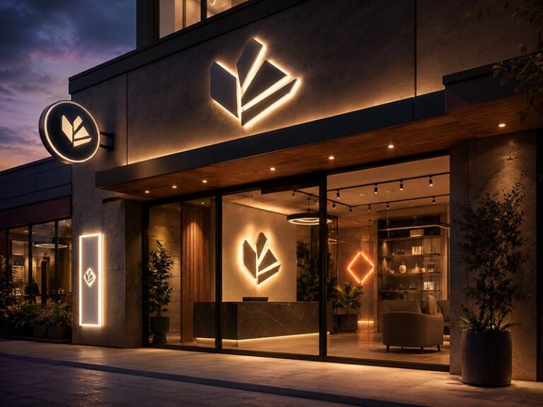
A nail salon is not judged only by polish colors, manicure skill, or service menu. The first judgment often happens before a client sits down. It happens when she walks past the window, opens the door, checks the reception wall, takes a quick look around, and decides whether the space feels clean, stylish, and worth sharing. In a beauty space, lighting is not just lighting. It becomes part of the brand. A harsh sign can make a salon feel cheap. A dim sign can disappear in photos. A badly placed sign can make the wall look messy. But a soft LED sign can turn a simple reception area, mirror wall, or manicure corner into a calm, polished, photo-friendly brand moment.
Soft LED signs work well for nail salons because they create a gentle glow, support brand colors, make small spaces feel more refined, and give clients a natural photo spot without overpowering the room. Compared with harsh lighting or generic wall decor, a custom soft LED logo sign, acrylic sign, or LED neon-style wall sign can help the salon look more professional, memorable, and ready for social sharing.
Think about a new client booking her first manicure. She may have found the salon on Google Maps, Instagram, TikTok, or through a friend’s photo. When she arrives, the sign on the wall becomes part of her first impression. If it feels soft, clean, and intentional, the salon already feels more trustworthy. That is why the right sign is not a small decoration detail. For many nail salons, it is the quiet visual anchor that holds the whole space together.
What Are Soft LED Signs?

Soft LED signs are illuminated signs designed to give a smooth, comfortable glow instead of a harsh light beam. In nail salons, they are often used as reception logo signs, selfie wall signs, slogan signs, window open signs, and small brand signs near manicure or waiting areas. A good soft LED sign should look clean from close distance, stay readable in photos, match the salon’s color style, and install without messy cables.
What Makes the Light Soft?
A soft LED sign does not become “soft” only because it uses LED lights. The softness comes from how the light is controlled inside the sign. For nail salons, this is very important because clients are usually close to the wall. A sign may look fine from 5 meters away, but if clients sit 1–2 meters from it during a manicure, uneven light, visible dots, strong glare, or the wrong color temperature can quickly make the space feel less comfortable.
The soft effect usually comes from several production details working together:
| Detail | Why It Matters in Nail Salons | What to Check Before Ordering |
|---|---|---|
| LED spacing | Prevents visible bright dots and dark gaps | Ask for even light, not exposed point light |
| Diffusion material | Makes the glow smoother | Silicone tube, frosted acrylic, white acrylic face |
| Light color | Affects skin tone, nail color, and room mood | Warm white, neutral white, soft pink, or brand color |
| Brightness level | Keeps the sign comfortable at close distance | Wall signs need softer light than storefront signs |
| Dimmer option | Helps adjust day/night brightness | Useful for selfie walls and mirror areas |
| Wire exit | Keeps the wall clean | Back, side, bottom, or custom exit |
| Power supply matching | Keeps brightness stable | Match sign size, LED load, and local voltage |
For nail salons, the sign should usually support the room rather than dominate it. A reception logo sign needs to look clear and professional. A selfie wall sign needs to stay visible in phone photos without turning into a glowing blur. A mirror-area sign needs lower glare because mirrors can double the brightness. A window sign may need stronger output because it has to compete with outside light.
The right softness also depends on viewing distance:
| Viewing Distance | Better Light Feeling | Common Use |
|---|---|---|
| Under 1 meter | Very soft, low glare | Small nail room, mirror corner |
| 1–2 meters | Soft but readable | Manicure wall, waiting area |
| 2–4 meters | Clear and balanced | Reception wall, selfie wall |
| 4–8 meters | Stronger brightness | Large salon interior, entrance wall |
| Street-facing glass | Higher visibility | Open sign, storefront window |
A common mistake is choosing the brightest sign because it looks eye-catching in a product photo. In a real nail salon, too much brightness can make the wall look cheap, wash out phone photos, and create discomfort when clients sit nearby. A better sign has controlled brightness, clean diffusion, and the right color for the room.
Soft light also helps the sign feel more expensive. When the glow is even from left to right and the cable is hidden, even a small sign can make the salon look more polished. When the sign has uneven light or visible wiring, even a large sign can look unfinished.
Which Sign Styles Count?
Soft LED signs can come in several styles. The right style depends on where the sign will be placed and what the salon wants the sign to do. A reception wall, photo wall, window, and private nail room do not need the same type of sign.
For nail salons, the most common soft LED sign styles include LED neon-style signs, acrylic LED logo signs, backlit logo signs, LED open signs, and mini wall signs. Each one has a different use.
| Sign Style | Best Location | Common Size Range | Best Use | Visual Feeling |
|---|---|---|---|---|
| LED neon-style sign | Selfie wall, nail art wall, mirror corner | 50–150 cm wide | Slogans, icons, short salon names | Cute, soft, social-media friendly |
| Acrylic LED logo sign | Reception wall, checkout wall, brand wall | 60–180 cm wide | Salon logo, brand name | Clean, professional, more official |
| Backlit logo sign | Luxury reception wall, spa-style salon | 80–200 cm wide | Premium logo display | Calm, soft, high-end |
| LED open sign | Window, glass door, storefront | 40–90 cm wide | Open, Nails, Walk-ins Welcome | Functional and visible |
| Mini LED wall sign | Private nail room, small studio | 30–80 cm wide | Personal brand, small phrase | Compact and warm |
An LED neon-style sign works well when the salon wants a smooth line effect. It is good for phrases like “Good Nails Good Mood,” “Self Care Club,” “Fresh Set,” or “Nails & Beauty.” It also works for simple icons such as a hand outline, heart, star, butterfly, flower, nail polish bottle, or lips shape. This type is especially useful for selfie walls because it gives the room a clear photo spot.
An acrylic LED logo sign is better when the salon wants to show a real brand logo. It can handle cleaner edges, sharper logo shapes, and a more professional reception-wall look. If the salon has a designed logo, especially one with a symbol or special lettering, acrylic is often more suitable than simple LED neon-style tubing.
A backlit logo sign works well for salons that want a more premium and quiet feeling. Instead of shining directly from the front, the light glows behind the logo or letters. This looks good on beige walls, dark panels, wood panels, marble backgrounds, and calm reception spaces.
A window open sign is more functional. It helps people outside know the salon is open. But for nail salons, it should still match the space. A custom soft pink, warm white, or brand-color open sign usually looks better than a generic red-and-blue open sign.
A mini LED wall sign is useful for small nail tech rooms, home studios, or private appointment spaces. It gives the room a branded point without using too much wall space.
The best salon setup may combine more than one sign:
| Salon Type | Better Sign Combination |
|---|---|
| Small private nail tech room | Mini logo sign or short LED neon-style phrase |
| Small storefront salon | Reception logo sign + window open sign |
| Cute pink nail studio | Soft pink selfie wall sign + small logo sign |
| Luxury nail lounge | Backlit reception logo + warm white wall sign |
| Chain nail salon | Standard acrylic logo sign + store-by-store window sign |
| Nail art studio | Slogan wall sign + branded photo corner sign |
The main point is simple: choose by function first, then style. A sign should solve a real salon need, such as branding, photos, walk-in visibility, or interior comfort.
Are They Different From Neon?
Many salon owners search for “nail salon neon signs,” but most modern salon signs are actually LED neon-style signs, not traditional glass neon. They can create a similar glowing line effect, but the structure is very different.
Traditional glass neon uses bent glass tubes. It has a classic look, but it is fragile, heavier to ship, harder to customize in small quantities, and less convenient for many indoor salon walls. LED neon-style signs usually use flexible silicone or acrylic light strips mounted on acrylic or metal backing. They are lighter, easier to install, easier to package, and more suitable for custom salon names, logos, short quotes, and small decorative icons.
For nail salons, LED neon-style signs are often more practical because they can be made with:
- Clear acrylic backing
- Cut-to-shape backing
- Screw holes
- Hanging chains
- Wall spacers
- Dimmable control
- RGB or single-color lighting
- Custom wire exit
- Different plug options
- Indoor or outdoor versions
A simple comparison:
| Item | LED Neon-Style Sign | Traditional Glass Neon |
|---|---|---|
| Material | Silicone/acrylic light strip + backing | Bent glass tube |
| Weight | Lighter | Heavier and more fragile |
| Custom logo use | Good for words and simple icons | Harder for complex small details |
| Shipping | Easier to pack and ship | Higher breakage risk |
| Installation | Easier for salon walls | Needs more care |
| Heat and safety | Lower heat in normal use | More fragile structure |
| MOQ flexibility | Better for small custom orders | Less convenient for small runs |
| Best for nail salons | Selfie walls, slogans, small brand signs | Vintage-style spaces only |
This does not mean glass neon is bad. In some vintage bars, retro interiors, or art spaces, glass neon can look beautiful. But for most nail salons, LED neon-style signs are easier to customize and easier to manage. They fit better with small reception walls, selfie corners, mirror areas, and shipping needs.
There is also a difference between LED neon-style signs and acrylic LED logo signs. LED neon-style signs are better for smooth line words and icons. Acrylic LED logo signs are better for detailed logos, brand names, and premium reception walls. A nail salon with a delicate logo may get a cleaner result from acrylic than from neon-style tubing.
The salon should not only ask, “Can you make a neon sign?” A better question is, “Which structure fits my logo, wall, and installation position?” That question leads to a better finished sign.
How Do They Fit Salon Walls?
A soft LED sign should feel like part of the salon design, not a random light placed on the wall. Nail salons often use detailed interiors: soft wall colors, manicure desks, polish shelves, mirrors, marble counters, gold accents, pink chairs, flowers, tile, glass, and product displays. The sign needs to work with all these details.
The first thing to check is wall size. A sign that is too small can look weak. A sign that is too large can make the room feel crowded. For reception walls, the sign should usually relate to the counter width. For selfie walls, it should relate to phone camera framing. For manicure areas, it should be soft enough for close viewing. For windows, it should be readable from outside.
A practical placement and size guide:
| Wall Area | Common Sign Width | Better Sign Type | Main Concern |
|---|---|---|---|
| Reception wall | 80–160 cm | Acrylic LED logo or backlit logo | Brand trust and clean wiring |
| Selfie wall | 80–150 cm | LED neon-style slogan or icon | Phone photo angle |
| Small nail room | 50–80 cm | Mini logo or short phrase | Avoid overpowering the room |
| Window glass | 40–90 cm | Open sign or simple logo | Outside readability |
| Mirror corner | 60–120 cm | Dimmable soft sign | Reflection and glare |
| Waiting area | 50–120 cm | Small slogan or brand sign | Comfort and mood |
The second thing is wall color. A soft white sign on a white wall may disappear if there is not enough contrast. A pink sign on a pink wall may look cute but can also become too flat. A warm white sign on beige or marble usually feels premium. A soft pink sign on a clean white wall usually feels fresh and friendly. A backlit sign on a dark wall can look very elegant.
The third thing is cable planning. For nail salons, visible cables can ruin the effect quickly. A wall sign should look neat from the client’s angle, not only from the installer’s angle. If the sign is near mirrors, the cable may appear in reflection even if it looks hidden from the front.
Before production, salons should confirm:
- Exact wall width and height
- Wall photo taken straight from the front
- Counter or furniture width below the sign
- Preferred sign width
- Wall color and material
- Outlet position
- Wire exit direction
- Mounting method
- Whether the wall can be drilled
- Whether the sign needs a dimmer
- Whether the sign will appear in photos or mirror reflections
The fourth thing is installation surface. Drywall, wood panels, tiles, glass, marble, and textured walls all need different mounting methods. A small LED neon-style sign on clear acrylic may be easy to screw into drywall. A larger acrylic logo on marble may need a more careful mounting plan. A glass-mounted window sign needs hardware that looks clean from both sides.
A soft LED sign fits a salon wall best when it is planned with the room, not after the room is finished. If the salon is still under renovation, hidden wiring and mounting support can be prepared early. If the salon is already open, the sign can still look clean, but outlet position and cable route should be checked before ordering.
The final test is simple: the sign should look good when the salon is full of real life. It should still look clean when clients sit below it, when staff work near it, when mirrors reflect it, and when someone takes a phone photo. That is the difference between a sign that only looks good in a product photo and a sign that actually works in a nail salon.
Why Do Nail Salons Need Soft Light?

Nail salons need soft light because clients stay in the space for a long time, take photos often, and judge the salon by how clean, calm, and polished it feels. A soft LED sign adds brand presence without harsh glare. It helps the reception wall look more finished, makes nail photos easier to share, and gives the salon a warmer, more premium feeling.
How Does Light Shape Mood?
A nail salon is not like a supermarket or a quick repair shop. A client may stay for 30, 60, or even 90 minutes. She looks at the walls, mirrors, polish shelves, manicure table, reception counter, and her own hands many times during the visit. If the lighting feels harsh, cold, or messy, the whole experience feels less relaxing, even when the service is good.
Soft light helps the salon feel more comfortable from the first few seconds. When a client walks in and sees a warm white logo sign behind the reception desk, the space feels more settled. When a soft pink LED sign sits on a clean selfie wall, the room feels more friendly and photo-ready. When the sign glow is even, without bright dots or dark corners, the salon looks more carefully designed.
This is important because many nail salons use light-colored interiors: white walls, nude beige chairs, pink decor, marble counters, gold trim, or glass shelves. These materials look beautiful, but they can also make harsh light stand out quickly. A strong blue-white sign on a beige wall may look cold. A bright red sign in a soft pink salon may feel too aggressive. A low-quality sign with visible light spots can make the wall look cheaper than the furniture around it.
For nail salons, soft light usually works better when it supports the room instead of taking over the room.
| Salon Area | What Clients Feel | Better Sign Choice | What to Avoid |
|---|---|---|---|
| Reception wall | “Is this salon professional?” | Warm white acrylic logo sign or soft backlit logo | Tiny logo, exposed wire, harsh cool white |
| Selfie wall | “Can I take a nice photo here?” | Soft pink or warm white LED neon-style sign | Over-bright sign that turns blurry in photos |
| Waiting area | “Is this place comfortable?” | Gentle slogan sign or small brand sign | Strong flashing RGB effect |
| Manicure zone | “Can I relax during the service?” | Low-glare wall sign away from direct eye level | Bright sign facing the client directly |
| Mirror corner | “Do I look good in this lighting?” | Dimmable soft sign with controlled brightness | Strong reflection from exposed LEDs |
Soft light also helps with price perception. A salon does not always need luxury furniture to feel more premium. Sometimes one clean logo sign, correct wall placement, and hidden cable can make a small salon look much more serious. Clients may not know the technical reason, but they can feel when the space looks intentional.
A good soft LED sign should make the room feel finished, not noisy. It should catch attention when the client enters, but it should not keep shouting during the whole appointment.
Why Does Glare Hurt the Space?
Glare is a bigger problem in nail salons than many people expect. The service is close-up. Clients sit still. Mirrors reflect light. Glossy nail polish, chrome tools, glass shelves, marble tops, and shiny wall tiles can all bounce light around the room. A sign that looks fine in a factory photo may feel uncomfortable when installed 1.5 meters from a client’s face.
This is why “bright enough” and “too bright” are very different things. A storefront sign needs stronger visibility. A reception sign needs clear brand display. A selfie wall sign needs a soft glow for photos. A sign near mirrors needs even lower glare. If all these signs use the same brightness level, at least one area will feel wrong.
Glare usually appears in several ways:
- The LED points are visible through the sign face.
- The sign is too bright for the room size.
- The light color is too cold for the interior.
- The sign faces a mirror or glossy surface.
- The sign is installed too close to client seating.
- The wall sign is placed at direct eye level.
- The dimmer or brightness control was not included.
For a small nail salon, this problem can be very obvious. A 100 cm sign in a compact 15–25 square meter room may look great online, but if it is too bright, it can dominate the whole space. In a larger salon, glare may come from the wrong angle instead of the wrong size. A bright sign facing a mirror wall can reflect into several manicure stations at once.
A practical way to avoid glare is to think about viewing distance before ordering:
| Viewing Distance | Better Brightness Feeling | Suitable Use |
|---|---|---|
| Within 1 meter | Very soft, no exposed light points | Mirror corner, small nail room |
| 1–2 meters | Soft and readable | Manicure area, waiting wall |
| 2–4 meters | Clear but not harsh | Reception wall, selfie wall |
| 4–8 meters | Stronger visibility | Entrance wall, large salon interior |
| Street-facing window | Higher brightness may be needed | Open sign, storefront display |
Dimming is useful when the salon has mixed lighting conditions. During the day, window light may weaken the sign effect. At night, the same sign may feel too strong. A dimmer lets the salon adjust brightness without replacing the sign. For photo walls and mirror corners, dimming is especially helpful.
Glare also affects perceived quality. A sign with uneven light makes the salon feel less polished. Clients may not say “the LED spacing is wrong,” but they may feel the wall looks cheap or uncomfortable. For nail salons, where visual detail is part of the service, that matters.
How Does It Help Photos?
Nail salons depend heavily on photos. Clients photograph their nails. Nail technicians post finished sets. Salon owners update Instagram, TikTok, Google Business Profile, booking platforms, and local ads. A soft LED sign helps because it gives these photos a clean brand background without stealing attention from the nails.
The problem with many bright signs is that phone cameras struggle with them. If the sign is too strong, the camera exposes for the bright light and makes the hands, face, or wall look darker. The sign may become a glowing white blur. If the sign is too weak, it disappears and gives no brand value. The right soft LED sign stays visible, readable, and gentle in the background.
For nail photos, this is especially important because polish color needs to look close to real life. Nude, milky white, French tips, chrome, cat-eye gel, glitter, and pastel colors can shift under bad lighting. A harsh blue-white sign can make skin tone look cooler. A deep red or strong purple sign can color-cast the hands. A soft warm white, blush pink, or neutral white sign is usually safer for manicure photos.
A photo-friendly sign should be designed around real phone behavior. Most clients do not take photos like a product photographer. They stand near the wall, hold the phone vertically, take a mirror selfie, hold their hands near the sign, or film a short video while moving. The sign needs to work in those real situations.
Useful planning points:
- Keep slogan signs short, usually 2–5 words.
- Avoid very thin fonts if the sign will be photographed from a distance.
- Place the sign where the client’s face or hands will not block it.
- Keep the sign high enough for wall photos but not too high for vertical phone shots.
- Use a color that flatters skin and nail polish.
- Avoid placing the sign directly opposite a strong mirror reflection.
- Use dimming if the sign is part of a selfie wall.
A good selfie wall does not need to be complicated. One clean wall, one soft LED sign, and enough space for a client to stand can be more useful than a wall full of decorations. If the salon name or slogan appears naturally in client photos, every shared photo becomes a small brand reminder.
For new salons, this is valuable. A soft LED sign can make opening-day photos look more complete. For established salons, it can make daily client content more consistent. For independent nail techs, even a small custom sign can make a home studio or private room look more professional online.
Does It Feel More Premium?
Soft light can make a nail salon feel more premium because it brings control. Premium spaces usually do not rely on loud lighting, messy cables, or random wall decor. They use clean focal points, balanced colors, and small details that feel planned. A soft LED sign can do that for a nail salon without requiring a full renovation.
For example, a warm white backlit logo on a beige wall can make a reception desk look more expensive. A soft pink LED neon-style phrase on a simple wall can make a young nail studio feel cute and memorable. A clean acrylic logo with hidden wiring can make a small private nail room feel more like a real brand space.
The sign does not need to be large to feel premium. In many salons, a medium-sized sign with better material looks more expensive than a large sign with poor light quality. The details clients notice most are not always technical, but they are visible:
- Is the logo clear?
- Is the glow even?
- Does the color match the room?
- Is the cable hidden?
- Does the sign fit the wall size?
- Does it look good in photos?
- Does it feel comfortable when sitting nearby?
A salon can use this simple guide when choosing the style:
| Salon Positioning | Better Sign Style | Better Light Color | Why It Works |
|---|---|---|---|
| Luxury nail lounge | Backlit logo sign or acrylic LED logo | Warm white, champagne white | Calm, polished, high-end |
| Cute nail studio | LED neon-style slogan or icon | Soft pink, peach, lavender | Friendly and photo-friendly |
| Minimal nail salon | Acrylic logo sign | Neutral white, warm white | Clean and uncluttered |
| Nail art studio | Custom LED neon-style wall sign | Pink, purple, controlled RGB | Adds personality and energy |
| Spa-style manicure room | Soft backlit sign | Warm white, soft amber | Relaxing and gentle |
| Small private nail tech room | Mini logo sign or short phrase | Warm white or blush pink | Professional without crowding the room |
Premium also means consistency. If the salon uses gold handles, beige chairs, and marble counters, the sign should not feel like a random bright party light. If the salon uses playful pink decor and bold nail art, the sign can be more expressive, but it still needs clean production and good placement.
For salons planning more than one location, soft LED signs also help build repeatable branding. Once the first sign is confirmed, the same logo file, color, material, brightness style, and mounting method can be used again. Different walls may need different sizes, but the brand feeling stays the same.
In the end, soft light helps nail salons because it makes the space easier to trust, easier to photograph, and easier to remember. It supports the service without distracting from it. That is why a well-made soft LED sign is not just wall decor. It becomes part of the salon experience.
Which Signs Work Best?

The best soft LED signs for nail salons are reception logo signs, selfie wall signs, window open signs, acrylic LED logo signs, and short slogan signs. Each one solves a different salon problem. A reception logo builds trust, a selfie wall supports photos, a window sign brings walk-in attention, an acrylic sign looks clean, and a slogan sign adds personality.
Which Logo Signs Fit Reception?
A reception logo sign is usually the first sign a nail salon should consider. It is the most useful place to spend the budget because every client sees it when checking in, paying, asking about services, or taking an interior photo. A clean logo sign behind the front desk can make a small salon look more established without changing the whole room.
For nail salons, the reception sign should not feel like a nightclub sign. It should feel clear, soft, and on-brand. If the salon has beige walls, gold hardware, marble counters, or cream chairs, a warm white acrylic LED logo or a soft backlit logo usually looks better than a bright colored neon-style sign. If the salon has a young, pink, playful style, a soft pink logo sign may still work, but the font and brightness need to stay clean.
The size should be chosen by wall width, counter width, and camera view. A common mistake is ordering a sign that looks good online but becomes too small on the actual wall. For a reception counter around 150–200 cm wide, many salons use a logo sign around 80–140 cm wide. For a small private nail room, 50–80 cm may be enough. For a larger salon reception wall, 150–200 cm can work if the wall has enough empty space.
| Reception Wall Type | Suggested Sign Style | Common Width | Better Light Color | Notes |
|---|---|---|---|---|
| Small nail studio | Mini acrylic logo or LED neon-style name | 50–80 cm | Warm white, blush pink | Keep it simple and lightweight |
| Standard salon front desk | Acrylic LED logo sign | 80–140 cm | Warm white, neutral white | Best balance of brand and comfort |
| Luxury nail lounge | Backlit logo sign or acrylic logo with metal finish | 100–180 cm | Warm white, champagne white | Works well with marble, beige, gold |
| Chain nail salon | Standardized acrylic LED logo | Custom by wall | Brand color or warm white | Good for repeat orders |
| Dark wall reception | Front-lit or halo-lit logo | 80–160 cm | Warm white or brand color | Needs enough contrast |
The logo file also matters. A clean vector file, such as AI, EPS, PDF, or SVG, gives better results than a small screenshot. Thin script fonts, tiny gaps, and very small logo details need production review before making the sign. If the salon logo has very fine lines, an acrylic LED sign may hold the logo shape better than LED neon-style tubing.
Before ordering a reception logo sign, the salon should confirm:
- Wall width and height
- Counter width
- Logo file quality
- Desired sign width
- Wall color and material
- Light color
- Wire exit position
- Outlet position
- Mounting method
- Whether the cable should be hidden behind the wall or routed to the side
A good reception sign should feel natural in the room. The best result is not when the sign looks the brightest. It is when the salon name looks clear, the wall looks finished, and clients feel the space is more professional the moment they walk in.
Which Wall Signs Create Photo Spots?
A photo wall sign is different from a reception logo sign. The reception sign needs to look professional. The photo wall sign needs to make people want to take out their phone. It can use the salon name, a short phrase, a nail-related icon, or a soft brand color. The goal is not only decoration. The goal is to create a spot where clients naturally take photos after their manicure.
For nail salons, the best photo wall signs are usually short and easy to read. Long quotes may look interesting in a design file, but they are harder to read in phone photos. They also take more wall space, cost more, and can make the wall feel crowded. A short phrase with 2–5 words is usually safer.
Good examples include:
- Good Nails Good Mood
- But First, Nails
- Self Care Club
- Nails & Beauty
- Fresh Set
- Mani Time
- You Look Good
- Nail Bar
- Beauty Starts Here
Icons also work well. A nail polish bottle, hand outline, heart, star, butterfly, lips, flower, moon, or simple line art can make the wall more visual without adding too much text. For a nail art studio, a small icon plus a short phrase can create a stronger photo corner than a large paragraph-style sign.
Placement is very important. A selfie wall sign should be installed for real phone photos, not only for empty-wall photos. Most people take vertical photos. Many clients stand 1–2 meters from the wall. Some take mirror photos. Some hold their hands near chest height. If the sign is too high, it may look nice on the wall but not appear well in client photos. If it is too low, it may be blocked by chairs, plants, or people.
| Photo Wall Goal | Better Sign Choice | Common Width | Best Placement Tip |
|---|---|---|---|
| Client selfie wall | Short LED neon-style phrase | 80–150 cm | Around upper body height in vertical photos |
| Nail photo background | Small logo or icon sign | 50–100 cm | Near hand-photo area, not too bright |
| Mirror selfie area | Dimmable soft LED sign | 60–120 cm | Avoid direct mirror glare |
| Pink salon decor wall | Soft pink LED neon-style sign | 80–160 cm | Keep wall decor simple around the sign |
| Luxury photo corner | Warm white backlit slogan or logo | 80–140 cm | Use clean wall, flowers, or textured panel carefully |
Brightness should stay controlled. A photo wall sign that is too bright will turn into a glowing blur on phone cameras. A sign that is too dim will disappear in the background. A dimmer is useful when the salon wants to take photos during different times of day.
The wall background should also be planned. If the wall already has floral decoration, wallpaper, shelves, or textured panels, the sign should be simple. If the wall is plain, the sign can carry more personality. A photo wall works best when clients can recognize the sign quickly and still remain the main focus of the photo.
Which Open Signs Fit Windows?
A window open sign has a simple job: help people notice that the nail salon is open. It is especially useful for salons in shopping streets, plazas, strip malls, mixed-use buildings, or locations where walk-in traffic matters. Even for appointment-based salons, a clean open sign can make the storefront feel active and easier to identify.
The problem is that many open signs look too generic. A basic red-and-blue “OPEN” sign may be visible, but it may not match a soft beauty interior. For nail salons, a custom LED open sign in warm white, soft pink, neutral white, or brand color often looks better. It still gives the functional message, but it does not weaken the salon’s style.
The sign should be readable from outside. This means the text should be simple, the stroke should not be too thin, and the color should have enough contrast against the window and interior background. If the salon faces strong sunlight, an indoor soft neon-style open sign may not be very visible during the day. It may work better for evening visibility, cloudy days, or mall corridors. For strong daytime storefront visibility, the salon may need a proper exterior sign or light box in addition to the window sign.
A useful window sign does not need too much text. “Open,” “Nails,” “Walk-ins Welcome,” or a small logo plus “Open” is usually enough. Long service lists on a glowing sign are harder to read and often look cluttered.
| Window Condition | Better Sign Choice | Light Color | Notes |
|---|---|---|---|
| Street-facing salon | Custom LED open sign | Warm white, pink, red-pink | Needs enough brightness for night visibility |
| Mall salon | Soft open sign or small logo sign | Brand color, warm white | Should follow mall display rules |
| Glass door entrance | Small hanging open sign | Pink or white | Keep cable neat |
| Dark interior behind window | Brighter open sign | White or pink | Contrast is easier |
| Bright interior behind window | Stronger color or larger text | Pink, red-pink, white | Avoid thin fonts |
Installation details matter for window signs. The salon should decide whether the sign will hang by chain, mount on the glass, sit behind the window, or attach to a frame. The cable path should be clean because it is visible from both inside and outside. The plug type and outlet position should also be checked before production.
For salons that close late, window signs are especially helpful. A soft but clear open sign can catch attention in the evening without making the salon look cheap. It tells people the space is active, open, and ready for service.
Which Acrylic Signs Look Clean?
Acrylic LED signs are one of the best choices for nail salons that want a clean and professional look. They are especially useful for reception walls, brand walls, checkout counters, and premium interior areas. Compared with simple LED neon-style tubing, acrylic signs can show logo shapes, letter edges, small symbols, and layered materials more clearly.
Acrylic works well because nail salons usually care about neatness. The service itself is detail-based. Clients notice clean cuticles, smooth polish edges, tidy tools, and organized color displays. A rough sign with uneven light does not fit that kind of environment. A clean acrylic sign supports the same feeling of detail and care.
There are several acrylic sign options:
- Clear acrylic backing with LED neon-style letters
- White acrylic face with internal LED lighting
- Frosted acrylic for softer diffusion
- Colored acrylic logo with soft lighting
- Gold mirror acrylic layered over a backlit structure
- Acrylic logo mounted on a metal or PVC backboard
- Acrylic letters with halo-lit effect
Each option fits a different salon style. A clear acrylic backing is simple and light, good for cute slogan signs and small logos. A white acrylic face feels cleaner and more official. Frosted acrylic softens the light and reduces glare. Gold mirror acrylic can look high-end, but it should be used carefully because too much mirror finish can look flashy. A metal backboard can make larger signs stronger and more stable.
| Acrylic Sign Style | Best Salon Use | Visual Feeling | Good Match |
|---|---|---|---|
| Clear acrylic backing | Quote wall, small logo, selfie wall | Light, simple, modern | Pink rooms, small studios |
| White acrylic front-lit logo | Reception, brand wall | Clean, bright, professional | Minimal salons, white interiors |
| Frosted acrylic sign | Soft wall glow | Gentle, low-glare | Spa-style nail salons |
| Gold acrylic logo | Premium reception wall | Decorative, upscale | Beige, marble, champagne interiors |
| Backlit acrylic logo | Main brand wall | Calm, refined | Luxury nail lounges |
| Acrylic with metal backing | Larger logo signs | Strong, structured | Multi-location salons |
Acrylic thickness should match the sign size. Very thin backing may be fine for a small sign, but larger signs need stronger material to stay flat and stable. For many small indoor wall signs, 3–5 mm acrylic backing is common. Larger or more structured signs may need thicker acrylic, metal support, or reinforced mounting.
Acrylic signs are also easier to clean than many decorative wall setups. Nail salons deal with dust, polish smell, hand cream, and daily service traffic. A smooth acrylic or metal surface is easier to wipe than a fabric wall decoration or complex handmade decor. For a salon owner, easy cleaning matters because the sign is not only for opening day photos. It needs to look good after months of use.
Which Slogan Signs Feel Natural?
A slogan sign works best when it sounds like the salon’s real personality. It should not feel copied from every other beauty wall. Nail salons can use slogan signs to make the room more fun, but the words need to fit the brand. A luxury salon, a cute pink studio, a bold nail art room, and a calm spa-style manicure space should not use the same phrase.
Short slogans usually work better. They are easier to read, easier to produce, easier to photograph, and easier to remember. A phrase with 2–5 words is often enough. If the salon wants a longer phrase, it should be checked carefully on the wall mockup because long lines can become messy.
A slogan sign should also match the service. If the salon is known for nail art, the words can be playful. If it focuses on bridal nails or luxury manicure, the phrase should feel softer and more elegant. If it is a private nail tech studio, a personal phrase or small brand name may feel more natural.
| Salon Style | Better Slogan Direction | Example Tone | Better Color |
|---|---|---|---|
| Cute nail studio | Fun and sweet | Good Nails Good Mood | Soft pink, peach |
| Luxury nail lounge | Calm and elegant | Beauty in Detail | Warm white, champagne |
| Nail art studio | Bold and creative | Fresh Set Energy | Pink, purple, controlled RGB |
| Spa-style salon | Soft and relaxing | Self Care Starts Here | Warm white, soft amber |
| Bridal nail studio | Romantic and clean | Ready for the Ring | Warm white, pearl white |
| Private nail tech room | Personal and friendly | By Appointment Only or brand name | Blush pink, warm white |
Font choice is just as important as the phrase. A script font can feel feminine, but if the strokes are too thin, the sign may be harder to read or produce. A bold font is clearer, but it may feel too heavy for a soft salon. Rounded fonts often work well for cute nail studios. Clean sans-serif fonts work well for modern salons. Thin elegant fonts can work for luxury spaces if the production method supports them.
A slogan sign should not compete with the main logo sign. If the reception wall already has a strong logo, the slogan can go on the selfie wall, waiting area, or manicure room. If the salon is small, one slogan sign may be enough. Too many glowing words can make the space feel less premium.
Before ordering a slogan sign, the salon should check:
- Is the phrase short enough for the wall?
- Does it match the salon’s price level and style?
- Will clients still like it after one year?
- Is the font readable from 2–3 meters away?
- Will it fit vertical phone photos?
- Does the color flatter skin and nail photos?
- Will it look good beside mirrors, chairs, or wall decor?
A good slogan sign should feel easy, not forced. It should give the salon a small moment of personality while still keeping the room clean and comfortable.
How Do Soft Signs Improve Branding?
Soft LED signs improve nail salon branding by making the salon name, color style, and space mood easier to remember. A good sign does more than light up a wall. It helps clients recognize the salon in photos, trust the business faster, and feel that the interior has been planned with care. For nail salons, branding is not only a logo. It is the whole feeling clients see, photograph, and talk about.
How Can Colors Match the Salon?
Color is one of the fastest ways a nail salon builds memory. Many clients may not remember the exact chair model, counter material, or polish shelf layout, but they remember the feeling of a soft pink wall, a warm white logo, or a clean gold-and-cream reception area. A soft LED sign can lock that feeling into the brand if the color is chosen carefully.
The problem is that many salon owners choose sign color too quickly. “Pink” sounds simple, but pink has many versions. Blush pink, rose pink, peach pink, hot pink, and magenta all create different moods. Warm white, neutral white, and cool white also feel very different in a beauty space. A warm white sign may look elegant on beige or marble walls. A cool white sign may look clean in a modern white salon, but it can feel cold on cream walls. A bright purple sign may work for a trendy nail art studio, but it may feel too strong in a spa-style manicure room.
A good color choice should start from the salon interior, not only from a color chart. The wall color, chair color, counter material, ceiling light, mirror position, and brand logo should all be considered.
| Salon Interior Style | Better Sign Color | Why It Works | What to Be Careful About |
|---|---|---|---|
| Beige, cream, marble, gold | Warm white, champagne white | Looks soft, premium, and calm | Avoid cold blue-white light |
| Pink, blush, cute decor | Soft pink, peach pink, warm white | Feels sweet and photo-friendly | Avoid deep red if the room is already pink |
| Black and white modern salon | Neutral white, warm white, soft logo color | Looks clean and sharp | Avoid too many colors at once |
| Trendy nail art studio | Pink, purple, controlled RGB | Adds energy and personality | Avoid fast color-changing effects |
| Spa-style nail salon | Warm white, soft amber, backlit glow | Feels relaxing and gentle | Avoid overly bright exposed light |
| Luxury nail lounge | Warm white, pearl white, soft gold tone | Matches high-end furniture and finishes | Keep the design simple and balanced |
For a salon with a real brand color, the sign supplier should receive a color reference. Pantone, CMYK, RGB, brand guide, or even clear photos of the interior can help. For LED signs, exact color matching has limits because light behaves differently from printed color. A pink acrylic sample and a pink LED glow will not look exactly the same. That is why a production mockup or sample photo is useful when the brand color is important.
The sign color also needs to work in photos. Some colors look nice to the eye but cause strange phone camera results. Deep red can make skin look warmer than normal. Strong blue can make hands look cold. Very bright white can turn into a glowing blur. For nail salons that rely on client photos, soft pink, warm white, neutral white, and gentle pastel tones are often safer.
A simple rule works well: the sign should make the wall look better, the nails look better, and the brand easier to remember. If the sign color fights with the room, it weakens the brand instead of improving it.
How Can Fonts Show Style?
Font choice decides whether a nail salon looks cute, premium, modern, artistic, or casual. A soft LED sign can carry the salon’s personality, but only if the font fits both the brand and the production method. A beautiful font on a logo file may not always become a beautiful sign on the wall.
Script fonts are popular in nail salons because they feel feminine and soft. They work well for phrases like “Good Nails Good Mood,” “Self Care Club,” or a salon name with a beauty-focused tone. But script fonts can become hard to read if the strokes are too thin, the letters connect too tightly, or the sign is installed far from the viewer. A font that looks delicate on a business card may look weak as a wall sign.
Clean sans-serif fonts are easier to read and often work better for modern salons, franchise salons, and reception logo signs. Rounded fonts feel friendly and cute. Thin elegant fonts can suit luxury nail lounges, but the production drawing must check whether the lines are thick enough for lighting, cutting, and mounting.
For custom LED signs, font choice is not only a design decision. It affects cost, size, strength, light output, and installation.
| Font Style | Best For | Visual Feeling | Production Notes |
|---|---|---|---|
| Script font | Beauty slogans, cute salon names | Soft, feminine, personal | Needs enough stroke width |
| Rounded font | Pink salons, young nail studios | Friendly, playful | Good for LED neon-style signs |
| Clean sans-serif | Reception logo, modern salon | Clear, professional | Easy to read from distance |
| Thin elegant font | Luxury nail lounge | Refined, quiet, premium | May need acrylic or backlit structure |
| Bold font | Window signs, open signs | Strong, visible | Good for storefront readability |
| Custom logo font | Brand wall, chain salon | Unique and memorable | Needs vector file and production review |
A nail salon should also think about how far the sign needs to be read. A reception sign may be read from 2–5 meters away. A selfie wall sign may appear in vertical phone photos. A window sign may need to be read from outside. These different positions may need different font weight.
For example, a thin script logo may be perfect for a reception wall but too hard to read from a storefront window. A bold “Open” sign may work well on glass but feel too heavy behind a luxury reception desk.
Before production, the salon should confirm:
- Is the font readable from the main viewing distance?
- Are thin strokes thick enough for the sign size?
- Are small gaps large enough to cut or light clearly?
- Will the letters look clean in phone photos?
- Does the font still match the salon after one year?
- Does the font suit the service price and interior style?
A good font does not need to be complicated. In many nail salons, simple letters with soft light look more expensive than a decorative font with poor readability.
How Does a Sign Support Trust?
Trust starts before the manicure begins. A new client may look at photos online, check reviews, walk past the window, and enter the salon with a quick question in her mind: “Does this place feel clean and professional?” A soft LED sign cannot replace good service, but it can support that first feeling.
A branded sign tells clients the salon is not temporary. A clean reception logo makes the business feel more stable. A soft light color makes the room feel more comfortable. Hidden wiring tells clients the owner cares about details. Even if clients do not explain it in these words, they feel the difference.
This matters especially for nail salons because the service is detail-based. Clients expect clean tools, steady hands, neat polish edges, good hygiene, and careful finishing. If the wall sign has messy cables, uneven lighting, wrong color, or poor mounting, it sends the opposite message. The room may still be functional, but it does not feel as careful.
A well-made sign supports trust in several practical ways:
- It makes the reception wall look official.
- It helps clients recognize the salon name in photos.
- It gives the business a clearer identity on Google and social platforms.
- It makes a small salon look more established.
- It creates a cleaner first impression for walk-in clients.
- It shows the salon pays attention to visual details.
- It helps the space feel ready for premium pricing.
The installation quality is just as important as the sign itself. A good logo sign with a visible loose cable can still look unfinished. A small sign installed straight, centered, and neatly wired may look more professional than a large sign installed carelessly.
| Trust Detail | What Clients Notice | Better Choice |
|---|---|---|
| Logo clarity | Can they read the salon name quickly? | Clean font, correct size, good contrast |
| Light evenness | Does the sign look expensive or rough? | Diffused face, even LED spacing |
| Wire control | Does the wall look tidy? | Back wire exit or planned cable route |
| Wall scale | Does the sign fit the room? | Size based on wall and counter width |
| Color match | Does the sign belong to the interior? | Warm white, soft pink, or brand color |
| Mounting | Does it look stable? | Proper holes, spacers, screws, or backboard |
| Photo result | Does it look good online? | Balanced brightness and readable text |
For new salons, trust is even more important because there may not be many reviews yet. The interior photos must work harder. A clean soft LED logo sign can help opening photos, booking page images, and Google Business Profile photos look more complete.
For established salons, a new sign can refresh the brand without changing the whole space. It can make an older reception wall feel updated and give regular clients a reason to notice the improvement.
How Can Small Salons Look Better?
Small nail salons often have limited wall space, limited renovation budget, and limited room for large decorative features. A soft LED sign can help because it creates a clear focal point without taking up floor space. It turns one wall into a brand wall, photo wall, or reception feature.
For a small nail room, the sign should be carefully sized. Bigger is not always better. A sign that is too large can make the room feel crowded and too bright. A sign that is too small can look like a cheap accessory. The best size usually depends on the wall width, furniture below it, and the distance from the client.
For many private nail tech rooms, a 50–80 cm sign works well. For small storefront salons, 80–120 cm is often a more balanced range for the reception wall. For a selfie corner, 90–150 cm can work if the wall has enough empty space and the sign is not too bright.
| Salon Size | Better Sign Plan | Suggested Use | Key Detail |
|---|---|---|---|
| Private nail room | Mini logo or short phrase | Personal brand wall | Keep brightness soft |
| Small studio | One logo sign + simple photo corner | Reception and social content | Avoid too many glowing signs |
| Compact storefront | Reception logo + window open sign | Brand trust and walk-in visibility | Plan cable routes early |
| Medium salon | Logo wall + selfie wall sign | Brand and client photos | Keep colors consistent |
| Multi-room salon | Standard logo sign + room signs | Clear identity across areas | Use same material and color style |
A small salon should not try to copy a large salon exactly. Large salons can handle bigger signs, wider walls, and more lighting layers. A compact nail studio needs cleaner choices. One strong sign is usually better than several unrelated signs.
A soft LED sign can also make a small salon feel more expensive when it matches the interior. For example, a warm white acrylic logo above a small reception desk can make the desk look intentional. A soft pink sign on a plain wall can create a photo corner without adding shelves, flowers, or heavy decoration. A small backlit logo can make a home studio look more like a real beauty brand.
Small salons should focus on these details:
- Choose one main visual wall.
- Keep the sign wording short.
- Match the light color with the room palette.
- Avoid strong glare near mirrors.
- Hide or neatly route the cable.
- Use a sign size that fits the wall, not just the logo file.
- Choose materials that are easy to clean.
- Keep surrounding decor simple.
This is where soft LED signs are useful. They bring brand value without needing much space. A sign can sit on the wall, create a photo background, help clients remember the salon name, and make the room feel more finished. For a small nail business, that can be one of the most efficient visual upgrades.
Where Should the Sign Be Placed?

A soft LED sign should be placed where it helps the nail salon look cleaner, easier to remember, and easier to photograph. The best positions are usually the reception wall, selfie wall, mirror corner, window area, and waiting or manicure zone. Before installation, the salon should check wall size, viewing distance, camera angle, outlet position, mirror reflection, and whether the wire can be hidden.
Is the Reception Wall Best?
For most nail salons, the reception wall is the best first placement for a custom soft LED sign. This is the wall every client sees when entering, checking in, paying, or asking about services. It is also the wall that often appears in Google Business Profile photos, booking page images, Instagram posts, and salon opening photos. If the salon can only order one sign at the beginning, the reception logo sign usually gives the strongest brand value.
The reception wall sign should feel like part of the front desk, not like a decoration added later. A good size should match the counter width and leave enough empty wall around the sign. If the sign is too small, the reception wall may still look empty. If it is too large, the wall can feel crowded and the glow may become uncomfortable.
A practical size guide:
| Reception Setup | Common Counter Width | Suggested Sign Width | Better Sign Type |
|---|---|---|---|
| Private nail room | 80–120 cm | 50–80 cm | Mini acrylic logo or LED neon-style name |
| Small salon reception | 120–180 cm | 70–120 cm | Acrylic LED logo sign |
| Standard nail salon | 180–240 cm | 100–160 cm | Acrylic logo or soft backlit logo |
| Large nail lounge | 240–350 cm | 140–220 cm | Backlit logo sign or layered acrylic sign |
| Chain salon reception | Varies by store | Scaled by wall ratio | Standardized logo sign file |
The sign should usually be centered above the reception counter, but not always exactly in the middle of the whole wall. If the counter is offset, the sign should follow the counter, not the room. If there are shelves, product displays, lamps, flowers, or a payment area, the sign needs enough space to breathe.
Height is also important. A reception sign is usually installed around eye level or slightly above eye level. In many salons, the center of the sign works well around 150–170 cm from the floor, depending on ceiling height, counter height, and sign size. If the sign is placed too high, it may feel disconnected from the desk. If it is too low, it may be blocked by staff, flowers, payment machines, or product displays.
For a reception wall, warm white, neutral white, soft champagne, or brand color usually works better than strong RGB effects. The goal is to make the salon look professional and calm. A playful pink sign can work for a cute salon, but the font and brightness should still look clean.
Before production, the salon should prepare:
- A straight photo of the reception wall
- Wall width and height
- Counter width
- Wall color and material
- Logo file
- Desired sign width
- Outlet position
- Preferred wire exit direction
- Mounting surface: drywall, tile, wood, marble, or panel
The most common mistake is forgetting the outlet. A beautiful reception sign loses a lot of value if the cable drops straight down the wall. If the salon is still under renovation, it is worth planning a hidden outlet or back wire route before the wall is finished.
Is a Selfie Wall Worth It?
A selfie wall is worth it if the salon wants more client photos, more social sharing, and a stronger visual memory. Nail services are naturally photo-friendly. Clients often take photos after a fresh set, especially for chrome nails, French tips, bridal nails, holiday designs, 3D nail art, and long extensions. A soft LED sign gives those photos a clean background and helps the salon name or style appear naturally.
A selfie wall does not need to be large. A small salon can create a good photo corner with one clean wall, one soft LED sign, and enough space for a person to stand or sit. It is better to have one clear photo spot than several messy decorative areas. The sign should not fight with flowers, wallpaper, shelves, mirrors, or wall art.
The best selfie wall sign is usually shorter than a reception logo. Phrases with 2–5 words work well because they are readable in vertical phone photos. Long quotes may look nice in a design file, but they often become too busy on the wall.
Good selfie wall sign ideas include:
- Good Nails Good Mood
- But First, Nails
- Self Care Club
- Fresh Set
- Nails & Beauty
- You Look Good
- Mani Time
- Beauty Starts Here
- The salon name with a small icon
- A hand, nail polish bottle, heart, butterfly, flower, or star icon
Placement should be planned around real phone photos. Most clients take vertical photos from chest height or face height. If the sign is too high, it may not appear in selfies. If it is too low, it may be blocked by chairs, plants, or the client’s body.
A useful placement guide:
| Photo Use | Suggested Sign Position | Suggested Width | Practical Tip |
|---|---|---|---|
| Standing selfie | Center around 145–165 cm from floor | 80–150 cm | Check vertical phone frame |
| Seated nail photo | Slightly above hand level in background | 60–120 cm | Avoid direct glare behind hands |
| Mirror selfie | Visible in mirror but not directly facing eyes | 60–140 cm | Use dimmer if possible |
| Group photo | Wider wall with centered sign | 120–200 cm | Leave empty space on both sides |
| Small studio corner | One short phrase or icon | 50–100 cm | Keep decor simple |
The selfie wall should also have enough distance. If clients stand too close to the sign, the glow may become too strong in photos. A distance of 1.5–3 meters is often more comfortable for phone shots. If the room is smaller than that, the sign should be softer and not too large.
For salons that post content often, a dimmer is useful. Daytime, evening, cloudy weather, and ceiling lighting can all change how the sign looks on camera. A dimmable sign gives the salon more control without needing to replace the sign.
How Should Mirror Areas Use Signs?
Mirror areas can make a nail salon look bigger and more stylish, but they also make sign placement more difficult. Mirrors reflect light, cables, people, ceiling lights, and wall signs. A soft LED sign that looks perfect on a plain wall can become too bright or visually messy when reflected in a mirror.
If the salon wants a sign near a mirror, it should first decide whether the sign is meant to be seen directly or through the reflection. These are different placements. A sign placed beside the mirror may decorate the wall nicely. A sign placed opposite the mirror may appear in selfies, but it can also create glare. A sign placed above a mirror can look stylish, but the cable and mounting need to be very clean.
For mirror corners, lower brightness is usually safer. Warm white, soft pink, and gentle backlit effects work better than strong cool white or exposed light strips. If the mirror wall is close to manicure tables, the sign should not shine directly into the client’s eyes while she is sitting.
A simple mirror placement guide:
| Mirror Setup | Better Sign Position | Better Sign Style | What to Avoid |
|---|---|---|---|
| Large wall mirror | Beside the mirror or above one side | Soft LED neon-style phrase | Bright sign directly opposite mirror |
| Small beauty mirror | Small logo or icon nearby | Mini acrylic LED sign | Oversized glowing text |
| Mirror selfie wall | Sign visible in reflection | Dimmable LED sign | Over-bright light that hides faces |
| Reception mirror panel | Logo on adjacent wall or panel | Backlit acrylic sign | Cable reflected in mirror |
| Manicure table mirror | Away from direct eye line | Low-brightness soft sign | Sign facing client’s eyes |
One thing many salons forget is the reflection of the wire. Even if the cable looks hidden from one direction, it may show clearly in the mirror. Before installation, stand where clients will sit or take selfies and check what the mirror actually shows. If the outlet, adapter, cable, or power supply appears in the reflection, the placement needs to be adjusted.
Mirror areas are also sensitive to sign color. Strong red, blue, or purple can reflect onto skin and nails. This may look fun in a party space, but it can make beauty photos less natural. For a nail salon, the sign should make hands, face, and polish look better. Soft warm white, blush pink, pearl white, and gentle pastel colors are usually safer.
If the salon wants a mirror selfie sign, test the position with a phone before production. Mark the rough sign size on the wall using paper tape. Take a vertical mirror photo from the usual standing position. This simple check helps avoid a common mistake: the sign looks great on the wall but appears cut off or distorted in real selfies.
How Should Windows Use LED Signs?
Window signs help nail salons attract attention from outside. They are useful for walk-in traffic, evening visibility, shopping plaza locations, mall corridors, and street-facing storefronts. A soft LED window sign can show “Open,” “Nails,” “Walk-ins Welcome,” the salon name, or a small logo. The key is to keep it readable and consistent with the salon style.
A window sign has a different job from an interior wall sign. Interior signs can be softer because clients are already inside. Window signs need enough contrast to be seen through glass, reflections, and outdoor light. During the day, sunlight can make a soft sign hard to see. At night, the same sign may become very visible. This is why placement, color, and brightness need to match the storefront condition.
For nail salons, a custom open sign usually looks better than a generic red-and-blue open sign. Soft pink, warm white, neutral white, or a brand color can make the storefront feel more polished. If the salon has a cute pink interior, a soft pink open sign can work well. If the salon has a luxury look, a warm white or champagne white sign may fit better.
Practical window sign options:
| Window Use | Better Sign Text | Suggested Width | Better Color | Notes |
|---|---|---|---|---|
| Basic open message | Open | 40–80 cm | Pink, warm white, red-pink | Keep it simple and readable |
| Beauty storefront | Nails or Nail Bar | 50–100 cm | Warm white, soft pink | Good for street recognition |
| Walk-in reminder | Walk-ins Welcome | 70–120 cm | White or pink | Needs clear font |
| Brand display | Salon logo + small text | 60–120 cm | Brand color | Avoid too much detail |
| Mall corridor | Logo or Open sign | 40–90 cm | Warm white or brand color | Check mall rules |
Mounting method should be decided early. A window sign may be hung with chain, mounted to glass with standoffs, attached to a frame, or placed behind the glass on a clear acrylic backing. Each method affects cable direction and appearance. If the sign hangs in the window, the cable should not look tangled. If it mounts on glass, the hardware should look clean from both sides.
Window signs also need to consider local rules. Some malls, plazas, or landlords limit sign size, brightness, flashing effects, or window coverage. A salon should check these rules before ordering. Flashing RGB or fast color-changing signs may not be allowed in some locations and may also feel too strong for a beauty space.
For salons that operate after dark, a window sign can be very useful. It helps passersby quickly understand that the business is open and active. For daytime visibility, the window sign should be supported by a clear storefront sign, printed window graphics, or exterior signage if the location allows it.
How Should Wiring Stay Hidden?
Wiring is one of the biggest details that separates a clean nail salon sign from a messy one. A soft LED sign may have a beautiful glow, but if the cable drops down the wall, crosses a mirror, or runs across the reception counter, the whole area looks unfinished. In a nail salon, where clients notice detail, wire planning matters a lot.
The best time to plan wiring is before production and before wall finishing. If the salon is still under renovation, the owner can ask the contractor to prepare a hidden outlet, wall hole, or power route behind the sign. If the salon is already finished, the sign supplier needs to know where the outlet is, so the wire exit can be placed in the cleanest direction.
Common wire solutions include:
| Wire Solution | Best Use | Advantage | Limitation |
|---|---|---|---|
| Back wire exit | New renovation, panel wall, reception sign | Cleanest look | Needs wall access or contractor support |
| Side wire exit | Existing wall with nearby outlet | Easier installation | Cable may still be visible |
| Bottom wire exit | Hanging signs or window signs | Simple and practical | Cable must be routed neatly |
| Cable cover | Finished wall with no hidden route | Cleaner than loose cable | Cover may still show |
| Backboard panel | Reception wall or selfie wall | Hides wire and power supply | Adds thickness and cost |
| Plug-in visible cable | Temporary setup or event use | Fast and low cost | Less premium for permanent salon walls |
For a reception wall, back wire exit is usually the cleanest choice. For a selfie wall, a side wire exit may be acceptable if the outlet is close and the cable can be hidden behind furniture or a cable cover. For a window sign, the cable path should be planned so it does not hang across the glass in a messy way.
The power supply also needs a place. Many LED signs use an adapter or transformer. If this piece is left on the floor or counter, it can make the installation look unfinished. For a cleaner salon, the power supply can be hidden behind a counter, inside a cabinet, behind a wall panel, or above a ceiling area if the installation allows it.
Before ordering, the salon should send a wall photo and mark:
- Outlet location
- Desired sign position
- Preferred wire exit
- Whether the wall can be drilled
- Whether the cable can go behind the wall
- Distance from sign to outlet
- Mounting surface material
- Whether the sign needs a dimmer or remote receiver
For salons with marble, tile, glass, or mirror surfaces, drilling may be more difficult. The mounting method should be discussed before production. Adhesive mounting is not always safe for heavier signs, especially in warm or humid rooms. Screws, spacers, hanging systems, or a backboard may be safer depending on the sign weight and wall type.
A simple rule: if the sign is meant to make the salon look premium, the cable should be treated as part of the design. Hidden or neatly planned wiring can make a medium-cost sign look much more professional. Loose wiring can make even an expensive sign look cheap.
How Should Nail Salons Choose One?
Nail salons should choose a soft LED sign by looking at the real wall, not only the product style. The right sign depends on size, viewing distance, light color, brightness, material, wiring, and installation method. A good sign should fit the salon’s mood, look clear in photos, stay comfortable for clients, and be easy to install without messy cables.
What Size Works Best?
The best sign size starts with the wall, not the logo file. A logo may look perfect on a phone screen, but once it becomes a wall sign, the room scale changes everything. A 60 cm sign can look clean in a small private nail room, but it may look too weak above a full reception counter. A 180 cm sign can look premium on a large salon wall, but it may feel too bright and crowded in a compact manicure studio.
For most nail salons, the sign should be sized around the wall width, furniture below it, and normal viewing distance. If the sign is going behind the reception desk, the counter width is a useful reference. If the sign is going on a selfie wall, the phone camera frame matters more. If the sign is going in the window, street visibility matters more than interior balance.
A practical size guide:
| Sign Location | Common Sign Width | Better For | Size Tip |
|---|---|---|---|
| Private nail tech room | 50–80 cm | Small logo, personal name, short phrase | Keep it light and soft |
| Small reception wall | 70–120 cm | Salon name or logo | Match the counter width |
| Standard salon reception | 100–160 cm | Main brand logo | Leave empty wall space around it |
| Large nail lounge | 150–220 cm | Premium logo wall | Use stronger structure and clean wiring |
| Selfie wall | 80–160 cm | Short slogan or icon | Check vertical phone photos |
| Window open sign | 40–90 cm | Open, Nails, Walk-ins Welcome | Make text readable from outside |
The sign should not fill the whole wall. Empty space around the sign makes the wall look cleaner and more expensive. For reception walls, leaving 20–40 cm of clear space around the sign often makes the layout feel more balanced. For selfie walls, enough empty space on both sides helps clients stand naturally without blocking the sign.
Letter thickness also affects size. Thin script fonts may need a larger sign to stay readable and strong enough for production. Bold fonts can be smaller and still readable. If the logo has tiny details, small icons, or narrow gaps, the supplier should check whether those details can be cut, lit, and mounted clearly.
A salon can do a simple test before ordering. Print the logo outline on paper or use tape to mark the size on the wall. Stand where clients will see it. Take a vertical phone photo. Check whether the sign looks too small, too large, too high, or too close to furniture. This small step often prevents expensive mistakes.
Which Color Temperature Fits?
Color temperature changes how the salon feels. Warm white, neutral white, cool white, soft pink, and RGB lighting can all look very different in a nail salon. The best choice depends on the wall color, furniture, brand style, and photo needs.
Warm white usually works well for nail salons that want a soft, premium, relaxing feeling. It pairs well with beige walls, marble counters, gold handles, cream chairs, wood panels, and spa-style interiors. Neutral white feels cleaner and more modern. It is useful for white salons, minimalist nail bars, and spaces that want a fresh look without looking too yellow. Cool white can look sharp, but it may feel too cold in beauty spaces if the wall and furniture are warm.
Soft pink is popular for nail salons because it feels friendly, feminine, and photo-friendly. But pink should still be chosen carefully. Blush pink, rose pink, peach pink, and hot pink do not create the same feeling. A soft blush sign may look elegant, while a strong hot pink sign may feel more playful and bold.
A useful color guide:
| Salon Style | Better Light Color | Why It Works | Be Careful With |
|---|---|---|---|
| Luxury nail lounge | Warm white, champagne white | Calm, soft, premium | Cold white can feel harsh |
| Cute pink salon | Soft pink, blush pink, warm white | Sweet and photo-friendly | Deep red may feel too heavy |
| Minimal white salon | Neutral white, warm white | Clean and simple | Too many colors can look messy |
| Nail art studio | Pink, purple, controlled RGB | More creative and energetic | Fast color changes may feel cheap |
| Spa-style manicure room | Warm white, soft amber | Relaxing and gentle | Strong blue or purple light |
| Bridal nail studio | Pearl white, warm white, soft gold | Elegant in photos | Overly bright white glare |
For nail salons, the color should flatter hands and skin. This is important because clients often take photos after service. Strong blue can make skin look cooler. Deep red can change the look of nude or pink nails. Very bright white can turn into a glowing blur in phone photos. Warm white, soft pink, neutral white, and gentle pastel tones are usually safer for beauty content.
If the sign must match a brand color, the salon should provide a clear reference. Pantone, RGB, CMYK, a brand guide, or a photo of the interior helps. Still, light color is not exactly the same as printed color. A pink LED glow will not look identical to a pink wall paint or a printed business card. For important brand projects, a sample photo, material sample, or production mockup is useful before making a larger order.
How Bright Should It Be?
A soft LED sign should be bright enough to read, but not so bright that it hurts the room. In nail salons, this balance is very important because clients sit close to the sign, mirrors reflect light, and phone cameras react strongly to bright areas.
The right brightness depends on where the sign will be installed. A window sign needs more visibility because people may see it from outside. A reception sign needs a clean brand glow, not extreme brightness. A selfie wall sign should stay readable in photos without turning into a white blur. A mirror-area sign needs even softer light because reflection can double the effect.
Brightness should be chosen by use:
| Sign Use | Better Brightness Level | Why |
|---|---|---|
| Reception logo | Medium-soft | Clear brand display without glare |
| Selfie wall | Soft to medium | Better for phone photos |
| Mirror corner | Soft or dimmable | Reduces reflection glare |
| Manicure room wall | Soft | Clients sit close for a long time |
| Window open sign | Medium to strong | Needs outside visibility |
| Large salon wall | Medium | More distance allows stronger light |
| Small private room | Soft | Too much brightness can fill the whole room |
A dimmer is often worth adding. Nail salons have different lighting at different times of day. During daytime, sunlight may make the sign look weaker. At night, the same sign may feel much brighter. A dimmer lets the salon adjust the sign for normal service, photos, evening hours, or opening events.
For selfie walls, dimming is especially useful. Phone cameras can struggle when the sign is much brighter than the face, hands, or wall. Lowering the brightness can make the sign text clearer in photos. It can also stop the sign from creating hard reflections on mirrors, glossy tiles, marble counters, or glass shelves.
A good brightness decision should consider:
- How far clients sit from the sign
- Whether the sign faces a mirror
- Whether the sign appears in photos
- Whether the salon has strong ceiling lights
- Whether the wall is dark or light
- Whether the sign is for indoor use or window visibility
- Whether the salon operates at night
- Whether a dimmer or remote control is needed
Brighter is not always better. In a nail salon, a sign should make the space look more polished, not more intense. The best sign is the one clients notice once, enjoy in the background, and photograph easily.
Which Material Looks Better?
The best material depends on the salon’s style. LED neon-style signs, acrylic LED signs, backlit logo signs, metal-backed signs, and clear acrylic signs can all work well, but they give different feelings.
LED neon-style signs are good for short words, slogans, icons, and playful walls. They have a smooth line effect and are popular for selfie walls. They work well for phrases like “Good Nails Good Mood,” “Self Care Club,” or “Fresh Set.” They also work well for icons such as a heart, hand outline, nail polish bottle, butterfly, or star.
Acrylic LED logo signs are better for reception walls and brand walls. They can show cleaner logo shapes, sharper edges, and more professional detail. If the salon has a proper brand logo, acrylic is often a stronger choice than simple neon-style tubing. Acrylic signs also work well when the salon wants a clean, modern, or premium look.
Backlit signs are a good choice for salons that want a softer luxury feeling. They create a glow behind the logo or letters instead of shining directly at the viewer. This works well on beige walls, dark panels, wood panels, marble backgrounds, and reception areas.
Material comparison:
| Material / Structure | Best Use | Visual Feeling | Better For |
|---|---|---|---|
| LED neon-style strip | Slogan wall, selfie wall, icon sign | Cute, smooth, playful | Photo corners and nail art studios |
| Clear acrylic backing | Small wall sign, quote sign | Light and simple | Small salons and private rooms |
| White acrylic face | Reception logo, clean brand wall | Bright and professional | Modern nail salons |
| Frosted acrylic | Soft wall glow | Gentle and low-glare | Spa-style salons |
| Backlit acrylic logo | Main logo wall | Premium and calm | Luxury nail lounges |
| Gold or mirror acrylic | Decorative logo | High-end and stylish | Beige, marble, gold interiors |
| Metal backboard | Larger sign, stronger structure | Stable and solid | Large salons and repeat orders |
The material should also be easy to clean. Nail salons deal with dust, polish products, hand cream, acetone smell, and daily traffic. Smooth acrylic and metal surfaces are easier to wipe than complex decorative materials. If the sign is near manicure tables, waiting chairs, or product shelves, easy cleaning becomes more important.
Thickness and structure should match the sign size. Small signs can use lighter backing. Larger signs may need thicker acrylic, metal support, or reinforced mounting. A sign above 120–150 cm wide should not feel weak or bend after installation. If the wall is tile, glass, marble, or textured panel, the mounting method should be confirmed before production.
The material should match the price level of the salon. A luxury nail lounge may need warm white backlit acrylic or metal trim. A young nail studio may look better with soft pink neon-style tubing. A small private nail room may only need a clean mini sign with clear acrylic backing. The best choice is not the most expensive one. It is the one that fits the room and brand.
What Details Should Be Confirmed?
Most sign problems happen before production, not after delivery. If size, color, brightness, wire exit, mounting holes, and wall conditions are not confirmed early, the finished sign may still light up but feel hard to install or visually wrong.
A nail salon should prepare real project details before asking for a quote. A supplier can make better suggestions when they know where the sign will go and how it will be used.
The basic information should include:
- Logo file, text, slogan, or icon
- Preferred sign width and height
- Wall photo
- Wall width and height
- Wall color and material
- Indoor or window use
- Reception, selfie wall, mirror area, or storefront position
- Preferred light color
- Brightness or dimmer need
- Plug type and voltage
- Outlet position
- Wire exit direction
- Mounting method
- Quantity
- Target installation date
A more practical checklist:
| Detail to Confirm | Why It Matters | What to Send |
|---|---|---|
| Logo file | Affects cutting and light quality | AI, EPS, PDF, SVG, or clear high-resolution file |
| Wall size | Prevents wrong sign scale | Width, height, straight wall photo |
| Sign location | Decides brightness and material | Reception, selfie wall, mirror, window |
| Light color | Affects mood and photos | Warm white, pink, neutral white, RGB, brand color |
| Viewing distance | Controls brightness | Distance from clients to sign |
| Wire exit | Keeps installation clean | Left, right, bottom, top, or back |
| Outlet position | Prevents visible cable problems | Mark outlet on wall photo |
| Mounting surface | Affects hardware | Drywall, tile, glass, marble, wood, panel |
| Dimming need | Helps photo and night use | Remote dimmer or inline dimmer |
| Packing need | Reduces shipping damage | Single piece, bulk order, or store-by-store packing |
For nail salons under renovation, sign planning should happen before the wall is finished. This makes hidden wiring much easier. The contractor can prepare a back outlet, wall hole, cable channel, or mounting support. For finished salons, the sign can still look clean, but the cable path needs more planning.
If the salon is ordering for more than one location, the first sign should become the standard sample. Save the production drawing, sign size, color, material, wire exit, mounting method, and packaging details. Future locations can adjust the size, but the brand feeling should stay consistent.
A good sign order is not only “make my logo in pink.” It is more like: “Here is my logo, this is my reception wall, this is the counter width, this is the wall color, this is where the outlet is, and I want the cable hidden.” With that information, the finished sign is much more likely to look clean, fit the space, and install without surprises.
Do Soft LED Signs Help Orders and Visits?

Soft LED signs can help nail salons get more attention, more client photos, and stronger brand recall. They do not replace good manicure skills, clean tools, fair pricing, or strong reviews. But they make the salon easier to notice, easier to photograph, and easier to remember. For a business where clients often choose by photos and first impressions, that matters.
Do They Make the Salon Easier to Notice?
A soft LED sign helps a nail salon become easier to notice in two places: from outside the salon and inside the salon. Outside, a window sign, open sign, or storefront logo can help people quickly understand what the business is. Inside, a reception logo sign gives clients a clear brand point the moment they walk in.
This is especially useful for nail salons in strip malls, shopping streets, office buildings, beauty plazas, and shared commercial spaces. Many salons sit beside hair salons, lash studios, massage shops, cafés, boutiques, or other small businesses. If the storefront is plain, clients may walk past without noticing. A clear LED sign can give the salon a stronger visual signal without making the storefront look too loud.
For walk-in traffic, the sign needs to be readable. A beautiful thin script sign may look nice up close, but if people cannot read it from outside, it will not help much. Window signs and open signs should use simple words, stronger strokes, and enough contrast. Reception signs can be softer because clients are already inside.
A practical visibility guide:
| Sign Position | Main Goal | Better Sign Type | Useful Distance |
|---|---|---|---|
| Storefront window | Show the salon is open | Custom LED open sign | 3–10 meters |
| Glass door | Help clients confirm location | Small logo or “Nails” sign | 1–5 meters |
| Reception wall | Build trust after entry | Acrylic LED logo sign | 2–5 meters |
| Interior feature wall | Make the salon memorable | Soft slogan or logo sign | 1–4 meters |
| Mall corridor | Catch passing foot traffic | Brighter logo or open sign | 3–8 meters |
The sign does not need to shout. A nail salon is still a beauty space, so the light should feel clean and stylish. For many salons, warm white, soft pink, neutral white, or brand color works better than strong flashing RGB. The sign should help people notice the business while keeping the salon feeling polished.
For appointment-based salons, visibility still matters. A client who booked online still needs to find the right door. A soft logo sign at the entrance or reception area makes the arrival experience smoother. It reduces confusion and makes the salon feel more organized.
A sign can also help local discovery indirectly. When the salon uses photos of the sign on Google Business Profile, social media, booking pages, and local ads, people start to recognize the wall or logo before they visit. This makes the salon feel more familiar.
Do They Improve Client Photos?
Yes, a soft LED sign can improve client photos when the sign is placed and lit correctly. Nail salons depend heavily on visual proof. A client wants to see clean polish, nice nail art, a comfortable room, and a place that feels worth visiting. A soft sign can give photos a branded background without making the image look too harsh.
The key is balance. The sign should be visible, but the nails should still be the main subject. If the sign is too bright, phone cameras may darken the hands or make the sign turn into a glowing blur. If the sign is too weak, it disappears and adds no brand value. A good soft LED sign stays readable in the background while keeping the photo comfortable.
Client photos usually happen in several ways:
| Photo Type | Where It Happens | Sign Role | What to Watch |
|---|---|---|---|
| Fresh manicure close-up | Manicure table or photo corner | Adds soft brand background | Avoid strong color cast on nails |
| Mirror selfie | Mirror wall or beauty corner | Shows salon mood | Avoid glare in mirror |
| Reception photo | Front desk area | Shows brand name clearly | Keep wire hidden |
| Opening event photo | Main wall or selfie wall | Makes space look finished | Use balanced brightness |
| Social media reel | Around the salon | Creates repeated visual identity | Keep sign readable while moving |
Nail colors are sensitive to light. Nude, milky white, French tips, chrome, cat-eye gel, glitter, and pastel colors can look different under strong colored lighting. A deep red sign may make hands look warmer. A cold blue-white sign may make skin look dull. A soft warm white, blush pink, pearl white, or neutral white sign usually works better for beauty photos.
A salon should not design the sign only for an empty wall photo. It should test how the sign looks with real people, hands, chairs, mirrors, and phone cameras. A simple way is to mark the sign size on the wall with tape, stand where clients will take photos, and shoot a few vertical phone pictures. This helps check height, size, background, and glare before production.
For salons that want better daily content, a soft LED sign can become a repeatable photo anchor. Clients may change, nail designs may change, and seasonal decorations may change, but the sign keeps the brand visible. Over time, this makes the salon’s photos look more consistent.
Do They Support Social Sharing?
Soft LED signs support social sharing because they give clients a reason to take and post photos. Many nail salon clients already like sharing new sets, especially for weddings, holidays, birthdays, vacations, graduations, and special events. A good wall sign makes the photo feel more complete and gives the salon a recognizable background.
This is not only about looking pretty. It is about making the salon easier to tag, remember, and recommend. When a client posts a photo with the salon’s logo or slogan behind her, the sign becomes part of the recommendation. Friends may not read a long caption, but they may notice the salon name or the wall style.
A soft LED sign is especially useful for:
- New nail salons building local awareness
- Independent nail techs trying to look more professional
- Beauty studios that depend on Instagram and TikTok
- Salons near colleges, offices, shopping streets, or wedding service areas
- Salons offering nail art, chrome nails, bridal nails, or seasonal designs
- Small salons that need one strong visual corner
A social-friendly sign should be simple. Long quotes are harder to read in photos and videos. A short phrase, clean logo, or simple icon works better. The sign should also match the salon’s audience. A luxury nail lounge may use a soft logo or elegant phrase. A young nail art studio may use a fun pink slogan. A private nail tech may use a personal brand name.
A practical content plan:
| Salon Goal | Better Sign Idea | Why It Helps |
|---|---|---|
| Get more client tags | Selfie wall slogan | Gives clients a photo spot |
| Make the brand easier to remember | Logo sign at reception | Keeps the salon name visible |
| Promote nail art | Small sign near photo table | Adds branded background to nail shots |
| Create opening content | Main wall LED logo | Makes launch photos look complete |
| Build a cute salon image | Pink LED phrase | Matches beauty and lifestyle content |
| Look more premium | Backlit logo sign | Works well in clean interior photos |
The sign should not make every photo look the same in a boring way. It should give the salon a visual anchor. The nail design, client, season, and service can change, but the sign keeps the brand recognizable.
For best results, the salon should also keep the area around the sign clean. A beautiful sign will not help much if the background has random boxes, loose cables, cluttered shelves, or too many decorations. Social sharing works better when the photo spot is easy for clients to use without staff needing to rearrange the room every time.
Are They Useful for New Openings?
Soft LED signs are very useful for new nail salon openings because they help the space look finished from day one. A new salon may have beautiful chairs, polish shelves, and manicure tables, but if the main wall is empty, the room can still feel incomplete. A custom sign gives the salon a clear center point for opening photos, first client visits, and local promotion.
For a new opening, the sign should be planned early. Many salon owners think about signage after furniture and renovation are finished. By then, the outlet may be in the wrong place, the wall may not have support, or the installation may require visible cable covers. If the sign is planned during renovation, the cable can often be hidden behind the wall or inside a panel.
A new salon usually needs at least one of these signs:
| New Opening Need | Recommended Sign | Why It Matters |
|---|---|---|
| Main brand display | Reception logo sign | Builds trust immediately |
| Walk-in visibility | Window open sign | Helps people know the salon is active |
| Social launch content | Selfie wall sign | Creates photos for opening week |
| Premium interior look | Backlit logo sign | Makes the space feel more complete |
| Small budget setup | One main wall sign | Gives the room a strong focal point |
Opening photos are important because they may be used for months. They appear on Google, social media, booking apps, printed flyers, local ads, and sometimes storefront posters. A clean soft LED sign makes these photos look more professional. It also helps people remember the salon name when they see the photos later.
For a new salon, timing should be considered. The sign process may include artwork review, production drawing, confirmation, manufacturing, testing, packing, international shipping, and local installation. If the opening date is fixed, the sign should not be left to the last minute. Rushing often causes wrong size choices, limited color options, poor wire planning, or stressful installation.
A new salon should prepare these details before ordering:
- Logo file or salon name
- Final wall photo or design rendering
- Wall size
- Counter width
- Preferred sign style
- Light color
- Outlet position
- Opening date
- Installation method
- Indoor or window use
- Whether a dimmer is needed
A soft LED sign cannot guarantee more bookings by itself. But for a new salon, it can make the business look more ready, more trustworthy, and more shareable from the first day.
How Can They Help Repeat Branding?
Soft LED signs help repeat branding when a nail salon opens more than one location, refreshes an older space, or wants the same visual style across different rooms. A salon brand becomes stronger when clients see the same logo style, light color, and material again and again.
For one salon, repeat branding may mean using the same logo style on the reception wall, window sign, and social media content. For a chain salon, it may mean producing the same sign design in different sizes for different branches. The sign does not always need to be identical in size, but the feeling should stay consistent.
Repeat branding is useful for:
- Chain nail salons
- Franchise nail salons
- Beauty studio groups
- Nail salons with multiple rooms
- Salon owners opening a second location
- Interior designers working on repeat store designs
- Sign companies supplying salon projects
- Local beauty brands expanding into physical stores
A repeatable sign standard should include:
| Standard Item | Why It Matters |
|---|---|
| Logo production file | Keeps shape consistent |
| Light color | Keeps the same brand mood |
| Material | Keeps the same quality feeling |
| Acrylic thickness or structure | Keeps the same physical look |
| Mounting method | Makes installation easier |
| Wire exit position | Helps each store look clean |
| Brightness or dimmer setting | Keeps photos consistent |
| Packaging method | Reduces damage during delivery |
| Store-by-store label | Helps multi-location installation |
For example, a nail salon group may use a warm white acrylic logo sign at every reception desk, a soft pink slogan sign in every selfie corner, and a small open sign for each storefront. The sign sizes can change based on wall width, but the color, font, material, and finish stay the same. This creates a stronger brand without making every store look copied in a rigid way.
Repeat branding also saves time. Once the first sign is confirmed, future orders do not need to start from zero. The supplier can adjust size, voltage, plug, mounting holes, wire exit, or packaging based on the new location. This is helpful for salon owners who open new branches quickly or remodel older stores.
For sign companies and designers, repeat branding also reduces project risk. A confirmed production file, sample photos, and standard material list make communication easier. The client can approve the look once, then use the same standard for later projects.
For nail salons, this consistency is practical. Clients recognize the brand faster. Staff can use the same photo spots. Social content looks connected. New locations open with less visual guesswork. A soft LED sign becomes more than one wall decoration. It becomes part of the salon’s brand system.
How Can Iduoduo Help Nail Salons Customize Soft LED Signs?
Choosing a soft LED sign for a nail salon is not just choosing a color from a product page. The final result depends on logo detail, wall size, interior style, brightness, wire exit, mounting method, packaging, and installation conditions. A salon may want a cute pink LED neon-style wall sign, a clean acrylic reception logo, a warm white backlit brand sign, or a complete sign set for reception, window, and photo wall.
Iduoduo can support custom nail salon sign projects from artwork review to production-ready drawing, material suggestion, soft color matching, sample confirmation, and export packing. For salon owners, designers, sign companies, beauty brands, and multi-location teams, this helps reduce guesswork before production. Instead of forcing every salon into the same standard product, the sign can be adjusted to match the wall, brand color, and installation plan.
Before sending an inquiry, it is helpful to prepare:
- Logo file, text, or slogan
- Preferred sign size
- Wall photo and wall dimensions
- Interior color style
- Indoor or outdoor use
- Preferred light color
- Installation position
- Power outlet position
- Wire exit preference
- Quantity and target delivery schedule
If you want a soft LED sign that looks clean in real salon photos, fits your wall, and supports your brand style, send your logo or idea to Iduoduo for a custom quote. The team can help turn a simple nail salon name, logo, or slogan into a production-ready LED sign made for your actual space.