A restaurant storefront sign does more than show a name. It tells hungry people what kind of place they are about to enter before they read the menu, check reviews, or speak to staff. A weak sign can make a good restaurant look temporary, hard to find, or closed. A strong sign can make the same space feel trusted, active, and worth trying. This is especially true for street restaurants, cafes, bars, dessert shops, bubble tea stores, food halls, and chain restaurant locations where customers often decide within seconds whether to walk in or keep moving.
The best LED sign for a restaurant storefront is usually front-lit channel letters for strong street visibility, a light box for simple menu or brand display, or a backlit logo sign for a softer premium look. LED neon signs are better for windows, photo walls, bars, and casual food brands. The right choice depends on location, viewing distance, brand style, budget, installation surface, weather exposure, and local sign rules.
Many restaurant owners start by asking, “Which sign looks best?” That is a fair question, but not the first one. A better question is, “Which sign helps people notice, understand, trust, and enter my restaurant?” A busy ramen shop on a city street, a quiet cafe inside a mall, and a rooftop cocktail bar all need different storefront signs. One needs bold visibility. One needs clean brand consistency. One needs atmosphere. The mistake is choosing a sign from a photo without checking the real storefront, viewing angle, wall size, wiring, and customer path. That is where most sign problems begin.
What Makes a Good Restaurant Storefront Sign?

A good restaurant storefront sign should help people notice the restaurant, read the name quickly, understand the brand style, and feel confident enough to walk in. For restaurants, the sign is not only decoration. It affects street visibility, night traffic, delivery pickup, first impressions, and how professional the storefront looks before customers even see the food.
What Should Customers Understand in 3 Seconds?
Most people do not study a restaurant sign carefully. They glance at it while walking, driving, parking, or deciding where to eat. A strong storefront sign should answer three simple questions within about 3 seconds:
What is the restaurant called?
What kind of place is it?
Is it open, active, and easy to enter?
This is why restaurant signs need clear hierarchy. The restaurant name should usually be the most visible part. The logo icon can support recognition, but it should not make the name harder to read. A slogan, food category, or small decorative element can work well only when the main name is already clear.
For example, a taco restaurant on a busy street may need bold front-lit channel letters for the main name, a smaller blade sign for side traffic, and a window sign for “Tacos” or “Open Late.” A dessert shop may use a softer acrylic LED logo sign, but the letters still need enough thickness and contrast to be readable from the sidewalk.
A simple test is helpful: show the storefront mockup to someone for 3 seconds, then ask what they remember. If they remember the color but not the name, the sign may be pretty but weak. If they understand the name, food style, and mood quickly, the sign is doing its job.
Is Readability More Important Than Decoration?
For restaurant storefronts, readability should come before decoration. A sign can be stylish, but if customers cannot read it from the real viewing distance, it will not perform well. This is especially important for restaurants located beside other food shops, in plazas, near traffic, or in areas with many competing signs.
Many restaurant logos are designed for menus, packaging, or social media. They may include thin script fonts, small icons, fine strokes, or long taglines. These details may look beautiful on a phone screen, but they can become hard to produce as illuminated signs. Thin strokes may not hold enough LED modules. Small gaps may be difficult to cut cleanly. Long taglines may disappear at night.
A practical storefront sign should balance design and production. The logo may need slight adjustment before manufacturing. This does not mean changing the brand. It means making the brand work in metal, acrylic, LED lighting, wiring, and outdoor conditions.
Useful readability checks include:
Can the main name be read from across the street?
Are the letters thick enough for lighting?
Does the sign contrast with the wall color?
Will the logo still be clear at night?
Is the tagline necessary on the main sign?
Will customers see the sign from the front, side, or both?
For most restaurant storefronts, clean and readable beats complex and delicate.
How Should Size Match the Storefront?
A good sign should feel naturally fitted to the storefront. It should not look squeezed into a small wall space, and it should not overpower the building. Restaurant owners often ask for “a big sign,” but the better question is: what size looks visible, balanced, and allowed for this exact location?
Sign size should be checked against the storefront photo, not only a number on a quotation sheet. A 1200 mm sign may look large on a narrow food booth but too small on a wide restaurant facade. A 300 mm letter height may be enough for a mall corridor but weak for a street-facing store seen from moving traffic.
Before ordering, restaurants should provide:
Storefront width
Wall height
Sign installation area
Viewing distance
Photos taken from customer approach points
Landlord or city sign limits
Preferred sign width or letter height
For chain restaurants, it is better to create several standard sign sizes instead of redesigning every store from scratch. For example, one version for small storefronts, one for standard street locations, one for mall shops, and one for wide facades. This keeps the brand consistent while still adapting to each location.
A well-sized sign should look like it belongs to the building. When the size is right, the storefront feels planned, not temporary.
What Details Make the Sign Look Professional?
Customers may not know why a sign looks professional, but they can feel it. A restaurant sign starts to look cheap when the light is uneven, the color is off, the acrylic edges are rough, the wiring is visible, or the sign does not sit straight on the wall. These small details affect how people judge the restaurant before they enter.
For restaurants, professional details usually include clean letter edges, even LED spacing, accurate logo shape, stable brightness, good color matching, neat mounting, and hidden or well-managed wiring. If the sign is outdoor, waterproof structure and durable materials also matter. If the sign is close to customers, such as a window sign or counter sign, the finish needs to be even cleaner because people will see it up close.
A helpful way to review a restaurant sign is to check it from two distances:
From far away: Can people notice and read it?
From close up: Does it still look clean, solid, and well made?
Important details to confirm before production:
| Detail | What to Check | Why It Matters |
|---|---|---|
| Logo shape | Letter thickness, small icons, curves | Prevents weak lighting and messy cutting |
| Light effect | Brightness, color temperature, dark spots | Keeps the sign clear and attractive at night |
| Material | Acrylic, aluminum, stainless steel, silicone neon | Affects durability, style, and cost |
| Wiring | Wire exit, power supply, plug, voltage | Avoids installation problems |
| Mounting | Wall type, screw holes, raceway, backboard | Helps the sign install safely |
| Outdoor use | Waterproof sealing, connector protection | Reduces failure from rain or moisture |
| Packaging | Foam, carton, crate, accessory bag | Reduces shipping damage |
A sign should not only look good in a factory photo. It should still look good after shipping, installation, and daily restaurant operation.
Does the Sign Support the Customer Journey?
A restaurant storefront sign should not work alone. It should support the whole customer journey from noticing the restaurant to entering, ordering, picking up food, and taking photos. This is why many restaurants need a small sign system instead of one single sign.
For example, the main storefront sign helps people find the restaurant. A window neon sign can show the food category or open status. A menu light box can help customers decide faster. An “Order Here” or “Pickup” sign can reduce confusion during busy hours. An interior logo wall can become a photo spot and improve brand memory.
This is especially useful for restaurants with takeout, delivery pickup, counter service, or high lunch and dinner traffic. Clear signs reduce staff explanations and help customers move naturally through the space.
A practical restaurant sign system may include:
Main storefront sign for brand recognition
LED Open sign for business status
Window sign for passing foot traffic
Menu light box for faster decisions
Order Here sign for queue direction
Pickup sign for delivery and takeout
Interior logo sign for photos and brand memory
For a single-location restaurant, this system can make the store feel more organized. For a chain restaurant, it helps every location deliver the same brand experience. A good storefront sign is not only about being seen. It helps customers feel that the restaurant is clear, active, reliable, and ready for business.
Which LED Signs Work Best for Restaurants?

The best LED signs for restaurants are front-lit channel letters, backlit logo signs, light box signs, and LED neon signs. Each one works for a different storefront problem. A street restaurant may need strong visibility from 30–80 feet away. A mall food shop may need a clean light box that follows landlord rules. A cafe may need a softer backlit logo. A bar or dessert shop may need LED neon for mood and photos.
For most restaurants, the right choice is not one “best” product for every project. It depends on where the restaurant is, how customers approach it, whether the sign is indoor or outdoor, how late the business stays open, and whether the brand needs one store sign or a repeatable sign package for several locations.
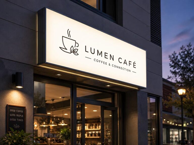
What Are Front-Lit Channel Letters?
Front-lit channel letters are one of the most practical main storefront signs for restaurants that need strong visibility. Each letter is built as a separate 3D structure, usually with an aluminum or stainless steel side return, acrylic front face, and LED modules inside. The light shines forward through the acrylic face, so the restaurant name stays clear at night.
This type is especially useful for street-facing restaurants, fast food shops, burger restaurants, pizza stores, sushi shops, ramen restaurants, cafes on busy roads, and chain restaurant storefronts. When people are driving, walking across the street, or looking for the restaurant in a plaza, front-lit channel letters are usually easier to recognize than small decorative signs.
A front-lit channel letter sign works best when the restaurant name needs to be read quickly. For example, if the customer only has 3–5 seconds to see the storefront, bold illuminated letters are often more useful than a complicated logo shape. For restaurants that open for dinner or late-night service, this type also helps the store look active after sunset.
Typical project range:
| Detail | Common Restaurant Use |
|---|---|
| Suitable location | Outdoor storefront, plaza, street shop |
| Viewing distance | Medium to long distance |
| Best lighting effect | Bright, direct, clear |
| Common materials | Acrylic face, aluminum return, stainless steel option |
| Good for night business | Yes |
| Good for chain stores | Yes, easy to standardize |
| Main concern | Letter size, waterproofing, wiring, installation |
Front-lit channel letters are not always the cheapest option. Cost increases with letter height, letter depth, number of letters, logo complexity, LED quantity, waterproof structure, and mounting method. A short restaurant name with bold letters is usually easier to produce than a long name with thin script fonts and small taglines.
For restaurant projects, these details should be checked before production:
Letter height: Small letters may not be readable from the street.
Stroke thickness: Thin strokes may not hold enough LED modules.
Letter depth: Deeper letters usually allow better internal lighting.
Acrylic color: Daytime color and nighttime color may look different.
Waterproof sealing: Outdoor restaurants need protected seams and wire exits.
Mounting method: Direct wall mounting looks clean, while a raceway may make installation easier.
Power supply location: It should be accessible for future repair.
This sign type is a strong choice when the restaurant wants the storefront to look established, visible, and easy to find.
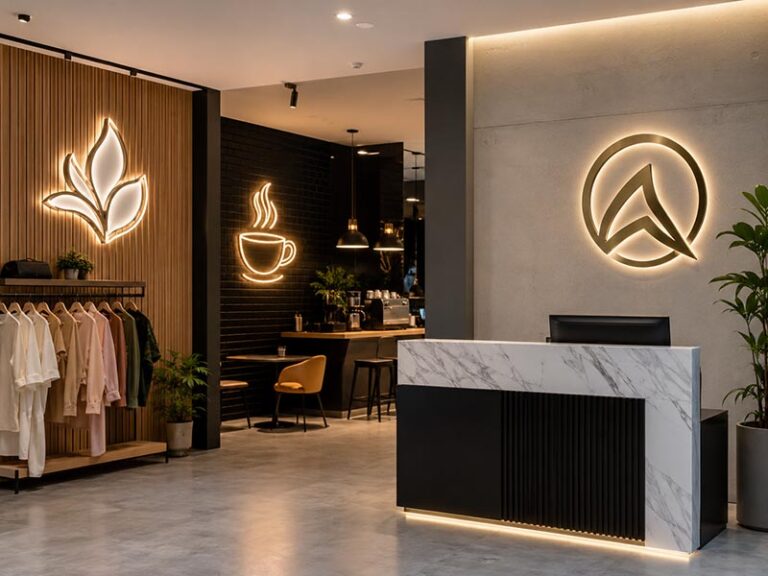
What Are Backlit Logo Signs?
Backlit logo signs create a softer, more premium lighting effect. Instead of shining directly through the front face, the LED light glows from behind the letters or logo and reflects onto the wall. This creates a halo effect around the sign. For restaurants that want a warmer, more refined storefront, backlit signs can look more elegant than very bright front-lit letters.
This type is a good fit for boutique restaurants, cafes, dessert shops, wine bars, hotel restaurants, sushi restaurants, fine dining spaces, and modern food brands. It is also useful for restaurant entrance walls, reception logo walls, and indoor brand walls where customers see the sign up close.
The main advantage is mood. Backlit signs do not shout at people. They create a controlled glow that can make the restaurant feel calmer and more carefully designed. A cafe with wood panels, a wine bar with dark walls, or a Japanese restaurant with a simple facade can use a backlit sign to make the entrance feel more high-end.
But backlit signs need the right wall condition. The glow depends on the background surface. If the wall is too glossy, uneven, dark, or visually busy, the halo may not spread evenly. If the sign is installed too close to the wall, the light may look blocked. If it is too far from the wall, the sign may look bulky.
Typical project range:
| Detail | Common Restaurant Use |
|---|---|
| Suitable location | Premium storefront, cafe entrance, lobby wall |
| Viewing distance | Short to medium distance |
| Best lighting effect | Soft halo glow |
| Common materials | Stainless steel, aluminum, acrylic, painted metal |
| Good for night business | Yes, but softer than front-lit |
| Good for chain stores | Yes, if wall conditions are controlled |
| Main concern | Wall surface, mounting distance, light color |
For restaurants, backlit logo signs are useful when the brand wants to avoid a cheap or overly bright look. They work especially well when the restaurant already has a clean facade or a designed interior. A backlit logo above a dark storefront can look polished, but only if the light is even and the logo is readable.
Before ordering a backlit restaurant sign, check:
Wall color: Lighter or matte surfaces usually show the halo better.
Logo thickness: Very thin logo strokes may not create a strong enough glow.
Mounting distance: Enough spacing is needed behind the letters.
Light color: Warm white often works well for cafes, bakeries, and restaurants.
Outdoor use: If installed outside, waterproof structure still matters.
Power hiding: Visible power supplies or wires can ruin the premium look.
For a restaurant that cares about atmosphere and brand quality more than maximum distance visibility, a backlit logo sign can be a very strong option.
What Are Light Box Signs?
Light box signs are one of the most useful and cost-controlled sign types for restaurants. A light box is usually built with a frame or cabinet, internal LEDs, and a translucent front face. The front can show the restaurant name, logo, menu, food category, or simple direction text.
This type works well for mall food shops, food courts, bubble tea shops, takeout restaurants, cafes, bakeries, dessert shops, fast-casual restaurants, and menu areas. It is also useful when the restaurant logo has many colors or detailed graphics that are hard to produce as separate channel letters.
For example, a light box can show a logo, food illustration, and short brand message in one clean panel. For a food court restaurant, a wide light box above the counter can help customers understand the brand while they compare different food options. For a takeout shop, a smaller light box can show “Order Here” or “Pickup” clearly during busy hours.
Light boxes are usually easier to control in cost because they are built as one sign body rather than many separate letters. They can also be easier to install in indoor spaces. However, the design must be simple. A light box with too much text, too many colors, or small menu items can become hard to read.
Typical project range:
| Detail | Common Restaurant Use |
|---|---|
| Suitable location | Food court, mall shop, small storefront, counter area |
| Viewing distance | Short to medium distance |
| Best lighting effect | Large, even illuminated panel |
| Common materials | Acrylic face, aluminum frame, printed film, LED modules |
| Good for menu display | Yes |
| Good for detailed logo | Yes |
| Main concern | Light uniformity, printing clarity, box thickness |
Light boxes are often useful in these restaurant areas:
Main storefront logo sign
Menu light box above counter
Food court fascia sign
“Order Here” sign
“Pickup” sign
Window display sign
Wall-mounted brand sign
Outdoor menu or service sign
A slim light box can feel more modern than a thick old-style cabinet. For restaurants with a clean interior design, a thinner frame, matte finish, and even light diffusion can make the sign look more refined. For outdoor use, waterproof sealing and proper frame structure should be confirmed.
Before ordering a restaurant light box, check:
Will it be indoor or outdoor?
Does the face need printing or acrylic lettering?
Is the menu text large enough to read?
Will the frame color match the storefront?
Is the light evenly diffused?
Can the face be cleaned or replaced later?
Is the box thickness acceptable for the wall or counter?
A light box is a strong choice when the restaurant needs clear information, controlled cost, and easy brand display.
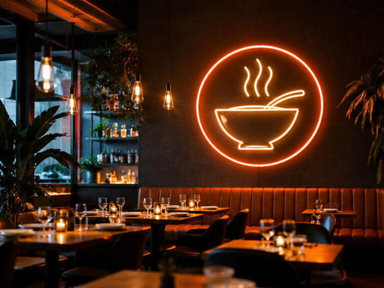
What Are LED Neon Signs?
LED neon signs are flexible, colorful, and very popular for restaurants that want atmosphere. They use LED neon flex or silicone tubing to create glowing letters, food icons, slogans, or decorative shapes. Compared with traditional glass neon, LED neon is lighter, safer, and easier to customize for modern restaurant interiors.
LED neon works especially well for bars, cafes, dessert shops, bubble tea shops, ice cream shops, burger restaurants, pizza stores, taco shops, ramen shops, night food brands, and photo-friendly restaurant spaces. It can show a coffee cup, cocktail glass, pizza slice, ramen bowl, ice cream cone, heart shape, slogan, or simple “Open” sign.
For restaurants, LED neon is often best as a supporting sign rather than the only main storefront sign. It is excellent for windows, indoor walls, bar counters, selfie walls, and brand photo corners. It helps create mood and encourages customers to take photos. This is very useful for cafes, dessert brands, bars, and casual restaurants that depend on social sharing.
Common LED neon uses:
| Location | Good Use |
|---|---|
| Window | Open sign, food icon, short message |
| Interior wall | Brand slogan or photo wall |
| Bar counter | Cocktail icon, brand mood sign |
| Dessert shop | Cute logo or product shape |
| Cafe | Warm quote or coffee icon |
| Takeout shop | Pickup or order sign |
| Event area | Temporary restaurant promotion sign |
The limitation is visibility distance. Thin LED neon lines may not be easy to read from far away, especially in daylight. A long restaurant name in script neon may look beautiful in photos but may not work well as the main street sign. If the restaurant needs people to read the name from across the road, front-lit channel letters or a light box may perform better.
Before ordering LED neon for a restaurant, check:
Indoor or outdoor use
Line thickness
Backboard material and color
Mounting method
Power adapter position
Cable visibility
Dimming option
Remote control option
Expected photo background
For a small cafe or dessert shop, a LED neon sign can become a recognizable photo spot. For a bar, it can help create the night mood. For a chain restaurant, it can be standardized as an interior brand element across multiple stores. But for the main outdoor name sign, LED neon should be used carefully and often combined with a stronger storefront sign.
Which Sign Fits Different Restaurant Types?
Different restaurants need different sign strategies. A fast-food restaurant, a boutique cafe, a sushi bar, a bubble tea shop, and a fine dining restaurant should not all use the same sign type. The best sign should match the restaurant’s location, price level, operating hours, customer flow, and brand personality.
A quick-service restaurant usually needs fast recognition. Customers should read the name and understand the food type quickly. Front-lit channel letters or a bright light box often works well. A cafe may need a warmer and more relaxed look, so a backlit logo sign or acrylic LED logo sign can feel more suitable. A bar may need stronger mood, so LED neon or RGB effects can support the interior and window area.
For chain restaurants, consistency matters more than one impressive sign photo. Each store may have a different facade size, but the brand color, logo proportion, lighting effect, and material feeling should stay consistent. In that case, standardized channel letters, light boxes, or complete sign kits are often better than one-off custom choices.
Restaurant sign matching guide:
| Restaurant Type | Better Main Sign | Better Supporting Sign | Why It Works |
|---|---|---|---|
| Fast food restaurant | Front-lit channel letters | Menu light box | Strong visibility and fast ordering |
| Pizza shop | Channel letters or light box | Window LED neon | Easy street recognition and casual mood |
| Coffee shop | Backlit logo sign | Warm LED neon sign | Soft, inviting, photo-friendly |
| Bubble tea shop | Light box or acrylic logo sign | LED neon icon | Colorful, young, easy to notice |
| Dessert shop | Backlit logo sign | Neon slogan or product icon | Sweet, soft, social-media friendly |
| Sushi restaurant | Backlit metal logo sign | Small interior logo sign | Clean, calm, premium feeling |
| Bar or nightclub | Channel letters or LED neon | RGB neon wall sign | Strong night atmosphere |
| Food court shop | Light box sign | Order/Pickup signs | Clear, compact, landlord-friendly |
| Chain restaurant | Standard channel letters | Store-by-store sign kit | Consistent across locations |
A good restaurant may also combine several sign types instead of relying on one sign. For example:
Main storefront: front-lit channel letters
Window: LED neon food icon
Counter: menu light box
Service area: order and pickup signs
Interior wall: backlit logo or neon slogan
This kind of sign system can help customers move through the space more easily. They notice the restaurant, understand what it offers, know where to order, know where to pick up food, and remember the brand after leaving.
For single restaurants, this improves the customer experience. For chain restaurants, it makes each location easier to repeat and manage. The final choice should not start from “Which sign is popular?” It should start from “What does this restaurant need customers to see, understand, and do?”
How Should You Choose by Location?
Restaurant sign choice should start with the real location, not only the logo style. A street-facing restaurant needs visibility from a longer distance. A mall restaurant needs a clean sign that fits landlord rules. A corner store may need signs facing two directions. A small cafe may depend heavily on window signs. The best LED sign is the one that matches how customers actually see, approach, and enter the restaurant.
For restaurant storefronts, location affects almost every sign decision:
Sign size
Letter height
Brightness
Viewing distance
Mounting method
Power access
Outdoor waterproof needs
Landlord or city approval
Need for window, blade, menu, or pickup signs
A sign that works well for a roadside burger shop may look too bright in a mall food court. A sign that looks perfect in a cafe window may be too small for a busy street. That is why the storefront photo, entrance position, customer path, and viewing angle should be checked before choosing the sign type.
Is the Sign for a Street Storefront?
For a street storefront, the sign needs to be noticed quickly. Customers may see it while walking, driving, parking, waiting at a traffic light, or looking for the restaurant on a delivery app map. In this situation, the sign should not be too small, too thin, or too decorative. It needs clear letterforms, strong contrast, and enough brightness for evening service.
Front-lit channel letters are usually a strong choice for street restaurants because each letter has depth and direct illumination. The name is easier to read from a distance compared with a small wall plaque or delicate decorative sign. A light box sign can also work well when the restaurant logo has multiple colors or when the building uses a rectangular sign band.
For street storefronts, the main question is not “Which sign looks nicest in a close-up photo?” The better question is: “Can a first-time customer find the restaurant without slowing down or checking twice?”
Important checks for street-facing restaurants:
| Check Item | Practical Meaning |
|---|---|
| Viewing distance | Decide letter height and sign width |
| Road or sidewalk direction | Know where people first see the sign |
| Wall color | Make sure the sign has enough contrast |
| Neighboring signs | Avoid being visually buried |
| Trees, poles, awnings | Check whether anything blocks the sign |
| Nighttime lighting | Confirm whether brightness is enough after dark |
| Power access | Avoid messy wiring or last-minute drilling |
| Local sign rules | Prevent approval or permit problems |
For a busy restaurant street, a simple and readable sign often works better than a complicated logo. If the restaurant name is long, the design may need wider spacing or a simplified layout. If the logo has a small tagline, it may be better to move that tagline to a window sign, menu board, or interior wall.
Street restaurants can also benefit from supporting signs. A main storefront sign helps people find the restaurant. A window LED sign can show “Open,” “Pickup,” “Coffee,” “Pizza,” or another quick message. A small menu light box near the entrance can help people decide before entering. This is especially useful for fast-casual restaurants, cafes, bakeries, ramen shops, burger shops, and takeout stores.
For outdoor street signs, do not ignore waterproofing and installation. The sign may face rain, dust, sunlight, wind, and long operating hours. Before production, confirm whether the sign is fully exposed or under an awning, where the wire exits, where the power supply sits, and how the installer will mount it to the wall.
Is the Restaurant Inside a Mall?
A restaurant inside a mall, shopping center, or food court usually has a different sign problem. Customers are closer to the storefront, but the sign must often follow landlord rules. The mall may control sign size, sign type, brightness, projection distance, wiring exposure, frame color, and installation method.
In this kind of location, a sign that is too bright or too large may not be approved. The better choice is often a clean light box sign, acrylic LED logo sign, backlit logo sign, or compact channel letter sign. These options can look polished at close distance and still fit a controlled indoor environment.
Mall restaurant signs should look clean from a few feet away. Customers may stand in line directly in front of the sign. If the acrylic edge is rough, the light is uneven, the printed face is low quality, or the cable is exposed, people will notice it. This is why mall signs need a more finished look, even when the sign is smaller than an outdoor storefront sign.
Common sign choices for mall restaurants:
| Mall Area | Better Sign Choice | Why It Works |
|---|---|---|
| Main counter fascia | Slim light box sign | Clear logo display and easy recognition |
| Food court shop | Wide light box | Good for brand name and food category |
| Premium restaurant entrance | Backlit logo sign | Softer and more refined appearance |
| Cafe kiosk | Acrylic LED logo sign | Compact, clean, and modern |
| Pickup counter | Small LED text sign | Helps takeout and delivery flow |
| Menu wall | Menu light box | Makes choices easier to read |
For food court restaurants, the menu area is often as important as the main logo. Customers compare several food options quickly, so the sign should help them understand the food type, price level, and order point. A good menu light box or clear category sign can reduce hesitation and make the line move faster.
Before ordering a mall restaurant sign, ask for the mall sign criteria. The document may include maximum sign height, approved materials, lighting rules, installation drawings, or wiring requirements. It is much cheaper to follow these rules before production than to remake the sign later.
For chain restaurants inside malls, standardized sign files are helpful. One approved mall version can be reused for future locations, with only size adjustments when needed. This saves design time and keeps the brand consistent.
Does the Sign Need to Face Foot Traffic?
Some restaurants depend more on people walking past than people seeing the sign from far away. This is common for cafes, dessert shops, bubble tea stores, small bakeries, sandwich shops, taco shops, food streets, college areas, tourist streets, and downtown storefronts. In these places, eye-level signs can be just as important as the main sign above the door.
Pedestrians do not always look up. They often look at windows, menus, people inside, food displays, and the entrance. A sign placed too high may identify the store, but it may not stop people. A window sign, blade sign, hanging sign, or small LED neon icon can catch attention at the customer’s natural eye level.
For foot-traffic locations, the sign should quickly answer: “Is this place worth stopping for?” A coffee cup neon sign, “Fresh Bakery” light box, “Open Late” window sign, or simple food icon can make the offer clear before the customer reads the full menu.
Useful signs for foot-traffic restaurants:
Main storefront sign for restaurant name
Window LED neon sign for food category or mood
Menu light box near the entrance
Small hanging sign for close walking traffic
Open sign for business status
Order or pickup sign for customer flow
Interior logo wall for photos
For small restaurants, this is very practical. If the facade is narrow or the landlord limits the main sign size, the window and entrance area become more valuable. A small sign in the right place can do more than a large sign that people do not notice.
For example, a small dessert shop may use a soft backlit logo above the entrance, a pink LED neon dessert icon in the window, and a small menu light box beside the door. A coffee shop may use a clean acrylic LED logo sign outside and a warm “Coffee” neon sign near the window. A takeout noodle shop may use a main light box plus a clear “Pickup” sign to guide delivery drivers.
The goal is not to fill every surface with signs. Too many signs can make the storefront look messy. The better strategy is to place a few signs where customers make decisions:
Where they first notice the shop
Where they decide to stop
Where they enter
Where they order
Where they pick up
For foot-traffic restaurants, good signage should feel natural. It should guide customers without making the storefront look crowded.
Do Corner Stores Need Blade Signs?
Corner restaurants often need more than one sign direction. A corner location may have people approaching from two streets, two sidewalks, two parking areas, or two sides of a shopping plaza. If the main sign only faces one direction, many potential customers may not see it until they have already passed the restaurant.
A blade sign, also called a projecting sign, can be very useful for corner stores and narrow streets. It extends from the wall and faces pedestrian traffic from the side. This helps people see the restaurant before they reach the storefront. For cafes, bars, bakeries, dessert shops, and small restaurants, a blade sign can make the location easier to find.
Corner restaurants may also need side-wall signs, window signs, or a second facade sign. The right choice depends on which side has more traffic and which wall is allowed for installation.
Common corner restaurant sign plan:
| Sign Position | Function |
|---|---|
| Main front sign | Shows the restaurant name from the main street |
| Side wall sign | Captures traffic from the second street |
| Blade sign | Helps pedestrians see the store from the side |
| Window sign | Shows food type, open status, or mood |
| Menu board | Helps customers decide before entering |
Blade signs are especially helpful when the storefront is on a walking street, downtown block, food street, or shopping district. People may approach from the side while looking at many storefronts in a row. A flat wall sign may be hidden until they are directly in front of the restaurant. A blade sign solves this problem.
However, blade signs need extra attention to structure. They project out from the wall, so wind load, bracket strength, mounting surface, weight, and local rules matter. Some landlords or cities limit projection distance, sign height, lighting type, or bracket style.
Before ordering a blade sign, restaurants should confirm:
Allowed projection distance
Wall material
Bracket style
Sign weight
Indoor or outdoor use
Power route
Viewing direction
Mounting height
Wind exposure
Permit or landlord approval
For chain restaurants, corner locations should have a special sign version. The same brand logo may need one design for front-facing channel letters, one for side-facing signs, and one for blade signs. Preparing these versions early makes future locations easier to open.
Are Window Signs Useful for Small Shops?
Window signs are very useful for small restaurants, especially when the main storefront sign is limited by space, budget, or landlord rules. A window sign is closer to eye level, easier to notice from the sidewalk, and often more flexible than a large outdoor sign.
LED neon signs are a popular window option because they are bright, lightweight, and visually friendly. They can show simple messages such as “Open,” “Coffee,” “Pizza,” “Tacos,” “Ramen,” “Bubble Tea,” “Pickup,” or a food icon. These signs work well for cafes, dessert shops, bars, bakeries, food trucks, takeout stores, and small casual restaurants.
Window signs help with three practical problems:
They show that the restaurant is open.
They tell people what the restaurant offers.
They make the storefront feel more active.
For small shops, one clear window sign can make a big difference. If the restaurant name is not well known, a food-category sign may be more useful than a decorative slogan. For example, a first-time customer may not understand the brand name, but they will understand “Fresh Coffee,” “Handmade Noodles,” or a glowing pizza icon.
Useful window sign ideas:
| Restaurant Type | Window Sign Idea |
|---|---|
| Coffee shop | Coffee cup icon, “Coffee,” “Open” |
| Bubble tea shop | Cup icon, fruit icon, “Fresh Tea” |
| Pizza shop | Pizza slice icon, “Pizza” |
| Ramen shop | Noodle bowl icon, “Ramen” |
| Bakery | Croissant icon, “Fresh Bakery” |
| Bar | Cocktail glass icon, “Open Late” |
| Takeout shop | “Pickup,” “Order Here” |
Window signs should still be clean and controlled. Too many window messages can make the storefront look crowded. If the window is already full of posters, menus, stickers, and promotions, adding a neon sign may create visual noise. One or two clear signs are usually better than many small ones.
Practical details to confirm for window signs:
Sign size compared with window size
Backboard shape and color
Cable route
Power outlet position
Hanging or wall-mounted method
Indoor use or outdoor-facing use
Brightness and dimming
Visibility during daytime
Cleaning around the window
For small restaurants, window signs are also useful because they can be changed or added more easily than large storefront signs. A shop may start with a main logo sign and later add an open sign, pickup sign, or seasonal LED neon sign. This gives the restaurant flexibility without changing the full facade.
A good window sign should not replace the main brand sign if the restaurant needs strong street recognition. But it can support the main sign, attract foot traffic, and make the storefront feel warmer and more active.
What Matters for Outdoor Use?

For outdoor restaurant signs, the key is not only whether the sign looks good when it is first installed. The sign also needs to handle rain, sunlight, dust, grease, wind, long operating hours, and daily cleaning around the storefront. A good outdoor restaurant LED sign should be waterproof, bright enough at night, built with weather-resistant materials, easy to wire, safe to install, and practical to maintain.
Outdoor signs are usually used harder than indoor signs. A cafe wall sign may only need to look soft and clean. A restaurant storefront sign may run 6–12 hours a day, face changing weather, and sit above the entrance where every customer sees it. If the structure is weak, problems may appear later as flickering, dark sections, water inside the letters, faded colors, rusty hardware, loose mounting, or messy wiring.
Is the Sign Waterproof?
Outdoor restaurant signs should be built for the exact exposure level. A sign under a deep awning does not face the same conditions as a sign fully exposed to rain. A rooftop bar, beach restaurant, roadside burger shop, or open-air food street may need stronger waterproof planning than a small cafe inside a covered plaza.
Water usually does not enter from the most obvious front surface. It often enters through small weak points: screw holes, wire exits, seams, connectors, back panels, acrylic edges, and poorly sealed mounting areas. Once moisture gets inside, the sign may still work for a while, but the LED modules, wires, or power connection can slowly fail.
Restaurants should ask more specific questions than “Is it waterproof?” A better checklist is:
Where does the wire exit?
Are the wire exits sealed?
Are the LED modules suitable for outdoor use?
Are connectors protected from rain?
Is the back panel sealed?
Are screw holes protected?
Can water collect inside the sign body?
Where will the power supply be placed?
Does the wall need extra sealing after drilling?
A practical outdoor waterproof guide:
| Storefront Condition | Waterproof Concern | What to Confirm |
|---|---|---|
| Fully exposed street facade | Rain hits the sign directly | Sealed letters, protected wire exits, outdoor LED modules |
| Under awning | Less rain, but still moisture | Back sealing and connector protection |
| Coastal restaurant | Salt air and corrosion | Better metal finish and corrosion-resistant hardware |
| Rooftop bar | Wind and rain exposure | Strong mounting and outdoor-rated structure |
| Food street shop | Rain, dust, and cleaning water | Easy-clean surface and sealed wiring |
| Mall exterior entrance | Landlord rules plus weather | Approved structure and hidden wiring |
For outdoor restaurant signs, waterproofing should be treated as part of the structure, not an optional decoration. If the sign will be used outside, the manufacturer should know this before quoting and production.
How Bright Should It Be at Night?
A restaurant sign should be bright enough to help customers find the store at night, but it should not look harsh or uncomfortable. Many restaurants think “brighter is better,” but this is not always true. A sign that is too bright can feel cheap, cause glare, or clash with the restaurant’s brand style.
Brightness should match the restaurant type and location. A fast-food restaurant on a busy road may need stronger brightness because customers see it from farther away. A fine dining restaurant may need softer backlit lighting to feel calm and premium. A bar may want stronger color and atmosphere. A bakery or coffee shop may look better with warm white light instead of cold white light.
Useful brightness factors to check:
Viewing distance
Street lighting around the restaurant
Neighboring sign brightness
Wall color
Letter size
Acrylic face color
LED spacing
Restaurant opening hours
Brand style
Local brightness rules
A simple night visibility guide:
| Restaurant Type | Better Light Feeling | Reason |
|---|---|---|
| Fast food | Bright and clear | Helps quick recognition from street or parking lot |
| Cafe | Warm and soft | Feels comfortable and inviting |
| Bar | Stronger color or neon mood | Supports nighttime atmosphere |
| Fine dining | Controlled halo glow | Looks more premium and less aggressive |
| Dessert shop | Soft colorful lighting | Matches cute or warm brand style |
| Takeout shop | Clear functional lighting | Helps pickup and delivery customers |
| Chain restaurant | Consistent brightness | Keeps stores looking unified |
The sign should be checked in two states: lights off during the day and lights on at night. Some materials look good in the daytime but become too bright or uneven at night. Some signs look good when lit but look dull when turned off. Restaurants need both effects because customers see the storefront throughout the day.
For outdoor signs, even lighting is usually more important than extreme brightness. Dark spots, overly bright LED points, and uneven edges make the sign look low quality. A well-made sign should look stable, readable, and clean after sunset.
Are Materials Weather-Resistant?
Outdoor restaurant signs need materials that can handle sun, rain, heat, dust, cleaning, and long-term exposure. The material choice affects appearance, cost, maintenance, and service life. A sign may look similar in a photo, but the actual material thickness, surface finish, acrylic quality, LED quality, and hardware can make a big difference after months of use.
Common outdoor restaurant sign materials include acrylic, aluminum, stainless steel, silicone LED neon, printed light box faces, LED modules, power supplies, and mounting hardware. Each material has a different role. Acrylic affects light diffusion and color. Aluminum or stainless steel affects structure. LEDs affect brightness and stability. Hardware affects installation safety.
Restaurants should match material choice to the real storefront environment:
| Environment | Material Risk | What to Check |
|---|---|---|
| Strong sunlight | Acrylic yellowing, color fading | UV-resistant acrylic or suitable finish |
| Rainy area | Water inside sign | Outdoor sealing and protected connectors |
| Coastal area | Rust and corrosion | Aluminum or stainless steel with proper surface treatment |
| Hot climate | LED stress and material expansion | Heat control and stable power supply |
| Greasy food area | Dirty surface | Smooth, easy-clean sign face |
| Roadside storefront | Dust and vibration | Strong structure and secure mounting |
| Cold climate | Expansion and contraction | Flexible wiring and suitable structure |
Different restaurants need different priorities. A seafood restaurant near the coast should care more about corrosion resistance. A fried chicken or grill restaurant should think about grease and cleaning. A dessert shop may care more about color accuracy and soft lighting. A roadside diner may need a strong structure and larger letters.
Material choice should not only follow the cheapest quote. For outdoor use, weak materials may create later costs: repair, replacement, repainting, LED failure, water damage, or shipment of spare parts. A well-chosen material can help the sign stay cleaner, brighter, and more reliable.
How Should Power and Wiring Be Planned?
Power and wiring should be confirmed before production, not after the sign arrives. Many outdoor sign problems happen because the sign body is correct, but the wire exits from the wrong place, the power supply cannot be hidden, or the installer has to make changes on site.
For restaurant storefronts, wiring affects both appearance and installation cost. Exposed cables can make a new restaurant look unfinished. Wrong wire direction can delay installation. A power supply placed in a hard-to-reach location can make future maintenance difficult.
Restaurants should confirm these details early:
Local voltage
Plug type
Power supply location
Indoor or outdoor power supply
Wire exit position
Cable length
Need for extension wire
Need for raceway or backboard
Need for dimmer, timer, or switch
Installer’s wiring preference
Whether the sign will be direct-mounted or raceway-mounted
Power planning by sign type:
| Sign Type | Wiring Concern | Practical Suggestion |
|---|---|---|
| Front-lit channel letters | Each letter may need wiring | Use drilling template or raceway if wall wiring is difficult |
| Backlit logo sign | Power should stay hidden | Confirm wire exit and wall penetration point |
| Light box sign | One main power entry is common | Match power entry to wall outlet or hidden wiring |
| LED neon window sign | Adapter and cable may be visible | Plan cable route and plug position cleanly |
| Blade sign | Wiring may pass through bracket or wall | Confirm bracket structure and power route |
| Menu light box | May need easy access | Make sure maintenance and face replacement are possible |
For outdoor signs, power supply placement is very important. If possible, the power supply should be placed in a protected and accessible area. If it must be outdoors, it should be suitable for outdoor conditions and installed properly. Restaurants should also think about how the sign will be turned on and off. A timer or switch can make daily operation easier.
Good wiring planning saves installation time, keeps the storefront cleaner, and makes future repairs easier.
Do Local Rules Affect the Sign Type?
Yes. Local sign rules can strongly affect what kind of restaurant sign can be installed. Many cities, shopping centers, malls, plazas, and landlords have rules about sign size, brightness, mounting height, projection distance, wiring exposure, raceways, colors, sign area, and sign type. A sign can be well made and still be rejected if it does not follow local rules.
This is especially important for restaurant storefronts because signs are often installed in visible public areas. A shopping plaza may require all signs to fit within a sign band. A mall may require hidden wiring and approved materials. A city may limit illuminated signs, flashing effects, blade signs, or brightness. A historical district may have stricter facade rules.
Restaurants should check approval requirements before production, especially for:
Outdoor storefront signs
Large channel letters
Light box signs
Blade signs
Signs above sidewalks
Rooftop or high-wall signs
RGB or color-changing signs
Flashing or animated signs
Signs in malls or plazas
Common rules to confirm:
| Rule Type | What It May Affect |
|---|---|
| Maximum sign size | Overall width, height, and sign area |
| Letter height limit | Size of channel letters |
| Projection limit | Blade signs and sign depth |
| Brightness limit | LED intensity and light color |
| Raceway rule | Whether wiring can be hidden or boxed |
| Color restriction | Brand color or light color |
| Mounting height | Placement above entrance |
| Landlord criteria | Materials, drawings, installation method |
| Permit requirement | Approval before installation |
Before ordering, restaurants should ask the landlord, property manager, contractor, or local installer for any sign criteria. If drawings are needed for approval, the manufacturer should know early so the production drawing can include size, structure, mounting method, and electrical details.
For chain restaurants, this step is even more important. One approved sign design may not fit every city or mall. A chain brand may need different sign versions for street storefronts, mall locations, corner stores, and food court counters.
A practical ordering tip: confirm local rules before final production, not after the sign is finished. Remaking a sign because of approval problems is much more expensive than adjusting the design early.
For outdoor restaurant signs, the best result comes from checking both the product and the place where it will be installed. A good sign should be waterproof enough for the environment, bright enough for real night visibility, made from suitable materials, wired cleanly, and designed within local rules. When these details are confirmed before production, the sign is much more likely to install smoothly and support the restaurant every day.
How Do Costs Compare?
Restaurant LED sign cost depends on sign type, size, logo complexity, material, lighting method, waterproof structure, installation accessories, packaging, shipping, and order quantity. A small LED neon window sign may be affordable for a cafe or dessert shop, while large outdoor channel letters or premium backlit metal signs usually cost more. The right way to compare cost is not only by the sign price, but by the total project cost after production, shipping, installation, and daily use.
For restaurant owners, the biggest mistake is comparing quotes without checking what is included. One quote may include outdoor waterproofing, power supply, mounting accessories, packing photos, and export-grade packaging. Another quote may only include the sign body. The second price looks cheaper at first, but the restaurant may pay more later for missing parts, local repair, delayed installation, or replacement.
Which Sign Usually Costs More?
In general, LED neon signs and simple light box signs usually cost less than custom channel letters and backlit logo signs. But this is only a general rule. A small channel letter sign with simple block letters may cost less than a large LED neon wall sign with many colors and a complex shape. A light box may be affordable if the design is simple, but a large outdoor waterproof light box with a thick frame, printed face, and strong packaging can also become a higher-cost project.
For restaurants, the cost should be compared by use case. A cafe window sign, a food court logo sign, and a street-facing storefront sign are not doing the same job. A lower-cost LED neon sign may work very well for a window or photo wall, but it may not be strong enough as the main sign for a busy road. A more expensive channel letter sign may be worth it if it helps the restaurant stay visible every night from a longer distance.
| Sign Type | Usual Cost Level | Best Restaurant Use | Main Cost Reason |
|---|---|---|---|
| LED neon sign | Low to medium | Window, bar wall, photo wall, open sign | Flexible material, lighter structure, smaller size options |
| Light box sign | Low to medium | Food court, menu area, small storefront | One complete illuminated panel, good for printed logos |
| Acrylic LED logo sign | Medium | Cafe, dessert shop, indoor logo wall | Layered acrylic, clean finish, soft lighting |
| Front-lit channel letters | Medium to high | Main street storefront sign | Separate letter bodies, acrylic faces, LEDs, wiring |
| Backlit logo sign | Medium to high | Premium restaurant, cafe, hotel dining | Metal finish, halo lighting, wall spacing |
| Dual-lit channel letters | High | Premium storefront with strong visibility | More complex lighting and structure |
A small restaurant with limited budget does not always need the most expensive sign. For example, a mall dessert shop may use a slim light box for the main counter and a small LED neon sign for the window. That can be more practical than large channel letters. But a street-facing burger restaurant or ramen shop may need front-lit channel letters because customers must notice the store from across the road.
When comparing sign types, restaurants should ask:
What is the main purpose of this sign?
Will customers see it from a car, sidewalk, mall corridor, or window?
Does the sign need to work in daylight and at night?
Is the sign indoor, outdoor, or fully exposed to rain?
Will it be used for one store or many stores?
Is it a main storefront sign or a supporting sign?
A sign should be priced based on the problem it solves. A cheap sign that cannot be seen from the street is not really cheap for a restaurant that depends on walk-in traffic.
What Affects the Final Price?
The final price is affected by many details that are not obvious in a simple product photo. Size matters, but it is not the only factor. A large sign with simple block letters may be easier to produce than a smaller sign with thin script letters, small food icons, multiple colors, and complicated wiring.
Restaurant logos are often more complex than people think. Many include hand-drawn fonts, chef icons, leaves, bowls, flames, coffee cups, noodles, animals, or long taglines. These details can increase production time, cutting difficulty, LED layout work, and assembly cost.
Main price factors include:
Overall sign width and height
Letter height and letter depth
Number of letters or logo parts
Logo complexity
Thin strokes or small details
Material type and thickness
Acrylic color and finish
Metal return material
LED color and brightness
Single color, RGB, or dimming control
Indoor or outdoor structure
Waterproof sealing
Power supply quality
Wire exit and cable length
Mounting holes, raceway, or backboard
Surface finish, painting, or polishing
Accessories included
Packaging method
Shipping method
Order quantity
| Price Factor | How It Changes Cost | Restaurant Example |
|---|---|---|
| Size | Larger signs use more material and LEDs | A 2-meter storefront sign costs more than a 1-meter counter sign |
| Logo detail | Thin lines and small icons need more work | A hand-drawn ramen logo is harder than bold block text |
| Lighting | RGB, dimming, and dual-light effects cost more | A bar sign with RGB control costs more than single warm white |
| Outdoor use | Waterproofing and stronger structure add cost | A street sign costs more than an indoor photo wall sign |
| Mounting | Raceways, backboards, brackets add cost | A difficult wall may need a backing panel |
| Packaging | Large or fragile signs need stronger protection | A large light box may need a wooden crate |
| Quantity | Repeated designs can reduce unit cost | Chain stores can reuse production files |
For an accurate quote, restaurants should not only send a logo. They should also send storefront photos, desired size, indoor or outdoor use, installation position, lighting preference, local voltage, and deadline. Without these details, the quote can only be rough.
A practical example:
If a restaurant asks for “a 120 cm sign,” the price may still vary a lot.
A 120 cm LED neon slogan for an indoor wall may be relatively simple.
A 120 cm light box with a printed face may be more structured but still controlled.
A 120 cm set of channel letters with 12 separate letters may need more labor.
A 120 cm backlit metal logo with thin strokes may need more precise fabrication.
So the same size does not mean the same cost. Production complexity matters.
Is a Cheap Sign Risky?
A cheap sign is not automatically bad. Some restaurants need simple, budget-friendly signage, and a basic light box or small LED neon sign may be enough. The risk appears when the quote is cheap because important details are missing or reduced. This is where restaurants need to be careful.
A low quote may skip or weaken parts that customers do not see in a product photo. These parts include LED quality, power supply, waterproof sealing, wiring, mounting accessories, inspection, and packaging. The sign may look fine in a factory photo but cause problems after shipping or installation.
Common risks behind a very low quote:
Weak LED modules with uneven brightness
Too few LEDs inside letters
Thin acrylic that bends or cracks easily
Poor light diffusion with dark spots
Wrong or unstable power supply
No waterproof protection for outdoor use
No protection around wire exits
No mounting template
Missing screws, anchors, or brackets
No clear installation drawing
Poor packaging for international shipping
No lighting test before shipment
No useful after-sales support
For restaurants, these problems are not small. A sign is often tied to opening day, landlord inspection, storefront photos, and first customer impressions. If the sign arrives broken, flickers after installation, or cannot be mounted as planned, the restaurant may need emergency local repair or temporary signage.
| Cheap Quote Issue | What It Can Cause |
|---|---|
| No power supply included | Extra local purchase and possible mismatch |
| Weak packaging | Acrylic cracks or sign damage during shipping |
| No waterproof sealing | Outdoor failure after rain |
| No mounting accessories | Installer delays and extra hardware cost |
| Thin letters | Uneven light and poor appearance |
| No drawing confirmation | Wrong size, spelling, or wire exit |
| No lighting test | Problems only found after delivery |
A better way to compare quotes is to ask each supplier what is included:
Does the quote include the sign body?
Does it include LED modules and power supply?
Does it include mounting screws or brackets?
Does it include installation template?
Does it include waterproof structure for outdoor use?
Does it include packaging suitable for shipping?
Does it include lighting test before shipment?
Does it include photos or videos before delivery?
Does it include warranty or replacement support?
The cheapest quote may still be acceptable if it clearly matches the project. But if the supplier cannot explain the materials, lighting, wiring, packaging, or accessories, the restaurant may be taking a bigger risk than expected.
How Can Restaurants Control Budget?
Restaurants can control budget by choosing the right sign type, simplifying the design, confirming size early, and avoiding unnecessary effects. Budget control should not mean removing the details that protect the project, such as waterproofing, power safety, packaging, and mounting support.
The most practical way to reduce cost is to spend money only where it helps the restaurant. For example, if the main problem is street visibility, invest in clear channel letters for the restaurant name. If the main problem is menu clarity, use a good menu light box. If the goal is atmosphere, use LED neon in the window or interior wall. Not every sign needs premium material or complex lighting.
Ways to control cost without making the sign look cheap:
Use the main storefront sign for the restaurant name only.
Move small taglines to windows, menus, or interior signs.
Avoid very thin logo strokes when possible.
Use one main lighting color instead of multiple effects.
Choose a light box for detailed multi-color logos.
Use LED neon for smaller window or photo-wall messages.
Use channel letters only for the most important brand text.
Use a raceway when it reduces difficult wall wiring.
Confirm the sign size with a storefront photo before production.
Order several signs together if the restaurant has multiple locations.
Save production files for future reorders.
| Budget Situation | Practical Choice | Why It Helps |
|---|---|---|
| Small cafe with limited budget | Acrylic logo sign plus small window neon | Clean look without oversized cost |
| Food court shop | Slim light box | Good visibility and landlord-friendly |
| Street restaurant | Front-lit main name only | Focus budget on readability |
| Long restaurant name | Simplify layout | Reduces letter count and wiring work |
| Detailed logo | Use light box instead of separate letters | Keeps artwork clear at lower complexity |
| Chain restaurant | Standardize sign files | Reduces repeat design and production setup |
Restaurants should avoid saving money in the wrong places. For outdoor signs, do not cut waterproof protection. For international shipping, do not use weak packaging. For large signs, do not ignore mounting structure. For daily-use signs, do not choose an underpowered power supply.
A clean, simple, well-built sign often looks better than a complicated sign made with weak materials. The goal is not to buy the cheapest sign. The goal is to get a sign that fits the restaurant, installs smoothly, and keeps working.
Does Bulk Ordering Reduce Cost?
Bulk ordering can reduce the unit cost when restaurants use the same or similar sign designs across multiple locations. This is especially useful for chain restaurants, franchise brands, coffee chains, bubble tea brands, fast-food groups, hotel restaurants, and multi-store food businesses.
The first sign usually needs more work. The factory may need to redraw the logo, confirm material, test lighting, adjust size, prepare production drawings, and solve installation details. After the first version is approved, future orders are easier because the production file, color standard, LED specification, material choice, and packaging method can be reused.
Bulk ordering can help reduce cost through:
Repeated production setup
Shared material purchasing
Saved logo and drawing files
Standard LED color and brightness
Standard mounting method
Faster production planning
Store-by-store packing
Lower average design time
More efficient QC process
Better reorder speed
For chain restaurants, the value is not only lower price. Consistency may be even more important. Customers should feel the same brand image whether they visit one location or another. If every store uses a slightly different color, brightness, letter thickness, or material, the brand can look less professional.
A chain restaurant sign program may include:
Standard main storefront sign
Small storefront version
Wide storefront version
Mall food court version
Window sign version
Menu light box version
Order and pickup sign version
Interior logo sign version
Approved material list
Approved LED color
Packaging and labeling system
| Chain Sign Item | Why It Matters |
|---|---|
| Standard logo drawing | Keeps shape and proportion consistent |
| Material record | Prevents different stores from looking mismatched |
| LED color record | Keeps lighting tone consistent |
| Size versions | Fits different storefronts without redesigning from zero |
| Store-by-store packing | Reduces confusion during rollout |
| Reorder files | Speeds up future production |
| QC photos/videos | Helps brand teams check before shipment |
Bulk ordering does not mean every sign must be exactly the same size. A restaurant chain may have different storefront widths, mall counters, corner stores, and outdoor entrances. The sign size can change, but the brand standard should stay the same.
For example, a chain may use:
Front-lit channel letters for street locations
Slim light boxes for mall food courts
LED neon window signs for selected stores
Menu light boxes for counter-service locations
Pickup signs for takeout-heavy stores
When the system is planned early, future stores can open faster and with fewer mistakes. The factory can produce based on saved files instead of starting every project from scratch.
For restaurants comparing costs, the best question is not only “How much is one sign?” A better question is: “What will this sign cost after design, production, packing, shipping, installation, and future reorders?” When that full cost is clear, the restaurant can choose a sign that fits both the budget and the storefront.
How Should Design Be Confirmed?

Restaurant sign design should be confirmed with real storefront photos, logo files, sign size, lighting color, material choice, installation position, and wiring details before production starts. A sign may look good in a design file but still fail on the actual storefront if the letters are too small, the color is wrong, the wall is too dark, or the power exit is not planned. For restaurants, design confirmation is not only about appearance. It decides whether customers can read the sign, whether the brand feels right, and whether the installer can finish the job without last-minute changes.
Is the Logo Easy to Read?
The first thing to check is whether the restaurant logo can be read clearly as a physical sign. Many restaurant logos are designed for menus, packaging, websites, or social media. They may look beautiful on a screen, but illuminated signs have different limits. Acrylic needs enough width. Metal returns need enough space. LED modules need room inside the letters. Thin strokes, tiny icons, long taglines, and delicate script fonts can become difficult to make or hard to see at night.
For a storefront sign, the restaurant name should usually be the easiest part to read. A customer walking on the sidewalk or driving past should not need to guess the name. If the logo includes a small slogan, founding year, food description, or decorative icon, those details should be checked carefully. Sometimes they work better on a window sign, menu board, or interior wall instead of the main storefront sign.
A practical readability check:
| Logo Detail | Possible Problem | Better Decision |
|---|---|---|
| Thin script letters | Weak lighting, hard cutting | Slightly thicken the strokes |
| Small tagline | Not readable from outside | Move it to window or menu sign |
| Detailed food icon | Difficult to cut cleanly | Simplify the icon shape |
| Long restaurant name | Sign becomes too wide | Adjust spacing or use stacked layout |
| Low contrast color | Blends into wall | Change face color or add backing |
| Very small letters | Poor street visibility | Increase letter height |
Before confirming the design, restaurants should review the logo from the customer’s real viewing distance. A sign may look clear when viewed from 2 feet away, but that does not mean it works from the sidewalk, parking lot, or road. For outdoor storefronts, the design should be tested on a storefront photo, not just a white background.
Helpful files to prepare:
AI, PDF, EPS, or SVG logo file
High-resolution PNG or JPG for reference
Brand color code
Font name, if available
Storefront photo
Wall size or sign area size
Preferred sign width or height
For chain restaurants, this step is even more important. Once the approved logo drawing is used for the first store, it should be saved as the standard production file. This helps future stores keep the same logo shape, letter spacing, material, and lighting style.
Are Brand Colors Accurate?
Brand color should be confirmed before production because sign colors can change depending on material, light, and viewing condition. A logo color on a computer screen may not look the same on acrylic, printed film, painted metal, stainless steel, or LED neon. Daytime color and nighttime light color can also look different.
For restaurants, color is closely tied to customer feeling. Warm white can make a cafe or bakery feel comfortable. Red and yellow can feel energetic for fast food, pizza, or burger shops. Soft pink, cream, or pastel colors can work well for dessert shops. Cool white may fit a clean sushi restaurant or modern food brand. Amber or warm backlighting may feel better for bars, wine restaurants, and hotel dining spaces.
Color confirmation should include both the surface color and the lighting color. For example, a red acrylic face may look dark when the sign is off but bright when lit. A warm white LED behind white acrylic may look soft, while cool white may look sharper. RGB lighting can create more effects, but it may not match a fixed brand color as accurately as a single-color LED setup.
Restaurants should confirm:
Pantone, CMYK, or RGB reference
Daytime sign face color
Nighttime LED color
Warm white, neutral white, or cool white
Single color or RGB option
Dimming or remote control needs
Painted metal color
Acrylic face color
Backboard or raceway color
A simple color confirmation table:
| Restaurant Style | Common Color Direction | Sign Effect |
|---|---|---|
| Coffee shop | Warm white, cream, soft brown | Cozy and relaxed |
| Burger or pizza shop | Red, yellow, white | Bold and easy to notice |
| Dessert shop | Pink, pastel, warm white | Sweet and photo-friendly |
| Sushi restaurant | White, black, soft backlit tone | Clean and premium |
| Bar or lounge | Amber, red, RGB, neon color | Night mood and atmosphere |
| Chain restaurant | Fixed brand color | Consistent across stores |
For multi-location restaurants, color records should be saved after the first approved order. This includes acrylic color, LED color temperature, paint color, and material finish. Without records, repeat orders may slowly become inconsistent. One store may look slightly warmer, another cooler, and another brighter. For a restaurant brand, these small differences can make the storefronts look less unified.
How Large Should the Sign Be?
Sign size should be confirmed with the real storefront, not by guessing. A “large sign” means different things for a food court counter, a small cafe, a wide street storefront, and a corner restaurant. The same 1200 mm sign can look too big in a narrow mall kiosk but too small on a wide building facade.
The best way to confirm size is to place the sign mockup on the actual storefront photo. This helps the restaurant owner, designer, landlord, contractor, and sign manufacturer see whether the sign fits the wall. It also helps avoid common problems such as the sign being too close to the awning, too high above the entrance, too small compared with neighboring stores, or too wide for the approved sign area.
Restaurants should provide photos from different angles:
Front view of the storefront
Left-side approach view
Right-side approach view
Across-the-street view
Entrance close-up
Nighttime storefront photo, if available
Wall or fascia measurement
Size decisions should consider:
| Size Factor | Why It Matters |
|---|---|
| Storefront width | Keeps the sign balanced with the building |
| Sign area height | Prevents the sign from looking squeezed |
| Viewing distance | Helps decide letter height |
| Entrance location | Helps customers find the door |
| Neighboring signs | Shows whether stronger visibility is needed |
| Wall color | Affects contrast and readability |
| Local rules | Prevents approval problems |
| Installation surface | Affects mounting method and sign weight |
For restaurants seen from the street, letter height and contrast matter more than small decorative details. If the customer sees the sign from a car or across a parking lot, the name should be bold enough to read quickly. For mall and food court restaurants, the sign can be smaller, but the finish should be cleaner because customers stand closer.
A practical approach is to prepare 2–3 size options:
Small version for limited storefronts
Standard version for normal shopfronts
Wide version for larger facades
For chain restaurants, this is very useful. The brand can keep the same visual style while adapting to different store sizes. It also makes future quotation, production, and approval much faster.
Should the Sign Match Interior Branding?
Yes, but the storefront sign and interior signs do not need to be identical. The storefront sign has to attract attention and identify the restaurant. Interior signs can create mood, guide customers, support photos, and improve the dining experience. The two should feel connected through color, material, logo style, and lighting tone.
For example, a street-facing restaurant may use front-lit channel letters outside for strong visibility, then use a softer LED neon slogan inside for a photo wall. A cafe may use a backlit logo sign at the entrance and a warm acrylic logo sign behind the counter. A bar may use a clear exterior sign for recognition and RGB LED neon signs inside for atmosphere.
The mistake is making every sign separately without a shared style. When the storefront sign, menu sign, pickup sign, window sign, and interior logo all look unrelated, the restaurant can feel less organized. Customers may not notice the difference consciously, but the space feels less polished.
A restaurant sign system can include:
Main storefront sign
Window LED sign
LED Open sign
Menu light box
Order Here sign
Pickup sign
Counter logo sign
Interior logo wall
Photo wall neon sign
Restroom or wayfinding signs
How different signs can work together:
| Sign Position | Main Purpose | Suggested Style |
|---|---|---|
| Storefront | Help customers find the restaurant | Channel letters, light box, or backlit logo |
| Window | Attract foot traffic | LED neon icon or Open sign |
| Counter | Guide ordering | Menu light box or small LED text sign |
| Pickup area | Reduce confusion | Clear Pickup or Delivery sign |
| Interior wall | Build brand memory | Neon slogan or acrylic logo sign |
| Photo wall | Encourage sharing | Custom LED neon or backlit logo |
This is especially important for restaurants with takeout, delivery pickup, counter service, or high customer turnover. Clear signs help customers move naturally through the space. They know where to enter, where to order, where to wait, and where to pick up food. That can reduce repeated questions for staff during busy hours.
For chain restaurants, matching interior and exterior signs also helps create a consistent customer experience. A customer should recognize the brand whether they visit a street store, mall store, or airport food shop.
Do Restaurants Need a Sign System?
Many restaurants need more than one sign. The main storefront sign is important, but it cannot solve every customer problem. A good sign system helps people notice the restaurant, understand what it sells, enter the right door, read the menu, order faster, pick up food, and remember the brand after leaving.
This is very practical for food businesses. Restaurants are busy spaces. Customers may arrive hungry, in a hurry, or unsure where to go. Delivery drivers may be looking for the pickup counter. First-time visitors may not know whether the restaurant is open, where to order, or whether they should wait to be seated. Signs can make these moments easier.
A simple restaurant sign system may include:
Storefront sign for brand recognition
Open sign for business status
Window sign for food category or offer
Menu light box for decision-making
Order Here sign for queue direction
Pickup sign for takeout and delivery
Interior logo sign for atmosphere
Directional signs for restroom or seating
For small restaurants, this system does not need to be expensive. It can start with a main sign, a window sign, and one clear order or pickup sign. For larger restaurants or chains, the system can be more complete and standardized.
A practical restaurant sign package:
| Restaurant Type | Suggested Sign Package |
|---|---|
| Small cafe | Backlit logo sign, window neon, small menu sign |
| Takeout shop | Light box, Order Here sign, Pickup sign |
| Street restaurant | Channel letters, window sign, menu light box |
| Bar | Main illuminated sign, neon wall sign, Open Late sign |
| Dessert shop | Acrylic logo sign, LED neon icon, photo wall sign |
| Chain restaurant | Standard storefront sign, menu signs, pickup signs, store-by-store kit |
For chain restaurants, sign systems are especially useful because they can be repeated. The first store becomes the reference. Future stores can use the same approved materials, colors, lighting, accessories, and packaging style. This reduces design time and helps every location look consistent.
Before confirming production, restaurants should ask:
Which signs are needed for the storefront?
Which signs are needed inside?
Where do customers enter, order, wait, and pick up?
Does the sign style match the menu and interior?
Can the same sign system be used for future stores?
Are production files saved for reorders?
A restaurant sign is not only a logo on a wall. It is part of how customers find, understand, and use the space. When the design is confirmed as a complete sign system, the restaurant looks more organized, more professional, and easier to enter.
What Should Restaurants Check Before Ordering?

Before ordering a restaurant LED sign, restaurants should check more than the design image and price. The order should include clear logo files, real storefront photos, sign size, indoor or outdoor use, lighting color, waterproof needs, installation method, power details, accessories, packaging, shipping plan, and approval requirements. These details decide whether the sign can be produced correctly, arrive safely, install smoothly, and look right after it is mounted.
For a restaurant, a sign problem is not just a small product issue. It can affect opening day, landlord approval, storefront photos, customer visibility, delivery pickup, and the first impression of the business. A missing power supply, wrong wire exit, weak packaging, or unclear size can cause delays after the sign arrives. That is why the order should be checked like a small project, not like a simple online product purchase.
What Files Should Be Provided?
The most important file is the restaurant logo. A clean logo file helps the manufacturer check letter shape, thickness, color, cutting path, LED layout, and production difficulty. The best formats are vector files such as AI, PDF, EPS, or SVG. These files can be enlarged without becoming blurry, which makes them much better for production drawings.
Many restaurants only have a JPG, PNG, screenshot, Canva file, menu image, or social media logo. These can be useful for reference, but they may not be enough for direct sign production. If the logo is low resolution, the factory may need to redraw it before quoting or manufacturing. This is common for new restaurants, small cafes, food trucks, and independent dessert shops that do not have a full brand file yet.
Restaurants should prepare these files and details before asking for a quote:
| File or Detail | Why It Matters |
|---|---|
| Vector logo file | Helps create accurate cutting and production drawings |
| High-resolution logo image | Useful as a visual reference when vector file is not available |
| Brand color codes | Helps match acrylic, paint, LED color, or printed face |
| Font name | Useful when text needs adjustment or production cleanup |
| Storefront photos | Helps check size, placement, wall color, and visibility |
| Wall or sign area size | Prevents the sign from being too large or too small |
| Indoor or outdoor use | Affects materials, waterproofing, and power setup |
| Preferred lighting color | Helps match the restaurant mood and night effect |
| Opening deadline | Helps plan production and shipping method |
Storefront photos are especially important. A logo alone cannot show whether the sign fits the building. Restaurants should send photos from the front, left side, right side, and across the street when possible. For a mall restaurant or food court shop, photos of the counter fascia, ceiling area, and landlord-approved sign position are helpful.
A simple file preparation checklist:
Logo file: AI, PDF, EPS, or SVG preferred
Storefront photo: clear front view
Size reference: wall width, sign area height, or desired sign width
Color reference: Pantone, CMYK, RGB, or previous brand sign photo
Use condition: indoor, outdoor, under awning, or fully exposed
Deadline: restaurant opening date or installation date
For chain restaurants, the first approved logo drawing should be saved as the standard file. This prevents future stores from having slightly different letter shapes, spacing, colors, or lighting effects. For restaurants planning several locations, this small step can save a lot of time later.
What Installation Details Are Needed?
Installation details should be confirmed before production starts. Many sign problems happen because the sign looks correct in the factory, but it does not match the actual wall, wiring, power source, or installer’s method. For restaurant storefronts, this can lead to extra drilling, visible wires, delayed installation, or local repair costs.
The first thing to confirm is the installation surface. A sign mounted on brick, concrete, glass, metal fascia, aluminum composite panel, wood, tile, stone, or stucco may need different mounting hardware and structure. A light box on a metal panel may need reinforcement. Channel letters on a brick wall may need a drilling template. A glass-mounted sign may need a different support method than a wall-mounted sign.
Restaurants should check these installation details:
| Installation Detail | What to Confirm |
|---|---|
| Wall material | Brick, concrete, metal, glass, wood, tile, or stone |
| Mounting height | Whether ladders, lift equipment, or local installer support is needed |
| Sign weight | Whether the wall can support the sign safely |
| Power source | Where the nearest power connection is located |
| Wire exit | Where the cable should come out of the sign |
| Mounting holes | Whether the sign needs pre-drilled holes |
| Backboard or raceway | Whether wiring needs to be hidden in one panel or box |
| Plug type | Whether the plug matches the country or local requirement |
| Voltage | Usually needs confirmation before power supply matching |
| Installer needs | Template, screw type, wiring diagram, or bracket details |
For front-lit channel letters, direct mounting usually looks cleaner because wires can pass through the wall behind each letter. But it requires accurate drilling and a clear installation template. Raceway mounting can make wiring easier because all letters connect through a single box, but the raceway should match the wall color so it does not look bulky.
For light box signs, the power entry point should match the actual wall or counter area. For LED neon window signs, cable routing matters because customers may see the wire from inside or outside. For blade signs, bracket strength and projection distance must be checked carefully because the sign extends outward from the wall.
Restaurants should also think about maintenance before installation. If the power supply fails later, can it be reached? If one LED section needs repair, can the sign be opened? If the sign is high above the entrance, will repair require special equipment? These questions are easier to solve before production than after installation.
What Accessories Should Be Included?
A restaurant LED sign should arrive with the right accessories, not only the sign body. Missing accessories can delay installation, especially when the restaurant has an opening date, contractor schedule, or landlord inspection. Before ordering, restaurants should ask for a clear accessory list.
The accessory needs depend on the sign type. A window LED neon sign may need a power adapter, hanging kit, dimmer, and remote control. Channel letters may need power supplies, installation template, wires, screws, anchors, and a wiring diagram. A light box may need brackets, screws, cable, and sometimes a replaceable face structure. Outdoor signs may need more careful power and connector protection.
Common accessories to confirm:
| Accessory | Why It Matters |
|---|---|
| Power supply | Matches the LED load and local voltage |
| Plug or adapter | Helps the sign connect properly after delivery |
| Mounting screws | Reduces local hardware searching |
| Expansion anchors | Useful for concrete, brick, or solid wall mounting |
| Installation template | Helps installers drill in the correct position |
| Wiring diagram | Makes installation easier and reduces mistakes |
| Dimmer | Useful when brightness needs adjustment |
| Remote control | Common for RGB or dimmable LED neon signs |
| Hanging chain or cable | Useful for window or suspended signs |
| Standoffs | Creates spacing for wall-mounted acrylic or backlit signs |
| Spare parts | Helpful for chain stores or long-distance projects |
| Accessory bag | Keeps small parts organized during shipping |
Restaurants should also check whether the accessories are included in the quoted price. One quote may look cheaper because it only includes the sign body. Another quote may look higher but includes the sign, power supply, dimmer, mounting hardware, template, and packaging. The second quote may actually be easier and cheaper once installation begins.
A practical accessory checklist by sign type:
| Sign Type | Accessories to Check |
|---|---|
| Front-lit channel letters | Power supply, wires, mounting screws, drilling template, wiring diagram |
| Backlit logo sign | Standoffs, screws, power supply, wire exit plan, mounting template |
| Light box sign | Brackets, screws, power cable, power supply, face access method |
| LED neon sign | Adapter, dimmer, remote, hanging kit, wall screws, cable clips |
| Blade sign | Bracket, bolts, wall anchors, power route, installation drawing |
| Menu light box | Mounting hardware, power cable, replacement face plan |
For restaurants with takeout or delivery areas, smaller functional signs should also be checked. “Order Here,” “Pickup,” “Open,” and menu signs may need their own adapters, mounting hardware, or hanging kits. These small signs are often installed quickly before opening, so missing accessories can create annoying delays.
How Should Packaging Be Confirmed?
Packaging should be confirmed before shipment, especially for international restaurant sign orders. A sign can be produced correctly but still arrive damaged if the packaging is weak. Acrylic faces can crack, LED neon tubes can bend or break, painted metal can scratch, light box panels can dent, and small accessories can get lost.
Restaurants should not treat packaging as an afterthought. For a new restaurant, a damaged sign may delay opening photos, soft launch, landlord approval, or customer-facing installation. For a chain restaurant, one damaged store package can affect the entire rollout schedule.
Good packaging should protect the sign body, lighting parts, accessories, and surface finish. Large signs may need stronger cartons or wooden crates. Separate letters should be wrapped individually. Accessories should be packed in clearly marked bags. For chain orders, each store package should be labeled to avoid confusion.
Packaging details to confirm:
| Packaging Item | Why It Matters |
|---|---|
| Protective film | Helps prevent scratches on acrylic or metal surface |
| EPE foam or pearl cotton | Cushions the sign during movement |
| Corner protectors | Protects light boxes and acrylic panels |
| Individual letter wrapping | Prevents channel letters from scratching each other |
| Accessory bag | Keeps screws, adapters, and remotes from getting lost |
| Inner carton | Adds basic protection for smaller signs |
| Outer carton | Protects during handling and transport |
| Wooden crate | Useful for large, fragile, or high-value signs |
| Store label | Helps identify signs for multi-location orders |
| Packing photos | Lets the restaurant check before shipment |
Packaging should also match the shipping method. Express shipping may involve more handling and faster movement through warehouses. Sea freight may involve longer transit time and stacking. Large light boxes, acrylic logo signs, and channel letter sets need protection based on how they will be transported.
A simple packaging guide:
| Order Type | Suggested Packaging |
|---|---|
| Small LED neon sign | Foam protection, carton box, accessory bag |
| Acrylic logo sign | Protective film, foam layer, reinforced carton |
| Channel letters | Individual wrapping, foam, carton, labeled accessories |
| Large light box | Corner protection, thick foam, wooden crate if needed |
| Chain restaurant order | Store-by-store packing, labels, packing list |
| Fragile premium sign | Custom foam, reinforced carton or wooden crate |
Before shipment, restaurants should ask for photos of the finished sign and packaging. Useful photos include the sign turned on, sign turned off, close-up of edges, accessory set, power supply, packed sign, carton labels, and wooden crate if used. This helps catch issues before the sign leaves the factory.
What Should Chain Restaurants Prepare?
Chain restaurants should prepare a repeatable sign standard, not just one sign order. The first approved sign should become the reference for future stores. This includes logo drawing, color record, material choice, lighting color, installation method, packaging method, accessory list, and quality check process.
This matters because chain restaurants often have different storefront sizes. One location may be a street store, another may be inside a mall, another may be a corner unit, and another may be a food court counter. The sign size may change, but the brand should still look consistent. Customers should recognize the same restaurant brand across different locations.
Chain restaurants should prepare:
| Standard Item | Why It Helps |
|---|---|
| Approved logo drawing | Keeps the logo shape and spacing consistent |
| Color record | Keeps acrylic, paint, and LED color stable |
| Material specification | Prevents different stores from looking mismatched |
| Lighting standard | Keeps brightness and color temperature consistent |
| Size versions | Adapts the sign to different storefront types |
| Mounting method | Makes installation easier for contractors |
| Accessory list | Ensures every store receives what it needs |
| Packaging standard | Protects signs and keeps store packages organized |
| Store label system | Prevents mixing signs for different locations |
| Reorder file | Speeds up future production and replacement |
A chain restaurant sign package may include several versions:
Small storefront sign
Standard street storefront sign
Wide facade sign
Corner location sign
Mall food court sign
Window sign
Menu light box
Order Here sign
Pickup sign
Interior logo wall sign
This approach makes rollout easier. Instead of redesigning every store from the beginning, the brand can choose the closest standard version and adjust size based on the new location. It also helps franchisees, designers, contractors, and suppliers work from the same files.
For multi-store orders, packing should be planned carefully. Each store package should include the correct sign, accessories, power supplies, templates, and labels. A clear packing list can prevent one store receiving another store’s sign or missing hardware.
Chain restaurants should also think about future reorders. If one store needs replacement letters, a new light box face, or another pickup sign, the manufacturer should be able to find the original production file and match the previous order as closely as possible.
A practical chain order checklist:
Confirm the first sample before bulk production.
Save final drawings and material records.
Create standard size options.
Confirm brand color and LED color.
Prepare store-by-store packing labels.
Keep accessories consistent.
Ask for pre-shipment photos and lighting videos.
Keep reorder files for future locations.
Plan extra spare parts for large rollouts.
For chain restaurants, a sign supplier should not only make one attractive sign. The supplier should help make future stores easier, faster, and more consistent.
Before placing an order, restaurants should slow down and check the practical details: files, size, installation, accessories, packaging, and future use. These checks may take a little extra time at the beginning, but they can prevent delays, missing parts, damaged shipments, and inconsistent storefronts later. A good restaurant sign order should arrive as a complete, checked, install-ready package.
Ready to Plan Your Restaurant LED Sign?
Choosing the right LED sign for a restaurant storefront is not only about picking the best-looking option. A good sign should match the storefront location, viewing distance, brand style, outdoor conditions, installation method, and daily customer flow. For some restaurants, front-lit channel letters are the right main sign. For others, a light box, backlit logo sign, or LED neon sign may work better. The best result usually comes from checking the real storefront before production, not choosing from a product photo alone.
If you are preparing a new restaurant, cafe, bar, dessert shop, bubble tea store, or chain restaurant project, you can send Iduoduo your logo file, storefront photo, preferred size, indoor or outdoor use, lighting color, and installation position. The team can help review whether your design is suitable for channel letters, light boxes, backlit signs, LED neon signs, or a full restaurant sign package with menu, order, pickup, and window signs.
For restaurant brands, sign companies, designers, contractors, and procurement teams, Iduoduo can also support sample confirmation, brand color matching, waterproof outdoor production, installation accessories, export packaging, and repeat orders for multiple locations. A restaurant sign should not only look attractive when it is finished. It should arrive safely, install smoothly, light evenly, and help the storefront feel ready for business.