An indoor logo wall does more than show your brand name. It becomes the first visual message people see when they walk into an office, store, clinic, salon, gym, showroom, hotel lobby, or commercial space. A good logo wall sign makes the space feel prepared, stable, and professional. A poor one can make even a well-designed room feel unfinished. That is why choosing the right LED sign is not only about brightness. It is about the wall surface, logo shape, lighting mood, material finish, viewing distance, wiring method, and how the sign will look in photos, videos, and daily customer visits.
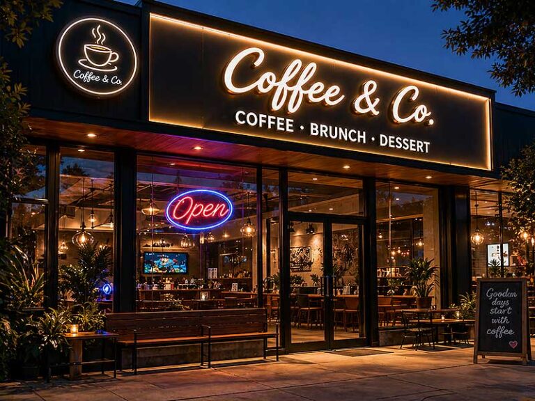
The best LED sign for an indoor logo wall is usually a backlit logo sign or acrylic LED logo sign when the goal is a clean, premium, and professional look. LED neon signs work better for casual, creative, lifestyle, beauty, fitness, cafe, and social media-friendly spaces. For corporate reception areas, clinics, hotels, and high-end retail interiors, backlit acrylic or metal signs often look more refined because they create soft depth without overpowering the room.
Think of a client walking into a reception area for the first time. They may not study your furniture, ceiling, or flooring one by one. But they will notice whether the logo wall feels clear, confident, and trustworthy. That single wall can quietly tell them whether the business is serious, modern, creative, warm, premium, or still “not quite finished.”
What Is an Indoor Logo Wall Sign?
An indoor logo wall sign is a custom brand sign installed on an interior wall, usually in a reception area, office lobby, retail store, salon, clinic, showroom, hotel, gym, or restaurant. It can be illuminated or non-illuminated, depending on the wall design and brand style. For most commercial spaces, its job is not only to display a logo. It helps the room look finished, gives visitors a clear brand impression, and creates a clean background for photos, videos, meetings, and customer check-ins.
What Does It Actually Do for a Space?
An indoor logo wall sign turns a plain wall into a branded focal point. In many projects, the wall behind the reception desk is the first place where visitors stop, talk to staff, sign in, or take photos. If that wall only has paint or wallpaper, the space may still feel empty. A well-sized logo sign makes the area look more complete.
For small businesses, this is especially important. A new salon, clinic, studio, cafe, or office may not have a large renovation budget, but a clean logo wall can immediately make the space feel more prepared for customers. For established brands, the sign helps maintain a consistent image across branches.
Common uses include:
| Business Type | Common Position | Main Purpose |
|---|---|---|
| Office or headquarters | Behind reception desk | Build trust and professional image |
| Beauty salon or spa | Front desk or selfie wall | Make the space more photo-friendly |
| Dental or medical clinic | Reception wall | Create a clean and credible feeling |
| Retail store | Checkout wall or brand wall | Strengthen brand memory |
| Gym or yoga studio | Mirror wall or training area | Add energy and identity |
| Hotel or showroom | Lobby or display wall | Create a premium first impression |
| Cafe or restaurant | Counter wall or dining area | Add atmosphere and visual appeal |
A useful way to judge whether a logo wall sign is needed is simple: when someone takes a photo in the space, does the brand appear clearly in the background? If not, the wall may be missing a strong visual anchor.
Which Signs Are Common for Indoor Logo Walls?
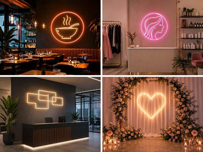
The most common indoor logo wall signs are backlit logo signs, acrylic LED logo signs, LED neon signs, metal dimensional letters, and light box signs. Each one creates a different feeling, so the choice should depend on the room, not only the logo.
Backlit logo signs are often used in offices, hotels, clinics, financial companies, law firms, and premium retail spaces. The light comes from behind the letters or logo shape, creating a soft halo on the wall. This style looks clean and professional, especially when paired with metal or acrylic faces.
Acrylic LED logo signs are flexible and suitable for many businesses. They can be made in different colors, thicknesses, and shapes, which makes them useful for salons, cafes, retail stores, clinics, showrooms, and office walls. Acrylic can also handle curved logos and detailed shapes better than many metal structures.
LED neon signs are more casual and eye-catching. They are popular for beauty studios, bars, gyms, cafes, event spaces, gaming rooms, and social media walls. They work well when the brand wants a fun, warm, or energetic look.
Here is a practical comparison:
| Sign Type | Best For | Typical Look | Buyer Should Watch |
|---|---|---|---|
| Backlit logo sign | Offices, clinics, hotels, premium stores | Soft, clean, professional | Needs good wire planning |
| Acrylic LED logo sign | Salons, stores, offices, cafes | Modern, flexible, bright | Edge quality and light diffusion matter |
| LED neon sign | Gyms, bars, beauty spaces, events | Fun, bold, photo-friendly | May look too casual for formal spaces |
| Metal dimensional letters | Corporate and luxury interiors | Solid, premium, simple | No light unless combined with LEDs |
| Light box logo sign | Retail, counters, menu areas | Bright and clear | Can look bulky if too thick |
For an indoor logo wall, “best” does not mean the brightest or most expensive. It means the sign looks natural in the room and matches how customers should feel when they enter.
How Big Should an Indoor Logo Wall Sign Be?
Size is one of the biggest decisions. Many buyers only say, “I want it to look good on the wall,” but the factory needs real measurements to avoid making the sign too small or too large.
For most reception walls, the logo sign usually looks balanced when it takes about 40% to 70% of the usable wall width. If there is a reception desk below the sign, the logo should not be wider than the desk unless the design intentionally needs a large brand wall effect. For small offices, salons, and clinics, a sign width between 600 mm and 1500 mm is common. For larger lobbies, showrooms, and hotels, the sign may be 1800 mm to 3000 mm or even larger.
A few details should be confirmed before production:
Wall width and height
Reception desk width
Ceiling height
Distance from viewer to wall
Logo shape: horizontal, square, round, or vertical
Whether the sign needs to appear in customer photos
Whether there is furniture, plants, lighting, or artwork near the wall
A common mistake is making the logo based only on the digital file. A logo that looks balanced on a computer screen may look small on a 4-meter-wide wall. The best method is to place a mockup on the real wall photo before production. This helps the buyer see whether the sign feels balanced with the desk, floor, ceiling, and surrounding space.
What Details Affect the Final Look?
The final look depends on several small details that customers often do not notice until the sign is installed. These details include material thickness, LED color, wall texture, wire exit, mounting distance, screw position, and surface finish.
Indoor signs are viewed from a short distance, often 1 to 3 meters away. That means rough edges, uneven lighting, visible glue, messy wires, or poor alignment can be seen clearly. Outdoor signs are usually judged from far away, but indoor logo wall signs are judged up close.
Important details include:
| Detail | Why It Matters |
|---|---|
| Material thickness | Affects depth, strength, and premium feeling |
| LED color | Changes the mood of the room |
| Light diffusion | Prevents dots, hot spots, and uneven glow |
| Wire exit position | Helps hide cables after installation |
| Mounting holes | Makes installation easier and cleaner |
| Wall surface | Affects halo effect and screw fixing |
| Finish quality | Impacts how premium the sign feels up close |
| Brand color matching | Keeps the logo consistent with the company identity |
For example, a warm white backlit sign on a beige wall may look soft and welcoming. The same sign with cool white LEDs on a dark glossy wall may feel sharper and more modern. Neither is wrong, but the feeling is different.
This is why buyers should not choose only from product photos. A product photo shows what the sign can look like in one setting. Your own wall, lighting, and interior style will decide whether the same style is suitable for your space.
What Should Buyers Confirm Before Ordering?
Before ordering an indoor logo wall sign, buyers should confirm the logo file, wall size, sign size, material, lighting color, power position, wire hiding method, mounting method, and installation accessories. These details directly affect price, production time, installation difficulty, and final appearance.
A good inquiry should include:
Logo file, preferably AI, EPS, SVG, PDF, or high-resolution PNG
Photo of the installation wall
Wall width and height
Preferred sign width or height
Indoor location, such as reception, clinic, salon, store, gym, or hotel lobby
Preferred sign style, such as backlit, acrylic LED, LED neon, or metal letters
Lighting color, such as warm white, neutral white, cool white, brand color, or RGB
Power supply position
Whether wires need to be hidden
Quantity and target delivery time
If the wall is still under renovation, wiring can be planned inside the wall for the cleanest result. If the wall is already finished, a backboard may help hide wires and reduce installation work. If the sign has many separate letters, a mounting template or pre-mounted backboard can help avoid crooked placement.
For clients ordering from overseas, packaging should also be discussed. Indoor logo signs may have delicate acrylic edges, polished metal surfaces, or separate letters. Foam protection, corner protection, carton strength, wooden crate options, and clear installation labels can reduce damage and make installation easier after delivery.
In short, an indoor logo wall sign is not just “a logo with lights.” It is a custom visual piece that needs to fit the actual wall, brand style, lighting environment, and installation conditions. The better these details are confirmed before production, the cleaner and more professional the final wall will look.
Which LED Sign Looks Best Indoors?

The best-looking indoor LED sign depends on the room style, brand tone, wall background, and how customers will view the sign. For most reception areas, offices, clinics, hotels, and premium retail spaces, backlit logo signs and acrylic LED logo signs usually look more professional. For cafes, salons, gyms, bars, events, and social media-friendly spaces, LED neon signs often create a stronger visual effect and better photo value.
Which Sign Gives the Most Premium Look?
For indoor logo walls that need a clean and high-end look, backlit logo signs are usually the safest choice. The light comes from behind the letters or logo shape, so the wall gets a soft halo instead of direct glare. This makes the sign feel more built into the space, especially when it is installed behind a reception desk, in an office lobby, hotel lobby, clinic, showroom, or luxury retail store.
A backlit sign works especially well when the wall already has a good finish, such as:
Painted feature wall
Wood veneer wall
Stone or marble-style wall
Textured wall panel
Dark matte wall
Reception counter background
For many business owners, the reason they choose a backlit logo sign is not because it is the brightest option. It is because it looks calm, stable, and more expensive. A brushed stainless steel face with warm white backlighting can make a law firm, dental clinic, hotel, or real estate office look more trustworthy. A matte black or white acrylic face with soft halo lighting can make a modern office or boutique store look clean and sharp.
A typical premium indoor logo wall sign often has:
30 mm to 80 mm letter depth, depending on logo size
Warm white, neutral white, or cool white LED lighting
Hidden wiring behind the wall or backboard
Individual letters mounted with spacers
Soft shadow around each letter
Clean screw positions or no visible screws from the front
The main thing to watch is the wall condition. A backlit sign needs enough space behind the letters to create the glow. If the wall surface is too rough, uneven, glossy, or crowded with decoration, the halo may not look as clean as expected.
Which Sign Is Best for Small Businesses?
For small businesses, acrylic LED logo signs are often the most practical indoor choice. They can look clean, modern, and customized without becoming too complicated. This makes them suitable for salons, nail studios, cafes, small clinics, boutiques, fitness studios, pet shops, beauty rooms, and small office reception areas.
Many small business owners care about three things:
Will the logo look professional?
Can it fit my actual wall size?
Will installation be too difficult?
Acrylic LED signs answer these questions well because they can be made in different sizes, colors, and shapes. They can also be mounted on a clear backboard, frosted backboard, or directly onto the wall, depending on the design. If the wall is already finished and the buyer does not want to open the wall for wiring, a backboard can help hide wires and make installation easier.
Here is a practical comparison for small business spaces:
| Business Space | Recommended Sign | Why It Works |
|---|---|---|
| Nail salon | Acrylic LED logo or LED neon sign | Soft, pretty, good for photos |
| Coffee shop | Warm white acrylic sign or LED neon sign | Cozy and photo-friendly |
| Dental clinic | White acrylic backlit sign | Clean and professional |
| Boutique store | Acrylic logo sign or small backlit sign | Modern and brand-focused |
| Yoga studio | Soft LED neon or warm backlit sign | Relaxed and gentle |
| Barber shop | LED neon or bold acrylic sign | Stronger style and personality |
| Small office | Acrylic LED logo sign | Clean, affordable, easy to install |
For a first indoor logo wall, acrylic is often a smart starting point. It does not need to feel cheap if the thickness, edge finish, light diffusion, and wiring are handled properly.
Which Sign Looks Best in Photos?
If the logo wall will appear often in customer photos, short videos, social media posts, or Google Business Profile images, the sign should be designed with camera performance in mind. In this case, LED neon signs and soft acrylic LED signs usually perform well because they create a clear visual focal point.
LED neon signs are especially popular for:
Beauty salons
Lash studios
Nail salons
Cafes
Bars
Gyms
Game rooms
Event spaces
Photo booths
Retail selfie walls
The reason is simple: LED neon signs are easy to notice in photos. They create strong lines, recognizable shapes, and a fun background. A short slogan like “Good Vibes,” “Glow Up,” “Open Late,” or a brand name in neon can become part of the customer experience.
However, brighter does not always mean better for photos. If the LED is too bright, phone cameras may overexpose the sign. The letters can become blurry white lines instead of readable text. For indoor photo walls, softer brightness or dimmable control is often better.
Buyers should consider:
Whether customers will stand close to the sign
Whether the wall is used for selfies or full-body photos
Whether the room lighting is warm or cool
Whether the sign color matches the brand and decor
Whether a dimmer is needed
Whether the sign should be readable in phone photos
For example, a pink LED neon sign may look perfect in a beauty room with soft lighting, but it may look too casual behind a serious clinic reception desk. A warm white acrylic logo may look less dramatic than neon, but it can photograph better in professional office environments.
Which Sign Fits Different Interior Styles?
The best indoor LED sign should match the interior design, not fight against it. Many buyers first choose a sign based on a product photo, but the final result depends heavily on the wall color, furniture, ceiling light, flooring, and brand personality.
A simple rule is this: the more formal the space, the softer and cleaner the sign should be. The more lifestyle-driven the space, the more expressive the sign can be.
| Interior Style | Better Sign Choice | Suggested Lighting |
|---|---|---|
| Corporate office | Backlit metal or acrylic logo | Warm white or neutral white |
| Medical clinic | Acrylic backlit logo | Neutral white or soft cool white |
| Luxury hotel lobby | Metal backlit logo | Warm white |
| Beauty salon | Acrylic LED logo or LED neon | Warm white, pink, or brand color |
| Cafe or dessert shop | LED neon or soft acrylic sign | Warm white or soft color |
| Gym or fitness studio | LED neon or bold acrylic sign | White, red, blue, or RGB |
| Retail store | Acrylic LED sign or backlit logo | Brand color or neutral white |
| Bar or lounge | LED neon or RGB sign | RGB, red, amber, blue |
| Real estate showroom | Backlit metal logo | Warm white or neutral white |
This is where many indoor sign projects succeed or fail. A sign can be well-made but still look wrong if it does not match the room. For example, a bright RGB neon sign may look exciting in a gym but out of place in a legal office. A brushed metal backlit sign may look premium in a hotel but too formal in a playful dessert shop.
The buyer should always share a wall photo before confirming the sign type. A good supplier can then suggest whether the logo should be backlit, front-lit, neon-style, acrylic, metal, or non-illuminated.
Which Sign Should You Avoid Indoors?
Some signs look good online but do not work well for indoor logo walls. The most common problem is choosing a sign that is too bright, too large, too thick, or too visually heavy for the room. Indoor signs are viewed at close distance, so small mistakes become obvious.
Buyers should be careful with:
Very bright signs in small reception areas
Large light boxes on narrow walls
RGB lighting in serious professional spaces
Thin LED neon details that make the logo hard to read
Mirror metal finishes in rooms with too many reflections
Signs with exposed wires on finished walls
Low-quality acrylic with rough or cloudy edges
Overly small tagline text that cannot be illuminated clearly
For example, a light box may work well in a retail store or menu area, but it can look bulky behind a high-end office reception desk. An LED neon logo may be great for a selfie wall, but if the logo has very small letters or complex shapes, the final sign may lose detail. A backlit sign may look premium, but if the wall has no clean power plan, visible wiring can ruin the effect.
Before ordering, buyers should ask a few practical questions:
Will this sign look good from 1 to 3 meters away?
Will the light be comfortable for people sitting nearby?
Can the wires be hidden?
Will the sign match the wall color and furniture?
Can the logo details be produced clearly at this size?
Will the sign still look good in photos?
For indoor logo walls, the best sign is usually the one that looks clean after installation, not just attractive in a catalog photo. A well-planned acrylic LED logo sign or backlit logo sign can make a room feel finished for years. A poorly planned sign, even if expensive, can make the whole wall look temporary.
How Should You Choose the Right Type?
You should choose the right indoor logo wall sign by looking at the actual wall, not only the product style. The best choice depends on the room type, wall size, logo shape, lighting condition, brand tone, installation method, and budget. A backlit logo sign may suit a law office or hotel lobby, while an LED neon sign may work better for a salon, gym, cafe, or photo wall.
What Type of Space Is It For?
The first question is not “Which sign is the most popular?” It should be “What kind of space will this sign live in?” A logo wall inside a dental clinic should not feel the same as a logo wall inside a cocktail bar. A reception sign in a law firm should not use the same visual language as a selfie wall in a nail salon.
For formal spaces, the sign should usually look clean, stable, and not too bright. Backlit metal letters, acrylic backlit logos, and non-illuminated dimensional letters are often better choices. These signs create a more professional look and are easier to match with office furniture, stone walls, wood panels, and neutral interiors.
For lifestyle spaces, the sign can be more expressive. LED neon signs, colorful acrylic LED signs, and custom-shaped signs can help the space feel more memorable. This is especially useful for businesses where customers take photos, share videos, or visit for atmosphere.
| Space Type | Better Sign Choice | Why It Works |
|---|---|---|
| Corporate office | Backlit metal or acrylic logo | Clean, stable, professional |
| Dental or medical clinic | White acrylic backlit sign | Bright, clean, trustworthy |
| Beauty salon | Acrylic LED logo or LED neon sign | Soft, pretty, photo-friendly |
| Cafe or dessert shop | Warm LED neon or acrylic logo | Cozy and social-media friendly |
| Gym or fitness studio | LED neon or bold acrylic sign | Stronger energy and visual impact |
| Hotel lobby | Metal backlit logo | Premium and calm |
| Retail store | Acrylic LED logo or backlit sign | Clear brand display |
| Bar or lounge | LED neon or RGB sign | Strong atmosphere |
A simple way to decide: if the business needs trust, choose cleaner lighting and premium materials. If the business needs attention and photos, choose stronger color and more expressive lighting.
What Is the Wall Background?
The wall background can completely change how the sign looks. The same backlit logo sign may look soft and expensive on a matte beige wall, but weak on a rough dark stone wall. A bright LED neon sign may look clean on a plain white wall, but messy on a patterned wallpaper.
Before choosing the sign type, check the wall carefully:
Is the wall light or dark?
Is the surface smooth, textured, glossy, or rough?
Is it painted, wood, stone, marble, tile, glass, or concrete?
Will the sign be installed behind a reception desk or on an open wall?
Is there already strong ceiling light or spotlighting?
Is the wall still under renovation or already finished?
Backlit signs usually need a wall that can reflect the halo effect. Matte painted walls, wood panels, and stone feature walls can work well. Glossy walls may create reflections, so the light may look stronger than expected. Very rough walls can make the halo uneven.
LED neon signs are less dependent on wall reflection because the light is more direct. They can work well on painted walls, acrylic panels, artificial greenery walls, brick walls, and decorative photo walls. But if the background is already visually busy, the sign shape should stay simple.
Acrylic LED signs are flexible and can work on many wall types. If the wall is difficult to drill or has no clean wiring plan, a pre-mounted acrylic backboard can make installation easier. This is common for salons, small stores, cafes, event walls, and finished office interiors.
How Detailed Is the Logo?
The logo shape has a big impact on the sign type. Some logos are easy to make as illuminated signs. Others need adjustment because small letters, thin strokes, gradients, and complex icons may not light evenly.
If the logo is simple, with bold letters and clear shapes, most sign types can work. Backlit letters, acrylic LED signs, LED neon signs, and metal dimensional signs are all possible. If the logo has very thin lines, small text, or complicated shapes, acrylic may be easier to produce than metal channel structures.
LED neon signs are good for simple line-style logos, handwritten fonts, short words, icons, and slogans. But they are not always suitable for detailed corporate logos. A small serif font, a complex emblem, or a detailed graphic may lose accuracy when converted into LED neon tubing.
Backlit signs work best when each letter or shape has enough width and depth to hold LEDs. If the strokes are too narrow, the light may become uneven or the factory may need to enlarge the logo. For very small tagline text, it is often better to make the tagline non-illuminated instead of forcing it to light up.
| Logo Detail | Better Choice | Reason |
|---|---|---|
| Simple bold letters | Backlit, acrylic, metal, or neon | Easy to produce clearly |
| Thin script font | LED neon or acrylic | Neon follows line shapes well |
| Complex icon | Acrylic LED or printed acrylic | Better detail control |
| Small tagline | Non-lit acrylic or metal | Easier to read cleanly |
| Premium brand logo | Backlit metal or acrylic | More refined appearance |
| Colorful logo | Acrylic LED or printed sign | Better color matching |
Before production, the logo should be checked as a real sign design, not only as a graphic file. A logo that looks perfect on a screen may need small production changes to work well on a wall.
How Bright Should the Sign Be?
Indoor brightness should be comfortable, not aggressive. Many buyers think a brighter sign must be better, but that is not true for indoor logo walls. Customers may stand only 1 to 3 meters away from the sign, so too much brightness can cause glare, overexposure in photos, and visual discomfort.
For reception areas, offices, clinics, hotels, and premium stores, soft lighting is usually better. Warm white or neutral white can make the wall feel welcoming and professional. For gyms, bars, cafes, gaming spaces, and entertainment venues, stronger colors or RGB lighting may make more sense.
A few real selection tips:
Choose warm white when the room uses wood, beige, cream, gold, or soft lighting.
Choose neutral white when the brand needs a clean and balanced look.
Choose cool white when the space is modern, medical, technical, or very bright.
Choose RGB only when color-changing effects match the brand or customer experience.
Choose a dimmer when the sign will be used for photos, videos, events, or changing room light.
Brightness should also match the wall color. A white sign on a white wall may need stronger contrast. A bright sign on a dark wall may need lower brightness to avoid glare. A neon sign in a small room should often use a dimmer, especially if people will sit near it.
For indoor logo walls, a good sign should look clear during daytime, under ceiling lights, and in phone photos. If the logo becomes a glowing blur in photos, the brightness is too strong or the light diffusion is not planned well.
What Budget and Installation Limits Matter?
Budget should not be judged only by the sign price. A slightly cheaper sign may become more expensive if it needs difficult installation, extra wiring work, repair, or replacement. For indoor logo walls, the total cost usually depends on sign size, material, lighting method, logo complexity, mounting method, packing, and shipping.
Acrylic LED signs and LED neon signs are often easier for small businesses because they can be pre-mounted on a backboard and installed with fewer steps. Backlit metal letters may look more premium, but they often require more accurate mounting, wire planning, and power positioning. Large signs may also need stronger packaging and more careful installation.
Buyers should check these cost-related details before ordering:
Does the wall already have a power outlet or hidden wire?
Will an electrician be needed?
Are the letters installed one by one or pre-mounted?
Does the sign need a backboard?
Is the sign large enough to require wooden crate packing?
Are mounting holes, screws, spacers, and templates included?
Does the power supply match the local voltage and plug type?
Can the sign be repaired or reordered later?
Here is a simple selection guide:
| Situation | Better Choice |
|---|---|
| Small budget, finished wall | Acrylic LED sign with backboard |
| Premium reception wall | Backlit metal or acrylic logo |
| Quick installation needed | Pre-mounted LED neon or acrylic sign |
| Hidden wiring available | Individual backlit letters |
| Photo wall needed | LED neon sign or soft acrylic LED sign |
| Multi-location brand | Standardized acrylic or backlit logo sign |
| Very detailed logo | Acrylic LED or mixed material sign |
The best sign type is the one that fits both the visual goal and the installation reality. A beautiful sign that cannot be wired cleanly will not look professional after installation. A slightly simpler sign with good size, clean wiring, and proper lighting often looks better in the final space.
What Materials Work Best?
The best materials for an indoor logo wall sign are usually acrylic, stainless steel, aluminum, painted metal, and sometimes a backboard made from acrylic, aluminum composite panel, or PVC foam board. Acrylic is flexible and clean for detailed logos. Metal feels more solid and premium. A backboard can make installation easier and help hide wires. The right material should match the wall, brand style, lighting method, and how close people will view the sign.
Is Acrylic a Good Choice?
Acrylic is one of the most practical materials for indoor logo wall signs because it is easy to shape, clean in appearance, and suitable for many logo styles. If the logo has curves, small icons, rounded letters, or custom colors, acrylic is often easier to work with than metal. It is widely used for reception signs, salon logo walls, cafe signs, clinic signs, retail store walls, gym signs, and showroom displays.
Acrylic can be used in different ways. It can be the front face of the logo, the illuminated body, the clear backing panel, or the light diffusion layer. For indoor signs, common acrylic thickness choices are often around 3 mm, 5 mm, 8 mm, 10 mm, or thicker depending on the sign size and structure. A small wall logo may only need a thinner acrylic face, while a larger sign needs more thickness to keep the shape stable and prevent the sign from looking too flat.
Acrylic works especially well when the buyer wants:
Clean logo edges
Smooth light diffusion
Custom brand color
Lower weight than metal
Detailed logo shapes
A modern indoor look
Easier wall installation
A clear or frosted backboard option
However, acrylic quality matters a lot. Low-quality acrylic may look cloudy, yellowish, or rough on the edges. Poor polishing can make the sign look cheap when customers stand close to it. Indoor signs are often viewed from 1 to 3 meters away, so edge quality is easy to notice.
| Acrylic Option | Best Use | What to Check |
|---|---|---|
| White acrylic | Clinics, offices, salons, stores | Light diffusion and surface smoothness |
| Clear acrylic | LED neon signs, backing panels | Scratch protection and edge polishing |
| Frosted acrylic | Premium soft logo walls | Even finish and clean cutting |
| Colored acrylic | Brand-color signs | Color matching with logo file |
| Printed acrylic | Complex logos or gradients | Print clarity and surface protection |
For buyers who want a clean indoor sign without a heavy structure, acrylic is usually a safe choice. But it should not be chosen only because it is common. The thickness, color, edge finishing, LED diffusion, and mounting method should all be confirmed before production.
Are Metal Letters Better?
Metal letters are better when the project needs a more solid, premium, and long-lasting appearance. Stainless steel, aluminum, and painted metal are common choices for office reception walls, hotel lobbies, real estate showrooms, corporate headquarters, law firms, financial offices, luxury retail stores, and high-end clinics.
Metal gives the sign more weight visually. Even when the sign is not very large, metal letters can make the wall feel more permanent and professional. This is why many formal spaces prefer brushed stainless steel, painted aluminum, mirror gold stainless steel, or matte black metal letters.
Metal letters are often used for:
Backlit logo signs
Halo-lit letters
Non-illuminated dimensional letters
Premium reception signs
Corporate logo walls
Hotel lobby logo signs
High-end retail brand walls
Metal is not always the right choice for every logo. If the logo has very thin strokes, small details, or complicated shapes, metal may need more production adjustment. Very small metal letters can also become expensive compared with acrylic because cutting, bending, welding, polishing, and painting all add work.
A simple comparison helps:
| Material | Visual Feeling | Best For | Possible Issue |
|---|---|---|---|
| Stainless steel | Premium, solid, professional | Offices, hotels, clinics, finance spaces | More expensive than acrylic |
| Aluminum | Light, clean, modern | Larger indoor signs, painted logo signs | Finish quality must be controlled |
| Painted metal | Brand-matched, modern | Retail, offices, showrooms | Paint color must be confirmed |
| Mirror metal | Luxury, eye-catching | Salons, hotels, luxury retail | Shows reflections and fingerprints |
| Brushed metal | Calm, premium, durable | Corporate and reception walls | May feel too formal for playful spaces |
For indoor logo walls, metal is usually chosen for appearance more than strength. The sign does not face wind or rain indoors, but it must look good up close. That means welding seams, paint finish, surface scratches, screw positions, and fingerprints need careful control.
What Finish Looks High-End?
A high-end finish does not always mean shiny. Many premium indoor logo walls use matte, satin, brushed, or softly lit finishes because they look calmer and more expensive in a real room. Glossy and mirror finishes can look beautiful in product photos, but they also reflect ceiling lights, people, cameras, furniture, and nearby windows.
For corporate offices, clinics, hotels, and premium stores, the safest finishes are usually brushed stainless steel, matte painted metal, white acrylic, frosted acrylic, or warm backlit finishes. These finishes look clean and do not distract from the logo itself.
For beauty salons, fashion boutiques, and lifestyle spaces, gold mirror, rose gold, colored acrylic, or soft LED neon may work better because these spaces often need stronger visual style and better photo appeal.
| Finish | Best Space | Visual Result | Buyer Tip |
|---|---|---|---|
| Brushed stainless steel | Office, hotel, clinic | Stable and professional | Good for serious brands |
| Matte black | Gym, fashion, tech office | Strong and modern | Needs contrast with wall color |
| White acrylic | Clinic, salon, office | Clean and soft | Works well with warm lighting |
| Frosted acrylic | Premium interior walls | Gentle and refined | Good for soft lighting |
| Gold mirror | Luxury retail, salon, hotel | Elegant and bright | Watch reflections |
| Painted brand color | Retail, cafe, showroom | Strong brand identity | Confirm color sample |
| Clear acrylic backboard | Neon signs, small shops | Light and simple | Keep edges polished |
A good finish should match the surrounding materials. If the reception desk has black stone, brushed metal letters may feel natural. If the space uses white walls and warm wood, warm white backlit acrylic may feel softer. If the wall is dark green, navy, or black, the sign may need stronger contrast or backlighting to remain readable.
Buyers should also consider cleaning and maintenance. Mirror finishes show fingerprints more easily. Matte finishes hide small marks better but may need careful handling during installation. Clear acrylic can scratch if not packed or cleaned properly. For indoor signs, the product may be touched during installation, cleaning, or front desk decoration, so surface protection is important.
Which Material Fits Different Spaces?
Different indoor spaces need different materials because customers expect different feelings from each business. A dental clinic should feel clean and trustworthy. A gym should feel energetic. A hotel lobby should feel premium. A cafe should feel warm. A salon should feel pretty and photo-friendly. Material choice should support that feeling.
For formal spaces, metal and backlit acrylic usually work best. They create a cleaner and more professional impression. For casual or lifestyle spaces, acrylic LED signs and LED neon signs are often more suitable because they feel lighter, warmer, and easier to photograph.
Here is a practical material guide:
| Space Type | Better Material Choice | Why It Works |
|---|---|---|
| Corporate office | Brushed metal, painted metal, acrylic backlit | Professional and stable |
| Dental clinic | White acrylic, frosted acrylic, soft backlit letters | Clean and comfortable |
| Beauty salon | Acrylic LED, gold metal, LED neon | Soft, stylish, photo-friendly |
| Cafe or dessert shop | Acrylic, LED neon, warm backlit sign | Cozy and memorable |
| Hotel lobby | Metal backlit letters, brushed stainless steel | Premium and calm |
| Retail store | Acrylic logo, painted metal, light box | Clear brand display |
| Gym or fitness studio | Bold acrylic, LED neon, matte metal | Strong and energetic |
| Real estate showroom | Metal backlit logo, acrylic backlit sign | High-end and project-focused |
| Kids space | Colored acrylic, soft LED sign | Friendly and safe-looking |
For example, a small nail salon may not need heavy metal letters. A pink acrylic LED logo or LED neon sign may fit the space better and create stronger social media value. A law office, on the other hand, may look more trustworthy with brushed metal letters and soft backlighting instead of bright colored neon.
If a buyer is not sure which material fits, the easiest way is to send a wall photo, logo file, and a reference image. A factory can then suggest whether the sign should use acrylic, metal, neon, backlit letters, or a mixed-material structure.
What Should Buyers Confirm Before Production?
Before production, buyers should confirm the material, thickness, finish, lighting method, mounting method, wire exit, wall condition, and packaging. These details directly affect the final look and installation experience. Many problems happen because the buyer only confirms the logo style but not the material structure.
For acrylic signs, buyers should confirm:
Acrylic thickness
Face color or printed color
Clear, frosted, or solid acrylic option
Edge polishing quality
Whether the sign needs a backboard
Whether the LED light should be front-lit, backlit, side-lit, or neon-style
For metal signs, buyers should confirm:
Metal type, such as stainless steel or aluminum
Surface finish, such as brushed, mirror, matte, or painted
Letter depth or return thickness
Paint color or metal color
Whether the sign is illuminated or non-illuminated
How the sign will be mounted to the wall
For all indoor logo wall signs, buyers should also confirm:
Logo file format
Wall size and wall photo
Expected sign size
Viewing distance
Interior lighting condition
Power supply position
Wire hiding method
Installation accessories
Packing method for international shipping
The best material is not chosen from a catalog alone. It is chosen after checking the real wall, logo shape, brand image, and installation condition. A simple acrylic logo can look premium if the thickness, light, and wiring are handled well. A metal sign can look expensive but still fail if the finish is scratched or the halo light is uneven.
For indoor logo walls, material selection should answer one practical question: when a customer stands in front of the wall, does the sign make the business look more professional, more trustworthy, and more complete? If the answer is yes, the material is doing its job.
How Should Lighting Be Planned?
Lighting for an indoor logo wall should be planned around the room, not only the logo. The right lighting should make the sign clear, comfortable, and consistent with the brand. For most indoor spaces, soft and even lighting works better than very strong brightness. Buyers should confirm LED color, brightness level, wall reflection, power position, dimming needs, and whether the sign will be used for photos or videos before production.
What Color Temperature Works Best?
Color temperature changes how the whole logo wall feels. Many buyers only ask for “white light,” but white light can look very different depending on the temperature. Warm white feels softer and more welcoming. Neutral white looks clean and balanced. Cool white feels brighter, sharper, and more modern.
For indoor logo walls, the most common choices are warm white, neutral white, cool white, and brand-color lighting. RGB can also be used, but it should match the business style.
| LED Color | Common Range | Best For | Visual Feeling |
|---|---|---|---|
| Warm white | 2700K–3500K | Hotels, cafes, salons, spas, restaurants | Soft, cozy, premium |
| Neutral white | 4000K–4500K | Offices, clinics, retail stores, showrooms | Clean, balanced, professional |
| Cool white | 6000K–6500K | Tech offices, gyms, medical spaces, modern interiors | Bright, crisp, sharp |
| Brand color | Custom | Retail, beauty, cafes, gyms, event spaces | Stronger brand recognition |
| RGB | Color changing | Bars, clubs, gyms, gaming rooms, events | Flexible, energetic, atmospheric |
Warm white is usually safer for spaces with wood, beige walls, cream furniture, gold details, or warm ceiling lights. It makes the logo feel more comfortable and less harsh. Neutral white is a good middle choice when the buyer wants the sign to look professional but not too yellow or too blue. Cool white works better in bright, modern, clean spaces, but it can feel cold if the room uses warm decoration.
For example, a dental clinic may choose neutral white or soft cool white because the space needs to feel clean. A beauty salon may choose warm white, pink, or soft brand-color lighting because the wall needs to look good in photos. A hotel lobby may choose warm white backlighting because the sign should feel premium, calm, and welcoming.
How Bright Should an Indoor Sign Be?
Indoor logo signs do not need to be extremely bright. In many cases, too much brightness makes the sign look cheaper, not better. Because indoor signs are usually viewed from 1 to 3 meters away, strong light can cause glare, wash out the logo shape, or make the sign hard to photograph.
The goal is not to “light up the whole room.” The goal is to make the logo readable and attractive without making people uncomfortable.
A good indoor brightness plan should consider:
Room size
Viewing distance
Wall color
Ceiling light strength
Whether people sit near the sign
Whether the sign appears in photos or videos
Whether the sign is used during daytime and evening
Whether the brand wants a soft or bold look
A reception sign behind a front desk usually needs controlled brightness. Staff may sit near it for hours. If the sign is too bright, it can become uncomfortable. A salon selfie wall may need stronger visual impact, but a dimmer is often useful because phone cameras can overexpose bright LED lines. A gym wall sign can be brighter because the space is larger and more energetic. A clinic should usually avoid strong glare because the environment needs to feel calm and clean.
Here is a practical brightness guide:
| Space | Suggested Lighting Style | Buyer Tip |
|---|---|---|
| Office reception | Soft backlit or neutral acrylic lighting | Avoid glare behind the front desk |
| Clinic reception | Even white lighting | Keep the sign clean and easy to read |
| Beauty salon | Soft warm white, pink, or brand color | Consider dimming for photos |
| Cafe wall | Warm white or soft neon | Match the cozy interior mood |
| Gym wall | Stronger white, red, blue, or RGB | Make sure the logo stays readable |
| Hotel lobby | Warm backlit lighting | Use soft halo, not strong direct light |
| Retail store | Brand color or neutral white | Balance sign light with product lighting |
For many indoor projects, a dimmer or remote control is worth considering. It gives the buyer more control after installation, especially when room lighting changes during the day.
How Can Light Stay Even?
Even lighting is one of the biggest signs of good production quality. When an indoor logo wall sign has bright spots, dark areas, visible LED dots, or uneven glow, customers can notice it quickly. This is especially true for reception walls, clinics, hotels, offices, and premium stores where people stand close to the sign.
Light uniformity depends on several details:
LED spacing
Letter depth
Acrylic diffusion
Wall distance
Logo stroke width
Power distribution
LED strip or module quality
Installation angle
For backlit logo signs, the distance between the logo and the wall affects the halo. If the letters are too close to the wall, the glow may look weak and narrow. If they are too far away, the sign may look separated from the wall. In many indoor projects, the factory needs to adjust the standoff distance based on the letter size and desired halo effect.
For acrylic LED signs, diffusion is important. If the acrylic is too thin or the LEDs are too close to the face, hot spots may appear. A better structure uses enough depth, proper LED layout, and suitable diffusion material so the light spreads more smoothly.
For LED neon signs, even light depends on the quality of the neon strip and how well the bending points are handled. Tight curves, small letters, and sharp corners need more care. If the logo is too detailed, some parts may look crowded or uneven when converted into neon lines.
Buyers should ask for production review before confirming the final design. A good supplier can point out whether the logo strokes are too thin, whether small text should be non-illuminated, or whether the sign needs a different structure for better lighting.
Should RGB or Dimming Be Added?
RGB and dimming can be useful, but they are not necessary for every indoor logo wall. The decision should depend on the space and how the sign will be used.
RGB lighting is suitable for businesses that want flexible atmosphere, color-changing effects, or event-style lighting. It works well for bars, gyms, clubs, gaming rooms, entertainment spaces, event venues, and some creative studios. It can also work for salons or beauty rooms if the brand style is playful and social-media focused.
But RGB is not always the best choice for professional reception walls. A law firm, clinic, financial office, real estate showroom, or corporate headquarters usually needs a stable brand impression. In these cases, fixed warm white, neutral white, or brand-color lighting often looks more professional.
Dimming is more practical than many buyers expect. A dimmer helps when:
The sign is used for customer photos
The room lighting changes from day to night
People sit near the sign
The sign is installed in a small room
The buyer wants softer light during business hours
The sign needs stronger light for events or videos
| Feature | Best For | When to Avoid |
|---|---|---|
| Fixed white light | Offices, clinics, hotels, stores | When color changes are needed |
| Brand-color light | Retail, salons, cafes, gyms | When brand color may change later |
| RGB | Bars, clubs, gyms, events, gaming spaces | Formal offices or medical spaces |
| Dimmer | Photo walls, reception signs, salons, cafes | Very simple low-budget projects |
| Remote control | Small businesses, event spaces | Projects needing hardwired wall control |
If the buyer is not sure, a fixed color plus dimming is often a safer choice than full RGB. It keeps the sign professional but still gives control over brightness.
What Power Details Should Be Confirmed?
Lighting planning is not complete until the power supply and wiring method are confirmed. Many indoor logo wall problems happen after production because the sign looks good, but the power cable has nowhere clean to go. For a reception wall, exposed wires can ruin the whole effect.
Before production, buyers should confirm:
Local voltage, such as 110V or 220V
Plug type or hardwiring requirement
Power supply position
Wire exit direction
Cable length
Whether wiring must be hidden
Whether a switch, dimmer, or remote is needed
Whether the wall is finished or still under renovation
Whether an electrician will install the sign
If the wall is still being built, the best solution is usually to reserve a hidden power point behind the logo position. This gives the cleanest result. If the wall is already finished, a backboard may help hide wires. For LED neon signs, a clear or colored acrylic backboard can also make installation easier and keep the wiring more controlled.
For signs with many separate letters, each illuminated part may need wiring routed to the back or connected through a central power line. This should be planned in the production drawing. The wire exit should not be decided after the sign is finished.
Power supply quality also matters. A stable power supply helps the sign run safely and reduces flickering. For indoor commercial spaces, buyers should also think about maintenance access. The power adapter or transformer should be hidden but not impossible to reach. If it fails years later, someone should be able to replace it without damaging the wall.
In short, good indoor logo wall lighting is not just about choosing a color. It is about making the sign readable, comfortable, photo-friendly, easy to power, and clean after installation. When the lighting, wall, logo, and wiring are planned together, the final sign looks intentional instead of added at the last minute.
How Is Installation Prepared?
Installation should be planned before production, not after the sign arrives. For an indoor logo wall sign, the buyer should confirm the wall size, wall material, power position, wire exit, mounting method, sign weight, backboard option, and accessory kit before the factory starts making the sign. A good installation plan helps the final wall look clean, avoids exposed wires, and reduces mistakes during local installation.
What Should Be Checked on the Wall?
The first step is to check the actual wall, not only the logo file. Many indoor logo wall projects look simple at the quotation stage, but the final result depends heavily on the wall condition. A sign behind a reception desk, salon counter, clinic front desk, hotel lobby, or retail checkout wall must fit the real space.
Buyers should take a straight front photo of the wall and measure the usable area. “Usable area” means the part of the wall where the logo can actually be installed, after considering the reception desk, ceiling height, side cabinets, plants, lamps, wall panels, doors, and other decoration.
Important wall details to confirm include:
Wall width and height
Distance from floor to ceiling
Reception desk height and width
Wall material, such as drywall, concrete, brick, wood panel, tile, marble, or glass
Whether the wall is flat, textured, glossy, or uneven
Whether there is a power outlet nearby
Whether the wall is finished or still under renovation
Whether the sign will be centered on the wall, desk, or room entrance
A common mistake is centering the sign only on the wall, while the reception desk is placed slightly to one side. After installation, the logo may look “wrong” even if the sign itself is made correctly. For reception walls, the sign is often visually centered with the desk or customer viewing angle, not always with the full wall width.
Here is a practical wall check table:
| Wall Detail | Why It Matters | What to Send the Supplier |
|---|---|---|
| Wall width and height | Helps confirm sign size | Clear measurements in mm or inches |
| Wall material | Affects screws and anchors | Drywall, concrete, wood, tile, glass, etc. |
| Wall photo | Helps judge position and style | Straight front photo, not angled only |
| Desk size | Helps balance sign proportion | Desk width and height |
| Power location | Affects wire exit and adapter position | Photo or marked position |
| Wall finish | Affects backlit glow | Matte, glossy, textured, stone, wood, etc. |
If the buyer can provide a wall photo with dimensions marked on it, the supplier can make a more accurate mockup and avoid many installation problems before they happen.
How Are Wires Hidden?
Hidden wiring is one of the biggest details that separates a professional logo wall from a temporary-looking sign. A beautiful backlit sign or acrylic LED logo can lose its value if the power cable runs visibly across the wall.
There are usually three common ways to handle wires for indoor logo wall signs.
The cleanest method is hidden wiring inside the wall. This works best when the wall is still under construction or renovation. The electrician can reserve a power cable behind the sign position, and the factory can place the wire exit on the back of the logo. After installation, the viewer sees only the sign, not the cable.
The second method is using a backboard to hide the wires. This is useful when the wall is already finished and the buyer does not want to open the wall. The sign can be mounted on an acrylic, metal, PVC, or aluminum composite backboard, and the wires can be routed behind the board. This method is common for salons, small stores, cafes, beauty studios, clinics, and finished office interiors.
The third method is side wire exit. This is used when the power outlet is nearby and the buyer accepts a short visible cable. It is not the most premium option, but it can be practical for small LED neon signs, temporary event signs, or low-budget indoor wall signs.
| Wiring Method | Best For | Visual Result | Buyer Should Know |
|---|---|---|---|
| Hidden inside wall | New renovation, premium reception wall | Cleanest look | Needs electrician and early planning |
| Behind backboard | Finished wall, easier installation | Clean and practical | Backboard becomes part of the design |
| Side wire exit | Small signs, quick setup, temporary use | Some cable may be visible | Lower-cost but less premium |
| Behind cabinet or desk | Reception walls with furniture | Mostly hidden | Cable route must be planned |
| Ceiling or wall channel | Commercial fit-out projects | Controlled wiring | Needs local installer support |
Before production, the wire exit direction should be confirmed. It can be back exit, left exit, right exit, top exit, or bottom exit. If this is not confirmed early, the installer may need to adjust the cable on site, which can make the wall look messy.
Do You Need a Backboard or Template?
A backboard or installation template can make installation much easier, especially for overseas clients who need local installers to mount the sign after delivery. It is also useful when the logo has many separate letters or small parts.
A backboard means the sign is pre-mounted on one panel. The panel can be clear acrylic, frosted acrylic, painted metal, PVC board, or aluminum composite panel. The installer only needs to fix the whole board onto the wall. This reduces the risk of crooked letters, uneven spacing, and wrong alignment.
A template is different. It is usually a paper or printed positioning guide that shows where each letter, screw, or hole should go. It helps the installer mount individual letters directly onto the wall. This is useful for backlit metal letters or acrylic letters when the client wants a floating logo look without a visible backboard.
Backboard and template options:
| Option | Best For | Advantage | Possible Trade-Off |
|---|---|---|---|
| Clear acrylic backboard | LED neon signs, small logo signs | Easy installation, light visual effect | Board edge may still be visible |
| Frosted backboard | Premium indoor walls | Softer look, hides wiring better | More visible than clear acrylic |
| Painted backboard | Brand walls, finished interiors | Can match wall or brand color | Must match room design |
| Metal backboard | Larger or premium signs | Stronger and cleaner structure | Higher cost and weight |
| Paper template | Individual letters | Keeps floating letter effect | Needs careful local installation |
| Pre-drilled template | Multi-letter logo signs | Faster and more accurate | Requires correct wall measurement |
A backboard is often better when the buyer wants easier installation. Individual letters are often better when the buyer wants a more high-end wall-integrated effect. The right choice depends on the wall, budget, installer skill, and expected look.
For small businesses, a pre-mounted backboard can save time and reduce stress. For premium office, hotel, or showroom projects, individual letters with a paper template may look more refined if the local installer is experienced.
What Mounting Method Is Best?
The best mounting method depends on the sign type, wall material, sign weight, and whether the sign is illuminated. A small acrylic sign can be easy to mount, while a large backlit metal logo may need stronger anchors and more accurate positioning.
Common mounting methods include screws, standoffs, spacers, studs, adhesive support, hanging kits, and backboard mounting. For indoor logo walls, screws and standoffs are the most common because they are stable and easier to service later.
Acrylic LED signs are often installed with screws through a backboard or with standoffs at the corners. LED neon signs are usually mounted on a clear acrylic board with pre-drilled holes. Backlit letters may use studs or spacers so the letters sit away from the wall and create a halo glow. Metal dimensional letters may use studs, adhesive support, or mounting templates depending on size.
| Sign Type | Common Mounting Method | What to Confirm |
|---|---|---|
| Backlit logo letters | Studs, spacers, screws | Letter depth, wall distance, wire exits |
| Acrylic LED logo sign | Screws, standoffs, backboard | Board size, hole position, power route |
| LED neon sign | Pre-drilled acrylic board | Hole position, wire direction, dimmer |
| Metal dimensional letters | Studs or adhesive support | Wall material and letter weight |
| Light box sign | Screws, brackets, wall anchors | Box depth, power entry, weight |
| Large logo sign | Anchors and reinforced fixing | Wall strength and installer ability |
Wall material changes the mounting method. Drywall may need anchors or reinforcement. Concrete and brick need drilling tools and proper wall plugs. Glass walls usually need special mounting planning and may not be suitable for direct drilling. Marble or tile walls need careful drilling to avoid cracking. Wood panels are easier to mount but still need the right screw type.
For overseas projects, the supplier should provide clear installation accessories and, when possible, an installation drawing. Even if the buyer uses a local installer, the factory should make the mounting logic easy to understand.
What Should Be Prepared Before Delivery?
Before delivery, the sign should not only be finished. It should be packed and labeled in a way that makes installation easier after arrival. This is especially important for international orders, multi-letter logos, acrylic signs, polished metal surfaces, and fragile LED neon signs.
A good pre-shipment preparation should include:
Final product photo or video
Lighting test photo or video
Wire exit confirmation
Power supply and plug confirmation
Mounting hole confirmation
Accessory kit confirmation
Installation drawing or simple guide
Labels for separate letters if needed
Protective film on acrylic or metal surfaces
Foam, corner protection, and carton or wooden crate packing
For signs with many separate parts, each letter or component should be labeled clearly. If the sign includes several words, icons, or small logo elements, the installer should know which part goes where. A printed layout drawing can prevent installation mistakes.
A typical indoor sign accessory kit may include:
Screws
Wall plugs or anchors
Standoffs or spacers
Mounting template
Power supply
Dimmer or remote control if requested
Cable connectors if needed
Installation guide
Spare small parts when possible
| Delivery Detail | Why It Matters |
|---|---|
| Product lighting test | Confirms the LEDs work before shipping |
| Photo/video confirmation | Lets buyer check appearance before delivery |
| Accessory kit | Reduces missing parts during installation |
| Labeled components | Helps installers place each part correctly |
| Protective film | Prevents scratches during transport |
| Strong packing | Reduces damage risk in international shipping |
| Installation drawing | Saves time for local installers |
For indoor logo wall signs, installation preparation is part of product quality. A sign can be well-made at the factory but still look poor if the wiring, mounting, or accessories are not planned correctly. The best result comes when the logo file, wall photo, sign structure, power route, mounting method, and packing details are confirmed together before production starts.
What Should You Check Before Ordering?
Before ordering an indoor logo wall sign, buyers should confirm the logo file, wall size, sign size, material, lighting color, power supply, wire exit, mounting method, installation accessories, and delivery requirements. These details affect the final look, quotation, production time, installation difficulty, and after-sales risk. A clear inquiry helps the factory recommend the right structure instead of guessing from a logo image only.
What Files Should Be Ready?
The first thing to check is the logo file. Many buyers send a screenshot, website logo, or low-resolution image and expect the final sign to match perfectly. That can work for a rough quote, but it is not enough for accurate production. If the logo needs clean edges, exact curves, correct letter spacing, and accurate brand shape, a vector file is much better.
The best file formats are usually AI, EPS, SVG, PDF, or CDR. These files allow the factory to scale the logo without losing quality. If the buyer only has PNG or JPG, the factory may need to redraw the logo before cutting or lighting design. This can affect cost, production time, and final accuracy.
Buyers should also check whether the logo has small text, thin strokes, shadows, gradients, or complex icons. Not every screen logo can be made as a lighted wall sign without adjustment. A tagline that looks clear on a website may be too small to illuminate evenly on a wall. In that case, the main logo can be illuminated, while the tagline can be made from non-illuminated acrylic or metal letters.
Useful files to send include:
Logo file in AI, EPS, SVG, PDF, or high-resolution PNG
Brand color reference, such as Pantone, CMYK, RGB, or HEX code
Wall photo where the sign will be installed
Reference image of the preferred sign style
Previous sign photo if this is a replacement project
Font name or brand guideline if available
For chain stores, offices, clinics, salons, or multi-location projects, it is also helpful to save the final production file after the first order. This makes future reorders much easier because the factory can repeat the same size, color, thickness, LED color, and mounting method.
| File or Reference | Why It Matters |
|---|---|
| Vector logo file | Keeps logo shape accurate during cutting |
| Brand color code | Helps match acrylic, paint, print, or LED color |
| Wall photo | Helps judge size, style, and installation method |
| Reference sign photo | Shows the buyer’s preferred look |
| Brand guideline | Helps keep the sign consistent with the brand |
| Previous sign photo | Useful for replacement or upgrade projects |
A clear file does not only help production. It also helps avoid wrong quotations. A simple bold logo and a complex multi-color logo may look similar in size, but they can require very different production methods.
How Should Size and Wall Details Be Confirmed?
Size should be confirmed with the real wall, not only by guessing from the logo. A logo that looks large on a computer screen may look small on a 3-meter-wide reception wall. A sign that looks balanced in a product photo may feel too wide behind a small front desk.
Before ordering, buyers should measure the usable wall area. This means the actual area where the sign can be installed after considering the desk, door, ceiling, cabinets, lamps, plants, artwork, and wall panels. For reception walls, the sign should often be centered with the reception desk or main viewing angle, not always with the full wall.
A practical indoor logo wall check should include:
Wall width and height
Reception desk width and height
Distance from floor to sign center
Viewing distance from the entrance or waiting area
Wall material, such as drywall, concrete, wood, stone, tile, or glass
Wall color and texture
Ceiling light position
Power outlet or reserved wire position
For many indoor projects, the sign width often falls between 600 mm and 1500 mm for small offices, salons, cafes, clinics, and studios. Larger lobbies, hotel spaces, showrooms, and corporate walls may use 1800 mm to 3000 mm or larger signs. These numbers are not fixed rules, but they help buyers understand the normal range.
A good way to avoid size mistakes is to request a mockup using the actual wall photo. The mockup should show the logo on the wall, with approximate size and position. This helps the buyer see whether the sign feels too small, too large, too high, too low, or visually unbalanced with the furniture.
| Detail to Confirm | Common Mistake | Better Practice |
|---|---|---|
| Wall size | Measuring only the full wall | Measure usable sign area |
| Desk position | Centering logo only on wall | Check visual center with desk |
| Sign width | Choosing by feeling | Use wall photo mockup |
| Logo height | Ignoring ceiling height | Keep enough top and bottom space |
| Viewing distance | Making letters too small | Check readability from entrance |
| Wall material | Assuming all walls install the same | Match mounting method to wall type |
Buyers should also consider whether the sign will appear in photos. If customers, staff, or visitors often take pictures in front of the wall, the sign should fit comfortably in the camera frame. It should not be so large that parts are cut off, and it should not be so small that the brand disappears in photos.
What Lighting and Power Details Matter?
Lighting and power should be confirmed before production because they affect the sign structure, wire exit, power supply, and installation method. Many buyers focus on the sign style first, then discover later that the power cable has no clean place to go. For an indoor logo wall, exposed wires can make even a beautiful sign look unfinished.
The buyer should confirm the LED color first. Common choices include warm white, neutral white, cool white, brand color, and RGB. Warm white is often used for hotels, salons, cafes, spas, and premium reception areas. Neutral white works well for offices, clinics, stores, and showrooms. Cool white fits modern, clean, technical, or medical spaces. RGB is better for bars, gyms, gaming rooms, event spaces, and entertainment-style walls.
Brightness should also match the room. Indoor signs do not always need strong brightness because customers may stand only 1 to 3 meters away. Too much brightness can cause glare, make photos look overexposed, and create discomfort for staff sitting near the sign. If the sign will be used for photos or videos, a dimmer can be useful.
Power details to confirm include:
Local voltage, such as 110V or 220V
Plug type or hardwired connection
Power supply location
Wire exit direction
Cable length
Whether a dimmer is needed
Whether a remote control is needed
Whether the adapter should be hidden
Whether an electrician will install the sign
| Lighting or Power Item | Why It Matters |
|---|---|
| LED color | Changes the mood of the logo wall |
| Brightness | Affects comfort and photo quality |
| Dimmer | Helps adjust light for day, night, and photos |
| Voltage | Must match the local power system |
| Plug type | Avoids adapter problems after delivery |
| Wire exit | Determines whether cables can be hidden |
| Power supply position | Affects installation and maintenance |
| Hardwiring | May require local electrician support |
If the wall is still under renovation, the cleanest option is to reserve hidden wiring behind the sign position. If the wall is already finished, the buyer may need a backboard to hide the wiring. For signs with separate illuminated letters, wire routing should be planned carefully so the installer does not need to improvise on site.
What Installation Details Should Be Checked?
Installation should be discussed before the sign is made. The sign type, wall material, weight, wiring method, and buyer’s installer skill all affect how the sign should be prepared. A small LED neon sign on a clear acrylic board may be easy to install. A large backlit metal logo with separate letters may need a template, spacers, anchors, and more careful wiring.
The buyer should confirm whether the sign will be installed directly on the wall or mounted on a backboard. Direct wall installation often looks more premium because the letters appear integrated with the wall. But it requires more accurate positioning and cleaner wiring. A backboard is easier to install and can hide wires, but it becomes part of the final look.
Common installation options include:
Individual letters mounted with studs or spacers
Acrylic backboard with pre-drilled holes
Clear backboard for LED neon signs
Painted backboard to match wall or brand color
Paper template for separate letters
Standoff mounts for acrylic panels
Screws and wall anchors for light boxes or larger signs
The wall material must also be checked. Drywall may need anchors or reinforcement. Concrete and brick need proper drilling tools. Wood panels are usually easier, but screw type still matters. Tile, marble, and glass need special care because drilling mistakes can damage the surface.
| Installation Detail | What to Confirm |
|---|---|
| Wall material | Drywall, concrete, wood, tile, stone, glass |
| Mounting method | Screws, studs, standoffs, spacers, backboard |
| Sign weight | Determines anchor strength |
| Hole position | Should match the production drawing |
| Template | Helps install separate letters accurately |
| Backboard | Helps simplify installation and hide wires |
| Accessories | Screws, anchors, spacers, remote, power supply |
| Installer | Professional installer or self-installation |
For overseas buyers, a clear installation drawing is very helpful. If the sign has several letters or logo parts, each part should be labeled. This reduces the chance of installing letters crooked, upside down, or with wrong spacing. For business owners who do not have a professional installer, a pre-mounted backboard is often the safer option.
What Production and Delivery Details Should Be Confirmed?
Before placing the order, buyers should confirm the production time, proofing process, pre-shipment testing, packaging method, shipping plan, and after-sales support. These details matter because indoor logo wall signs often include acrylic edges, polished metal surfaces, LED modules, wiring, and separate accessories. Damage or missing parts can delay installation.
A good pre-production confirmation should include:
Final artwork or production drawing
Material and thickness
LED color and lighting method
Sign size
Wire exit position
Mounting method
Backboard size if used
Power supply and plug type
Accessory list
Packaging method
Estimated production time and delivery method
Before shipment, the buyer should ask for photos or videos of the finished sign. For illuminated signs, a lighting test video is especially useful. It helps confirm whether the logo lights up correctly, whether the color looks right, and whether there are obvious dark areas or flickering issues.
For international shipping, packaging is not a small detail. Acrylic signs can scratch or crack if not protected well. Metal signs can be scratched if surfaces are not covered. LED neon signs need protection around bends and acrylic boards. Large signs may need stronger cartons or wooden crates.
| Delivery Detail | Why It Matters |
|---|---|
| Finished product photos | Confirms appearance before shipping |
| Lighting test video | Checks LED color and function |
| Protective film | Reduces scratches on acrylic or metal |
| Foam and corner protection | Helps prevent cracks and dents |
| Labeled parts | Makes installation easier |
| Accessory checklist | Reduces missing screw or power issues |
| Strong carton or crate | Protects larger signs during transport |
| Tracking and shipping plan | Helps plan installation schedule |
Buyers should also ask what happens if the sign is damaged during shipping or if one accessory is missing. Clear communication before ordering saves time later. For repeat orders or chain store projects, the supplier should keep production records so the next batch can match the first one.
A careful pre-order check may feel like extra work, but it protects the final result. The best indoor logo wall signs are not made from a logo file alone. They come from matching the logo, wall, lighting, wiring, mounting, packaging, and real installation conditions before production starts.
How Can You Get a Better Result?
The best result comes from treating the sign as part of the interior design, not as a separate decoration. Share real photos, measurements, brand colors, and installation needs early. Be open to material suggestions if the original idea does not fit the logo or wall condition. Ask for a mockup before production. Confirm the power supply and mounting method before shipping.
If you are planning a reception area, brand wall, salon front desk, clinic logo wall, office lobby, retail checkout wall, gym photo wall, hotel lobby, or showroom display, Iduoduo can help turn your logo into a custom indoor LED sign that fits your space. You can send your logo and wall details to request a custom quote, compare sign types, and confirm the best solution before production starts.
A good indoor logo wall sign should feel natural the moment it is installed. It should not look like a random product added at the end. It should look like the wall was designed for the brand from the beginning.