Choosing between front-lit and back-lit signs is not just a design choice. It affects how people see your business from the street, how your brand feels at night, how much the sign costs to produce, and how easy it is for your installer to mount it on the wall. A front-lit sign may look bright and direct, while a back-lit sign may feel softer and more premium. But the better option depends on the real project: the wall color, viewing distance, local lighting, weather, brand style, budget, and installation method.
For many storefronts, the wrong choice does not look “wrong” in a design file. It only becomes obvious after installation. The letters may be too soft to read from the road. The halo may disappear on a dark wall. The front-lit face may look too bright for a luxury clinic. The wire exit may not match the wall power point. That is why this decision should be made before production, not after the sign arrives.
The best way to choose between front-lit and back-lit signs is to match the lighting method to the business goal. Choose front-lit signs when you need strong visibility, clear reading, and better street impact. Choose back-lit signs when you want a softer glow, a more premium look, and a cleaner architectural feel. Choose front-and-back-lit signs when the project needs both readability and atmosphere.
Think of a sign as a silent front door. A busy restaurant may need a sign that says, “You can find us quickly.” A boutique hotel may need one that says, “This place feels refined.” A gym may want energy. A law firm may want trust. A coffee shop may want warmth. The sign lighting should support that first impression before anyone walks inside.
What Are Front-Lit and Back-Lit Signs?

Front-lit signs shine through the front face of the letters or logo, so they are bright, clear, and easy to read from a distance. Back-lit signs, also called halo-lit or reverse-lit signs, shine backward onto the wall, creating a softer glow around the letters. One is better for visibility; the other is better for a premium atmosphere.
What Is a Front-Lit Sign?
A front-lit sign is the type of illuminated sign most people picture when they think of a bright storefront sign. The LEDs are installed inside the letters or logo, and the light passes through the front face. The front face is usually made from translucent acrylic, while the sides are often aluminum, stainless steel, or painted metal.
For a business owner, the biggest advantage is simple: people can read it quickly. If someone is walking past a coffee shop, driving into a shopping plaza, or looking for a restaurant at night, a front-lit sign gives them a direct visual cue. The illuminated face makes the name stand out without needing people to stand close to the building.
Front-lit signs are commonly used for:
- Restaurant storefront signs
- Coffee shop signs
- Retail store signs
- Gym and fitness studio signs
- Salon and beauty shop signs
- Pharmacy and clinic storefronts
- Shopping mall tenant signs
- Franchise store signs
- Outdoor channel letters
- Custom business logo signs
A typical front-lit sign may include these parts:
| Part | Common Material | What It Does |
|---|---|---|
| Front face | Acrylic or polycarbonate | Lets light pass through |
| Letter return | Aluminum or stainless steel | Forms the letter body |
| Back plate | Aluminum, PVC, or metal | Holds the LEDs and structure |
| LEDs | LED modules or strips | Provide illumination |
| Power supply | Indoor or outdoor-rated driver | Converts power for LEDs |
| Mounting parts | Studs, screws, raceway, or backer | Helps install the sign |
| Wiring | Low-voltage cable | Connects letters to power |
For outdoor use, front-lit signs usually need stronger sealing, outdoor-rated LEDs, suitable power supplies, and proper wire exits. For indoor use, the focus is more on clean finish, even light, and hidden wiring.
When ordering a front-lit sign, the most useful details to confirm are:
- Final sign width and height
- Letter depth
- Acrylic face color
- LED color or color temperature
- Indoor or outdoor use
- Wall material
- Mounting method
- Wire exit position
- Voltage and plug type
- Whether a raceway or backer panel is needed
- Whether installation accessories are included
A common mistake is only asking, “How much is this logo sign?” A better question is, “Can this logo be made bright, readable, waterproof, and easy to install at this size?” That question helps avoid problems later.
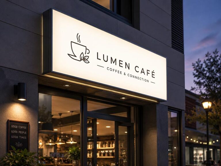
What Is a Back-Lit Sign?
A back-lit sign lights up from behind. The front face is usually opaque, so the light does not shine directly through the front. Instead, the LEDs shine backward onto the wall, creating a halo glow around the letters or logo.
This is why back-lit signs are also called halo-lit signs or reverse-lit channel letters. The glow is not as direct as a front-lit sign, but it feels softer and more designed. It can make a logo look like it is floating slightly away from the wall.
Back-lit signs are often chosen when the business wants a more premium look, such as:
- Hotel lobby logo signs
- Corporate reception signs
- Beauty salon brand walls
- Med spa and clinic signs
- Law firm office signs
- Jewelry store signs
- Boutique retail signs
- Restaurant feature walls
- Cafe photo walls
- Real estate sales center signs
- Office building logo signs
The front face of a back-lit sign can use different finishes:
| Finish | Visual Effect | Suitable Places |
|---|---|---|
| Matte black | Clean and modern | Offices, boutiques, restaurants |
| Brushed stainless steel | Professional and premium | Lobbies, clinics, law firms |
| Mirror gold | Luxury and decorative | Salons, hotels, jewelry stores |
| Painted aluminum | Flexible and brand-friendly | Retail, restaurants, offices |
| White acrylic or metal | Minimal and clean | Clinics, cafes, modern interiors |
| Bronze or champagne finish | Warm and upscale | Hotels, spas, real estate spaces |
Back-lit signs depend heavily on the wall. A smooth white wall can reflect the glow beautifully. A dark brick wall may absorb much of the light. A rough stone wall may create uneven shadows. That does not mean back-lit signs cannot be used on these walls, but the structure may need adjustment.
For example:
| Wall Condition | What May Happen | Practical Solution |
|---|---|---|
| Smooth white wall | Clean halo glow | Standard back-lit design works well |
| Dark wall | Glow may look weak | Use stronger LEDs or a backer panel |
| Rough brick wall | Halo may look uneven | Increase spacing or use a flat panel |
| Glossy tile | Light may reflect sharply | Test light color and distance |
| Wood wall | Glow may feel warm but soft | Use proper LED color temperature |
| Outdoor facade | Weather exposure matters | Confirm waterproof structure |
For back-lit signs, installation spacing is very important. If the sign sits too close to the wall, the halo may be too narrow. If it sits too far away, the glow may look too spread out or the hardware may become visible. The supplier should confirm standoff depth, letter depth, LED layout, and wire exit before production.
Are Back-Lit Signs the Same as Halo-Lit Signs?
In most real sign projects, yes. When clients say “back-lit sign,” “halo-lit sign,” or “reverse-lit sign,” they usually mean a sign where the light shines backward and creates a glow on the wall.
The names are different because people describe the sign from different angles:
| Term | What It Describes |
|---|---|
| Back-lit sign | The light direction: backward |
| Halo-lit sign | The visual effect: glow around the letters |
| Reverse-lit sign | The structure: light exits from the back |
| Backlit channel letters | The product type: channel letters with rear lighting |
However, the final halo effect is not automatic. A back-lit sign can look excellent or disappointing depending on the details. Many clients send a reference photo and say, “I want this glow,” but the reference may be installed on a smooth white wall, while their real wall is black brick or rough concrete. The same sign will not look the same in both places.
The halo effect is mainly affected by:
- Wall color
- Wall texture
- Letter depth
- Distance from wall
- LED brightness
- LED spacing
- Rear diffuser design
- Sign size
- Light color
- Ambient lighting nearby
For a soft luxury look, warm white light around 3000K may be suitable. For a clean modern office, neutral white around 4000K may look better. For a medical clinic or technology brand, cooler white may fit the space. RGB can work for bars, entertainment spaces, gyms, and nightlife venues, but it may feel wrong for a law firm or clinic.
A practical example:
| Business Type | Common Back-Lit Style |
|---|---|
| Hotel | Warm white halo with metal letters |
| Law firm | Neutral white halo with brushed metal |
| Beauty salon | Warm white or soft pink glow with gold finish |
| Dental clinic | Clean white halo with white or silver letters |
| Restaurant | Warm halo with black or bronze letters |
| Retail boutique | Soft halo with matte or mirror finish |
So, back-lit and halo-lit can usually be treated as the same category, but the project still needs technical confirmation. The name alone is not enough.
How Do They Light Up Differently?
Front-lit signs and back-lit signs create different effects because the light travels in different directions.
A front-lit sign sends light forward. The viewer sees the bright face of the letters. This makes the sign clear and readable, especially from the street. It is practical for businesses that need people to find them quickly.
A back-lit sign sends light backward. The viewer sees the solid letter face and the glow around it. It is less about direct brightness and more about depth, shadow, and atmosphere.
The difference can be understood like this:
| Feature | Front-Lit Sign | Back-Lit Sign |
|---|---|---|
| Main light direction | Forward | Backward |
| Main purpose | Readability | Premium glow |
| Best viewing distance | Medium to long distance | Close to medium distance |
| Best location | Storefronts, roadsides, plazas | Lobbies, feature walls, premium facades |
| Wall dependence | Lower | Higher |
| Daytime look | Depends on acrylic face and returns | Depends on metal or opaque face finish |
| Nighttime look | Bright and direct | Soft and dimensional |
| Installation focus | Mounting and wiring | Spacing, halo reflection, hidden wiring |
| Common risk | Too bright or uneven face | Weak halo or visible wires |
For a restaurant on a busy road, front-lit letters may bring better value because people need to read the name fast. For a boutique hotel entrance, back-lit metal letters may fit better because the goal is not only to be seen, but also to look refined.
For some projects, the best answer is not one or the other. A front-and-back-lit sign can combine both effects. The front face lights up for visibility, while the back creates a halo glow. This is often used for flagship stores, premium restaurants, retail chains, and commercial building signs.
Which Details Should Be Confirmed Before Choosing?
Before choosing between front-lit and back-lit signs, the buyer should confirm how the sign will be used in real life. A design file only shows the logo. It does not show the wall condition, viewing distance, wiring path, installation difficulty, or night environment.
A practical project checklist:
| Detail to Confirm | Why It Matters |
|---|---|
| Indoor or outdoor use | Affects waterproof structure and power supply |
| Viewing distance | Decides whether visibility or atmosphere matters more |
| Wall color | Especially important for back-lit signs |
| Wall surface | Smooth, rough, glossy, brick, stone, glass, or panel |
| Sign size | Affects readability, cost, and packaging |
| Letter depth | Affects light spread and structure |
| Logo complexity | Thin strokes may need adjustment |
| LED color | Changes the feeling of the sign |
| Mounting method | Affects installation time and final look |
| Wire exit position | Helps hide cables and match the power point |
| Voltage and plug | Must match the destination country |
| Waterproof level | Important for outdoor and semi-outdoor signs |
| Packaging method | Important for international shipping |
| Testing before shipment | Reduces after-sales problems |
For small shop owners, the most important points are usually price, visibility, easy installation, and whether the sign fits the storefront. For sign companies and contractors, the most important points are structure, drawing accuracy, mounting details, wire exits, power supply matching, and repeatable quality. For brand teams and designers, color, material, finish, and overall visual consistency matter more.
A good supplier should ask questions before production, not only after payment. Useful files and information include:
- Logo file in AI, PDF, SVG, CDR, or high-resolution format
- Target size
- Installation wall photo
- Indoor or outdoor use
- Preferred lighting effect
- Wall material
- Power location
- Destination country
- Required deadline
- Quantity
- Packaging requirement
With these details, the factory can suggest whether front-lit, back-lit, or front-and-back-lit signage is more suitable. This also helps avoid common problems such as weak brightness, uneven glow, wrong wire position, visible cables, oversized power supplies, or poor fit with the wall.
For custom LED signs, the lighting choice should not be made only from a product photo. It should be made from the real use case. A sign that looks perfect for a hotel lobby may not work for a roadside restaurant. A bright storefront sign may not feel right in a quiet clinic reception. The right sign is the one that fits the wall, the viewer, the brand, and the installation plan.
Which Sign Is More Visible?

Front-lit signs are usually more visible because the illuminated face points directly toward viewers. They are better for busy streets, storefronts, shopping centers, and locations where people need to read the business name quickly. Back-lit signs can still be visible at night, but they work better when viewers are closer and the wall reflects light well.
Which Works Better on Busy Streets?
Front-lit signs usually work better on busy streets because they are easier to read in a short time. A person driving past a restaurant, gym, pharmacy, or coffee shop may only glance at the sign for one second. In that moment, the sign needs clear contrast, simple letter shapes, and enough brightness.
A front-lit sign helps because the face of each letter lights up directly. The business name does not depend as much on wall reflection. This makes it more reliable in areas with traffic, streetlights, other shop signs, and window displays.
Good use cases for front-lit signs include:
- Roadside restaurants
- Retail storefronts
- Shopping plaza shops
- Fast food stores
- Bubble tea shops
- Gyms and fitness studios
- Convenience stores
- Auto service shops
- Pharmacies
- Chain store facades
Back-lit signs can still work on a busy street, but they need more careful planning. The letters may need to be larger. The halo may need to be stronger. The wall may need a light-colored backer panel. Without these details, a back-lit sign can look beautiful up close but too soft from across the road.
How Does Viewing Distance Matter?
Viewing distance is one of the most important details when choosing the lighting type. A sign seen from 10 feet away can be softer. A sign seen from 100 feet away needs stronger readability.
For long viewing distances, front-lit signs are usually safer. The bright face makes the letter shape more obvious. This is useful for storefronts facing parking lots, main roads, wide streets, or open commercial areas.
For short viewing distances, back-lit signs can work very well. A customer standing near a reception desk, lobby wall, salon mirror wall, or restaurant feature wall can enjoy the glow and material details. They do not need the sign to shout.
A practical comparison:
| Viewing Distance | Better Option | Why |
|---|---|---|
| 5–15 ft | Back-lit or front-lit | Both can work; style matters more |
| 15–50 ft | Front-lit or dual-lit | Readability becomes more important |
| 50–150 ft | Front-lit | Direct light is easier to read |
| Indoor close view | Back-lit | Soft glow feels more premium |
| Large outdoor facade | Front-lit or dual-lit | Needs both scale and visibility |
The logo design also matters. Thin script fonts, small icons, and narrow strokes may look elegant on a computer screen but become harder to read after production. Before ordering, ask for a mockup with actual size, not just a pretty logo preview.
Is Daytime Readability Different?
Yes. A sign should look good when it is turned off during the day, not only when it is glowing at night. This is especially important for storefronts and offices that operate in daylight.
Front-lit signs often use colored acrylic faces. That means the brand color can still be visible during the day. For example, a red restaurant logo, blue clinic logo, or green retail logo can stay recognizable even before the LEDs turn on.
Back-lit signs usually have opaque front faces. These can look very premium during the day if the material is well chosen. Brushed stainless steel, matte black, mirror gold, white painted aluminum, and champagne metal finishes can all create a refined daytime look.
But there is a risk. A black back-lit sign on a dark wall may look weak during the day. A gold mirror sign in a very bright space may reflect too much. A white sign on a white wall may need a slight shadow, thickness, or backer plate to avoid disappearing.
Before production, check:
- What does the sign look like when switched off?
- Does the face color contrast with the wall?
- Does the material match the interior or facade?
- Will sunlight create reflection problems?
- Is the logo still readable in daylight?
A good sign should not only perform after sunset. It should support the brand all day.
Are Back-Lit Signs Bright Enough at Night?
Back-lit signs can be bright enough at night, but they are not designed to behave like front-lit signs. Their light is indirect. It depends on the wall to reflect the glow.
A back-lit sign works well at night when:
- The wall is light or medium colored
- The surface is smooth
- The letters have enough depth
- The LEDs are evenly placed
- The mounting distance is correct
- The surrounding area is not too bright
- The sign size is large enough for the space
For a hotel lobby, beauty clinic, boutique store, or restaurant interior, this can be perfect. The glow feels warm and intentional. It creates a better atmosphere than a very bright front-lit face.
For a busy outdoor storefront, the answer depends on the environment. If the business is on a dark, quiet street, back-lit may be enough. If it is surrounded by bright signs and traffic lights, back-lit alone may be too subtle.
In that case, a dual-lit sign can solve the problem. The front face gives readability, and the back glow gives a premium finish.
Which Sign Looks Better for Your Brand?

Front-lit signs usually look brighter, clearer, and more direct, so they are better for storefronts that need strong visibility. Back-lit signs usually look softer, cleaner, and more premium, so they work well for lobbies, salons, clinics, hotels, offices, boutiques, and brand walls. The better choice depends on what your brand needs people to feel at first glance.
What Brand Style Fits Front-Lit Signs?
Front-lit signs fit brands that need quick recognition. The light comes through the front face, so the logo or letters are easy to read from the street, parking lot, sidewalk, or shopping plaza. This makes front-lit signage practical for businesses that rely on walk-in traffic and night visibility.
A front-lit sign usually gives these brand signals:
| Brand Signal | What Customers Feel |
|---|---|
| Bright | The business is open and easy to find |
| Clear | The name can be read quickly |
| Active | The brand feels lively and commercial |
| Friendly | The store feels approachable |
| Practical | The sign is made for real visibility |
| Consistent | Good for chain stores and repeat locations |
Front-lit signs are usually a strong match for:
- Restaurants
- Coffee shops
- Bubble tea stores
- Bakeries
- Retail stores
- Gyms
- Pharmacies
- Convenience stores
- Car wash shops
- Shopping mall stores
- Franchise storefronts
For example, a burger shop beside a busy road should not choose a very soft halo-lit sign only because it looks stylish in a hotel photo. That sign has one main job: help people notice the restaurant fast. A front-lit sign with clear letter shapes, strong contrast, and even LED light will usually bring better value.
Front-lit signs also work well when brand color matters. Red, blue, green, orange, pink, and white acrylic faces can make the logo more recognizable at night. For multi-store brands, this is useful because each location can keep the same visual identity.
Before choosing front-lit signage, confirm:
- Is the logo easy to read from the expected distance?
- Does the acrylic face match the brand color?
- Is the LED layout even, without dark areas?
- Will the brightness feel comfortable in the actual location?
- Is the sign for indoor, outdoor, or semi-outdoor use?
- Can the wire exit and mounting holes match the wall?
- Does the sign need a raceway, backer panel, or individual letters?
A good front-lit sign should not simply be bright. It should be bright, clean, readable, and matched to the storefront.
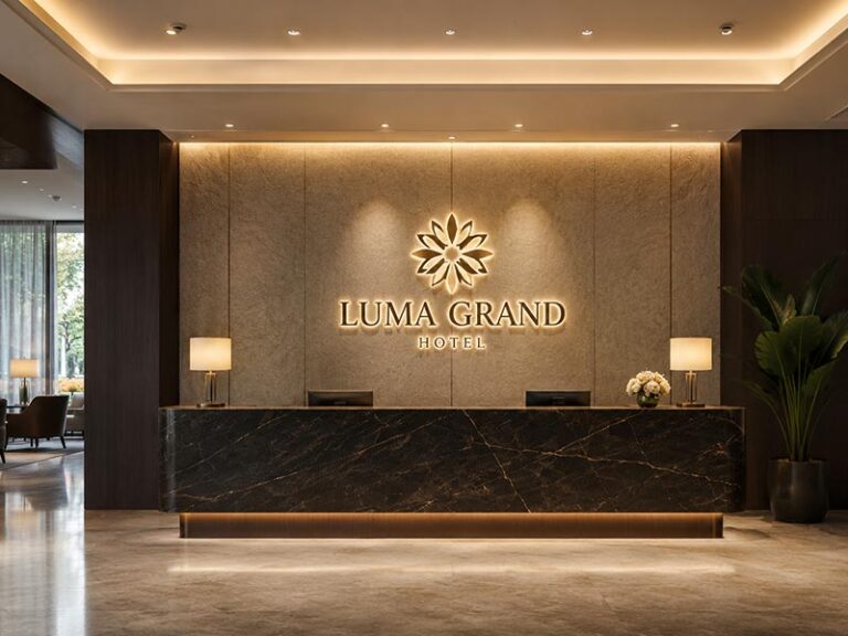
What Brand Style Fits Back-Lit Signs?
Back-lit signs fit brands that want a softer and more refined look. The light shines backward onto the wall, creating a halo around the letters. This effect feels less direct than front-lit signage, but it can make the space look more polished.
Back-lit signs are often chosen by businesses where customers judge the space closely, such as beauty salons, med spas, clinics, hotels, offices, law firms, boutiques, jewelry stores, and reception areas. In these spaces, people do not only look for the business name. They also notice the material, glow, wall finish, and wiring details.
A back-lit sign usually gives these brand signals:
| Brand Signal | What Customers Feel |
|---|---|
| Premium | The brand feels more refined |
| Calm | The light is softer and less aggressive |
| Professional | Good for offices, clinics, and lobbies |
| Stylish | Metal finishes look strong during the day |
| Warm | Halo glow can make the space feel welcoming |
| Designed | The sign feels like part of the interior |
Back-lit signs are usually suitable for:
- Hotel lobby logo walls
- Office reception signs
- Dental clinic signs
- Beauty salon logo walls
- Med spa signs
- Law firm reception signs
- Jewelry store signs
- Boutique retail signs
- Restaurant interior walls
- Cafe photo walls
- Real estate sales center signs
For example, a beauty salon with beige walls, gold details, and soft lighting may look better with a warm back-lit logo than a very bright front-lit sign. The customer should feel that the space is clean, comfortable, and worth paying for. A soft halo behind metal or acrylic letters can support that feeling.
But back-lit signs need the right wall. A smooth white wall reflects the halo well. A black brick wall may absorb the glow. A rough stone wall may create uneven shadows. If the wall is dark or textured, the sign may need stronger LEDs, a deeper letter body, a light-colored backer panel, or a front-and-back-lit structure.
Before choosing back-lit signage, confirm:
- Is the wall smooth enough for a clean halo?
- Is the wall color too dark?
- Is the sign viewed up close or from far away?
- Can the wires be hidden?
- Is there enough space behind the letters?
- Should the light be warm white, neutral white, cool white, or RGB?
- Does the front material look good when the lights are off?
Back-lit signage is not only about glow. It is about the full wall effect.
Which Materials Make the Sign Look More Premium?
Materials can change the whole feeling of a sign. The same logo can look casual, modern, luxury, professional, or cheap depending on the face material, side finish, paint quality, and lighting color.
For front-lit signs, the acrylic face is very important because the light passes through it. If the acrylic diffuses light evenly, the sign looks cleaner. If the LED spacing is poor, the face may show bright dots or dark shadows.
For back-lit signs, the front material matters more because people see the solid letter face during the day. Brushed stainless steel, mirror gold, matte black, champagne metal, and painted aluminum can all create very different brand impressions.
| Material or Finish | Visual Feeling | Common Use |
|---|---|---|
| Translucent acrylic | Bright, clean, colorful | Front-lit storefront signs |
| White acrylic | Minimal and soft | Clinics, cafes, offices |
| Painted aluminum | Clean and flexible | Restaurants, retail, offices |
| Brushed stainless steel | Professional and stable | Lobbies, clinics, law firms |
| Mirror stainless steel | Decorative and eye-catching | Retail, beauty, hospitality |
| Mirror gold | Luxury and warm | Salons, hotels, jewelry stores |
| Matte black | Modern and calm | Restaurants, boutiques, offices |
| Bronze or champagne | Warm and upscale | Hotels, spas, real estate spaces |
| Acrylic backer panel | Clean and easy to install | Indoor brand walls |
| Aluminum backer panel | Strong and practical | Outdoor or uneven wall projects |
Premium does not always mean expensive. It means the sign looks right for the space. A matte black back-lit logo may look more premium in a modern office than a mirror gold logo. A bright white front-lit sign may look more professional for a pharmacy than a soft halo sign.
Before confirming materials, check:
- Will customers see the sign up close?
- Does the material match the wall and interior design?
- Does the finish match the brand position?
- Is the sign for indoor or outdoor use?
- Will the surface be easy to clean?
- Will the finish scratch easily during shipping?
- Can the same material be repeated for future orders?
For chain stores and brand projects, material consistency is very important. If one location uses brushed stainless steel and another uses painted aluminum, the same logo may look like two different brands.
How Should Different Businesses Choose?
Different businesses should not choose signs in the same way. A restaurant, clinic, gym, law firm, hotel, and boutique store have different customer expectations. The sign should match how people decide whether the place feels right.
A restaurant usually needs visibility first. Customers may be walking, driving, or comparing several places at once. A clear front-lit exterior sign helps them find the location quickly. Inside the restaurant, a back-lit or neon-style logo wall can create atmosphere and make the space more photo-friendly.
A clinic or dental office needs trust. The sign should look clean, stable, and professional. A soft back-lit acrylic or metal sign often works better than a very colorful or flashy sign.
A hotel needs both recognition and mood. The exterior sign may need strong visibility, while the lobby sign should feel calm and premium.
A gym needs energy. Front-lit signs, bold letters, or RGB interior signs may fit better than a very subtle halo effect.
A retail brand may need consistency. If the same logo will be used across many stores, the sign structure, material, color, lighting, and mounting method should be easy to repeat.
| Business Type | Better Visual Direction | Suggested Sign Type |
|---|---|---|
| Fast food restaurant | Bright and easy to read | Front-lit |
| Coffee shop | Warm and friendly | Front-lit outside, back-lit inside |
| Beauty salon | Soft and elegant | Back-lit or neon-style |
| Dental clinic | Clean and trustworthy | Back-lit or acrylic LED sign |
| Hotel lobby | Premium and calm | Back-lit |
| Gym | Bold and energetic | Front-lit or RGB sign |
| Boutique retail | Stylish and memorable | Back-lit or dual-lit |
| Convenience store | Clear and practical | Front-lit |
| Law firm | Stable and professional | Back-lit metal sign |
| Shopping mall store | Clear and brand-consistent | Front-lit or dual-lit |
| Jewelry store | Luxury and detailed | Back-lit metal sign |
| Chain brand | Repeatable and consistent | Standardized front-lit or dual-lit |
The table is not a fixed rule, but it helps avoid poor choices. A luxury clinic should not choose an overly bright sign just because it is cheaper. A roadside store should not choose a weak halo sign just because it looks elegant in a lobby photo.
The better-looking sign is the one that fits the real business scene.
What Should You Confirm Before Choosing the Better-Looking Option?
Before choosing the sign that “looks better,” check how it will perform in the real space. A supplier photo may look perfect, but your wall, lighting, logo size, and installation conditions may be completely different.
Send the supplier these details before production:
- Logo file
- Target sign size
- Brand color reference
- Installation wall photo
- Indoor or outdoor use
- Wall material
- Viewing distance
- Preferred lighting effect
- Material finish
- Power location
- Wire hiding requirement
- Mounting method
- Destination country
- Quantity
- Deadline
A practical decision checklist:
| Question | Why It Matters |
|---|---|
| Does the sign need to attract people from the street? | Front-lit may work better |
| Does the sign need to look premium up close? | Back-lit may work better |
| Is the wall light and smooth? | Back-lit glow will look cleaner |
| Is the wall dark or rough? | Front-lit or a backer panel may be safer |
| Is the logo very thin or detailed? | Production adjustment may be needed |
| Is the brand color strict? | Color matching should be confirmed |
| Can wiring be hidden? | Very important for back-lit signs |
| Is the sign for outdoor use? | Waterproof design must be confirmed |
| Is this for multiple stores? | Production files should be saved |
| Will the sign ship internationally? | Strong packaging is needed |
For sign companies and local sign shops, the better-looking option is also the one that installs smoothly. A sign with the wrong wire exit, weak mounting, or poor packaging can create problems with the final client.
For brand teams, the better-looking option is the one that stays consistent across stores. The same logo should not look warm white in one location, cool white in another, and yellowish in a third unless that is planned.
For small business owners, the better-looking option is the one that helps customers notice, trust, and remember the store.
A good sign should look right in four situations:
- From the street
- From the entrance
- In customer photos
- When the lights are off during the day
If the sign works in all four situations, it is probably the right direction for the brand.
How Does Location Affect the Choice?

Location often decides whether a front-lit or back-lit sign will work better. Front-lit signs are usually safer for busy outdoor storefronts, long viewing distances, and darker streets. Back-lit signs work better on smooth walls, reception areas, premium facades, and spaces where people view the sign up close. Wall color, surface texture, weather, power access, and local rules should be checked before production.
Is the Sign for Indoor or Outdoor Use?
Indoor and outdoor signs should not be planned the same way. A sign that looks perfect inside a salon may not survive rain, sunlight, dust, and wind outside a storefront. Before choosing front-lit or back-lit, first confirm where the sign will actually be installed.
For outdoor storefronts, front-lit signs are often the safer choice because they give stronger visibility. Restaurants, cafes, pharmacies, gyms, retail shops, car wash shops, and convenience stores usually need customers to see the name quickly from the street. A bright front face makes the sign easier to read from a sidewalk, parking lot, or moving car.
Back-lit signs can also work outdoors, but the location must support the halo effect. The wall should reflect the glow well, and the sign structure must be suitable for weather. A hotel entrance, office building, clinic facade, or boutique storefront may look more premium with back-lit letters, especially if the wall surface is clean and the lighting environment is not too crowded.
For indoor signs, back-lit signage often becomes more attractive. Reception walls, lobby logos, salon selfie walls, cafe interiors, hotel front desks, and clinic entrances usually do not need maximum brightness. They need a clean look, soft light, hidden wiring, and a finish that looks good from close range.
A practical comparison:
| Location Type | Better Starting Choice | Main Reason |
|---|---|---|
| Busy outdoor storefront | Front-lit | Easier to read from distance |
| Shopping plaza facade | Front-lit or dual-lit | Needs stronger visibility |
| Hotel entrance | Back-lit or dual-lit | Premium image matters |
| Office reception wall | Back-lit | Close-view finish matters |
| Beauty salon interior | Back-lit or neon-style | Softer light feels better |
| Restaurant exterior | Front-lit | Helps customers find the store |
| Restaurant interior wall | Back-lit | Creates atmosphere |
| Mall storefront | Front-lit or dual-lit | Needs landlord-approved visibility |
| Clinic front desk | Back-lit | Looks clean and professional |
| Dark roadside location | Front-lit | Stronger light is safer |
For outdoor projects, confirm these details before production:
- Is the sign fully outdoor or under a canopy?
- Will it face rain directly?
- Is the area hot, humid, dusty, or coastal?
- Does the sign need waterproof sealing?
- Where will the power supply be placed?
- Will the wire exit be protected from water?
- Does the installer need a raceway or backer panel?
- Can the sign be serviced after installation?
For indoor projects, confirm:
- Will customers see the sign from close distance?
- Can wires be hidden behind the wall?
- Does the brightness need to be softer?
- Will the sign be near mirrors, glass, or glossy tiles?
- Does the sign need a dimmer?
- Does the material match the interior design?
- Is the mounting wall strong enough?
A front-lit sign usually solves visibility first. A back-lit sign usually solves atmosphere first. Location decides which problem matters more.
Does the Wall Surface Matter?
The wall surface matters for all signs, but it matters much more for back-lit signs. A front-lit sign creates its own bright face. Even if the wall is dark, rough, or textured, the letters can still be readable because the light shines forward. A back-lit sign depends on the wall to reflect the glow, so the wall becomes part of the lighting system.
A smooth white wall can make a back-lit sign look clean and expensive. A dark brick wall may absorb the glow. Rough concrete may break the halo into uneven shadows. Glossy tile may create strange reflections. Wood can look warm, but it may reduce the brightness of the halo.
This is why a back-lit sign should not be confirmed from a logo file only. The supplier should see the real wall photo before suggesting letter depth, LED layout, mounting distance, and light color.
A practical wall surface guide:
| Wall Surface | Effect on Front-Lit Sign | Effect on Back-Lit Sign | Suggested Action |
|---|---|---|---|
| Smooth white wall | Works well | Best for clean halo | Back-lit is a good option |
| Beige painted wall | Works well | Warm, soft halo | Use warm or neutral white |
| Dark painted wall | Works well | Glow may be weaker | Use stronger LEDs or backer panel |
| Black brick wall | Works well | Halo may disappear | Consider front-lit or dual-lit |
| Rough concrete | Works well | Halo may look uneven | Use backer panel if needed |
| Glossy tile | Works well | May reflect too sharply | Test distance and light color |
| Wood wall | Works well | Warm but softer glow | Use proper LED brightness |
| Stone wall | Works well | Depends on texture | Check photo before production |
| Glass wall | Needs special mounting | Not ideal for normal halo | Use backer or hanging method |
| Metal panel facade | Works well | Can work if smooth | Confirm mounting and reflection |
For back-lit signs, wall color is especially important. A white or light gray wall reflects more light. A black or deep green wall absorbs more light. If the business wants a strong halo on a dark wall, the sign may need:
- Deeper letters
- Higher LED density
- Wider mounting distance
- White or light-colored backer panel
- Front-and-back-lit structure
- Larger letter size
- Warmer or brighter LEDs
For front-lit signs, the wall still matters, but mostly for contrast and installation. A white front-lit sign on a white wall may not stand out during the day. A black return or backer panel may help. A bright red face may look strong on a neutral wall but may clash with a colorful facade.
Before choosing the sign type, send the supplier:
- Front photo of the wall
- Side photo of the wall if possible
- Wall material
- Wall color
- Approximate wall size
- Power location
- Installation height
- Whether the wall is indoor or outdoor
A beautiful sign can look weak on the wrong wall. A simple sign can look excellent when the wall and lighting are planned together.
How Does Viewing Distance Change the Decision?
Viewing distance changes the choice because people do not read every sign the same way. Some signs are seen from a moving car. Some are seen from a sidewalk. Some are viewed from three feet away at a reception desk. The longer the viewing distance, the more important clear front illumination becomes.
Front-lit signs usually perform better when the sign must be seen from far away. The illuminated face makes the letter shape clearer. This is useful for outdoor storefronts, shopping plazas, food streets, parking lots, roadside stores, and building facades.
Back-lit signs work better when people are closer to the sign. A hotel lobby logo, clinic reception sign, salon wall sign, or boutique counter sign does not need to be read from 100 feet away. Customers are already inside or near the space. In that situation, soft glow and material finish may matter more than maximum brightness.
A practical viewing distance guide:
| Viewing Distance | Common Scene | Better Choice | Reason |
|---|---|---|---|
| 3–10 ft | Reception wall, counter, interior logo | Back-lit | People notice finish and glow |
| 10–30 ft | Cafe interior, salon wall, mall shopfront | Back-lit or front-lit | Depends on style and brightness |
| 30–80 ft | Storefront, sidewalk, plaza | Front-lit | Clear reading becomes important |
| 80–150 ft | Parking lot, roadside storefront | Front-lit | Direct light is easier to read |
| 150 ft+ | Large facade, building sign | Front-lit or dual-lit | Needs stronger visibility |
| Close photo wall | Salon, cafe, event backdrop | Back-lit or neon-style | Better for atmosphere and photos |
The logo design also affects viewing distance. Thin fonts, script letters, small icons, and complex shapes may look beautiful on a screen but become harder to read after production. If the sign is for outdoor use, the letters may need thicker strokes and larger spacing.
A simple rule:
- If people need to find the store fast, choose front-lit first.
- If people will stand close and take photos, choose back-lit first.
- If both are important, consider front-and-back-lit.
For example, a coffee shop may use a front-lit sign outside because customers need to find the entrance. Inside, it may use a back-lit logo wall because customers want a warm photo spot. A hotel may use large front-lit or dual-lit exterior letters for visibility and a back-lit reception sign for a premium feeling.
Before production, confirm:
- From where will people first see the sign?
- Are they walking, driving, or already inside?
- Is the area visually crowded?
- Is the sign above eye level?
- Is the logo readable at the planned size?
- Will the sign be seen in daylight and at night?
- Does the project need one sign or different signs for different locations?
A sign should be designed for the viewer’s real distance, not only for the design file.
How Do Weather and Environment Affect the Sign?
Weather can change the sign structure, material, power setup, and installation method. This is especially important for outdoor and semi-outdoor signs. A sign installed inside a lobby and a sign installed on a rainy storefront cannot use the same assumptions.
For outdoor front-lit signs, the face, sides, seams, LEDs, wires, and power supply must be protected. The sign may face rain, sunlight, humidity, dust, and wind. If the sealing is poor, water can enter the letter body. If the face material is weak, it may yellow or crack under sunlight. If the power supply is not suitable, the sign may fail early.
For outdoor back-lit signs, the rear structure is even more important because the light comes from behind the letters. The sign needs enough space for light, but that space should not allow water to collect. Wire exits should be sealed. Standoffs and screws should resist rust. The back side should be designed for both lighting and weather protection.
Common environmental risks:
| Environment | Possible Problem | What to Confirm |
|---|---|---|
| Heavy rain | Water enters letters | Sealing, drainage, waterproof LEDs |
| High humidity | Corrosion or electrical issues | Outdoor-rated parts and sealed wiring |
| Coastal area | Rust risk | Stainless steel or treated hardware |
| Strong sunlight | Fading or yellowing | UV-resistant materials |
| Dusty road | Dirty face and reduced brightness | Easy-clean surface |
| Cold weather | Material stress | Suitable acrylic and electrical parts |
| Hot climate | LED heat stress | Proper LED layout and power matching |
| Wind exposure | Loose mounting | Strong structure and wall anchors |
| Semi-outdoor canopy | Less rain but still humid | Suitable sealing and power location |
Outdoor signs should confirm:
- Waterproof structure
- Outdoor-rated LEDs
- Correct power supply
- Rust-resistant mounting hardware
- Wire exit sealing
- Drainage or water-blocking design
- UV-resistant face materials
- Safe installation method
- Suitable packaging for shipping
- Lighting test before shipment
For semi-outdoor signs, do not assume indoor structure is enough. A sign under a canopy may still face humidity, dust, temperature changes, and wind-driven rain.
For indoor signs, the environment still matters. A salon sign near mirrors may reflect too much light. A restaurant sign near heat or grease may need an easy-clean surface. A gym sign may need stronger mounting because of vibration and long operating hours. A clinic sign may need soft, stable lighting that does not feel harsh.
A good location decision should consider not only how the sign looks on day one, but also how it will look after months of daily use.
Do Power, Wiring, and Local Rules Limit the Choice?
Power and wiring can decide whether a sign looks clean after installation. Many sign problems are not caused by the logo or material. They happen because the wire exit, power supply, wall access, or local rules were not confirmed early enough.
Front-lit signs usually have more flexible installation options. They can be mounted as individual letters, on a raceway, or on a backer panel. A raceway can make wiring easier because the wires are collected inside one box. It is not always the cleanest look, but it can save installation time and reduce wall holes.
Back-lit signs usually need cleaner wiring because visible wires ruin the premium effect. If the sign is installed on a reception wall, hotel lobby wall, beauty salon wall, or office background wall, the wires should be hidden behind the wall, inside a backer panel, or through a planned wire exit.
Before choosing the sign type, confirm:
- Is there power behind the wall?
- Does the sign need to be hardwired or plug-in?
- Where should the wire exit?
- Can the power supply be hidden?
- Is the power supply indoor or outdoor-rated?
- Does the project need 110V or 220V?
- What plug type is needed?
- Does the sign need a dimmer?
- Does the sign need RGB control?
- Does the installer need a wiring diagram?
- Will the sign use a raceway, backer panel, or individual letters?
Local rules can also affect the choice. Shopping malls, landlords, business parks, commercial streets, and city areas may have signage requirements. These can cover sign size, brightness, color, projection distance, raceway use, and installation method.
A practical rules checklist:
| Rule or Requirement | Why It Matters |
|---|---|
| Maximum sign size | Prevents landlord or permit rejection |
| Letter height limit | Affects readability and design |
| Brightness limit | May require dimmer or softer lighting |
| Color restrictions | RGB or strong colors may not be allowed |
| Raceway rules | Some places do not allow visible raceways |
| Projection distance | Affects back-lit spacing and standoffs |
| Electrical requirements | Affects power supply and wiring |
| Installation height | Affects structure and access |
| Storefront standard | Important for malls and chain stores |
| Permit drawing | May require technical details before approval |
For sign companies, contractors, and project managers, these details are not small issues. They affect whether the sign can be installed on schedule. A beautiful back-lit sign may fail the project if the landlord does not allow the required standoff depth. A front-lit sign may need brightness control if it faces apartments or shared public areas.
Before production, it is better to solve these questions on paper. Send the supplier the wall photo, power location, installation rules, and preferred mounting method. This makes it easier to design a sign that looks good, installs smoothly, and avoids last-minute changes.
Which Sign Costs More?
Back-lit signs usually cost more than standard front-lit signs because they need more controlled structure, cleaner front finishes, rear lighting space, standoff mounting, and more careful installation planning. Front-lit signs are often more cost-effective when visibility is the main goal. Front-and-back-lit signs usually cost the most because they combine direct front lighting and halo lighting in one sign body.
What Makes Front-Lit Signs Cost Less or More?
Front-lit signs are usually the more budget-friendly option because the structure is simpler and widely used. The LED light shines through the front acrylic face, so the sign does not depend heavily on wall reflection or standoff distance. For many restaurants, cafes, retail stores, gyms, and small business storefronts, this makes front-lit signs a practical choice.
But “front-lit” does not always mean cheap. The final price can change a lot depending on size, material, logo complexity, brightness, waterproofing, and installation method.
A small indoor front-lit logo sign for a reception wall may be simple to make. A large outdoor storefront sign with thick channel letters, waterproof LEDs, brand-color acrylic, strong packaging, and export delivery will cost much more.
Common front-lit sign cost factors:
| Cost Factor | Why It Affects Price |
|---|---|
| Total sign size | Larger signs need more acrylic, metal, LEDs, and labor |
| Number of letters | More letters mean more cutting, bending, wiring, and assembly |
| Logo complexity | Thin strokes, curves, and small shapes take more production time |
| Acrylic face color | Custom colors may cost more than standard white |
| Letter depth | Deeper returns use more material and may need stronger structure |
| LED density | More LEDs improve brightness but increase cost |
| Waterproof level | Outdoor signs need better sealing and outdoor-rated components |
| Mounting method | Individual letters, raceway, or backer panel affect cost |
| Power supply | Larger signs may need multiple power supplies |
| Packaging | International shipping needs stronger protection |
For a small storefront, a front-lit sign can often give the best return because it solves the biggest problem: being seen. If the store is on a street, in a plaza, or inside a mall, clear visibility can matter more than a premium glow.
However, front-lit signs should not be priced only by size. A very low quote may use fewer LEDs, thinner acrylic, weaker power supplies, or lighter packaging. These details may not be obvious in the quote, but they can show up later as uneven brightness, short lifespan, installation trouble, or transport damage.
Before accepting a front-lit sign quote, ask:
- What acrylic thickness is used?
- What material is used for the letter returns?
- Is the light even across the face?
- Is the sign suitable for indoor or outdoor use?
- What power supply is included?
- Are mounting holes or installation accessories included?
- Is the wire exit position customized?
- Is the sign tested before shipment?
- How will the sign be packed?
A good front-lit sign does not need to be the most expensive option, but it should not remove the details that affect real use.
Why Do Back-Lit Signs Often Cost More?
Back-lit signs usually cost more because they need more controlled lighting and cleaner finishing. The light does not shine through the front. It shines backward onto the wall, so the structure must create a clean halo effect.
This means the sign has to do two jobs at the same time. It must look good during the day when the light is off, and it must create a smooth glow at night when the light is on.
The front face is often made from painted aluminum, stainless steel, brushed metal, mirror gold, matte black metal, or opaque acrylic. These materials need cleaner cutting, polishing, painting, or surface protection. If the front face is scratched, uneven, or poorly finished, the sign will look cheap even if the LEDs work well.
Back-lit signs also need enough space behind the letters. The supplier has to consider letter depth, LED layout, rear diffuser, standoff length, wall color, and hidden wiring. This adds production time and installation planning.
Back-lit cost factors usually include:
| Cost Factor | Why It Adds Cost |
|---|---|
| Opaque front face | Metal or painted finishes need cleaner processing |
| Surface finish | Brushed, mirror, gold, or matte finishes require careful handling |
| Rear lighting design | LEDs must create even halo light |
| Letter depth | Deeper letters help light spread but use more material |
| Standoff mounting | Needed to create space between sign and wall |
| Hidden wiring | More planning is needed for a clean wall look |
| Wall condition | Dark or rough walls may need a backer panel |
| Protective packing | Metal finishes need scratch protection during shipping |
| Installation accuracy | Wrong spacing can damage the halo effect |
Back-lit signs are often worth the higher cost when the sign is part of the brand experience. For a hotel lobby, beauty salon, clinic, law firm, boutique store, or premium restaurant, customers see the sign up close. They notice the glow, material, wiring, and finish. A softer back-lit sign can make the whole space feel more expensive.
But back-lit signs are not always the best value. If the sign will be installed high on a busy roadside wall, and people need to read it from far away, a lower-cost front-lit sign may perform better. A premium glow does not help much if customers cannot read the business name quickly.
A back-lit sign quote should clearly explain:
- Face material and finish
- Letter depth
- LED layout
- Rear diffuser or back structure
- Standoff distance
- Wire exit position
- Power supply type
- Mounting accessories
- Whether a backer panel is needed
- Packing method for scratch protection
If a back-lit sign quote looks unusually cheap, check whether the halo structure, mounting hardware, and finish protection are actually included.
Are Dual-Lit Signs Worth the Higher Price?
Dual-lit signs, also called front-and-back-lit signs, usually cost more than both front-lit and back-lit signs because they combine two lighting effects. The front face lights up for visibility, while the back creates a halo glow on the wall.
This type is often used when a business wants both strong readability and a premium appearance. It can be a good choice for flagship stores, high-end restaurants, shopping mall storefronts, hotels, large retail brands, and commercial building signs.
Dual-lit signs may cost more because they require:
- Front acrylic face
- Rear lighting structure
- More LEDs
- More wiring
- More power planning
- More careful heat control
- Deeper letter body
- Better internal separation of light
- More production time
- More detailed testing
A dual-lit sign is not just a front-lit sign with extra LEDs. If the structure is not designed properly, the front light may be uneven, the back halo may be weak, or the internal wiring may become messy. The sign needs a good balance between visibility and glow.
Dual-lit signs make sense when:
| Project Need | Why Dual-Lit Helps |
|---|---|
| The sign must be readable from distance | Front lighting makes the letters clear |
| The brand wants a premium wall effect | Back lighting creates depth |
| The storefront is in a competitive area | Stronger visual impact helps the store stand out |
| The project is a flagship location | A higher-end sign supports brand image |
| The sign is used at night | Both direct light and halo glow are visible |
| The logo needs stronger presence | Dual lighting gives more dimension |
Dual-lit signs may not be necessary when:
- The sign is small and indoor
- The budget is tight
- The wall cannot reflect halo light well
- The business only needs basic visibility
- The sign is temporary
- The logo has very thin strokes
- The installation space is limited
For example, a small dental clinic reception sign may look excellent with a simple back-lit logo. A fast-food storefront may only need a clean front-lit sign. But a premium restaurant in a busy shopping district may benefit from dual-lit letters because the sign needs to be visible from outside and stylish up close.
The higher price is worth it when the sign is doing more than identifying a door. If the sign is part of the brand image, customer photos, store design, and street visibility, dual-lit can bring better long-term value.
How Should You Compare Quotes Fairly?
When comparing front-lit and back-lit sign quotes, do not only look at the final price. Two suppliers may quote the same logo, but the actual structure, materials, LEDs, power supply, packaging, and installation details can be completely different.
A cheaper quote may not be a bad quote. It may simply use a simpler structure, standard materials, or a basic indoor design. But if the project needs outdoor waterproofing, hidden wiring, strong packaging, or brand-color consistency, missing details can create extra costs later.
A fair quote comparison should include:
| Quote Item | What to Check |
|---|---|
| Lighting type | Front-lit, back-lit, or dual-lit |
| Final size | Width, height, and letter depth |
| Face material | Acrylic, aluminum, stainless steel, or painted metal |
| Side material | Aluminum, stainless steel, or other metal |
| LED type | Color, brightness, density, and layout |
| Power supply | Voltage, indoor/outdoor rating, quantity |
| Waterproof design | Required for outdoor and semi-outdoor use |
| Mounting method | Studs, raceway, backer panel, or standoffs |
| Wire exit | Customized or fixed position |
| Accessories | Screws, template, hanging kit, remote, dimmer |
| Testing | Lighting test or aging test before shipment |
| Packaging | Foam, carton, wooden crate, or custom export packing |
| Shipping support | EXW, CIF, DDP, express, air, or sea options |
| Reorder support | Whether files and specs are saved |
A useful way to compare quotes is to separate the price into real project parts:
| Cost Area | What It Includes |
|---|---|
| Design and drawing | Logo adjustment, production drawing, structure confirmation |
| Materials | Acrylic, metal, paint, LED modules, power supply |
| Fabrication | Cutting, bending, welding, polishing, painting, assembly |
| Electrical work | Wiring, power matching, dimmer or RGB control |
| Waterproofing | Sealing, outdoor-rated parts, wire protection |
| Installation preparation | Mounting holes, template, screws, brackets |
| Testing | Lighting check, aging test, QC inspection |
| Packaging | Foam, carton, wood frame, crate, protection for metal finishes |
| Shipping | Delivery method, destination, volume weight, trade term |
If one quote includes testing, export packing, wiring customization, and mounting accessories, while another only includes the bare sign body, the two prices are not comparable.
For sign companies, contractors, and brand teams, a clear quote saves time. It helps them explain the project to their own clients and reduces arguments later. For small business owners, a detailed quote helps avoid surprise costs after the sign arrives.
A good supplier should be willing to explain why one option costs more. If the price difference is caused by better waterproofing, stronger packaging, higher LED density, or a more complex material finish, that is useful information. If the supplier cannot explain the price, the buyer should be careful.
How Can You Control Cost Without Reducing Quality?
Cost control does not mean choosing the cheapest sign. It means keeping the parts that affect performance and reducing the parts that do not matter for your project.
For example, a roadside shop should not reduce letter size too much because visibility will suffer. But it may choose standard painted aluminum returns instead of a more expensive decorative metal finish. A salon reception sign should not save money by leaving wires visible, but it may choose painted metal instead of mirror gold if the interior design still looks good.
Practical ways to control cost:
| Cost Control Method | Good For | What to Watch |
|---|---|---|
| Use standard size ranges | Small businesses and repeat orders | Do not make letters too small |
| Choose standard LED color | Most storefronts and offices | Confirm color temperature |
| Use painted aluminum instead of premium metal | Budget-conscious projects | Paint quality still matters |
| Use a backer panel | Uneven walls or easier installation | Must match the space design |
| Use raceway mounting | Outdoor signs with easier wiring | Raceway should look clean |
| Keep logo strokes simple | Complex logos | Do not damage brand recognition |
| Confirm wire exit early | All custom signs | Avoids onsite modification |
| Choose proper packaging | Export orders | Do not reduce protection too much |
| Save production files | Chain stores and reorders | Helps future consistency |
What should not be reduced too much:
- LED density
- Power supply quality
- Waterproof sealing for outdoor signs
- Mounting safety
- Wire protection
- Packaging for international shipping
- Testing before shipment
- Material thickness for large signs
These parts affect real use. If they are reduced too much, the sign may look fine in a photo but fail after installation.
For front-lit signs, the best cost control is usually keeping the structure simple and making sure the light is even. For back-lit signs, the best cost control is choosing the right wall, finish, and mounting method before production. For dual-lit signs, the best cost control is using them only where both visibility and halo effect truly matter.
A practical decision guide:
| Budget Situation | Recommended Direction |
|---|---|
| Tight budget, outdoor storefront | Front-lit sign |
| Medium budget, indoor brand wall | Back-lit sign |
| Premium budget, flagship storefront | Dual-lit sign |
| Dark or rough wall | Front-lit or backer panel |
| Chain store program | Standardized front-lit or dual-lit |
| Luxury lobby | Back-lit metal sign |
| Event or temporary use | Simpler structure, easy installation |
| Long-term outdoor use | Do not cut waterproofing or power quality |
Before ordering, tell the supplier your budget range and project goal. A good factory can often suggest a more practical structure instead of simply reducing quality. Sometimes changing material, mounting method, or sign depth can save cost without hurting the final effect.
The smartest choice is not always the lowest price. It is the sign that fits the location, looks right for the brand, installs without trouble, and keeps working after delivery.
How Should Installation Be Planned?

Installation should be planned before production, not after the sign arrives. Front-lit signs need clear mounting holes, wiring paths, power supply placement, and wall fixing methods. Back-lit signs need extra planning for standoff distance, hidden wiring, wall reflection, and halo effect. A good installation plan reduces onsite drilling mistakes, visible cables, weak mounting, and extra labor cost.
What Should Be Confirmed Before Production?
Before production starts, the sign manufacturer should not only receive the logo file. The project team should also confirm where the sign will be installed, how it will be powered, how it will be mounted, and whether the installer has any special requirements.
Many installation problems happen because these details are confirmed too late. The sign may look correct in the mockup, but the wire exits from the wrong side. The mounting holes may not match the wall structure. The power supply may be too large to hide. The back-lit letters may sit too close to the wall, making the halo weak. These are not design problems. They are planning problems.
Before production, send the supplier:
- Logo file
- Target sign size
- Indoor or outdoor use
- Installation wall photo
- Wall material
- Wall thickness if known
- Power point location
- Preferred wire exit position
- Mounting method requirement
- Voltage and plug type
- Installer notes
- Local landlord or permit rules
- Deadline
- Destination country
A practical pre-production checklist:
| Detail | Why It Matters |
|---|---|
| Final size | Affects readability, cost, packaging, and installation |
| Wall photo | Helps judge mounting, wiring, and halo effect |
| Wall material | Concrete, drywall, brick, glass, wood, or metal need different fixing methods |
| Indoor/outdoor use | Decides waterproof structure and power supply type |
| Lighting type | Front-lit, back-lit, or dual-lit affects installation |
| Wire exit | Helps match the power point and hide cables |
| Mounting holes | Reduces onsite measuring and drilling mistakes |
| Power supply | Must match voltage, load, and installation space |
| Accessories | Screws, template, standoffs, brackets, or hanging kit |
| Packaging | Prevents damage before installation |
For sign companies and installers, this information saves real time. Instead of modifying the sign onsite, they can install it according to the drawing. For small business owners, it reduces the chance of calling an electrician twice or paying extra labor because something was missed.
A good custom sign project should move like this:
| Step | What Happens |
|---|---|
| 1. Logo review | Check whether the logo can be made as front-lit, back-lit, or dual-lit |
| 2. Size confirmation | Confirm readable size based on viewing distance |
| 3. Wall review | Check wall color, material, and power position |
| 4. Structure drawing | Confirm letter depth, mounting, wire exit, and accessories |
| 5. Production | Manufacture according to approved details |
| 6. Testing | Check lighting, power, and appearance before shipment |
| 7. Packing | Protect acrylic, metal finish, wires, and accessories |
| 8. Installation | Installer follows drawing and template onsite |
The best time to solve installation questions is before production. After the sign is packed and shipped, even a small change can become expensive.
Which Mounting Method Is Better?
The best mounting method depends on the sign type, wall condition, sign size, and how clean the final look needs to be. Front-lit signs, back-lit signs, and dual-lit signs can all use different installation methods, but each method has its own cost, appearance, and wiring impact.
Common mounting methods include individual letter mounting, raceway mounting, backer panel mounting, standoff mounting, and hanging installation.
| Mounting Method | Best For | Main Benefit | What to Watch |
|---|---|---|---|
| Individual letter mounting | Clean storefronts and premium facades | Looks professional and separate | More drilling and wiring work |
| Raceway mounting | Outdoor signs and easier wiring | Reduces wall holes and hides wiring | Raceway is visible if not designed well |
| Backer panel mounting | Uneven walls or easier installation | Helps wiring, contrast, and alignment | Adds background panel to the design |
| Standoff mounting | Back-lit and halo-lit signs | Creates space for halo glow | Distance must be planned correctly |
| Hanging installation | Some indoor or window signs | Easier for temporary or light signs | Not suitable for all channel letters |
| Screw-through mounting | Small indoor signs | Simple and low-cost | Screws may be visible |
| Adhesive support | Lightweight indoor signs | Easy installation | Not ideal for heavy or outdoor signs |
For front-lit signs, raceway mounting is often used when the client wants easier wiring or when the wall cannot accept many wire holes. A raceway is a long box behind or below the letters that holds wiring and sometimes the power supply. It is practical for storefronts, especially when installation time matters.
Individual letter mounting looks cleaner because each letter is mounted separately. But it requires more accurate drilling and wiring. This method is often preferred for higher-end storefronts, mall signs, and clean facade designs.
For back-lit signs, standoff mounting is important because the letters need space behind them to create the halo. If the sign is mounted flat against the wall, the back light cannot spread properly. The standoff depth should be confirmed before production.
For uneven walls, dark walls, or walls with limited wiring access, a backer panel can be a smart solution. It gives the sign a cleaner background, makes wiring easier, and can improve the halo effect for back-lit signs.
Before choosing a mounting method, ask:
- Is the wall concrete, drywall, brick, glass, wood, or metal?
- Is the sign indoor or outdoor?
- Does the client want hidden wiring?
- Can the installer drill through the wall?
- Is a raceway allowed by the landlord?
- Does the back-lit sign need standoff spacing?
- Is the wall flat enough for direct mounting?
- Does the sign need a backer panel for contrast?
- Will the sign be removed or replaced later?
The most beautiful mounting method is not always the most practical. For a landlord-controlled mall store, a raceway may be required. For a hotel lobby, visible raceways may look unacceptable. For a temporary event sign, easy installation may matter more than a perfect hidden-wire system.
How Should Wiring and Power Be Planned?
Wiring is one of the details that can make a sign look professional or unfinished. A sign may have a beautiful metal finish and even lighting, but if the cable is visible across the wall, the final result feels cheap. This is especially true for back-lit signs, reception signs, salon walls, hotel lobbies, and office logo walls.
The wiring plan should answer three basic questions:
- Where does the power come from?
- Where do the wires exit the sign?
- Where will the power supply be hidden?
For front-lit signs, wiring can often be managed inside a raceway, behind a backer panel, or through individual holes behind each letter. For back-lit signs, the wire exit must be more carefully planned because the wall behind the letters is visible and part of the glow effect.
Common wiring options:
| Wiring Option | Best For | Benefit | Possible Issue |
|---|---|---|---|
| Wire through wall | Premium indoor and outdoor signs | Cleanest appearance | Needs wall access |
| Raceway wiring | Storefront signs | Easier installation and maintenance | Raceway may be visible |
| Backer panel wiring | Interior logo walls and uneven walls | Hides wires and improves background | Adds panel thickness |
| Plug-in power | Small indoor signs | Simple setup | Cable may be visible |
| Hardwired power | Commercial signs | Cleaner and safer for permanent use | Needs electrician |
| Remote power supply | Large signs or tight spaces | Keeps driver away from sign | Cable length must be planned |
Power supply planning is just as important as wiring. The power supply must match the LED load, voltage, and installation environment. A small indoor sign may use a simple plug-in adapter. A large outdoor storefront sign may need multiple outdoor-rated power supplies and protected wiring.
Power details to confirm:
| Detail | Why It Matters |
|---|---|
| Input voltage | Must match destination country, such as 110V or 220V |
| Plug type | Important for plug-in indoor signs |
| Power supply rating | Indoor and outdoor drivers are different |
| Total wattage | Prevents overload and dim lighting |
| Cable length | Helps installer connect to the power point |
| Dimming option | Useful for lobbies, salons, restaurants, and offices |
| RGB controller | Needed for color-changing signs |
| Power supply size | Must fit hidden space or raceway |
| Heat dissipation | Important for long operating hours |
| Service access | Power supply may need future replacement |
For outdoor signs, avoid placing the power supply where it will collect water or be hard to service. For indoor premium signs, avoid placing the power supply where it creates visible cables or bulky shadows.
Before production, the buyer should mark the preferred power location on the wall photo. Even a simple note like “power point is behind the right side of the logo” can help the factory design the wire exit properly.
A clean wiring plan can save hours during installation and prevent the client from saying, “The sign looks good, but why is the cable showing?”
How Do Front-Lit and Back-Lit Installation Differ?
Front-lit and back-lit signs may look similar in a product photo, but their installation needs are different. Front-lit signs focus more on visibility, mounting strength, and wire routing. Back-lit signs focus more on spacing, wall reflection, hidden wiring, and glow control.
For front-lit signs, the main goal is to make sure the letters are securely fixed and the face lights evenly. The sign can be installed on a raceway, backer panel, or directly as individual letters. Since the light shines forward, the wall does not affect the illumination as much. The installer mainly needs to align the letters, connect the power, and make sure the sign is stable.
For back-lit signs, the wall becomes part of the lighting effect. The distance between the letters and the wall controls the halo. The wall color affects brightness. The surface texture affects shadow. The wiring must be hidden because visible cables can ruin the premium look.
Main differences:
| Installation Detail | Front-Lit Signs | Back-Lit Signs |
|---|---|---|
| Light direction | Forward through the face | Backward onto the wall |
| Wall reflection | Less important | Very important |
| Mounting distance | Usually closer to wall | Needs standoff space |
| Wiring visibility | Important but more flexible | Very important |
| Raceway use | Common for storefronts | Less ideal for premium halo signs |
| Wall color impact | Affects daytime contrast | Affects nighttime halo |
| Installation difficulty | Usually simpler | Usually more detail-sensitive |
| Best onsite check | Alignment and brightness | Halo width, spacing, and hidden wires |
Back-lit signs can fail visually even when the sign itself is well made. If the wall is too dark, the halo may look weak. If the letters are too close, the glow may be too narrow. If the wires exit in the wrong position, the installer may struggle to hide them. If the wall is uneven, the glow may look patchy.
For front-lit signs, common installation mistakes include:
- Letters mounted out of alignment
- Wrong hole positions
- Power supply not hidden
- Uneven wire routing
- Raceway not centered
- Wrong face direction
- Not enough support for large letters
- Outdoor wiring not sealed properly
For back-lit signs, common installation mistakes include:
- Standoff distance too short
- Halo blocked by wall texture
- Visible wires between letters
- Wrong wire exit position
- Hardware visible from side view
- Wall too dark for the desired glow
- Power supply too close to the visible area
- Letters not level, causing uneven glow
A good factory drawing should show more than the logo outline. It should show mounting position, letter depth, wire exit, power supply suggestion, and accessory details. This helps the installer understand the sign before it reaches the site.
What Should Be Included for Easier Installation?
A custom sign should arrive with the right accessories and information. This is especially important for sign companies, local installers, contractors, and overseas clients who need to install the sign without calling the factory for every small detail.
The exact accessory kit depends on the sign type, size, and mounting method. A small indoor logo sign may only need screws and a paper template. A large outdoor channel letter sign may need studs, spacers, wiring diagram, power supplies, mounting pattern, and stronger packing.
Common installation items include:
| Item | Why It Helps |
|---|---|
| Installation template | Helps mark hole positions accurately |
| Mounting screws | Saves installer time |
| Wall anchors | Needed for drywall, concrete, or brick |
| Studs | Common for individual channel letters |
| Standoffs | Needed for back-lit halo spacing |
| Raceway | Helps collect wiring for storefront signs |
| Backer panel | Helps mounting, contrast, and wire hiding |
| Wiring diagram | Reduces connection mistakes |
| Power supply | Matches LED load and voltage |
| Controller or dimmer | Needed for RGB or brightness control |
| Remote control | Useful for RGB or dimmable signs |
| Cable extensions | Helps reach power location |
| Spare small parts | Useful for onsite backup |
For export projects, packaging is also part of installation success. If a sign arrives with scratched metal, cracked acrylic, bent returns, or missing screws, the installation will be delayed. Strong packing matters, especially for back-lit metal signs and large channel letters.
For international shipping, useful packing details include:
- Protective film on acrylic and metal faces
- Foam around each letter
- Edge protection
- Separate accessory bag
- Labeling for parts and wires
- Strong carton for small signs
- Wooden crate or wood frame for large signs
- Clear packing list
- Photos before shipment
- Lighting test video before shipment if needed
Before shipment, it is also useful to check:
| Check Item | Why It Matters |
|---|---|
| Does every letter light up? | Prevents dead-on-arrival problems |
| Is the light even? | Avoids customer complaints |
| Is the power supply correct? | Prevents connection issues |
| Are wires labeled? | Helps installer connect faster |
| Are accessories complete? | Prevents onsite delays |
| Is the finish protected? | Prevents scratches |
| Is the packing strong enough? | Reduces shipping damage |
| Are photos/videos provided? | Helps buyer confirm before delivery |
For small business owners, an easy installation kit can reduce the need for repeated communication with the installer. For sign companies, it helps them complete the job faster and protect their relationship with the final client. For contractors, it helps keep the project schedule under control.
The goal is simple: when the sign reaches the site, the installer should already know where each part goes, where the wire exits, how the power connects, and how the sign should look after mounting.
Good installation planning does not make the sign more complicated. It makes the whole project easier.
How Do You Make the Final Choice?
Choose front-lit signs when visibility, distance, and quick reading matter most. Choose back-lit signs when brand atmosphere, premium appearance, and softer lighting matter more. Choose dual-lit signs when the project needs both clear visibility and a halo effect. The final choice should be based on location, wall surface, brand style, budget, and installation details.
Which Is Better for Storefronts?
For most storefronts, front-lit signs are the safer first choice. They are bright, clear, and easy to read. This matters for businesses that depend on walk-in traffic and quick recognition.
Front-lit signs are usually better for:
- Restaurants
- Cafes
- Bubble tea stores
- Retail shops
- Gyms
- Pharmacies
- Convenience stores
- Auto shops
- Shopping plaza stores
- Franchise locations
Back-lit storefront signs are better when the brand wants a premium facade and the wall supports the halo effect. For example, a boutique hotel, luxury salon, clinic, or high-end retail store may prefer back-lit letters because they feel more refined.
A quick storefront guide:
| Storefront Goal | Better Choice |
|---|---|
| Strong road visibility | Front-lit |
| Premium exterior look | Back-lit |
| Both visibility and style | Dual-lit |
| Budget control | Front-lit |
| Light smooth wall | Back-lit works well |
| Dark textured wall | Front-lit or backer panel |
| Chain store consistency | Front-lit or standardized dual-lit |
If the store is located in a busy sign environment, do not choose a very subtle halo only because it looks nice in reference photos. Check the real street conditions first.
Which Is Better for Offices and Lobbies?
For offices and lobbies, back-lit signs are often the better choice. The viewer is close to the sign, so the business does not need maximum brightness. It needs a clean and professional first impression.
Back-lit signs work well for:
- Corporate reception walls
- Law firm offices
- Financial offices
- Consulting firms
- Real estate offices
- Dental clinics
- Med spas
- Hotel lobbies
- Brand headquarters
- Showrooms
In these spaces, people notice details. They see whether the wires are hidden, whether the glow is even, whether the logo is aligned, and whether the material matches the interior design.
Warm white or neutral white lighting often works better than very cold white light for reception areas. It feels more welcoming. For medical or corporate spaces, clean white light can also work well if the interior design is modern.
Front-lit signs can still be used in offices when the brand wants a brighter and more energetic look, but for most professional spaces, back-lit feels more polished.
Which Is Better for Restaurants and Retail?
Restaurants and retail stores often need both visibility and atmosphere, so the answer depends on sign placement.
For exterior signs, front-lit is usually better because customers need to find the business quickly. This is especially true for restaurants on busy streets, food courts, shopping centers, and retail plazas.
For interior signs, back-lit or neon-style signs often work better because they create atmosphere. A restaurant may use a front-lit sign outside and a softer back-lit logo wall inside. A boutique store may use a front-lit storefront sign and a back-lit checkout counter logo.
Common combinations:
| Business Type | Exterior Sign | Interior Sign |
|---|---|---|
| Restaurant | Front-lit | Back-lit or neon-style wall sign |
| Coffee shop | Front-lit or back-lit | Warm back-lit logo or neon sign |
| Boutique retail | Back-lit or dual-lit | Back-lit brand wall |
| Gym | Front-lit | Motivational LED sign |
| Beauty salon | Back-lit | Soft selfie wall sign |
| Chain store | Standardized front-lit | Consistent interior logo sign |
For multi-location brands, consistency is more important than experimenting each time. Once the first sample is approved, the production file, material, LED color, mounting method, and packaging method should be saved for future orders.
What Should You Confirm Before Ordering?
Before ordering a front-lit or back-lit sign, confirm the details that affect real use. A sign is not just a logo. It is a product that needs to be made, shipped, installed, powered, and used every day.
Send the supplier:
- Logo file
- Target sign size
- Wall photo
- Indoor or outdoor use
- Daytime color requirement
- Nighttime lighting effect
- Preferred material
- Installation method
- Wire exit preference
- Power location
- Voltage and plug type
- Destination country
- Waterproof requirement
- Need for dimmer or remote
- Packaging requirement
- Expected deadline
Also ask these questions:
| Question | Why It Matters |
|---|---|
| Can you make front-lit, back-lit, and dual-lit signs? | Gives more flexible options |
| Can you provide a production drawing? | Helps avoid misunderstanding |
| Can the wire exit be customized? | Makes installation easier |
| Can mounting holes be pre-drilled? | Saves installer time |
| Is the power supply matched to the sign? | Improves safety and reliability |
| Is the sign tested before shipping? | Reduces after-sales problems |
| Can you pack it for international transport? | Reduces shipping damage |
| Can you save files for repeat orders? | Helps chain stores and brands |
A reliable custom sign manufacturer should help you think through these points before production, not only after a problem appears.
For Iduoduo, front-lit signs, back-lit signs, halo-lit channel letters, front-and-back-lit signs, acrylic logo signs, and storefront signs can be customized based on your logo file, wall condition, lighting goal, installation plan, and export requirements.
If you are not sure which lighting type is better for your project, you can send Iduoduo your logo, target size, installation wall photo, indoor or outdoor use, preferred lighting effect, and destination country. The team can review the project and suggest a practical structure before production.
Whether you need one reception logo sign, a restaurant storefront sign, a premium back-lit brand wall, or a repeat-order program for multiple stores, the best result starts with clear details. A good sign should not only look attractive in a photo. It should fit the wall, install smoothly, work safely, and represent the brand every day.