A hotel lobby does not have much time to explain the brand. Before a guest speaks to the receptionist, before they notice the room rate, and before they walk toward the elevator, they have already judged the space. The lighting, wall finish, reception desk, scent, music, and signage all work together to create that first impression. Among these details, the illuminated lobby sign is often the visual anchor. It tells guests whether the hotel feels premium, modern, boutique, warm, corporate, artistic, or careless.
The best illuminated sign for most hotel lobbies is a custom backlit logo sign or acrylic LED logo sign with soft, even lighting, clean wiring, premium surface finish, and a size matched to the reception wall. Luxury hotels often prefer halo-lit metal letters or backlit acrylic logos because they create a calm glow without looking too commercial. The right choice depends on hotel style, wall material, logo design, lighting color, maintenance needs, and installation conditions.
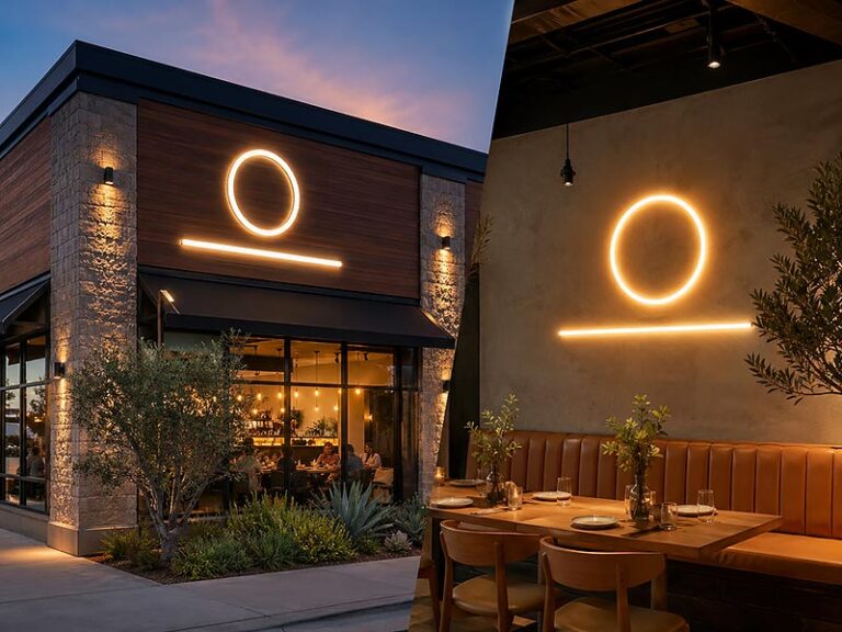
Many hotels make the mistake of choosing a lobby sign only from a front-view product photo. The photo may look good, but the real lobby experience depends on the thickness of the letters, the glow on the wall, the distance from the reception desk, the ceiling light, the reflection from marble or glass, and whether wires are hidden properly. A good lobby sign should feel like it belongs to the architecture, not like an afterthought placed on the wall the day before opening. Imagine a guest arriving late at night after a long flight: the lobby is quiet, the staff smiles, and a softly lit logo on the wall gives them one simple message — they are in the right place.
What Makes Hotel Lobby Signs Different?

Hotel lobby signs are different from regular shop signs because they are not made only for visibility. They must help guests feel the hotel’s quality within the first few seconds. A good lobby sign should look clean from the entrance, match the reception wall, create a soft lighting effect, hide wires properly, and support the hotel’s overall brand image. For hotels, the goal is not “the brightest sign.” The goal is a sign that looks premium, comfortable, and well planned.
Why Does the First View Matter?
Guests start judging a hotel before they reach the front desk. They notice the floor, lighting, smell, furniture, staff uniforms, wall finish, and logo sign almost at the same time. If the lobby sign looks cheap, too bright, crooked, or poorly installed, it can weaken the whole space, even if the hotel spent a large budget on decoration.
In many hotel lobbies, the logo wall is also the most photographed area. It may appear on the hotel website, Google Business Profile, OTA platforms, guest reviews, Instagram posts, travel blogs, and interior project photos. This means the sign does not only serve people standing in the lobby. It also affects how future guests judge the hotel online.
A hotel lobby sign should work well from three common viewing points:
| Viewing Point | What the Sign Should Do |
|---|---|
| Lobby entrance | Help guests recognize the brand quickly |
| Reception queue | Look clear, balanced, and comfortable |
| Photo angle | Look clean without glare, messy wires, or dark spots |
For most hotel reception walls, the sign is viewed from around 3–10 meters away. This distance matters. A small tagline that looks clear in a design file may disappear in the real lobby. A sign that looks bright in a close-up factory photo may feel too strong when guests see it behind the front desk. So the sign should be judged by real lobby distance, not only product photos.
What Should Guests See at Check-In?
At check-in, guests should see a logo sign that makes the reception area easy to identify and the hotel brand easy to remember. The sign should not distract from staff service, but it should give the wall a clear visual center.
A strong hotel lobby sign usually has these qualities:
| Detail | Better Result |
|---|---|
| Clear logo shape | Guests recognize the hotel faster |
| Proper size | The wall feels balanced, not empty or crowded |
| Soft lighting | The reception area feels more comfortable |
| Hidden wires | The installation looks professional |
| Matching finish | The sign feels part of the interior design |
| Clean edges | The product looks more premium up close |
Hotels should avoid treating the lobby sign as a last-minute decoration. In real projects, the sign affects reception wall layout, power point position, wall drilling, lighting control, and installation schedule. If the wall is already finished and no wire path is planned, the installer may need to expose wires, add a cable channel, or use a back panel. These solutions can work, but they should be planned before production.
The front desk is also a daily working area. Staff may stand or sit in front of the sign for many hours. If the sign is too bright, reflects too much light, or creates glare at eye level, it may look uncomfortable in real use. A good sign should look good for guests and also be comfortable for the people working behind the desk.
How Is Lobby Lighting Different?
Hotel lobby lighting is different from storefront lighting. A storefront sign often needs to be seen from the street, across traffic, or at night from a long distance. A lobby sign is much closer to the viewer. It should feel softer and more controlled.
For most hotel lobbies, warm white or neutral white lighting is safer than strong cool white. Warm white often works well for luxury hotels, boutique hotels, resorts, and spa-style spaces. Neutral white works better for business hotels, serviced apartments, and modern city hotels. Strong cool white can look clean, but it may also make the lobby feel cold if the interior uses warm ceiling lights or natural materials.
A simple lighting choice guide:
| Hotel Style | Common Light Choice | Why It Works |
|---|---|---|
| Luxury hotel | Warm white backlight | Soft, calm, premium |
| Business hotel | Neutral white | Clean and professional |
| Resort hotel | Warm white or soft gold tone | Relaxed and welcoming |
| Boutique hotel | Warm white or custom brand tone | More personality |
| Spa hotel | Low-glare warm white | Gentle and comfortable |
| Modern city hotel | Neutral white | Sharp but not too cold |
Brightness should also match the wall. A dark stone wall absorbs more light, so the sign may need stronger LEDs or better contrast. A glossy marble wall reflects light, so the sign may need softer brightness or a brushed finish to reduce glare. A wood wall can make the glow warmer, but gold letters may not stand out if the tones are too close.
This is why hotels should send wall photos, wall material details, and lighting conditions before ordering. A good factory should not only ask for the logo size. It should also ask where the sign will be installed and what the wall looks like.
Which Details Make It Look Premium?
A hotel lobby sign looks premium because of details, not because it is complicated. Many high-end signs are actually very simple: clean logo, good material, soft light, correct size, hidden wiring, and accurate installation.
The most common details that separate a premium lobby sign from an ordinary one are:
| Detail | Premium Standard |
|---|---|
| Acrylic edge | Smooth, polished, no rough cutting marks |
| Metal finish | Even brushing, no dents, no color mismatch |
| Lighting | No visible LED dots, dark areas, or light leaks |
| Wire exit | Hidden behind the sign or planned neatly |
| Mounting | Straight alignment with template or clear drawing |
| Surface protection | No scratches after shipping and installation |
| Logo proportion | Matches approved brand file |
For hotels, the sign should also look good when the light is off. This is easy to forget. During the day, the lobby may have enough natural light, and the illuminated sign may not be the only light source. If the material looks thin, scratched, or cheap when turned off, the overall quality still suffers.
Material choice also affects the premium feeling. Brushed stainless steel looks professional and stable. Champagne gold feels warm and high-end. Matte black can look modern and clean. Frosted acrylic feels soft and simple. Mirror finishes can look expensive, but they can also reflect ceiling lights, cameras, guests, and luggage, so they should be used carefully in hotel lobbies.
A practical hotel decision is often not “Which material is best?” but “Which material looks best on this wall, under this lighting, with this logo?”
How Does It Support Hotel Wayfinding?
A lobby sign is usually the main brand sign, but it should also connect with the hotel’s wayfinding system. Guests do not stay in the lobby only. They move from entrance to reception, elevators, rooms, restaurant, bar, spa, gym, meeting rooms, parking area, and outdoor spaces. If every sign uses a different style, the hotel can feel less organized.
A good lobby sign can set the design direction for other hotel signs:
| Hotel Area | What Can Match the Lobby Sign |
|---|---|
| Elevator area | Font, arrow style, metal finish |
| Restaurant entrance | Logo finish or light color |
| Bar or lounge | Same brand tone with more atmosphere |
| Spa area | Softer lighting and calmer material |
| Meeting rooms | Matching typography and room number style |
| Outdoor entrance | Same logo proportion, stronger structure |
| Parking area | Clearer function, but same brand direction |
This is especially important for hotel chains, serviced apartments, resorts with multiple buildings, and hotels planning future renovations. If the lobby sign is made as a one-off product with no saved drawings, future signs may look slightly different. The logo color may change, the light color may be different, or the metal finish may not match.
Hotels should ask the supplier to keep production records, including logo drawings, size, material, light color, surface finish, mounting method, wire exit, power supply details, and packing method. This makes future reorders easier and helps the hotel keep a consistent look across different areas or locations.
A successful hotel lobby sign should feel natural. Guests may not stop to analyze it, but they should feel that the reception area is clear, the brand is trustworthy, and the space is well designed. That is what makes hotel lobby signs different from ordinary illuminated signs.
Which Sign Type Works Best?
For most hotel lobbies, the best illuminated sign is usually a backlit logo sign, halo-lit metal letter sign, or acrylic LED logo sign. These options look clean, premium, and comfortable in a reception area. Light boxes are better for directories and functional signs, while neon-style signs work best in hotel bars, lounges, photo spots, or lifestyle areas rather than formal front desk walls.
Is a Backlit Logo Sign Best?
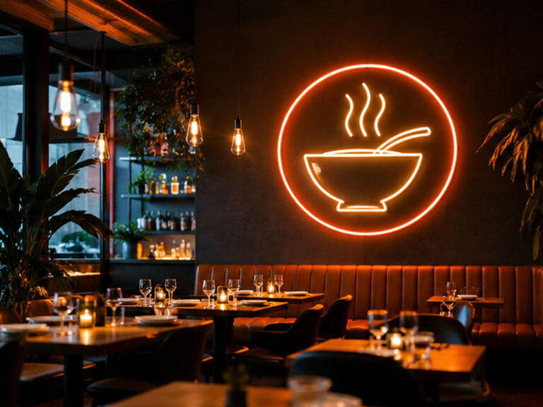
A backlit logo sign is often the best all-around choice for hotel lobbies because it gives the logo a soft glow without shining directly into guests’ eyes. Instead of making the front surface very bright, the light spreads behind the logo and reflects onto the wall. This creates depth, warmth, and a more expensive feeling.
For many hotels, this is exactly what the lobby needs. Guests do not want the reception wall to feel like a retail storefront. They want the space to feel calm, organized, and trustworthy. A backlit sign can make a plain wall look finished, especially when it is installed behind the reception desk, on a feature wall, or above a concierge counter.
Backlit signs work especially well for:
| Hotel Area | Why Backlit Works |
|---|---|
| Main reception wall | Creates a premium first impression |
| Concierge area | Looks elegant without being too bright |
| VIP check-in area | Adds a quiet luxury feeling |
| Spa reception | Soft glow feels calm and relaxing |
| Resort lobby | Works well with stone, wood, and textured walls |
| Business hotel lobby | Looks professional and clean |
A backlit sign is also a good choice when the hotel wall has texture. For example, marble, stone, wood veneer, micro-cement, and fabric wall panels can all look more layered when a soft glow is added behind the logo. However, the wall surface must be considered before production. A dark wall absorbs more light. A glossy wall may reflect more light. A rough stone wall may scatter the glow unevenly.
For most hotel projects, backlit signs look best when the lighting is warm white or neutral white. Warm white is better for luxury hotels, boutique hotels, resorts, and spa-style spaces. Neutral white is better for city hotels, serviced apartments, and business hotels that want a clean modern feel.
A hotel should consider a backlit sign if it wants:
- A premium logo wall behind reception
- Soft lighting instead of strong face lighting
- Hidden wiring and a clean installation
- A sign that photographs well for hotel websites and booking platforms
- A more architectural look than a simple flat logo
- Better brand presence without making the lobby feel too commercial
The main thing to check is the glow effect. The sign should not have uneven light, strong LED spots, or strange shadows around small letters. Before production, the hotel should confirm logo size, wall material, spacer depth, light color, wire exit, and installation height.
Are Acrylic LED Signs Better?
Acrylic LED signs are a very practical choice for hotel lobbies, especially when the logo has curved shapes, thin lines, small icons, or brand colors that need to be shown clearly. Acrylic can be cut accurately, polished cleanly, painted, printed, frosted, or combined with LED lighting. This makes it flexible for many hotel styles.
Compared with metal letters, acrylic signs can sometimes show more logo detail. If the hotel logo includes a symbol, soft curves, small brand text, or a custom shape, acrylic may be easier to produce cleanly. It is also lighter than many metal sign structures, which can help when the wall is not suitable for heavy letters.
Acrylic LED signs are usually suitable for:
| Hotel Type | Suitable Acrylic Sign Style |
|---|---|
| Modern city hotel | White acrylic logo with neutral LED light |
| Boutique hotel | Custom color acrylic with soft backlight |
| Serviced apartment | Clean acrylic logo panel |
| Hotel reception wall | Acrylic logo with hidden wiring |
| Spa or wellness hotel | Frosted acrylic with warm white light |
| Budget hotel | Simple acrylic LED logo for a clean upgrade |
The advantage of acrylic is that it can look clean and modern without becoming too heavy. A white acrylic logo on a dark wall can be very clear. A frosted acrylic sign can create softer lighting. A painted acrylic logo can match the hotel’s brand color better than metal in some cases.
But acrylic signs need careful quality control. Poor acrylic can look cheap very quickly. The most common problems are visible glue marks, rough edges, scratches, uneven light, exposed screws, and low-quality surface finishing. In a hotel lobby, these details are easy to notice because guests stand close to the reception wall.
Hotels should check these details before choosing acrylic:
| Checkpoint | Why It Matters |
|---|---|
| Acrylic thickness | Affects strength and premium feel |
| Edge polishing | Rough edges make the sign look cheap |
| Light diffusion | Prevents LED dots and hot spots |
| Surface finish | Should match the hotel interior |
| Logo color | Must stay close to brand standards |
| Mounting method | Impacts final wall appearance |
| Cleaning needs | Glossy acrylic shows dust and fingerprints more easily |
Acrylic LED signs are better when the hotel wants clean logo detail, lighter structure, and flexible design. They may not be the best choice if the hotel wants a heavier luxury look with metal texture. In that case, acrylic can still be used together with metal, such as a metal face with an acrylic back diffuser.
Do Halo-Lit Letters Look Premium?
Yes, halo-lit letters are one of the most premium options for hotel lobbies. They usually have a solid metal face, and the LED light comes from the back of each letter. The front of the sign stays clean and calm, while the wall behind the letters gets a soft glow. This gives the logo more depth than a flat sign.
Halo-lit letters work very well when the hotel wants the sign to feel like part of the architecture. They are not loud. They are not overly decorative. They feel controlled and elegant. This is why halo-lit letters are often used in luxury hotels, boutique hotels, resort entrances, high-end office lobbies, and premium reception walls.
Good applications include:
| Application | Why Halo-Lit Letters Fit |
|---|---|
| Luxury hotel lobby | Soft glow and metal finish feel premium |
| Boutique hotel reception | Adds depth without looking too corporate |
| Resort entrance lobby | Works well with stone, wood, or textured walls |
| Hotel brand wall | Makes the logo feel more permanent |
| Executive lounge | Quiet and refined lighting |
| Premium serviced apartment | Professional and high-end appearance |
The material finish is important. Brushed stainless steel gives a professional look. Champagne gold feels warmer and more luxurious. Matte black looks modern and sharp. Bronze can work well for boutique or resort interiors. Mirror gold can look expensive, but it may create strong reflections, so it should be used carefully.
Halo-lit letters are not always suitable for every logo. Very thin strokes, tiny text, and complicated icons may be difficult to light evenly. If the logo is small, the glow may not be strong enough or the internal structure may become too tight. For this reason, the manufacturer should review the logo file and suggest a suitable minimum size.
Hotels should check:
- Minimum letter stroke width
- Letter depth
- Distance from wall
- Wall color and texture
- Backlight color temperature
- Installation template
- Wire exit position
- Power supply location
- Whether small text should be produced separately or simplified
Halo-lit letters are usually a strong choice when the hotel wants a luxury feel, but they need accurate production drawings and good installation planning. A poorly installed halo-lit sign can create uneven shadows or messy wiring. A well-made one can become the most memorable branded detail in the lobby.
Are Light Boxes Suitable?
Light boxes can be suitable in hotels, but they are not always the best choice for the main lobby logo wall. A light box is usually easier to read and more direct because the front face is illuminated. This makes it useful for practical signs, but it can sometimes look too commercial for a luxury reception background.
In hotel projects, light boxes are often better for functional areas instead of the main lobby logo. For example, they can be used for directory signs, restaurant signs, spa signs, parking signs, elevator lobby signs, meeting room signs, and exterior identification signs. They are especially useful when the sign needs to display clear information instead of only a logo.
Best hotel uses for light boxes:
| Hotel Area | Suitable Light Box Use |
|---|---|
| Lobby directory | Clear wayfinding information |
| Restaurant entrance | Menu or brand sign |
| Hotel bar entrance | Soft branded light box |
| Spa reception | Clean service identification |
| Parking entrance | Stronger visibility |
| Exterior wall | Weather-resistant brand sign |
| Meeting area | Directional or room identification sign |
For the main reception wall, a light box should be designed carefully. A thick, bright, standard box may make the lobby feel like a mall or retail store. A slim light box with a refined frame, soft diffuser, and warm light can look much better. The frame color should match the lobby interior, such as black, bronze, silver, champagne gold, or custom painted finish.
Light boxes are practical because they can be easier to maintain. If the front panel needs to be replaced, it may be simpler than replacing individual letters. They also work well when the hotel needs clear text, icons, arrows, or multi-language information.
Hotels should choose a light box when they need:
- High readability
- Clear direction or information
- A larger illuminated panel
- Easier front-panel replacement
- Good visibility in public areas
- A cost-effective sign for multiple hotel zones
Hotels should avoid a standard light box when they want the reception wall to feel very luxurious, quiet, or architectural. In those cases, backlit letters, halo-lit metal letters, or acrylic LED logos usually look more refined.
When Should Neon Be Used?
LED neon-style signs can be useful in hotels, but they should be placed in the right area. They are usually better for atmosphere than formal branding. A neon-style sign can make a hotel bar, lounge, café, rooftop area, game room, event space, or photo wall feel more social and memorable.
For example, a hotel bar may use a warm white script sign behind the counter. A rooftop lounge may use a short slogan in amber or red. A boutique hotel may use a custom neon-style quote near a photo corner. A beach resort may use a playful icon or location name for guest photos. These signs help guests interact with the space and share it online.
Good hotel uses for LED neon signs:
| Hotel Area | Neon Sign Idea |
|---|---|
| Hotel bar | Cocktail slogan or brand phrase |
| Rooftop lounge | Short lifestyle quote |
| Photo wall | Hotel name or location phrase |
| Event space | Custom event backdrop sign |
| Game room | Fun graphic or room name |
| Boutique lobby corner | Small artistic sign |
| Resort café | Warm decorative line sign |
However, neon-style signs should be used carefully in hotel lobbies. If the main reception wall needs to feel premium and calm, bright neon colors may not be the best choice. Neon signs can easily look too casual if the color, size, font, and wiring are not controlled.
A hotel should choose LED neon when the goal is:
- Creating a photo spot
- Adding personality to a lifestyle space
- Making a bar or lounge more memorable
- Supporting social media sharing
- Creating a warm decorative phrase
- Adding color in a controlled area
For formal reception logos, neon-style signs are usually less suitable unless the hotel brand is young, creative, or nightlife-focused. Even then, the sign should still be made with clean backing, safe wiring, stable LEDs, and a good installation method.
Which Sign Should a Hotel Choose?
The best sign type depends on the hotel’s brand style, lobby wall, lighting environment, and budget. There is no single sign that fits every lobby. A luxury resort and a budget city hotel should not use the same sign solution. A quiet spa lobby and a rooftop hotel bar should also use different lighting effects.
A simple selection guide:
| Hotel Goal | Best Sign Type |
|---|---|
| Premium reception wall | Backlit logo sign |
| Luxury architectural look | Halo-lit metal letters |
| Clean modern logo detail | Acrylic LED logo sign |
| Clear directory or wayfinding | Slim light box |
| Bar, lounge, or photo area | LED neon-style sign |
| Multi-location hotel standard | Backlit or acrylic logo with saved production files |
| Outdoor-to-indoor brand consistency | Matching channel letters and lobby logo sign |
For most hotel lobby reception walls, the safest order is:
- Backlit logo sign if the hotel wants soft premium branding.
- Halo-lit metal letters if the hotel wants a stronger luxury material feel.
- Acrylic LED logo sign if the logo has fine details or needs a clean modern finish.
- Slim light box if the sign needs to show information clearly.
- LED neon-style sign if the area is more social, decorative, or photo-focused.
Before making the final choice, hotels should compare the sign type with real project conditions:
| Question | Why It Matters |
|---|---|
| What is the wall material? | Affects glow, reflection, and mounting |
| How far will guests view the sign? | Affects size and readability |
| Is the lobby warm or modern? | Affects light color and finish |
| Is the wall already finished? | Affects hidden wiring options |
| Does the hotel need dimming? | Affects power supply and control |
| Will the sign be repeated later? | Affects standard drawings and reorder files |
| Is the sign for reception or another area? | Determines whether it should be premium, practical, or decorative |
A good hotel sign choice is not just about the product name. It is about whether the sign fits the actual lobby. The best result usually comes from sharing the logo file, wall photo, size, lighting preference, and installation condition with the manufacturer before production starts.
How Should Hotels Choose Materials?

Hotels should choose lobby sign materials based on the lobby style, wall finish, lighting effect, cleaning needs, and long-term brand image. Acrylic works well for clean modern logos, metal gives a stronger premium feel, and mixed materials can balance both. The best material is not simply the most expensive one. It is the one that looks right on the actual wall, under the actual lobby lighting, after installation.
Is Acrylic Good for Lobbies?
Acrylic is a very common material for hotel lobby signs because it is clean, flexible, lightweight, and easy to customize. It works especially well when the hotel logo has smooth curves, small icons, soft edges, or a modern brand style. Compared with full metal letters, acrylic can often show more shape detail and can create softer light diffusion.
For hotel lobbies, acrylic is often used in these ways:
| Acrylic Use | Best For | What to Check |
|---|---|---|
| White acrylic face | Clean modern hotel logos | Even light, no LED dots |
| Frosted acrylic | Spa, wellness, boutique hotels | Soft glow and smooth surface |
| Painted acrylic | Brand color matching | Color accuracy and scratch protection |
| Clear acrylic back panel | Easier installation | Edge polish and wall visibility |
| Thick acrylic letters | Premium indoor logo walls | Edge quality and weight |
| Acrylic + metal | Higher-end lobby signs | Joint quality and finish matching |
Acrylic is a good choice when the hotel wants the sign to look clean but not too heavy. For example, a serviced apartment lobby may use a white acrylic logo with neutral white light. A boutique hotel may use frosted acrylic with warm backlighting. A spa hotel may use soft acrylic letters to avoid a cold or corporate feeling.
The weak point of acrylic is that poor production details are easy to see in a lobby. Guests may stand only 1–3 meters from the reception wall, so rough edges, visible glue, scratches, dust inside the sign, or uneven light can make the product look cheaper than expected.
Hotels should ask about acrylic thickness before production. For small indoor logos, thinner acrylic may be enough. For larger reception signs, thicker acrylic can look more solid and reduce the feeling of a temporary display. The exact thickness depends on logo size, lighting method, and structure, but the key is simple: the sign should not feel flimsy when installed on a premium lobby wall.
Acrylic is usually a strong choice when the hotel needs:
- Clean logo edges
- Custom brand colors
- Soft and even lighting
- Lighter weight than metal
- A modern reception wall look
- Good detail for curved logos or icons
- A cost-effective indoor illuminated sign
However, acrylic may not be the best choice if the hotel wants a heavy luxury feel, strong metal texture, or a very architectural look. In those cases, acrylic can still be used as a light diffuser behind metal faces or inside halo-lit structures.
Which Metal Finish Looks Better?
Metal is often chosen when a hotel wants the lobby sign to feel more premium, more permanent, and more connected to the interior design. A metal sign usually feels more solid than a simple acrylic sign, especially when paired with backlighting or halo lighting.
The most common metal finishes for hotel lobby signs include brushed stainless steel, champagne gold, titanium gold, bronze, matte black, rose gold, and mirror stainless steel. Each finish creates a different feeling.
| Metal Finish | Best Hotel Match | Visual Feeling |
|---|---|---|
| Brushed stainless steel | Business hotels, city hotels | Clean, professional, stable |
| Champagne gold | Luxury hotels, resorts | Warm, premium, welcoming |
| Bronze | Boutique hotels, classic interiors | Mature, calm, artistic |
| Matte black | Modern hotels, minimalist spaces | Sharp, clean, high contrast |
| Rose gold | Beauty hotels, soft boutique spaces | Warm, stylish, feminine |
| Mirror stainless steel | High-gloss luxury interiors | Bright, reflective, dramatic |
| Painted aluminum | Custom brand interiors | Flexible, controlled, practical |
Brushed stainless steel is usually a safe choice because it does not reflect too much light and works with many interior styles. Champagne gold is very popular for hotel lobbies because it feels warmer than silver and pairs well with marble, wood, beige walls, warm lighting, and soft furniture. Matte black works well on light walls, especially in modern or minimal hotel spaces.
Hotels should be careful when choosing gold finishes. A gold sign can look very premium, but the wrong gold tone may look too yellow, too orange, or too shiny in the actual lobby. The same finish can look different under warm light, daylight, and cool white ceiling light. For important hotel projects, close-up material photos or small finish samples are helpful before final confirmation.
Metal signs are usually suitable when the hotel wants:
- A more expensive appearance
- A stronger architectural feeling
- Better match with marble, wood, stone, or metal interiors
- Long-term use in a high-traffic lobby
- A premium logo wall behind reception
- Halo-lit or backlit lighting effects
The hotel should also confirm whether the metal is stainless steel, aluminum, or another material. Stainless steel often feels more premium and solid. Aluminum is lighter and easier for some large sign structures. The right choice depends on sign size, wall strength, finish requirement, and budget.
Are Mirror Finishes Too Bright?
Mirror finishes can look beautiful, but they are not always easy to use in hotel lobbies. A mirror gold or mirror stainless steel logo may look impressive in a product photo, but the real lobby environment is more complicated. It may reflect ceiling lights, guests, reception staff, chandeliers, windows, plants, luggage, or the camera taking the photo.
This does not mean mirror finish is wrong. It means the hotel should use it with care.
Mirror finishes are more suitable when:
- The lobby has controlled lighting
- The wall background is simple
- The hotel wants a dramatic luxury effect
- The sign is not placed directly under strong spotlights
- The logo shape is simple and bold
- The reception wall does not already have many reflective materials
Mirror finishes may be risky when:
| Lobby Condition | Possible Problem |
|---|---|
| Glossy marble wall | Too many reflections |
| Strong ceiling spotlights | Glare on the logo face |
| Glass behind reception | Messy reflected image |
| Small detailed logo | Shape becomes harder to read |
| High-traffic front desk | Fingerprints and cleaning marks |
| Bright daylight from windows | Reflections change through the day |
For many hotel lobbies, brushed or satin finishes are safer than mirror finishes. They still look premium but are easier to read, easier to photograph, and easier to maintain. A brushed champagne gold sign, for example, can feel warm and high-end without creating strong reflection problems.
If the hotel still wants a mirror finish, it is better to test the idea with actual lobby photos. The supplier should check the wall material, ceiling light direction, and viewing angle. The hotel should also consider cleaning. Mirror finishes show fingerprints, dust, and wiping marks more easily than brushed finishes. In a busy hotel lobby, this may increase daily maintenance.
A practical rule is this: use mirror finish when the hotel wants a bold visual feature; use brushed or satin finish when the hotel wants quiet luxury.
What Material Matches Luxury Hotels?
Luxury hotel signs usually work best with materials that feel calm, solid, and refined. The sign does not need to be overly bright or complicated. In many high-end lobbies, the most premium sign is actually simple: clean letters, good spacing, soft light, accurate finish, and no visible wiring.
Good material combinations for luxury hotel lobbies include:
| Sign Structure | Why It Works |
|---|---|
| Brushed metal face + halo light | Solid front, soft wall glow |
| Champagne gold letters + warm backlight | Warm, elegant, premium |
| Frosted acrylic + hidden LED | Soft and modern |
| Metal face + acrylic diffuser | Premium look with smooth lighting |
| Thick acrylic logo + polished edge | Clean, modern, refined |
| Stainless steel + stone wall | Strong contrast and high-end feel |
| Bronze finish + wood wall | Warm boutique atmosphere |
Luxury does not always mean gold. A business luxury hotel may look better with brushed stainless steel. A wellness resort may look better with frosted acrylic and warm lighting. A boutique hotel may look better with bronze or custom-painted metal. A modern hotel may look better with matte black letters and soft halo light.
The material should match three things:
First, it should match the hotel brand. A quiet luxury hotel should not use a sign that looks like a nightclub. A young lifestyle hotel should not use a sign that feels too corporate.
Second, it should match the lobby materials. If the reception desk uses brass trim, champagne gold letters may connect well. If the wall uses dark stone, brushed stainless steel or warm backlight may create good contrast. If the interior uses white, beige, and soft textures, frosted acrylic or champagne gold may feel more natural.
Third, it should match maintenance needs. A hotel lobby is a daily-use space. The sign should be easy to clean, stable, and not too delicate. A finish that looks beautiful on day one but scratches easily may create problems later.
A luxury hotel should ask these questions before choosing material:
- Does the material match the reception desk and wall?
- Does it look premium when the light is off?
- Does it look comfortable when the light is on?
- Will it reflect too much light?
- Will fingerprints or dust show easily?
- Can the logo details be produced cleanly?
- Is the structure strong enough for long-term use?
- Can the same material be used for future hotel areas or reorders?
A good hotel lobby sign should still look good during the day when the LEDs are off. This is an important detail. If the material only looks attractive when illuminated, it may not be the best choice for a premium lobby.
How Does Wall Color Matter?
Wall color and wall material can completely change how a hotel lobby sign looks. The same sign can look premium on one wall and weak on another. This is why hotels should never choose sign material without considering the actual installation background.
A white wall makes the sign and lighting look brighter. A dark wall absorbs light and may need stronger illumination or higher contrast. A marble wall may reflect light and create glare. A wood wall can make the sign feel warmer but may reduce contrast if the sign color is too close to the wood tone. A textured wall can create a beautiful halo effect, but it may also make the glow less even.
A practical wall and material guide:
| Wall Type | Better Sign Choice | What to Watch |
|---|---|---|
| White painted wall | Metal letters, acrylic logo, backlit sign | Avoid sign looking too flat |
| Dark stone wall | Warm backlit metal or white acrylic | Make sure contrast is strong enough |
| Marble wall | Brushed metal, controlled halo light | Watch reflection and glare |
| Wood veneer wall | Champagne gold, bronze, warm white light | Avoid similar tones blending together |
| Textured wall | Halo-lit or backlit letters | Glow may be uneven but atmospheric |
| Fabric wall panel | Lightweight acrylic or backlit logo | Check mounting strength |
| Glass wall | Special structure or back panel | Wiring and reflection need planning |
Hotels should provide wall photos before production. If the lobby is still under renovation, renderings can also help. The supplier can then suggest whether the sign should be face-lit, backlit, halo-lit, acrylic, metal, or mixed-material.
Contrast is one of the most important points. A sign should not disappear into the wall. For example, champagne gold letters on beige marble may look elegant in close-up photos, but from 8 meters away they may not be clear enough. White acrylic on a white wall may need backlighting or shadow spacing. Matte black on dark wood may need stronger halo light to stay visible.
Wall color also affects lighting temperature. Warm white light may look very yellow on beige walls. Neutral white may look cleaner on white or gray walls. Dark walls may need brighter LEDs or a larger glow area. This should be decided before production, not after installation.
What Should Be Confirmed Before Choosing Materials?
Before the hotel confirms the final material, the project team should check both appearance and practical installation details. Many problems happen because the material looks good in a sample photo but does not fit the real lobby condition.
A simple material confirmation checklist:
| Item to Confirm | Why It Matters |
|---|---|
| Logo file | Determines whether acrylic, metal, or mixed material is suitable |
| Wall size | Helps decide sign size and material weight |
| Wall material | Affects mounting, glow, and reflection |
| Interior style | Helps match finish and lighting color |
| Viewing distance | Affects contrast and readability |
| Light color | Changes how material appears |
| Surface finish | Controls premium feeling and maintenance |
| Wire exit | Affects clean installation |
| Local installer needs | Helps prepare holes, template, and accessories |
| Future reorders | Keeps hotel signs consistent across locations |
Hotels should also ask for production drawings before manufacturing. The drawing should show sign size, material, thickness, lighting method, wire exit, mounting hole position, and power supply details. For important hotel projects, a close-up finish photo or sample can reduce risk.
The best material choice is usually made after comparing three things together: the logo, the wall, and the lighting. If one of these is ignored, the final sign may not feel right even if the product itself is well made. For hotel lobbies, material choice is not only about beauty. It is about making the whole reception area feel complete, comfortable, and trustworthy.
How Should Light Be Planned?

Hotel lobby sign lighting should be planned around guest comfort, brand style, wall material, and the lobby’s existing lighting. The sign should be bright enough to read from the entrance or reception queue, but not so bright that it creates glare behind the front desk. For most hotel lobbies, warm white or neutral white, soft diffusion, hidden wiring, and optional dimming are safer than strong face lighting.
What Color Temperature Fits Hotels?
Color temperature is one of the first lighting details hotels should confirm. It changes the whole feeling of the lobby sign. The same logo can feel warm and premium, clean and modern, or cold and too commercial just because the light color is different.
For hotel lobbies, the most common choices are warm white and neutral white. Warm white usually feels more relaxed. It works well with wood, beige walls, marble, champagne gold, bronze, warm stone, and soft interior lighting. Neutral white looks cleaner and sharper. It suits modern hotels, business hotels, serviced apartments, and lobbies with gray, white, black, or silver finishes.
A simple color temperature guide:
| Light Color | Common Range | Best For | Possible Risk |
|---|---|---|---|
| Warm white | 2700K–3500K | Luxury hotels, resorts, spas, boutique hotels | May look too yellow in a very modern lobby |
| Neutral white | 3800K–4500K | Business hotels, city hotels, serviced apartments | May feel less warm in leisure spaces |
| Cool white | 5000K–6500K | Very modern or high-contrast interiors | Can feel cold or too sharp for hospitality |
| Custom color | Depends on brand | Bars, lounges, photo areas, lifestyle hotels | Can look less premium if overused |
Hotels should not choose the light color only from a small product photo. A sign with 3000K warm white may look elegant on a beige stone wall, but the same light may look too yellow on a pure white wall. A 4000K neutral white sign may look clean in a business hotel, but it may feel too bright in a spa reception area.
The safest method is to match the sign light with the lobby’s existing light. If the ceiling lights, wall washers, and desk lamps are warm, the sign should usually stay warm. If the lobby uses a clean modern lighting plan, neutral white may be better.
Is Warm White Better?
Warm white is often better for hotel lobbies because it feels softer and more welcoming. Guests arriving at a hotel are usually not looking for strong commercial brightness. They want a space that feels calm, safe, and comfortable. A warm white backlit logo can help create that feeling, especially at night.
Warm white is especially suitable for:
- Luxury hotel reception walls
- Boutique hotel logo signs
- Resort lobby signs
- Spa and wellness reception signs
- Hotel restaurant and lounge signs
- Champagne gold or bronze metal letters
- Wood, stone, beige, cream, and warm gray walls
Warm white also photographs well in many hotel spaces. It helps the sign feel less harsh in booking platform photos, website images, and guest social media photos. For hotels that care about atmosphere, this is very important.
However, warm white is not always the best answer. Some hotel brands need a sharper and more business-like feeling. A city hotel with black, white, and silver interiors may look better with neutral white. A serviced apartment lobby with clean gray walls may need a crisper light to match the space. If the hotel logo uses blue, silver, or cool gray brand colors, warm white may change the brand feeling too much.
A practical way to decide:
| If the Lobby Feels Like This | Better Light Choice |
|---|---|
| Warm, quiet, luxury | Warm white |
| Natural, resort, relaxing | Warm white |
| Clean, corporate, efficient | Neutral white |
| Minimal, black-white-gray | Neutral white |
| Futuristic or high contrast | Controlled cool white |
| Bar, lounge, nightlife | Warm white, amber, or custom color |
For most hotel reception logo signs, warm white between 3000K and 3500K is a safe starting point. It gives a premium glow without becoming too yellow. If the interior is very modern, 4000K neutral white may be more suitable.
How Bright Should It Be?
A hotel lobby sign should be visible, but it should not dominate the room. This is different from an outdoor storefront sign. A lobby sign is usually viewed from a short or medium distance, often around 3–10 meters. Guests may see it while walking in, standing at the front desk, sitting in the lounge, or taking photos.
If the sign is too bright, it can cause several problems. It may reflect on marble, glass, mirrors, or polished metal. It may make staff uncomfortable if it is directly behind the reception desk. It may also make the lobby feel less premium, especially in the evening when the surrounding lighting is dim.
If the sign is too dim, the hotel logo may disappear in photos or look weak from the entrance. This is common when the wall is dark, the logo is small, or the lobby has strong ambient light.
Brightness should be checked based on real conditions:
| Factor | What It Changes |
|---|---|
| Viewing distance | Longer distance needs stronger visibility |
| Wall color | Dark walls need more light or better contrast |
| Wall finish | Glossy walls may create glare |
| Sign type | Face-lit signs look brighter than halo-lit signs |
| Logo size | Large signs need balanced LED layout |
| Lobby lighting | Bright lobbies need stronger signs |
| Night scene | Dim evening lobbies may need lower sign brightness |
For most hotel lobbies, the sign should look comfortable from the front desk area and clear from the lobby entrance. It should not create a “hot spot” on the wall or show visible LED dots. The goal is smooth light, not just strong light.
Hotels should ask the supplier to confirm:
- LED layout
- Light color
- Diffuser method
- Estimated brightness level
- Whether the sign can be dimmed
- Whether the light is face-lit, backlit, or halo-lit
- Whether the wall color needs stronger LED output
- Whether pre-shipment lighting photos or videos can be provided
This is especially important for backlit and halo-lit signs. The glow should be soft and even around the logo. If the LED spacing is poor or the letters are too shallow, the light may look uneven after installation.
Do Hotels Need Dimming?
Dimming is not necessary for every hotel lobby sign, but it is very useful for many hotel projects. Hotel lobbies often change lighting throughout the day. Morning light, afternoon daylight, evening atmosphere, and late-night check-in scenes can all feel different. A fixed-brightness sign may look good at one time of day but too bright or too weak at another.
Dimming is worth considering when:
| Situation | Why Dimming Helps |
|---|---|
| Lobby stays open 24 hours | Brightness can be lowered late at night |
| Sign is behind reception staff | Reduces eye discomfort |
| Wall is glossy or reflective | Helps control glare |
| Hotel uses lighting scenes | Sign can match morning/evening mood |
| Luxury or boutique hotel | Allows softer atmosphere |
| Bar or lounge nearby | Light can be adjusted for evening use |
| Large logo sign | Prevents the sign from overpowering the wall |
Dimming should be confirmed before production, not after the sign is finished. It can affect LED selection, transformer choice, wiring, remote control, wall switch control, and installation details. If the hotel wants dimming, the supplier needs to know the control method early.
Common control options include:
- Standard on/off switch
- Remote dimmer
- Wall-mounted dimmer
- Controller hidden behind the sign or reception desk
- Connection to the hotel’s lighting control system
- Separate control for different sign zones
For many hotel lobbies, a simple dimming option is enough. The hotel may not need a complex control system. Even a basic dimmer can help staff adjust the sign after seeing it in the real space.
Hotels should also confirm who will install and connect the dimmer. If a local electrician will handle it, the factory should provide clear wiring notes, power supply details, and control instructions.
How Can Glare Be Avoided?
Glare is one of the most common problems in hotel lobby signs. A sign may look beautiful in a factory photo but feel uncomfortable after installation because the wall, ceiling lights, and viewing angle are different. Glare is especially common in lobbies with marble walls, glossy panels, mirrors, glass doors, polished floors, and bright spotlights.
The first way to reduce glare is to choose the right sign type. Backlit and halo-lit signs are usually more comfortable than strong face-lit signs because the light reflects from the wall instead of shining directly toward guests. Frosted acrylic can also help soften the light.
Ways to reduce glare:
| Glare Problem | Better Solution |
|---|---|
| Light is too direct | Use backlit or halo-lit structure |
| Front face is too bright | Add diffuser or reduce brightness |
| Wall is glossy | Use softer light and avoid strong hotspots |
| Metal face reflects too much | Use brushed or satin finish |
| Sign is near eye level | Adjust height or brightness |
| Ceiling spotlight hits the sign | Change installation position or light angle |
| Night scene feels too bright | Add dimming control |
Material finish also matters. Mirror gold and mirror stainless steel can look luxury, but they may reflect ceiling lights or camera flashes. Brushed metal, satin metal, frosted acrylic, and matte finishes are usually easier to control in hotel spaces.
The hotel should also check the reception desk position. If staff sit directly in front of the sign for long hours, the sign should not create strong light around their eye level. A sign can look good to guests but still be uncomfortable for the people working there every day.
Before production, hotels should provide photos or renderings of:
- Wall material
- Ceiling lights
- Reception desk position
- Viewing direction from entrance
- Nearby glass, mirrors, or marble
- Planned installation height
These details help the supplier suggest a safer lighting method.
How Should Light Match the Wall?
The wall behind the sign decides how the light will behave. This is why the same backlit logo can look very different in two hotel lobbies. On a smooth white wall, the glow may look bright and clean. On a dark stone wall, the glow may become softer and weaker. On textured wood or rough stone, the glow may look more natural but less even.
A practical wall lighting guide:
| Wall Material | Lighting Suggestion | What to Watch |
|---|---|---|
| White painted wall | Soft backlight or neutral face light | Avoid too much brightness |
| Dark stone | Stronger warm backlight or high contrast material | Logo may look dim |
| Marble | Controlled halo light, brushed metal | Watch glare and reflection |
| Wood veneer | Warm white backlight | Avoid low contrast with gold letters |
| Fabric panel | Lightweight sign and soft light | Check mounting strength |
| Textured wall | Halo-lit or backlit letters | Glow may be uneven but attractive |
| Glass wall | Back panel or special structure | Hide wires carefully |
Hotels should not only ask, “How bright is the sign?” They should ask, “How will this light look on our wall?” That question is much more useful.
For example, champagne gold halo-lit letters may look excellent on dark stone, but they may not stand out enough on beige wood. White acrylic letters may look clean on a dark wall, but too plain on a white wall unless backlighting is added. A warm backlit logo may look premium on marble, but it needs careful brightness control to avoid reflection.
Wall samples, lobby renderings, or site photos are very helpful. Even simple phone photos can help the supplier understand the real environment better than a logo file alone.
What Lighting Details Should Be Confirmed Before Production?
Lighting details should be confirmed before the hotel pays for production or approves the final drawing. Many installation problems happen because the sign looks good in the design mockup, but the practical lighting details were not discussed clearly.
A useful lighting checklist:
| Detail to Confirm | Why It Matters |
|---|---|
| Light color | Controls mood and brand feeling |
| Sign type | Face-lit, backlit, halo-lit, or mixed lighting |
| Brightness level | Prevents signs from being too dim or too harsh |
| Dimming | Helps adjust day and night scenes |
| Wall material | Affects glow and reflection |
| LED layout | Prevents dark spots and uneven light |
| Diffuser method | Makes light softer and smoother |
| Power supply | Must match sign size and local voltage |
| Wire exit | Keeps installation clean |
| Switch or control | Affects daily operation |
| Pre-shipment test | Helps catch problems before delivery |
For hotel projects, it is also helpful to request photos and videos before shipment. The supplier can show the sign when it is turned on, turned off, and viewed from different angles. This does not replace the real lobby effect, but it can help the hotel check light color, logo shape, surface finish, and obvious lighting problems.
If the hotel is ordering signs for multiple areas, each area may need a different lighting plan. The main lobby logo may use warm backlighting. The hotel restaurant may use a softer decorative sign. The parking entrance may need stronger visibility. The spa may need lower brightness. The meeting room directory may need clear face lighting.
A good lighting plan does not make every sign equally bright. It gives each area the right amount of light for its purpose.
What Design Details Matter?
For hotel lobby signs, the details that matter most are logo clarity, wall proportion, lighting comfort, hidden wiring, mounting method, and consistency with other hotel signs. A lobby sign should not only look good in a product photo. It should look balanced from the entrance, clear behind the reception desk, clean from close viewing distance, and easy for the local installer to mount without visible wires or last-minute changes.
How Clear Should the Logo Be?
A hotel logo sign should be clear from the distance where guests actually see it. In many lobbies, guests first notice the reception wall from about 3–10 meters away. This means the sign cannot be judged only from a close-up drawing or a factory photo. Small taglines, thin strokes, tight letter spacing, and complex icons may look fine on a computer screen but become unclear after the sign is produced and illuminated.
For illuminated signs, light can change how the logo looks. A thin letter may look thicker when the light turns on. Small gaps between letters may become less visible if the glow is too strong. A delicate icon may lose detail if the size is too small. This is why the logo should be checked before production, especially when the hotel wants backlit letters, halo-lit letters, or acrylic LED signs.
A practical logo check before ordering:
| Logo Detail | What Hotels Should Check |
|---|---|
| Thin strokes | Are they wide enough for cutting, lighting, and structure? |
| Small tagline | Can guests read it from 3–10 meters away? |
| Script font | Are the curves thick enough to avoid weak parts? |
| Tight spacing | Will the glow make letters look connected? |
| Small icon | Can the factory keep the shape clean after production? |
| Brand color | Will the color still look right under warm or neutral light? |
| Long logo | Does it fit the reception wall without looking crowded? |
For many hotel lobby signs, it is better to illuminate the main logo only and make very small taglines non-illuminated. For example, the hotel name can be backlit, while a small slogan underneath can be made with flat metal or acrylic. This keeps the wall cleaner and avoids uneven light in tiny letters.
Hotels should provide a vector logo file such as AI, EPS, PDF, SVG, or CDR. A JPG or PNG image can help show the logo style, but it is not enough for accurate cutting and production. If the hotel only has a low-resolution file, the logo may need to be redrawn before the factory prepares the production drawing.
What Size Fits the Reception Wall?
The right size is not simply the biggest size the budget allows. A hotel lobby sign should match the wall, reception desk, ceiling height, and viewing distance. If the sign is too small, the reception wall may feel empty and the brand may look weak. If the sign is too large, it may make the lobby feel crowded, too commercial, or visually heavy.
A useful starting point is to compare the sign width with the main wall panel and reception desk. In many hotel lobbies, the logo sign often looks balanced when it takes around 35%–60% of the main reception wall panel width. This is not a fixed rule, but it helps avoid two common problems: a tiny logo lost on a large wall, or an oversized sign that dominates the whole lobby.
Size planning should consider:
| Lobby Condition | Better Design Direction |
|---|---|
| Small boutique lobby | Smaller sign, better material, softer light |
| Wide reception wall | Wider logo or stronger centered layout |
| High ceiling lobby | Larger sign or more vertical spacing |
| Narrow wall panel | Compact logo without long tagline |
| Dark wall | Bigger size or stronger contrast may be needed |
| Bright marble wall | Controlled size and softer lighting to avoid glare |
| Photo-friendly lobby | Logo should be clear in full-wall photos |
Hotels should send the wall width, wall height, reception desk width, ceiling height, and installation height before confirming the sign size. A simple wall photo with rough dimensions is already very helpful. If the lobby is still under renovation, an interior rendering can also help the factory place the logo visually and suggest a better size.
The sign should also align with the reception area. If the front desk is centered on the wall, the sign usually looks best centered above it. If the desk is offset, the sign may need to align with the main check-in point rather than the full wall. These small layout decisions affect whether the final lobby looks intentional or awkward.
How Should Wires Be Hidden?
Hidden wiring is one of the most important details in a hotel lobby sign. Even a beautiful backlit logo can look unfinished if the wire is visible on the wall. Since guests often stand close to the reception desk, exposed cables, loose power supplies, or random wire channels can quickly make the installation look cheap.
The best wiring solution depends on the project stage. If the lobby wall is still under construction, the cleanest method is to reserve power behind the sign. The wire can come out directly behind the logo and stay invisible. If the wall is already finished, the project team may need a back panel, hidden cable route, side wire exit, or a cable cover matched to the wall color.
Common wiring situations:
| Wall Condition | Better Wiring Plan |
|---|---|
| New renovation wall | Reserve a power point behind the sign |
| Finished painted wall | Use back panel or hidden cable route |
| Marble or stone wall | Confirm drilling and wire exit before production |
| Wood panel wall | Hide cable behind panel or reception desk |
| Glass wall | Use special backing structure or side wiring |
| Sign above front desk | Hide power supply under desk or inside service area |
| Multi-letter logo | Plan shared wiring to avoid messy cables |
Hotels should confirm the wire exit position before production. This includes whether the wire exits from the back, side, bottom, or a custom position. If the wire exit is wrong, the installer may need to modify the sign on-site, which can damage the product or delay installation.
The power supply should also be hidden but accessible. It should not be sealed somewhere impossible to maintain. Common locations include behind the wall, inside the reception desk, above the ceiling access area, or inside a service cabinet. Hotels should also confirm local voltage, plug type, switch position, and whether dimming is required.
Do Mounting Details Matter?
Mounting details matter because they affect safety, alignment, lighting effect, and installation time. A hotel lobby sign is usually installed on a finished wall, sometimes on marble, wood veneer, stone, drywall, glass, or decorative panels. If the mounting method is not confirmed early, the installer may face problems after the sign arrives.
Different sign types need different mounting plans. Halo-lit letters need spacers behind the letters to create a soft wall glow. Backlit logo signs need the correct distance from the wall to avoid harsh shadows. Acrylic LED signs may need a back panel, hidden screws, or studs. Large metal signs need stronger fixing points and wall support.
Mounting details to confirm:
| Sign Type | What to Confirm |
|---|---|
| Halo-lit letters | Studs, spacer depth, wire exit, installation template |
| Backlit logo sign | Wall distance, glow area, mounting holes |
| Acrylic LED sign | Back panel, screw points, edge protection |
| Metal letters | Stud position, welding quality, alignment template |
| Light box sign | Frame fixing, service access, power entry |
| Large lobby sign | Weight, wall strength, installer tools |
| Multi-part logo | Numbered parts and clear layout drawing |
An installation template is very useful for hotel projects. It shows where each letter, screw, spacer, and wire should go. This reduces measuring mistakes and helps the local installer finish the job faster. Without a template, letter spacing may be uneven, the logo may tilt slightly, or the installer may drill extra holes in an expensive wall.
Hotels should also check who will install the sign. If a local sign company or contractor will handle installation, the factory should provide clear drawings, accessory lists, and wiring notes. If the project has a tight opening date, missing screws, unclear mounting holes, or wrong accessories can create unnecessary pressure.
Should the Sign Match Other Hotel Areas?
Yes, the lobby sign should match the wider hotel signage system. It does not need to use exactly the same structure everywhere, but the design language should feel connected. Guests move from entrance to reception, elevators, guest rooms, restaurant, bar, spa, gym, meeting rooms, and parking areas. If each area uses a different sign style, the hotel can feel less organized.
The lobby sign is usually the main brand sign, so it can set the direction for other signs. For example, if the lobby logo uses champagne gold and warm white backlighting, the elevator signs, restaurant entrance sign, and spa sign can use matching gold tones or warm lighting. If the lobby sign uses matte black metal, wayfinding signs can use the same finish for arrows, room numbers, or direction panels.
A simple hotel signage consistency guide:
| Hotel Area | What Can Match the Lobby Sign |
|---|---|
| Elevator area | Font, arrow style, metal finish |
| Restaurant entrance | Logo finish, frame color, light tone |
| Bar or lounge | Same brand tone with more atmosphere |
| Spa area | Softer light and calmer material |
| Meeting rooms | Matching typography and room number style |
| Outdoor entrance | Same logo proportion with stronger structure |
| Parking area | Clearer function but same brand direction |
| Guest room corridor | Same finish family in a simpler form |
This is especially important for hotel chains, serviced apartments, resorts with multiple buildings, and hotels planning future renovations. If production files are saved, future signs can keep the same logo proportion, material finish, light color, mounting method, and packaging method.
Before approving the final design, hotels should ask the supplier to keep production records, including:
| Record to Save | Why It Helps Later |
|---|---|
| Final drawing | Keeps size and logo shape consistent |
| Material details | Avoids finish differences in future orders |
| Light color | Keeps warm white or neutral white consistent |
| Mounting method | Helps repeat installation more easily |
| Wire exit position | Reduces future site problems |
| Power supply model | Helps maintenance and replacement |
| Production photos | Helps compare future batches |
| Packing method | Protects future shipments better |
A good hotel lobby sign should not feel like a separate decoration. It should feel like it belongs to the reception wall, the lighting plan, the brand identity, and the rest of the hotel signage. When these design details are handled well, guests may not notice every technical choice, but they will feel that the hotel is polished, organized, and trustworthy.
What Should Hotels Check Before Ordering?
Before ordering an illuminated hotel lobby sign, hotels should confirm the logo file, wall size, sign type, material, light color, wire exit, mounting method, voltage, packaging, delivery schedule, and future reorder needs. A lobby sign should not be ordered only with a logo image and a rough size. The more details confirmed before production, the lower the risk of wrong proportions, visible wires, glare, installation delays, or shipping damage.
What Files Should Be Prepared?
The first thing a hotel should prepare is a proper logo file. For real production, a vector file is much safer than a normal image. AI, EPS, PDF, SVG, or CDR files allow the factory to check the exact outline, letter spacing, stroke width, curves, and cutting path. A JPG or PNG can show the logo style, but it may not be accurate enough for cutting, lighting layout, or metal fabrication.
Hotels should also send real lobby information, not just the logo. A sign that looks perfect in a product photo may look too small, too bright, or poorly matched after it is placed on the actual reception wall.
| File or Detail | Why It Matters |
|---|---|
| Vector logo file | Keeps the logo shape accurate during cutting and production |
| Brand color code | Helps match Pantone, CMYK, RGB, or approved brand color |
| Lobby wall photo | Helps judge size, contrast, lighting, and installation position |
| Interior rendering | Useful when the lobby is still under renovation |
| Wall width and height | Helps confirm the correct sign proportion |
| Reception desk width | Helps align the sign with the check-in area |
| Wall material | Affects mounting, glow, drilling, and reflection |
| Installation height | Helps check real guest viewing distance |
| Local voltage | Helps match the correct power supply |
| Deadline | Helps plan sampling, production, testing, and shipping |
For hotel projects, the most useful information is often very simple: one front-view wall photo, one side-view photo, rough wall dimensions, and the logo file. If the wall is marble, stone, wood, glass, or metal panel, that should be mentioned early because it affects drilling and light reflection.
If the hotel needs more than one sign, a sign schedule is strongly recommended. It can list each sign by location, such as lobby logo, restaurant sign, bar sign, spa sign, elevator sign, meeting room sign, outdoor entrance sign, and parking sign. This avoids confusion during quotation, production, packing, and installation.
Which Specs Must Be Confirmed?
A hotel lobby sign order should include clear specifications before production starts. A short request like “We need a backlit hotel logo sign” is not enough for accurate manufacturing. The factory still needs to know the size, material, finish, lighting method, light color, wire exit, mounting method, power supply, and packaging requirement.
A clear specification sheet helps both sides avoid misunderstanding. It also helps hotels compare quotes fairly. One supplier may quote a thin acrylic sign with simple LEDs, while another may quote stainless steel halo-lit letters with dimming, installation template, and export-grade packing. These are not the same product, even if both are called “hotel lobby signs.”
| Spec | What Hotels Should Confirm |
|---|---|
| Sign type | Backlit logo, halo-lit letters, acrylic LED sign, light box |
| Final size | Width, height, depth, and logo proportion |
| Material | Acrylic, stainless steel, aluminum, metal + acrylic |
| Surface finish | Brushed, matte, mirror, painted, frosted, plated, or custom |
| Light color | Warm white, neutral white, cool white, RGB, or custom |
| Brightness | Soft, standard, stronger, or dimmable |
| Wire exit | Back, side, bottom, or custom position |
| Power supply | Voltage, quantity, placement, and indoor/outdoor suitability |
| Control method | On/off switch, remote, dimmer, or wall control |
| Mounting method | Studs, screws, spacers, back panel, or installation template |
| Wall type | Drywall, concrete, marble, wood, stone, glass, or metal panel |
| Accessories | Screws, anchors, spacers, remote, dimmer, power supply |
| Packaging | Foam, carton, wooden crate, location label, accessory bag |
| Delivery term | Express, air, sea, EXW, FOB, CIF, DDP, or other terms |
Hotels should be especially careful with light color and brightness. Warm white may look premium in a resort lobby, but it may look too yellow in a very modern city hotel. Neutral white may look clean in a business hotel, but it may feel less warm in a spa or boutique lobby.
The hotel should also confirm whether the sign is for indoor use only or near an outdoor entrance. Indoor lobby signs usually do not need the same waterproof structure as exterior signs, but covered entrances, open-air resort lobbies, and semi-outdoor reception areas may need better moisture protection and safer wiring.
How Should Installation Be Planned?
Installation should be discussed before the sign is produced, not after it arrives. Many hotel lobby sign problems happen because the product is made well, but the installation details were not planned clearly. The wire exits from the wrong place, the wall cannot support the sign, the installer does not have a template, or the power supply has nowhere to hide.
The most important question is simple: where will the power come from? If the wall is still under renovation, the cleanest method is to reserve a power point behind the sign. If the wall is already finished, the hotel may need a back panel, side wire exit, cable channel, or hidden route through the reception desk.
| Installation Detail | Why It Should Be Checked Early |
|---|---|
| Power point position | Prevents visible wires after installation |
| Wire exit | Must match the actual wall and power route |
| Wall material | Decides drilling method and anchor type |
| Sign weight | Affects wall support and safety |
| Installation height | Affects guest viewing and staff comfort |
| Spacer depth | Controls halo or backlit glow |
| Mounting holes | Must match the final drawing |
| Template | Helps local installer align letters correctly |
| Power supply location | Should be hidden but accessible |
| Dimming control | Must be planned with wiring and power supply |
For marble or stone walls, drilling mistakes are expensive. The installer should know the exact hole positions before touching the wall. For glass walls, a normal mounting method may not work, so a special back structure may be needed. For wood panel walls, the sign may need to align with panel joints or hidden supports.
Hotels should also think about who will install the sign. If a local sign company, contractor, or electrician will handle it, the factory should provide clear installation drawings, wiring notes, accessory lists, and photos if needed. For multi-part signs, each letter or logo piece should be numbered to avoid confusion on site.
A good installation plan should answer these questions before production:
| Question | Practical Reason |
|---|---|
| Is the wall finished or still under construction? | Decides hidden wiring options |
| Can power be reserved behind the sign? | Keeps the lobby wall clean |
| What is the wall material? | Affects screws, anchors, and drilling |
| Who will install the sign locally? | Decides how detailed the guide should be |
| Does the sign need dimming? | Affects wiring and power supply |
| Is the sign heavy? | Affects wall safety and mounting structure |
| Is the opening date fixed? | Avoids delays caused by missing accessories |
For hotel projects with a tight opening date, installation accessories should be checked carefully before shipping. Missing screws, spacers, dimmers, power supplies, or templates can delay installation even when the sign itself is finished.
What Quality Checks Matter?
Hotel lobby signs should be checked before shipment because repairs after delivery are slow and costly. A hotel opening or renovation schedule usually does not leave much room for rework. Even a small issue, such as uneven lighting, wrong color temperature, visible scratches, or incorrect mounting holes, can create stress on site.
Quality checking should cover both appearance and function. The sign should be inspected when the light is off and when the light is on. A sign may look good when illuminated but show scratches or poor surface finish when turned off. It may also look clean from the front but have poor wire protection or loose accessories at the back.
| Quality Check | What Hotels Should Look For |
|---|---|
| Logo shape | Matches the approved drawing and brand file |
| Final size | Matches confirmed width, height, and depth |
| Surface finish | No obvious scratches, dents, stains, or wrong color |
| Acrylic edge | Smooth polishing, no rough cutting marks |
| Metal finish | Even brushing, plating, painting, or coating |
| Light effect | No LED dots, dark spots, harsh glow, or light leaks |
| Color temperature | Matches approved warm white, neutral white, or custom color |
| Wiring | Correct wire exit and safe connection |
| Power supply | Correct voltage and suitable output |
| Mounting holes | Match drawing and installation template |
| Accessories | Screws, anchors, spacers, remote, dimmer, power supply included |
| Packing | Protective film, foam, carton, crate if needed |
For hotel signs, pre-shipment photos and videos are very helpful. The factory can show front view, side view, close-up surface view, lighting-on view, lighting-off view, back wiring view, accessory view, and packing view. A short lighting video can help the hotel check whether the glow is smooth and whether the color looks correct.
If several signs are ordered for the same hotel, they should be tested together when possible. This reduces the risk of one sign looking warmer, cooler, brighter, or dimmer than the others. For lobby, restaurant, spa, and bar signs in the same project, consistent light color and finish are important.
Hotels should also ask about testing time. For illuminated signs, a pre-shipment lighting test helps catch wiring or LED problems before delivery. For Iduoduo projects, the standard quality message can be expressed as 72-hour pre-shipment testing plus warranty support, which helps hotel teams feel more confident before international shipping.
How Should Packing and Reorders Be Managed?
Packing is very important for hotel lobby signs because many parts are easy to scratch or damage during international transport. Acrylic can crack or scratch. Metal letters can bend. Brushed or mirror finishes can be marked by friction. Small accessories can get lost if they are not packed and labeled clearly.
Good packing should protect the product during factory handling, trucking, export transfer, warehouse storage, customs inspection, local delivery, and hotel site storage. For small signs, strong cartons with foam protection may be enough. For large, heavy, fragile, or high-finish hotel signs, wooden crates are usually safer.
| Packing Detail | Why It Helps |
|---|---|
| Protective film | Protects acrylic and metal surfaces from scratches |
| Soft foam or EPE | Reduces vibration and surface friction |
| Edge protectors | Protects corners and thin letter edges |
| Separate accessory bag | Prevents screws and small parts from being lost |
| Labeled wires | Helps local installers connect faster |
| Inner carton | Adds first-layer protection |
| Outer carton | Protects during normal shipping |
| Wooden crate | Better for large, heavy, or fragile signs |
| Location labels | Helps sort signs by lobby, bar, spa, restaurant |
| Packing photos | Allows the hotel to check before shipping |
For multi-area hotel projects, packing should be labeled by location. For example, lobby sign parts should not be mixed with restaurant sign accessories or spa sign wiring. Each package should show the sign name, location, quantity, accessories, and installation notes if possible.
A simple package label system can look like this:
| Package Label | Contents |
|---|---|
| Lobby Logo Sign | Main logo, power supply, screws, spacers, template |
| Restaurant Sign | Logo sign, wiring notes, mounting accessories |
| Spa Reception Sign | Acrylic sign, dimmer, screws, installation drawing |
| Elevator Direction Sign | Direction panel, anchors, location label |
| Outdoor Entrance Sign | Weather-resistant sign, power supply, mounting hardware |
Hotels should also think about reorders before the first order is finished. This is especially useful for hotel chains, serviced apartments, resorts with multiple buildings, or brands planning future renovations. If production files are saved, future signs can match the original sign more closely.
Important reorder records include:
| Record to Save | Why It Matters Later |
|---|---|
| Final production drawing | Keeps logo size and structure consistent |
| Material details | Avoids finish differences between batches |
| Light color | Keeps warm white or neutral white consistent |
| LED layout | Helps repeat the same lighting effect |
| Wire exit position | Helps installers follow the same method |
| Mounting method | Keeps installation consistent |
| Power supply model | Helps maintenance and replacement |
| Production photos | Helps compare future batches |
| Packing method | Protects future shipments better |
For hotels, consistency is part of the guest experience. A hotel group may order the first lobby sign for one location, then repeat it for another city, another building, or another floor. If the original drawing, material, finish, and light color are not saved, the next batch may look slightly different. Guests may not measure the difference, but they can feel when a brand looks more polished and consistent.
A good order is not just about getting one sign made. It is about making sure the sign can be installed smoothly, arrive safely, look right in the lobby, and be repeated later if the hotel needs more signs.
How Can Iduoduo Help With Custom Hotel Lobby Signs?
Choosing the best illuminated sign for a hotel lobby is not about picking one product from a catalog. It is about matching the hotel’s brand, wall material, lighting mood, installation condition, and guest experience. A backlit logo sign may be the best choice for a quiet luxury lobby. A halo-lit metal letter sign may fit a boutique hotel with a strong architectural style. An acrylic LED logo sign may work better for a clean modern reception wall. A light box or neon-style sign may be better for restaurants, bars, lounges, or wayfinding areas inside the hotel.
Iduoduo can help hotel owners, interior designers, project managers, sign companies, and hospitality procurement teams turn a logo file into a finished illuminated sign. You can share your logo, lobby wall photo, preferred size, material idea, light color, installation position, voltage requirement, and project timeline. Based on these details, Iduoduo can suggest the suitable sign type, prepare production drawings, customize the material and lighting effect, and support packaging for international delivery.
For a more accurate quotation, send the following details when you inquire:
- Hotel logo file, preferably AI, EPS, PDF, or SVG
- Lobby wall size and wall material
- Installation location photo or rendering
- Preferred sign type, such as backlit, halo-lit, acrylic LED, or light box
- Desired size, finish, and light color
- Indoor or outdoor use
- Voltage, plug, dimming, or control needs
- Quantity and delivery schedule
- Any matching signs needed for reception, restaurant, bar, spa, wayfinding, or hotel exterior areas
A well-made lobby sign should make the hotel feel more complete the moment guests walk in. If your hotel project needs a custom illuminated sign that looks clean, premium, and ready for real installation, Iduoduo can review your design and help you plan the right solution before production starts.