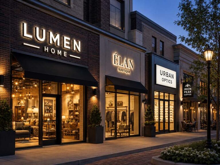
A reception area is usually the first place where a visitor quietly decides what kind of company they are walking into. Before anyone reads a brochure, talks to the receptionist, or joins the meeting, the wall behind the desk has already said something about the brand. A clean logo sign can make the office feel stable, organized, and professional. A poor one can make even a well-designed office look unfinished.
The best logo sign for an office reception area is usually an acrylic logo sign, metal logo sign, or backlit logo sign, depending on the office style, wall material, lighting, and brand image. Acrylic signs work well for modern and clean spaces. Metal signs look more premium and serious. Backlit signs are best when the company wants a soft, high-end focal point behind the reception desk.
But there is no single “best” sign for every office. A law firm may need a brushed stainless steel logo with calm lighting. A tech company may prefer a clean acrylic logo with soft backlighting. A beauty clinic may want a warm, elegant wall sign that looks good in photos. A co-working space may need something durable, clear, and easy to repeat across different locations.
Think of the reception sign as the office’s handshake. It should not shout. It should not feel cheap. It should simply tell visitors, “You are in the right place, and this company pays attention to details.” The real question is not only which sign looks good online, but which sign will still look right after it is installed on your actual wall, under your actual lighting, with your actual brand logo.
What Makes a Good Reception Logo Sign?
A good reception logo sign is not just about looking “nice” on the wall. In real office projects, it has to work under real conditions: different wall materials, uneven lighting, limited space, visitor viewing distance, and installation constraints. The best reception signs are the ones that look correct from 10–20 feet away, stay visually balanced behind the desk, and do not create problems during installation or daily use.
Most issues in reception signs come from three things: wrong size, wrong material choice, or poor planning for wiring and lighting. When these are handled correctly, even a simple acrylic or metal logo can look very professional.
What Should Visitors Notice First in a Reception Area?
In real office environments, visitors only have a few seconds to form an impression. The reception logo should immediately communicate the brand name clearly—without requiring them to walk closer or look twice.
A good reception sign should be readable:
- From the main entrance (typically 10–20 ft / 3–6 m away)
- From the waiting area seating position
- While people are standing at the reception desk
If the logo cannot be recognized quickly, the sign is usually too small, too thin, or has poor contrast with the wall.
Common real-world issues:
- Thin fonts disappear under ceiling lighting
- Small taglines become unreadable at distance
- Low contrast between wall and sign color
- Overly complex logos lose clarity
Simple rule used in real projects:
If a visitor cannot read the company name in 2–3 seconds, the sign size or design needs adjustment.
How Should the Sign Match the Actual Office Interior?
Reception signs must match the real interior, not just the logo design file. A sign that looks good on a white background may fail completely on wood, marble, or textured stone walls.
In real office projects, designers usually match sign type with interior style:
| Interior Type | Best Sign Choice | Why It Works in Real Space |
|---|---|---|
| White / glass modern office | Black acrylic or stainless steel letters | High contrast, clean visibility |
| Wood / warm interior | Brushed gold or soft acrylic | Blends naturally with material tone |
| Marble / stone wall | Metal letters or backlit sign | Creates depth and separation |
| Dark feature wall | White acrylic or halo-lit sign | Strong readability |
| Creative studio | Layered acrylic or mixed materials | Flexible, expressive look |
Key real-world insight:
- Contrast matters more than material cost
- A simple acrylic sign can outperform expensive metal if wall match is correct
- Wrong tone matching is the most common reason for “cheap-looking” results
What Size Actually Works Behind a Reception Desk?
Reception sign size should be based on wall width and desk width—not guesswork from product photos.
In real installations, a commonly used guideline is:
- Sign width = 50% to 75% of reception desk width
This keeps the sign visually centered and prevents it from feeling too small or overwhelming.
| Desk Width | Recommended Sign Width | Typical Use Case |
|---|---|---|
| 4–5 ft (1.2–1.5 m) | 2–3 ft (60–90 cm) | Small office, clinic |
| 6–8 ft (1.8–2.4 m) | 3–5 ft (90–150 cm) | Standard office reception |
| 8–10 ft (2.4–3 m) | 4–6 ft (120–180 cm) | Corporate lobby |
| 10 ft+ (3 m+) | Custom large wall sign | HQ / hotel / showroom |
Real installation mistakes:
- Sign too small → wall looks empty and unbranded
- Sign too large → feels crowded and hard to read
- No margin space → sign feels “stuck” to wall edges
A good reception sign always leaves breathing space around it.
How Do Materials Change the Real Look in Offices?
Material choice directly affects how “premium” a reception sign feels in real lighting conditions. The same logo can look modern, cheap, luxury, or outdated depending on material selection.
In real office lighting, materials behave differently:
| Material | Real Office Effect | Common Problem |
|---|---|---|
| Thin acrylic | Clean but light visual impact | Can look too basic |
| Thick acrylic | Modern and stable | Needs good edge finishing |
| Brushed stainless steel | Professional and solid | Can look cold on white walls |
| Gold metal | Premium and warm | Wrong tone looks cheap |
| Mirror metal | Luxury effect | Reflects lights & people |
| Backlit acrylic/metal | Strong focal wall | Requires wiring planning |
Practical decision logic:
- Want clean modern look → acrylic
- Want authority & trust → brushed metal
- Want visual impact → backlit sign
- Want cost balance → acrylic + 3D structure
Important real detail:
Material quality is not just appearance—it also affects edge finish, installation stability, and long-term cleaning.
Is Lighting Always Necessary for Reception Signs?
Lighting can improve reception signs, but it is not always required. In real offices, backlit signs work best when the wall is designed as a feature wall or when the brand needs a strong focal point.
Backlighting works well when:
- Wall is dark, stone, or textured
- Reception area is the main visual focus
- Company wants premium brand impression
- Lighting in room is controlled
Backlighting is often unnecessary when:
- Wall is already bright white
- Reception space is small
- Office already has strong ceiling lighting
- Budget or wiring access is limited
Real lighting comparison:
| Situation | Result of Backlit Sign |
|---|---|
| Dark stone wall | Strong premium effect |
| White minimalist wall | Often no noticeable improvement |
| Strong daylight reception | Glow becomes weak |
| Small reception area | Can feel visually heavy |
Real requirement checklist:
- LED brightness must match indoor use (not outdoor level)
- Glow should be soft, not sharp
- Wiring must be fully hidden
- Power supply must remain accessible
What Usually Goes Wrong in Real Projects?
Most reception sign problems are not design failures—they are planning failures before production.
Common real issues:
- Sign arrives too small for wall
- Logo strokes too thin to read from entrance
- Wall contrast too low (sign blends in)
- Visible wiring behind reception desk
- Wrong installation height
- Missing mounting accessories
- Poor packing leads to scratches or damage
Pre-order checklist used in real projects:
| Check Item | Why It Matters |
|---|---|
| Wall photo | Ensures correct scale & contrast |
| Desk width | Prevents wrong sign proportion |
| Viewing distance | Ensures readability |
| Material sample | Avoids color mismatch |
| Lighting condition | Prevents glare or weak visibility |
| Wiring plan | Avoids visible cables |
| Installation method | Ensures safe mounting |
| Accessories list | Prevents missing parts |
Key takeaway:
A reception sign problem is usually decided before production, not during installation.
What Makes a Reception Sign Truly Successful?
A successful reception logo sign is the one that fits naturally into the space and works every day without drawing attention to mistakes.
It should:
- Be readable from entrance within seconds
- Match wall material and interior tone
- Stay balanced above reception desk
- Avoid visible wiring or messy installation
- Look consistent in photos and real life
- Require minimal maintenance after installation
In real office environments, the best reception signs are not always the most complex ones—they are the ones that were correctly planned.
A good sign quietly communicates one thing:
“This is a professional, organized, and trustworthy company.”
Which Sign Type Fits Your Reception?

The best sign type for your reception depends on the wall size, office style, logo shape, lighting, installation conditions, and how formal the brand should feel. Acrylic signs are clean and flexible. Metal signs feel more premium. Backlit signs create a softer focal point. 3D letters work well when you want depth without wiring. The right choice should fit the real reception wall, not just look good in a catalog photo.
What Are Acrylic Logo Signs Best For?
Acrylic logo signs are a practical choice for many office reception areas because they are clean, lightweight, customizable, and easy to match with different brand styles. They work especially well for startups, clinics, beauty offices, design studios, consulting firms, co-working spaces, and modern corporate offices.
Acrylic can be made in several ways. It can be laser-cut into separate letters, layered into a 3D logo, printed with brand colors, painted on the back, or mounted as a clear panel with standoffs. This makes it useful for logos with multiple colors, curved shapes, icons, or small design details.
For most reception walls, acrylic thickness is often selected based on sign size. Small wall logos may use thinner acrylic, while larger signs need thicker material so the letters do not look flat or weak. A very thin acrylic sign may save cost, but it can look less professional on a large reception wall.
| Acrylic Sign Option | Best For | What to Check |
|---|---|---|
| Cut acrylic letters | Clean logo walls | Letter thickness and edge finish |
| Printed acrylic panel | Multi-color logos | Print quality and color accuracy |
| Frosted acrylic sign | Soft modern offices | Wall contrast and visibility |
| Layered acrylic logo | More depth without metal | Alignment between layers |
| Acrylic with LED | Modern backlit logo walls | LED brightness and wire exit |
Acrylic is a good choice when the office wants a modern look without making the reception feel too formal. It is also useful when the logo has colors that are hard to reproduce in metal. However, the finish matters. Rough edges, thin material, poor printing, or visible glue can make acrylic look cheap. For reception use, it is worth confirming material thickness, surface finish, mounting method, and whether the edges will be polished.
When Should You Choose Metal Letters?
Metal letters are better when the office wants a stronger, more premium, and more permanent look. They are often used by law firms, finance companies, real estate offices, corporate headquarters, luxury showrooms, hotel management offices, and professional service firms.
Common metal finishes include brushed stainless steel, mirror stainless steel, brushed gold, champagne gold, black titanium, painted aluminum, and powder-coated metal. Brushed finishes are usually safer for office reception areas because they reduce glare and fingerprints. Mirror finishes can look luxurious, but they may reflect ceiling lights, windows, people, or furniture.
Metal signs work best when the logo is relatively simple and strong. If the logo has very thin strokes, tiny letters, gradient colors, or complex small icons, metal may not be the easiest option. In that case, acrylic or a mixed-material sign may give a cleaner result.
| Metal Finish | Visual Feeling | Suitable Reception Style |
|---|---|---|
| Brushed silver | Professional, stable | Law, finance, corporate offices |
| Brushed gold | Warm, premium | Luxury, beauty, hospitality, showroom |
| Black metal | Sharp, modern | Tech, design, real estate, high-end retail |
| Mirror metal | Bold, luxury | Controlled lighting environments |
| Painted metal | Clean and brand-matched | Offices needing exact logo colors |
Metal letters are heavier than acrylic, so installation needs more attention. The wall material should be checked before production. Drywall, marble, tile, glass, wood panel, and concrete may require different mounting methods. For larger metal letters, screws, studs, spacers, or a mounting template are usually better than simple adhesive.
If the reception area is meant to feel serious, stable, and long-term, metal letters are often a strong choice. But they should not be selected only because they sound “premium.” The finish, wall contrast, logo shape, and lighting conditions must all work together.
Is a Backlit Sign Worth It?
A backlit sign is worth considering when the reception wall should become a visual focal point. It adds depth, warmth, and a more polished feeling, especially behind the reception desk. Backlit signs are common in corporate offices, hotel lobbies, clinics, beauty spaces, showrooms, and brand headquarters.
In most office reception areas, backlit signs use soft halo lighting. The light comes from behind the logo or letters and reflects onto the wall. This creates a glow around the sign instead of shining directly at visitors. The result can feel high-end without being too loud.
Backlit signs are most useful when:
- The reception wall is a main brand wall.
- The office receives clients or partners often.
- The wall is dark, textured, stone, wood, or matte painted.
- The company wants better photos and videos in the reception area.
- The logo is simple enough to support LED lighting.
- Wiring can be hidden through the wall or behind a panel.
However, backlit signs need more planning than non-lit signs. The supplier should check the LED color, brightness, power supply, wire exit, wall material, and maintenance access. A backlit sign with poor wiring can look worse than a non-lit sign. A visible cable, exposed adapter, or uneven glow will quickly reduce the premium feeling.
| Detail | Good Practice |
|---|---|
| LED color | Warm white for softer offices, neutral white for clean modern spaces |
| Brightness | Indoor-level brightness, not outdoor storefront brightness |
| Wire exit | Confirm before production, not during installation |
| Power supply | Hidden but accessible for future replacement |
| Wall surface | Matte or lightly textured walls usually show halo lighting better |
| Logo stroke width | Must be wide enough for stable LED placement |
Backlit signs are not always necessary. If the reception is small, bright, or already visually busy, a clean acrylic or metal sign may look better. The question is not “Is lighting more expensive?” The better question is “Will lighting improve this specific wall?”
Are 3D Letter Signs a Good Middle Option?
3D letter signs are a good middle option when the office wants depth and a professional look without LED wiring. They are often made from acrylic, PVC, aluminum, stainless steel, or painted materials. They can be mounted directly on the wall or slightly raised with spacers.
This type of sign is useful for offices that want a clean brand wall but do not want to open the wall, hide a power supply, or deal with electrical installation. It is also suitable for leased offices where drilling and wiring may be limited.
3D letters usually look better than flat vinyl or printed wall graphics because they create natural shadows and physical depth. Even without lighting, the sign feels more permanent. For many small and medium office reception areas, this is a very practical choice.
| 3D Letter Material | Best Use | Main Advantage |
|---|---|---|
| Acrylic letters | Modern office logos | Clean, flexible, color-friendly |
| PVC letters | Budget-friendly indoor signs | Lightweight and easy to install |
| Metal letters | Premium reception walls | Stronger and more durable |
| Painted letters | Brand color matching | Good for simple custom colors |
| Mixed material letters | More design depth | Combines cost and appearance |
The thickness should match the sign size. For small logos, too much thickness can look bulky. For large walls, thin letters may look weak. Many reception projects need a balance between letter height, stroke width, and material thickness.
3D letters are also easier to pack and ship than some fully illuminated signs. But installation accuracy still matters. If each letter is mounted separately, a paper template or mounting guide should be included. Without a template, the installer may spend more time aligning letters, and spacing mistakes can be hard to fix.
How Do You Choose the Right Type Quickly?
The easiest way to choose the right reception sign type is to start with the office goal. Do you want the space to look modern, premium, warm, serious, creative, or photo-friendly? Once the goal is clear, material and lighting choices become easier.
A small office with a clean white wall may only need acrylic letters. A financial office with a stone wall may look better with brushed metal. A clinic may need a soft backlit sign that feels calm and clean. A brand showroom may need a larger logo wall with halo lighting. A rented office may prefer non-lit 3D letters because installation is easier.
Here is a simple decision table:
| Reception Need | Better Sign Type | Why |
|---|---|---|
| Clean and modern look | Acrylic logo sign | Flexible, neat, and cost-controlled |
| Premium corporate feel | Metal letter sign | Stronger visual weight and authority |
| Soft high-end focal wall | Backlit logo sign | Adds depth and atmosphere |
| Easy installation | Non-lit 3D letters | No wiring, fewer installation steps |
| Multi-color logo | Acrylic or printed acrylic | Better color reproduction |
| Dark feature wall | Backlit or light-colored letters | Better contrast |
| Leased office | Acrylic or 3D letters | Easier to remove or replace |
| Client-facing office | Metal or backlit sign | Stronger first impression |
Before making the final decision, the office team should confirm a few real project details:
- Wall size and desk width
- Wall material and color
- Viewing distance from the entrance
- Logo file quality
- Whether wiring can be hidden
- Preferred brand feeling
- Installation restrictions
- Budget range
- Delivery deadline
A good reception sign should not be chosen from product names alone. “Acrylic,” “metal,” and “backlit” are only starting points. The final result depends on size, finish, wall contrast, lighting, wiring, and installation quality. If those details are confirmed early, the sign will look more natural in the office and cause fewer problems during installation.
How Do Materials Affect the Final Look?
Materials decide whether a reception logo sign looks modern, premium, warm, clean, or cheap. The same logo can feel completely different when made from acrylic, stainless steel, brushed gold metal, painted aluminum, or a backlit mixed-material structure. For office reception areas, the best material should match the wall finish, lighting, brand tone, cleaning needs, and installation method—not just the product photo.
Which Material Looks More Premium?
Metal usually gives the strongest premium feeling, especially brushed stainless steel, brushed gold, champagne gold, black titanium, and painted aluminum. It has more visual weight than flat acrylic and often works well in offices where trust, stability, and long-term brand image matter. Law firms, financial offices, real estate offices, consulting companies, headquarters, and luxury service spaces often choose metal because it feels more permanent.
But “premium” does not always mean “shiny.” In many reception areas, brushed metal looks better than mirror metal because it reflects less light and feels calmer. Mirror gold or mirror silver can look impressive in close-up photos, but in a real office, it may reflect ceiling lights, glass doors, people walking by, or the reception desk. That can make the sign look busy instead of elegant.
Acrylic can also look premium when it is thick enough, well polished, and matched with the right wall. For example, thick white acrylic letters on a dark stone wall can look clean and expensive. A layered acrylic logo with a matte finish can look more refined than thin metal letters on the wrong wall.
| Material | Visual Feeling | Best For | Risk If Chosen Poorly |
|---|---|---|---|
| Brushed stainless steel | Professional, stable, serious | Law, finance, corporate offices | Can look cold on white walls |
| Brushed gold metal | Warm, premium, elegant | Beauty, hospitality, luxury offices | Can look too yellow if wall tone is wrong |
| Black metal | Sharp, modern, bold | Tech, real estate, design offices | May disappear on dark walls |
| Thick acrylic | Clean, modern, flexible | Clinics, startups, studios | Thin acrylic can look cheap |
| Painted aluminum | Clean and brand-matched | Corporate logo walls | Poor paint finish looks low-end |
| Mixed acrylic + metal | More depth and detail | Feature reception walls | Needs careful alignment |
For a reception area, material should be judged from 6–15 feet away, not only from a close-up photo. Visitors usually see the sign while entering, waiting, or talking to the front desk. If the material only looks good from 12 inches away, it may not be the best office choice.
How Should the Material Match the Wall?
The wall behind the sign is just as important as the sign material. A good sign on the wrong wall can lose its effect. A simple sign on the right wall can look more expensive than expected. Before choosing material, the office team should look at wall color, texture, lighting, desk material, and nearby furniture.
For example, white acrylic letters on a white painted wall may look too weak unless the letters are thick, raised, or backlit. Gold metal on a warm wood wall can look elegant, but if the wood is also yellow-toned, the logo may not stand out clearly. Black metal on a dark gray wall may feel stylish in a rendering but become hard to read in real life.
Here is a practical matching guide:
| Wall Finish | Better Material Choice | Why It Works |
|---|---|---|
| White painted wall | Black acrylic, brushed metal, colored acrylic | Creates clear contrast |
| Dark painted wall | White acrylic, brushed gold, backlit metal | Stronger visibility |
| Wood panel wall | Brushed metal, warm white acrylic, soft backlit logo | Matches natural warmth |
| Marble wall | Metal letters, halo-lit logo, acrylic with standoffs | Adds depth without covering the stone |
| Concrete wall | Black metal, brushed steel, white acrylic | Clean industrial contrast |
| Glass wall | Acrylic panel or metal letters with careful mounting | Needs safe fixing and clean back side |
| Textured wall | Raised letters or backlit sign | Keeps the logo visible despite texture |
If the wall has strong patterns, such as marble veins, wood grain, or stone texture, the logo should be cleaner. Too many colors or small details can get lost. If the wall is plain, the sign can carry more detail, lighting, or layered structure.
Before production, it is helpful to send the supplier a straight front photo of the wall, a wider room photo, and the reception desk width. This allows the factory to suggest a material and finish that will work in the actual space, not just in a blank mockup.
How Do Materials Change Lighting Effects?
Lighting behaves differently on each material. This is one of the biggest reasons reception signs can look different from online photos. Acrylic can transmit, diffuse, or reflect light depending on its color and thickness. Metal blocks light, so it is often used for halo-lit signs where the glow comes from behind the letters. Mirror finishes reflect light strongly, while matte and brushed finishes feel softer.
For office reception areas, soft and even lighting usually looks better than strong brightness. The sign should support the reception atmosphere, not feel like an outdoor storefront sign. If the office already has bright ceiling lights, a very glossy or mirror material may create glare. If the wall is dark, backlighting can help separate the logo from the background.
Different materials affect lighting in different ways:
| Material / Finish | Lighting Effect | Best Use |
|---|---|---|
| White acrylic | Can look clean with front or back lighting | Modern office signs |
| Frosted acrylic | Softens light and reduces glare | Clinics, wellness offices, clean interiors |
| Clear acrylic | Creates floating effect but needs clean installation | Small premium wall signs |
| Brushed metal | Reflects light softly | Professional reception areas |
| Mirror metal | Reflects strongly | Luxury spaces with controlled lighting |
| Painted metal | Stable color, good for halo lighting | Brand-matched backlit signs |
| Black acrylic/metal | Strong contrast, but needs enough light | Bright walls or backlit layouts |
For backlit signs, the wall surface also matters. A smooth matte wall usually gives a cleaner halo effect. A glossy wall may create uneven reflections. A rough textured wall may break the light pattern. This does not mean textured walls cannot use backlit signs, but the light effect should be checked before confirming production.
The sign structure also matters. If the letters are too close to the wall, the light may look tight and uneven. If the letters are too far from the wall, the sign may look bulky. A good reception sign needs the right material, LED brightness, spacer depth, and wall distance working together.
Which Material Is Easier to Clean and Maintain?
Reception signs are seen every day, so maintenance matters. A sign may look good when installed, but if it easily shows dust, fingerprints, scratches, or light marks, it can become a problem for the office team. This is especially important for hotels, clinics, beauty spaces, corporate offices, and high-traffic reception areas.
Matte acrylic and brushed metal are usually easier to maintain than mirror metal or glossy acrylic. Brushed finishes hide small fingerprints better. Matte surfaces reduce glare and make dust less obvious. Mirror finishes can look high-end, but they need more careful cleaning because they reflect everything around them.
For signs installed behind a reception desk, the maintenance pressure is usually lower because people do not touch them often. For signs installed near corridors, waiting seats, glass walls, or public areas, scratch resistance and cleaning method become more important.
| Material | Maintenance Level | Common Issue | Better Use |
|---|---|---|---|
| Matte acrylic | Low | Dust on surface | Most modern offices |
| Glossy acrylic | Medium | Fingerprints and glare | Clean feature walls |
| Brushed stainless steel | Low to medium | Light fingerprints | Professional offices |
| Mirror stainless steel | High | Reflections and visible marks | Controlled luxury interiors |
| Painted aluminum | Low | Scratches if hit | Clean brand-color signs |
| Clear acrylic panel | Medium | Dust on both sides | Smaller signs with standoffs |
| Backlit metal sign | Medium | LED or power supply access | Premium reception walls |
Cleaning should also be considered during installation. If the sign is mounted too close to the wall, it may be harder to clean behind the letters. If the power supply is sealed in a place that cannot be reached, future maintenance becomes difficult. For illuminated signs, the power supply should be hidden but still accessible.
A good material choice is not only about the first day. It should still look clean after six months of dusting, guest visits, cleaning routines, and daily office use.
What Should You Confirm Before Choosing Materials?
Before choosing the final material, the office team should confirm the wall condition, logo details, finish sample, lighting need, installation method, and budget range. Many reception sign problems happen because material is selected too early, before checking the real wall and production limits.
A logo with thin lines may not work well in heavy metal. A multi-color logo may be easier to produce with acrylic or printed acrylic. A wall with no hidden wiring access may not be suitable for a backlit sign unless a cable route is planned. A small office may not need expensive metal if a clean acrylic sign fits the space better.
Before confirming material, check these details:
| Question | Why It Matters |
|---|---|
| Is the logo simple or detailed? | Complex logos may need acrylic, printing, or layered production |
| Is the wall light or dark? | Material color must create enough contrast |
| Is the wall smooth or textured? | Textured walls affect mounting and lighting |
| Will the sign be illuminated? | Backlit signs need material and wiring planning |
| Is the finish matte, brushed, glossy, or mirror? | Finish affects glare, photos, and cleaning |
| Can the wall support the sign weight? | Metal signs may need stronger mounting |
| Is the office rented or owned? | Rented offices may need simpler installation |
| Will the sign be reused or reordered? | Chain offices need consistent material records |
A practical way to avoid mistakes is to ask for a production drawing before payment. The drawing should show size, material, thickness, finish, mounting method, wire exit if needed, and accessories. If color is important, ask for Pantone matching, material reference, or a sample photo under normal lighting.
The best material is not always the most expensive one. It is the one that fits the brand, wall, lighting, installation plan, and daily use. When these details are confirmed before production, the finished reception sign is much more likely to look natural, professional, and worth the investment.
Is a Backlit Sign Better for Offices?
A backlit sign is better for offices when the reception wall needs a soft, premium, and more memorable brand effect. It works especially well behind reception desks, meeting area entrances, brand walls, and executive office spaces. But it is not always necessary. If the office is small, very bright, rented, or has limited wiring access, a clean non-lit acrylic or metal sign may be more practical.
What Does Backlighting Add to a Reception Wall?
Backlighting makes a reception logo sign feel more dimensional. Instead of the logo sitting flat on the wall, the light creates a soft glow around the letters or logo shape. This helps the sign stand out without using large size or loud colors. For many offices, this is the main reason to choose a backlit sign.
In real reception areas, the wall behind the front desk often has other design elements: wood panels, stone, marble, paint, wall texture, or decorative lighting. A flat sign may look clean, but it can disappear if the wall color is close to the logo color. Backlighting helps separate the logo from the background and gives the wall more depth.
Backlit signs are especially useful when the office wants:
- A stronger first impression for visitors
- A cleaner photo background for team photos or client visits
- A more premium reception wall without adding too much decoration
- Better logo visibility on dark, stone, wood, or textured walls
- A sign that still looks attractive in the evening or low-light conditions
However, backlighting should support the space, not take over the room. A reception sign should not feel like a storefront sign inside the office. The glow should be soft enough that people can stand near the desk, take photos, and talk with staff without feeling glare.
| Office Situation | Is Backlighting Useful? | Reason |
|---|---|---|
| Dark feature wall | Yes | Helps the logo stand out clearly |
| Wood or stone wall | Yes | Adds depth and highlights the brand |
| Small white wall | Maybe | May not be necessary if contrast is already strong |
| Very bright office | Maybe | Lighting effect may be less visible during daytime |
| Premium client-facing space | Yes | Creates a more finished reception look |
| Temporary rented office | Not always | Wiring and installation may be inconvenient |
A backlit sign is not just about making the logo brighter. The real value is making the wall look complete, designed, and more professional.
How Bright Should an Office Backlit Sign Be?
An office backlit sign should be bright enough to create a clear glow, but not so bright that it feels harsh. Reception signs are viewed from a short distance, usually within 3–15 feet. That is very different from outdoor storefront signs, which need to be seen from across the street. For offices, comfort is more important than maximum brightness.
The most common mistake is using lighting that is too strong. When the LED is too bright, the glow may become uneven, the logo edge may look overexposed in photos, and the reception area may feel less refined. Guests may not say the sign is too bright, but they may feel the space is a bit uncomfortable.
Color temperature also changes the feeling:
| LED Color | Visual Feeling | Better For |
|---|---|---|
| Warm white | Soft, welcoming, calm | Hotels, beauty offices, wellness spaces, warm interiors |
| Neutral white | Clean, balanced, professional | Corporate offices, clinics, modern reception areas |
| Cool white | Bright, sharp, modern | Tech spaces, high-contrast interiors |
| RGB/RGBW | Flexible and colorful | Creative studios, gaming spaces, event areas |
For most office reception areas, warm white or neutral white is safer than cool white. Warm white feels softer with wood, beige, stone, gold metal, and hospitality-style interiors. Neutral white works better with white walls, glass, black frames, stainless steel, and modern corporate spaces.
Before production, the office team should confirm:
- LED color temperature
- Whether the brightness is suitable for indoor use
- Whether dimming is needed
- Whether the glow will be soft or strong
- Whether the sign will be used during daytime, evening, or both
- Whether the wall surface can reflect the light evenly
If the sign will be used for photos or video backgrounds, softer lighting is usually better. A sign that looks slightly less bright in person may actually look much better on camera.
When Is a Backlit Sign Not the Best Choice?
A backlit sign is not always the best option. Some reception areas look better with simple metal letters, acrylic letters, or a non-lit 3D logo. Choosing backlighting only because it sounds more premium can create extra cost and installation problems if the wall is not suitable.
Backlit signs may not be the best choice when:
- The office wall has no easy power access.
- The office is rented and wall drilling is limited.
- The reception area is very small.
- The logo has very thin lines or tiny letters.
- The wall is glossy and may reflect the light unevenly.
- The office already has strong decorative lighting.
- The budget does not include wiring, installation, and power supply planning.
Logo structure is also important. Not every logo works well with LEDs. Thin strokes may not have enough space to hold LED modules or create a clean halo. Very small separated parts may make wiring difficult. Fine taglines can become messy when illuminated. In many cases, it is better to illuminate only the main logo and leave the tagline out.
| Logo / Wall Condition | Better Option |
|---|---|
| Very thin logo strokes | Non-lit metal or acrylic letters |
| Small tagline under logo | Main logo only, tagline printed separately |
| No hidden wiring access | Non-lit 3D letters or plug-in solution |
| Bright white office wall | Acrylic or brushed metal sign may be enough |
| Strong wall texture | Backlighting possible, but test glow effect first |
| Rented office | Lightweight acrylic or non-lit dimensional letters |
Backlit signs also cost more than basic non-lit signs because they include LED modules, wiring, power supply, structure, testing, and more careful packing. The sign price is only one part. Installation time, electrician work, wall access, and future maintenance should also be considered.
A good supplier should not push every office toward backlighting. The better approach is to check the wall, logo, budget, and installation condition first, then decide whether illumination really improves the result.
How Should Wiring and Power Be Planned?
Wiring is one of the most important details for a backlit office sign. A beautiful sign can look unprofessional if the cable is visible, the adapter hangs below the logo, or the wire exits in the wrong direction. For reception areas, the best wiring is usually hidden through the wall, behind a wall panel, inside a cabinet, or near the reception desk structure.
The wiring plan should be confirmed before production, not after the sign arrives. The sign needs to be built according to the wire exit direction and power supply location. If the wire exit is wrong, the installer may need to modify the sign, drill extra holes, or leave a visible cable cover.
Common wiring methods include:
| Wiring Method | Best For | Notes |
|---|---|---|
| Through-wall wiring | New office renovation or feature wall construction | Cleanest result, best for premium reception areas |
| Behind wood/stone panel | Designed reception walls | Needs early coordination with contractor |
| Side wire exit | Finished walls with limited access | May need cable cover or careful routing |
| Plug-in adapter | Small signs or temporary offices | Easy, but less premium |
| Remote power supply | Larger signs | Cleaner wall, but power supply must stay accessible |
The power supply should be hidden, but not buried in a place that cannot be reached. If it ever needs replacement, the office should not have to damage the wall. For commercial offices, this detail is very practical. A sign may work perfectly for years, but if maintenance is needed, access matters.
Before ordering, confirm these points with the supplier:
- Destination voltage, such as 110V or 220V
- Plug type or hardwiring requirement
- Power supply location
- Wire exit position
- Cable length
- Whether dimmer or remote control is needed
- Whether the installer needs a wiring diagram
- Whether mounting holes and wire holes are shown on the drawing
For new office projects, the sign supplier should coordinate early with the interior designer or contractor. For finished offices, the supplier should recommend the cleanest installation method based on the existing wall.
What Should Be Included in a Backlit Sign Quote?
A backlit sign quote should include more than the visible logo. It should clearly explain the sign structure, material, LED type, power supply, wiring, mounting method, accessories, production time, testing, and packing. Without these details, two quotes that look similar may actually include very different products.
For example, one quote may include stainless steel letters, LEDs, transformer, installation template, mounting hardware, wiring diagram, and export-safe packaging. Another quote may only include acrylic letters and basic LEDs. If the office team compares only the final price, they may choose the cheaper quote and later discover missing parts.
A clear backlit sign quote should include:
| Quote Item | What to Confirm |
|---|---|
| Overall size | Width, height, and thickness |
| Material | Acrylic, stainless steel, aluminum, or mixed structure |
| Finish | Brushed, painted, matte, glossy, mirror, or custom color |
| LED type | Backlit, halo-lit, edge-lit, or other lighting method |
| LED color | Warm white, neutral white, cool white, RGB, or brand color |
| Power supply | Voltage, plug type, transformer details |
| Wire exit | Back, side, bottom, or custom position |
| Mounting method | Screws, studs, spacers, template, or backboard |
| Accessories | Power supply, screws, spacers, connectors, mounting paper |
| Testing | Lighting test before shipment |
| Packing | Protection for surface, letters, LEDs, and accessories |
For office reception signs, pre-shipment testing is very important. The supplier should check whether the light is even, whether the power supply works, whether the wiring is stable, and whether all accessories are packed correctly. It is much easier to fix lighting issues before shipment than after the sign reaches the office.
A backlit sign can be a very good investment for an office reception area, but only when the details are handled properly. The best result comes from matching the logo, wall, lighting, wiring, and installation plan before production starts.
How Should Size and Placement Be Chosen?

Size and placement should be chosen according to the reception wall, desk width, viewing distance, logo shape, ceiling height, and installation conditions. A good reception logo sign should look balanced from the entrance, stay visible behind the front desk, and leave enough blank space around the logo. The best size is not the biggest size, but the size that makes the wall feel complete.
What Size Fits Behind a Reception Desk?
The reception desk is usually the easiest reference point for choosing sign size. In many office reception areas, the logo sign looks balanced when its width is about 50%–75% of the reception desk width. This is not a fixed rule, but it gives project managers a useful starting point before confirming the final drawing.
For example, if the reception desk is 8 feet wide, a logo sign around 4–6 feet wide may look comfortable in many spaces. If the wall is very wide and plain, the sign can be larger. If the wall has side panels, wall lamps, plants, screens, or artwork, the sign may need to be smaller so it does not feel crowded.
A common mistake is choosing the sign size only from an online product photo. Product photos are often taken close up, with no real desk, no wall height, and no people in the frame. In a real office, the sign must work with furniture and human scale.
| Reception Desk Width | Common Sign Width Range | Suitable Situation |
|---|---|---|
| 4–5 ft | 24–36 in | Small office, clinic, studio, private office |
| 6–8 ft | 36–60 in | Standard reception desk, small corporate office |
| 8–10 ft | 48–72 in | Larger reception wall, client-facing office |
| 10–14 ft | 60–96 in | Corporate lobby, showroom, brand wall |
| 14 ft+ | Custom large size | Headquarters, hotel lobby, commercial project |
Logo shape also affects size. A long horizontal logo may need more width but less height. A round or square logo may need more vertical space. If the logo includes a tagline, the main logo may need to be larger so the smaller text does not become unreadable.
Before confirming size, check these points:
- Is the logo readable from the entrance?
- Does the sign look balanced above the desk?
- Is the sign narrower than the main desk or wall panel?
- Is there enough blank space on both sides?
- Will monitors, flowers, lamps, or staff block the lower part?
- Does the size still work in photos and video backgrounds?
For most reception signs, leaving clean space around the logo makes it look more expensive. A wall filled too tightly often feels cheaper, even when the material is good.
How High Should the Sign Be Installed?
A reception logo sign should usually sit at a comfortable eye-level zone when visitors enter the office. It should be high enough to stay visible above the reception desk, but not so high that it feels disconnected from the front desk area.
In many offices, the center of the logo is placed roughly around 57–65 inches from the finished floor when there is no desk blocking the wall. But behind a reception desk, the logo often needs to be higher because monitors, counter height, plants, and staff may block the lower area. The final height should be checked on the actual wall, not decided only from a drawing.
A good placement test is simple. Stand at three points:
- At the office entrance
- In the waiting area
- In front of the reception desk
If the logo feels centered, readable, and not blocked from all three places, the height is likely close to correct.
| Placement Situation | Better Height Direction | What to Avoid |
|---|---|---|
| No desk in front | Center near eye level | Installing too high near the ceiling |
| Desk behind sign | Raise slightly above desk visual line | Letting monitors block the logo |
| Tall feature wall | Keep logo connected to reception zone | Floating too high with too much empty lower wall |
| Low ceiling | Use a wider, lower sign layout | Oversized tall logo |
| Waiting area view | Check from seated and standing angles | Sign hidden behind furniture |
If the office has a feature wall panel, the logo should usually be centered within that panel instead of the whole wall. If the wall has marble, wood strips, or vertical panels, the installation height should follow the visual structure. A logo that is technically centered on the wall but not centered within the design panel can look wrong after installation.
For large signs, use a paper template or tape outline on the wall before drilling. This small step can prevent expensive mistakes.
How Much Blank Space Does the Wall Need?
Blank space is not wasted space. It makes the logo easier to read and makes the reception wall look more premium. When the sign is too close to wall edges, ceiling lights, switches, vents, doors, or decorative panels, the whole area can feel crowded.
For a reception logo sign, there should be enough space around the logo so the brand can “breathe.” This is especially important for backlit signs because the glow needs room to spread evenly. If a halo-lit logo is too close to a corner or wall panel edge, the light may look uneven.
As a practical guide, try to leave at least 10%–20% of the sign width as clear space on the left and right sides. For example, if the sign is 60 inches wide, leaving at least 6–12 inches of clear space on both sides is usually safer. Larger premium walls may need more space.
| Wall Condition | Placement Advice |
|---|---|
| Plain painted wall | Leave balanced space around the logo |
| Wood panel wall | Center within the main panel, not just the total wall |
| Marble wall | Avoid covering the best stone pattern too much |
| Wall with side lamps | Keep logo away from lamp glare and shadows |
| Wall with switches or vents | Move sign or hide visual distractions |
| Backlit wall sign | Leave extra glow space around logo |
| Narrow wall | Use a compact logo or stacked layout |
Also check the top and bottom space. The sign should not sit too close to the ceiling, and it should not be so low that it competes with the reception desk surface. If the office has pendant lights or ceiling spotlights, make sure they do not create strong glare on glossy acrylic or mirror metal.
Good wall spacing makes even a simple acrylic sign look cleaner. Poor wall spacing can make an expensive metal sign look awkward.
How Should Viewing Distance Affect the Size?
Viewing distance affects letter height, logo thickness, and contrast. A sign that looks perfect from 3 feet away may be too small from the entrance. A sign that looks bold from the entrance may feel too large when guests stand at the desk. The goal is to make the logo readable from the main visitor path without overwhelming the front desk.
For small offices, the main viewing distance may be only 6–10 feet. In this case, the sign does not need to be huge, but the edges and material finish should be clean because people see it up close. For larger corporate reception areas, visitors may first see the sign from 15–30 feet away, so the logo needs stronger size, contrast, or lighting.
| Viewing Distance | Sign Planning Tip |
|---|---|
| 3–6 ft | Focus on clean finish, smooth edges, and detail quality |
| 6–10 ft | Use clear letter height and good wall contrast |
| 10–15 ft | Avoid thin strokes and small taglines |
| 15–25 ft | Increase logo size or use stronger contrast/material depth |
| 25 ft+ | Consider larger letters, backlighting, or a simpler layout |
Thin fonts are one of the biggest issues. A thin elegant logo may look good on a business card but weak on a reception wall. If the logo strokes are too narrow, the sign may be difficult to cut, paint, illuminate, or mount. For backlit signs, the problem is even bigger because the letters need enough width to hold LEDs and create an even glow.
Before production, the supplier should review:
- Minimum stroke width
- Small letter height
- Tagline readability
- Logo spacing
- Material thickness
- Lighting feasibility
- Mounting points
If a tagline is too small, it may be better to remove it from the main sign or print it separately on the wall. A clean main logo usually looks more professional than a crowded sign that tries to include every detail.
What Should Be Checked Before Final Approval?
Before approving production, the office team should confirm the final size, wall position, mounting method, wiring route, material thickness, and accessories. Many reception sign problems happen not because the sign is badly made, but because size and placement were not checked carefully before production.
The best way to avoid mistakes is to ask for a production drawing. A simple visual mockup is helpful, but a production drawing is more useful because it shows the real size, thickness, wire exit, mounting holes, and structure.
Before approval, check this list:
| Item to Confirm | Why It Matters |
|---|---|
| Overall size | Prevents the sign from being too small or too large |
| Logo position on wall | Makes sure the sign is centered correctly |
| Wall material | Affects screws, studs, adhesive, and drilling |
| Desk height | Prevents the sign from being blocked |
| Viewing distance | Helps confirm letter readability |
| Wire exit | Important for backlit or LED signs |
| Power supply location | Should be hidden but accessible |
| Mounting template | Helps installers align letters correctly |
| Accessories | Screws, spacers, power supply, connectors, template |
| Packing method | Protects surface, letters, and LED parts during shipping |
Photos are very useful. Send the supplier a front photo of the wall, a wider photo of the reception area, and the desk measurements. If the wall is not finished yet, send the interior rendering and wall elevation drawing. The more real information the supplier has, the less guessing is involved.
A good reception sign should arrive ready for the actual installation situation. The installer should know where each letter goes, where the wire exits, what hardware is included, and how the sign should sit on the wall. When size and placement are confirmed properly, the finished sign will look intentional instead of “just attached to a wall.”
What Should You Confirm Before Ordering?
Before ordering a reception logo sign, confirm the logo file, final size, wall condition, material, finish, lighting, wiring, mounting method, accessories, packaging, and delivery schedule. A good quote should not only show the price. It should explain what will be made, how it will be installed, what parts are included, and whether the finished sign will match the real reception wall.
What Logo File and Design Details Are Needed?
The first thing to confirm is the logo file. For a custom reception sign, a vector file is usually the safest option because the factory needs clean lines for cutting, printing, painting, lighting layout, and production drawings. Common usable file formats include AI, EPS, PDF, SVG, and CDR. A PNG or JPG can help show the logo visually, but it is often not enough for accurate production unless the resolution is very high and the design is simple.
This matters because a reception logo sign is not printed on paper. It may need to be cut into separate letters, built in layers, painted to match brand colors, or fitted with LEDs. If the file is unclear, the finished sign may have wrong spacing, distorted curves, uneven letter thickness, or missing small details.
Before ordering, confirm these design details:
| Item to Confirm | Why It Matters |
|---|---|
| Vector logo file | Keeps cutting lines clean and accurate |
| Correct brand version | Avoids producing an old or wrong logo |
| Main logo or logo + tagline | Small taglines may be hard to read on the wall |
| Font details | Thin fonts may be difficult to cut or illuminate |
| Icon and letter spacing | Prevents the sign from looking crowded |
| Minimum stroke width | Important for metal letters and LED signs |
| Logo color reference | Helps match brand colors more accurately |
If the logo includes very thin lines, small text, gradients, or complex icons, ask the supplier to review whether it can be made at the requested size. Many logos look perfect on a website but become difficult when turned into acrylic letters, metal letters, or backlit signs.
For reception areas, the main logo usually matters more than every small detail. If the tagline is too small, it may be better to remove it from the sign or print it separately nearby. A clean logo wall often looks more professional than a crowded sign that tries to include too much text.
A good supplier should send a design proof or production drawing before production. Do not approve the order only based on a quick mockup. The drawing should show the real size, material, thickness, mounting method, wire exit if needed, and final layout.
What Size, Wall Photo, and Placement Should Be Confirmed?
Size should not be guessed from a product photo. A reception sign must fit the actual wall, desk, entrance view, and ceiling height. Before ordering, send the supplier a front photo of the wall, a wider photo of the reception area, and basic measurements. This helps avoid signs that arrive too small, too large, too low, or visually unbalanced.
The most useful measurements include:
- Wall width and height
- Reception desk width
- Distance from entrance to sign wall
- Ceiling height
- Available clear wall space
- Height of desk, monitors, plants, or other objects
- Location of switches, vents, wall panels, lights, and sockets
A practical starting point is to compare the sign width with the reception desk width. In many offices, the logo sign looks balanced when it is around 50%–75% of the desk width. This is not a fixed rule, but it helps project teams judge whether the sign will feel too weak or too crowded.
| Area to Check | What to Look For |
|---|---|
| Reception desk | Will the sign look centered above it? |
| Wall panel | Should the sign be centered on the panel or full wall? |
| Entrance view | Can visitors read the logo when they walk in? |
| Waiting area | Does the sign still look clear from a seated position? |
| Ceiling lights | Will the finish reflect too much glare? |
| Furniture and monitors | Will anything block the lower part of the sign? |
If the wall is still under renovation, send the interior rendering or wall elevation drawing. If the wall is already finished, a real photo is better. A nice mockup on a blank white background is not enough because it does not show wall texture, desk scale, light direction, or possible obstacles.
Before production, ask for a size drawing. The drawing should show the overall width, height, letter thickness, and the sign’s position on the wall. For separated letters, a mounting template is very useful because it helps installers keep spacing accurate.
Which Material, Finish, and Color Should Be Approved?
Material and finish decide how the sign feels in the room. Acrylic, stainless steel, painted aluminum, brushed gold metal, black metal, frosted acrylic, and backlit mixed-material signs all create different impressions. Before ordering, confirm the material based on the office style, wall color, lighting, and brand image.
For example, a corporate office may choose brushed stainless steel because it feels stable and professional. A beauty clinic may prefer soft backlit acrylic or brushed gold. A modern tech office may use black acrylic, white acrylic, or a clean backlit logo. A law firm may avoid overly bright colors and choose a calm metal finish.
Color should also be confirmed carefully. Screen colors are not reliable because different monitors show colors differently. If brand color accuracy matters, provide Pantone, CMYK, RGB, HEX, or a physical sample reference. For metal finishes, ask for real finish photos or samples when possible.
| Choice to Confirm | Common Options | Why It Matters |
|---|---|---|
| Main material | Acrylic, metal, aluminum, mixed material | Affects look, weight, cost, and installation |
| Surface finish | Matte, glossy, brushed, mirror, painted | Affects glare, cleaning, and photo quality |
| Brand color | Pantone, CMYK, RGB, HEX, sample | Helps avoid color mismatch |
| Metal tone | Silver, gold, champagne, black, custom | Must match interior hardware and wall tone |
| Acrylic thickness | Thin, medium, thick, layered | Affects depth and perceived quality |
| Edge finish | Polished, painted, clean-cut | Rough edges make the sign look cheap |
One common mistake is choosing a material because it looks good in a close-up supplier photo. In a real office, the sign will be seen from several feet away, under ceiling lights, against a specific wall. Brushed finishes usually feel safer than mirror finishes in reception areas because they reduce reflection. Matte acrylic can look cleaner than glossy acrylic if there are windows or strong lights nearby.
For high-value projects, ask the supplier to confirm the finish with photos, material references, or samples before production. This is especially important for gold, champagne, bronze, black titanium, and custom painted colors because small tone differences can change the whole feeling of the reception wall.
How Should Lighting, Wiring, and Power Be Planned?
If the reception sign is backlit or illuminated, lighting and wiring must be confirmed before production. These details cannot be left until installation day. The sign structure, wire exit, LED layout, power supply, and mounting method all need to match the real wall.
First, confirm the lighting style. Is the sign backlit, halo-lit, front-lit, edge-lit, or non-lit? For office reception areas, soft backlit or halo-lit signs are usually more suitable than very bright lighting. The goal is to create a clean premium glow, not an outdoor storefront effect.
Then confirm the LED color. Warm white works well with wood, beige walls, gold metal, hotel-style interiors, and soft reception spaces. Neutral white is better for clean corporate offices, clinics, modern walls, and glass-heavy interiors. Cool white can look sharp, but it may feel harsh if the office already has bright lighting.
| Lighting Detail | What to Confirm |
|---|---|
| Lighting type | Backlit, halo-lit, front-lit, edge-lit, or non-lit |
| LED color | Warm white, neutral white, cool white, RGB, or custom |
| Brightness | Indoor comfort level, not outdoor-level brightness |
| Dimming | Needed or not needed |
| Wire exit | Back, side, bottom, or custom position |
| Power supply | Hidden but accessible |
| Voltage | 110V, 220V, or project-specific requirement |
| Plug type | US, EU, UK, AU, hardwired, or no plug |
| Cable length | Long enough for the planned power route |
Wiring is one of the most visible quality details after installation. A beautiful backlit sign can look unfinished if the cable is exposed. For new office renovations, the cleanest solution is usually through-wall wiring or wiring hidden behind a wall panel. For finished offices, the supplier may need to design a side wire exit, cable cover, plug-in solution, or remote power supply position.
The power supply should be hidden, but not sealed permanently inside a wall where nobody can reach it. If it needs replacement later, the office team should not have to damage the wall. For larger signs, ask whether the supplier will provide a wiring diagram or installation guide.
If the office is rented, ask the landlord or building manager whether drilling, hidden wiring, or electrical work is allowed. If it is not allowed, a non-lit 3D sign may be more practical.
What Installation, Packaging, and Quote Details Should Be Included?
The final quote should be clear enough that the office team knows exactly what will arrive. A vague quote such as “custom logo sign” is not enough. It should list the material, size, finish, lighting, power supply, accessories, mounting method, production time, packaging, and shipping method.
Installation details are especially important for reception signs because they are installed in a very visible place. If the letters are crooked, spacing is uneven, screws are missing, or the wire exit is wrong, the whole wall can look unprofessional.
Ask whether these items are included:
| Item | Why It Matters |
|---|---|
| Mounting template | Helps align letters accurately |
| Screws and anchors | Needed for secure installation |
| Spacers or standoffs | Important for raised or backlit signs |
| Power supply | Required for illuminated signs |
| Connectors and wires | Prevents local installer confusion |
| Installation drawing | Shows placement, holes, and wire exit |
| Extra small parts | Useful if screws or spacers are lost |
| Cleaning/protection film | Protects surfaces during installation |
Packaging should also be confirmed, especially for international shipping. Reception signs often have polished acrylic, painted surfaces, brushed metal, LEDs, thin letters, or delicate edges. Poor packing can cause scratches, broken corners, bent letters, or lost accessories.
A good packing method may include:
- Protective film on acrylic or metal surfaces
- Foam or EPE around each letter
- Edge protection for sharp or thin parts
- Separate accessory bag with labels
- Strong carton for small and medium signs
- Wooden crate for large or fragile signs
- Clear packing list inside the box
- Photos before shipment if needed
For the quote, check whether production time and shipping time are separated. Production time means the factory making the sign. Shipping time depends on destination country, shipping method, customs, and delivery service. For time-sensitive office openings or renovation deadlines, confirm the required delivery date early.
Before payment, the safest checklist is:
| Final Check | Confirmed? |
|---|---|
| Correct logo file and version | Yes / No |
| Final size and wall placement | Yes / No |
| Material and finish | Yes / No |
| Brand color or metal tone | Yes / No |
| Lighting and LED color | Yes / No |
| Wire exit and power supply | Yes / No |
| Voltage and plug type | Yes / No |
| Mounting method and accessories | Yes / No |
| Production drawing approved | Yes / No |
| Packing method confirmed | Yes / No |
| Production and shipping schedule | Yes / No |
| Warranty or testing process | Yes / No |
A clear order saves time for everyone. It helps the factory produce the right sign, helps the installer work faster, and helps the office avoid last-minute problems. For a reception logo sign, the best result comes from confirming the small details before production, not trying to fix them after the sign arrives.
Final Inquiry & Customization CTA (Rewritten Conclusion)
If you are currently planning a reception logo sign project, the next step is usually to translate your idea into a real production-ready solution. At this stage, what matters most is not just the design, but confirming the wall condition, logo file quality, size, material choice, and installation environment. These details help ensure the final sign fits naturally into your office reception space without unexpected adjustments during installation.
For many projects, teams will share their logo file, reception wall photo, and basic size requirements first, then receive a tailored recommendation covering material options, lighting suggestions (if needed), and a simple production drawing for confirmation. This process helps avoid common issues such as incorrect proportions, poor contrast on the wall, or wiring limitations that only appear during installation.
If you would like to discuss your reception logo sign or explore a custom solution for your office project, you can simply send your logo and wall photo to Iduoduo. A suitable structure, material, and installation approach can then be suggested based on your actual space, not just a standard catalog option.