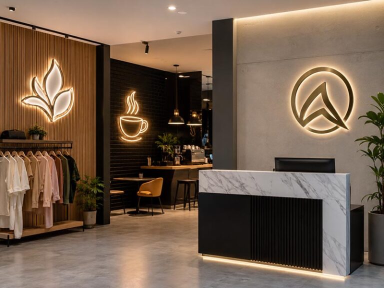
A clinic reception area is not just a waiting space. It is the first moment when a patient decides, often without thinking too much, whether the clinic feels organized, trustworthy, and professional. Before they meet the doctor, before they speak to the receptionist, and before they understand the treatment plan, they have already read the wall, the lighting, the logo, the front desk, and the small visual details around them. That is why the sign behind the reception desk matters more than many clinic owners expect.
The best LED sign for a clinic reception area is usually a soft backlit acrylic logo sign, because it looks clean, professional, and calm without feeling too bright or commercial. For dental clinics, medical offices, skin clinics, eye clinics, therapy centers, and wellness clinics, the sign should use soft light, clear lettering, easy-clean materials, hidden wiring, and colors that match the clinic’s brand and interior style.
A clinic sign should not try to look like a nightclub sign, a fast-food sign, or a retail promotion sign. Patients usually come to a clinic with questions, stress, pain, or uncertainty. The reception sign should make the space feel stable and easy to understand. It should say, “You are in the right place.” A good sign does this quietly. It does not shout. It does not distract. It supports the brand, guides the eye, and helps the whole reception wall look complete.
Think of a patient walking into a dental clinic for the first time. They may be nervous. They look up and see a clean backlit logo on a white stone wall, with soft warm-white lighting and no messy wires. The clinic immediately feels more reliable. That is the real job of a clinic reception LED sign.
What Makes a Good Clinic Reception Sign?

A good clinic reception sign should make the clinic feel clear, clean, and trustworthy from the moment a patient walks in. It does not need to be the brightest sign in the room. It needs to help people recognize the clinic name quickly, feel that the space is professional, and understand that the clinic pays attention to details. For most reception areas, this means a well-sized logo sign, soft lighting, clean edges, hidden wiring, and materials that match the wall, front desk, and overall clinic style.
What Should Patients See First?
Patients should first see the clinic name or logo clearly. This sounds basic, but it is the main job of a reception sign. A patient may be visiting the clinic for the first time, arriving for a dental appointment, skin treatment, eye exam, therapy session, or medical checkup. When they enter the reception area, the sign should quickly confirm: “Yes, this is the right place.”
For a clinic reception wall, the logo should usually be placed behind the front desk, centered with the reception counter or the main wall panel. The sign should not be blocked by computers, flowers, display stands, pendant lights, or wall decorations. If patients need to look around to find the clinic name, the sign is not doing its job well.
A practical rule is that the clinic name should be readable within 2–3 seconds from the entrance or check-in point. For many small and medium clinic reception areas, the sign width is often around 50%–75% of the reception desk width. This is not a fixed formula, but it helps keep the sign balanced. If the reception desk is 1800 mm wide, a logo sign around 900–1300 mm wide may often look natural, depending on the logo shape. If the desk is wider, the sign may need to be larger. If the room is compact, a smaller sign with clean lighting may look better than an oversized logo.
The sign also needs enough contrast with the wall. A white acrylic logo on a white wall may look clean in a close-up photo, but it can disappear in the real room if there is not enough backlighting or shadow. A dark logo on a dark wall has the same problem. Before production, clinics should check the wall color, desk width, viewing distance, ceiling height, and where patients will stand or sit.
A good reception sign should work from these common viewing points:
| Viewing Position | What the Sign Should Do |
|---|---|
| Entrance door | Confirm the clinic identity quickly |
| Front desk | Make check-in feel clear and professional |
| Waiting chairs | Look calm and readable without glare |
| Hallway entrance | Help patients find the reception area |
| Google Business Profile photo | Make the clinic look trustworthy online |
| Website reception photo | Show a clean and branded space |
The goal is not only to decorate the wall. The sign should help patients feel oriented. In a clinic, this small feeling matters. People often arrive with questions, stress, or discomfort. A clear reception logo helps the space feel more organized and easier to trust.
What Makes a Sign Look Professional?
A clinic reception sign looks professional when the details are controlled. Patients may not know the difference between 5 mm acrylic and 10 mm acrylic, or whether the LED layout is good, but they can feel when a sign looks cheap, uneven, or poorly installed.
The first detail is the logo shape. The logo should not be stretched, compressed, or simplified too much without approval. If the original logo has thin lines, small letters, or a delicate icon, the factory should review whether those details can be produced clearly. Some thin strokes may need slight thickening, especially for illuminated signs. Small taglines may need to be enlarged or removed, because tiny illuminated text can look messy from normal viewing distance.
The second detail is lighting. A good clinic sign should have even light, not bright dots, dark corners, or strong glare. For a reception wall, soft backlighting usually looks more professional than very bright front lighting. Warm white or neutral white lighting often works well because it feels clean but not cold. If the clinic wants a more premium look, a metal-faced backlit sign can make the wall feel more refined.
The third detail is finishing. Clean acrylic edges, smooth painted surfaces, neat metal faces, and accurate letter spacing all affect the final impression. A reception sign is usually installed in a clean, quiet part of the clinic, so flaws are easy to notice. Rough edges, glue marks, uneven screw positions, or exposed cables can make the whole reception wall feel unfinished.
Here is a simple checklist clinics can use before approving a sign design:
| Detail to Check | Good Standard | Risk If Ignored |
|---|---|---|
| Logo proportion | Matches original brand file | Logo looks distorted |
| Letter stroke | Thick enough for production | Thin parts break or do not light well |
| Sign size | Balanced with desk and wall | Looks too small or too heavy |
| Light effect | Soft and even | Hot spots or dark areas |
| Wire exit | Planned before production | Cable may be visible after installation |
| Mounting holes | Pre-confirmed layout | Installation becomes slow or inaccurate |
| Surface finish | Smooth and easy to clean | Looks rough or collects dust |
| Color | Matches brand style | Sign feels disconnected from the clinic |
Professional does not always mean expensive. A simple white acrylic backlit sign can look better than a complicated sign with poor lighting. For clinics, the safest design is often clean, balanced, and easy to read.
What Details Build Trust?
Trust is built through small visible details. In a clinic, patients are not only looking at the doctor’s qualifications or the equipment. They are also reading the environment. A clean reception sign can support the feeling that the clinic is careful, organized, and serious about patient experience.
One important detail is readability. Medical office signs should not make people guess. Fonts should be clear. Letter spacing should not be too tight. The logo should be visible from the entrance and front desk area. If the clinic serves older patients, families, or international visitors, clarity becomes even more important. A beautiful script font may look elegant on a business card, but it may not work well as a wall sign if patients cannot read it quickly.
Another detail is color consistency. Many clinics use blue, green, white, gray, silver, or soft gold because these colors feel clean, calm, and professional. If the clinic already has brand guidelines, the sign should follow them. If the sign color is different from the website, uniforms, printed forms, or interior design, the brand can feel less organized.
Lighting also affects trust. A sign that flickers, looks too harsh, or has uneven brightness can make the space feel lower quality. Patients may not consciously think about LED quality, but they will notice if the sign feels uncomfortable. Soft, stable lighting is usually better for healthcare spaces because patients may sit near the sign for 10–30 minutes.
The installation details are also important. Hidden wiring makes a big difference. A visible black or white cable running down the wall can ruin an otherwise good sign. Pre-planned rear wiring, side wire exits, cable channels, or wiring hidden behind the reception desk can make the final result much cleaner.
For clinic chains or multi-location medical brands, consistency builds trust too. If one branch uses warm white backlit letters and another branch uses a bright front-lit sign in a different color, the brand may feel less controlled. Saving production files, material specs, LED color, paint color, sign size, and installation method helps future locations keep the same look.
Trust-building details include:
| Detail | Why It Matters to Patients |
|---|---|
| Clear logo | Patients know they are in the right place |
| Soft lighting | The space feels calm and comfortable |
| Clean edges | The clinic feels more detail-oriented |
| Hidden wires | The reception wall looks more professional |
| Correct color | The brand feels consistent |
| Proper size | The sign feels planned, not random |
| Stable brightness | Avoids a cheap or distracting impression |
| Easy-clean surface | Supports the clean healthcare feeling |
A good clinic reception sign should not look like a temporary decoration. It should feel like part of the clinic’s identity and daily patient experience.
What Should Be Avoided?
Clinics should avoid choosing a reception sign only because it looks eye-catching in product photos. A sign that works for a bar, salon, gaming room, or retail store may not work in a clinic. Healthcare spaces need a different feeling: calm, clean, clear, and reliable.
The first thing to avoid is overly strong lighting. Very bright front-lit letters or intense cool-white LEDs can create glare, especially on glossy walls, marble panels, glass doors, or polished reception desks. Patients sitting in the waiting area may feel uncomfortable if the sign is too bright. Staff working near the front desk may also find it distracting during long hours.
The second thing to avoid is poor readability. Thin fonts, small taglines, low contrast, and decorative lettering can make the sign harder to read. A clinic logo can still be stylish, but it should not sacrifice clarity. If the clinic name cannot be read from the entrance or waiting area, the design needs adjustment.
The third thing to avoid is messy installation. Visible wires, random screw holes, tilted letters, uneven spacing, and poorly placed power supplies can make the clinic look less professional. These problems often happen when the sign is ordered without confirming wall size, wire exit position, mounting method, and installation template.
The fourth thing to avoid is copying another clinic’s sign without considering your own wall. A sign that looks good in a large dental office may look too big in a small therapy clinic. A warm gold backlit sign may look premium on a stone wall, but it may not match a simple white medical office. The best sign should match the real reception wall, not just a reference photo.
Common mistakes include:
| Mistake | Better Choice |
|---|---|
| Choosing the brightest sign | Choose readable, comfortable brightness |
| Using RGB effects for the main logo | Use soft white or brand-matched lighting |
| Keeping a tiny tagline | Enlarge it or remove it for better readability |
| Ignoring wall dimensions | Make a mockup on the real wall photo |
| Leaving wires visible | Confirm wire exit before production |
| Choosing glossy material on a reflective wall | Use matte, satin, or backlit design |
| Ordering only by price | Check material, lighting, packaging, and installation details |
| Using poor logo files | Provide vector files such as AI, EPS, SVG, or PDF |
A clinic reception sign should make the space feel more complete, not busier. The safest approach is to keep the design clean, choose comfortable lighting, confirm the size with real wall measurements, and make installation details clear before production.
Which LED Sign Type Is Best?

For most clinic reception areas, the best choice is a backlit acrylic logo sign. It gives the reception wall a clean, calm, and professional look without making the space feel too commercial. Front-lit letters, light box signs, metal backlit letters, and LED neon signs can also work, but they fit different clinic styles. The right choice depends on the wall size, interior design, logo shape, lighting needs, budget, and how formal or friendly the clinic wants to feel.
Which Is Better: Backlit or Front-Lit?
Backlit signs are usually better for clinic reception areas because they create a softer glow around the logo or letters. The light does not shine directly into the patient’s eyes. Instead, it reflects gently onto the wall, which makes the reception area feel calmer and more polished. This is why backlit signs are often used in dental clinics, medical offices, dermatology clinics, aesthetic clinics, eye clinics, wellness centers, and therapy offices.
A backlit sign works especially well when the clinic wants the wall to look premium but not flashy. For example, a white acrylic logo with warm white backlighting can make a small dental clinic feel cleaner and more welcoming. A brushed stainless steel logo with soft halo lighting can make a private medical office feel more established. A champagne gold backlit logo can work well for aesthetic clinics or med spa reception areas.
Front-lit signs are different. The light comes through the front face of the letters or logo, so the sign looks brighter and more direct. This can be useful when the clinic wants stronger brand visibility, or when the wall is dark and the logo needs to stand out clearly. But in a reception area, front-lit signs need careful brightness control. If the face is too bright, it can create glare in photos, reflect on glossy walls, or feel uncomfortable for patients sitting nearby.
Here is a practical comparison:
| Sign Type | Best Use | Clinic Reception Fit | What to Watch |
|---|---|---|---|
| Backlit acrylic sign | Main logo wall | Very good | Needs enough space behind letters for soft glow |
| Backlit metal letters | Premium reception wall | Very good | Higher cost and heavier structure |
| Front-lit acrylic letters | Stronger logo visibility | Good | Brightness must be controlled |
| Front-lit channel letters | Large indoor or storefront branding | Sometimes suitable | May feel too commercial if too bright |
| Non-lit acrylic logo | Minimal clinic wall | Good if wall lighting is strong | Less visible in dim rooms |
For a clinic reception area, backlit signs are often the safer choice because they feel more comfortable. Patients may sit in the waiting area for 10–30 minutes, so the sign should not behave like a storefront sign trying to catch traffic from the street. It should support the room, not dominate it.
A good way to decide is to look at the wall material. If the clinic has a stone, wood, painted, or textured feature wall, backlighting can create a nice shadow and make the logo look more three-dimensional. If the wall is very plain and the clinic wants a sharper, brighter brand display, front-lit letters may still be an option. For most medical reception spaces, soft backlighting gives a better balance of visibility and comfort.
Is Acrylic Good for Clinics?
Acrylic is one of the most practical materials for clinic reception LED signs. It looks clean, can be cut into precise logo shapes, works well with LED lighting, and is suitable for many medical interiors. Compared with some heavier materials, acrylic is also easier to install, which is helpful for small and medium clinics that may not have a complex construction team onsite.
Acrylic works well for clinic signs because it can support different styles:
| Acrylic Sign Style | Best For | Typical Look |
|---|---|---|
| White acrylic backlit logo | Dental clinics, medical offices, therapy centers | Clean, simple, bright but soft |
| Frosted acrylic logo | Wellness clinics, skin clinics, calm interiors | Soft, modern, gentle |
| Clear acrylic backboard sign | Small clinics, leased spaces, easy installation | Lightweight and practical |
| Printed acrylic panel | Simple logo or light box style | Budget-friendly and clear |
| Acrylic letters with metal face | Premium clinics | Clean shape with higher-end finish |
For a clinic, acrylic is not only about appearance. It is also practical. A smooth acrylic surface is easier to wipe than rough decorative materials. It can work with white, blue, green, gray, silver, or warm neutral brand colors. It also allows flexible production for logos with curves, icons, and custom shapes.
However, acrylic quality needs attention. Very thin acrylic may look weak or cheap, especially when used for a main reception wall. Poor cutting can leave rough edges. Low-quality painting can make the color look uneven. Bad LED layout can create bright dots or dark areas behind the logo. These problems are easy to notice in a clinic because reception walls are usually clean and simple.
For most clinic reception projects, the clinic should confirm these details before production:
| Detail | Why It Matters |
|---|---|
| Acrylic thickness | Affects strength, edge quality, and premium feel |
| Surface finish | Glossy, matte, frosted, or painted finish changes the look |
| Edge treatment | Clean edges make the sign look more professional |
| LED color | Warm white, neutral white, or brand color affects mood |
| Backboard design | Helps with installation and wiring |
| Logo stroke width | Thin logo parts may need adjustment |
| Cleaning needs | Smooth surfaces are easier to maintain |
Acrylic is especially useful when the clinic wants a clean medical look without the heavy cost of full metal letters. It is also a good choice for clinics that may later open more branches, because the same acrylic specification can be repeated more easily for future locations.
Are Neon Signs Suitable?
LED neon signs can be suitable for some clinic spaces, but they are usually not the best choice for the main reception logo. Neon-style signs feel more decorative and emotional. They can work well in beauty clinics, med spas, pediatric dental clinics, wellness studios, or photo-friendly waiting areas, but they need to be used carefully.
For a general medical clinic, dental clinic, eye clinic, therapy office, or healthcare reception area, the main logo usually needs to look more stable and professional. A backlit acrylic sign or metal backlit sign often gives a better first impression. It feels cleaner, more permanent, and more connected to a healthcare environment.
LED neon can still work well in secondary areas. For example:
| Clinic Space | Suitable Neon Use |
|---|---|
| Pediatric dental clinic | Friendly smile phrase or playful wall icon |
| Med spa | Soft slogan sign for a photo wall |
| Wellness clinic | Calm quote in warm white LED neon |
| Skin clinic | Small decorative sign near consultation area |
| Therapy studio | Gentle phrase in a waiting corner |
| Beauty clinic | Brand slogan for social media photos |
The problem starts when clinics use neon as the main reception logo without thinking about the patient experience. Bright pink, purple, blue, or RGB neon may look attractive online, but it can feel too casual or too commercial in a medical reception area. If the clinic wants to build trust, the sign should not look like a party decoration.
If a clinic still wants LED neon, the safest choices are usually warm white, soft white, or a gentle brand color. The design should be simple. Avoid flashing effects, strong RGB color changes, or very thin script that is hard to read. The sign should be treated as a brand accent, not the main proof of professionalism.
Here is a quick decision guide:
| Question | If Yes | Better Sign Type |
|---|---|---|
| Is this the main clinic logo behind reception? | Yes | Backlit acrylic or metal sign |
| Is the clinic a med spa or beauty clinic? | Yes | Backlit logo plus optional neon slogan |
| Is the sign mainly for photos? | Yes | LED neon can work |
| Is the clinic style formal and medical? | Yes | Avoid strong neon effects |
| Is the wall near waiting chairs? | Yes | Keep neon soft and low glare |
LED neon is not wrong. It just has to be used in the right place. For the main reception logo, most clinics will get a more professional result with backlit acrylic or metal backlit letters.
Which Sign Fits Small Receptions?
Small clinic reception areas need signs that are clean, light, and well-proportioned. The sign should make the space feel more complete, not more crowded. A common mistake is choosing a large sign because it looks impressive in a product photo. In a small waiting room, that same sign may feel too bright, too close, or visually heavy.
For small receptions, a thin backlit acrylic logo sign is often the best option. It gives the wall a finished look without taking up too much depth. A clear acrylic backboard can also make installation easier, especially if the clinic is in a leased space and does not want too many separate holes in the wall. If the wall already has good lighting, a non-lit acrylic logo or metal logo can also work.
Small reception areas should pay extra attention to these details:
| Detail | Recommended Choice |
|---|---|
| Sign width | Usually 50%–70% of desk width |
| Lighting | Soft, low-glare, preferably dimmable |
| Material | Acrylic or lightweight metal |
| Color | High contrast with wall, but not too strong |
| Wiring | Rear wire or neatly hidden cable |
| Mounting | Pre-drilled backboard or clear template |
| Logo details | Avoid tiny tagline or very thin strokes |
| Depth | Keep structure slim if wall space is tight |
If the reception desk is small, the sign should not be oversized. For example, if the desk is around 1200–1500 mm wide, a logo sign around 600–1000 mm wide may be enough, depending on the logo shape. A round or square logo may need less width but more height. A long horizontal logo may need more width to keep the letters readable.
Light control matters more in small rooms because patients may sit closer to the sign. A bright front-lit sign that looks fine from three meters away may feel harsh from one meter away. For this reason, warm white or neutral white backlighting is often safer than strong front lighting.
Small clinics should also think about installation before ordering. If the wall is narrow, has a glass panel, has hidden pipes, or uses decorative wall panels, the mounting method should be confirmed early. A sign with the wrong wire exit position can create visible cable problems. A sign without a template can be harder to install straight.
For a small reception, the best sign is usually not the most complex one. A clean logo, soft backlight, correct size, hidden wire, and easy installation will look more professional than a large sign with too many effects.
How Should the Light Look?

The light on a clinic reception sign should feel soft, stable, and easy on the eyes. It should make the clinic logo clear without turning the reception wall into a bright advertising display. For most clinics, warm white or neutral white lighting works better than strong cool white or color-changing effects. The best light is not the one that looks brightest in a product photo. It is the one that looks comfortable in the real waiting area, works with the wall material, and still looks clean in photos.
What Color Temperature Works Best?
For clinic reception areas, warm white and neutral white are usually the safest choices. These light colors feel clean without making the room look too cold. They also work well with common clinic interiors, such as white walls, light wood panels, marble reception desks, gray flooring, soft beige walls, glass partitions, and simple medical-style furniture.
A very cold white light can look sharp in photos, but in a real reception area it may feel harsh, especially when patients are sitting nearby. A very warm yellow light can feel cozy, but if it is too yellow, the sign may look less medical and less clean. The right color temperature depends on the clinic type, wall color, and brand style.
A practical guide:
| Light Color | Common Range | Best For | What to Watch |
|---|---|---|---|
| Warm white | Around 3000K | Dental clinics, wellness clinics, therapy offices, med spas | Can look too yellow if the wall is cream or beige |
| Soft neutral white | Around 3500K | Most clinic reception areas | Usually the safest choice |
| Neutral white | Around 4000K | Medical offices, eye clinics, dermatology clinics | Clean and modern, but still comfortable |
| Cool white | Around 5000K or above | Very clinical interiors, special brand styles | May feel cold or too bright in waiting areas |
| Brand color light | Custom color | Beauty clinics, wellness brands, logo accents | Should be tested to avoid looking too decorative |
| RGB lighting | Color-changing | Usually not recommended for main clinic logo | Can feel too casual for healthcare reception |
For most reception logo signs, 3500K–4000K is a good starting point. It looks clean on camera and still feels comfortable in person. If the clinic has warm wood, beige walls, or a soft wellness style, 3000K–3500K may look better. If the clinic has a very modern white, gray, and glass interior, 4000K may feel more suitable.
Clinics should also compare the sign light with the room lighting. If the ceiling lights are warm but the sign is cool white, the logo may look disconnected from the room. If the room is bright neutral white and the sign is very warm, the logo may look yellow in photos. Before production, it is helpful to send the supplier a photo of the reception wall with the ceiling lights turned on. This helps choose a more realistic LED color instead of guessing from a catalog.
For multi-location clinics, color temperature should be recorded. If one clinic uses 3000K and another branch uses 5000K, the same logo may feel very different. Saving the LED color temperature in the production file helps future branches keep a more consistent brand image.
How Bright Should It Be?
A clinic reception sign should be bright enough for patients to read the logo clearly, but not bright enough to create discomfort. This is one of the biggest differences between a clinic sign and a storefront sign. A storefront sign may need to compete with traffic, street lights, and other shops. A reception sign is much closer to people. Patients may sit near it for 10–30 minutes, and staff may work in front of it all day.
For reception areas, brightness should be judged by real viewing distance. A sign that looks good from five meters away may feel too bright when the waiting chairs are only one or two meters away. A sign that looks bright in a dark factory test room may look completely different under clinic ceiling lights. That is why clinics should not judge brightness only from supplier photos.
Here is a more practical way to think about brightness:
| Clinic Situation | Better Brightness Choice |
|---|---|
| Small waiting room | Softer light, lower brightness, or dimmer |
| Large reception lobby | Medium brightness with even glow |
| Dark feature wall | Slightly stronger backlighting may be needed |
| White wall with strong ceiling lights | Lower brightness can still look clear |
| Patients sit close to the sign | Avoid strong front-lit brightness |
| Reception used for photos and videos | Choose even light over maximum brightness |
| Evening clinic hours | Consider dimmable lighting |
For many clinic reception signs, dimming is worth adding. A dimmer gives the clinic more control after installation. During the day, the sign can be brighter if the room has strong natural light. In the evening, the brightness can be reduced to make the waiting area feel softer. For clinics that take reception photos, before-and-after patient photos, social media videos, or Google listing photos, dimming also helps reduce overexposure.
Brightness is also affected by the sign type. A backlit sign usually feels softer because the light reflects on the wall. A front-lit sign looks brighter because the light faces forward. A light box can look very clear, but if the panel is too bright, it may feel like a display board instead of a premium reception logo.
Before ordering, clinics should confirm these details with the supplier:
| Detail to Confirm | Why It Matters |
|---|---|
| Indoor use only or outdoor use | Affects LED brightness and structure |
| Wall color | Dark walls need different light planning |
| Sign type | Backlit, front-lit, light box, or neon-style |
| Viewing distance | Close viewing needs softer brightness |
| Dimming option | Helps adjust light after installation |
| LED layout | Affects evenness and hot spots |
| Power supply matching | Supports stable brightness |
| Room photo | Helps choose realistic brightness |
The best clinic sign should not make patients think, “That sign is bright.” It should make them feel, “This place looks clean and professional.”
Is Soft Light Better?
Soft light is usually better for clinic reception signs because it supports the feeling of calm and care. Clinics are not only selling a service. They are also managing patient emotions. A patient may walk in nervous about a dental treatment, skin procedure, eye exam, consultation, or test result. The reception lighting should help the space feel steady, not overwhelming.
Soft light works especially well with backlit acrylic signs and metal-faced halo-lit letters. The light reflects onto the wall and creates a gentle glow around the logo. This gives the sign depth without making it too aggressive. It also makes the reception wall look more finished, especially when the wall uses stone, wood, paint, or textured panels.
Compared with direct bright light, soft light has several advantages:
| Soft Light Benefit | Why It Helps Clinics |
|---|---|
| More comfortable for waiting patients | Reduces eye strain in close seating areas |
| Better for reception photos | Less overexposure and fewer blown-out letters |
| More premium appearance | Makes the logo feel built into the space |
| Works with clean interiors | Matches medical, dental, and wellness design |
| Less distracting for staff | Better for long working hours |
| Easier to pair with wall materials | Looks good on wood, stone, painted walls, and panels |
Soft light does not mean the sign should be weak or dull. It means the light should be controlled. The logo should still be readable from the entrance and front desk. The edges should still be clear. The sign should still show up in photos. The difference is that the light should feel comfortable instead of sharp.
The production structure affects whether the light is soft or harsh. LED spacing, letter depth, backboard distance, diffuser material, acrylic thickness, wall color, and mounting gap all change the final result. If LEDs are placed too close to the face or not diffused properly, the sign may show bright dots. If the backlit letters are too close to the wall, the glow may look narrow and uneven. If the wall surface is glossy, the light may reflect too strongly.
For clinics, it is useful to ask the supplier for the intended light effect before production. Terms like “soft backlit,” “halo glow,” “warm white backlight,” “no visible LED dots,” and “dimmable option” are more useful than simply saying “make it bright.”
A soft-light sign is often the better long-term choice because it still looks good after the opening day. It does not rely on a strong wow effect. It helps the clinic look clean every day.
How Can Glare Be Reduced?
Glare is a common problem in clinic reception signs, especially when the sign is too bright, the wall is glossy, or the face material reflects ceiling lights. Glare can make the logo harder to read, create poor photos, and make the waiting area feel less comfortable. It is better to prevent glare during design than to fix it after installation.
The first way to reduce glare is to choose the right sign type. Backlit signs usually create less direct glare than front-lit signs because the light goes toward the wall instead of directly toward the patient. If the clinic wants a clean and comfortable main logo, backlit acrylic or metal backlit letters are usually safer than strong front-lit letters.
The second way is to control the surface finish. High-gloss acrylic, mirror metal, polished gold, and shiny wall panels can reflect ceiling lights, windows, and camera flashes. These finishes may look attractive in close-up photos, but they can create glare in the real room. Matte, satin, brushed, frosted, or painted finishes often work better for clinic reception areas.
A practical glare-control guide:
| Glare Source | Better Solution |
|---|---|
| Glossy wall panel | Use softer backlighting or matte sign face |
| Strong ceiling spotlights | Avoid mirror finish and very bright front light |
| Glass door opposite the sign | Check reflection direction before installation |
| Polished marble wall | Use warm backlight and reduce brightness |
| Small waiting room | Add dimmer and avoid intense cool white |
| Photo/video use | Choose even light and non-glossy surface |
| Front-lit letters | Use diffuser and brightness control |
The third way is to check the viewing angle. A sign may look fine when viewed straight on, but glare may appear from the waiting chairs or the entrance door. Clinics should look at the wall from real patient positions before finalizing the design. If the waiting chairs face the sign directly, soft lighting becomes more important. If the sign is near a window, daylight reflection should be considered.
The fourth way is to add dimming. Even a well-made sign can feel too bright in certain conditions. A dimmer gives the clinic a simple way to adjust the light after installation. This is especially useful for clinics with changing daylight, evening appointments, or reception areas used for photos.
Before production, clinics can reduce glare risk by sending the supplier:
| Information | Why It Helps |
|---|---|
| Reception wall photo | Shows wall material and lighting |
| Ceiling light position | Helps avoid reflection problems |
| Waiting chair position | Shows patient viewing angle |
| Wall finish | Glossy, matte, stone, wood, or paint |
| Preferred light color | Helps choose warm or neutral tone |
| Sign type preference | Backlit, front-lit, or light box |
| Need for photos/videos | Helps plan brightness and surface finish |
A clinic reception sign should be easy to look at. If the sign is beautiful but uncomfortable, it is not the right sign for a healthcare space. Reducing glare makes the logo clearer, the room calmer, and the final installation more professional.
What Materials Work Best?
The best materials for clinic reception LED signs are acrylic, stainless steel, aluminum, and mixed acrylic-metal structures. Acrylic works well for clean medical logos and soft backlit signs. Metal gives a more premium and stable look. Aluminum is useful when the sign needs to be lightweight. The right material should match the clinic’s wall, brand style, cleaning needs, installation conditions, and budget. A good clinic sign should not only look good on day one. It should still look clean, safe, and easy to maintain after daily use.
Is Acrylic Easy to Clean?
Acrylic is one of the most practical materials for clinic reception signs because it has a smooth surface, clean edges, and a modern look. For dental clinics, medical offices, therapy centers, eye clinics, and skin clinics, acrylic often gives the right balance: it looks clean without feeling too cold, and it can be shaped into logos, letters, icons, and backlit panels.
In a clinic reception area, cleaning matters more than many buyers expect. The reception desk is close to patients, staff, delivery people, and cleaning teams. Dust, fingerprints, hand marks, and small surface stains can appear over time. A smooth acrylic sign is usually easier to wipe than rough wood, fabric, or textured decorative materials. This is useful for clinics that want the reception wall to keep a fresh, hygienic look.
Acrylic can be used in several ways:
| Acrylic Type | Best Use | Clinic Reception Effect |
|---|---|---|
| White acrylic | Logo letters, backlit signs | Clean, simple, medical |
| Frosted acrylic | Soft logo wall, wellness clinics | Gentle, modern, low glare |
| Clear acrylic | Backboard signs, small clinics | Lightweight, easy to install |
| Painted acrylic | Brand color logos | Custom and flexible |
| Diffuser acrylic | Light box or front-lit areas | More even light |
| Thick acrylic letters | Premium logo effect | More depth and stronger presence |
For most clinic reception signs, acrylic thickness should not be too thin. Very thin acrylic may look light and cheap, especially on a large wall. A thicker acrylic face or layered structure usually feels more solid. If the sign is backlit, the acrylic thickness, diffuser layer, LED spacing, and letter depth all affect whether the light looks smooth or uneven.
Clinics should also think about surface finish. Glossy acrylic can look bright and fresh, but it may show reflections and fingerprints more easily. Matte or frosted acrylic can feel softer and more suitable for healthcare spaces, especially when the reception wall has strong ceiling lights or glass nearby.
Acrylic is a good choice when the clinic wants:
| Clinic Need | Why Acrylic Works |
|---|---|
| Easy cleaning | Smooth surface can be wiped more easily |
| Custom logo shape | Acrylic can be cut into letters and icons |
| Soft backlighting | Works well with LED halo effects |
| Lightweight installation | Easier than heavy metal letters |
| Brand color matching | Can be painted or printed |
| Modern reception style | Fits clean clinic interiors |
| Lower budget than metal | More cost-friendly for many projects |
However, acrylic should still be handled carefully. Strong chemical cleaners, rough cloths, and sharp tools may scratch the surface. Clinics should use gentle cleaning methods and avoid abrasive wiping. If the sign is installed in a high-touch area, the clinic should choose a surface finish that is easier to maintain.
For many reception projects, acrylic is the safest first choice. It looks clean, supports soft lighting, works with many logo styles, and keeps installation relatively simple.
Is Metal More Premium?
Metal usually gives a clinic reception sign a more premium and permanent feeling. It is often used when the clinic wants the logo wall to look more refined, especially in private medical offices, high-end dental clinics, dermatology clinics, aesthetic clinics, med spas, eye clinics, and specialist centers.
Metal does not have to look cold. The finish changes the feeling a lot. Brushed stainless steel can look clean and professional. Champagne gold can feel warm and high-end. Matte black can look modern and confident. Painted aluminum can match brand colors while staying lighter than solid stainless steel.
Common metal options include:
| Metal Material or Finish | Best For | Look and Feel |
|---|---|---|
| Brushed stainless steel | Dental, medical, corporate clinics | Clean, stable, professional |
| Painted aluminum | Larger signs, lighter structures | Practical and flexible |
| Champagne gold finish | Aesthetic clinics, med spas | Warm, premium, soft luxury |
| Titanium gold finish | High-end reception walls | More reflective, luxury feel |
| Matte black metal | Modern clinics, strong branding | Clean contrast, bold but controlled |
| Brushed silver | Eye clinics, specialist offices | Calm and technical |
| Metal face + acrylic back | Backlit logo signs | Premium face with soft glow |
Metal works especially well on feature walls. If the reception wall uses marble, stone, wood veneer, microcement, gray panels, or textured paint, metal letters can make the sign feel more integrated with the interior design. A brushed metal face with soft backlighting often looks more expensive than a full acrylic sign, even if the logo shape is simple.
But metal is not always the best answer. It is usually heavier and more expensive than acrylic. If the wall is weak, thin, or made of a delicate decorative panel, installation needs more planning. Large metal letters may require stronger mounting points, studs, spacers, or a backboard. If the clinic is in a leased space and wants fewer wall holes, a lighter acrylic structure may be easier.
Clinics should consider metal when they want:
| Clinic Goal | Why Metal Helps |
|---|---|
| More premium reception wall | Metal feels more permanent |
| Luxury or specialist image | Works well for high-end clinics |
| Strong brand presence | Gives logo more weight |
| Backlit halo effect | Metal face with acrylic back looks refined |
| Long-term visual quality | Good finish can stay elegant |
| Stone or wood feature wall | Metal pairs well with premium materials |
The biggest risk with metal is choosing the wrong finish. Mirror gold or very shiny metal may create reflections under ceiling lights. It can also look too flashy for some medical offices. For clinic reception areas, brushed, matte, satin, or softly reflective finishes are usually safer than mirror-like finishes.
A good approach is to match the material to the clinic’s personality. A family dental clinic may not need a heavy metal sign. A premium cosmetic clinic may benefit from it. A therapy office may feel warmer with acrylic and soft lighting. A specialist clinic may look stronger with brushed metal letters.
Which Finish Looks Medical?
A medical-looking finish should feel clean, clear, and controlled. It should not fight with the reception wall or make the clinic feel like a retail shop. In most clinic reception areas, the best finishes are white acrylic, frosted acrylic, brushed silver, matte black, soft gray, champagne gold, brushed stainless steel, or neutral painted finishes.
The right finish depends on the clinic type. A general medical clinic often looks better with white, silver, gray, or soft blue tones. A dental clinic may use white acrylic, brushed stainless steel, or soft backlit letters. A dermatology clinic may choose white, champagne, or warm neutral finishes. A med spa may use gold, beige, frosted acrylic, or soft warm light. A pediatric clinic may use friendlier colors, but the finish should still look clean and safe.
Here is a practical guide:
| Clinic Type | Suitable Finish | Why It Works |
|---|---|---|
| Dental clinic | White acrylic, brushed silver, soft backlit finish | Clean and trusted |
| Dermatology clinic | White, champagne gold, frosted acrylic | Fresh and premium |
| Eye clinic | Blue, silver, white, brushed metal | Clear and professional |
| Pediatric clinic | Soft color acrylic, rounded logo shapes | Friendly but still clean |
| Therapy clinic | Warm white, frosted acrylic, light wood-friendly finishes | Calm and comfortable |
| Med spa | Champagne gold, warm white, frosted acrylic | Premium and soft |
| General medical office | White, gray, silver, neutral backlit finish | Simple and reliable |
| Specialist clinic | Brushed metal, matte black, neutral white light | Professional and stable |
Clinics should be careful with overly strong colors. Bright red, strong purple, saturated pink, RGB lighting, and color-changing effects may work in beauty, entertainment, or lifestyle spaces, but they can feel too casual for a medical reception logo. If the brand color is strong, it can still be used, but the sign design should balance it with clean material and controlled lighting.
Finish also affects how the sign photographs. Many clinics use reception photos on their website, Google Business Profile, appointment pages, social media, and local ads. A finish that reflects too much light may look messy in photos. A finish that is too flat may disappear on the wall. The best finish should look clear in real life and still photograph well.
Clinics should also compare the sign finish with the wall and desk:
| Wall or Desk Style | Better Sign Finish |
|---|---|
| White painted wall | Brushed metal, colored acrylic, or backlit white with shadow |
| Light wood wall | Warm white, champagne, frosted acrylic |
| Dark gray wall | White acrylic, silver metal, warm backlight |
| Marble wall | Brushed metal, soft backlit letters |
| Beige wall | White, champagne, warm neutral finishes |
| Glass wall or glossy panel | Matte, satin, or frosted finish |
| Minimal white reception desk | Clean acrylic or soft metal finish |
A good medical finish does not need to look boring. It just needs to feel appropriate. Patients should feel that the clinic is clean, organized, and careful with details.
What Material Fits the Wall?
The reception wall should always influence the sign material. A sign may look beautiful in a product photo but feel wrong once installed on the real wall. Wall color, texture, strength, lighting, and wiring access all affect the best material choice.
For a plain white wall, a white logo may need backlighting or shadow to avoid disappearing. A brushed metal face, matte black acrylic, soft blue acrylic, or backlit white acrylic can work better. For a dark wall, white acrylic or silver metal usually gives better contrast. For wood walls, warm white backlit signs and champagne finishes often feel more natural. For stone or marble walls, metal-faced backlit letters can look very polished, but glare and mounting need to be planned carefully.
A practical wall-material guide:
| Wall Type | Good Sign Material | Notes |
|---|---|---|
| White painted wall | Backlit acrylic, brushed metal, matte black letters | Add contrast so the logo does not disappear |
| Dark painted wall | White acrylic, silver metal, warm backlit sign | Strong contrast works well |
| Wood panel wall | Warm white acrylic, champagne metal, soft backlit letters | Avoid very cold light |
| Marble or stone wall | Metal face backlit letters, acrylic backlit logo | Check reflections and drilling method |
| Glass wall | Lightweight acrylic, mounted panel, careful wiring | Avoid too much reflection |
| Textured wall | Backlit letters with enough spacing | Uneven surfaces may affect glow |
| Thin decorative panel | Lightweight acrylic or backboard sign | Heavy metal may need support |
| Leased clinic wall | Acrylic backboard sign | Fewer holes and easier installation |
Wall strength is just as important as appearance. Some clinic reception walls are built with drywall, thin decorative panels, or hollow structures. Heavy metal letters may need reinforced mounting. A lightweight acrylic sign may be safer and easier. If the sign is large, the clinic should ask the contractor whether the wall can support the weight.
Wiring access also affects material choice. If the wall has a prepared electrical outlet behind the logo, individual backlit letters can look very clean. If there is no hidden wiring, a clear acrylic backboard sign may be easier because the wire can be routed more neatly. If the sign will be installed after renovation is finished, the wiring plan should be discussed before production to avoid visible cables.
Clinics should send these details before ordering:
| Information to Send | Why It Helps |
|---|---|
| Front-facing wall photo | Shows wall color and layout |
| Wall width and height | Helps choose sign size |
| Reception desk width | Helps keep the sign balanced |
| Wall material | Affects mounting method |
| Outlet position | Helps plan wire exit |
| Ceiling light position | Helps avoid glare |
| Preferred sign location | Helps make an accurate mockup |
| Brand file | Helps choose material and finish |
The best material is not chosen from a catalog alone. It is chosen by looking at the real reception wall. When the material, lighting, size, and installation method all match the space, the sign feels like part of the clinic instead of an added decoration.
How Should the Sign Be Installed?

A clinic reception sign should be installed where patients can see it clearly as soon as they enter, usually behind the front desk or on the main reception wall. The installation should look clean, safe, and planned, with hidden wiring, straight alignment, secure mounting, and a clear power supply position. A good sign can still look poor if it is installed too high, too low, off-center, or with visible cables. Before production, clinics should confirm the wall size, desk width, wire exit, mounting holes, installation template, and who will install the sign onsite.
Where Should It Be Placed?
The most common and practical position is behind the reception desk. This is where patients naturally look when they arrive, check in, ask questions, or wait for staff to respond. If the sign is placed correctly, it helps the clinic look organized from the first few seconds. If it is placed in the wrong area, even a high-quality sign can feel like an afterthought.
For most clinic reception areas, the sign should align with one of these visual centers:
| Alignment Option | Best For | What to Check |
|---|---|---|
| Centered with reception desk | Most clinics | Desk width, wall width, computer screens |
| Centered on feature wall | Larger reception walls | Wall panel edges, ceiling lights |
| Centered with logo backdrop | Clinics with stone, wood, or panel wall | Backdrop size and symmetry |
| Slightly offset | Reception desk is not centered | Door position, patient flow |
| Side wall placement | Small clinics or narrow entrance | Visibility from entrance and waiting chairs |
A common mistake is centering the sign on the full wall without checking the reception desk. If the front desk is not centered, the sign may look strange even if it is technically in the middle of the wall. In real clinics, the sign should usually feel connected to the desk, not just the wall.
Height also matters. The logo should be high enough to be seen above the reception counter, but not so high that it looks disconnected from the front desk. For many reception walls, the visual center of the sign is often placed around normal eye level or slightly above it. The exact height depends on the desk height, ceiling height, logo shape, and whether patients view it while standing or sitting.
Before deciding the final position, clinics should check these site details:
| Site Detail | Why It Matters |
|---|---|
| Reception desk width | Helps decide logo width and center line |
| Desk height | Prevents the logo from sitting too low |
| Wall height | Prevents the sign from looking cramped |
| Ceiling lights | Avoids glare and shadows |
| Computer monitors | Prevents the sign from being blocked |
| Door position | Helps patients see the logo when entering |
| Waiting chair direction | Checks whether the sign is comfortable to view |
| Wall panel lines | Keeps the sign aligned with interior details |
A good practical step is to tape a paper outline of the sign size on the wall before confirming production. This helps the clinic see whether the logo feels too small, too large, too high, or too low. A digital mockup is useful, but a physical size check on the real wall can prevent many mistakes.
For clinics with a small reception area, the sign should not be oversized. If patients sit close to the wall, a large bright sign can feel heavy. For larger medical offices, the sign needs enough size to anchor the reception wall and show clearly in photos. The right position should make the clinic feel calm, clear, and complete.
How Can Wires Be Hidden?
Hidden wiring is one of the most important details for a clinic reception sign. A visible cable running down the wall can make the whole reception area look unfinished, even if the sign itself is well made. In a healthcare space, patients expect clean details. Messy wires can quietly weaken the professional feeling of the room.
The best wiring method is usually rear wiring. This means the power cable exits from the back of the sign and goes through the wall, so no cable is visible from the front. This works best when the clinic plans the sign during renovation or before the wall is finished. The electrician can prepare a power point behind the logo location, and the sign factory can design the wire exit to match.
If rear wiring is not possible, there are still other options:
| Wiring Method | Best For | Notes |
|---|---|---|
| Rear wire exit | New renovation or prepared wall | Cleanest result |
| Side wire exit | Finished walls without rear access | Cable route must be planned |
| Bottom wire exit | Sign above reception desk | Wire may be hidden behind desk |
| Cable channel | Finished clinics | Better than loose cable, but still visible |
| Through backboard | Acrylic backboard signs | Easier for small signs |
| Power hidden in cabinet | Reception desk nearby | Good if the outlet is below desk level |
Clinics should confirm the wire exit before production, not after the sign arrives. The sign supplier needs to know where the power will be located: behind the wall, above the ceiling, below the desk, on the left side, on the right side, or inside a cabinet. If the wire exits from the wrong position, the local installer may need to modify the sign, drill extra holes, or leave a visible cable.
For backlit signs or individual letters, wiring can become more complex because each letter may need internal LED connection. Some signs use one main cable. Larger or more complicated signs may need multiple internal wires connected to one power supply. This should be prepared in the production drawing.
Clinics should also think about power supply placement. The power adapter should not sit visibly on the reception counter or hang from the wall. It should be hidden but still accessible enough for maintenance. Common places include behind the reception desk, inside a cabinet, above the ceiling, or behind a removable wall panel.
Before production, clinics should provide:
| Information to Confirm | Why It Helps |
|---|---|
| Outlet location | Helps choose wire exit direction |
| Wall photo | Shows possible hidden cable routes |
| Wall material | Affects drilling and cable access |
| Sign position | Helps match wiring to the logo center |
| Local voltage and plug type | Helps match power supply |
| Need for dimmer | Affects wiring and control setup |
| Installer’s preference | Reduces onsite changes |
Good wiring planning saves time during installation and keeps the reception wall clean after the sign is turned on.
Do Mounting Holes Matter?
Mounting holes matter because they affect how straight, secure, and clean the final sign looks. In a clinic reception area, the wall is usually simple and visible. A small alignment mistake can stand out. If the logo is tilted, the letter spacing is uneven, or the holes are drilled in the wrong place, the whole reception wall may look less professional.
Mounting requirements depend on the sign type:
| Sign Type | Common Mounting Method | What to Confirm |
|---|---|---|
| Acrylic backboard sign | Screws, spacers, pre-drilled holes | Hole position and backboard size |
| Individual acrylic letters | Adhesive, studs, or template mounting | Letter spacing and alignment |
| Backlit metal letters | Studs and spacers | Wall strength and wire holes |
| Light box sign | Direct screws or wall bracket | Weight and power entry |
| LED neon-style sign | Clear backboard with screw holes | Backboard hole position |
| Large reception logo | Combination of screws, studs, and support points | Wall load and installer plan |
For small signs, pre-drilled holes on a clear acrylic backboard can make installation easier. The installer only needs to level the backboard, mark the holes, drill, and fix it to the wall. This is helpful for small clinics, leased clinics, or clinics without a specialist sign installer.
For individual letters, mounting is more sensitive. Each letter must be placed with the correct spacing. If the installer guesses the position manually, the logo may not match the original design. This is why a paper template or installation drawing is important. It helps the installer drill holes and place each part accurately.
For heavier metal signs, wall strength must be checked. A thin drywall or decorative panel may not hold heavy letters safely without reinforcement. If the wall is hollow, the installer may need anchors, backing plates, or a stronger fixing method. If the wall is stone, tile, or marble, drilling must be planned carefully because mistakes are harder to repair.
A clinic should confirm these mounting details before approving production:
| Mounting Detail | Why It Matters |
|---|---|
| Total sign weight | Helps check wall support |
| Hole position | Prevents random drilling |
| Screw type | Should match wall material |
| Spacer length | Affects backlit glow distance |
| Stud position | Helps secure individual letters |
| Template availability | Helps install logo accurately |
| Wall material | Drywall, wood, stone, tile, or glass need different methods |
| Installer skill level | Affects how simple the mounting plan should be |
A good sign factory should think about installation while making the sign, not only after production is finished. The final goal is not just a good-looking product in the workshop. The goal is a sign that local installers can put on the wall cleanly and safely.
Is a Template Needed?
A template is strongly recommended for clinic reception signs, especially when the design includes individual letters, separate logo parts, a tagline, or a backlit structure with multiple mounting points. A template helps the installer place everything in the correct position, keep the logo straight, and avoid unnecessary holes in the reception wall.
A template is usually a full-size paper or film layout showing where each letter, logo part, mounting hole, and wire exit should be placed. The installer can tape the template to the wall, check the level, mark the holes, and install the sign based on the guide. This makes the installation faster and more accurate.
A good template should include:
| Template Detail | Purpose |
|---|---|
| Full-size logo outline | Shows real installed size |
| Center line | Helps align with desk or wall center |
| Mounting hole marks | Guides drilling |
| Wire exit mark | Helps match power point |
| Letter position | Keeps spacing accurate |
| Part numbers | Helps install complex logos |
| Top and bottom reference lines | Helps avoid tilted installation |
| Final sign dimensions | Helps confirm wall fit |
For clinic reception areas, a template is especially useful because the wall is often already finished. The clinic may have painted walls, wood panels, stone slabs, marble, glass, or custom wall panels. Drilling extra holes can be costly and hard to hide. A template helps reduce that risk.
Templates are also useful when the clinic uses a local contractor instead of a professional sign installer. A general contractor may be good at renovation work, but not familiar with letter spacing, halo-lit gaps, or logo alignment. A clear template makes the job easier.
For export signs, templates become even more important. The supplier is not onsite, so the installation package must explain the work clearly. Along with the template, the clinic should ask for simple installation guidance, accessory labels, and photos or drawings showing how the sign should be mounted.
Before shipping, the clinic can ask the supplier to prepare:
| Installation Support Item | Why It Helps |
|---|---|
| Full-size template | Helps accurate wall placement |
| Installation drawing | Shows mounting and wiring details |
| Accessory list | Helps installer check parts |
| Screw and spacer kit | Reduces local sourcing issues |
| Power supply label | Avoids wrong connection |
| Wire exit instruction | Prevents visible cable problems |
| Product photos before packing | Confirms sign and accessories |
| Packing list | Helps clinic check everything after delivery |
A template may seem like a small piece of paper, but it can save hours onsite. More importantly, it helps protect the clinic’s finished reception wall. For a clinic that wants a clean, professional result, installation planning is just as important as the sign itself.
What Should Clinics Confirm Before Ordering?
Before ordering a clinic reception LED sign, clinics should confirm the logo file, wall size, sign size, material, light color, brightness, wire exit, mounting method, power supply, plug type, accessories, and packaging. These details may look small during quotation, but they decide whether the final sign looks clean on the wall or causes problems during installation. A good order is not only about choosing a sign style. It is about making sure the sign fits the real reception area, matches the clinic brand, and can be installed without messy changes onsite.
What Logo File Is Needed?
A vector logo file is the best file for custom clinic reception signs. Common formats include AI, EPS, SVG, or editable PDF. These files allow the factory to check the exact logo shape, letter spacing, curves, icon details, and production size. A PNG or JPG image can be useful for reference, but it is not always enough for clean cutting, painting, or illuminated sign production.
Many clinics only have a logo image from their website, business card, or social media page. This may look fine on a screen, but it can become blurry, uneven, or inaccurate when enlarged into a wall sign. If the logo file is too low-resolution, the factory may need to redraw it before production. This step is important because the finished sign should not look like a rough copy of the clinic’s brand.
Clinics should prepare these files and details if available:
| File or Detail | Why It Matters |
|---|---|
| AI / EPS / SVG logo | Best for accurate cutting and production |
| Editable PDF | Often usable if the logo is vector-based |
| High-resolution PNG | Good for visual reference |
| Brand color codes | Helps match blue, green, white, gold, gray, or other brand colors |
| Font name | Helps keep letter style accurate |
| Logo usage guide | Useful for chain clinics or formal medical brands |
| Wall photo | Helps place the logo in a realistic mockup |
| Preferred sign width | Helps scale the logo correctly |
The factory should also check whether the logo is suitable for physical production. Some logo details may work well online but not as a sign. Very thin strokes, tiny taglines, small dots, complex gradients, and delicate icons may need adjustment. For example, a thin medical cross, tooth icon, leaf symbol, or small tagline may look clear on a business card, but it may be too thin for a backlit acrylic sign.
This does not mean the clinic must change its logo. It means the production version may need small technical adjustments so the final sign looks clean from normal viewing distance. The clinic should ask the supplier to point out any risky parts before production, not after the sign is made.
A practical logo check should include:
| Logo Detail | What to Check Before Production |
|---|---|
| Thin lines | Can they be cut and lit clearly? |
| Small text | Should it be enlarged or removed? |
| Tagline | Is it readable from the entrance? |
| Gradient color | Can it be produced with paint, print, or acrylic? |
| Icon shape | Does it need simplification? |
| Letter spacing | Will it stay accurate after scaling? |
| Logo proportion | Is it stretched or compressed? |
| Production mockup | Does it match the clinic’s real wall? |
For clinics with multiple branches, the final approved production file should be saved. This makes future reorder easier and keeps the same logo size, color, material, and lighting effect across different locations.
What Size Should Be Chosen?
The right size should be based on the real reception wall, not only on a product photo. A sign that looks perfect in a supplier’s case image may look too small on a wide wall or too large in a compact waiting room. Clinic owners should confirm wall width, wall height, reception desk width, ceiling height, and viewing distance before choosing the final sign size.
The reception desk is usually the best starting point. If the sign is installed behind the front desk, the sign should feel connected to the desk. For many clinic reception areas, the sign width is often around 50%–75% of the reception desk width. This is not a strict rule, but it helps prevent the most common size mistakes.
A simple size reference:
| Reception Desk Width | Possible Sign Width Range | Notes |
|---|---|---|
| 1200–1500 mm | 600–1000 mm | Good for small clinics or narrow walls |
| 1600–2000 mm | 900–1400 mm | Common for small and medium reception areas |
| 2200–2800 mm | 1200–2000 mm | Good for larger front desks |
| 3000 mm+ | 1600 mm+ | Suitable for larger medical offices or clinic lobbies |
The logo shape also affects the size. A long horizontal logo needs enough width so the letters remain readable. A round or square logo may need more height instead of more width. If the logo includes a tagline, the sign may need to be larger, or the tagline may need to be removed from the physical sign.
Clinics should also think about the viewing distance. If patients see the sign from the entrance, the letters need enough height to be read quickly. If the waiting chairs are very close to the wall, an oversized illuminated sign may feel too strong. A sign can look impressive in a photo but feel uncomfortable in a small room.
Before approving size, clinics should ask for a wall mockup. The best mockup uses the real reception wall photo and places the sign at the correct scale. It should show the reception desk, wall edges, ceiling lights, nearby doors, and other visual elements. This makes the size decision much more reliable than viewing the sign on a blank white background.
A good size confirmation checklist:
| Size Detail | Why It Matters |
|---|---|
| Wall width and height | Prevents the sign from looking cramped |
| Desk width | Helps keep the logo balanced |
| Ceiling height | Affects vertical placement |
| Viewing distance | Affects letter readability |
| Logo shape | Changes width and height needs |
| Wall decorations | Prevents visual conflict |
| Electrical outlet position | May affect final placement |
| Mockup approval | Reduces size mistakes before production |
If the clinic is not sure about size, it is usually safer to test two or three mockup sizes. A 1000 mm logo, 1200 mm logo, and 1400 mm logo can look very different on the same wall. Seeing the options before production helps avoid regret after installation.
Do Colors Need Matching?
Yes, color matching is very important for clinic reception signs. A clinic sign should match the brand identity, interior style, and patient experience. If the wall sign color looks different from the clinic’s website, printed materials, uniforms, appointment cards, or Google listing images, the brand may feel less organized.
Many clinic brands use blue, green, white, gray, silver, soft gold, or warm neutral colors. These colors can feel clean, calm, and trustworthy. But even small differences can matter. A medical blue that is too dark may look heavy. A green that is too bright may feel less professional. A gold finish that is too shiny may look more like a retail store than a clinic.
Clinics should provide color references whenever possible:
| Color Reference | Why It Helps |
|---|---|
| Pantone code | Good for brand color matching |
| CMYK value | Useful for print-related reference |
| RGB or HEX code | Helpful for digital brand colors |
| Brand guideline file | Best for formal clinic brands |
| Website color sample | Useful if no brand guide exists |
| Interior photo | Helps match wall, desk, and lighting |
| Material reference photo | Helps choose acrylic, metal, or paint finish |
For illuminated signs, color matching is more complex than normal print color. The final color can change depending on the acrylic, paint, LED color, room lighting, wall color, and whether the sign is front-lit or backlit. For example, a white acrylic logo with warm white backlighting may look slightly warmer. A blue logo with internal lighting may look brighter when lit. A brushed gold face may reflect nearby ceiling lights or wall colors.
Clinics should decide whether the priority is exact brand color, lighting effect, or interior harmony. Sometimes these goals need balance. A strict brand blue may be accurate, but if it looks too strong in a calm reception room, a softer finish may work better. A champagne gold sign may look premium, but if the clinic’s brand is mainly blue and white, too much gold may feel disconnected.
A practical color decision table:
| Clinic Style | Suitable Color Direction |
|---|---|
| General medical office | White, silver, gray, soft blue |
| Dental clinic | White, blue, brushed silver, warm white light |
| Dermatology clinic | White, beige, champagne, soft neutral light |
| Eye clinic | Blue, silver, white, neutral white light |
| Pediatric clinic | Soft colors with clear readability |
| Med spa | Champagne gold, warm white, frosted acrylic |
| Therapy clinic | Warm white, soft green, natural neutral tones |
| Premium specialist clinic | Brushed metal, matte black, soft halo lighting |
For chain clinics, color consistency should be recorded after the first approved order. The supplier should save material specs, paint color, acrylic color, LED color temperature, and production photos. This helps future locations avoid color differences.
What Accessories Are Needed?
Clinic reception signs usually need more than the main logo piece. Accessories can affect installation speed, final appearance, safety, and long-term use. If accessories are not confirmed before shipment, the local installer may need to buy parts onsite, modify the sign, or delay installation.
The required accessories depend on the sign type. A simple acrylic backboard sign may need screws, spacers, wall plugs, a power adapter, and a paper template. Individual backlit letters may need studs, spacers, wiring diagrams, a template, power supply, and mounting hardware. A light box sign may need brackets, screws, power cable, and installation instructions.
Common accessories include:
| Accessory | Why It Is Needed |
|---|---|
| Power supply | Converts power for LED operation |
| Plug | Must match destination country |
| Dimmer | Helps control brightness |
| Remote control | Useful for dimming or color control |
| Screws | For wall mounting |
| Wall plugs / anchors | Match drywall, concrete, brick, or other wall types |
| Spacers | Create distance for backlit glow |
| Mounting studs | Used for individual letters |
| Installation template | Helps position letters correctly |
| Wiring diagram | Helps installer connect power safely |
| Extra cable | Useful if outlet is not close |
| Accessory label | Helps installer identify parts quickly |
Clinics should also confirm the voltage and plug type. A clinic in the United States, Canada, the United Kingdom, Australia, Europe, or the Middle East may require different plug types. If the sign is exported, the power supply and plug should be confirmed before production and packing. This avoids the common problem of receiving a sign that cannot be plugged in directly.
The mounting accessories should match the wall material. Drywall, concrete, brick, wood panels, marble, tile, and glass all need different installation methods. If the supplier does not know the wall type, they can only provide general accessories. For a cleaner installation, the clinic should tell the supplier what the wall is made of and whether a local contractor will install the sign.
Clinics should also ask about packaging. A reception sign may include acrylic parts, metal faces, LED modules, power supply, small screws, templates, and cables. If these parts are not packed clearly, installation becomes confusing. For international shipping, the packaging should protect the sign from scratches, bending, broken corners, and pressure damage.
Before ordering, clinics can use this final checklist:
| Item to Confirm | Recommended Answer Before Production |
|---|---|
| Logo file | Vector file approved |
| Sign size | Confirmed with wall mockup |
| Material | Acrylic, metal, or mixed structure selected |
| Light color | Warm white, neutral white, or brand color confirmed |
| Brightness | Standard or dimmable confirmed |
| Wire exit | Rear, side, bottom, or custom position confirmed |
| Power supply | Voltage and plug type confirmed |
| Mounting method | Screws, studs, spacers, backboard, or bracket confirmed |
| Template | Required for accurate installation |
| Accessories | Listed and labeled |
| Packaging | Export-safe packing confirmed |
| Final proof | Production drawing or mockup approved |
The best time to solve these details is before production. Once the sign is finished, changes become harder and more expensive. A careful confirmation process helps the clinic receive a sign that looks right, installs smoothly, and supports the reception area for daily use.
Ask Iduoduo for a Custom Clinic Reception Sign
A clinic reception sign should feel like part of the space, not a separate decoration added at the last minute. If you are planning a new clinic, updating an old reception wall, or preparing signage for multiple locations, it is worth confirming the logo size, wall material, light color, wire exit, mounting method, and accessories before production. These details help the final sign look clean on the wall and reduce installation problems later.
Iduoduo can help turn your logo file and reception wall photo into a custom LED sign plan, including backlit acrylic logo signs, metal-faced backlit signs, reception logo signs, light boxes, and other clinic signage options. To start a quote, you can send your logo, wall size, preferred sign width, installation photo, destination country, and any lighting or material preferences. The goal is not just to make the sign look good in a product photo, but to make it fit your real clinic reception area.