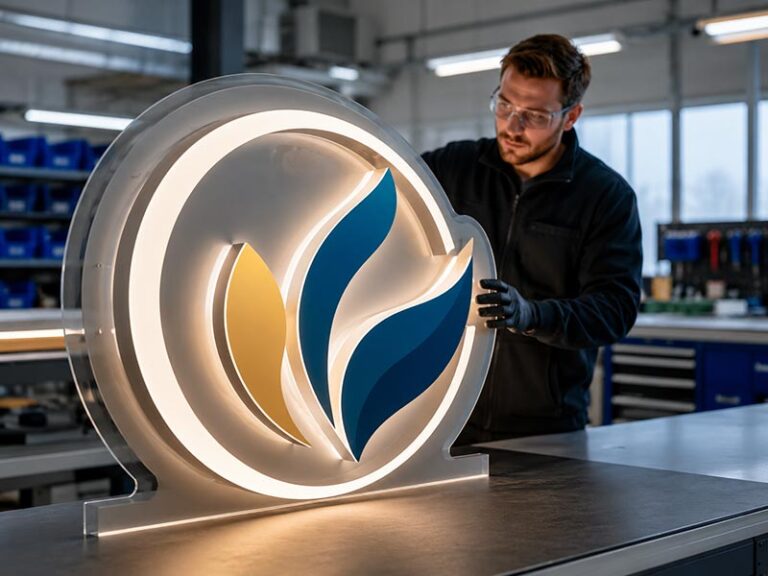
A sign can be beautifully made and still feel wrong the second it goes on the wall. That usually happens when the illumination style is chosen from a catalog photo instead of from the real setting where the sign will live. On one street, a bright front lit logo can pull attention from half a block away. On another, the same look can feel too loud, while a halo lit sign makes the whole storefront feel more expensive. Then there are projects where neither one is enough on its own. The face needs to read clearly, but the wall also needs that soft glow that gives the sign depth after dark. That is where dual lit signs come in. In practice, the right answer depends on more than taste. It depends on distance, traffic speed, wall material, surrounding light, installation method, and the kind of first impression the space needs to create. Channel letters remain one of the most widely used illuminated sign formats because they can be built in many styles, finishes, and mounting methods, but the performance still changes dramatically with lighting direction and site conditions.
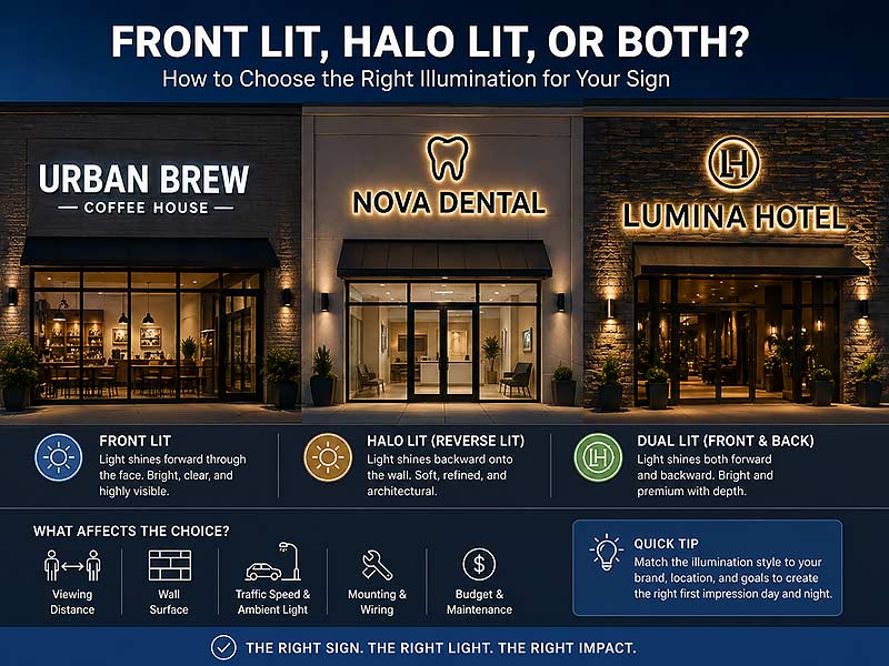
Front lit signs are usually the best choice when visibility and fast readability matter most. Halo lit signs work better when the goal is a softer, more architectural look. Dual lit signs make sense when the sign needs to read clearly from a distance and still feel premium up close. The best option is the one that fits the wall, the viewing distance, the environment, and the brand mood at the same time.
Picture three businesses on the same block at 8:30 p.m. A bakery wants to be found fast before closing time. A law office wants quiet confidence, not noise. A boutique hotel wants the entrance to feel memorable before anyone touches the door handle. All three may order channel letters. All three probably need different illumination. That is why this choice matters more than it seems.
What Are Front Lit, Halo Lit, and Dual Lit Signs?
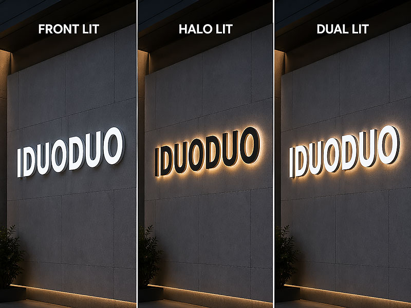
Front lit, halo lit, and dual lit signs are all channel-letter styles, but the light moves in different directions. Front lit pushes light forward through the face, halo lit throws light back onto the wall, and dual lit does both. That one difference changes readability, mood, installation behavior, and price.
What Is a Front Lit Sign?
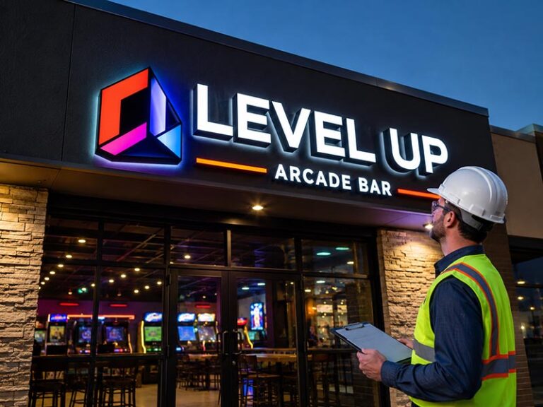
A front lit sign is the version most people recognize first. The face of each letter is translucent, usually acrylic, and the internal LEDs shine through it toward the viewer. At night, the name looks direct, clear, and easy to read. In daylight, the letter depth, trim, and face color still matter, but after dark the message becomes the star.
This style is common because it solves a basic business problem very well: being seen quickly. On a main road, in a retail strip, or across a parking lot, front lit letters are usually easier to read than a softer halo effect. That is why they show up so often on restaurants, salons, gyms, convenience retail, service businesses, and chain storefronts.
A front lit sign is usually the strongest fit when the job is straightforward:
- the sign needs to read fast
- the storefront competes with many neighboring signs
- the location is seen from farther away
- the budget needs to stay controlled
- the wall behind the sign is not ideal for halo lighting
What Is a Halo Lit Sign?
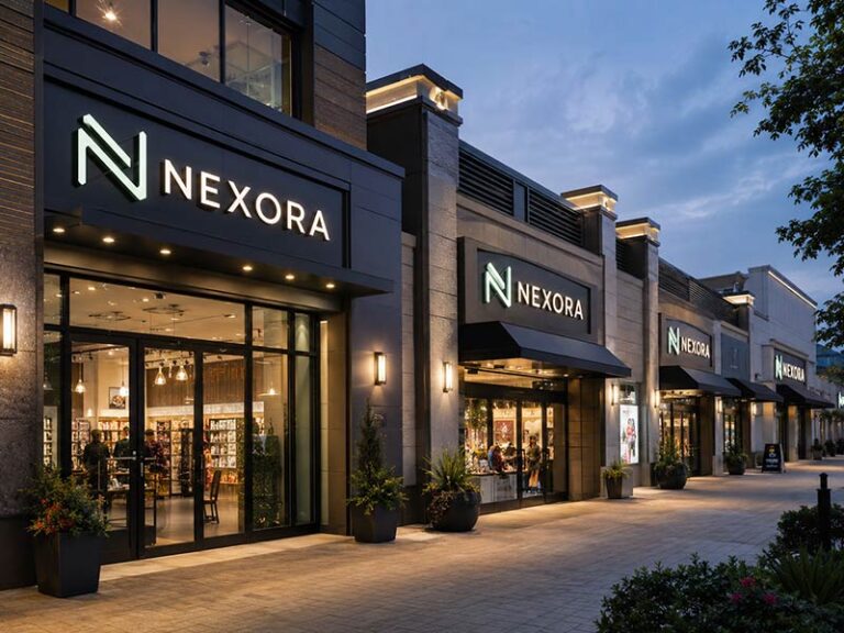
A halo lit sign, also called a reverse-lit sign, works in the opposite direction. The front face is usually opaque metal, and the light exits from the back of the letters, creating a glow on the wall behind them. That glow is the halo.
The effect is softer than front lit. Instead of light coming straight toward the eye, it wraps around the letter shape. That is why halo lit signage often feels calmer, more polished, and more architectural. It does not just identify a business. It adds atmosphere to the surface it is mounted on.
Halo lit signs tend to look especially strong in places where the wall itself is part of the visual experience:
- office lobbies
- hotel entrances
- reception walls
- clinics and studios
- boutique retail
- premium restaurant facades
The catch is simple: halo lighting depends on the wall. A smooth, light-painted wall usually gives a clean halo. A rough, dark, uneven, or reflective surface can weaken or break the effect.
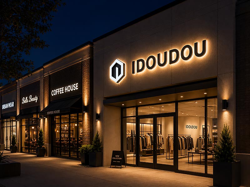
What Is a Front and Back Lit Sign?
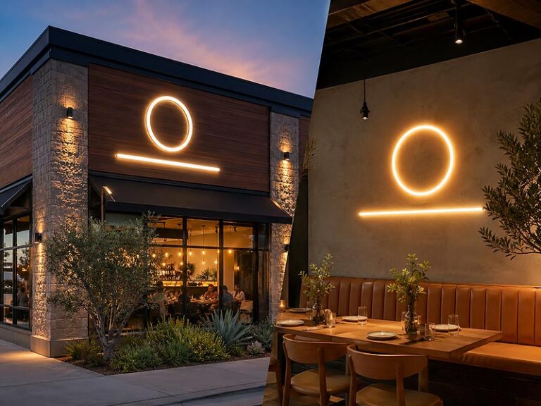
A front and back lit sign, often called dual lit or combination lit, puts both effects into one build. The face is illuminated for readability, and the back of the letters creates a halo on the wall. When it is done well, the sign feels layered. From a distance, the face carries the name. Up close, the halo adds depth and finish.
This style is usually chosen when the sign is expected to do more than mark a location. It is often used for:
- flagship storefronts
- branded office entrances
- modern hospitality spaces
- boutique cafés and restaurants
- premium franchise concepts
Here is the simplest way to think about the three styles:
| Type | Light direction | First impression | Best use |
|---|---|---|---|
| Front lit | Forward through face | Bright, clear, direct | High visibility storefronts |
| Halo lit | Backward onto wall | Soft, refined, architectural | Offices, hospitality, upscale interiors |
| Dual lit | Forward + backward | Rich, layered, premium | Statement projects and premium facades |
This basic pattern is consistent across current channel-letter guides and product references.
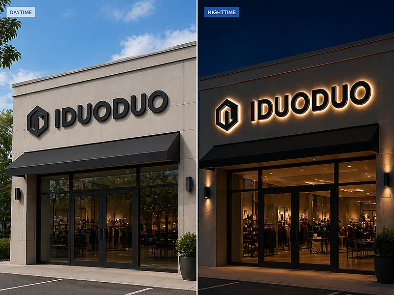
How Do They Look Day and Night?
A sign can look sharp in a mockup and still feel completely wrong once it is on the wall.
That is usually where the real difference between front lit, halo lit, and dual lit shows up. In daylight, the eye notices shape, depth, finish, edges, shadows, and how the letters sit against the building. At night, the lighting takes over. Some signs feel direct and easy to read from the street. Some feel softer, quieter, and more architectural. Some manage to do both.
This is why illumination is not just a technical choice. It changes the mood of the storefront, the way the brand is remembered, and how easily the name can be picked up in a few seconds. On a crowded retail street, that matters. On a polished office facade, it matters just as much. The sign is often the first thing seen and the last thing remembered.
Which Style Looks Brighter?
Front lit letters usually win the brightness contest right away.
When the LEDs shine through the face, the light comes forward instead of bouncing off the wall behind the sign. That makes the name read faster, especially from across the road, across a parking lot, or from a moving car. In practical terms, this is why front lit signage is so common on main-road storefronts, shopping plazas, convenience stores, restaurants, salons, gyms, and other businesses that need instant recognition rather than a slow reveal.
At night, a front lit sign tends to separate itself clearly from the background. The letters are obvious. The outline is obvious. The message lands quickly. That kind of clarity becomes even more important when there are streetlights, traffic lights, neighboring signs, window reflections, and all the other visual noise that competes for attention after dark.
But brightness alone does not guarantee a good look. A sign can be too bright for its own good. When the face material, LED output, and letter spacing are not balanced well, the result can feel flat or overly harsh, especially on smaller storefronts. The best front lit signs do not just glow strongly. They stay crisp. The lettering remains clean, the color stays stable, and the illumination looks even from edge to edge rather than blown out in the middle.
Which Style Feels More Premium?
Halo lit signs usually feel more refined the moment the lights come on.
Instead of sending light straight outward, they throw it back onto the wall. The letters themselves stay solid and sculptural, while the glow forms a soft outline around them. That one detail changes the whole atmosphere. The sign feels quieter, more expensive, and more connected to the architecture around it.
This is why halo lit letters often look especially strong on reception walls, hotel entrances, clinics, studio spaces, showrooms, and brands with a more elevated visual identity. They do not fight the building. They sit within it. The effect is less about grabbing attention from a distance and more about creating a sense of finish, confidence, and permanence. Current sign-industry guidance consistently describes halo-lit channel letters as the more subtle and premium-looking option, especially for offices, hospitality, and boutique-style branding.
Still, halo lighting only looks as good as the surface behind it. On a smooth painted wall, the glow can look soft and elegant. On rough stone, dark brick, corrugated metal, or heavily textured cladding, the light may break apart, scatter unevenly, or lose the clean halo effect that makes this style so appealing in the first place. That is why the same sign can feel luxurious in one setting and underwhelming in another. Halo lit letters are not only about the letters themselves. The wall becomes part of the design.
Is Dual Lit the Best of Both?
Dual lit signs can be stunning because they work on two levels at once.
The face is illuminated, so the name stays clear and readable. At the same time, the back of the letters casts a glow onto the wall, adding depth and atmosphere. The result feels fuller, richer, and more layered than either style alone. In the right setting, it gives the sign a real sense of presence. Not louder, just more complete.
This is often the look that makes people slow down for a second glance. From farther away, the illuminated face carries the name. Up close, the halo adds shape, detail, and a premium finish. That balance can work beautifully on modern storefronts, statement restaurant facades, branded office entrances, boutique retail spaces, and hospitality projects where the sign is expected to do more than simply identify the location. Public product and trade references consistently present dual-lit letters as the combination of face visibility and halo depth, which is why they are positioned as a premium option.
But dual lit only works when the balance is right. Too much light in the face, and the halo effect disappears into the background. Too much back glow, and the lettering loses some of its directness. When handled well, the two lighting directions support each other. When handled badly, the sign looks busy, expensive, and oddly unresolved.
| Nighttime question | Front lit | Halo lit | Dual lit |
|---|---|---|---|
| Which reads fastest from a distance? | Strong | Moderate | Strong |
| Which feels softest up close? | Moderate | Strong | Strong |
| Which works best for a premium statement look? | Moderate | Strong | Strongest when balanced |
| Which is easiest to over-light? | Yes | Less often | Yes, if poorly balanced |
The real question is not whether dual lit is the most advanced option. The real question is whether the space actually benefits from that extra layer. In some places, a clean front lit sign does the job better. In others, halo lit says everything it needs to say. And in the right project, dual lit gives the wall a kind of nighttime identity that neither one can create alone.
Which Illumination Fits Your Brand?
The right illumination style is the one that matches the feeling the space needs to create before a word is spoken. Front lit usually feels open, energetic, and easy to spot. Halo lit feels calmer and more elevated. Dual lit feels more custom, more deliberate, and more image-driven.
Which Style Works for Retail?
Retail usually rewards speed. The name has to register fast, especially when people are comparing several storefronts in a short span of time.
Front lit is often the cleanest answer for retail settings such as:
- shopping plazas
- street-facing fashion stores
- service businesses
- salons and barbershops
- fitness studios
- quick-service food locations
That does not mean halo lit has no place in retail. It can look excellent on boutique fashion, cosmetics, jewelry, or concept-led stores where mood matters as much as visibility. But when the biggest challenge is simply being noticed in time, front lit usually carries the job better.
Which Style Suits Restaurants and Cafés?
Restaurants sit in the middle of the decision. A breakfast spot on a busy road may need the storefront name to read instantly. A wine bar may need the facade to feel quiet and inviting. A café that lives on social media may want a sign that is readable outside and photogenic inside.
That is why restaurant signage often falls into three patterns:
- Front lit for fast recognition, takeaway traffic, and busy commercial streets
- Halo lit for mood, premium positioning, and slower pedestrian environments
- Dual lit for restaurants that want the name to pop and the facade to feel memorable after dark
This is one of the few categories where the sign often has to do two jobs at once: help people find the place and help them feel something about it before walking in.
Are Halo Lit Signs Better for Offices?
Very often, yes.
Office spaces usually benefit from restraint. The sign is not trying to compete with traffic. It is shaping the atmosphere of the entrance, reception wall, or lobby. Halo lit letters work well in these spaces because they feel integrated with the architecture. The glow is softer, the letters feel more sculptural, and the overall look often photographs better in person and on camera.
Places where halo lit usually performs especially well include:
- corporate reception areas
- consulting and legal offices
- medical and wellness clinics
- hotel and co-working lobbies
- conference and showroom entries
When the space needs to say “established,” “considered,” or “well put together,” halo lit often lands more gracefully than a bright face-lit sign.
What Site Factors Affect the Choice?
The wall, the street, the distance, and the mounting conditions usually decide the sign before personal taste does. A halo-lit logo that looks perfect in a rendering can lose half its effect on dark stone. A front-lit sign that seems too simple on paper can become the right answer when the storefront sits far back from the road. In real projects, the best illumination style is the one that still works after the logo leaves the screen and meets the building.
How Does Viewing Distance Matter?
The first thing to check is not the logo file. It is where the sign will be seen from.
If the storefront is on a walkable street and most people first notice the sign from 15 to 40 feet away, halo-lit letters can work beautifully because there is enough time to see the edge detail, the stand-off, and the glow behind the letters. That is one reason halo-lit signs often feel stronger on office entries, reception walls, boutique retail, and restaurant facades where people approach slowly. But once the sign needs to read from much farther away, the job changes. The United States Sign Council’s legibility guidance uses a rule-of-thumb legibility index of 30 for many perpendicular sign conditions, meaning 10-inch capital letters are readable at about 300 feet and 20-inch letters at about 600 feet. The same guidance shows that parallel-mounted roadside signs often need much larger letters because glance legibility is much weaker.
That difference matters a lot when choosing between front lit and halo lit. A front-lit sign sends light toward the viewer, so the name holds together better when there is only a second or two to catch it. Halo lighting is more subtle. So if the storefront sits behind a parking lot, faces a multilane road, or competes with several neighboring businesses, the distance alone often pushes the project toward front lit or dual lit before color and finish even enter the conversation.
A quick field check usually makes things clearer:
- 15–40 feet, slow approach: halo lit can work very well
- 40–100 feet, mixed approach: front lit or dual lit is often safer
- 100+ feet, roadside visibility: front lit usually performs best
- Parallel wall to traffic: larger letters are often needed than most first mockups suggest
Does Wall Surface Affect Halo Lighting?
A halo-lit sign does not end at the edge of the letters. The wall behind it becomes part of the sign.
That is why wall surface matters so much more than most people expect. A smooth, light-painted wall usually gives the cleanest halo because the light can spread evenly and reflect back with a soft edge. ASI guidance notes that halo effects are strongest on lighter surfaces, and general reverse-lit sign references make the same point in practical terms: the wall has to help the light, not fight it. Put the same letters on dark brick, stacked stone, ribbed metal cladding, or a wall full of joints and recesses, and the glow can break apart, scatter, or sink into the background.
Texture changes the result just as much as color. On rough masonry, the light catches the high points and leaves the recessed areas darker, so the halo starts to look patchy. On glossy wall panels, the glow can turn into reflections instead of a clean outline. On very dark finishes, especially charcoal stone or black metal, the halo can feel much weaker unless spacing and LED layout are handled carefully.
A simple way to judge the wall:
- Best for halo: smooth paint, light neutral walls, matte finishes
- Use caution: textured concrete, dark brick, mixed cladding
- Usually better for front lit: very dark facades, reflective panels, visually busy surfaces
Do Traffic Speed and Ambient Light Push the Choice?
They do, and often more than the logo style does.
A quiet pedestrian lane and a five-lane commercial road are two completely different sign environments. Once headlights, traffic signals, gas-station canopies, streetlights, neighboring signs, and glass reflections enter the picture, the sign is no longer sitting in a clean frame. It is competing with a full nighttime scene.
In those conditions, direct light usually wins. That is why front lit remains the standard on so many roadside storefronts. USSC legibility guidance notes that drivers may only have seconds to detect, read, and react to an on-premise sign, and that parallel wall signs are especially compromised because they are often read through short sideways glances rather than direct forward viewing.
This is also why some signs look great in close-up photos but disappoint in real traffic conditions. The issue is not the craftsmanship. The issue is that the sign was asked to do a roadside job with a style better suited to closer, slower viewing.
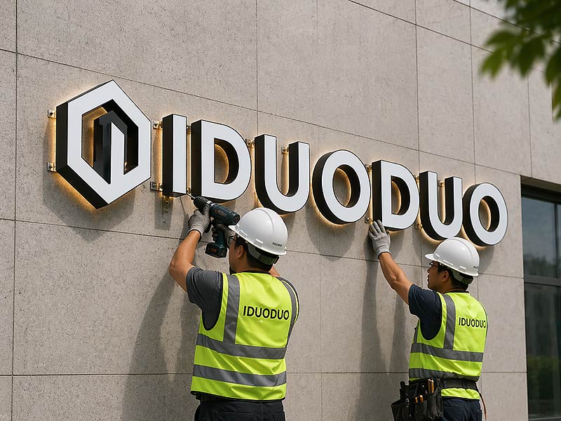
Do Mounting and Wiring Change the Decision?
Yes, because the cleanest-looking sign is not always the easiest sign to install, service, or replace later.
Direct-mount letters usually look more architectural because each letter sits on the wall individually. But that cleaner look also means more precise drilling, wiring, alignment, and coordination. Raceway mounting places the letters on a painted housing that carries the wiring and reduces the number of wall penetrations. Current sign guidance consistently treats raceway mounting as the more service-friendly and labor-efficient approach, while direct mount usually costs more in installation time but delivers the cleaner visual result.
That matters because halo-lit signs often depend on clean spacing and visible wall area to look right. If the landlord limits facade penetrations, if service access is difficult, or if the property turns over tenants frequently, a raceway-mounted front lit sign may simply be the more practical decision.
Which Option Costs More?
In most real projects, front lit costs the least, halo lit costs more, and dual lit costs the most. That pattern stays fairly consistent because each step adds more fabrication detail, more lighting work, and usually more installation time. Based on estimates from Iduoduo’s engineers, front-lit and halo-lit channel letters usually fall in the USD 1,000 to USD 2,000 range, while dual-lit channel letters are commonly priced at around USD 1,500 to USD 2,000. Final project cost can still vary depending on installation height, wiring conditions, permits, and local labor requirements.
What Changes the Sign Price?
The first thing that changes the quote is not the lighting style. It is the amount of sign being built.
A short word in a simple font is cheaper than a wide logo with thin strokes, custom shapes, and multiple colors. Deeper returns, stainless finishes, specialty paint, trim caps, and complex logos all move the price upward. Then installation starts adding its own costs.
The biggest price drivers usually look like this:
- letter height
- total sign length
- logo complexity
- material and finish
- illumination type
- mounting method
- installation height
- lift or access equipment
- electrical routing
- local permits and inspections
This is why two signs with the same business name can come back with very different quotes. One may be a simple raceway-mounted front lit set. The other may be a direct-mounted halo-lit build on a difficult facade. Same name, very different job. Current pricing guidance from sign manufacturers consistently identifies size, materials, lighting, mounting, and installation complexity as the main cost factors.
Is Halo Lit More Expensive?
Yes, in most cases it is.
A front lit letter is usually the most economical illuminated option because the construction method is straightforward and widely standardized. Halo-lit letters cost more because they depend more on finish quality, spacing, wall interaction, and cleaner fabrication. The light is not hidden behind a glowing acrylic face. It is reflected onto the wall, which means the build has less room to hide small imperfections.
Dual lit adds another step up because it is not just halo lit plus a little more light. It is a more demanding build. The face illumination has to read cleanly, the halo has to stay visible, and the two effects have to feel balanced. More LEDs, more internal planning, and more testing usually mean a higher quote. Public market examples consistently place dual lit above both front lit and halo lit.
A useful way to read the price ladder:
- Front lit: best value when the goal is visibility
- Halo lit: higher spend for a softer, more premium look
- Dual lit: premium spend when both readability and atmosphere matter
Do Maintenance Needs Differ?
They do, and this is where the cheapest first quote can stop looking cheap later.
LED channel letters are efficient and durable, but they still live with heat, weather, voltage changes, and long operating hours. Iduoduo notes that LED end of life is commonly measured at L70, the point where the light source has lost 30% of its original output. In plain language, that means the sign often does not fail all at once. It slowly looks dimmer, less even, and less sharp over time.
Service access matters too. Raceway-mounted front-lit signs are often easier to service because wiring and components are more centralized. Direct-mounted halo-lit and dual-lit signs can look better, but they may take more labor to inspect or repair. In the U.S., electric signs are also tied to NEC Article 600 for installation and UL 48 for product safety, which is why certified components and proper fabrication matter far beyond the first invoice.
| Sign type | Typical public price pattern | What the money is really buying |
|---|---|---|
| Front lit | Lowest | Visibility, simpler construction, easier value case |
| Halo lit | Mid to higher | Better finish sensitivity, softer image, more architectural effect |
| Dual lit | Highest | Layered nighttime impact, more build complexity, more premium presence |
This pattern is consistent across recent public channel-letter pricing references, even though final numbers move with size, materials, access, and local installation conditions.
How Do You Choose the Right One?
The easiest way to choose is to stop asking which style is “best” in general and start asking which one works best on the real wall, from the real viewing distance, in the real lighting conditions. Once the site is honest, the answer usually gets much simpler.
What Should You Check First?
Before choosing an illumination style, it helps to lock down the practical things first:
- where the sign is first seen from
- whether people approach on foot or by car
- how bright the surrounding environment is at night
- what the wall is made of
- whether the wall is smooth or textured
- whether direct mount is allowed
- how easy the sign will be to service later
Skipping these questions is what causes most expensive sign mistakes.
Which Option Fits Best?
A simple decision path works surprisingly well.
Choose front lit when the sign needs to be read quickly, from farther away, or in a visually noisy environment.
Choose halo lit when the wall is suitable, the approach is slower, and the space benefits from a softer, more premium look.
Choose dual lit when the sign needs strong name recognition and a richer nighttime image at the same time.
If the logo is supposed to stop traffic, front lit usually earns its place. If the logo is supposed to make the space feel better, halo lit often wins. If the sign is expected to do both jobs, dual lit becomes worth discussing.
When Is Both Worth It?
Both is worth it when the sign carries real brand weight.
That usually happens in places where the sign is not just identification but part of the experience:
- flagship storefronts
- boutique hospitality
- statement restaurants
- premium reception walls
- showrooms and branded office entries
In those settings, dual lit can make the space feel finished in a way that a standard front lit sign cannot. But the extra layer only pays off when the wall, budget, and installation plan support it.
The smartest sign is not the fanciest one on paper. It is the one that still feels right at 10 a.m., at 8 p.m., from the road, from the sidewalk, and six months after installation.
A good custom sign should never be guessed from one reference photo alone. The better approach is to match the illumination style to the logo, the facade, the viewing distance, and the brand mood before production starts.
Request a Custom Quote from Iduoduo
For that reason, the most useful next step is simple: send Iduoduo the logo file, required size, installation photos, mounting location, and quantity. With those five things, it becomes much easier to judge whether the project should be front lit, halo lit, or dual lit.
If the goal is a sign that is not only well made but also right for the space, Iduoduo can help with:
- custom front lit channel letters
- halo lit logo signs
- front and back lit premium letters
- indoor and outdoor options
- waterproof commercial builds
- OEM and ODM production
- low MOQ custom fabrication
- free 3D mockup support before production
The right illumination should make the wall work harder, the brand look stronger, and the sign feel like it belongs there. That is the point where a quote stops being just a number and starts becoming the right project.
Contact Iduoduo