A cafe sign is not just a piece of decoration on the wall. For many coffee shops, dessert shops, bubble tea stores, and small beverage brands, it is the first visual message customers receive before they even taste the product. A warm LED neon sign behind the counter can make a small cafe feel friendly and shareable. A soft backlit logo sign on the wall can make the same space look cleaner, calmer, and more premium. The hard part is that both can look good, but they do not solve the same problem.
LED neon signs are usually better when a cafe wants a warm, playful, social-media-friendly atmosphere, while backlit logo signs are better when the cafe wants a cleaner, more refined brand image. The best choice depends on where the sign will be installed, how the logo is designed, whether the space needs a photo spot, and whether the cafe plans to repeat the same sign across multiple locations.
Think about two cafes on the same street. One sells colorful drinks, soft desserts, and seasonal products. Its customers take photos before they order. The other serves specialty coffee in a quiet, minimalist space, where customers notice the material, lighting, and small details. Both cafes need a sign, but they may need very different signs. That is why choosing between LED neon and backlit logo signs should start with the space, the customer experience, and the brand feeling — not just the product photo.
What Do Cafes Need from a Logo Sign?
A cafe logo sign should do more than show the shop name. It should help people notice the cafe from the street, understand the brand style in a few seconds, and feel that the space is worth entering, photographing, and remembering. For cafes, the right sign usually balances four things: visibility, atmosphere, brand consistency, and installation practicality.
What first impression should the sign create?
Most customers decide how they feel about a cafe before they order. They see the storefront, the logo wall, the counter area, the lighting, and the overall color tone. A good logo sign helps shape that first feeling quickly.
For a cafe, the sign should answer these customer questions without needing words:
Is this place warm and relaxed?
Is it modern and premium?
Is it cute and photo-friendly?
Is it easy to find from outside?
Does the brand look professional enough to trust?
This is why the same sign style does not work for every cafe. A small neighborhood coffee shop may want a warm white LED neon sign that feels friendly and handmade. A specialty coffee brand may prefer a backlit acrylic or metal logo sign because it looks cleaner and more controlled. A dessert shop or bubble tea store may need brighter colors because customers expect a more playful visual experience.
The first impression should match the business model. A takeaway coffee shop needs fast recognition from the sidewalk. A sit-down cafe needs a stronger interior atmosphere. A dessert shop needs a sign that looks good in customer photos. A chain cafe needs a sign that can be repeated in many locations without losing the brand style.
A simple way to judge the right direction:
| Cafe Type | First Impression Needed | Better Sign Feeling |
|---|---|---|
| Specialty coffee shop | Calm, serious, refined | Soft backlit logo sign |
| Small neighborhood cafe | Warm, friendly, approachable | Warm LED neon or acrylic sign |
| Bubble tea shop | Young, colorful, energetic | LED neon logo or shape sign |
| Dessert cafe | Cute, bright, photo-friendly | Neon slogan or icon sign |
| Bakery cafe | Fresh, warm, trustworthy | Warm backlit logo or light box |
| Chain cafe | Consistent, clean, recognizable | Standardized backlit logo sign |
A sign that looks attractive but sends the wrong message can weaken the whole space. For example, a very colorful RGB neon sign may look fun, but it can feel out of place in a quiet coffee bar with wood furniture and soft lighting. A simple backlit logo may look premium, but it may feel too plain for a dessert shop that depends on customer photos and social sharing.
How should the sign match the cafe style?
A cafe sign should feel connected to the interior design, not like a last-minute decoration. Customers may not know the exact reason, but they can feel when a sign, furniture, wall color, menu board, and lighting do not match.
The sign should be planned together with:
Wall color
Counter material
Menu board position
Ceiling light brightness
Window size
Customer photo area
Brand color
Logo shape
Storefront viewing distance
For example, if the cafe uses beige walls, wood tables, and warm lighting, a warm white backlit logo sign may look natural. If the cafe uses pink, cream, and playful dessert displays, a soft pink LED neon sign may feel more suitable. If the cafe uses black, gray, and stainless steel, a white or warm white backlit logo can make the brand look more modern.
The wall surface is especially important. A smooth painted wall works well for both LED neon and backlit signs. A textured wall can make halo lighting look more dimensional, but it may also create uneven shadows. A mirror wall can make neon look attractive, but it can also create strong reflections. A glass window can make a sign visible from outside, but sunlight and reflections may reduce readability during the day.
Cafe owners should not choose a sign only from a product photo. A supplier photo usually shows the sign in a clean, controlled environment. A real cafe has ceiling lights, people, menu boards, cables, shelves, plants, and other visual elements. Before production, it is better to check the sign size and placement on a real wall photo or store rendering.
Key matching points:
| Design Detail | What to Check | Why It Matters |
|---|---|---|
| Wall color | Light, dark, textured, glossy | Affects contrast and photo quality |
| Logo style | Script, block letters, icon, thin lines | Affects readability and production method |
| Interior style | Minimal, cute, industrial, luxury | Decides neon or backlit direction |
| Lighting environment | Bright daytime, soft evening, mixed lights | Affects brightness and color choice |
| Customer position | Close viewing or street viewing | Affects size and letter thickness |
| Brand color | Pantone, CMYK, RGB, sample color | Keeps sign consistent with menus and packaging |
The best cafe sign should look like it belongs to the space. It should not fight with the menu, furniture, or wall design. When the sign matches the interior, the whole cafe feels more finished, even if the space is small.
What makes a cafe sign photo-friendly?
For many cafes, a sign is also a photo background. Customers may take pictures of drinks, desserts, friends, or the counter area, and the sign often appears in the background. If the sign looks good in these photos, it can help the cafe get more natural exposure.
A photo-friendly cafe sign usually has these features:
Clear text from 1.5–3 meters away
Clean logo shape with enough spacing
Brightness that does not overexpose phone photos
Color that matches drinks, packaging, and wall design
A simple background without too many objects
Hidden or tidy wiring
Enough empty space around the sign
LED neon signs are often strong for photo walls because the glowing lines create a clear focus. They work well for short slogans, brand names, coffee cup shapes, dessert icons, or cute phrases. However, if the neon is too bright, the phone camera may capture the sign as a white glowing blur instead of readable text. This is common when the sign uses very bright white or when the room is too dark.
Backlit logo signs are usually more controlled in photos. They may not feel as playful as neon, but they can make the space look cleaner and more premium. This is useful for cafes that want official website photos, Google Business Profile images, franchise store photos, or interior design portfolios to look professional.
A good photo wall is not only about the sign. The surrounding space matters just as much. If the sign is too close to a menu board, fire extinguisher, power socket, exposed cable, or storage shelf, the photo effect will be weaker. Many cafes get better results by leaving at least 15–30 cm of clean wall space around the sign, depending on sign size and wall layout.
Practical photo planning:
| Photo Use | Better Sign Choice | Placement Tip |
|---|---|---|
| Customer selfie wall | LED neon sign | Use simple words or icon, avoid clutter |
| Counter order photos | Backlit logo sign | Keep logo centered behind service area |
| Drink product photos | Small neon or acrylic logo | Place near product display, not too bright |
| Brand website images | Backlit logo sign | Use clean wall and balanced lighting |
| Social media reels | LED neon sign | Use warm or brand color lighting |
| Franchise store photos | Backlit standard logo | Keep same size ratio across stores |
A sign should help customers take better photos without thinking too much. If people naturally stop in front of the wall, raise their phone, and take a picture, the sign is doing more than decoration. It is becoming part of the cafe experience.
Do small cafes need a large sign?
Small cafes do not always need large signs. In many cases, a medium or compact sign works better because the viewing distance is short. The goal is not to fill the wall. The goal is to make the brand visible, balanced, and easy to remember.
For a small cafe, an oversized sign can cause several problems. It may make the wall feel crowded. It may compete with the menu board. It may look too bright in photos. It may also cost more without improving the customer experience. A smaller sign with good placement can look more refined and intentional.
A useful rule is to choose the size based on where customers stand:
For a counter wall, customers usually view the sign from 1.5–4 meters.
For a window sign, pedestrians may view it from 3–10 meters.
For a storefront sign, people may view it from across the street.
For a photo wall, the sign should fit inside a phone camera frame.
For a small logo behind the cashier, the sign should be readable but not dominate the menu.
Instead of asking “How big can we make it?”, cafe owners should ask “From where will customers see it?” This leads to better sizing decisions.
General sizing logic:
| Installation Area | Common Viewing Distance | Size Direction |
|---|---|---|
| Small counter wall | 1.5–3 m | Compact to medium logo |
| Interior feature wall | 2–5 m | Medium logo or slogan |
| Glass window | 3–8 m | Clear and simple design |
| Storefront | 5–15 m | Larger letters, stronger contrast |
| Photo wall | 1–3 m | Balanced with human height |
| Dessert display area | 1–2 m | Small icon or short phrase |
For small cafes, the sign should also leave enough room for shelves, menu boards, wall lamps, plants, and customer movement. A compact logo sign behind the counter plus a small neon phrase on another wall may work better than one oversized sign trying to do everything.
What practical details should cafes confirm early?
Many sign problems happen because the design looks good, but the real installation details were not confirmed early. For cafes, this is especially important because the sign may be installed near counters, glass, tiles, menu boards, food display areas, or customer seating.
Before ordering, cafe owners should confirm:
Exact installation location
Wall width and height
Indoor or outdoor use
Logo file quality
Final sign size
LED color or color temperature
Power supply position
Wire exit direction
Mounting method
Backboard shape
Need for hidden wiring
Plug type and voltage
Whether installation accessories are needed
Packaging and shipping method
These details may sound small, but they directly affect the final look. For example, a beautiful logo sign can look messy if the power cable exits from the wrong side. A window sign can lose impact if the hanging chain is too long. A backlit sign can look uneven if the wall is not flat. A neon sign can look cheap if the backboard shape is too large or poorly matched to the logo.
For outdoor cafe signs, the requirements become stricter. The sign may need waterproof protection, stronger mounting, outdoor-rated power supply, and better sealing. For indoor signs, the focus is often softer light, cleaner wiring, easy cleaning, and photo quality.
A clear pre-order checklist helps avoid rework:
| Item to Confirm | Why It Matters |
|---|---|
| Logo file | Keeps shape accurate and production-ready |
| Sign size | Prevents the sign from looking too small or too large |
| Wall photo | Helps check placement, color, and installation method |
| LED color | Affects mood, photos, and brand consistency |
| Power location | Avoids visible messy wiring |
| Mounting method | Keeps installation safe and clean |
| Indoor/outdoor use | Decides material and waterproof needs |
| Accessories | Makes local installation easier |
| Quantity | Helps plan sampling, bulk order, or future reorder |
For cafes planning more than one location, it is also useful to save the confirmed production file, size ratio, LED color, material, and installation method. This makes future reorders faster and keeps every store visually consistent.
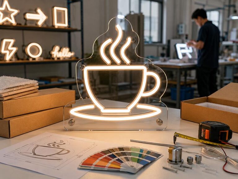
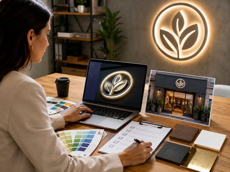
What Are LED Neon Signs?

LED neon signs are flexible LED light signs designed to create a soft neon-style glow without using traditional glass neon tubes. For cafes, they are often used for logo walls, window displays, photo spots, counter signs, slogan signs, and drink or dessert icons. Their biggest value is not only lighting, but also atmosphere, customer photos, and brand memory.
What is an LED neon cafe sign?
An LED neon cafe sign is usually made with flexible LED neon tubing fixed onto an acrylic backing. The tubing follows the shape of a logo, word, icon, or short phrase. Instead of lighting up a whole panel, it creates a glowing line effect. This is why LED neon signs are very popular for coffee shops, bubble tea stores, dessert cafes, bakery corners, and small lifestyle brands.
For cafes, this type of sign works especially well when the design is simple and easy to read. A clean cafe name, a coffee cup icon, a croissant shape, a bubble tea cup, a heart, or a short slogan can look much better than a complicated logo with many tiny details. The sign should be designed for real viewing distance, not only for a close-up product photo.
Most cafe LED neon signs are used indoors, but they can also be made for covered storefronts or outdoor areas if the structure, power supply, and waterproof protection are planned correctly. This should be confirmed before production, because an indoor wall sign and an outdoor storefront sign should not be treated as the same product.
Common LED neon sign uses in cafes:
| Use Area | Common Design | Main Purpose |
|---|---|---|
| Counter wall | Cafe logo or brand name | Brand recognition |
| Photo wall | Slogan, icon, cute phrase | Customer photos |
| Glass window | Open sign, logo, coffee icon | Street attention |
| Seating area | Warm phrase or line art | Atmosphere |
| Dessert display | Cake, ice cream, drink shape | Product focus |
| Pop-up booth | Portable logo sign | Temporary branding |
A good LED neon cafe sign should feel light, clean, and intentional. If the design is too crowded, the final sign may look messy once it becomes a glowing line.
How does LED neon create atmosphere?
LED neon creates atmosphere because customers can see the light itself. It does not just brighten the wall. It gives the space a mood. In a cafe, that mood can be warm, playful, romantic, cute, modern, or energetic, depending on the color and design.
This is why LED neon signs are often used in spaces where customers naturally slow down: near the counter, beside seating areas, on a selfie wall, or above a dessert display. A simple warm white “Coffee Time” sign can make a small corner feel more inviting. A pink or soft yellow dessert icon can make a cake shop feel more cheerful. A custom logo in warm white can help a small cafe look more complete without spending too much on a full storefront renovation.
But atmosphere should be controlled. A sign that is too bright can make the wall look harsh in phone photos. A color that is too strong can fight with the cafe’s furniture, cups, packaging, and menu design. For example, RGB lighting may work well in a youth-focused bubble tea shop, but it may feel strange in a quiet specialty coffee bar.
For most cafes, these color choices are easier to use:
| LED Color | Best Fit | Visual Feeling |
|---|---|---|
| Warm white | Coffee shops, bakeries, cozy cafes | Soft, warm, relaxed |
| Cool white | Modern cafes, clean interiors | Bright, simple, crisp |
| Soft pink | Dessert shops, beauty-style cafes | Cute, sweet, photo-friendly |
| Yellow | Bakery, brunch, warm interiors | Friendly, sunny, appetizing |
| Blue | Modern drink shops, themed cafes | Cool, fresh, young |
| Green | Matcha cafes, plant cafes, natural brands | Fresh, calm, organic |
| RGB | Bubble tea, pop-up stores, nightlife-style cafes | Dynamic, playful, flexible |
The safest option for many cafes is warm white, because it works with wood, cream walls, coffee colors, and most interior lighting. Strong colors should be used when they clearly match the brand.
Which cafe areas suit LED neon?
LED neon works best in areas where customers look, wait, sit, or take photos. It should not be placed only where there is empty wall space. The location should support a real customer action.
Behind the counter is one of the most common positions. Customers stand there to order, pay, and wait for drinks, so the logo has repeated exposure. A neon logo behind the counter can make the brand easier to remember, especially in small cafes where there is no large storefront sign.
A photo wall is another strong location. This is usually a cleaner wall near seating, a side wall near the entrance, or a corner where customers can stand with drinks. For this area, a short slogan or icon often works better than a long logo. People take photos quickly, so the sign should be easy to understand at a glance.
Glass windows can also work well, especially for small cafes on busy streets. A neon open sign, coffee cup icon, or simple cafe name can attract people walking past. However, window signs must be designed for distance. Very thin script fonts may look beautiful inside but become hard to read from outside, especially in daytime reflections.
Good placement ideas:
| Location | Good For | Design Tip |
|---|---|---|
| Behind counter | Logo recognition | Keep centered and not too bright |
| Side photo wall | Customer photos | Use short words or simple icon |
| Glass window | Street visibility | Use bold, readable lines |
| Seating corner | Atmosphere | Use warm color and smaller size |
| Pickup area | Direction and branding | Use simple message like “Pick Up” |
| Event booth | Portable branding | Use lightweight acrylic backing |
The sign should also avoid practical problems. Do not place it too close to steam, open water, heavy grease, or areas that need frequent cleaning unless the product design is suitable. For food and beverage spaces, easy cleaning and safe wiring matter just as much as appearance.
Is LED neon good for slogans and icons?
LED neon is very good for slogans and icons, but only when the content is short and clear. It is not ideal for long sentences, small paragraphs, or very detailed illustrations. Since LED neon uses glowing lines, every design needs enough spacing between strokes. If the letters are too close or the icon details are too small, the sign may lose clarity.
For cafes, the best LED neon slogans are usually short, easy to read, and connected to the customer experience. Examples include coffee-related phrases, dessert messages, brand taglines, or simple mood words. Icons can also work well, such as cups, beans, croissants, donuts, ice cream cones, bubbles, leaves, hearts, or stars.
Better LED neon content:
Short brand name
Simple logo mark
Coffee cup icon
Dessert or drink shape
One short slogan
One photo-wall phrase
Open sign or pickup sign
Small decorative line art
Content to avoid:
Long menu text
Very small tagline
Thin detailed logo
Complex illustration
Many colors in one small sign
Tiny letters under 2–3 cm stroke height
Full address or contact information
If the cafe logo is complex, it may be better to make a simplified neon version. For example, the main storefront or counter wall can use a backlit logo sign, while the LED neon sign uses only the logo icon or a short phrase for the photo wall. This approach keeps the brand clear and avoids forcing every logo detail into neon tubing.
How bright should a cafe LED neon sign be?
Brightness should be chosen based on the cafe’s lighting, not just the sign itself. A sign that looks perfect in a dark supplier photo may feel too strong in a real cafe, especially if it is close to customers. For indoor cafes, the goal is usually soft visibility, not maximum brightness.
If the sign will be installed behind the counter, the brightness should not distract customers from the menu board or staff area. If it is used on a photo wall, it should be bright enough to stand out but not so bright that phone cameras capture the letters as a glowing blur. If it is used near a window, it may need stronger brightness to compete with daylight, but it should still be readable at night.
For many cafe projects, a dimmer is useful. It allows the shop to adjust the sign during daytime, evening, events, or photo shoots. A dimmer can also help match the sign with the cafe’s general lighting after installation.
Brightness planning by use:
| Use Situation | Brightness Need | Practical Advice |
|---|---|---|
| Cozy indoor cafe | Soft to medium | Warm white with dimmer is safer |
| Bright window display | Medium to high | Use simple bold design |
| Photo wall | Medium | Avoid overexposed phone photos |
| Counter logo | Soft to medium | Do not compete with menu board |
| Dessert shop | Medium | Match product display lighting |
| Pop-up event | Medium to high | Check visibility under venue lights |
A cafe sign should feel comfortable when customers sit near it. If people avoid sitting under the sign because it feels too bright, the sign is not helping the space.
What should cafes confirm before ordering LED neon signs?
Before ordering an LED neon sign, cafes should confirm the design, size, color, backing shape, installation method, wire position, power supply, and use environment. These details decide whether the sign looks clean after installation.
The logo file is the first step. A vector file is best because it keeps the line shape accurate. If the cafe only has a PNG or JPG logo, the manufacturer may need to redraw it. For LED neon, the design may also need small adjustments, such as increasing letter spacing, simplifying thin lines, or changing sharp corners into smoother curves.
Size is another key point. A sign that looks large in a product mockup may feel small on a real wall, and a sign that looks impressive on the wall may be too large for customer photos. Cafe owners should share the wall size, viewing distance, and installation photo before production. A simple wall photo with marked measurements can prevent many mistakes.
Important order details:
| Detail | What to Confirm | Why It Matters |
|---|---|---|
| Logo file | AI, SVG, EPS, PDF, or clear image | Keeps the design accurate |
| Final size | Width and height | Controls visibility and balance |
| LED color | Warm white, pink, RGB, etc. | Affects mood and brand style |
| Backing type | Clear acrylic, cut-to-shape, rectangle | Affects final appearance |
| Wire exit | Left, right, bottom, back | Avoids messy cable direction |
| Mounting | Screws, hanging chain, standoffs | Matches wall or window use |
| Power supply | Plug type and voltage | Helps local installation |
| Indoor/outdoor | Real use environment | Decides protection level |
| Accessories | Screws, hanging kit, remote, dimmer | Makes setup easier |
For cafes that may open more locations later, it is smart to keep the confirmed production file, sign size, LED color, backing style, and installation method. This makes future reorders faster and helps each store keep the same brand feeling.
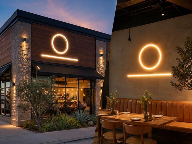
What Are Backlit Logo Signs?
Backlit logo signs are illuminated signs where LED light is hidden behind the logo, letters, or acrylic structure to create a soft glow. For cafes, they are often used behind the counter, on brand walls, near the entrance, or on storefront areas where the logo needs to look clean, professional, and easy to remember. Compared with LED neon signs, backlit logo signs usually feel calmer and more polished, which makes them a strong choice for specialty coffee shops, bakery cafes, hotel cafes, dessert brands, and chain cafe stores.
What is a backlit logo sign?
A backlit logo sign is a custom sign made with letters, logo shapes, acrylic panels, or metal structures, with LED lighting placed behind or inside the sign. The light does not appear as an exposed glowing tube. Instead, it creates a soft glow around the logo, through the logo face, or behind the letters. This makes the sign look more like part of the cafe interior instead of a separate decorative light.
For cafes, a backlit logo sign is usually chosen when the brand wants the shop to feel more finished. A printed logo on the wall may look flat. A sticker logo may look temporary. A simple acrylic logo may look clean but not very eye-catching at night. A backlit logo sign solves these problems by adding depth, shadow, and controlled lighting.
In real cafe projects, backlit logo signs are commonly used for:
Counter logo walls
Main brand walls
Storefront logo displays
Mall cafe entrance signs
Reception-style cafe walls
Bakery and dessert display areas
Premium coffee bar backgrounds
Multi-location cafe brand standards
The structure can be simple or more detailed, depending on the logo and space. A small cafe may use a warm white acrylic backlit logo behind the cashier. A specialty coffee shop may use metal letters with soft halo lighting on a concrete or wood wall. A chain cafe may use the same backlit logo structure across different store sizes to keep the brand consistent.
A simple way to understand the difference:
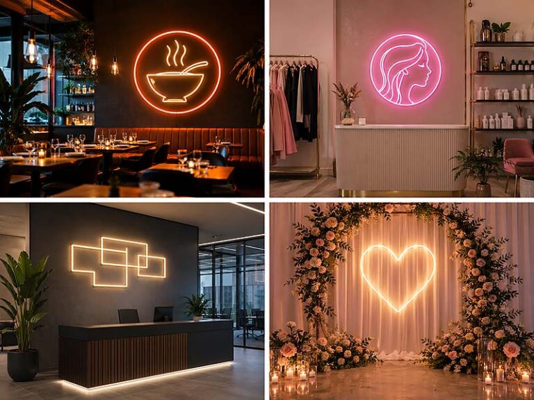
| Sign Type | Light Effect | Cafe Feeling |
|---|---|---|
| LED neon sign | Visible glowing line | Warm, fun, casual, photo-friendly |
| Backlit logo sign | Hidden light behind logo | Clean, premium, stable, brand-focused |
| Light box sign | Full illuminated panel | Clear, practical, easy to read |
| Acrylic non-lit logo | No lighting | Simple, low-cost, less visible at night |
For cafes that rely on brand trust, product quality, and interior style, backlit logo signs can make the space look more reliable. This is especially useful for cafes selling specialty coffee, bakery products, premium desserts, or branded drinks at a higher price point.
Before choosing a backlit logo sign, the cafe should confirm where the sign will be seen from. If customers mainly see it from 1–3 meters away, a smaller and softer sign may be enough. If people need to see it from the street, the letters should be larger, clearer, and brighter. The same logo may need different production details for indoor walls and outdoor storefronts.
How does backlighting make a logo look premium?
Backlighting makes a cafe logo look premium because it adds a soft layer of light around the sign. Instead of shouting for attention, it creates a more controlled visual effect. This is important for cafes because the space needs to feel comfortable. Customers may sit for 30 minutes, take photos, work on laptops, or talk with friends. A sign that is too bright can become tiring. A soft backlit logo can stay visible without making the space feel harsh.
The premium feeling usually comes from several small details, not only from the light itself.
The glow should be even.
The logo should be easy to read.
The material should feel solid.
The cable should be hidden or tidy.
The sign should match the wall color.
The brightness should fit the cafe lighting.
The logo size should feel balanced on the wall.
For example, a warm white backlit logo on a beige wall can make a bakery cafe feel soft and welcoming. A white halo-lit logo on a dark gray wall can make a specialty coffee shop feel modern and clean. A gold metal logo with soft backlighting can make a dessert brand feel more premium. These effects are hard to achieve with a flat logo sticker or a simple printed board.
Backlighting also helps the logo show better in photos when it is not over-bright. Many cafes need images for Google Business Profile, Instagram, delivery platforms, website banners, and store opening posts. A clean backlit logo behind the counter can appear in customer photos, staff photos, drink photos, and short videos. If the light is too strong, the logo may become overexposed. If the light is too weak, it may disappear in the background. The best effect is usually soft, clear, and balanced.
Here is a practical comparison for cafe owners:
| Detail | Good Backlit Result | Common Problem |
|---|---|---|
| Brightness | Logo is visible but comfortable | Light is too harsh or too dim |
| Wall match | Logo stands out naturally | Logo blends into the wall |
| Letter thickness | Shape feels stable and clear | Thin letters look weak or uneven |
| Cable position | Wall looks clean | Visible cable makes the sign look cheap |
| LED color | Matches cafe mood | Color feels too cold or too strong |
| Size ratio | Wall feels balanced | Sign looks too small or oversized |
| Material finish | Looks custom-made | Looks thin, flat, or temporary |
For cafes, “premium” does not always mean luxury. It often means the space looks planned. Customers may not say, “This sign has good backlighting,” but they will feel that the cafe looks more professional. That feeling can affect how they judge the coffee, dessert, service, and even pricing.
A backlit sign is especially useful when the cafe wants to avoid a “temporary shop” feeling. Many small cafes spend a lot on furniture, tiles, paint, cups, and packaging, but the wall logo is still a cheap printed board. This creates a gap between the product quality and the visual impression. A proper backlit logo sign can close that gap and make the whole store look more complete.
Which materials work best?
The best material for a backlit cafe logo sign depends on the cafe style, logo shape, installation area, and budget. There is no single material that works for every cafe. A cute dessert shop, a specialty coffee bar, and a chain bakery may all need different material choices.
Acrylic is one of the most common materials because it works well with LED lighting. It can diffuse light softly, show clean colors, and be cut into logo shapes. It is suitable for indoor logo walls, counter walls, and small to medium cafe signs. For many small cafes, acrylic gives a good balance between appearance, customization, and cost.
Metal is often used when the cafe wants a stronger and more premium look. Stainless steel or aluminum letters can create a more solid structure. When paired with backlighting, metal letters can produce a clean halo effect on the wall. This works well for coffee brands with simple logos, minimalist interiors, or higher-end store design.
Painted aluminum is useful when brand color matters. If the cafe logo uses a specific color, the surface can be painted to match the brand tone. This is helpful for chain cafes, beverage brands, and stores that want the sign to match menus, packaging, uniforms, and storefront design.
Translucent acrylic is useful when the cafe wants the front face of the logo to glow softly. This can work well for dessert shops, bakery cafes, or brands with a softer visual style. Clear acrylic backing can also be used when the cafe wants the sign to look lighter on the wall.
Common material choices:
| Material | Best Use | Cafe Benefit |
|---|---|---|
| Acrylic | Indoor logo walls, small cafe signs | Smooth light, clean look, good for logo shapes |
| Stainless steel | Premium letters, high-end interiors | Strong texture, more professional feeling |
| Aluminum | Lightweight sign bodies, outdoor use | Easier installation, good structure |
| Painted metal | Brand color logo signs | Better color consistency |
| Translucent acrylic | Soft glowing logo faces | Gentle light, suitable for dessert and bakery spaces |
| Clear acrylic backing | Floating wall effect | Cleaner look and easier mounting |
| Metal + acrylic | Premium custom logo signs | Combines structure and soft lighting |
The cafe environment should also be considered. A sign behind a coffee bar may face steam, dust, fingerprints, and daily cleaning. A sign near a bakery display may need to stay clean from flour, oil, or food particles. A sign close to customers should not have sharp exposed parts or messy wiring. For food and beverage spaces, the sign should be easy to wipe and safe for long-term use.
For outdoor or semi-outdoor cafe signs, material choice becomes more important. The sign may need stronger sealing, better waterproof design, outdoor-rated components, and more durable mounting. Indoor signs are mainly judged by appearance, comfort, and wiring. Outdoor signs are judged by visibility, weather resistance, and installation safety.
A practical material decision can look like this:
| Cafe Situation | Better Material Direction |
|---|---|
| Small indoor cafe with limited budget | Acrylic backlit logo |
| Specialty coffee shop with clean interior | Metal letters with halo lighting |
| Dessert shop with soft colors | Translucent acrylic logo |
| Bakery with warm wood interior | Warm white backlit acrylic or metal logo |
| Mall cafe | Acrylic or metal logo with clean installation |
| Outdoor storefront | Aluminum or metal structure with suitable protection |
| Chain cafe | Repeatable material, stable color, saved production specs |
For cafes planning to open more stores later, the material should not only look good once. It should be easy to repeat. If the first store uses a very special finish that is hard to match later, future stores may look inconsistent. This is why material samples, color references, and production files should be saved after the first order.
Is backlit better for brand walls?
Backlit logo signs are often better for cafe brand walls when the goal is a clean, long-term, professional logo presentation. A brand wall is not just an empty wall with a logo. In many cafes, it becomes the main visual background for customer photos, staff photos, store opening announcements, Google listing images, and social media content. If the wall looks unfinished, the whole cafe can feel less professional.
A backlit logo sign works well on a brand wall because it gives the logo a clear position in the space. Customers can remember the brand name more easily. Staff can take product photos with the logo in the background. The cafe can use the same wall for marketing images. For chain cafes, the brand wall can also become part of the store standard.
Compared with LED neon, backlit signs usually look more stable over time. Neon signs are great for mood and photos, but some colors or slogans may feel seasonal. A backlit logo sign is more suitable as the main long-term brand sign. It can stay the same even when the cafe changes menu items, seasonal posters, or interior decorations.
Backlit brand walls are especially useful for:
Specialty coffee shops that want a calm, refined image
Bakery cafes that want a warm and trustworthy feeling
Dessert brands that want a cleaner logo wall
Hotel cafes and lobby cafes that need a premium look
Chain cafes that need the same logo style in many stores
Small cafes that want to look more established
Cafe brands preparing official photos or store launch content
A good brand wall should be planned around real use, not just decoration.
| Brand Wall Detail | What to Check |
|---|---|
| Wall width | Make sure the logo is not too wide or too small |
| Wall height | Keep the sign at a comfortable eye level |
| Counter position | Avoid placing the logo behind cluttered equipment |
| Photo angle | Check how the wall looks in phone photos |
| Cable route | Hide the wire if possible |
| Wall color | Choose enough contrast for the logo |
| Light color | Match the cafe mood and brand style |
| Future stores | Save size ratio and production specs for reorder |
The best brand wall is usually simple. One clear logo, clean wall space, balanced lighting, and tidy installation often work better than too many decorative elements. If the cafe also wants a fun photo spot, LED neon can be placed on another wall. This creates a better balance: the backlit sign builds brand trust, while the neon sign creates atmosphere and sharing.
For cafes that only have one main wall, a backlit logo sign is often the safer long-term choice. It looks good during opening day, daily operation, product photos, and future store updates. It also makes the cafe feel less temporary and more like a serious brand.
Before ordering, cafe owners should send the logo file, wall size, wall photo, preferred light color, indoor or outdoor use, and installation needs. If hidden wiring is required, it should be planned before the wall is finished. If the sign will be repeated in future stores, the confirmed size, material, color, LED type, and mounting method should be saved for easier reorder.
Which Sign Looks Better for Cafes?
LED neon signs usually look better when a cafe wants a warm, playful, and photo-friendly feeling. Backlit logo signs usually look better when a cafe wants a clean, premium, and more brand-focused look. The better choice depends on the cafe’s style, customer age group, wall color, logo shape, lighting environment, and how the sign will appear in real customer photos.
Which style feels warmer?
LED neon signs often feel warmer because the light itself is visible. The glowing line gives the wall a more relaxed and emotional feeling, which works especially well for cafes where customers stay, talk, take photos, or enjoy desserts. A warm white neon coffee cup, a soft yellow slogan, or a pink dessert icon can quickly make the space feel more friendly.
This is why LED neon is often used in small cafes, dessert shops, bubble tea stores, brunch corners, and photo walls. It does not only show the brand name. It adds mood. When customers walk in and see a glowing phrase or logo, the space feels more personal and less empty.
However, “warm” does not always mean “better.” If the cafe is designed with stone, metal, concrete, dark wood, or a minimalist layout, too much neon can make the space feel less refined. A specialty coffee shop may want warmth, but not a party-like feeling. In this case, a backlit logo sign with warm white light may be a better choice.
Backlit signs create a quieter type of warmth. The glow is usually softer and more controlled. Instead of becoming the most eye-catching object in the room, it supports the whole wall. This is useful for cafes that want customers to feel calm, comfortable, and confident in the brand.
A simple comparison:
| Cafe Goal | Better Visual Choice | Why It Works |
|---|---|---|
| Cozy neighborhood feeling | Warm white LED neon | Feels friendly and relaxed |
| Cute dessert atmosphere | Pink or soft color LED neon | Looks sweet and photo-friendly |
| Quiet specialty coffee style | Warm backlit logo | Feels calm and refined |
| Bakery warmth | Backlit logo or warm neon | Works well with wood and cream colors |
| Young drink shop energy | Color LED neon | Feels active and playful |
| Hotel cafe or premium cafe | Backlit logo sign | Looks cleaner and more stable |
If the cafe wants people to say “this place feels cute,” LED neon often wins. If the cafe wants people to say “this place feels professional,” backlit signs often win. The real decision is not about which light is warmer, but which kind of warmth matches the brand.
Which style looks more premium?
Backlit logo signs usually look more premium because they use hidden light, layered materials, and a cleaner logo structure. They do not look like a decoration added to the wall. When made well, they look like part of the cafe interior.
This matters for cafes that sell higher-priced coffee, handmade bakery products, premium desserts, or branded drinks. Customers may not judge the sign directly, but they judge the whole space. A clean backlit logo behind the counter can make the cafe feel more serious and trustworthy. It can also make a small shop look more established.
A backlit sign looks premium when these details are done well:
The light is even, not patchy.
The logo is centered and balanced.
The material has enough thickness.
The cable is hidden or arranged neatly.
The LED color matches the interior lighting.
The wall around the sign is clean.
The logo does not look too small or too large.
LED neon can also look premium, but it needs more control. A simple warm white neon logo on a clean wall can look stylish. A thin-line neon sign with good spacing can work beautifully in a modern cafe. But if the color is too strong, the design is too busy, or the sign is placed on a cluttered wall, it can look cheaper than expected.
For example, a dessert cafe may use a soft pink neon sign as a photo spot and still look high-end if the rest of the wall is clean. But if the same cafe uses five neon colors, long slogans, and too many small icons, the space may feel messy. Premium design is often about editing, not adding more.
Practical premium comparison:
| Detail | LED Neon Sign | Backlit Logo Sign |
|---|---|---|
| First impression | More fun and emotional | More clean and professional |
| Material feeling | Light and decorative | More solid and structured |
| Best logo style | Simple line logo or slogan | Full brand logo or 3D letters |
| Premium risk | Can look cheap if too bright or colorful | Can look plain if too dim or too small |
| Best cafe type | Dessert, bubble tea, casual cafes | Specialty coffee, bakery, hotel cafe, chain cafe |
| Long-term brand use | Good for feature areas | Strong for main logo wall |
For cafes that want a premium feeling, the safest approach is often to use a backlit logo sign as the main brand sign. LED neon can still be used as a smaller supporting element, such as a slogan, icon, or photo corner. This gives the cafe both brand quality and customer-friendly atmosphere.
Which sign works better in photos?
LED neon signs usually stand out more in customer photos. The glowing line becomes a clear visual focus, especially in short videos, selfies, and drink photos. This is useful for cafes that want customers to take photos naturally and share them online.
A good neon photo wall does not need to be complicated. A short phrase, a simple logo, or a coffee-related icon is often enough. The sign should be readable from normal phone distance, usually around 1.5 to 3 meters. It should also have enough empty wall space around it so the photo does not feel crowded.
But LED neon has one common problem: overexposure. If the sign is too bright, phone cameras may capture the letters as a glowing blur. This is especially common in dark corners or when using bright white LED neon. A dimmer can help. Warm white, soft pink, or light yellow are often easier to photograph than very strong blue or pure white.
Backlit logo signs work better for cleaner brand photos. They may not jump out as strongly as neon, but they can make the cafe look more polished in official photos. A backlit logo behind the counter can appear in product photos, opening day photos, Google Business Profile images, website banners, and franchise store pictures. It helps the brand look stable, not just trendy.
Photo-use comparison:
| Photo Situation | Better Sign Choice | Reason |
|---|---|---|
| Customer selfie wall | LED neon sign | More eye-catching and shareable |
| Drink photos on counter | Backlit logo sign | Cleaner brand background |
| Dessert display photos | LED neon icon or small logo | Adds visual sweetness |
| Google Business photos | Backlit logo sign | Looks more professional |
| Instagram reels | LED neon sign | Stronger light focus in videos |
| Franchise store photos | Backlit logo sign | Easier to keep consistent |
| Opening event photos | Both can work | Backlit for brand, neon for atmosphere |
If the cafe’s main goal is social sharing, LED neon has an advantage. If the main goal is brand presentation, backlit signs are usually stronger. Many cafes use both for this reason: one clean logo sign behind the counter and one neon feature wall for customers.
The background is just as important as the sign. Even a beautiful sign will not look good if it is installed near messy cables, storage shelves, exposed sockets, or too many menu posters. For photo-friendly results, the cafe should leave clean wall space around the sign and confirm the viewing angle before installation.
How do colors affect the final look?
Color is one of the biggest reasons a cafe sign looks right or wrong. The same logo can feel warm, cute, premium, or cheap depending on the light color. Cafe owners should choose color based on brand style and interior design, not only personal preference.
Warm white is usually the safest color for cafes. It works well with coffee, bread, wood, cream walls, soft lighting, and cozy interiors. It feels comfortable and does not usually fight with the menu, cups, or furniture. For backlit logo signs, warm white can make the logo look softer and more welcoming.
Cool white can work for modern cafes, especially those with black, gray, white, stainless steel, or concrete interiors. But if the cafe uses warm wood and yellow lighting, cool white may feel too cold. It can make the logo look separate from the space.
Pink, yellow, green, blue, and RGB colors can work well for dessert shops, bubble tea stores, juice bars, pop-up cafes, and younger brands. These colors are more expressive, but they need control. If the sign color does not match the packaging, menu design, or wall color, the whole cafe can feel inconsistent.
Color choice guide:
| Color | Best For | Possible Risk |
|---|---|---|
| Warm white | Coffee shops, bakeries, cozy cafes | May feel too simple for playful brands |
| Cool white | Modern cafes, clean interiors | Can feel cold in warm spaces |
| Soft pink | Dessert shops, cute cafes | Can feel too sweet for serious coffee brands |
| Yellow | Bakery, brunch, cheerful cafes | Too strong if wall color is already warm |
| Green | Matcha, plant, wellness cafes | Needs matching brand theme |
| Blue | Modern drinks, themed cafes | Can feel less appetizing for food |
| RGB | Bubble tea, pop-up, youth brands | May feel unstable or too decorative |
| Gold/warm backlit tone | Premium cafes, bakery brands | Needs good material and wall match |
For brand consistency, cafe owners should also think beyond the wall. The sign color should work with cups, menus, packaging, staff uniforms, social media images, and storefront design. A sign may look nice alone but still feel wrong if it does not match the full brand system.
For multi-location cafes, color becomes even more important. The first store should not choose a random LED color that is hard to repeat later. It is better to confirm the LED color, material color, logo size, and production file clearly. This makes future stores easier to copy and keeps the brand looking consistent.
In most cafe projects, the best color decision is simple:
Use warm white when you want safe, cozy, and flexible.
Use backlit warm tones when you want premium and calm.
Use soft colors when the brand is cute or dessert-focused.
Use RGB only when the cafe truly needs changing light effects.
Match the sign color with the real wall, not only the design file.
A good cafe sign should look natural in the space during daytime, evening, and customer photos. If the color only looks good in one product image but not in real operation, it is not the right color.
How Do Placement and Use Differ?

LED neon signs and backlit logo signs can both be used in cafes, but they work better in different places. LED neon signs are stronger for photo walls, window attention, slogans, and atmosphere. Backlit logo signs are stronger for counter walls, storefront logos, brand walls, and long-term brand presentation. The best placement depends on where customers stand, how far they view the sign, how much light the area has, and whether the sign is mainly for branding, direction, photos, or street visibility.
What works best for storefronts?
For storefronts, the first job of the sign is simple: help people find the cafe quickly. A storefront sign should be easy to read from outside, not just attractive in close-up photos. People may see it while walking, driving, looking across the street, or searching for the cafe after using Google Maps. If the sign is too small, too thin, or too decorative, it may look nice up close but fail in real street use.
Backlit logo signs usually work better as the main storefront sign because they can present the cafe name and logo more clearly. They are suitable for street-facing cafes, mall cafes, bakery entrances, and coffee shops that want a stable brand image. A backlit logo can be made with acrylic, metal, aluminum, or light box-style structures, depending on the storefront and installation condition.
LED neon can also work for storefronts, but it is usually better as a window feature or secondary sign. For example, a cafe may use a backlit logo sign above the entrance and a small LED neon “Open” sign or coffee cup icon in the window. This gives the storefront both clarity and warmth.
For outdoor or semi-outdoor storefronts, cafes should confirm practical details early:
Indoor or outdoor use
Waterproof protection
Sun exposure
Mounting surface
Power supply position
Wire exit direction
Viewing distance
Local installation method
Size allowed by landlord or property manager
Whether the sign needs to be visible in daytime and nighttime
A common mistake is using a delicate script neon sign as the main storefront sign. Script fonts can look beautiful in a photo, but they may be hard to read from 5–15 meters away. For storefronts, thicker letters, stronger contrast, and simpler logo shapes usually perform better.
| Storefront Need | Better Choice | Why It Works |
|---|---|---|
| Main cafe name | Backlit logo sign | Clearer and more brand-focused |
| Street visibility at night | Backlit sign or light box | Stronger readability |
| Window attraction | LED neon sign | Adds warmth and draws attention |
| Open/closed message | LED neon open sign | Simple and easy to notice |
| Premium storefront | Backlit metal or acrylic logo | Looks more stable and polished |
| Cute dessert shop entrance | Neon icon + backlit logo | Balances fun and clarity |
| Chain cafe storefront | Standard backlit logo | Easier to repeat across stores |
The storefront should not rely only on decoration. It needs to help real customers find the shop, understand the brand, and feel confident walking in.
What works best for interior walls?
Interior walls give cafes more freedom because customers view the sign from a shorter distance. The sign can be more emotional, more decorative, or more detailed than a storefront sign. This is where LED neon signs often perform very well.
LED neon signs are suitable for interior walls when the cafe wants atmosphere. A warm phrase near the seating area, a glowing coffee icon on a side wall, or a custom slogan on a photo wall can make the space feel more alive. For small cafes, one good neon wall can create a stronger memory point than adding many small decorations around the room.
Backlit logo signs work better on interior walls when the cafe wants a clean brand presentation. The best locations are usually behind the counter, near the entrance, on the main brand wall, or in an area used for official photos. A backlit logo does not have to be very large. Even a medium-sized sign can make the cafe look more complete if the wall is clean and the lighting is balanced.
Interior wall placement should consider how customers move through the space. A sign placed behind a shelf, plant, menu board, or high counter may lose value because customers cannot see it clearly. A sign placed too high may not appear well in photos. A sign placed too low may be blocked by furniture or people.
Before deciding the wall position, cafes should check:
Where customers first look after entering
Where customers stand while ordering
Which wall appears in most photos
Whether the wall is clean enough for a sign
Whether cables can be hidden
Whether the sign will reflect on mirrors or glossy tiles
Whether people will sit very close to the sign
Whether the sign competes with the menu board
| Interior Wall Area | Better Sign Type | Best Use |
|---|---|---|
| Behind counter | Backlit logo sign | Strong brand recognition |
| Seating photo wall | LED neon sign | Customer photos and atmosphere |
| Entrance side wall | Backlit logo or neon icon | First impression |
| Dessert display wall | Small neon icon or backlit logo | Product focus |
| Minimalist wall | Backlit logo sign | Clean and premium look |
| Colorful feature wall | LED neon sign | More playful visual effect |
| Brand story wall | Backlit logo + printed graphics | More complete brand display |
For interior walls, the best result usually comes from balance. A cafe does not need neon on every wall. One clean backlit logo wall and one warm neon photo spot can often create a better experience than too many glowing signs in one small space.
Which sign fits glass windows?
Glass windows are useful for cafes because they connect the inside space with the street. A window sign can attract people walking by, show that the cafe is open, and make the storefront look more active at night. But glass also creates problems: reflection, sunlight, limited hanging space, and visibility from different angles.
LED neon signs are often a good fit for glass windows because their glowing lines can be seen from outside. A simple “Open” sign, coffee cup icon, brand name, or short phrase can make the window more noticeable. This is especially helpful for small cafes, bubble tea shops, dessert shops, and takeaway coffee stores on busy streets.
However, window neon signs should stay simple. If the letters are too thin or the wording is too long, people outside may not read it clearly. A window sign has only a few seconds to work. Customers passing by should understand it quickly.
Backlit logo signs can also be used near windows, but they need more planning. If the sign is installed directly on or very close to the glass, reflection may affect readability. If the window faces strong sunlight, the sign may look weak during the day. If the sign is too heavy, mounting may be more complicated. For these reasons, backlit signs near windows often work better when mounted on a wall behind the glass or placed at the entrance area instead of directly on the glass.
For glass window signs, cafes should think about both daytime and nighttime:
During the day, sunlight and reflection may reduce visibility.
At night, the sign may look much stronger and brighter.
From inside, customers may see cables or the back of the sign.
From outside, people may view the sign at an angle.
Window displays, plants, stickers, and shelves may block the sign.
| Window Situation | Better Sign Choice | Practical Tip |
|---|---|---|
| Small street cafe | LED neon open sign | Keep wording short and bold |
| Bubble tea shop | Color neon logo or cup icon | Use bright but readable colors |
| Dessert shop | Pink or warm neon icon | Match product and packaging style |
| Premium cafe window | Small backlit logo behind glass | Keep design clean and centered |
| Bright daytime window | Simple bold design | Avoid thin script fonts |
| Night street visibility | LED neon or light box | Check brightness from outside |
| Mall glass frontage | Backlit logo or neat neon sign | Follow property rules and wiring limits |
A glass window sign should not only look good from inside the cafe. It must also work for people outside. Before ordering, cafes should take a photo from the sidewalk and mark where the sign will be placed. This helps check whether the sign is blocked, too small, too high, or hard to read.
How should signs be used near counters?
The counter area is one of the most valuable sign positions in a cafe. Customers order there, pay there, wait there, ask questions there, and often take photos of drinks or desserts nearby. A sign near the counter can appear in many customer interactions, so it should be planned carefully.
Backlit logo signs usually work very well behind counters because they make the brand look clean and stable. When customers look at the menu, talk to staff, or wait for their drink, the logo stays in their view. This repeated exposure helps them remember the brand. It also makes the counter area feel more professional, especially for small cafes that want to avoid a temporary or unfinished look.
LED neon signs can also work near counters, but they should not compete with the menu board. If the cafe already has a bright digital menu, colorful product posters, or many display shelves, a large neon sign may make the counter feel too busy. In that case, a smaller neon icon or short phrase may work better than a full neon logo.
The counter sign should also consider staff workflow. It should not block shelves, menu boards, pickup numbers, POS equipment, or wall-mounted storage. It should not create glare for staff or customers. The wire should be hidden or routed neatly, because messy cables are very visible behind a counter.
Good counter sign uses include:
Logo behind the cashier
Small neon phrase near pickup area
Backlit brand mark above the coffee machine
Small illuminated icon near dessert display
Directional sign for “Order Here” or “Pick Up”
Soft logo wall for drink photos
| Counter Area Goal | Better Sign Choice | Why It Works |
|---|---|---|
| Main brand display | Backlit logo sign | Clean and professional |
| Customer order area | Backlit logo or simple neon | Repeated brand exposure |
| Pickup area | Small LED neon or lighted text | Helps customers find orders |
| Dessert counter | Small neon icon | Adds product attraction |
| Coffee machine wall | Backlit logo | Looks premium in photos |
| Busy menu area | Backlit logo sign | Less visual clutter |
| Social media corner near counter | LED neon sign | More eye-catching for photos |
A counter wall sign should usually be centered, readable, and not too bright. If the sign is used for brand photos, it should be placed where drinks, cups, or staff can appear naturally in the foreground. If the cafe plans to open more locations, the counter logo size and placement should be recorded so future stores can repeat the same look.
For many cafes, the best setup is:
Use a backlit logo sign behind the main counter.
Use a smaller LED neon sign for a slogan, icon, or photo wall.
Keep window signs simple and readable.
Use outdoor signs for clear identification, not only decoration.
This way, each sign has a clear job. The storefront brings people in. The counter wall builds brand trust. The window sign attracts attention. The neon wall encourages photos. When placement is planned this way, the cafe does not just look better — it also works better for real customers.
Which Sign Is Better for Your Cafe?
The better sign depends on what the cafe needs most. If the cafe needs warmth, attention, and customer photos, LED neon is usually the better choice. If the cafe needs a clean logo wall, stronger brand trust, and a more premium look, a backlit logo sign is usually better. Many cafes do not need to choose only one. A practical setup is to use a backlit logo sign for the main brand wall and an LED neon sign for the photo area, window, or slogan wall.
How should new cafes choose?
New cafes usually have limited budget, limited wall space, and many things to finish before opening. The sign should solve the most important problem first. For some cafes, the biggest problem is that the space feels empty and needs a warm visual point. For others, the biggest problem is that the brand does not look professional enough yet.
If a new cafe is small, casual, and depends on walk-in customers, an LED neon sign can be a smart first choice. It creates atmosphere quickly and makes the space easier to remember. A warm white cafe name, a simple coffee cup icon, or a short phrase behind the seating area can make a plain wall feel more alive. This is useful when the cafe has not invested heavily in interior design.
If a new cafe wants to look more premium from day one, a backlit logo sign may be better. This is common for specialty coffee shops, bakery cafes, hotel lobby cafes, or small brands with a carefully designed logo. A backlit logo behind the counter can make the shop feel more established, even if the store size is not large.
New cafe owners should avoid choosing a sign only because it looks popular online. A neon sign that works in a dessert shop may not work in a quiet coffee bar. A backlit logo that looks premium in a large space may look too plain in a playful drink shop. The decision should start from the cafe’s actual goal.
For new cafes, ask these questions first:
What is the first wall customers see after entering?
Do customers need to find the shop from the street?
Will the sign appear in customer photos?
Is the cafe style cute, warm, premium, minimal, or energetic?
Is the logo simple enough for LED neon?
Does the counter wall need to look more professional?
Can the power cable be hidden?
Will the sign be used indoors or near the storefront?
A simple decision guide:
| New Cafe Situation | Better First Choice | Reason |
|---|---|---|
| Small cafe with plain walls | LED neon sign | Quickly adds warmth and atmosphere |
| Specialty coffee shop | Backlit logo sign | Looks cleaner and more premium |
| Takeaway coffee shop | Window neon + clear logo sign | Helps attract walk-in customers |
| Cafe with tight budget | One simple LED neon logo | Strong visual effect with controlled cost |
| Cafe with high-end interior | Backlit logo sign | Matches the refined space better |
| Cafe needing social media photos | LED neon photo wall | Encourages customer sharing |
| Cafe with strong brand logo | Backlit logo sign | Shows logo more accurately |
| Cafe unsure about future style | Warm white sign | Safer and easier to match |
For a new cafe with only one sign budget, the safest choice is usually the wall that customers see most often. If that wall is behind the counter, a backlit logo sign often gives better brand value. If that wall is a customer photo wall, an LED neon sign often creates better sharing value.
How should chain cafes choose?
Chain cafes should think less about one beautiful sign and more about repeatable results. A sign that looks good in the first store should also work in the second, third, and tenth store. This means the brand needs control over size, color, material, brightness, installation method, and packaging.
For chain cafes, backlit logo signs are often better as the main brand sign. They are easier to standardize. Once the first sample is confirmed, the same logo structure can be repeated for different stores. The factory can save the production file, material details, LED color, logo thickness, mounting method, and packaging method. This helps future stores look consistent even if wall sizes are different.
LED neon signs can still be useful for chain cafes, but they usually work better as secondary signs. For example, a chain bubble tea store may use the same backlit logo behind every counter, then use different LED neon slogans for seasonal campaigns or photo walls. A coffee chain may use a standard backlit logo in every store and a small warm neon phrase in selected locations.
The key is to separate the core brand sign from the atmosphere sign.
Core brand sign:
Should stay consistent across stores
Usually uses the main logo
Often placed behind the counter or on the storefront
Needs stable material and color
Should be easy to reorder
Atmosphere sign:
Can be more flexible
Can use slogans, icons, or seasonal messages
Can be placed on photo walls or windows
Can change by store style or campaign
Can support social media content
For chain cafes, the decision may look like this:
| Sign Role | Better Choice | Why |
|---|---|---|
| Main counter logo | Backlit logo sign | Clean, consistent, easy to repeat |
| Storefront brand sign | Backlit sign, light box, or channel letters | Stronger visibility and structure |
| Photo wall slogan | LED neon sign | More shareable and emotional |
| Seasonal campaign display | LED neon sign | Easier to create visual freshness |
| Multi-store standard | Backlit logo sign | Better for production records |
| Window attraction | LED neon sign | More eye-catching for pedestrians |
| Franchise store kit | Backlit logo + optional neon | Balances brand control and local atmosphere |
Chain cafes should also confirm whether each store will have the same wall size. If not, the sign should be designed with a standard ratio instead of only one fixed size. For example, the logo can be produced in small, medium, and large versions while keeping the same material, LED color, and letter thickness. This helps the brand stay consistent without forcing every store to use the same sign dimensions.
For multi-location projects, these details should be saved after the first approved sample:
Logo production file
Standard size ratio
Material and thickness
LED color or color temperature
Brightness requirement
Power supply specification
Wire exit position
Mounting method
Packing method by store
Photos of the approved sample
This is especially important for cafes planning franchise stores, mall counters, regional expansion, or overseas locations. The first sign should not only look good. It should become a standard that future stores can copy.
What should dessert shops consider?
Dessert shops, ice cream stores, bakeries, donut shops, and bubble tea stores often need stronger visual attraction than traditional coffee shops. Customers usually expect these spaces to look cute, bright, and photo-friendly. In these cases, LED neon signs are often very effective.
A dessert shop can use LED neon to create a sweet and memorable mood. A cake icon, ice cream shape, donut outline, bubble tea cup, heart, star, or short phrase can make the wall more interesting. Customers are more likely to take photos when the sign feels playful and matches the product. For dessert shops, the sign is often part of the product experience.
However, dessert shops should still control the design. Too many colors, too many icons, or too many signs can make the space look crowded. A good dessert shop sign should be clear enough to photograph, not just bright. If the store sells premium desserts or gift boxes, a backlit logo sign may be needed to balance the playful feeling with a more trustworthy brand image.
A practical setup for many dessert cafes is:
Use a backlit logo sign behind the counter for brand trust.
Use an LED neon icon or slogan on the photo wall.
Use a small neon window sign to attract walk-in customers.
Keep the sign colors close to the brand palette.
Avoid using too many different LED colors in one small space.
For dessert shops, color choice matters a lot:
| Dessert Shop Style | Better Sign Direction | Suggested Feeling |
|---|---|---|
| Cute cake shop | Soft pink LED neon | Sweet and photo-friendly |
| Ice cream shop | Colorful neon icon | Fun and playful |
| Premium bakery | Warm backlit logo | Fresh, clean, trustworthy |
| Donut shop | Neon shape sign | Energetic and memorable |
| Bubble tea shop | LED neon logo or cup icon | Young and social-media-friendly |
| Luxury dessert brand | Backlit logo + small neon accent | Premium but not boring |
| Small dessert counter | Small neon icon | Adds product focus without crowding |
Dessert shops should also think about how the sign appears with actual products. A pink neon wall may look great with cakes and drinks, but it may not match bread, coffee, or dark chocolate products. A warm backlit sign may look better with croissants, pastries, cream cakes, and gift boxes. The sign color should support the food, not make it look strange.
Photo quality is also important. Many dessert customers take pictures from close distances. If the sign is behind the product, the light should not overpower the dessert. Strong blue or purple light may make food colors look less natural. Warm white, soft pink, light yellow, and gentle brand colors are usually safer for food photos.
A dessert shop does not always need the largest sign. It needs the most useful visual point. One clean neon icon beside the dessert display may perform better than a huge sign that overwhelms the small store.
What should coffee brands confirm?
Coffee brands should first confirm what kind of brand feeling they want customers to remember. Coffee shops can be warm, quiet, serious, artistic, fast-service, premium, local, or lifestyle-focused. The sign should support that feeling.
For specialty coffee brands, a backlit logo sign is often the better main choice. These cafes usually care about details: coffee origin, bar design, cup design, menu typography, wall texture, and customer comfort. A soft backlit logo fits this kind of space because it feels controlled and mature. It does not pull too much attention away from the coffee experience.
For casual coffee shops, LED neon can be a better choice. A warm neon phrase, small coffee cup icon, or simple brand name can make the space feel more welcoming. This is useful for neighborhood cafes, brunch cafes, student cafes, and small stores that want people to feel relaxed.
Coffee brands should also confirm where the sign will appear in photos. If the sign is behind the barista area, a clean backlit logo may look better because it can appear naturally in drink-making photos. If the sign is on a side wall where customers sit, LED neon may create a stronger photo spot. If the sign is near the window, readability from outside becomes more important than decorative detail.
Before choosing, coffee brands should confirm:
Is the cafe more premium or casual?
Is the sign mainly for the counter, storefront, window, or photo wall?
Does the logo have thin lines or small text?
Should the light feel warm, neutral, or bright?
Will customers sit close to the sign?
Will the sign appear in Google Business or website photos?
Does the cafe plan to open more locations?
Does the sign need to be repeated later?
A coffee brand decision table:
| Coffee Brand Need | Better Choice | Why |
|---|---|---|
| Premium specialty coffee | Backlit logo sign | Clean and refined |
| Cozy neighborhood cafe | Warm LED neon sign | Friendly and inviting |
| Minimalist interior | Backlit logo sign | Matches simple design |
| Youth-focused coffee shop | LED neon slogan | More casual and shareable |
| Strong logo identity | Backlit logo sign | Shows logo more accurately |
| Photo wall need | LED neon sign | Easier to create a visual focus |
| Storefront recognition | Backlit sign or light box | Clearer from distance |
| Future chain expansion | Backlit logo sign | Easier to standardize |
Coffee brands should avoid choosing a sign that only looks good in a dark product photo. Real cafes have daylight, ceiling lights, menu boards, customers, machines, cups, and reflections. The sign should be tested against the real wall color and lighting condition.
For many coffee brands, the best answer is not “LED neon or backlit.” It is “Which sign should play which role?” A strong cafe sign plan may use:
Backlit logo sign behind the counter
LED neon phrase on a side photo wall
Small window neon for street attention
Outdoor sign for clear storefront recognition
This gives the cafe different visual layers. The backlit sign builds brand trust. The neon sign adds warmth and sharing value. The window sign attracts passersby. The storefront sign helps customers find the shop. When each sign has a clear job, the whole cafe feels more complete and easier to remember.
What Should You Check Before Ordering?

Before ordering LED neon signs or backlit logo signs for a cafe, do not only compare product photos and prices. The better approach is to confirm the real use area, logo file, size, color, mounting method, power position, indoor or outdoor environment, accessories, and packaging. These details decide whether the finished sign looks clean, installs smoothly, and matches the cafe after it arrives.
What logo files are needed?
The logo file is the starting point for a custom cafe sign. If the file is clear, the sign can be drawn, quoted, sampled, and produced much faster. If the file is blurry, low-resolution, or only taken from a social media profile, the design may need to be redrawn before production.
For LED neon signs, the logo often needs adjustment because neon uses glowing lines. Thin strokes, tiny letters, gradients, shadows, and complex illustrations may not work well as neon tubing. A cafe logo that looks beautiful on a cup or menu may become too crowded when converted into LED neon. In this case, the supplier may suggest simplifying the logo, increasing spacing, or using only the main icon or brand name.
For backlit logo signs, more logo details can usually be kept, but production still has limits. Very thin letters may not be strong enough for cutting. Small text may not light evenly. Complicated outlines may increase production cost and make installation harder. The goal is not to change the brand style, but to make the logo production-ready.
Best file types to provide:
AI
EPS
SVG
CDR
High-resolution PNG
High-resolution JPG if no vector file is available
If the cafe does not have a professional logo file, it should send the clearest image available, plus any brand references such as menu design, packaging photos, storefront photos, or previous logo usage. This helps the factory understand the correct shape, color, and brand feeling.
| File Situation | What May Happen | Better Action |
|---|---|---|
| Vector logo available | Fastest for drawing and quotation | Send AI, EPS, SVG, PDF, or CDR |
| Only PNG/JPG available | Logo may need redraw | Send the highest-resolution version |
| Logo has thin lines | Neon may need simplification | Confirm minimum line thickness |
| Logo has gradient colors | Hard to copy with standard lighting | Convert to solid colors if needed |
| Logo has small tagline | May be unreadable in sign form | Produce logo and tagline separately |
| Logo includes icon + text | Can be made together or separated | Ask for mockup before production |
A cafe should always request a production mockup before confirming the order. The mockup should show the sign shape, size, light color, backing style, wire exit, and installation direction. This prevents the common problem where the final sign technically matches the logo, but does not look right on the cafe wall.
Which size should you confirm?
Sign size should be decided by real viewing distance, wall size, and customer behavior, not only by budget. A cafe sign that looks good in a close-up product photo may be too small on the actual wall. A sign that looks impressive in a mockup may be too large once installed behind a small counter.
Before confirming size, the cafe should measure the installation area. This includes wall width, wall height, counter height, window size, distance from ceiling, and nearby objects such as menu boards, shelves, lamps, sockets, and plants. If the sign is for a storefront, the cafe should also consider the distance from the street and how fast people pass by.
A simple way to check size is to mark the proposed sign width on the wall with masking tape. This gives a more realistic feeling than only looking at a digital mockup. For photo walls, the sign should fit naturally into a phone camera frame when customers stand in front of it. For counter walls, the sign should be readable from the entrance and ordering area. For windows, the sign should be readable from outside, not only from inside.
Common sizing logic:
| Installation Area | Viewing Distance | Size Direction |
|---|---|---|
| Small counter wall | 1.5–3 m | Compact to medium logo |
| Main brand wall | 2–5 m | Medium logo with clean spacing |
| Photo wall | 1–3 m | Balanced with human height |
| Glass window | 3–8 m | Simple, bold, readable design |
| Storefront | 5–15 m | Larger letters and stronger contrast |
| Dessert display | 1–2 m | Small icon, short phrase, or mini logo |
A cafe should also confirm whether the size refers to the full sign size or only the logo size. This is important for LED neon signs because the acrylic backing may be larger than the glowing line. It is also important for backlit logo signs because the total depth, letter thickness, and wall spacing affect the final visual effect.
Key size details to confirm:
Total width
Total height
Letter height
Logo icon size
Sign depth or thickness
Acrylic backing size
Distance from wall
Installation height from floor
Distance from counter or shelf
For chain cafes or stores planning future expansion, the first sign should be saved as a standard. Even if future stores use different sizes, the logo ratio, material, LED color, and installation style should stay consistent. This helps every location look like the same brand.
How should color be matched?
Color matching is one of the biggest details in cafe sign production. A sign color that looks nice by itself may not match the cafe once it is installed. The sign should work with the wall color, menu design, cups, packaging, furniture, lighting, and product style.
For LED neon signs, cafes should confirm the LED color clearly. Warm white, cool white, pink, yellow, green, blue, RGB, and custom color effects can create very different feelings. Warm white is usually safe for coffee shops and bakeries. Soft pink can work well for dessert shops. Green may fit matcha, plant-based, or wellness-style cafes. RGB may suit bubble tea shops, pop-up stores, or younger brands, but it may feel too decorative for a serious coffee brand.
For backlit logo signs, cafes should confirm both the surface color and the light color. For example, a black metal logo with warm halo lighting feels very different from a white acrylic logo with cool white lighting. If the logo uses a brand color, the cafe should provide Pantone, CMYK, RGB, or a physical reference when possible.
Color choices for cafe signs:
| Color / Light | Best Fit | Risk to Avoid |
|---|---|---|
| Warm white | Coffee shops, bakeries, cozy cafes | May feel too simple for playful brands |
| Cool white | Modern cafes, clean interiors | May feel cold in warm interiors |
| Soft pink | Dessert cafes, cute drink shops | May not fit serious coffee brands |
| Yellow | Bakery, brunch, cheerful cafes | Can look too strong on warm walls |
| Green | Matcha, plant, wellness brands | Should match brand theme clearly |
| Blue | Modern beverage shops | Can make food photos look less warm |
| RGB | Bubble tea, events, pop-ups | Can feel too busy if overused |
| Warm halo light | Premium cafe walls | Needs clean wall and good material |
Lighting in the cafe will also change the final color. A warm white sign may look different under yellow ceiling lights than under daylight. A pink neon sign may look softer in a bright shop and much stronger in a dark corner. A backlit logo may create different shadows on smooth paint, concrete, tile, or textured walls.
To avoid color mistakes, cafes should confirm:
LED color or color temperature
Surface material color
Brand color reference
Wall color
Daytime and nighttime lighting
Whether dimming is needed
Whether the sign will appear in photos
Whether the same color needs to be repeated later
For cafes that care about social media photos, color should also be checked with food and drinks. Strong blue or purple light may look cool on the wall but can make coffee, cakes, bread, or cream desserts look less appetizing in photos. Warm white, soft pink, and light yellow are often safer for food-related spaces.
What installation details matter?
Installation details decide whether the finished sign looks professional after it arrives. Many cafe owners spend time choosing the design but forget to check wire direction, mounting method, plug type, wall material, and power supply position. These small details can affect the final look more than expected.
For LED neon signs, cafes should confirm the acrylic backing style, hanging method, screw holes, wire exit position, remote control, dimmer, and power adapter. The sign may be mounted with screws, hanging chains, standoffs, or other accessories depending on the wall or window. If the wire exits from the wrong side, it may be visible across the wall or counter.
For backlit logo signs, installation needs more structure planning. The sign may need studs, screws, spacers, a mounting template, or hidden wiring. If the cafe wants a very clean wall with no visible cable, this should be planned before the wall is finished. If the wall is already completed, the installation method may need to be adjusted.
Cafe wall materials can affect installation:
| Wall / Surface | Installation Note |
|---|---|
| Painted drywall | Common and easy, but needs secure anchors |
| Concrete wall | Strong, but drilling tools may be needed |
| Tile wall | Clean look, but drilling needs care |
| Wood wall | Easy to mount, check thickness |
| Glass window | Usually needs hanging or special fixing |
| Metal frame | May need custom bracket |
| Textured wall | May affect backlit shadow and mounting |
| Mirror wall | Reflection and cable hiding need attention |
The cafe should also think about the working environment. A sign near a coffee machine may face steam. A sign near a sink or drink station may face moisture. A sign near a bakery display may need frequent cleaning. A sign close to customer seating should not be too bright, too hot, or installed at a risky height.
Important installation details to confirm:
Mounting method
Screw hole position
Backboard shape
Wire exit direction
Power adapter location
Plug type
Voltage
Dimmer or remote control
Distance from wall
Installation height
Wall material
Accessories included
Installation guide or template
For local installers, clear instructions matter. If the cafe uses a contractor, the supplier should provide photos, drawings, or basic mounting guidance. This is especially useful for backlit signs, outdoor signs, large signs, and multi-store projects.
A clean installation usually has three signs of quality: the sign is level, the wires are not messy, and the logo is placed at the right height. Even a good product can look poor if these three details are ignored.
Do you need outdoor protection?
Outdoor protection should be confirmed before ordering if the sign will be used outside, near a storefront, close to a window with strong sun, under a covered entrance, or in a humid area. An indoor cafe sign and an outdoor cafe sign should not be treated as the same product.
For outdoor use, the sign may need waterproof sealing, stronger materials, outdoor-rated LEDs, proper power supply protection, and a safer mounting method. It also needs to handle sunlight, rain, wind, dust, temperature changes, and long operating hours. A sign that works perfectly on an indoor wall may not last well on an exposed storefront.
Cafe owners should be clear about the real installation environment:
Fully indoor
Indoor but near a window
Covered outdoor entrance
Semi-outdoor mall corridor
Street-facing storefront
Direct rain exposure
Strong sun exposure
High humidity area
Near steam, sink, or drink station
For LED neon signs, outdoor use should be planned with suitable protection. The acrylic backing, wiring, connectors, and power supply all need to match the environment. For backlit logo signs, outdoor use may require stronger sealing, better structure, and more durable materials such as aluminum or metal bodies.
Outdoor planning checklist:
| Outdoor Factor | What to Confirm |
|---|---|
| Rain exposure | Waterproof design and sealing |
| Sun exposure | UV and material resistance |
| Wind | Secure mounting method |
| Dust | Easier cleaning and sealed structure |
| Humidity | Safe wiring and suitable components |
| Storefront distance | Larger and clearer letters |
| Night visibility | Brightness and color temperature |
| Local installer | Mounting template and accessories |
| Power supply | Safe placement and protection |
If the cafe only needs an indoor photo wall sign, outdoor protection may not be necessary. But if the sign is placed near glass doors, open windows, patio areas, or humid drink stations, it is still worth mentioning the environment to the supplier.
For storefront signs, visibility should be checked together with protection. A waterproof sign is useful only if customers can also read it clearly. The letters should be large enough, the contrast should be strong enough, and the lighting should work both at night and in real street conditions.
A practical approach for many cafes is:
Use an outdoor-rated backlit logo, light box, or channel letter sign for the storefront.
Use an indoor LED neon sign for the photo wall or window atmosphere.
Use a small LED neon open sign if the shop needs quick street attention.
Use a backlit logo behind the counter for long-term brand recognition.
This way, each sign is used where it performs best. The outdoor sign helps people find the cafe. The counter sign builds trust. The neon sign adds warmth and photos. The whole store looks more complete, and the products are easier to install and maintain.
How Can Iduoduo Help with Custom Cafe Signs?
Choosing between LED neon and backlit logo signs is easier when the design is checked against the real cafe space, not only the logo file. Iduoduo can help cafe owners, coffee brands, dessert shops, sign companies, and design studios turn a logo, sketch, or reference image into a custom sign plan that fits the wall, window, counter, or storefront.
For a better quote and faster design confirmation, you can prepare the following details before sending an inquiry:
- Logo file, brand name, or rough design idea
- Preferred sign type: LED neon, backlit logo sign, acrylic sign, light box, or not sure yet
- Installation area: storefront, window, counter wall, photo wall, or interior brand wall
- Approximate size or wall measurement
- Indoor or outdoor use
- Preferred color, LED color, or brand color reference
- Wall photo or cafe rendering if available
- Quantity, delivery country, and expected project timeline
- Any installation needs, such as hanging, screw mounting, hidden wiring, or accessory kit
If you are still comparing options, you do not need to decide everything first. You can send Iduoduo your cafe logo, space photo, or design reference, and the team can help suggest whether LED neon, a backlit logo sign, or a combined solution is more suitable for your project. The goal is simple: make the sign look good in the real cafe, support your brand style, and help customers remember the space after they leave.