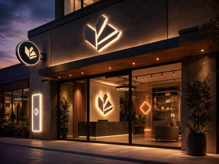
A retail window sign has a harder job than most people realize. It must compete with sunlight, reflections, passing vehicles, neighboring stores, mannequins, products, posters, and the natural tendency of pedestrians to look at a window for only a few seconds. A sign that looks bright and attractive inside a workshop may become difficult to read once it is placed behind glass at midday.
For most retail window displays, a slim LED light box is the best all-round choice because it remains readable, presents product graphics clearly, and allows campaigns to be replaced without rebuilding the sign. LED neon is better for atmosphere, edge-lit acrylic for minimal branding, illuminated letters for permanent logos, and a high-brightness digital display for frequently changing video or promotional content.
The right answer therefore depends on what the window must accomplish. A fashion retailer launching new seasonal artwork has different needs from a jewelry store displaying a permanent logo. A café may want a warm neon message, while a chain retailer may need hundreds of matching light boxes with replaceable graphics.
Imagine installing a beautiful sign on Friday evening, then returning on Saturday morning to discover that sunlight has turned it into a faint reflection behind the glass. That expensive mistake usually begins long before installation—with the wrong product type, insufficient contrast, poor placement, or specifications that were never tested against the actual window.
Which Illuminated Sign Is Best?

A slim LED light box is usually the safest all-around choice for retail window displays because it can show product images, campaign graphics, prices, and brand messages with even illumination. LED neon works better for short slogans and atmosphere, edge-lit acrylic suits minimal logos, illuminated letters fit permanent branding, and high-brightness digital screens are better when content changes daily.
The word “best” depends on what the window needs to achieve. A light box may be excellent for a seasonal fashion campaign but unnecessary for a permanent jewelry-store logo. LED neon may create a memorable photo spot but perform poorly when used for small product details. Digital screens offer frequent content updates, yet they bring higher equipment costs, software management, cooling requirements, and more complicated maintenance.
Start with five practical questions:
| Selection question | Recommended direction |
|---|---|
| Will the message change every day? | High-brightness digital display |
| Will the campaign change every 1–4 months? | Replaceable LED light box |
| Is the sign mainly a logo or short phrase? | LED neon or illuminated letters |
| Is a thin, understated look required? | Edge-lit acrylic sign |
| Must the sign remain installed for several years? | Illuminated letters or a fixed logo sign |
Lighting conditions also matter. A sign positioned in a shaded shopping mall can use a softer output than a west-facing street window receiving direct afternoon sun. Glass tint, reflections, surrounding store lighting, sign distance from the glass, and background color can change the result more than product wattage alone.
Is an LED Light Box Best for Promotions?
An LED light box is normally the strongest choice for retail windows displaying campaign artwork, product photography, promotional prices, seasonal collections, or launch graphics. A properly built light box illuminates the complete graphic instead of lighting only the letters, making it easier to present detailed visual information.
Common applications include:
- New collection posters
- Holiday sales
- Product launches
- Limited-time offers
- Menu graphics
- Brand photography
- Shopping-mall campaign displays
- Multi-store promotional programs
For smaller poster displays, slim light-box frames are commonly produced at approximately 20–40 mm deep. Larger fabric light boxes often require profiles of 40–100 mm or more to maintain strength and allow enough distance between the LEDs and the graphic face. A frame that is too shallow can show bright LED dots, uneven edges, or dark areas around the corners.
Graphic replacement is the main advantage. A fashion store running four campaigns per year can keep the frame, LEDs, power supply, and installation hardware while replacing only the printed face. A magnetic frame or snap frame may allow store staff to change the graphic. A large SEG fabric light box usually requires the silicone edge of the graphic to be pressed evenly into the frame.
Before ordering, confirm:
- Visible frame width
- Overall frame depth
- Graphic size
- Graphic replacement method
- Single-sided or double-sided lighting
- Wall mounting or cable suspension
- LED color temperature
- Dimming requirements
- Cable exit position
- Power supply access
A light box works best when visual content matters more than dimensional letter depth. It is less suitable for open-view windows where a large opaque panel would block mannequins, merchandise, or sightlines into the store.
Is LED Neon Best for Brand Atmosphere?
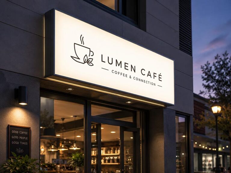
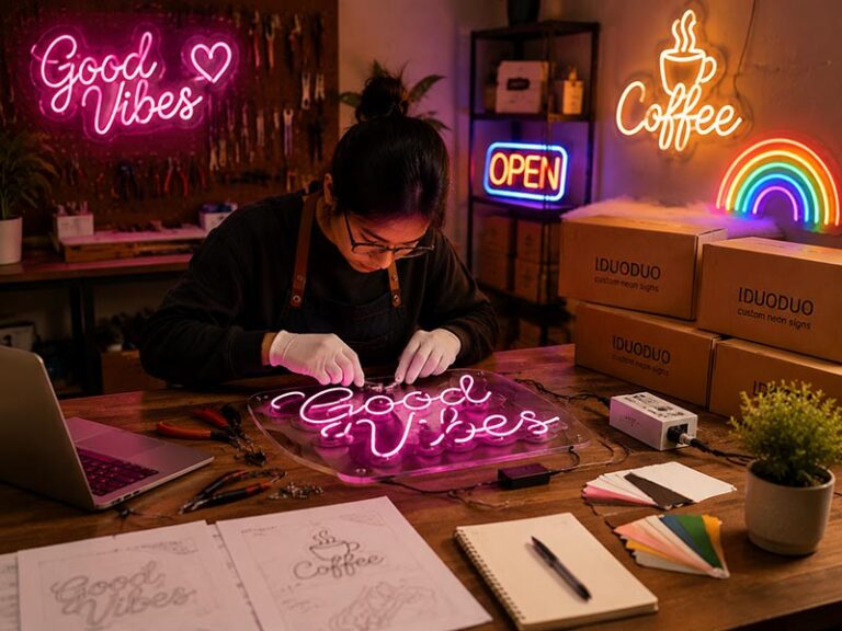
LED neon is ideal for short messages, recognizable logos, symbols, and visual features intended to give the window personality. It is widely used in fashion stores, cafés, beauty retailers, gyms, lifestyle shops, bars, event displays, and social-media-friendly installations.
Strong LED neon content is usually brief:
- A brand name
- A two-to-five-word phrase
- A simple icon
- A recognizable product outline
- An arrow or directional message
- An “OPEN” message
- A campaign hashtag
Long sentences and small lettering should be avoided. From the street, pedestrians may only look at the window for two or three seconds. A short message with thick strokes and enough spacing will normally outperform a detailed phrase squeezed into the same area.
For practical production, stroke widths often range from approximately 6–12 mm, depending on the neon material and design. Very small letter heights can make bends, corners, and internal spacing difficult to reproduce cleanly. As a general manufacturing starting point, simple letters often work more reliably above 80–100 mm high, while complex scripts may need larger dimensions.
The backing also changes the appearance. Clear acrylic keeps the window visually open but can expose wires, screws, and reflections. A cut-to-shape backing reduces visible acrylic. A printed or colored backboard increases contrast and can help pale neon colors remain visible during the day.
LED neon is not always the right answer for a sunny window. A warm white or pastel pink sign may look excellent after dark but become weak against a bright interior during midday. Daytime performance can be improved by:
- Increasing stroke size
- Reducing message length
- Choosing a stronger color
- Adding a darker backing
- Moving the sign closer to the glass
- Reducing competing lights behind the sign
- Using adjustable brightness
LED neon should be chosen for emotional impact and brand recognition, not for displaying detailed product specifications or frequently changing prices.
Are Edge-Lit Signs Best for Minimal Displays?
Edge-lit acrylic signs suit retail windows where the sign needs to look thin, modern, and visually quiet. LEDs are installed along one or more edges of an acrylic panel. Engraved lines, printed graphics, or laser-marked areas capture the light, making selected content appear illuminated.
Common applications include:
- Jewelry-store logos
- Cosmetic brand marks
- Optical shop signs
- Gallery names
- Technology product displays
- Premium service counters
- Small directional messages
- Minimal promotional graphics
Acrylic panels are commonly made in thicknesses such as 5 mm, 8 mm, or 10 mm. Larger panels may require thicker acrylic, aluminum framing, or additional hanging points to reduce bending. Panel size, engraving depth, LED position, and light-guide pattern determine whether illumination remains even across the surface.
Edge-lit acrylic has a cleaner daytime appearance than many bulky illuminated products. The panel can remain almost transparent when unlit, allowing products behind it to stay visible. However, the same transparent quality can reduce readability against a crowded store interior.
A simple test helps prevent mistakes: place the intended logo over a photograph of the real window and check whether the content remains visible against merchandise, shelves, lighting, and movement inside the store. A dark vinyl layer, frosted area, printed background, or narrow frame may be needed to increase contrast.
Edge-lit signs are strongest when viewed from the front or a moderate angle. Very sharp side viewing can make the image less clear. They are also less suitable for high-impact street visibility where the sign must compete with direct sunlight or surrounding illuminated storefronts.
Choose edge-lit acrylic when the retail concept values transparency, low visual weight, and precise detailing. Choose a light box or illuminated letters when stronger daytime visibility is more important than minimal structure.
Are Illuminated Letters Best for Permanent Logos?
Illuminated letters are usually the best option for a permanent store name, logo, or brand mark expected to remain in the window for several years. They provide depth, material presence, and a more architectural appearance than printed light boxes or flat acrylic panels.
The main lighting options are:
| Letter type | Visual result | Suitable use |
|---|---|---|
| Front-lit letters | Bright illuminated face | Strong brand visibility |
| Halo-lit letters | Soft glow behind each letter | Premium and understated branding |
| Front-and-back-lit letters | Bright face with rear halo | High-impact flagship displays |
| Side-lit letters | Illuminated return or edge | Contemporary branded installations |
Front-lit letters work well when clear recognition is the priority. Halo-lit letters are more restrained and often suit jewelry, beauty, hospitality, premium fashion, and interior-facing retail windows. Front-and-back-lit letters create stronger visual depth but require enough space around every letter for the rear glow to remain visible.
Letter depth depends on size, lighting method, materials, and viewing distance. Small indoor letters may use relatively shallow structures, while large letters need greater depth for rigidity and even LED distribution. A shallow front-lit letter can show bright spots when LEDs sit too close to the acrylic face.
Installation requires more planning than hanging a light box. The project normally needs confirmation of:
- Letter layout
- Mounting template
- Wall or backboard material
- Stud or spacer length
- Cable exit for each letter
- Power supply position
- Back access
- Service method
- Installation voltage
- Surface load capacity
Individual letters installed directly onto transparent glass can create wiring problems because cables and power connections remain visible. A slim raceway, decorative backboard, suspended frame, or concealed support structure may produce a cleaner result.
Illuminated letters make financial sense when the logo will remain unchanged. They are not efficient for monthly promotions because replacing the message normally means producing a new sign. For permanent branding, however, they provide a stronger sense of quality and permanence than temporary poster systems.
Are Digital Displays Best for Changing Content?
Digital window displays are the best choice when content changes daily or several times per week. Video, animated graphics, prices, store hours, product launches, and localized promotions can be scheduled without printing or physically replacing a graphic.
Digital displays are commonly used by:
- Real estate agencies
- Telecom stores
- Travel agencies
- Automotive showrooms
- Quick-service restaurants
- Financial services
- Electronics retailers
- Convenience stores
- Multi-location retail chains
Brightness must match the window environment. Standard indoor screens are often too dim for outward-facing storefront use.
| Window environment | Typical starting brightness |
|---|---|
| Indoor mall with controlled lighting | 700–1,500 nits |
| Shaded street-facing window | 1,500–2,500 nits |
| Bright outward-facing window | 2,500–4,000 nits |
| Strong direct sunlight | Site testing required |
The ranges are planning references rather than guaranteed specifications. Glass tint, reflections, window direction, display position, and screen angle must still be checked.
Digital screens need more than power. A working system may include:
- Media player
- Content management software
- Internet connection
- Scheduled playlists
- User access control
- Cooling and ventilation
- Security brackets
- Remote monitoring
- Replacement planning
- Technical support
Heat is an important concern. Direct sun can raise the temperature behind the window, especially when the screen sits close to the glass. Insufficient ventilation may shorten screen life or trigger automatic brightness reduction.
Content preparation also affects performance. Small text, long paragraphs, and rapidly changing scenes are difficult to understand from the street. Effective window content normally uses one clear message per screen, strong contrast, limited words, and enough display time for pedestrians to read it.
A digital display can be expensive when only one permanent logo is needed. It becomes more economical when frequent campaign changes, centralized control, or multiple stores create enough value to justify the equipment and management costs.
The most reliable choice comes from matching the sign to the content schedule:
| Content life | More suitable sign |
|---|---|
| One day to one week | Digital display |
| One month to one season | Replaceable LED light box |
| Six months to several years | LED neon or edge-lit logo sign |
| Permanent brand identity | Illuminated letters |
No single illuminated product wins every retail window project. A useful recommendation must account for the message, daylight conditions, viewing distance, window size, installation space, replacement frequency, maintenance access, and planned service life. Selecting the product only from a nighttime reference photo often leads to poor daytime visibility, messy wiring, or a sign that cannot be updated as intended.
What Should Retail Stores Compare?

Retail stores should compare daylight visibility, message life, viewing distance, window obstruction, installation space, power access, maintenance, and three-year operating cost. A sign should not be selected from appearance alone. The right option must remain readable through glass, fit around merchandise, allow safe servicing, and match how often promotions or brand content will change.
A useful comparison starts with the job the sign must perform. A permanent logo, a quarterly campaign, a daily price update, and a short neon phrase require different products. Window direction, pedestrian traffic, installation height, glass reflection, and store opening hours can change the result even when two stores use the same sign.
| Project factor | Questions to answer before selecting a sign |
|---|---|
| Main purpose | Is the sign for branding, promotion, pricing, atmosphere, or wayfinding? |
| Content life | Will the message stay for one week, three months, or several years? |
| Daylight exposure | Is the window shaded, mall-facing, north-facing, or exposed to direct sun? |
| Viewing distance | Will people read it from 2 meters, 10 meters, or across a road? |
| Window use | Must people still see products and the store interior? |
| Installation | Can the sign hang, stand, mount to a wall, or attach to a support frame? |
| Power | Where is the outlet, and where can the power supply remain accessible? |
| Maintenance | Who will replace graphics, clean the sign, or service electrical parts? |
| Rollout quantity | Is the project for one store, a pilot location, or many branches? |
| Budget period | Is the decision based on purchase price or total cost over three years? |
How Visible Is the Sign in Daylight?
Daylight visibility should be checked before color, style, or decorative finish. Many illuminated signs look impressive in a dim showroom but lose contrast behind reflective glass during business hours.
Start by studying the window at four times:
- Morning
- Midday
- Late afternoon
- After sunset
Take photographs from the main pedestrian approach and from across the street where relevant. Record direct sunlight, bright sky reflection, neighboring signs, traffic movement, interior spotlights, window tint, and dark or bright merchandise behind the proposed sign position.
Glass creates a second image over the sign. A bright sky, white building, or moving vehicle can appear stronger than the illuminated message. Increasing electrical power alone may not solve the problem. Contrast, background control, letter size, stroke width, and placement often have a greater effect.
A practical visibility review can use the following scale:
| Window condition | Visibility risk | Recommended action |
|---|---|---|
| Indoor mall, controlled lighting | Low | Standard illuminated sample may be enough |
| Shaded street window | Moderate | Check contrast and reflections at midday |
| Bright window without direct sun | Medium to high | Use stronger contrast and larger lettering |
| Direct morning or afternoon sun | High | Test a physical sample at the location |
| Tinted or mirrored glass | High | Check actual transmission and reflection |
| Busy interior behind clear glass | High | Add backing or simplify the message |
Viewing distance also affects the result. A sign read from 2–3 meters can carry smaller details than one viewed from 15 meters. As a planning reference, short high-contrast wording may begin with around 25 mm of capital-letter height for every 3–4 meters of reading distance. Decorative fonts, thin strokes, low-contrast colors, and sharp viewing angles require larger lettering.
Do not approve a sign only from a close-up rendering. Print the artwork at full size, place it in the intended position, and walk the normal approach route. The message should become readable before the pedestrian reaches the window, not only when standing directly in front of it.
How Often Will the Content Change?
Content life often determines the product more clearly than appearance.
A permanent logo expected to remain for three to five years can justify illuminated letters, LED neon, or a fixed edge-lit panel. A campaign replaced every season is usually better suited to a light box. Offers updated several times per week may justify a digital display.
| Expected content life | More suitable option | Main reason |
|---|---|---|
| One day to one week | Digital display | Fast updates without printing |
| Two weeks to three months | Replaceable light box | New graphics, same illuminated frame |
| Three to twelve months | Light box, LED neon, or edge-lit sign | Depends on message and visual style |
| One to five years | Illuminated logo or letters | Stronger permanent brand presence |
| Five years or more | Serviceable illuminated letters | Replaceable electrical parts and durable structure |
The replacement method should be tested before purchase. A small magnetic poster frame may be changed by one store employee in a few minutes. A large fabric light box may require two people to remove and tension the graphic evenly. A sign installed four meters above the floor may need a ladder, mobile platform, or local installer every time the campaign changes.
For seasonal graphics, calculate more than printing cost. Include:
- Artwork adaptation
- Color proofing
- Graphic production
- Packaging
- Delivery to each store
- Old graphic removal
- New graphic installation
- Disposal or storage
- Corrections when a store receives the wrong version
A chain with 40 stores changing graphics four times per year will complete 160 graphic replacements annually. Even ten extra minutes per replacement becomes more than 26 labor hours across the rollout, before travel and access time are counted.
Digital signage removes physical graphic changes but adds content scheduling, file formatting, account permissions, internet access, media-player management, and technical support. A screen provides value only when the store has enough new content to use it properly. Running one static logo for months on an expensive screen rarely makes financial sense.
Does the Sign Block Product Displays?
A window sign should help the merchandise attract attention, not become a wall between the product and the street.
Opaque light boxes provide strong graphics but can cover mannequins, product shelves, and sightlines into the store. Clear-backed LED neon and edge-lit acrylic preserve more visual depth, although busy interiors can make them difficult to read.
Before selecting the sign size, prepare a front elevation showing:
- Total clear glass area
- Window frames and mullions
- Mannequins or hero products
- Main pedestrian eye level
- Display platforms
- Proposed sign position
- Power cables
- Mounting hardware
- Store entrance
- Important interior sightlines
As a planning guide, many stores keep permanent signs below roughly 20–30% of the visible glazing area when the goal is to maintain an open storefront. The figure is not a universal rule. Full-window campaign graphics, privacy requirements, landlord restrictions, and local regulations may lead to a different result.
Window coverage can be estimated with a simple calculation:
Sign area ÷ visible glass area × 100
For example:
- Visible glass area: 3,000 mm × 2,400 mm = 7.2 m²
- Proposed sign: 1,200 mm × 800 mm = 0.96 m²
- Window coverage: 0.96 ÷ 7.2 × 100 = 13.3%
A 13.3% panel may leave enough space around the sign for merchandise to remain visible. Two similar panels would cover 26.6% before frames, cables, and other graphics are included.
Sign placement matters as much as size. A panel mounted just above the main product zone may work better than a smaller panel placed directly in front of a mannequin’s face. A horizontal sign may fit above merchandise, while a narrow vertical light box may use an otherwise empty side section of the window.
Also check the rear view from inside the store. The back of a light box, power supply, mounting plate, and cables may be visible to staff or shoppers. A clean rear enclosure or double-sided finish can be worth specifying even when only the outward face is illuminated.
How Much Installation Space Is Needed?
Measure the complete installed system, not only the sign body.
A light box described as 30 mm deep may need additional space for hanging brackets, cable bends, rear ventilation, connectors, and access to the graphic. Illuminated letters may require spacers, a raceway, a supporting panel, or a concealed wiring zone. A digital screen needs a bracket, cooling clearance, security access, and enough room for cable connections.
Record the following dimensions during the site survey:
| Measurement | Why it matters |
|---|---|
| Clear glass width and height | Confirms the available display area |
| Distance from glass to merchandise | Prevents the sign from crowding products |
| Ceiling height | Determines hanging length and access equipment |
| Window-frame depth | Affects bracket and cable routing |
| Distance to outlet | Determines cable length and power position |
| Space behind sign | Allows wiring, cooling, and service |
| Distance from sprinklers or lights | Prevents conflicts with building services |
| Door swing and customer route | Avoids obstruction and safety problems |
As a practical starting point:
- Slim poster light boxes may use frames around 20–40 mm deep.
- Larger fabric light boxes may use profiles around 40–100 mm or more.
- Acrylic-backed LED neon often needs space for the acrylic, mounting spacers, cable exit, and power connection.
- Illuminated letters may require approximately 20–100 mm or more of depth, depending on letter size and lighting structure.
- Digital window screens may need significant rear clearance for brackets, ventilation, media equipment, and service access.
The total installed depth should be drawn in side view. A front elevation alone can hide serious problems.
Power supplies should remain accessible. Hiding a transformer inside a sealed ceiling or behind a permanent wall panel may create future maintenance problems. For a suspended sign, check whether power can travel neatly along one hanging cable or through a dedicated channel. Clear acrylic backgrounds make every cable visible, so the wire-exit position should be agreed before production.
Store rules may also limit attachment methods. A leased unit may prohibit drilling into glass, structural ceilings, or decorative wall panels. In such cases, a freestanding base, approved ceiling track, removable support frame, or landlord-approved mounting point may be required.
What Is the Long-Term Cost?
Purchase price provides only part of the cost. A useful comparison covers design, samples, production, installation, content changes, electricity, maintenance, replacement parts, packaging, shipping, and removal.
Consider a three-year period instead of comparing quotations only on the first day.
| Cost category | LED neon logo | Replaceable light box | Digital display |
|---|---|---|---|
| Initial equipment | Low to medium | Medium | High |
| Installation | Low to medium | Medium | Medium to high |
| Content replacement | New sign or face change | Printed graphic | Digital file |
| Scheduled maintenance | Limited | Limited | Regular technical support |
| Electrical complexity | Low to medium | Medium | High |
| Best value when | Message stays fixed | Campaigns change seasonally | Content changes frequently |
A simple three-year cost model can be written as:
Initial sign cost
- installation
- replacement graphics or new content
- labor for each change
- maintenance
- expected replacement parts
- shipping and handling
= total cost of ownership
Consider a store changing one campaign every three months:
- Four changes per year
- Twelve changes over three years
- Printed graphic: USD 80 each
- Local replacement labor: USD 60 each
- Three-year change cost: 12 × USD 140 = USD 1,680
A light box costing USD 900 initially would reach USD 2,580 before installation, electricity, or shipping. The figure does not mean a light box is a poor choice. It shows why replacement frequency and local labor must be included.
A digital display may cost much more at the beginning but reduce printing and replacement labor. It can still carry expenses for software, media players, internet service, technical visits, and screen replacement. A fixed illuminated logo may have the lowest content cost because the message never changes, yet it cannot support changing promotions.
For multi-store work, packaging and identification also affect cost. Poor carton labels can send the wrong sign to the wrong branch. Missing brackets can delay installation. A damaged acrylic face may require express replacement freight. Store number, product code, mounting location, accessory list, and carton sequence should appear on every package.
The lowest quotation may become expensive when it leaves out dimming, mounting templates, cables, plug types, spare components, graphics, or suitable packaging. Compare quotations line by line and confirm what arrives in the box.
A practical scoring method can help when several options remain:
| Comparison factor | Suggested weight |
|---|---|
| Daylight visibility | 25% |
| Fit with content-change schedule | 20% |
| Effect on merchandise visibility | 15% |
| Installation and service access | 15% |
| Three-year cost | 15% |
| Brand appearance | 10% |
Score each option from 1 to 5, multiply the score by the weight, and compare the totals. A product with the lowest purchase price may not achieve the highest project score. The strongest choice is the one that remains readable, fits the window, supports the campaign schedule, and can be maintained without disrupting store operations.
How Do Glass and Lighting Affect Visibility?

Glass changes how an illuminated sign looks from the street. Reflections from the sky, nearby buildings, cars, streetlights, and shop interiors can cover the message even when the sign appears bright indoors. Window tint, direct sunlight, sign position, background color, letter size, and viewing angle all influence readability.
A successful retail window sign needs enough contrast for the brightest part of the day and controlled output after dark. Brightness alone cannot solve every visibility problem. A moderately bright sign with a dark background, simple wording, and large letters can outperform a much brighter sign installed behind reflective glass with a busy store interior.
Before approving production, review the window under real operating conditions:
| Site factor | What to record |
|---|---|
| Window direction | North, south, east, or west facing |
| Direct sunlight | Time of day when sun reaches the glass |
| Glass type | Clear, tinted, laminated, mirrored, or coated |
| Main viewing distance | Closest and farthest useful reading point |
| Viewing angle | Straight ahead or approached from the side |
| Interior background | Dark wall, bright shelves, moving shoppers, or open store |
| Nearby competition | Other illuminated signs, screens, headlights, or streetlights |
| Night conditions | Store lighting level after sunset |
| Sign position | Distance from glass and height above the floor |
Take photographs at opening time, midday, late afternoon, and after sunset. One evening photo cannot show whether the sign will remain visible during the busiest shopping hours.
How Bright Should the Sign Be?
Brightness should be selected according to the window environment rather than product wattage. Wattage only shows electrical consumption. It does not prove how bright the sign face will look, how evenly the LEDs will illuminate the surface, or whether the message will remain readable through glass.
For digital window screens, luminance is commonly measured in nits. The following ranges can be used for early planning:
| Window environment | Typical planning range |
|---|---|
| Indoor mall with controlled light | 700–1,500 nits |
| Shaded street-facing window | 1,500–2,500 nits |
| Bright outward-facing window | 2,500–4,000 nits |
| Window receiving strong direct sun | Physical site test required |
A standard office monitor may look bright inside a room but disappear behind a sunny storefront window. A high-brightness screen can handle stronger ambient light, although direct sunlight may still create glare, heat, and reduced contrast.
Light boxes require a different review. Ask for face luminance, illumination uniformity, LED spacing, diffuser structure, and edge-to-center consistency. A light box can look bright overall while still showing dark corners, bright LED dots, or uneven bands.
Useful checks include:
- No visible LED hotspots from the normal viewing distance
- No dark bands between LED rows
- Similar brightness at the center and edges
- Graphic colors remaining recognizable when illuminated
- No obvious color shift between replacement graphics
- Stable output after several hours of operation
LED neon and illuminated letters are judged more by stroke or face contrast than by a single luminance number. A narrow warm-white stroke against a brightly lit store may look weaker than a wider red or cool-white stroke using similar power.
Sign brightness should also match message size. Small letters often need stronger contrast because the eye has less illuminated area to identify. Increasing brightness cannot fully rescue a font with thin strokes, tight spacing, or poor proportions.
A practical test uses three settings:
- Maximum daytime output
- Normal evening output
- Reduced late-night output
Photograph each setting from the main approach route. The daytime setting should remain readable without appearing like a white glowing block. The evening setting should not overpower nearby merchandise. The late-night setting should avoid unnecessary glare when surrounding streets become darker.
Does Window Glare Reduce Readability?
Window glare can hide a sign even when the LEDs are working correctly. Glass reflects whatever is brighter on the viewer’s side. During the day, reflections may include the sky, clouds, buildings, vehicles, trees, and pedestrians. At night, headlights and streetlights can produce moving reflections across the sign face.
The strength of glare depends on several conditions:
- Sun position
- Window angle
- Exterior brightness
- Interior brightness
- Glass coating
- Viewing direction
- Sign distance from the glass
- Color and finish of the sign face
A sign located deep inside the store may look weaker because more interior elements appear between the sign and the glass. Moving the sign closer to the window can improve apparent brightness and reduce competing background detail. A starting distance of approximately 50–150 mm behind the glass can be tested for slim signs, although cleaning access, ventilation, mounting structure, and local rules may require more space.
Do not press an electrical sign directly against the glass unless the product and installation method are designed for such placement. Heat, vibration, condensation, cleaning, and cable pressure must be considered.
Glare can often be reduced without increasing LED power:
- Use a darker or less reflective background behind the sign.
- Position interior spotlights away from the glass.
- Avoid glossy black surfaces directly behind bright lettering.
- Move the sign away from strong reflected sightlines.
- Increase letter size and stroke width.
- Reduce the amount of wording.
- Use matte graphics instead of highly glossy printed faces.
- Angle a digital screen slightly where mounting allows.
- Test anti-glare film only after confirming color and light transmission.
Tilting a screen or poster frame may redirect reflections, but excessive tilt can distort the image and reduce visibility for people approaching from the side. Even a small adjustment of 3–7 degrees can change the reflection pattern. A physical trial is more reliable than assuming a standard angle will work.
A simple mock-up can prevent an expensive mistake. Print the artwork at full size or place a sample illuminated panel in the intended position. Photograph it from the left approach, front position, and right approach at several times of day. Mark any point where reflections cover the message.
When glare cannot be eliminated, design for recognition rather than fine detail. A bold logo, a short campaign phrase, or one large product image usually survives reflections better than several lines of small promotional text.
How Does Glass Type Change the Result?
Not all storefront glass transmits light in the same way. Clear glass, laminated security glass, tinted glass, low-emissivity glass, mirrored film, and solar-control coatings can produce visibly different results.
Clear untreated glass usually allows the strongest apparent sign output, although reflections can still be significant. Tinted or coated glass can reduce transmitted light and alter color. A warm-white LED may appear duller or more yellow behind certain films. Blue or purple tones may also shift depending on the coating.
Common glass-related issues include:
| Glass condition | Possible effect on the sign |
|---|---|
| Dark tint | Lower apparent brightness |
| Mirrored film | Strong exterior reflections |
| Warm-colored tint | Shift in white and blue illumination |
| Cool-colored tint | Shift in warm white and red tones |
| Laminated glass | Slight reduction in light transmission |
| Double glazing | Additional reflections from multiple surfaces |
| Dirty glass | Lower contrast and scattered light |
| Condensation | Blurred lettering and uneven appearance |
Do not assume the sign will look identical behind the window and outside the window. A color sample should be viewed through the actual glass whenever brand color accuracy matters.
A useful test can be completed with a portable illuminated sample or even a small LED panel:
- Hold the sample at the intended distance behind the glass.
- View it from the street at midday and after dark.
- Compare several LED colors or color temperatures.
- Photograph the sample using the same camera exposure.
- Record which option remains readable without excessive glare.
For chain stores, glass may differ between locations. One branch may use clear glazing, while another may have solar film or darker architectural glass. A single brightness setting may not suit every location.
Group stores by window condition before finalizing the rollout:
- Controlled mall locations
- Shaded street locations
- Bright street locations
- Direct-sun locations
- Tinted-glass locations
The sign structure can remain standardized while brightness, dimmer settings, backing color, or sign position varies by group.
Which Colors and Fonts Work Best?
Color contrast is usually more important than the number of colors used. Two bright colors can still be difficult to separate when their visual brightness is similar. Pale yellow on white, light pink on warm beige, and cool white on a bright silver background often perform poorly through reflective glass.
Stronger combinations include:
- White lettering on black or dark blue
- Warm white on deep green
- Red on a neutral dark background
- Cool white on charcoal
- Bright yellow on black
- Saturated brand color on a controlled neutral background
Color selection should account for both the illuminated and unlit appearance. A white acrylic face may look clean during the day and illuminate brightly at night. A dark acrylic face can create stronger daytime contrast but may require different LED output and diffuser construction.
Color temperature also changes the mood of the display:
| Color temperature | Typical visual effect | Common retail use |
|---|---|---|
| 2700–3000K | Warm, soft, intimate | Jewelry, cafés, boutiques, hospitality |
| 3500–4000K | Balanced and natural | Fashion, beauty, general retail |
| 5000–6500K | Bright, crisp, cooler | Electronics, sports, convenience retail |
Color temperature should not be selected only from a catalog number. Acrylic, diffuser film, printed graphics, store lighting, and window tint may change the final appearance.
Fonts should remain simple enough to read during movement. Pedestrians rarely stand still and study a window sign. Many people see the message while walking at 1–1.5 meters per second, driving past, or approaching from an angle.
Readable window lettering normally has:
- Open counters in letters such as A, B, D, O, P, and R
- Moderate or bold stroke width
- Clear spacing between letters
- Limited use of decorative scripts
- Short line length
- Strong contrast
- Few competing font styles
Very thin fonts can disappear during daylight. Tight letter spacing can cause illuminated strokes to merge at night. Script lettering may work for a short brand name but becomes difficult to read when used for prices, dates, or long campaign messages.
A practical content hierarchy can use:
- One main message
- One supporting line
- One logo or product image
- One action, when needed
For example:
NEW SEASON
Available Now
Brand Logo
The wording can be understood quickly. A sign containing product name, discount percentage, campaign dates, terms, website, QR code, and five feature statements is unlikely to be read from the street.
Is Dimming Needed at Night?
Dimming is strongly recommended when daytime and nighttime light levels differ greatly. A sign bright enough for a sunny afternoon may become uncomfortable after sunset. Excessive nighttime brightness can create glare, wash out printed colors, reflect across the glass, and make the surrounding display look darker.
Three control methods are common:
| Control method | Suitable use | Main consideration |
|---|---|---|
| Manual dimmer | Single store with staff control | Depends on staff remembering to adjust it |
| Timer control | Fixed opening and closing schedule | Seasonal schedule changes may be needed |
| Light sensor | Automatically responds to ambient light | Sensor position must avoid false readings |
| Central control | Multi-store or digital programs | Requires setup, access, and maintenance |
RGB and RGBW signs also need controlled presets. Allowing every store to choose colors freely can create inconsistent branding. A chain program should define approved color settings, brightness levels, transition speed, and operating schedule.
Not every LED system uses the same dimming method. Power supply, driver, controller, and LED modules must be compatible. Incorrect combinations can create:
- Flickering
- Uneven low-level output
- Electrical noise
- Color shift
- Controller failure
- Reduced component life
Confirm the dimming system before manufacturing. Adding control later may require new wiring or replacement power supplies.
A useful operating schedule might look like:
| Time period | Suggested output |
|---|---|
| Bright daytime | 80–100% |
| Cloudy afternoon | 60–80% |
| Early evening | 40–60% |
| Late night | 20–40% |
| Closed hours | Off or reduced according to store policy |
The percentages are starting points. Final settings should be checked on site.
Store lighting should also be adjusted with the sign. A bright sign inside a dark window becomes a floating light source with little connection to the merchandise. Gentle lighting on nearby products can create a more balanced display and improve the overall storefront impression.
How Does Viewing Distance Affect the Design?
Viewing distance controls letter height, image detail, sign size, and the number of words that can be understood. A sign designed for people standing one meter away will not necessarily work for pedestrians approaching from ten meters.
A useful early planning guide for short, high-contrast text is approximately 25 mm of capital-letter height for every 3–4 meters of reading distance.
| Approximate reading distance | Starting capital-letter height |
|---|---|
| 2–3 meters | 20–30 mm |
| 4–6 meters | 40–60 mm |
| 8–10 meters | 70–100 mm |
| 12–15 meters | 100–150 mm |
| 20 meters or more | Full-scale site test recommended |
The table assumes simple lettering, good contrast, and a near-front viewing angle. Increase letter height when using:
- Script fonts
- Thin strokes
- Low-contrast colors
- Tinted glass
- Busy backgrounds
- Sharp side angles
- Fast vehicle traffic
- Strong reflections
Viewing angle can be as important as distance. A sign may be clear from directly in front of the store but difficult to read from the direction where most foot traffic begins. Measure the main approach route and check whether window frames or mullions block part of the message.
For side approaches, avoid placing critical wording near the edge of the sign. Letter spacing may appear compressed from an angle. A shorter message with larger letters performs better.
The sign height above the floor should also match the viewing situation. Pedestrian-focused signs often work well near eye level, while larger brand signs can sit higher and remain visible over merchandise. Avoid placing small promotional wording too high, where people must look sharply upward through reflective glass.
A full-scale paper test is inexpensive and reliable:
- Print the main wording at actual size.
- Attach it at the proposed height.
- Walk toward the store from the normal direction.
- Record the point where the wording becomes readable.
- Repeat the test from both sides and across the street.
- Check again after dark.
The final sign should be readable early enough to influence the decision to approach the store. A message that only becomes clear when someone is already standing against the glass has limited value as a traffic-generating display.
Glass, lighting, background, typography, and viewing distance must be planned together. Increasing LED output cannot compensate for poor placement, small lettering, reflective surroundings, or a message carrying too much information. The strongest retail window signs use controlled brightness, high contrast, short copy, suitable scale, clean mounting, and enough testing before production.
How Should a Window Sign Be Installed?

A retail window sign should be installed according to the glazing size, sign weight, viewing direction, mounting structure, cable route, power location, cleaning access, and local property rules. Installation details should be confirmed before production so the sign arrives with the correct holes, brackets, suspension cables, wire exits, power supplies, templates, and labeled accessories.
A clean installation should meet five practical goals:
- The sign is level and positioned for the main viewing route.
- The mounting structure safely supports the complete installed weight.
- Cables and power supplies remain neat but accessible.
- Graphics, LEDs, and electrical parts can be serviced without removing the entire display.
- Merchandise, doors, sprinklers, lights, and cleaning access remain unobstructed.
| Installation factor | Information required before production |
|---|---|
| Window dimensions | Clear glass width, height, frame position, and usable display area |
| Sign position | Distance from floor, glass, merchandise, and window mullions |
| Mounting surface | Ceiling, wall, frame, display platform, or freestanding base |
| Product weight | Sign, brackets, cables, power supplies, and graphic combined |
| Power access | Outlet position, voltage, plug, cable length, and switching method |
| Maintenance | Graphic replacement, cleaning, driver access, and LED servicing |
| Building limits | Landlord rules, fire routes, glazing restrictions, and local approval |
What Size Fits the Window?
The correct sign size is not simply the largest panel that fits inside the glass. A useful sign must remain readable without covering too much merchandise, blocking the store interior, or appearing crowded between window frames.
Begin with the clear visible glass area rather than the overall building opening. Measure between the inside edges of mullions, frames, doors, display platforms, and ceiling details. Record measurements in millimeters rather than rounded feet or inches when drawings will be used for manufacturing.
A complete window survey should include:
- Clear glass width and height
- Window-frame width
- Mullion position
- Distance from glass to merchandise
- Ceiling height
- Display platform height
- Main pedestrian eye level
- Proposed sign centerline
- Distance to the nearest power outlet
- Available space for the power supply
- Door opening and customer walking route
A scaled front elevation helps reveal problems before production. Place the logo, light box, or neon sign on a photograph or measured drawing of the actual window. Include mannequins, shelves, product displays, cables, and mounting points rather than showing the sign alone on an empty background.
Window coverage can be calculated as:
Sign face area ÷ visible glass area × 100
For example:
- Visible glass: 3,200 × 2,500 mm = 8.00 m²
- Proposed light box: 1,200 × 900 mm = 1.08 m²
- Window coverage: 1.08 ÷ 8.00 × 100 = 13.5%
A 13.5% sign leaves substantial glazing visible. Two identical units would cover 27%, before suspension hardware and other graphics are counted.
For open-view storefronts, permanent illuminated signs are often kept around 15–30% of the visible glass area as a design starting point. Campaign displays may use more space. Local regulations, landlord standards, and the visual-merchandising concept can require a different ratio.
Size should also match reading distance. A sign facing pedestrians two meters away can use smaller details than a sign intended to reach people across a road. Short, high-contrast wording may begin with approximately 25 mm of capital-letter height for every 3–4 meters of reading distance. Decorative fonts, reflections, tinted glass, and side viewing require larger letters.
Leave enough clearance around the sign:
| Area | Useful planning clearance |
|---|---|
| Between sign and glass | Often 50–150 mm for slim suspended signs |
| Around a replaceable graphic frame | Enough room for the frame to open |
| Behind a digital screen | According to bracket and ventilation needs |
| Between hanging sign and merchandise | Enough space to prevent contact |
| Above doors or walking routes | Confirm safe head clearance locally |
The final size should be checked with a full-scale paper template. Tape the outline or printed artwork in the intended position, then view it from both approach directions. A small adjustment in height or width can improve visibility more than increasing the sign area.
Is a Single- or Double-Sided Sign Better?
A single-sided sign is normally suitable when the main audience is outside the store and the rear of the sign faces a wall, curtain, display panel, or area where appearance is not important.
A double-sided sign is useful when:
- Pedestrians approach from opposite directions.
- The sign hangs perpendicular to the window.
- The message must be visible from outside and inside.
- The window sits between two active circulation areas.
- A shopping-mall unit has open visibility from several sides.
The extra face increases more than material cost. A double-sided light box may need two graphics, additional LEDs, a deeper frame, stronger suspension hardware, and higher electrical capacity. A double-sided digital installation normally requires two screens or one purpose-built double-sided display.
| Feature | Single-sided sign | Double-sided sign |
|---|---|---|
| Weight | Lower | Higher |
| Frame depth | Usually slimmer | Usually deeper |
| Power use | Lower | Higher |
| Suspension load | Lower | Higher |
| Graphic cost | One face | Two faces |
| Maintenance access | Simpler | More planning required |
| Best use | Window-facing display | Multi-directional viewing |
A double-sided LED light box should illuminate both graphics evenly without light leakage around the frame. LED placement and internal dividers need careful planning. Poor construction can create a bright center line, dark edges, or visible shadows from internal wiring.
LED neon requires additional consideration. The reverse side of a clear acrylic-backed neon sign usually shows wires, silicone channels, fasteners, and reversed lettering. A genuinely double-sided neon sign may require two separate neon faces mounted back-to-back with a central support panel.
For illuminated letters, double-sided viewing often calls for a fabricated cabinet, blade-sign structure, or shared frame. Individual letters mounted back-to-back can become thick and difficult to wire cleanly.
Ask whether the second face provides measurable value. A sign installed flat and parallel to the glass may gain little from rear illumination. A clean rear enclosure may be more useful than a second active face.
Where the sign is visible from inside the store, specify the rear finish even for a single-sided product. Confirm:
- Rear panel color
- Visible screw finish
- Cable routing
- Power-supply cover
- Bracket finish
- Product labels
- Service-access position
A neatly finished rear surface prevents an outward-facing sign from looking unfinished to people inside the shop.
Should the Sign Hang or Stand?
Hanging, freestanding, and wall-mounted installations solve different problems. Selection should be based on site structure, sign weight, display layout, maintenance frequency, and whether drilling is permitted.
Hanging signs work well when floor space must remain clear. Slim light boxes, acrylic panels, LED neon signs, and poster frames can often be suspended from a ceiling track or approved overhead structure.
A hanging system may include:
- Stainless-steel suspension cables
- Adjustable cable grippers
- Ceiling anchors
- Safety cables
- Power cable
- Cable-management sleeve
- Leveling hardware
Suspension points should align with the sign’s center of gravity. Two cables are often enough for a small rigid panel, while wide or heavy products may require four suspension points to reduce tilting and movement.
A 1,500 mm-wide light box hanging from only two closely spaced cables may rotate or lean. Moving the suspension points toward the outer thirds of the frame usually improves stability.
Air movement also matters. Doors, ventilation systems, and nearby pedestrian traffic can cause lightweight signs to swing. Stabilizing cables, lower restraints, or a rigid frame may be needed where movement could bring the sign into contact with glass or merchandise.
Freestanding signs avoid ceiling work and can be repositioned when the display changes. They are useful where:
- Drilling is prohibited.
- The ceiling structure is unknown.
- The store layout changes regularly.
- The sign sits on a display platform.
- Power is available near floor level.
The base must be wide and heavy enough to resist tipping. A tall, narrow sign with a small base can become unstable when touched or exposed to air movement. The power cable should run through the stand or along a protected route rather than across a walking area.
Wall-mounted installations provide strong stability but require an available wall, column, or purpose-built support panel. Illuminated letters are often mounted to:
- A solid wall
- A decorative backboard
- An aluminum raceway
- A fabricated frame
- A suspended panel
Direct mounting onto glass is more complicated. Standard glass cannot be drilled after tempering. Adhesive attachment also needs careful review of product weight, glass finish, temperature variation, long-term bond strength, and removal requirements.
A separate support frame placed in front of the glass is often safer and easier to service than attaching a heavy sign directly to the glazing.
| Installation type | Main advantage | Main concern |
|---|---|---|
| Ceiling-hung | Preserves floor space | Structural support and movement |
| Freestanding | Easy to reposition | Base stability and cable safety |
| Wall-mounted | Strong and neat | Drilling and access behind the wall |
| Raceway-mounted | Simplifies wiring | More visible structure |
| Backboard-mounted | Clean grouped installation | Panel size, weight, and appearance |
| Glass-adjacent frame | Avoids direct glass fixing | Requires custom support structure |
The mounting method should be shown in both front and side drawings. A front view confirms alignment, while a side view shows sign depth, glass distance, brackets, cable bends, and service space.
How Are Wires and Power Supplies Hidden?
Electrical planning should begin before the sign is manufactured. Visible cables, oversized adapters, and loose connectors can make an otherwise well-made sign look temporary.
Confirm the complete electrical route:
- LED or screen connection inside the sign
- Wire exit from the sign body
- Cable path to the power supply
- Power-supply position
- Cable path to the outlet
- Plug type and voltage
- Switching, timer, dimmer, or controller location
A production drawing should mark the wire exit with a dimension from the edge of the sign. “Wire from the back” is not precise enough when the outlet sits on one side of the window.
Common wire-exit options include:
- Rear-center exit
- Rear-left exit
- Rear-right exit
- Lower-edge exit
- Upper-edge exit
- Exit through a suspension point
- Exit through a backboard or raceway
Clear acrylic signs make cable placement especially important. A wire crossing the middle of a transparent panel can distract from the logo. A lower-corner exit, printed cable cover, shaped backboard, or concealed support channel usually looks cleaner.
Cable color should match the installation:
| Background | Common cable choice |
|---|---|
| Clear glass | Transparent, white, or carefully routed neutral cable |
| Black backboard | Black cable |
| White wall or frame | White cable |
| Metal support | Cable concealed inside the frame |
| Suspended light box | Power cable aligned with a suspension cable |
Power supplies should remain accessible. Hiding a driver inside a sealed ceiling can make a small replacement job much more expensive. Good locations include:
- Ventilated service cabinet
- Accessible ceiling panel
- Raceway with removable cover
- Rear service box
- Display platform enclosure
- Approved space near the outlet
Do not place a power supply where heat cannot escape. Digital screens, high-output light boxes, and multiple illuminated letters can generate noticeable heat in a sunny window.
Cable length also needs confirmation. A sign supplied with a 1-meter lead may not reach an outlet located 3 meters away. Extensions added on site can create exposed joints and inconsistent installations.
For multi-store programs, prepare a standard electrical schedule:
| Item | Information to record |
|---|---|
| Input voltage | 110V, 220V, or other confirmed supply |
| Plug type | Market-specific plug or hardwired connection |
| Output voltage | Match LED and sign design |
| Power-supply quantity | One or more units |
| Power rating | Include suitable operating margin |
| Cable length | Sign to power supply and power supply to outlet |
| Controller | Dimmer, RGB, RGBW, timer, or sensor |
| Connector type | Labeled and keyed where possible |
| Spare parts | Driver, controller, connector, or cable where needed |
Each connector should be labeled when several sign sections are packed together. Labels such as “A1,” “A2,” “Left Logo,” and “Right Text” reduce installation mistakes.
A wiring diagram, installation layout, and photograph of the assembled rear structure can save considerable time at the site.
Do Local Sign Rules Apply?
Retail window signs may be controlled by municipal rules, shopping-center standards, lease requirements, electrical codes, fire regulations, and brand guidelines. Approval should be checked before production, especially for large illuminated areas, flashing effects, digital screens, animated RGB signs, or displays close to exits.
Rules may cover:
- Maximum sign area
- Percentage of glass coverage
- Brightness
- Flashing or animation
- Operating hours
- Electrical installation
- Mounting into the building
- Fire exits and emergency routes
- Sprinkler clearance
- Visibility through the storefront
- Security glazing
- Historic-building restrictions
- Landlord-approved colors and finishes
A shopping center may allow a static warm-white logo but prohibit rapidly changing RGB effects. A city may allow window graphics up to a percentage of the glazing area. A landlord may require every cable and transformer to remain hidden.
The local project team should obtain and provide:
- Tenant design manual
- Landlord sign criteria
- Approved sign zone drawing
- Electrical requirements
- Fire and sprinkler restrictions
- Installation working-hour limits
- Insurance or contractor requirements
- Permit drawings where required
Electrical work may need to be completed by a locally licensed electrician. Ceiling anchors and structural attachments may need approval from building management or an engineer.
Tempered or laminated glass should never be drilled without confirmation from the glazing contractor. Existing holes, clamps, or approved support frames are safer than unplanned site drilling.
Fire-safety planning deserves special attention. A sign should not cover:
- Exit markings
- Emergency lighting
- Fire-control equipment
- Sprinklers
- Smoke detectors
- Required visibility zones
- Door hardware
Digital screens and large light boxes may also add heat near the glass. Adequate clearance and ventilation should be reviewed, particularly in windows receiving direct sunlight.
Before manufacturing begins, ask the local installer to sign off on:
- Final dimensions
- Product weight
- Mounting points
- Anchor type
- Power position
- Cable route
- Installation height
- Required equipment
- Access times
- Local compliance responsibilities
Installation becomes much smoother when production drawings reflect real site conditions. A correctly engineered sign should arrive ready to mount, connect, level, test, and clean—not require drilling new holes, moving wire exits, replacing plugs, or improvising brackets at the store.
What Should You Confirm Before Ordering?

Before ordering an illuminated window sign, confirm the artwork, finished dimensions, sign structure, materials, lighting color, brightness control, mounting method, wire exit, voltage, plug, power-supply position, quantity, packaging, destination, and required arrival date. Written production drawings should be approved before fabrication, especially when several stores, custom mounting hardware, or strict brand colors are involved.
A reliable quotation cannot be prepared from a logo and approximate width alone. Two signs with the same visible size may have very different prices because of frame depth, metal finish, LED layout, graphic replacement method, backing structure, control system, packaging, and installation accessories.
Use the following information as an ordering checklist:
| Information | What should be confirmed |
|---|---|
| Artwork | Vector logo, fonts, colors, spacing, and graphic layout |
| Finished size | Overall width, height, depth, and letter height |
| Window conditions | Glass type, sunlight, viewing distance, and interior background |
| Sign type | Light box, LED neon, edge-lit panel, letters, or digital display |
| Materials | Acrylic, aluminum, stainless steel, fabric, vinyl, or backing panel |
| Lighting | Color temperature, brightness, dimming, RGB, or RGBW |
| Installation | Hanging, wall-mounted, freestanding, raceway, or backboard |
| Electrical setup | Voltage, plug, wire exit, cable length, and power-supply location |
| Quantity | Total pieces, store codes, and any location-specific differences |
| Delivery | Destination, required arrival date, packaging, and shipping method |
What Files and Measurements Are Needed?
Vector artwork gives the factory accurate cutting lines, curves, spacing, and proportions. Preferred formats include AI, EPS, SVG, CDR, or editable PDF. A high-resolution PNG or JPG can support an early quotation, but raster files often require redrawing before production.
Send all linked fonts or convert text to outlines. Missing fonts can change letter width, spacing, and logo proportions. Brand color references should include Pantone, CMYK, RGB, RAL, or physical color samples where strict matching is required.
For window projects, provide:
- Front photograph of the complete window
- Side photograph showing available depth
- Photograph of the ceiling or mounting surface
- Photograph of the nearest outlet
- Clear glass width and height
- Proposed sign position
- Distance from glass
- Installation height
- Main viewing distance
- Distance from sign to power source
Place a tape measure in site photographs whenever possible. A photograph without a known reference can hide major scale errors.
Do not send only “approximately 1.2 meters wide.” Clarify whether 1.2 meters refers to:
- Overall logo width
- Light-box frame width
- Acrylic backboard width
- Width of the largest letter
- Clear window opening
- Maximum permitted sign zone
Lettering projects also need finished height and depth. For example, a logo measuring 1,200 mm wide may contain capital letters only 130 mm high. Small letters, thin strokes, and tight spaces may require design adjustment for clean fabrication and even illumination.
A useful measurement sheet should include millimeters and inches when several countries are involved. Keep one unit as the production standard to prevent conversion mistakes.
| Measurement | Example |
|---|---|
| Clear glass area | 2,800 × 2,300 mm |
| Maximum sign zone | 1,500 × 900 mm |
| Proposed sign size | 1,200 × 700 mm |
| Distance behind glass | 100 mm |
| Sign center from floor | 1,650 mm |
| Outlet distance | 2,400 mm |
| Viewing distance | 4–12 meters |
A production drawing should show the front view, side view, overall dimensions, mounting-hole positions, wire exit, cable length, sign depth, and power-supply location. Approval should cover both appearance and installation, not only logo shape.
Which Materials and Lighting Specs Matter?
Material choice affects weight, appearance, durability, price, packaging, and installation. A request such as “acrylic LED sign” is too broad because acrylic may be used as a face, backboard, light guide, spacer, or complete panel.
Common material decisions include:
| Sign part | Common options | Main decision |
|---|---|---|
| Illuminated face | Acrylic, printed fabric, translucent film | Color, diffusion, and impact resistance |
| Letter returns | Aluminum or stainless steel | Weight, finish, corrosion resistance |
| Backboard | Clear, frosted, colored acrylic, metal panel | Contrast and wire concealment |
| Light-box frame | Aluminum profile | Depth, finish, and graphic access |
| Graphic face | PET film, acrylic, fabric, or vinyl | Replacement method and print quality |
| Mounting hardware | Stainless steel, aluminum, coated steel | Load, appearance, and environment |
Confirm material thickness instead of accepting general terms. A clear acrylic backing may be 5 mm for a small neon sign, while a larger panel may need 8–10 mm acrylic or additional support to limit bending. Large light boxes need frame profiles selected according to span, graphic tension, and suspension points.
Lighting specifications should cover more than “white LED.”
White light can be defined by color temperature:
| Color temperature | Appearance | Typical use |
|---|---|---|
| 2700–3000K | Warm and soft | Boutiques, cafés, jewelry, hospitality |
| 3500–4000K | Neutral and balanced | Fashion, cosmetics, general retail |
| 5000–6500K | Cool and crisp | Electronics, sports, convenience stores |
Ask whether the selected white LED is fixed at one color temperature or available within a tolerance range. Two batches described as warm white can appear different when placed side by side.
For colored signs, confirm whether color comes from:
- Colored acrylic
- Printed graphic
- Colored LED
- RGB LEDs
- RGBW LEDs
- Colored vinyl
- Painted metal
RGB creates red, green, blue, and mixed colors. RGBW adds a dedicated white channel, producing cleaner white light than mixed RGB. The controller, remote, wiring, and operating instructions should match the chosen system.
Also confirm:
- Dimming required or not
- Manual dimmer, timer, sensor, or remote control
- Daytime and nighttime brightness settings
- Static color or animated effects
- Maximum allowed flashing speed
- Memory after power interruption
- Controller location
- Replacement access
For light boxes, request information about LED arrangement, diffuser construction, and visible uniformity. Frame depth should allow enough distance between LEDs and the illuminated face. A frame made too shallow can show bright dots, stripes, and dark corners.
For illuminated letters, confirm face thickness, return depth, trim style, LED color, rear spacing, and halo distance. Halo-lit letters normally need a controlled gap between the letter back and mounting surface. A very short spacer creates a tight glow; a larger offset produces a wider halo.
What Electrical Details Must Be Confirmed?
Electrical compatibility should be settled before production, not after the sign reaches the store. Confirm the destination voltage, plug type, sign operating voltage, power-supply quantity, cable length, controller, and installation responsibility.
Typical mains power includes:
| Destination | Common mains supply |
|---|---|
| United States and Canada | Approximately 110–120V |
| United Kingdom and Europe | Approximately 220–240V |
| Australia and New Zealand | Approximately 220–240V |
| Middle East | Often 220–240V, depending on country |
| Japan | Commonly 100V |
| South Korea | Commonly 220V |
The table provides general planning information. Final voltage and plug must be confirmed for the exact installation country and building.
Many illuminated signs use low-voltage LEDs powered through an external driver. Confirm:
- Input voltage
- Output voltage
- Output wattage
- Number of drivers
- Operating margin
- Indoor or outdoor rating
- Certification requirement
- Plug type
- Cable length
- Connector type
A power supply should not operate continuously at its maximum rated output. Engineering teams commonly leave a reasonable capacity margin to reduce heat and improve stability. The exact margin depends on the driver, LED load, and installation environment.
Wire-exit position needs a dimension on the drawing. Useful options include rear center, rear left, rear right, lower edge, upper edge, or through a backboard. A cable exiting from the wrong side can remain visible across clear glass or fail to reach the planned outlet.
For example:
- Sign-to-driver cable: 2 meters
- Driver-to-plug cable: 1.5 meters
- Total outlet distance: 3.2 meters
A standard 1-meter cable would be too short. Adding an extension at the store may create exposed joints and delay installation.
Ask whether the sign arrives with:
- Prewired connectors
- Labeled cables
- Plug
- Driver
- Dimmer or controller
- Mounting template
- Wiring diagram
- Installation instructions
Hardwired installations should be reviewed by the local electrician before production. The electrician may require bare cable ends, junction-box entry, specific cable types, or locally approved electrical components.
What Testing and Warranty Should Be Confirmed?
A sign switching on once is not enough to prove production quality. Inspection should cover dimensions, materials, surface finish, electrical performance, color, illumination uniformity, control functions, mounting parts, and packaging.
Ask for an inspection process covering:
- Overall width, height, and depth
- Letter spacing and logo proportions
- Surface scratches, dents, and paint marks
- Acrylic edges and corners
- LED dark spots
- Uneven brightness
- Color-temperature consistency
- RGB or RGBW controller functions
- Cable and connector stability
- Driver temperature
- Mounting-hole accuracy
- Accessory quantity
- Final packaging
Illuminated products should run continuously before shipment. Extended operation can reveal early LED failure, loose connections, unstable drivers, overheating, flickering, and controller faults that may not appear during a short power-on test.
Request photographs or video showing:
- Complete sign unlit
- Complete sign illuminated
- Front surface close-up
- Rear structure
- Wire exit
- Power supplies and labels
- Mounting accessories
- Dimmer or RGB functions
- Packaging before carton closure
Color approval needs consistent conditions. A phone camera may automatically change exposure and white balance. For strict brand projects, approve physical material samples, printed proofs, or illuminated samples rather than relying only on photographs.
Warranty terms should answer five questions:
- How long is the warranty?
- Which parts are covered?
- Does coverage differ for indoor and outdoor use?
- Who pays shipping for replacement parts?
- Which situations are excluded?
Normal exclusions may include incorrect installation, wrong input voltage, unauthorized rewiring, impact damage, water entering through site connections, use outside the approved environment, and extreme weather beyond the agreed specification.
Ask how replacement parts are supplied. Replacing a driver or controller locally may be faster than shipping the complete sign back to the factory. A wiring diagram, labeled connectors, and removable service covers make future maintenance much easier.
How Should Packaging and Shipping Be Planned?
Packaging should match the sign structure, transport method, and number of handling points. A package traveling by international courier may be loaded, stacked, scanned, and transferred many times before reaching the store.
Small acrylic or LED neon signs may use:
- Protective surface film
- Shaped foam
- EPE foam
- Corner protectors
- Separate accessory box
- Corrugated carton
- External product label
Large light boxes, metal letters, and fragile multi-part signs may need:
- Reinforced cartons
- Internal timber support
- Honeycomb panels
- Custom foam cavities
- Wooden crates
- Shock and tilt labels
- Moisture protection
Power supplies, controllers, studs, screws, templates, and cables should not move freely inside the package. Heavy electrical parts can scratch acrylic or damage LED neon during transport.
A packing list should show:
| Packing information | Example |
|---|---|
| Project name | Spring Window Campaign |
| Store code | NY-014 |
| Product code | LB-1200-800-A |
| Carton number | 1 of 3 |
| Sign quantity | 1 unit |
| Accessory bag | Included |
| Power supply | 2 units |
| Mounting template | Included |
| Gross weight | 24 kg |
| Carton size | 1,360 × 930 × 160 mm |
Large signs may need modular construction to reduce freight cost and breakage risk. A 3-meter light box shipped as one piece can require oversized handling and a large crate. A divided frame may be easier to transport, but joints, graphic alignment, electrical connections, and installation time must be planned carefully.
Shipping schedules should work backward from the store opening date:
| Project stage | Example allowance |
|---|---|
| Drawing and specification approval | 2–5 working days |
| Sample or color approval | 3–10 working days |
| Production | Depends on product and quantity |
| Testing and packing | 2–4 working days |
| Express transport | Often several working days |
| Air or sea freight | Route-dependent |
| Customs and local delivery | Destination-dependent |
| Installation buffer | At least several days where possible |
Do not set the installation date on the same day as expected delivery. Customs checks, weather, local carrier delays, damaged cartons, missing site access, and installer availability can all affect the schedule.
Ask for the packed dimensions and gross weight before confirming freight. Product dimensions alone cannot determine shipping cost because carriers often charge by volumetric weight.
Volumetric weight for express shipments is commonly calculated using a formula such as:
Length × Width × Height ÷ carrier divisor
The divisor varies by carrier and service. A large lightweight light box may be billed according to volume rather than actual weight.
How Can Multi-Store Consistency Be Controlled?
Multi-store consistency begins with one approved master specification. A photograph of the first sign is not enough because camera settings, ambient light, and screen differences can hide variations in color and brightness.
The master specification should record:
- Approved artwork revision
- Overall dimensions
- Letter height and spacing
- Frame depth
- Acrylic color and thickness
- Metal material and finish
- Paint or Pantone reference
- LED brand or approved equivalent
- Color temperature
- Brightness setting
- Driver model
- Dimmer or controller
- Wire-exit position
- Cable lengths
- Mounting-hole layout
- Hardware finish
- Packaging method
- Carton labels
- Approved inspection photos
Use a project code and drawing revision number. For example:
Project: RETAIL-WINDOW-2026
Master drawing: RW-001
Revision: C
Approved date: 18 June 2026
Every repeat order should reference the same project code and revision. Any change should create a new revision rather than being buried in email or chat messages.
Store-specific differences should be listed separately:
| Store code | Sign width | Cable length | Plug | Mounting variation |
|---|---|---|---|---|
| US-001 | 1,200 mm | 2 m | US plug | Standard ceiling cables |
| UK-004 | 1,200 mm | 3 m | UK plug | Longer suspension |
| DE-011 | 1,000 mm | 2 m | EU plug | Narrow window frame |
A pilot store is valuable before a large rollout. Install one complete production unit and check:
- Daylight readability
- Nighttime brightness
- Graphic replacement
- Cable routing
- Mounting time
- Packaging condition
- Accessory completeness
- Cleaning access
- Driver temperature
- Staff operation
Record every adjustment before bulk production. A ten-minute installation problem repeated across 100 stores becomes more than 16 labor hours, excluding travel, scheduling, and communication.
Packaging labels should match the rollout schedule. Store name, store code, sign position, carton sequence, and accessory list reduce sorting errors. For projects containing several signs per location, use labels such as “Left Window,” “Center Window,” and “Right Window.”
A small quantity of spare parts can reduce downtime. Suitable spares may include drivers, dimmers, controllers, connectors, printed graphics, mounting hardware, or LED sections. Spare planning depends on store count, installation country, and service access.
Before releasing a bulk order, approve a signed specification sheet covering appearance, structure, electrical details, installation, testing, packaging, and shipment. Clear records make repeat production faster and reduce arguments when a later store needs an exact replacement.
iduoduo is a Shenzhen-based custom sign and commercial signage OEM/ODM manufacturer established in 2007. Its manufacturing system includes 21,000 square meters of factory space, 500+ employees, five production bases, 18 production lines, 10+ designers, 20+ engineers, and 30+ QC staff. The team supports project review, production drawings, material selection, lighting, mounting details, testing, packaging, and export preparation.
For illuminated products, iduoduo performs a 100% lighting inspection and a 72-hour aging test before shipment. LED neon signs normally require 3–5 days of production, while other illuminated signs generally require 7–10 days after the artwork, structure, specifications, and payment are confirmed. LED neon warranty coverage is two years for indoor use and one year for outdoor use; other illuminated signs carry a three-year warranty under the confirmed application conditions.
To request a project review, send iduoduo your vector logo, window photographs, required size, quantity, sign preference, mounting details, destination country, and delivery schedule. The team can then prepare a more accurate recommendation and quotation for a sample, one-store installation, or repeat retail program.