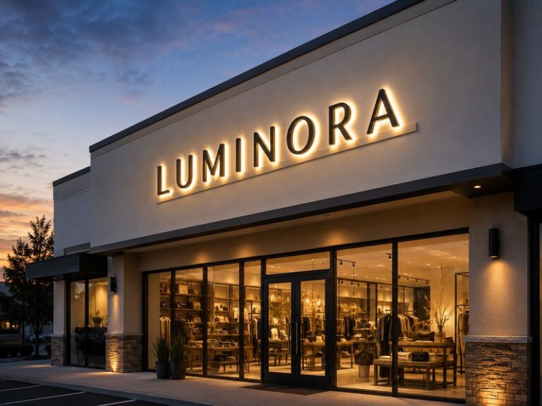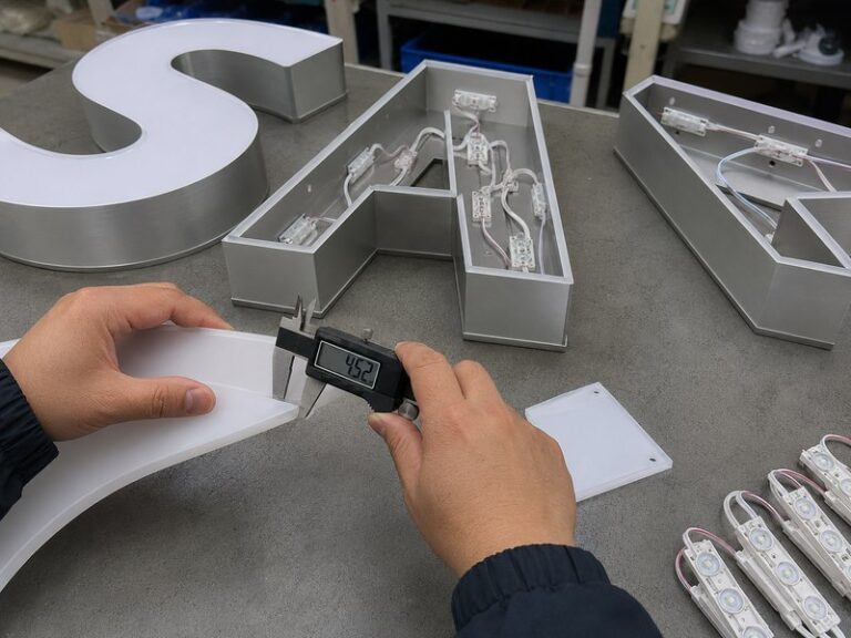

A channel letter can look excellent during fabrication and still disappoint the moment it is switched on. The metal returns may be straight, the acrylic may match the approved color, and every letter may fit the installation template perfectly, yet a row of visible LED points suddenly appears behind the face. In other cases, the center of a broad stroke glows intensely while corners remain noticeably darker. These problems are commonly grouped under the term “hotspots,” but they are rarely caused by one bad LED module. They usually appear because several optical and structural decisions do not work well together.
Preventing hotspots in channel letters requires matching LED spacing, beam angle, letter depth, stroke width, face diffusion, internal reflectivity, and target brightness as one lighting system. There is no universal LED spacing that works for every letter. Uniform illumination depends on giving individual LED beams enough room to overlap, selecting a face that diffuses light properly, adapting the module layout to the actual letter geometry, and testing the finished letters under realistic lighting conditions before shipment.
The challenge becomes more obvious when a logo combines a narrow stroke with a large illuminated block, or when a premium interior sign requires a very shallow profile. A layout that works perfectly in one part of the logo may produce visible bright points somewhere else. That is why reliable channel letter lighting begins before the LEDs are installed. The best results come from treating the letter cavity as an optical system rather than simply filling available space with modules.
What Causes Hotspots in Channel Letters?

Hotspots form when concentrated LED light reaches the visible face before neighboring beams have blended into a smooth field. Shallow letter depth, unsuitable module spacing, concentrated beam angles, weak face diffusion, poor internal reflection, and irregular letter geometry can all contribute. In most projects, the defect comes from several interacting conditions rather than one component working incorrectly.
Visible LED Points and Bright Zones
A hotspot is a visibly brighter area within an illuminated channel letter where the light source becomes more noticeable than the surrounding surface. In a front-lit letter, this may appear as individual LED dots, repeated bright circles, bright strips, or localized patches. The important distinction is that the lighting does not look continuous. Instead of seeing a clean illuminated letter, the viewer begins to see how the light sources are arranged behind the acrylic.
Hotspots should also be distinguished from dark areas. A dark area forms when too little light reaches part of the face, while a hotspot occurs when too much concentrated light reaches a localized area. Both defects can exist in the same letter. For example, the center of a broad stroke may be too bright while its edges remain weak, creating an obvious difference across the face even though the total LED output is more than sufficient.
Viewing distance changes how serious these defects appear. A small variation may not be noticeable on a storefront sign installed several meters above street level, but the same variation can look poor on a reception logo viewed from one or two meters away. For interior branding, hotels, premium retail spaces, clinics, restaurants, and office environments, close-range viewing usually requires more careful control of optical uniformity.
The practical goal is therefore not mathematical perfection. It is visual balance. The viewer should notice the letter shape, color, and overall glow before noticing individual LED sources, dark corners, or repeated patterns behind the face.
Letter Depth and Optical Mixing
Letter depth controls the physical distance available for light to spread before it reaches the illuminated face. Each LED module produces light over a defined area. When the acrylic is farther from the modules, neighboring light fields have more distance to overlap and blend. When the cavity is very shallow, the light can reach the face while the individual source pattern is still visible, creating bright points and uneven areas.
A deeper letter often improves optical mixing, but depth cannot be increased without consequence. More depth normally means more metal, higher weight, greater shipping volume, a thicker daytime appearance, and potentially more difficult installation. For large exterior letters, those differences can become significant. The objective is therefore not to make every letter as deep as possible, but to provide enough optical distance for the chosen lighting system.
A balanced design considers module output, beam angle, spacing, face diffusion, stroke width, and internal reflection at the same time. If a project requires a very shallow profile, the lighting system may need smaller modules, broader optical distribution, stronger diffusion, more reflective internal surfaces, or a different construction method altogether.
This is especially important for narrow letters. A shallow cavity combined with a narrow stroke gives very little space for the light to mix. Even a high-quality LED can produce visible points when the structure itself does not provide enough room for controlled distribution.
Too Many LEDs Can Also Be a Problem
More LEDs do not automatically produce better channel letters. Increasing module quantity raises available light output, but uniformity depends on where that light is placed and how it spreads. When modules are packed too closely together, local brightness can increase faster than the face can diffuse it. In a shallow cavity, this can produce a row of intense bright spots rather than a smoother illuminated surface.
Excessive LED density also increases power consumption, power supply requirements, internal heat, wiring complexity, and the number of connections inside the letter. These additional components can be useful when they solve a real lighting requirement, but adding them without a clear optical reason can increase cost and complexity without improving the final appearance.
At the other extreme, spacing modules too widely can create dark gaps, weak corners, or uneven brightness between narrow and wide sections. A good layout therefore seeks a controlled overlap between neighboring light fields. The goal is not maximum LED quantity, but the right quantity in the right locations.
During engineering review, it is useful to separate two questions. First, does the sign have enough total light output? Second, is that output distributed evenly across the visible area? A letter can be bright enough overall and still have poor optical quality. Solving the second problem often requires layout adjustment rather than additional wattage.
Hotspots and Dark Areas
Hotspots and dark zones often reveal the same underlying imbalance. A bright center with weak edges, bright straight strokes with dark corners, or one noticeably brighter letter beside several dimmer ones are all signs that the lighting layout is not matching the geometry of the product. Correcting these conditions requires identifying the pattern rather than treating every problem as a shortage of LEDs.
A dark corner may genuinely need another module, but it can also be caused by an existing module facing in the wrong direction. A bright center may require fewer modules, wider spacing, greater depth, or stronger diffusion. A letter that is darker at one end may point to wiring or voltage-drop issues rather than an optical layout problem.
This is why experienced factories evaluate the entire lighting system rather than changing one component in isolation. LED model, module position, beam angle, cavity depth, face material, internal color, power configuration, and wiring all influence what the customer ultimately sees.
The strongest results come from diagnosing the actual symptom first. Once the pattern is understood, the correction becomes much more targeted and repeatable.
How Do LED Spacing, Beam Angle, and Depth Work Together?

LED spacing, beam angle, and letter depth determine how quickly separate light fields overlap before reaching the face. Wider beam distribution and greater cavity depth generally make blending easier, while shallow letters require more precise spacing and stronger optical control. The correct LED pitch depends on the full construction and should never be treated as a universal fixed number.
LED Spacing by Letter Depth
LED spacing is often discussed as though one number could apply to every channel letter, but actual projects vary too much for that approach. In practical sign engineering, spacing may fall anywhere from roughly 30 mm to more than 100 mm depending on the LED module, beam angle, cavity depth, face material, stroke width, target brightness, and whether the lighting system is front-lit, halo-lit, or part of a larger illuminated structure.
That range should not be treated as a universal installation specification. It simply shows how much the correct spacing can change. A module placed inside a deep, wide letter has much more room to spread its light than the same module used inside a shallow, narrow stroke. Using identical spacing in both structures may produce completely different visual results.
As the cavity becomes shallower, designers often need tighter optical control through module selection, beam distribution, face diffusion, or closer spacing. When the cavity is deeper, light has more room to blend and the module pitch may be able to increase without producing dark gaps.
The correct approach is to coordinate the lighting layout with the physical letter depth before production begins. Designing the shell first and trying to “fit the LEDs in later” makes hotspot control much more difficult.
| Variable | Condition | Likely Lighting Effect |
| Letter depth | Shallow | Less optical mixing distance and higher hotspot sensitivity |
| Letter depth | Deeper | More room for adjacent beams to blend |
| LED spacing | Too close | Possible bright zones, higher power, and more heat |
| LED spacing | Too wide | Dark gaps and weak corner coverage |
| Beam angle | Narrow | More concentrated light and greater spacing sensitivity |
| Beam angle | Wide | Faster overlap and easier blending in shallow structures |
| Face diffusion | Low | LED points become easier to see |
| Face diffusion | High | Better blending but possible light-output loss |
Beam Angle and Light Spread
Beam angle describes how broadly an LED module distributes its light. A narrow beam concentrates output into a smaller area, which can be useful in certain deep structures but becomes more sensitive in shallow letters. When the face is close to the LED, concentrated light can reach the acrylic before it has blended with neighboring modules, creating bright circles or strips.
A wider beam spreads light across a larger area and allows neighboring light fields to overlap sooner. This is often helpful in shallow front-lit structures, but beam angle alone does not determine performance. Lens geometry, LED output, module orientation, internal reflectivity, face material, and physical distance all influence the final result.
Two modules with similar published beam angles may perform differently because their optical lenses distribute intensity differently across the beam. That is why specification sheets are useful for screening components but cannot fully replace physical testing. A shallow letter with a premium finish may require a first-article lighting test even when the module specifications appear suitable.
The best decision comes from evaluating the LED as part of the completed structure. The same module can perform very well in one letter and poorly in another simply because the geometry and optical distance have changed.
More LEDs Are Not Always Better
Adding LED modules should always solve a defined problem. If the letter is genuinely too dim, more light output may be necessary. If the problem is visible LED dots, adding more modules without changing the structure can make those dots more noticeable. The lighting becomes stronger, but the blending problem remains.
Additional modules also increase electrical load, wiring length, connection points, power supply capacity, and heat generation. In small letters, the extra wiring and connectors can occupy a surprising amount of internal space, making assembly and future service more difficult.
For this reason, a better engineering process starts with a reasonable layout, lights the first article, and adjusts only the areas that need correction. One corner may need another module. Another area may need a module moved farther away or removed completely. The final spacing does not need to be perfectly equal if intentionally different spacing produces a more uniform visual result.
Uniform illumination is the goal. Identical physical spacing is only one possible method for reaching it.
No Universal Spacing Formula
A universal LED-spacing formula would require every channel letter to use the same face material, cavity depth, LED model, stroke width, output level, internal finish, and viewing environment. Commercial signs vary on every one of these points, which makes a single pitch rule unreliable.
A wide block letter can support several rows of modules and may need separate center and edge coverage. A narrow script letter may only have room for smaller modules or another lighting method. A logo can contain both conditions in one product, meaning the LED spacing may need to change several times within a single illuminated shape.
This is an important detail when evaluating a custom sign manufacturer. The more useful question is not simply how many LEDs will be used, but how the layout was chosen for the actual geometry, depth, face material, and intended brightness.
A clear engineering explanation normally indicates that the product has been considered as an optical system rather than assembled using a standard pattern regardless of shape.
Which Face and Interior Materials Improve Light Diffusion?

The best face and interior materials help spread LED output without unnecessarily sacrificing brightness. A suitable diffusing acrylic hides individual light sources, while reflective internal surfaces return more stray light toward the visible face. Face transmission, diffusion, LED output, cavity depth, and internal finish should be evaluated together because improving one factor can create trade-offs elsewhere.
Acrylic Transmission and Diffusion
The illuminated face has to perform two jobs at the same time. It must allow enough light through for the letter to remain visible, and it must scatter that light sufficiently so the individual modules are not obvious. Those two requirements naturally compete with each other, which is why the brightest acrylic is not automatically the best face material.
A face with high light transmission loses less LED output, but it may reveal the modules behind it more clearly. A stronger diffuser hides those modules more effectively, but some useful light is lost during scattering. The correct balance depends on the application, viewing distance, target brightness, face color, and letter depth.
White acrylic is widely used because it can provide a good balance of brightness and diffusion, but different grades, thicknesses, pigments, and production batches can still behave differently. Colored faces add another layer of complexity because the material must look correct when the sign is off and produce the intended illuminated color when it is on.
For that reason, important projects should evaluate acrylic under actual illumination rather than relying only on an unlit sample.
| Face Property | Main Advantage | Main Trade-Off |
| High transmission | More LED output reaches the viewer | Individual modules may become easier to see |
| Strong diffusion | Better visual blending | Some brightness can be lost |
| Dark or saturated color | Strong daytime brand appearance | More light may be absorbed |
| Light-colored face | Easier illumination | Brand color may require additional control |
| Different production batches | Similar nominal specification | Small optical and color differences may still occur |
Diffusion Is Not a Cure for Everything
A stronger diffuser can make visible LED points less obvious, but it should not be used to hide a poor layout. If the modules are positioned too close to the face, concentrated in one region, or poorly matched to the letter geometry, a more opaque face may simply reduce brightness without eliminating the underlying imbalance.
A more reliable troubleshooting sequence begins with the structure. Check the letter depth, module positions, beam distribution, spacing, and internal reflection before deciding that the face material is the problem. Once those variables are reasonably controlled, the amount of diffusion can be adjusted to achieve the final balance between brightness and smoothness.
The ideal balance also changes with the application. Outdoor storefront letters may need stronger brightness to compete with street lighting, illuminated windows, surrounding signs, and vehicle headlights. An indoor reception logo may benefit from softer illumination because excessive brightness can feel harsh at close range.
Diffusion should therefore support the intended environment rather than act as a universal fix.
Reflective Interior Surfaces
The inside of a channel letter may be invisible after installation, but it remains part of the optical system. Light that strikes the internal walls can either be absorbed or reflected back into the cavity. White or other light-colored surfaces generally return more useful light, while dark or contaminated surfaces absorb more output and reduce efficiency.
Reflective interiors can be especially helpful in wide letters, large logo sections, and irregular shapes where light needs to travel farther before reaching the face. White coatings, reflective films, and other suitable reflective surfaces can help distribute this stray light and reduce unnecessary losses.
The benefit should not be overstated. Reflection cannot correct a module positioned directly under a highly transmissive face or a severely unbalanced LED pattern. It improves the optical environment but does not replace correct spacing and geometry.
Cleanliness also matters. Dust, dark adhesive, loose wiring, surface discoloration, and components blocking LED output can alter the final illumination. For higher-quality work, the internal cavity should be treated as a controlled part of the product rather than hidden space that does not matter.
Day and Night Appearance
A channel letter has a daytime appearance and a nighttime appearance, and the two should be evaluated separately. During the day, the viewer sees acrylic color, trim, metal returns, surface finish, edge quality, and proportions. At night, those same materials interact with LED color and transmitted light, which can change the perceived appearance significantly.
A face selected only because it matches a brand color in daylight can look different after illumination. White acrylic can appear warmer or cooler depending on the chosen color temperature. Deep red, blue, or green materials can absorb substantial output and require additional optical consideration.
This difference becomes especially important for retail programs, restaurant chains, hotel groups, and brands operating across multiple sites. A consistent brand standard needs more than one approved Pantone value. It may also require approved illuminated samples, LED color temperature, face material, and lighting photographs.
Good material selection therefore considers how the sign looks both when it is off and when it becomes part of the nighttime environment.
How Does Letter Geometry Change the LED Layout?

Letter geometry should determine the lighting layout because narrow strokes, wide strokes, corners, curves, internal counters, and irregular logo shapes do not receive light in the same way. A convenient uniform LED grid can create inconsistent illumination. Reliable layouts change module size, spacing, row position, orientation, or even lighting method where the geometry changes.
Narrow Strokes
Narrow strokes are difficult because the available space has to accommodate LEDs, wires, connections, adhesives, structural material, and sufficient distance for optical mixing. When a conventional module is forced into a very narrow area, it may sit too close to the face or edges, producing a bright strip rather than a smooth illuminated stroke.
Possible solutions include using smaller LED modules, flexible strips, greater cavity depth, slightly wider strokes, stronger diffusion, or another lighting construction. In extreme cases, a very fine detail may work better as a non-illuminated element rather than forcing a light source into a space that cannot support it properly.
This is where manufacturability review becomes important. A logo that works well at two meters wide may become difficult to illuminate when reduced to 500 mm because the smallest strokes shrink at the same time. The visual artwork may still look correct on a computer screen, but the physical product has different requirements.
The earlier these areas are identified, the easier it is to protect the brand appearance without creating unreliable lighting.
Wide Strokes
Wide strokes present the opposite challenge. A single central row of LEDs may create a bright center while leaving the edges weak. Placing modules only around the perimeter can create the reverse effect, with strong edges and a darker central area. Large block letters and wide logo sections therefore often require multiple rows and deliberate center-to-edge balancing.
Internal reflection becomes more important as the illuminated area grows because some regions are farther from the nearest light source. Corners, enclosed counters, wide horizontal sections, and transitions between broad and narrow strokes all deserve separate attention.
A useful approach is to divide a large logo into optical zones instead of treating it as one uniform cavity. Each zone can use slightly different spacing or module positions while still producing one consistent face when viewed from outside.
The final layout may look irregular during assembly, but if the visible surface is even, the optical design is doing its job. The customer does not see the internal LED grid. The customer sees the finished illuminated logo.
Corners and Curves
Corners and curves often expose weaknesses in regular spacing patterns because the stroke direction changes. In a sharp internal corner, two module rows may end too close together and create a bright area. If both rows stop early, the same corner may become dark. Curves create a similar problem because equal linear spacing does not always produce equal visual coverage.
Letters such as C, G, O, and S, as well as rounded logos and script forms, may require intentional adjustments. A module can be rotated, shifted, removed, or added depending on how the adjacent light fields overlap. The pitch can tighten slightly around a dark transition and widen where several beams already overlap strongly.
This is one reason physical first-article testing remains valuable even when the layout has been prepared digitally. Computer drawings show where the modules will sit, but the finished illuminated face reveals whether the light actually blends.
Perfect internal symmetry is not the objective. Uniform visible illumination is.
Logo Manufacturability
Hotspot prevention often begins before anyone selects an LED module. Complex artwork may contain tiny internal gaps, fine serifs, thin connecting strokes, isolated dots, sharp points, or fragile acrylic areas that leave too little space for reliable lighting and assembly.
A manufacturability review should identify minimum stroke widths, narrow negative spaces, tight corners, weak acrylic sections, LED access, wiring paths, module adhesion areas, and places where face support may be difficult. The purpose is not to casually redesign a brand logo, but to identify areas where the requested size conflicts with the physical requirements of the product.
Sometimes increasing the overall sign size slightly creates enough space to solve several optical and structural problems at once. In other cases, simplifying one tiny detail produces a cleaner result without changing the brand identity at normal viewing distance.
These decisions are much easier before cutting and bending begin. Once a complete set of letters has been manufactured, correcting optical problems can require expensive rework.
Do Different Channel Letter Types Need Different Hotspot Controls?

Different channel letter constructions need different hotspot controls because the light follows different paths. Front-lit letters distribute light through a face, halo-lit letters project light onto a wall, and front-and-halo structures must control both effects together. Face material, LED orientation, wall reflectance, stand-off distance, and internal geometry therefore change in importance depending on the construction.
Front-Lit Letters
Front-lit channel letters make lighting defects especially visible because the viewer looks directly at the illuminated face. The primary design variables include acrylic diffusion, module spacing, cavity depth, stroke width, beam angle, LED color, internal reflection, viewing distance, and ambient light.
The objective is to create a continuous illuminated surface. Corners need enough coverage without becoming brighter than nearby strokes, while wide areas need enough center and edge coverage to prevent brightness gradients. Narrow sections should not become over-bright simply because the same module density has been squeezed into less space.
The complete word or logo should also be reviewed as a single system. One perfectly illuminated letter beside another that is noticeably brighter or darker still produces an inconsistent storefront. Letter-to-letter balance matters just as much as uniformity within each individual character.
For professional commercial signage, the final inspection should therefore include both close viewing and the expected real-world viewing distance. The two perspectives reveal different types of optical defects.
Halo-Lit Letters
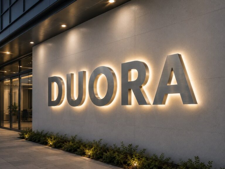
Halo-lit channel letters create a different optical challenge because the visible glow comes from light reflected off the installation wall rather than transmitted through a front face. The wall becomes part of the lighting system, which means a letter that looks good on one surface can produce a very different halo on another.
Important variables include LED direction, letter-to-wall distance, wall color, wall texture, stroke width, back material, mounting consistency, and ambient light. A smooth matte white wall may return light efficiently and produce an even halo, while dark stone or rough brick can absorb and scatter the same output differently.
A stand-off distance around 20 to 50 mm is common in many projects, but that range is a reference rather than a universal specification. A smaller distance generally creates a tighter halo, while a larger distance allows the light to spread more broadly.
The correct distance should be selected according to the desired visual effect and the actual wall surface.
| Halo Variable | Lower or Smaller Condition | Higher or Larger Condition |
| Stand-off distance | Tighter and more concentrated halo | Broader and softer halo |
| Wall reflectance | Dark surfaces produce weaker visible glow | Light surfaces usually return more light |
| Surface texture | Rough surfaces scatter light irregularly | Smooth surfaces usually produce cleaner halos |
| Ambient light | Halo appears stronger in darker areas | Brighter environments may need more output |
| LED concentration | Local bright patches may appear | Controlled wider distribution improves blending |
Front and Halo-Lit Letters
Front-and-halo-lit letters require two lighting systems to look balanced at the same time. The front face needs enough output for clear recognition, while the rear system must create a controlled halo. If one effect is much stronger than the other, the sign can appear visually unbalanced even when both systems technically function correctly.
Engineering considerations include front brightness, rear brightness, color temperature, letter depth, LED distribution, back material, electrical grouping, power capacity, and wall distance. In some projects, front and rear lighting may be divided into separate electrical groups so they can be adjusted or controlled independently.
The desired balance changes with the application. A high-visibility retail storefront may use a strong front face with a softer rear halo, while an interior premium logo may intentionally reduce front brightness and place more emphasis on the surrounding wall glow.
These effects should therefore be inspected separately and then together before production is approved.
Wall Distance and Surface Conditions
Halo quality cannot be controlled properly without considering the actual installation surface. White paint, black stone, timber, glass, concrete, brick, and metallic panels all interact with light differently. Surface roughness can also break up the halo and make the edge appear less consistent.
Stand-off distance influences how far the glow travels before reaching the wall. Smaller distances usually create tighter, more defined halos, while larger distances produce broader diffusion. If the distance becomes excessive, the glow can weaken or look disconnected from the letter. If it is too small, individual bright zones behind the letter may become easier to see.
For multi-location projects, documenting wall material and intended stand-off distance can improve consistency significantly. Identical letters installed on different surfaces will not necessarily produce identical halos.
Providing wall photographs, mounting details, and site information during engineering gives the manufacturer much more useful data than simply specifying “halo-lit letters.”
How Should a Factory Test Channel Letters for Hotspots?

A factory should illuminate every completed channel letter set before packing and check the entire visible area for brightness, hotspots, dark zones, corner coverage, light color, wiring stability, and letter-to-letter consistency. First-article testing establishes the approved optical standard, while final inspection and extended operation help identify manufacturing, electrical, and component issues before shipment.
First-Article Lighting Test
The first article is where the engineering plan meets the physical product. A drawing can confirm dimensions, LED positions, and wiring routes, but it cannot fully demonstrate how the finished face will look when illuminated. The first completed unit therefore provides an opportunity to evaluate the optical result before the same structure is repeated across the full order.
The review should include overall face uniformity, visible LED points, bright patches, dark edges, corner coverage, letter-to-letter balance, color temperature, illuminated face color, halo quality where applicable, power behavior, and wiring arrangement. Testing should be performed under lighting conditions where subtle differences can actually be seen. Strong factory lighting can hide problems that become obvious at night.
For repeat programs, an approved first article becomes more than a sample. It becomes a production reference. LED model, module spacing, depth, face material, color temperature, and approved illuminated photographs can be retained for future orders.
This makes later production less dependent on memory and helps keep visual standards more consistent across locations and batches.
100% Lighting Inspection
Every illuminated channel letter set should be powered before shipment. A sampling-only approach can miss the one defective character that changes the appearance of an entire installed word. One dark letter, incorrect color, flickering connection, or obvious hotspot may be enough for the final installation to fail visual approval.
A complete inspection should compare every character for face uniformity, dark zones, light color, letter-to-letter brightness, halo continuity, power behavior, wiring stability, and control functions. Close inspection can reveal individual LED points, while viewing the entire set from a practical distance exposes differences between letters that are harder to notice one at a time.
The inspection should also take place after the product has reached its final assembled condition. Face fit, wiring position, internal contamination, loose components, and handling during assembly can all affect lighting even when the original LED layout was correct.
Lighting quality therefore needs to be verified on the finished product, not assumed from the design alone.
Recording Optical Results
Optical records are especially valuable for chain stores, repeat production, replacement orders, and projects that may continue for several years. A useful record can include the LED model, LED color, color temperature, module spacing, letter depth, face specification, stand-off distance, controller type, lighting photographs, video, and approved sample reference.
These records make future troubleshooting much more objective. If a later batch looks different, the factory can compare the new components and structure with the original approved configuration. If an LED model has been discontinued, a replacement can be tested against the stored visual standard rather than selected solely by electrical specification.
Consistent photography is also important. Different camera exposure settings can make one sign appear smoother or brighter than another, so photographs should support production traceability rather than act only as marketing images.
For long-term commercial projects, the ability to reproduce an approved optical result can be as important as the initial appearance itself.
72-Hour Pre-Shipment Testing
Extended operation serves a different purpose from a short lighting inspection. A sign can look correct immediately after assembly but still contain an unstable LED, weak connection, power supply issue, abnormal temperature condition, or control problem that only appears after continued operation.
A 72-hour pre-shipment test can help expose early LED failure, flicker, power instability, local dark areas, color changes, abnormal temperature rise, wiring problems, and control-system faults while the product is still in the factory. This does not mean a 72-hour test can guarantee permanent failure-free operation, and it should not be presented that way.
Its practical value is risk reduction. Discovering a loose connection or unstable power supply before packing is far less costly than diagnosing the same problem after the letters have been installed several meters above a storefront.
At iduoduo, illuminated products are checked through 100% lighting inspection and pre-shipment testing as part of the production quality process, helping verify optical consistency, electrical operation, and early component stability before international delivery.
Conclusion
Preventing hotspots in channel letters is not about finding one perfect LED spacing number or installing as many modules as possible. Uniform illumination is the result of several decisions working together: letter geometry, stroke width, LED type, beam angle, cavity depth, module spacing, acrylic transmission, diffusion, internal reflection, electrical configuration, wall conditions, and final testing.
The most reliable projects consider lighting before the letter structure is finalized. A logo that looks simple on a screen may contain narrow strokes, broad blocks, sharp corners, or shallow cavities that require different lighting approaches inside the same sign. Identifying these conditions during engineering is far easier than correcting them after an entire set has been assembled.
For custom channel letter development, a strong manufacturing process should therefore connect artwork review, structural engineering, optical planning, first-article approval, production control, and final illumination testing. When those steps are treated as one continuous process, hotspots and dark zones become engineering risks that can be managed rather than surprises discovered after installation.
Frequently Asked Questions
What is the main cause of hotspots in channel letters?
The most common underlying cause is insufficient optical blending between individual LED sources before their light reaches the visible face. This can happen because the cavity is too shallow, modules are positioned too close together, the LED beam is highly concentrated, the face has limited diffusion, or the internal layout does not follow the actual stroke geometry. In practice, hotspots usually result from several of these factors interacting rather than one defective component.
How far apart should LEDs be in channel letters?
There is no universal spacing that is correct for every channel letter. Practical engineering layouts may use spacing from roughly 30 mm to more than 100 mm, but the actual value depends on module output, beam angle, cavity depth, face diffusion, stroke width, letter color, and target brightness. The final spacing should be verified through a representative illuminated sample or first article instead of being selected from one fixed rule.
Does increasing channel letter depth reduce hotspots?
Increasing depth often helps because it gives neighboring LED beams more distance to overlap before reaching the face. However, deeper letters also increase material usage, weight, shipping volume, and visual thickness. The goal is therefore not maximum depth but sufficient optical mixing distance for the selected LEDs and face material. Shallow letters can still perform well when module type, spacing, diffusion, and internal reflection are carefully coordinated.
Which acrylic is best for preventing visible LED dots?
A suitable diffusing acrylic is generally more effective than a highly transparent face when the goal is to hide individual LED points. However, stronger diffusion also reduces some useful light output, so the best material balances transmission and diffusion for the specific application. Face color, thickness, LED color, letter depth, and viewing distance should all be considered. Important projects should evaluate the acrylic under actual illumination before final approval.
Can adding more LEDs remove dark areas?
Adding LEDs can help when a dark area is genuinely caused by insufficient light coverage, but it is not always the correct solution. A dark corner may come from module direction, geometry, internal reflection, or excessive spacing rather than low total LED quantity. Adding modules without diagnosing the pattern can create new bright zones nearby. The safer approach is to evaluate the full illuminated surface and adjust module position, orientation, spacing, or quantity where needed.
How do halo-lit channel letters avoid uneven backlighting?
Halo-lit letters rely on controlled LED direction, consistent stand-off distance, suitable wall reflectance, and balanced module distribution. A common stand-off range is around 20 to 50 mm, but the correct distance depends on the desired halo width and the installation surface. Smooth, light-colored walls generally produce stronger and more even halos than dark or heavily textured surfaces. Wall information should therefore be included during project engineering whenever possible.
Should every channel letter be tested before shipment?
Every illuminated channel letter set should ideally be powered and visually inspected before packing because a single defective or noticeably different character can affect the appearance of the entire installation. Inspection should cover hotspots, dark areas, color consistency, letter-to-letter brightness, corner coverage, wiring, power supplies, and control functions where applicable. Extended pre-shipment operation can then help expose early electrical or component issues that may not appear during a short initial test.