The hardest part of a multi-location sign project is rarely choosing one attractive sign. The real challenge is creating a sign system that still looks like the same brand after it has been adapted to twenty different façades, three landlord manuals, several local sign codes, different electrical conditions, and multiple installation teams. A storefront sign can look excellent at the first location and still become a rollout problem when the next store has less wall space, a different viewing angle, or no suitable place for the power supply.
The best signage for multi-location stores is a coordinated system: channel letters or light boxes for primary storefront identification, monument or pylon signs where long-distance visibility matters, window graphics for changeable campaigns, and interior or directional signs for navigation. The strongest program standardizes logo, color, materials, lighting, and records while adapting size, mounting, power, and permits to each site.
Imagine receiving photographs from Store 18 and realizing its sign looks noticeably cooler and brighter than Store 3, even though both purchase orders say “white LED.” That small wording gap can become a visible brand inconsistency across an entire network. The following sections explain how to prevent those problems before the first production batch leaves the factory.
Which Signs Do Multi-Location Stores Need?

Most multi-location stores need a sign package rather than one sign. A typical package includes a primary storefront sign, a roadside or entrance sign where long-distance identification is needed, window graphics for changeable messages, interior branding signs, and directional or accessibility signs. The final mix should follow the store format, approach direction, viewing distance, operating hours, landlord rules, and frequency of promotional updates.
A small shopping-mall unit may need only one storefront logo, opening-hours graphics, and several interior signs. A freestanding restaurant beside a busy road may need illuminated channel letters, a monument sign, drive-through directional signs, window graphics, menu-related signs, and pickup-area identification. Using the same sign list for every location usually creates unnecessary cost at some stores and poor visibility at others.
The table below gives a practical starting point for sign scheduling. Quantities vary by layout, local regulations, and the number of entrances.
| Sign category | Typical quantity per store | Main purpose | Common specification risks |
|---|---|---|---|
| Primary storefront sign | 1–2 sets | Identify the store and brand | Wrong scale, weak contrast, inconsistent lighting |
| Monument or pylon panel | 0–2 panels | Identify the site from the road | Poor viewing angle, undersized logo, permit limits |
| Window graphics | 1–10 panels | Promotions, privacy, hours and services | Artwork not matched to actual glass divisions |
| Interior logo sign | 1–3 sets | Reinforce branding at reception, checkout or feature walls | Sign too bright, too large or unsuitable for the wall |
| Directional signs | 2–20+ pieces | Guide visitors to entrances, departments and services | Inconsistent arrows, wording or mounting height |
| Room and accessibility signs | Based on room count | Identify rooms and support accessibility | Incorrect tactile, Braille, contrast or placement requirements |
| Temporary campaign signs | Based on campaign | Promote launches, sales and seasonal messages | No reusable size or graphic standard |
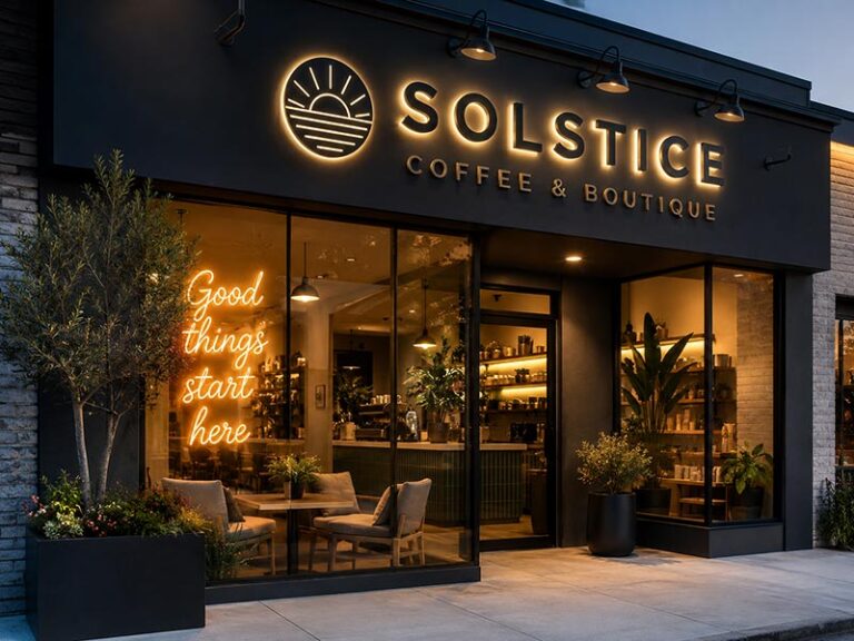
Are Channel Letters Best for Storefronts?
Channel letters are often the first choice for permanent storefront identification because they provide clear letter shapes, visible depth, and several lighting options. Front-lit channel letters produce direct illumination through the face and usually provide the strongest nighttime recognition. Halo-lit letters direct light onto the wall behind the letters, creating a softer architectural effect. Front-and-back-lit letters combine both effects but require suitable wall clearance and more detailed wiring.
The choice should start with viewing conditions. A pedestrian-facing store in an indoor mall does not need the same scale or brightness as a roadside location viewed from moving vehicles. Letter height, stroke width, spacing, mounting height, façade color, and surrounding lighting all affect readability. A wide logo can fill the available sign band while still having letters too short to read from the main approach.
Logo geometry also affects manufacturability. Very thin strokes may not provide enough room for LEDs, returns, wiring, and stable internal structure. Closely spaced letters can create unwanted light overlap. Small counters inside letters such as “A,” “B,” “P,” or “R” may become difficult to reproduce when the overall sign is reduced.
For a multi-store program, the production record should include:
- Approved vector artwork and logo proportions
- Face material, color and thickness
- Return material, depth and finish
- Back material and mounting clearance
- Lighting color, such as 3000K, 4000K or an approved colored LED
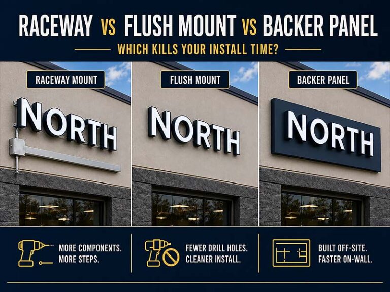
- Raceway, backboard or individual-letter mounting
- Wire exit position and cable color
- Power-supply location and input voltage
- Full-size installation pattern or drilling template
A purchase order that only states “white illuminated letters” leaves too many decisions open. One batch may use warm white LEDs while another uses cool white. Return depths may vary, face colors may shift, and later orders may no longer match the first stores. A complete approved construction record is far more valuable than a general product name.
When Do Light Boxes Work Better?
Light boxes work well when the sign contains a logo, supporting text, a graphic background, or information that cannot be produced efficiently as separate letters. They are also useful when the available wall area favors one complete cabinet rather than many individually mounted components. A rectangular light box can combine the brand name, icon, slogan, and operating category in one controlled unit.
A light box may be more suitable than channel letters in several situations:
- The logo contains very small text or fine details
- The store requires a large illuminated graphic panel
- The wall cannot accept many individual fixing points
- Wiring needs to remain inside one cabinet
- The graphic may require future face replacement
- The sign must fit a shallow or clearly defined sign band
- A landlord requires a cabinet-style sign
Construction depends heavily on size. Smaller rigid-face boxes may use acrylic or polycarbonate faces. Larger cabinets may require flexible face material or sectional construction to reduce weight and improve transport. The internal LED layout, cabinet depth, face material, and graphic density all affect light distribution. Poor spacing may cause visible LED dots, dark areas, or bright edges.
For a multi-location rollout, every light box should follow a controlled frame profile, finish, face material, graphic method, lighting color, brightness level, access method, and mounting structure. The cabinet dimensions may change by location, but the logo should never be stretched to fill a different ratio. Artwork should be resized with approved clear space around the logo.
Maintenance also deserves attention. Front-access cabinets may be easier to service when rear access is impossible. Hinged faces can help at some large installations, but hinges and opening directions must suit the mounting height and surrounding structure. Stores with long operating hours should also consider power access, heat management, and the ease of replacing LEDs or power supplies without removing the entire cabinet.
Where Are Monument and Pylon Signs Needed?
Monument and pylon signs are needed when the building sign alone cannot identify the store early enough. They are especially valuable at shopping centers, freestanding restaurants, hotels, medical facilities, fuel stations, large parking areas, and properties set back from the road. Their role is to tell drivers where the site is before they pass the entrance.
A monument sign sits closer to ground level and often works well in landscaped areas or locations with architectural design requirements. A pylon sign is taller and may remain visible above parked vehicles, nearby structures, or roadside landscaping. Multi-tenant pylon signs can display several store panels, while a freestanding brand location may use one larger logo and supporting message.
Before selecting either format, review:
- Road direction and traffic approach
- Approximate viewing distance
- Vehicle speed
- Entrance position
- Trees, parked vehicles and nearby structures
- Maximum permitted height and sign area
- Setback from the road
- Foundation requirements
- Power availability
- Service access after installation
A common mistake is placing a correctly manufactured sign at the wrong angle. A panel facing directly toward the building may be difficult to read from approaching traffic. Dual-sided cabinets are often needed where vehicles arrive from two directions.
Structural work is usually handled locally because foundations, wind loads, steel supports, lifting equipment, permits, and inspections depend on the installation site. A factory may produce illuminated logo panels, tenant panels, channel letters, cabinet faces, and internal lighting assemblies, while a local contractor builds the foundation and installs the supporting structure.
For repeat projects, keep the brand panel design consistent while allowing the overall structure to follow local restrictions. The approved record should show the logo size, panel ratio, background color, lighting method, border treatment, panel sequence, and minimum clear space. Without those controls, logos on different pylon signs may appear crowded, stretched, or visually unrelated.
Which Interior Signs Guide Shoppers?
Interior signs should help people understand where to go without relying on staff assistance. The required quantity depends on store size, number of departments, entrances, service areas, floors, restrooms, fitting rooms, pickup points, and restricted areas. A compact boutique may need fewer than ten interior signs, while a department store, clinic, hotel, supermarket, or large showroom may require dozens or hundreds of individual items.
Useful interior sign categories include:
- Reception and feature-wall logos
- Department and category signs
- Aisle markers
- Suspended directional signs
- Checkout and payment signs
- Pickup and return-area signs
- Fitting-room and restroom signs
- Room-number signs
- Staff-only and restricted-area signs
- Fire, safety and emergency information
- Tactile and Braille signs where required
The best interior system uses a clear information hierarchy. Primary destination signs should be visible from farther away. Secondary signs should confirm the route. Room signs should identify the final destination. Using the same size and visual weight for every message makes important directions harder to notice.
Material choice should follow the space. Metal letters and halo-lit logos may suit premium reception walls. Acrylic letters can provide clean edges and controlled brand colors. Printed panels are useful when messages include detailed graphics. Foam or PVC letters can reduce weight for selected indoor applications. Suspended signs require suitable ceiling support and safe fixing points.
Typography, arrows, icons, contrast, terminology, and mounting height should remain consistent across locations. Dimensions may change according to ceiling height, aisle width, shelving, wall width, and viewing distance. For accessibility signs, tactile characters, Braille, contrast, location, and mounting height should be confirmed against the regulations that apply at the installation site.
A store team should also avoid changing terminology between locations. “Collection,” “Pickup,” “Order Pickup,” and “Click & Collect” may refer to the same service, but mixed wording can weaken a coordinated brand experience. An approved message list helps keep navigation clear across every store.
Do Window Graphics Support Promotions?
Window graphics are one of the most flexible parts of a multi-location sign program. They can display opening hours, product launches, seasonal campaigns, privacy patterns, temporary announcements, service information, directional messages, and opening-soon graphics. They are easier to update than permanent illuminated signs and can use glass areas that would otherwise contribute little to street visibility.
The first step is measuring the actual glass, not the overall storefront. Each pane should be recorded separately, including mullions, door handles, safety markings, vents, frames, and areas that must remain clear. A design created for one large rectangular window may not work when another store has six narrow panes divided by metal frames.
Common material choices include:
| Graphic type | Suitable use | Main limitation |
|---|---|---|
| Opaque vinyl | Strong colors and full visual coverage | Blocks visibility and daylight |
| Clear printed film | Layered graphics with transparent areas | Colors may appear lighter without white ink |
| Frosted film | Privacy, patterns and premium interiors | Limited color impact |
| Perforated window film | Exterior graphics with outward visibility from inside | Appearance changes with lighting conditions |
| Cut vinyl lettering | Hours, services and simple messages | Not suitable for photographic artwork |
| Removable promotional film | Short campaigns and seasonal changes | Adhesive and removal period must be confirmed |
Coverage percentage matters. Full-window graphics can create strong impact but may reduce natural light and interior visibility. In some locations, security, planning, or landlord rules limit how much glass may be covered. Door graphics should not hide handles, safety strips, or required visibility zones.
A practical rollout system uses reusable templates rather than redesigning every store from the beginning. Templates can define logo position, campaign headline area, product image area, legal text, store-specific information, and safe zones. The artwork can then be adjusted to each window schedule without changing the overall campaign look.
Installation direction should also be confirmed. First-surface graphics are applied to the exterior face of the glass and usually provide stronger color but face more weather exposure. Second-surface graphics are installed inside the glass and receive better protection, although tinted or reflective glass may alter their appearance. Samples are useful when the glazing has a strong tint.
Window graphics should support the main storefront sign rather than compete with it. The permanent sign identifies the brand. Window graphics communicate the current message. Keeping those roles separate makes the storefront easier to recognize and easier to update across many locations.
How Should Signs Match Each Location?

Signs should be adapted to the real conditions of each address instead of being copied at one fixed size across every store. Logo proportions, brand colors, materials, finish quality, and lighting appearance should remain controlled, while sign dimensions, mounting structure, wire exits, power placement, and installation hardware may change according to the façade, viewing distance, wall construction, local regulations, and landlord requirements.
A 1,500 mm-wide logo may look balanced above a narrow mall entrance but disappear on a 20-meter-wide roadside façade. A sign designed for concrete cannot use the same mounting hardware on glass, insulated panels, or aluminum cladding. The goal is not to make every sign physically identical. The goal is to make every location immediately recognizable as the same brand.
Before approving production, prepare one site record for each address.
| Site information | What should be recorded | Why it matters |
|---|---|---|
| Available sign area | Width, height and usable depth | Controls sign scale and construction |
| Main viewing distance | Nearest and farthest useful viewing point | Helps determine letter height |
| Viewing direction | Front, left approach, right approach or both | Affects orientation and sign position |
| Mounting height | Distance from ground to sign center | Influences readability and installation access |
| Wall construction | Concrete, brick, metal panel, glass, timber or other substrate | Determines fixing and wiring |
| Power position | Voltage, cable route and power-supply access | Prevents visible wiring and rework |
| Store operating hours | Daytime only, evening or late-night use | Influences illumination requirements |
| Local restrictions | Sign area, projection, brightness and operating hours | Prevents permit rejection |
| Installation access | Ladder, scaffold, lift or crane | Affects sign sections and packaging |
| Delivery route | Door, corridor, lift and loading-area dimensions | Prevents oversized products arriving on site |
How Does Viewing Distance Affect Sign Choice?
Viewing distance should influence letter height, logo width, stroke thickness, contrast, and lighting level. A sign viewed by pedestrians from 5 to 15 meters can carry finer details than a sign viewed from a vehicle 50 meters away. Mounting a larger logo does not always solve poor visibility. Thin strokes, tight spacing, low contrast, and a crowded background can still make a large sign difficult to recognize.
The following ranges can be used for early planning. They are not substitutes for local sign codes, professional visibility studies, or site approval.
| Approximate viewing distance | Common location | Suggested starting letter height |
|---|---|---|
| 3–8 m | Reception, corridor or indoor mall | 100–250 mm |
| 8–15 m | Pedestrian storefront | 200–400 mm |
| 15–30 m | Parking lot or neighborhood retail | 300–600 mm |
| 30–60 m | Road-facing retail façade | 500–1,000 mm |
| 60 m and above | Pylon, large retail park or highway approach | Site-specific engineering required |
Letter height is only one factor. A 400 mm-high letter with a 30 mm stroke may be less readable than a 350 mm-high letter with a 60 mm stroke. Script fonts, condensed fonts, outlines, and closely connected letters usually require more space than simple sans-serif lettering. Logos containing several lines of small text may need to be simplified for distant viewing.
Photographs should be taken from the actual approach route. One straight-on image is rarely enough. Useful site photos include:
- A front view from the opposite side of the road
- A left-approach view
- A right-approach view
- A view from the main parking entrance
- A view showing nearby signs and visual clutter
- A close-up showing the mounting surface
- A night photograph showing surrounding light levels
Place a known dimension in the image whenever possible. A doorway, brick course, measured wall panel, or marked tape line helps estimate scale. For greater accuracy, provide a dimensioned elevation drawing or laser measurements.
Mounting height also changes perception. A 500 mm letter installed 3 meters above the ground appears much larger than the same letter installed 12 meters high. High-mounted signs may need thicker strokes, more spacing, stronger contrast, and a larger overall layout.
For illuminated signs, brightness should suit the surroundings. A sign beside a brightly lit supermarket may need more output than a sign inside a dim hotel lobby. Excessive brightness is not always an advantage. Overpowered LEDs can create glare, wash out letter shapes, disturb nearby properties, and fail landlord requirements. A dimmer or adjustable power setting can be useful when final nighttime conditions are difficult to judge before installation.
Which Signs Suit Malls and Street Stores?
Mall locations usually have smaller viewing distances, stricter landlord manuals, limited sign depth, and more controlled lighting. Street-facing stores often need weather protection, stronger nighttime visibility, secure mounting, drainage, and greater resistance to temperature changes. The same logo can be used at both locations, but the construction may need to be different.
An indoor mall store may use halo-lit stainless steel letters, front-lit acrylic letters, a slim fabricated logo, or non-illuminated metal letters. Wiring often needs to remain hidden inside a sign band or behind the shopfront. Landlords may limit letter depth to 50–100 mm, prohibit visible raceways, or specify an approved illumination color.
A street store may use deeper channel letters, a sealed light box, an illuminated fascia sign, a blade sign, or a projecting sign. Outdoor construction should address rain, drainage, UV exposure, cable protection, wall penetrations, and maintenance access. Power supplies should be installed in accessible, protected positions rather than sealed inside an area that cannot be serviced.
A practical chain-store system may approve several sign families:
| Store format | Suitable primary sign | Typical reason |
|---|---|---|
| Indoor shopping mall | Halo-lit or slim front-lit letters | Controlled viewing distance and premium appearance |
| Street storefront | Front-lit channel letters | Strong day and night visibility |
| Historic district | Non-illuminated metal letters or externally lit signs | Illumination and projection may be restricted |
| Retail park | Large channel letters plus monument or pylon panel | Building and roadside recognition are both needed |
| Temporary location | Lightweight letters, printed panels or removable graphics | Faster installation and limited wall alteration |
| Premium flagship store | Custom metal letters, integrated lighting and architectural panels | Greater material and finish control |
Store format should not be judged only by whether it is “mall” or “street.” Two mall locations can still have different rules. One may permit illuminated letters mounted directly to stone. Another may require all electrical parts to be installed inside a fabricated sign tray. A covered outdoor shopping center may appear similar to an indoor mall while still exposing the sign to humidity, wind-driven rain, and temperature changes.
Landlord criteria should be collected before the design is finalized. Useful documents include the tenant signage manual, shopfront elevation, permitted sign zone, approved materials, maximum projection, electrical requirements, installation hours, insurance requirements, and approval forms.
Some stores operate within shared architectural systems. The primary logo may need to fit a fixed sign band, while secondary signs, blade signs, or window graphics provide extra visibility. Trying to force a larger logo into a restricted area often leads to distorted proportions or reduced clear space. A smaller, properly proportioned logo usually looks more professional than a stretched logo that fills every available millimeter.
How Do Building Conditions Affect Installation?
Wall construction determines how a sign should be fixed, wired, sealed, and serviced. A mounting method suitable for reinforced concrete may damage insulated cladding. Adhesive mounting suitable for small indoor acrylic letters may be unsafe for large exterior metal letters. Installation details should therefore be confirmed before production drawings are released.
Common mounting surfaces require different planning:
| Mounting surface | Main concern | Typical preparation |
|---|---|---|
| Concrete | Drilling depth and anchor selection | Studs, mechanical anchors and sealed cable penetrations |
| Brick | Mortar condition and uneven surface | Appropriate anchors, spacers and careful hole positioning |
| Aluminum composite panel | Limited holding strength in the face sheet | Fixing into the supporting frame behind the panel |
| Corrugated metal cladding | Uneven profile and hidden structural members | Rails, spacers or a supporting backboard |
| Insulated wall panel | Compression and moisture risk | Through-fixing or engineered support points |
| Glass | Drilling restrictions and transparency | Standoff systems, adhesive solutions or suspended mounting |
| Timber | Movement and weather exposure | Suitable screws, sealing and load verification |
| Drywall | Weak surface layer | Fixing into studs, blocking or a prepared backing structure |
A storefront photograph cannot confirm what lies behind the visible surface. Request wall sections, contractor drawings, stud locations, or on-site confirmation whenever the sign is heavy or mounted at height. The local installer should verify anchor type, quantity, embedment depth, pull-out capacity, and structural suitability.
Large signs may need to be divided into sections. Sectional construction can reduce carton size, make lifting easier, and allow products to pass through narrow access routes. Section joints should be planned carefully so they do not create visible light gaps, misaligned faces, or weak structural points.
Before choosing the maximum product size, check:
- Loading-door width and height
- Freight-lift dimensions
- Corridor width
- Stair access
- Scaffold or lift capacity
- Maximum lifting weight
- Available installation crew
- Permitted installation hours
- Storage space before installation
Mounting templates are especially useful for individual letters. A full-size paper template can show the position of every letter, mounting stud, and cable exit. For larger projects, a rigid or segmented template may be more accurate. Each template should carry the store number, sign reference, drawing revision, overall dimensions, orientation, and installation height.
Wire exits must match the real cable route. A center rear exit may work for one façade but land directly on a steel beam at another location. Side exits, lower exits, shared raceways, or backboards may be required. Moving wire exits after production can damage waterproofing and create visible patchwork.
Maintenance access should also be considered. A sign installed above a fixed canopy may be easy to mount during construction but difficult to service later. Power supplies, controllers, and connection points should remain reachable without removing large façade sections.
What Changes for Indoor and Outdoor Use?
Indoor and outdoor signs may share the same artwork, but materials, electrical protection, brightness, fixing methods, and surface finishes often need to change. An indoor sign is protected from rain but may still face cleaning chemicals, accidental contact, air-conditioning condensation, and strict interior design requirements. An outdoor sign must handle moisture, sunlight, wind, dust, temperature variation, and long-term exposure.
Outdoor construction should address more than an IP rating. Water often enters through cable holes, screw points, poorly sealed seams, unprotected power connections, and upward-facing joints. Drainage paths are important because completely sealing a large fabricated sign is not always realistic. Water should be prevented from reaching electrical parts and given a route to escape.
Outdoor sign planning should include:
- Protected cable entry points
- Sealed electrical connectors
- Drainage holes in suitable positions
- Corrosion-resistant metal or surface treatment
- UV-resistant face and graphic materials
- Weather-protected power supplies
- Safe access for maintenance
- Wind-load review for large signs
- Waterproofing around wall penetrations
- Installation instructions for sealing points
Indoor signs need different controls. Lighting may need to match the interior atmosphere. A 3000K warm-white halo-lit logo can suit a hotel, restaurant, or luxury store. A 4000K neutral-white sign may fit an office, clinic, or modern retail interior. A 6000K cool-white sign can appear bright and crisp but may look harsh beside warm interior lighting.
Brightness should be judged from the normal viewing position rather than directly in front of the LEDs. A reception sign installed behind staff should remain visible without creating glare in photographs or reflecting strongly on polished walls. Dimming can help adjust the result after installation.
Surface finish also behaves differently indoors and outdoors. Mirror stainless steel can produce a premium indoor appearance but may show fingerprints and reflections. Brushed metal hides minor marks more effectively. Painted aluminum offers broad color control. Electroplated finishes can provide decorative effects but require careful packaging to prevent scratches.
The following electrical information should be confirmed for every illuminated store sign:
| Electrical item | Required information |
|---|---|
| Input voltage | 110V, 120V, 220V, 230V or local requirement |
| Power-supply position | Inside, behind wall, above ceiling, in raceway or remote cabinet |
| Cable length | Distance from sign to power point |
| Plug requirement | Plug type or hardwired connection |
| Lighting color | CCT, colored LED, RGB or RGBW |
| Control method | Switch, dimmer, remote, app or programmed controller |
| Certification need | UL, CE, RoHS or project-specific requirement |
| Operating schedule | Daily operating hours and automatic timer requirements |
Outdoor signs should not use an indoor-rated power supply in an exposed location. Remote power supplies should be placed within the permitted cable distance and in a ventilated, serviceable position. Local electricians should confirm final wiring, grounding, circuit protection, and code compliance.
How Do Local Sign Rules Affect Design?
Local sign rules can change the size, position, illumination, structure, and operating schedule of a sign. A brand standard may define the preferred appearance, but the approved local version must comply with municipal regulations, property rules, structural requirements, and electrical codes.
Common restrictions include:
- Maximum sign area as a percentage of the façade
- Maximum letter or cabinet height
- Maximum projection from the wall
- Minimum distance from property boundaries
- Restrictions on roof-mounted signs
- Limits on flashing, animation or color-changing light
- Nighttime brightness limits
- Required shut-off times
- Restrictions in residential or historic areas
- Structural calculations for large or elevated signs
- Licensed electrical installation
- Permit drawings and inspection requirements
Landlord rules can be stricter than city regulations. A city may permit a raceway-mounted sign while the property owner requires individual letters. A local authority may allow white illumination, while the shopping center limits all signs to 3000K. Both approval layers must be checked.
A reliable approval process separates four stages:
- Brand approval confirms logo, color, proportions and overall appearance.
- Site review confirms measurements, wall construction, power and access.
- Landlord approval confirms compliance with property criteria.
- Permit approval confirms local planning, structural and electrical requirements.
Production should begin only after the approved drawing reflects all required changes. Starting production while permits are still under review creates a real risk of remaking faces, reducing sign size, changing illumination, or replacing the mounting structure.
Every location should have an approval record containing:
- Store number and address
- Final sign dimensions
- Final drawing revision
- Landlord approval date
- Permit reference number
- Approved construction type
- Approved illumination
- Required operating restrictions
- Installation contractor
- Inspection or completion status
Local changes should not be made through informal phone calls alone. A request such as “make it 20% smaller” can affect letter strokes, LED spacing, structural depth, readability, and logo clear space. The revised drawing should be reviewed by the design, engineering, and installation teams before production.
When many locations require the same exception, the issue may not be a local problem. The original sign standard may need another approved size or construction family. Creating small, medium, and large versions is often more efficient than redesigning every store separately. Each version can define acceptable logo dimensions, minimum stroke widths, return depths, LED layouts, and mounting methods.
A well-managed multi-location program therefore combines two controls: a fixed brand standard and a location-specific technical record. The first protects recognition. The second makes sure the sign can be approved, manufactured, delivered, installed, powered, and maintained at the actual address.
How Do Brands Keep Signs Consistent?

Brands keep signs consistent by controlling the details people notice first: logo proportions, colors, letter construction, surface finish, lighting color, spacing, and installation appearance. Sign size and mounting may change from one address to another, but approved production data should remain traceable. Every store needs a final drawing, specification record, inspection record, packaging label, and repeat-order reference.
Consistency cannot be managed with a brand logo file alone. A vector logo shows shape, but it does not explain how deep the letters should be, which acrylic should be used, whether the metal is brushed or painted, how warm the LEDs should look, or where cables should leave the sign. Those missing decisions are where store-to-store differences usually begin.
A useful sign program separates information into two groups.
| Fixed brand details | Location-specific details |
|---|---|
| Logo artwork and proportions | Overall sign dimensions |
| Approved color references | Mounting height |
| Letter construction family | Wall substrate |
| Face and return materials | Anchor type |
| Surface finish | Wire exit position |
| Lighting color | Power-supply location |
| Minimum stroke width | Raceway or backboard size |
| Spacing principles | Input voltage |
| Inspection requirements | Delivery address |
| Packaging label format | Installation schedule |
The fixed details protect brand recognition. Location-specific details allow each sign to fit the building safely and legally. Mixing those two groups often leads either to uncontrolled visual changes or to a sign that cannot be installed at the actual site.
Which Details Must Stay Standard?
Logo proportions should remain the first non-negotiable item. Store teams sometimes reduce the width of a logo, stretch it vertically, tighten letter spacing, or move an icon closer to the wordmark to make the artwork fit a narrow sign band. Small changes may appear harmless on a drawing, but the difference becomes obvious when photographs from several stores are viewed side by side.
Keep one master vector file and assign an artwork version number. Approved horizontal, stacked, icon-only, and wordmark-only versions should be stored separately. The file record should also show minimum clear space, permitted background colors, minimum production size, and any logo elements that cannot be removed.
Construction details should be equally specific. “Front-lit channel letters” still leaves many open decisions. A repeatable specification should state:
- Face material and thickness
- Face color or acrylic reference
- Return material and depth
- Return finish or paint reference
- Trimmed or trimless construction
- Back material and thickness
- LED color and arrangement
- Letter mounting method
- Raceway or backboard requirements
- Wire exit position
- Power-supply type
- Installation accessories
A practical record may read:
| Specification item | Approved value |
|---|---|
| Sign type | Front-lit channel letters |
| Face | 3 mm white acrylic |
| Returns | 1.0 mm aluminum |
| Return depth | 80 mm |
| Return finish | Matte black paint |
| Back | 8 mm PVC |
| Lighting | 4000K white LED |
| Mounting | Individual stud mounting |
| Wire exit | Rear center |
| Power | Remote power supply |
| Input voltage | Set by destination |
| Template | Full-size paper layout |
Material names should not be shortened until their meaning becomes unclear. “Gold letters” may refer to painted gold aluminum, brushed brass, mirror gold stainless steel, titanium-coated stainless steel, electroplated acrylic, or gold vinyl applied to another material. Those finishes can differ greatly in reflection, color, durability, cost, weight, and packaging needs.
Spacing must also be controlled. The distance between letters and logo elements affects recognition just as much as letter size. A full-size installation pattern is often the safest way to maintain approved spacing. Installers should not estimate letter positions directly on the wall from a small drawing.
A multi-location record should include tolerances as well. For example, a production team may allow a small dimensional tolerance caused by fabrication, while logo proportions and center-to-center spacing remain fixed. Writing acceptable tolerances prevents minor manufacturing realities from being treated as major defects while still protecting important visual details.
How Are Colors and Lighting Matched?
Color consistency is difficult because paint, acrylic, vinyl, printing ink, LED light, and digital screens do not reproduce color in the same way. A Pantone reference may guide paint mixing, but it does not guarantee an acrylic face or illuminated graphic will look identical. A screen image may also appear different on every phone, laptop, and monitor.
Use the correct reference for each production process.
| Production process | Useful color reference |
|---|---|
| Painted metal | Pantone, RAL or approved paint sample |
| Colored acrylic | Manufacturer color code and physical swatch |
| Printed graphic | CMYK file, print profile and printed proof |
| Cut vinyl | Vinyl manufacturer and series code |
| Stainless steel finish | Physical finish sample |
| Illuminated face | Face material plus approved nighttime sample |
| LED lighting | CCT, LED color or RGB values with controller settings |
Physical samples are valuable when brand color is critical. A painted metal chip, acrylic sample, printed proof, or one finished letter can reveal differences that a digital rendering cannot show. Sample approval should record the date, material code, supplier, batch where available, and photographs under daylight and operating conditions.
Lighting needs a measurable reference. Phrases such as “warm white,” “natural white,” and “cool white” are too broad for repeat production. One factory may treat 3000K as warm white, while another uses 3500K. A store operating under 2700K interior lights may make a 4000K sign look cooler than expected.
Typical lighting ranges include:
| Lighting range | Common visual effect | Typical application |
|---|---|---|
| 2700–3000K | Warm, soft and hospitality-focused | Hotels, restaurants, lounges |
| 3500–4000K | Neutral and balanced | Retail, offices, clinics |
| 5000–6500K | Cool, crisp and high-contrast | Selected modern retail or exterior use |
| RGB | Changeable color | Events and controlled brand displays |
| RGBW | Color effects plus dedicated white | Flexible interior installations |
CCT alone does not control the complete appearance. Brightness, acrylic opacity, LED spacing, letter depth, wall color, halo distance, and surrounding light all influence the final result. A 3000K halo-lit letter on a white wall can look different from the same letter on dark stone.
For illuminated signs, approve both daytime and nighttime appearance. Daytime inspection confirms material and color. Nighttime inspection confirms brightness, uniformity, light leakage, dark zones, halo width, and color temperature.
When several signs must operate together, controller settings should also be saved. RGB projects need the controller model, channel order, programmed scenes, speed, brightness, remote pairing information, and synchronization method. Without those records, replacement controllers or later signs may produce different colors or effects.
Material batches can vary slightly over time. Critical repeat orders should be compared against an approved retained sample, not only against a written color name. When the original material is discontinued, produce a replacement sample before switching to a new material across the remaining stores.
What Should a Sign Standard Include?
A useful sign standard should help a designer prepare artwork, help a factory produce the sign, help an installer mount it, and help a store team order the same item again two years later. A document focused only on attractive visuals will not be enough.
The standard should include five practical sections.
| Section | Information to include |
|---|---|
| Brand artwork | Logo files, proportions, clear space and approved versions |
| Product construction | Materials, thicknesses, depths, finishes and lighting |
| Size rules | Approved size families, minimum strokes and scaling limits |
| Installation | Mounting, templates, wire exits, power and accessories |
| Project control | Drawing revisions, labels, inspection, packaging and reorder records |
Size rules deserve special attention. One fixed size rarely works for every store. A more useful approach is to approve several size families, such as small, medium, large, and extra-large. Each family should have a tested letter depth, face thickness, stroke range, LED arrangement, and mounting method.
For example:
| Size family | Approximate letter height | Typical use |
|---|---|---|
| Small | 150–300 mm | Indoor mall or reception |
| Medium | 300–600 mm | Pedestrian storefront |
| Large | 600–1,000 mm | Road-facing façade |
| Extra-large | Above 1,000 mm | Large-format retail or elevated installation |
Those ranges are planning references rather than universal rules. Final dimensions should still follow the logo, site, viewing distance, local code, and structural needs.
The standard should explain how the logo may be adapted when the sign area changes. Scaling the entire logo proportionally is usually acceptable. Stretching the logo, changing letter spacing, reducing one element independently, or removing part of the artwork should require formal approval.
Production drawings should have a fixed information structure. Each drawing should show:
- Project name
- Store number and address
- Drawing revision
- Overall dimensions
- Letter and logo dimensions
- Materials and thicknesses
- Surface colors and finishes
- Lighting type and CCT
- Return depth
- Mounting method
- Hole and stud positions
- Wire exits
- Power-supply location
- Accessories
- Packaging reference
- Approval date
File naming also matters. A structure such as Brand-Store027-ExteriorLogo-Rev03 is easier to track than final-logo-new-approved.pdf. Drawing revisions should not be overwritten. Keeping old versions prevents confusion when someone asks why a size, finish, or mounting detail changed.
The sign standard should include photographs of approved samples and completed stores. Written specifications explain how a sign is made, while approved photographs show how the finished product should look. Use close-up photos for edges and finishes, front views for proportions, side views for depth, and nighttime photos for illumination.
Packaging belongs in the standard because chain projects often include many similar items. Outer cartons, inner packages, accessory bags, templates, and packing lists should carry the same store number and item reference. A perfect sign delivered to the wrong address is still a failed rollout.
How Does First-Store Approval Reduce Risk?
The first store is the best time to find problems while the quantity is still small. A drawing may look complete, but only a physical sample or installed first location can show whether the logo appears too small, the lighting looks too cool, the halo is too wide, the finish reflects too much, or the mounting hardware is inconvenient.
First-store approval should test more than appearance. Review the complete path from unpacking to installation.
| Checkpoint | What to review |
|---|---|
| Artwork | Logo shape, proportions and spacing |
| Size | Balance on the wall and viewing distance |
| Material | Color, finish, thickness and edge quality |
| Lighting | CCT, brightness, uniformity and leakage |
| Structure | Depth, rigidity and assembly |
| Mounting | Template accuracy, stud length and hole positions |
| Electrical | Power supply, cable length and controller |
| Accessories | Quantity, labeling and suitability |
| Packaging | Protection, carton size and unpacking order |
| Installation | Crew time, access and unexpected site issues |
A first-store sample can take several forms. A full set is the strongest choice when the sign contains several materials or a complicated mounting structure. One complete letter may be enough when the main risk is face color, return depth, lighting, or halo effect. A material panel may work for comparing finishes, but it cannot prove mounting and electrical performance.
Approval should be written and traceable. Record:
- Final drawing revision
- Approved sample photographs
- Material and color references
- Lighting setting
- Accepted surface appearance
- Mounting changes
- Accessory changes
- Packaging changes
- Name of the approving person
- Approval date
Any change made during first-store installation should return to the production record. For example, an installer may discover that 50 mm studs are too short because the façade includes a thick spacer panel. Increasing the stud length on site solves Store 1, but the same issue will repeat at every later store unless the master specification is updated.
Installation time is another useful measurement. Record how many installers were needed, how long unpacking took, how long positioning and drilling took, whether a lift was required, and whether the power location was convenient. A sign package that saves one hour per store can make a meaningful difference across 100 locations.
The first-store process should end with a locked production standard. Bulk production should not start while unresolved comments remain scattered across emails, chat messages, photographs, and marked-up drawings.
Are Site-Specific Changes Acceptable?
Site-specific changes are acceptable when they solve a documented problem and preserve the main brand features. A narrow façade may need a smaller sign. A stone wall may require a backboard. An indoor mall may require halo-lit letters instead of front-lit letters. A local code may limit sign height or nighttime brightness.
The important question is not whether a change exists. The important question is whether the change is controlled.
Use a location exception record for every departure from the approved standard.
| Exception record field | Example |
|---|---|
| Store number | Store 042 |
| Standard product | Medium front-lit channel letters |
| Requested change | Reduce overall width by 12% |
| Reason | Landlord sign-zone limit |
| Affected details | Letter height, stroke width and LED spacing |
| Revised drawing | Revision 04 |
| Brand approval | Approved |
| Engineering approval | Approved |
| Local approval | Approved |
| Date | Recorded before production |
Some changes are low risk. Moving a power supply to a more accessible position may not affect the visible brand appearance. Other changes are high risk. Reducing letter size can make internal strokes too narrow for LEDs. Changing acrylic may alter both daytime color and nighttime illumination. Replacing individual mounting with a raceway can create a completely different storefront appearance.
A useful approval structure classifies changes by level.
| Change level | Example | Approval needed |
|---|---|---|
| Level 1 | Delivery address or carton label | Project coordinator |
| Level 2 | Wire exit, cable length or accessory change | Engineering review |
| Level 3 | Sign size, material, finish or mounting system | Brand and engineering approval |
| Level 4 | Logo proportions, logo elements or lighting concept | Senior brand approval |
Store managers and installers should not make visual substitutions without an approved revision. A local team may suggest a material that appears similar, but small differences in gloss, metal grain, color, or illumination can become obvious across a network.
Repeated exceptions should be studied. If ten mall stores require a 60 mm return depth instead of the standard 80 mm depth, the program may need a separate approved mall construction. If many sites cannot support individual mounting, a raceway version may need to become an official sign family.
Creating approved alternatives is better than processing the same exception again and again. A mature program may include:
- Standard indoor version
- Standard outdoor version
- Shallow mall version
- Raceway-mounted version
- Backboard-mounted version
- Small-format version
- Large-format version
- Non-illuminated version for restricted areas
Every approved version should still share the same artwork, colors, material family, finish quality, spacing logic, and inspection standard.
Consistency is not achieved by refusing every change. It is achieved by knowing which details protect brand recognition, which details may respond to the building, and how every approved variation will be recorded for production and future orders.
What Should You Confirm Before Ordering?
Before ordering signs for multiple stores, confirm the artwork, store list, dimensions, materials, finishes, illumination, electrical configuration, mounting conditions, packaging labels, delivery addresses, and approval process. A logo file and total quantity are not enough for an accurate quotation. Each store needs a clear sign schedule and an approved technical record before production begins.
Missing information rarely removes cost. It usually moves cost to a later stage, where changes are more expensive. A wrong wall measurement may require a remake. An unconfirmed wire exit may force installers to drill new holes. A vague request for “warm white” may produce different lighting between two production batches. A delivery list without store numbers may send the correct sign to the wrong location.
A complete pre-order package should answer five practical questions:
- What exactly is being manufactured?
- Where will each sign be installed?
- How will each sign be mounted and powered?
- How will quality be checked before shipment?
- How will every carton reach the correct store?
The following checklist provides a useful starting point.
| Information group | Details to confirm | Risk when missing |
|---|---|---|
| Artwork | Vector logo, logo version, colors and proportions | Distorted or outdated branding |
| Store information | Store number, address, photos and dimensions | Wrong size or delivery location |
| Sign schedule | Product type and quantity per store | Missing items or inaccurate quotation |
| Materials | Acrylic, aluminum, stainless steel, PVC or other material | Unexpected appearance or durability |
| Finish | Paint, brushed, polished, plated or printed finish | Visible differences between batches |
| Lighting | CCT, LED color, RGB, brightness and dimming | Inconsistent nighttime appearance |
| Electrical | Voltage, plug, power supply and controller | Incompatible or unsafe installation |
| Mounting | Wall type, studs, raceway, backboard and wire exits | Installation delays and extra site work |
| Quality control | Inspection points, photos, tests and tolerances | Disputes after delivery |
| Packaging | Store labels, carton sequence and protection | Parts mixed between locations |
| Shipping | Destination, method, delivery date and receiving contact | Missed opening dates |
| Approval | Drawing revision and authorized approver | Production based on the wrong file |
Which Files and Store Details Are Required?
Start with the best available artwork. Vector files such as AI, EPS, SVG, editable PDF, or CAD preserve clean curves and accurate proportions. JPG and PNG files may be useful as visual references, but low-resolution images are not reliable production files for large channel letters, light boxes, window graphics, or detailed metal logos.
The artwork package should include:
- Master logo in vector format
- Current brand guide
- Approved horizontal and stacked logo versions
- Pantone, CMYK, RGB, RAL, paint, acrylic, or vinyl references
- Font files or converted vector outlines
- Rules for clear space and minimum size
- Examples of incorrect logo use
- Previous sign photographs, where relevant
- Existing production drawings, where available
Confirm the logo version before pricing. Many organizations have several files in circulation: an old logo, a website logo, a simplified icon, a monochrome version, and a recently updated brand mark. A sign produced accurately from the wrong logo is still wrong.
Each store should receive a unique location code. Avoid identifying stores only by city name because one city may contain several branches. A simple format such as US-PHX-027 or STORE-027 makes drawings, cartons, templates, and repeat orders easier to track.
A store record should include:
| Store field | Example |
|---|---|
| Store number | STORE-027 |
| Full address | Installation or delivery address |
| Store format | Mall, street, flagship or retail park |
| Opening date | Required operational date |
| Installation date | Planned fitting date |
| Receiving contact | Name, phone and working hours |
| Main sign area | Measured width and height |
| Wall material | Concrete, brick, glass or metal panel |
| Mounting height | Ground to sign centerline |
| Power location | Behind wall, ceiling or external cabinet |
| Voltage | 120V, 220V, 230V or local requirement |
| Local installer | Company and contact details |
| Approval status | Brand, landlord and permit status |
Photographs should show more than the front of the building. Include the left and right approach, parking entrance, opposite side of the street, nearby signs, available wall area, power position, and close-up views of the mounting surface. Night photographs are useful for judging surrounding brightness and possible glare.
Measurements should come from a site survey, contractor drawing, or verified field dimensions. Do not estimate a sign size from an unscaled photograph. A façade may appear 5 meters wide in a photograph while the usable sign band is only 3.8 meters after allowing for columns, vents, cameras, canopies, and landlord clearances.
At minimum, measure:
- Usable sign-zone width
- Usable sign-zone height
- Available mounting depth
- Distance from the sign area to the power point
- Mounting height above ground
- Distance between structural supports
- Door, corridor, lift, or loading access dimensions
- Location of joints, vents, lights, cameras, and fire equipment
- Distance from the main viewing point
Mark every dimension on a photograph or elevation drawing. Written messages such as “the wall is about four meters” leave too much room for error.
The sign schedule should list each item separately. A store with one exterior logo, one blade sign, one reception logo, six directional signs, and eight room signs should not appear as “one complete sign package” without further detail.
A useful sign schedule may look like the following:
| Item code | Sign name | Quantity | Size | Use |
|---|---|---|---|---|
| EXT-CL-01 | Exterior channel letter logo | 1 set | 2400 × 620 mm | Main façade |
| EXT-BL-01 | Double-sided blade sign | 1 set | 600 × 600 mm | Pedestrian approach |
| INT-ML-01 | Metal reception logo | 1 set | 1200 × 300 mm | Reception wall |
| DIR-01 | Directional sign | 6 pcs | 300 × 150 mm | Interior navigation |
| ROOM-01 | Room sign | 8 pcs | 200 × 100 mm | Door identification |
Quantities should be checked against floor plans and store layouts. Missing one directional sign may require a separate small shipment later, often costing more in freight than the sign itself.
Also confirm which information may vary by location. Operating hours, phone numbers, languages, department names, room numbers, and legal text should be supplied in a store-specific data sheet. Copying variable text manually from emails increases spelling and numbering errors.
What Materials and Finishes Should Be Approved?
Material approval should cover appearance, structure, use environment, cleaning, expected service conditions, and transport. A material that looks suitable in a rendering may be too heavy, too reflective, too fragile, or unsuitable for outdoor exposure.
Common sign materials have different roles.
| Material | Common use | Main strength | Point to confirm |
|---|---|---|---|
| Acrylic | Illuminated faces and dimensional letters | Clean color and light transmission | Color code, opacity and thickness |
| Aluminum | Channel-letter returns and light boxes | Lightweight and corrosion resistant | Alloy, thickness and coating |
| Stainless steel | Premium letters and logos | Strong, refined appearance | Grade, grain, finish and coating |
| Polycarbonate | Impact-resistant faces | Greater impact resistance | UV grade and surface appearance |
| PVC | Indoor letters and panels | Lightweight and easy to machine | Density, thickness and indoor use |
| Foam | Events and lightweight interior signs | Low weight and large-format capability | Surface coating and edge finish |
| Vinyl | Window graphics and applied text | Flexible and replaceable | Brand, series, color and adhesive |
| Printed film | Promotional graphics | Detailed color artwork | Print profile, laminate and installation side |
Acrylic should be specified by more than color. Record the manufacturer or supplier code, thickness, opacity, gloss level, and whether illumination passes through the face. Two white acrylic sheets can look almost identical during the day but produce noticeably different brightness or color under LEDs.
Metal finishes need equally clear language. “Brushed stainless steel” should include the steel grade where required, brushing direction, surface protection, and whether the edges use the same finish. Brushing directions that change between letters can become visible under store lighting.
“Gold” requires a physical definition. Possible gold finishes include:
- Painted metallic gold
- Brushed brass
- Mirror gold stainless steel
- Titanium-coated stainless steel
- Electroplated acrylic
- Gold vinyl
- Printed gold effect
Each option has a different color, reflectivity, cost, durability, lead time, and packing requirement. A photograph from another project can guide the direction, but a physical sample offers safer approval.
Paint references may use Pantone or RAL numbers, but even a standard code can vary with gloss level, primer, substrate, spraying method, curing, and lighting. Record whether the surface should be matte, satin, semi-gloss, or high gloss. A matte black return and a glossy black return can make the same sign look like two different products.
For critical brand colors, approve samples in the actual material.
| Sample type | What it can confirm |
|---|---|
| Painted metal chip | Paint color, texture and gloss |
| Acrylic swatch | Daytime color and opacity |
| Illuminated acrylic sample | Nighttime color and light transmission |
| Printed proof | Graphic color, resolution and finish |
| Metal finish panel | Grain, reflection and coating |
| One finished letter | Construction, depth, face, finish and lighting |
| Full sample sign | Complete appearance and installation method |
Check illuminated samples in both daylight and darkness. A red acrylic face may match the brand in daylight but become orange or pink when illuminated. Face color, LED color, material thickness, and internal depth work together.
Material thickness should follow sign size and structure. A thin acrylic face may work on a small letter but flex on a larger light box. Thin metal returns may deform during fabrication or shipping. Increasing thickness can improve rigidity, but it also adds weight and cost. Engineering review should balance appearance, weight, span, and installation conditions.
Outdoor products should use materials and coatings suitable for sunlight, rain, temperature changes, and corrosion. Confirm whether the store is near the coast, in a high-temperature area, or exposed to snow and freezing conditions. Coastal air can accelerate corrosion, while intense sunlight can fade unsuitable prints and plastics.
Cleaning methods should be considered for interior signs. Mirror finishes show fingerprints easily. Deep grooves collect dust. Printed surfaces may react poorly to aggressive cleaning chemicals. Medical, hospitality, and food-service environments may prefer smooth, cleanable surfaces with limited exposed gaps.
Packaging requirements can also influence material selection. A highly polished surface may need protective film, soft foam, separate wrapping, and stronger carton separation. Large acrylic panels may need wooden-crate protection. Choosing a finish without considering transport can result in scratches before installation begins.
How Should Mounting and Power Be Confirmed?
Mounting and power should be decided before the final drawing is approved. Installation details affect the sign structure, back panel, hole positions, wire exits, cable length, power-supply selection, packaging, and installation template.
Begin with the wall type. The visible surface may not be the load-bearing structure. Aluminum composite panels, insulated panels, stone veneers, plasterboard, and decorative wood may require fixing into hidden framing or a prepared support system.
Record:
- Visible wall material
- Structural material behind the surface
- Wall thickness
- Location of studs, beams, or supports
- Areas where drilling is prohibited
- Waterproofing requirements
- Existing power and cable routes
- Access behind the wall
- Equipment available for installation
- Local anchor requirements
Common mounting methods include:
| Mounting method | Suitable use | Main point to confirm |
|---|---|---|
| Individual stud mounting | Channel letters and dimensional logos | Stud length, hole pattern and wire exits |
| Raceway mounting | Façades requiring fewer wall penetrations | Raceway size, color and fixing points |
| Backboard mounting | Uneven walls or unified presentation | Backboard material, size and weight |
| Standoff mounting | Halo-lit letters and acrylic panels | Spacer depth and shadow effect |
| Adhesive mounting | Small indoor non-illuminated letters | Surface condition and product weight |
| Suspended mounting | Aisle and directional signs | Ceiling support and suspension length |
| Glass mounting | Window or partition signs | Visible fixings, rear appearance and adhesive |
| Freestanding structure | Monument or pylon signs | Foundation and local engineering |
For individual letters, a full-size installation pattern should show the centerline, overall dimensions, each letter position, stud holes, cable holes, and orientation. Templates should carry the store number and drawing revision. A template without a revision number may no longer match the current sign.
Stud length should account for wall finish, spacers, cladding depth, and installation hardware. A 50 mm stud may be sufficient for a smooth interior wall but too short for a stone façade with a 30 mm cavity. Confirm the required usable length rather than specifying only the total stud length.
Wire exits should be placed according to the real cable path. A standard center exit may land on a steel support, glass joint, or inaccessible cavity. Mark every wire exit on the elevation drawing and confirm it against the wall structure before production.
Electrical information should be provided for every illuminated sign.
| Electrical item | Information required |
|---|---|
| Input voltage | Local mains voltage |
| Frequency | 50Hz or 60Hz where relevant |
| Connection | Hardwired or plug-in |
| Plug type | Destination-specific plug |
| Power-supply position | Inside sign, raceway, ceiling or remote cabinet |
| Cable length | Sign to power point |
| Lighting | Single color, CCT, RGB or RGBW |
| Control | Switch, dimmer, remote, app or programmed system |
| Certification | UL, CE, RoHS or project requirement |
| Operating hours | Daily schedule and timer needs |
| Access | Method for future power-supply replacement |
The target country should be stated even when the input voltage appears known. Stores in different regions may need different plugs, power supplies, certifications, cable markings, and installation practices.
Remote power supplies should remain accessible and ventilated. Placing a power supply permanently inside a sealed wall can make future maintenance unnecessarily difficult. Confirm whether access will be from the ceiling, rear wall, service cabinet, raceway, or removable panel.
Cable length should be measured rather than guessed. A power supply positioned 3 meters from the sign may need more than 3 meters of cable after allowing for bends, vertical drops, service loops, and routing around framing.
For dimming or RGB systems, confirm the complete control arrangement:
- Controller model
- Number of channels
- Remote or app type
- Operating distance
- Preset colors
- Brightness level
- Animation speed
- Synchronization between signs
- Power-on default mode
- Replacement-controller availability
Several RGB signs installed in one store may not display matching colors unless they use compatible controllers and saved settings. Record the approved controller configuration for future replacements.
Local licensed installers or electricians should verify final anchors, circuits, grounding, waterproofing, and code compliance. A manufacturer can prepare the sign, wiring diagram, power components, mounting points, and accessories, but hidden wall conditions and local electrical work must be checked at the site.
Which Quality Checks Should Be Documented?
Quality checks should be linked to the approved drawing rather than to a general statement such as “quality inspected.” A useful inspection record shows what was checked, how it was checked, what tolerance applied, and what evidence was saved.
Inspection should cover five stages:
- Incoming materials
- In-process fabrication
- Finished appearance
- Electrical and lighting performance
- Packaging and labeling
Incoming-material checks may include:
- Acrylic color and thickness
- Metal type and thickness
- Paint or finish reference
- Vinyl series and color
- LED model and CCT
- Power-supply model
- Controller model
- Fasteners and accessories
In-process checks are useful because some errors become difficult to correct after assembly. Letter depth, return joints, acrylic fit, welding, paint finish, internal supports, LED spacing, and cable routing should be reviewed before the product is permanently closed.
Finished dimensional checks should compare production with the approved drawing.
| Inspection point | Example control |
|---|---|
| Overall width and height | Compared with approved dimensions |
| Letter height | Checked at specified points |
| Return depth | Confirmed by caliper or ruler |
| Logo proportions | Compared with master vector file |
| Letter spacing | Checked against full-size layout |
| Hole positions | Compared with installation template |
| Backboard dimensions | Checked before packing |
| Wire exit positions | Confirmed against drawing |
| Accessory quantity | Counted per store and item |
Tolerances should be realistic and agreed where dimensions are critical. Large fabricated products may have different practical tolerances from small precision-cut acrylic pieces. A small variation may be acceptable in an overall cabinet dimension while a similar variation in letter spacing may visibly disturb the logo.
Surface inspection should check:
- Scratches
- Dents
- Paint runs
- Dust in paint
- Uneven brushing
- Visible weld marks
- Adhesive residue
- Rough edges
- Gaps between parts
- Inconsistent gloss
- Protective-film condition
For illuminated products, inspect the sign in darkness or reduced ambient light. Daylight alone will not reveal dark areas, visible LED dots, light leakage, inconsistent CCT, or uneven halos.
Lighting checks should include:
| Lighting check | What to look for |
|---|---|
| Complete illumination | Every letter and logo element lights correctly |
| Uniformity | No dark sections or obvious bright spots |
| CCT or color | Matches approved lighting reference |
| Halo appearance | Even glow and consistent wall clearance |
| Light leakage | No unintended light through joints or backs |
| Dimming | Smooth adjustment without flicker |
| RGB operation | Correct colors, scenes and synchronization |
| Power stability | No overheating, flicker or shutdown |
| Wiring | Secure connections and proper insulation |
For iduoduo illuminated signs, the documented standard can include a 100% lighting inspection and a 72-hour aging test before shipment. Aging tests are useful for finding early LED, power-supply, controller, and wiring problems before the sign enters international transport.
Testing records may include:
- Start and finish time
- Sign item and store number
- Input voltage
- Power-supply model
- Controller model
- Lighting setting
- Test photographs or video
- Issues found
- Corrective action
- Final pass result
Water-related checks should match the product structure and project requirements. Avoid treating a general waterproof claim as proof of correct installation. Wire entries, wall penetrations, connectors, screw points, and installer-applied seals can affect outdoor performance. Record which parts are factory sealed and which points require sealing during installation.
Packaging inspection should confirm:
- Correct store number
- Correct sign item
- Correct carton sequence
- Complete accessories
- Correct template
- Correct power supplies and controllers
- Surface protection
- Corner and edge protection
- Internal movement prevention
- Carton or crate strength
- Gross weight and dimensions
- Outer shipping label
Take packing photographs before sealing the package. For a multi-store project, photograph the sign, accessory bags, template, power components, protective layers, inner labels, and outer carton label. Those records help resolve receiving questions and make missing-item checks faster.
Final approval photographs should show:
- Front view in daylight
- Side view showing depth
- Close-up of finish
- Rear view or mounting system
- Illuminated front view
- Illuminated side or halo view
- Power supplies and accessories
- Labels and packing arrangement
Photographs should include a ruler or measurement tool for critical dimensions. Decorative photos are useful for marketing, but QC photos need to prove measurable details.
How Do SKUs and Delivery Plans Affect Cost?
Sign cost is affected by the number of product variations, not only by the total quantity. Fifty identical sign sets are easier to quote and manufacture than fifty sets divided among ten sizes, six materials, four lighting systems, and thirty delivery addresses.
Every variation can create additional work in:
- Artwork adjustment
- Engineering review
- Production drawings
- Material preparation
- Machine setup
- LED layout
- Power calculation
- Inspection
- Labeling
- Packing
- Inventory control
- Shipping documents
A project with one hundred signs may contain only one SKU or more than one hundred SKUs.
| Project example | Quantity | SKU count | Management level |
|---|---|---|---|
| Identical reception logos | 100 | 1 | Low |
| Three approved sizes | 100 | 3 | Moderate |
| Different size per store | 100 | 100 | High |
| Different size, voltage and delivery address | 100 | 100+ | Very high |
An SKU should represent a unique construction, size, finish, lighting, voltage, or packaging requirement. Store numbers can remain separate tracking fields without automatically creating different production SKUs when the products are identical.
A practical SKU code may look like:
CL-FL-2400-BLK-4000K-120V
The code could represent:
- Channel letters
- Front-lit construction
- 2400 mm overall width
- Black returns
- 4000K lighting
- 120V input configuration
Store tracking can then be added separately:
STORE-027 / CL-FL-2400-BLK-4000K-120V
Standardizing a few approved sizes can reduce drawing work, machine setup, material waste, and inspection complexity. However, forcing every store into one size may reduce visibility or create permit problems. The aim is controlled size families, not blind uniformity.
Quotation comparisons should show what is included. A low unit price may exclude items needed at installation.
Confirm whether the quotation includes:
- Production drawings
- Sample or first-store sign
- Power supplies
- Controllers and remotes
- Plugs and cables
- Mounting studs and spacers
- Raceway or backboard
- Full-size templates
- Spare parts
- Store-number labels
- Individual store packing
- Wooden crates
- Inspection photos
- Aging tests
- Export documents
- Freight
- Customs duties
- Local installation
Packaging cost depends on product structure and delivery plan. Small acrylic letters may fit in one reinforced carton. Large channel letters may require several cartons. Long light boxes or fragile polished surfaces may need wooden crates. Individual store packing usually costs more than bulk packing because every set needs separate labels, accessory bags, packing lists, and protection.
A carton plan should be reviewed before production is complete. Large signs may need sectional construction to meet freight limits or pass through store access routes. Sectional construction can lower package size but adds joints, hardware, installation steps, and alignment work.
Freight should be evaluated by chargeable weight, not only product weight. Express and air freight often use the greater of actual weight and volumetric weight. A lightweight but oversized light box may cost more to ship than a smaller, heavier metal sign.
Delivery routes commonly include:
| Delivery route | Main advantage | Cost consideration |
|---|---|---|
| One central warehouse | Simpler international shipment | Local redistribution needed |
| Regional warehouses | Shorter final delivery routes | Several split shipments |
| Direct to stores | Less warehouse handling | Many addresses and receiving risks |
| Direct to installers | Better technical receiving | Installer schedule must be fixed |
| Phased batch delivery | Follows opening schedule | Repeated freight and documentation |
Opening dates should drive production batches. Shipping all signs at once may appear efficient, but early delivery creates storage costs and damage risk when later stores are not ready. Shipping too late leaves no time for receiving inspection or replacement parts.
Build a realistic schedule backward from installation.
| Project stage | Example planning allowance |
|---|---|
| Store measurement and data collection | 3–10 working days |
| Drawing preparation and revision | 2–7 working days |
| Sample production and approval | Depends on sign type |
| Standard sign production | Commonly 7–10 days after confirmation |
| Inspection and aging test | Included before packing |
| Packing and shipping preparation | 1–3 working days |
| International transport | Depends on freight method |
| Customs and local delivery | Destination-dependent |
| Receiving inspection | 1–2 working days |
| Installation buffer | Several days before opening |
Production time should begin after artwork, materials, finish, illumination, mounting, electrical details, quantity, packaging, and payment are confirmed. A purchase order placed before drawings are approved should not be treated as a complete production release.
Include a buffer before store opening. A sign delivered on the planned installation date leaves no room for customs delays, carton damage, missing accessories, local weather, lift availability, or permit inspection.
Procurement teams should also consider the cost of later replacements. Retaining production drawings, color references, LED data, mounting patterns, and approved photographs may not reduce the first invoice, but it can reduce the cost and time of future store openings and replacement orders.
Before requesting a final quotation, prepare one consolidated project package rather than sending information across dozens of messages. The package should contain:
- Master artwork folder
- Brand and material references
- Store matrix
- Sign schedule
- Site photographs
- Dimensioned drawings
- Approved sign families
- Electrical requirements
- Mounting requirements
- Packaging instructions
- Delivery plan
- Opening schedule
- Approval contacts
A well-prepared request allows the manufacturer to quote the real project rather than a simplified assumption. It also makes supplier comparisons more meaningful because every quotation is based on the same sign types, materials, accessories, packaging, and delivery responsibilities.
How Can iduoduo Support Your Multi-Location Sign Program?
A strong rollout begins with a controlled first location, not with a rushed bulk order. iduoduo can review logo files, storefront photographs, sign schedules, materials, illumination, mounting requirements, power arrangements, packaging labels, and delivery plans before production begins. The aim is to turn a visual concept into a repeatable sign package that can be manufactured, installed, recorded, and reordered.
Established in 2007, iduoduo operates as a Shenzhen-based custom commercial signage OEM/ODM manufacturer with 21,000 square meters of factory space, 500+ employees, five production bases, eighteen production lines, 10+ designers, 20+ engineers, and 30+ QC staff. The product range includes channel letters, LED neon signs, light boxes, acrylic letters, metal letters, foam signs, ADA signs, reception signs, storefront signs, and other illuminated and non-illuminated products.
For a multi-location quotation, send the following information:
- Master logo files and brand color references
- Store list and store numbers
- Required sign types and quantities for each location
- Storefront photographs and available dimensions
- Indoor or outdoor use
- Lighting color and control requirements
- Destination countries, voltage and plug requirements
- Mounting surface and preferred installation method
- First-store sample requirements
- Packaging labels and delivery destinations
- Target opening dates and repeat-order plans
MOQ starts from one piece, allowing a project to begin with a sample or first-store approval before moving into repeat production. Standard production time is usually 3–5 days for LED neon signs and 7–10 days for other illuminated or non-illuminated signs after the artwork, materials, lighting, installation details, and payment are confirmed. Larger quantities, special finishes, multiple SKUs, and complex packaging plans may require additional time.
Send your logo, store list, drawings, photographs, and project requirements to sales@led3dsigns.com or WhatsApp +86-13689586814. iduoduo can review the first-location requirements and help establish the production, labeling, testing, and repeat-order standards needed for a controlled multi-store rollout.