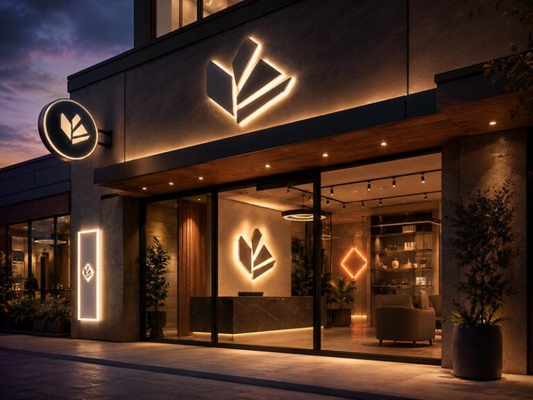
A halo-lit channel letter is different from a front-lit sign because the wall behind it is not merely a background. It becomes an active part of the lighting effect. LEDs send light toward the mounting surface, the wall reflects that light back toward the viewer, and the reflected band creates the halo around each letter. As a result, changing the wall from smooth white plaster to charcoal concrete, timber, brick or polished stone can noticeably change the appearance of the same sign without changing a single LED module.
Wall color affects halo-lit channel letters because light-colored, smooth surfaces generally return more visible LED light, while darker or rougher surfaces absorb or scatter more of it. The final halo also depends on standoff distance, LED placement, letter depth, wall flatness, ambient light and letter spacing. For a predictable result, the wall and the letters should be evaluated as one lighting system rather than two separate design elements.
This becomes important when a project moves from a rendering to a real building. A set of letters may look beautifully balanced during workshop testing against a pale wall, then appear softer after installation on dark stone. Nothing may be wrong with the LEDs or the fabrication. The wall simply changed the optical conditions. Understanding that relationship before production helps avoid late adjustments, disappointing nighttime visibility and unnecessary changes after the sign has already been installed.
How Does Wall Color Affect Halo Lighting?

Wall color changes how much rear-facing LED light returns to the viewer and how clearly the halo separates from its background. Light walls generally support stronger visible reflection, while dark walls reduce reflected output. The final effect also depends on surface texture, LED direction, letter geometry, standoff distance, ambient lighting and the spacing between characters, so wall color should never be evaluated on its own.
What Creates the Halo?
Halo-lit channel letters, sometimes called reverse-lit or backlit channel letters, are normally designed with opaque faces and sides while the LEDs direct light toward the wall behind the letters. The letters are mounted away from the wall using studs, spacers or another mounting system, leaving enough room for the light to spread before it reaches the surface. Once that light hits the wall, part of it reflects outward around the perimeter of the letter, creating the soft glow that defines halo illumination.
The quality of that halo depends on several physical relationships working together. Letter height, stroke width, internal depth, LED type, module spacing, rear opening, wall surface and the space between individual characters all affect how light reaches the wall. A wide block letter can accommodate LEDs more easily than a very narrow script stroke, while tightly spaced letters may produce overlapping halos even if each individual letter looks correct when tested alone.
For this reason, reverse illumination should be treated as an optical system rather than a decorative LED feature added after the letter shape has already been decided. The light begins inside the letter, passes through or around the rear structure, travels across the air gap, reaches the wall and then returns toward the viewer. Every stage of that path can influence brightness, spread, uniformity and the final shape of the glow.
Wall Reflectance and Brightness
A pale wall normally returns more visible light into the surrounding space than a dark wall under similar lighting conditions. In practical terms, this often makes the halo easier to see and gives the designer more flexibility to create a soft glow without pushing LED output unnecessarily high. A dark wall absorbs more of the light that reaches it, so the visible halo can look narrower, softer or less intense even when the electrical specification remains unchanged.
This difference explains why describing a wall simply as “gray” is rarely enough for accurate planning. Smooth light-gray paint, dark cement board and rough charcoal concrete may belong to the same broad color family, but their optical behavior can be very different. Surface finish also matters. A smooth matte wall usually creates a more predictable reflected band than rough stone or deeply textured concrete, where small changes in depth can interrupt the halo.
The same principle applies to other materials. Timber introduces color and grain, polished stone creates more directional reflection, and metallic surfaces can reveal bright points or surrounding reflections. A realistic project review should therefore identify both the wall color and the wall material before anyone assumes that the finished halo will behave like the rendering.
LED Color and Day-Night Contrast
The wall can also change how the LED color is perceived. White light reflected from a neutral surface normally stays relatively close to the intended color temperature, while beige, wood, colored paint or warm natural stone may visually shift that reflected light. This does not mean the LED specification itself has changed. It means the viewer is seeing the LED after it has interacted with another colored surface, which is why wall tone and LED color should be selected together.
The daytime appearance needs a separate review because the lighting system may contribute very little when the sign is switched off. During the day, the viewer sees the material finish, letter depth, shadows and contrast between the letter and the architecture. At night, the halo becomes part of the visual identity. A combination that looks excellent after dark may have weak daytime contrast, while a strong daytime combination may produce a much more subtle nighttime effect than expected.
For important storefront, hospitality and corporate projects, reviewing both conditions is far more useful than approving one attractive nighttime rendering. The sign should answer two different questions: can the logo be recognized clearly when the LEDs are off, and does the reflected light create the intended atmosphere and visibility once the sign is illuminated?
Which Wall Colors Work Best?

Light neutral walls are generally the easiest backgrounds for halo-lit channel letters because they provide stronger and more predictable reflection. White and light gray often create clean halos, while beige and warm architectural surfaces can soften the visual effect. The best wall color still depends on the letter finish, LED color temperature, ambient lighting, viewing distance and the brand environment rather than on one universal rule.
White and Light Walls
White walls are among the most forgiving backgrounds for reverse-lit letters because they normally reflect enough rear-facing light to make the halo visible without relying on unusually high LED output. This makes them well suited to reception areas, offices, clinics, premium retail spaces and hospitality interiors where the goal is often a controlled architectural glow rather than the strongest possible sign brightness.
The main risk on a very light wall is not insufficient illumination but excessive spread. If the LEDs are too strong, the letters are too close together or the standoff distance is larger than the logo requires, separate halos may begin to merge. The wall can become a broad illuminated area instead of showing a clean glow around each character. Fine lettering and closely spaced logos are particularly sensitive to this issue because their negative spaces can fill with reflected light more quickly.
A white wall should therefore still be treated as a technical surface. Paint tone, matte or glossy finish, environmental lighting, letter color and viewing distance all matter. A white reception wall illuminated by ceiling spotlights will not behave exactly like a white exterior facade viewed at night. Good reflection gives the project more flexibility, but it does not remove the need to control the light.
Gray and Neutral Walls
Light gray is often one of the most practical wall colors for halo-lit signage because it can combine useful reflectance with stronger visual separation than pure white. Black letters, white letters, brushed stainless steel and painted metal can all work well against a carefully selected neutral gray, which is one reason this combination appears frequently in modern offices, retail interiors and corporate reception spaces.
However, “gray” covers a very wide range. A pale warm gray can behave much like an off-white surface, while charcoal is much closer to a dark wall from an optical standpoint. Some grays also carry blue, green or warm undertones that influence how the reflected halo feels. A 4000K neutral white LED may appear slightly cooler on a blue-gray wall and noticeably softer on a warmer gray surface.
For specification work, three questions are more useful than the color name alone: how light or dark is the actual surface, how smooth is the finish, and does the wall have an undertone that could influence the visible LED color? For repeat projects, a paint reference, approved material sample or clear site photograph gives more reliable information than a description such as “medium gray.”
Warm Walls and Practical Pairings
Beige, cream, timber, warm stone and similar architectural finishes can create excellent halo-lit installations when the LED temperature is chosen with the material rather than separately from it. These combinations are common in restaurants, hotels, beauty spaces, boutiques and premium reception areas, where an extremely cool or sharp white glow may feel disconnected from the rest of the interior.
Warm white lighting in the approximate 2700-3500K range often works naturally with timber, bronze, brass, gold and warm neutral walls, while neutral white around 4000-4500K can preserve a cleaner commercial appearance. Cooler ranges can still work, but the contrast between a warm surface and a cooler LED needs to be intentional. Color temperature describes the character of white light; it does not automatically tell you how bright the halo will be.
| Wall Condition | Letter Finish | Likely Halo Character | Main Item to Check |
| Smooth white | Black or dark metal | Strong, clearly visible glow | Excessive spill |
| Light gray | Black, white or brushed metal | Balanced, controlled halo | Daytime contrast |
| Beige or warm stone | Gold, bronze or dark metal | Softer, warmer character | LED color temperature |
| Charcoal or black | Light metal or contrasting face | Lower reflected intensity | Output and standoff |
| Brick or textured stone | Metal letters | Textured or broken halo | Joints and shadows |
| Reflective metal | Opaque letters | Strong directional reflection | Glare and visible wiring |
The table is best used as a starting point rather than a fixed formula. A luxury hotel may deliberately choose a subtle glow, while a roadside restaurant may need much stronger nighttime recognition. The right combination is the one that supports the required viewing conditions and brand character without forcing every project toward maximum brightness.
Do Dark Walls Reduce Halo Visibility?

Dark walls generally reduce visible halo intensity because they absorb more rear-facing light than pale surfaces. Halo-lit channel letters can still perform well on black, charcoal, navy and other dark backgrounds, but the project usually needs more careful evaluation of LED layout, standoff distance, wall texture, ambient light and letter spacing. In some situations, a backer panel or combined front-and-halo lighting may produce a more reliable result.
Why Dark Walls Look Dimmer
A dark surface appears dark partly because it returns less visible light to the viewer. The same principle applies when LEDs behind a channel letter illuminate that surface. Compared with a pale wall, a smaller portion of the rear-facing light comes back toward the viewer, so the halo can appear weaker even when the LEDs, voltage and power supply are operating exactly as designed.
The impact becomes more noticeable in bright commercial environments. A subtle reverse-lit logo on a charcoal wall may look elegant in a dim restaurant but much less visible in a shopping mall with strong overhead lighting. Ambient light does not physically change the LED system, but it reduces the visual contrast between the halo and the surrounding space, making the reflected glow harder to notice.
This is why the project team needs to define the role of the halo before selecting the structure. If the rear light is mainly creating atmosphere, a softer glow may be completely acceptable. If the letters need to be identified across a parking area or busy street, halo-only illumination on a very dark wall may not provide the same practical visibility as front illumination or a combined front-and-halo structure.
Can More LED Output Solve It?
Increasing LED output can improve a weak halo in some cases, but it is rarely the only variable that should be changed. Light distribution matters as much as total output. If modules are concentrated in the wrong areas, adding more power may create bright patches behind the letters while leaving other areas uneven. On rough walls, stronger lighting can also make shadows and surface irregularities more obvious rather than making the halo cleaner.
There are also electrical and thermal considerations. Increasing LED density or power raises the load on the power supply and can increase internal heat. More modules do not automatically mean a better sign. If spacing is too dense, the project can create unnecessary heat or visible hotspots. If spacing is too wide, dark areas can appear. A useful engineering review looks at beam direction, module layout, letter depth and rear opening before simply increasing wattage.
When a dark-wall project appears weak during review, the better sequence is to check the entire optical path: LED type, LED distribution, standoff distance, wall material, ambient light, stroke width and the intended viewing distance. Sometimes more output is justified, but sometimes adjusting the geometry produces a cleaner result with the same electrical load.
Backer Panels and Dual Lighting
A backer panel can be useful when the original architecture provides an unpredictable reflection surface. Instead of asking the rear light to work directly against dark stone, rough masonry or another difficult wall, a controlled panel can provide a lighter and more consistent surface behind the letters. The same panel can also simplify wiring, create a flatter installation plane and reduce differences between multiple store locations.
The disadvantage is that a backer changes the visual language of the sign. Individual letters may begin to feel more like a panel-mounted sign if the backer is too large, too thick or too visually dominant. Its dimensions, color and relationship to the logo therefore need the same attention as the letters themselves. Outdoor installations must also consider drainage, access, fixing and weather exposure rather than treating the panel as a purely decorative component.
For projects that need stronger recognition, front-and-halo-lit letters can be another solution. The illuminated face carries the main visibility requirement while the rear light creates depth and atmosphere. This approach is more complex because front brightness, rear brightness, heat, wiring, color and power must be balanced together, but it can provide a more dependable result when the mounting wall absorbs too much light for halo-only letters.
How Does Wall Texture Affect the Halo?

Wall texture can affect halo uniformity as much as wall color. Smooth and reasonably flat surfaces usually produce a cleaner reflected band, while brick, rough concrete, stone and deep wood grain can create lighter and darker areas around the same letter. Highly polished surfaces create a different challenge because they can reflect light directionally and reveal LEDs, wiring or hardware instead of producing a soft diffuse glow.
Smooth Matte Surfaces
Smooth matte or low-sheen walls are generally easier to work with because they provide a consistent reflection plane and scatter light more evenly than mirror-like finishes. When the distance between the rear of the letter and the visible wall remains reasonably consistent, the halo tends to maintain a more even width around the character, which is especially important for small logos viewed from close range.
This does not mean the wall must be perfectly flat. Normal plaster and paint texture is common in commercial spaces and rarely creates a major problem. The important issue is whether the wall has significant recesses, raised areas or construction joints that materially change the optical gap. A minor paint roller texture behaves very differently from stone with deep relief or a wall made from panels installed at different depths.
Installation quality becomes part of the lighting result here. Correct studs and spacers are not enough if the wall itself changes plane across a long wordmark. The installer may need adjusted spacers or another mounting method to preserve a visually consistent letter-to-wall distance rather than simply fastening every component directly to the existing surface.
Brick, Stone and Concrete
Brick and natural stone can give halo-lit lettering a strong architectural character, but they also introduce optical variation. A raised stone face reflects light differently from a recessed mortar joint only a few centimeters away. Rough concrete can produce irregular shadows, while mixed-color brick can cause the same halo to appear brighter in one area and weaker in another even though the LED distribution inside the letter is consistent.
These effects are not necessarily defects. Restaurants, hotels, bars and heritage-style retail spaces sometimes benefit from a textured, less uniform glow because the light feels integrated with the architecture. The problem appears when an approved rendering shows a perfectly smooth halo while the real wall has deep joints, strong color variation and uneven relief. The visual expectation and the physical surface are then working against each other.
Before producing a precision logo for brick or stone, it is useful to review joint depth, surface relief, wall coating, fixing positions, wiring routes and the intended viewing distance. Large letters viewed from farther away can tolerate more irregularity because the eye averages the halo at a distance. Small detailed logos installed on rough masonry are much less forgiving and may benefit from a prepared mounting area or backer.
Glossy Walls and Wall Flatness
Glossy stone, stainless steel, mirror panels and other highly reflective materials create a different problem from dark absorbent walls. They may return plenty of light, but that light can be directional rather than softly diffused. Viewers can sometimes see bright reflections of LEDs, the backs of letters, studs, wiring or nearby architectural lighting, especially when they view the sign from an angle instead of directly from the front.
For that reason, reflective wall projects should be evaluated from multiple viewing directions. A sign can look clean in a front elevation rendering yet reveal unwanted components from a 30-degree side angle. Lower brightness, different LED direction, controlled rear diffusion, darker rear components or revised wiring routes may improve the installation more effectively than increasing the amount of light.
Flatness also matters because the designed standoff is only meaningful if the actual wall plane stays reasonably consistent. A nominal 30 mm spacer does not guarantee a 30 mm optical gap when one panel projects forward and another sits recessed. Smaller gaps tend to create tighter halos, while larger gaps usually produce a broader and softer glow. If the wall varies significantly, adjusted mounting hardware or a common backer may be necessary to keep the finished lighting visually consistent.
How Do Standoff Distance and LEDs Affect the Halo?

Standoff distance determines how much space the rear-facing light has to spread before it reaches the wall. A smaller gap generally creates a tighter and more concentrated halo, while a larger gap produces a broader and softer glow. In iduoduo’s production practice, approximately 20-50 mm is a common working range for many halo-lit projects, although the final value depends on letter size, LEDs, wall conditions and the target effect.
Smaller and Larger Standoff Distances
At the smaller end of the standoff range, light reaches the wall before it has had much room to spread. The halo therefore tends to stay closer to the edge of the letter and can appear more concentrated with a clearer boundary. This can be useful for smaller interior logos, tightly spaced lettering and projects where a crisp outline is more important than a wide architectural wash.
Moving the letters farther away gives the rear light more room to expand, so the halo becomes broader and generally softer. This can create an attractive floating appearance around large metal letters, hotel logos and premium brand walls. The tradeoff is that broad halos can begin to overlap between letters, especially where the spacing is tight or the logo contains narrow internal gaps.
A larger projection also changes the physical installation. Longer studs create more leverage, wiring becomes easier to see from the side and the entire sign projects further into the space. The final distance should therefore be chosen by balancing optical appearance with installation stability, side-view aesthetics, servicing and the available wall structure rather than selecting one standard dimension for every project.
| Variable | Smaller Setting | Larger Setting | Main Risk |
| Standoff distance | Tighter, clearer halo | Wider, softer halo | Too tight or excessive overlap |
| Letter spacing | Compact branding | Better halo separation | Halos merging when too close |
| Letter depth | Less internal space | More optical and wiring space | Poor fit or unnecessary bulk |
| Stroke width | Limited LED placement | Easier module distribution | Dark areas in narrow strokes |
| Rear opening | Restricted light output | More light reaches wall | Uncontrolled spill |
The most important point is that standoff distance cannot be selected independently from the logo. A script wordmark, a broad sans-serif logo and a large individual monogram can all require different optical treatment even when they are installed on the same wall.
LED Temperature and Environment
Color temperature changes the character of white light but does not directly equal brightness. Warm white often feels softer and more comfortable, while cool white can appear sharper and more technical. The appropriate range depends on the wall material, brand atmosphere and surrounding interior or exterior lighting rather than on a general assumption that one Kelvin value is always more professional.
A practical commercial range is approximately 2700-3500K for warm white, 4000-4500K for neutral white and 5000-6500K for cooler white applications. Warm ranges are commonly suited to hospitality, boutiques, timber interiors and warmer metal finishes. Neutral white works well in many offices, clinics, malls and corporate spaces, while cooler white may fit technology, fitness, modern retail and selected exterior applications.
The wall can change the visible character of those temperatures. A 3000K source reflected from beige stone can feel warmer than the same LED on neutral white plaster, while a cool gray background can make neutral white feel sharper. For projects where several signs must match, the LED model, approved Kelvin range and production batch should be recorded instead of using the vague specification “white LED.”
Letter Geometry and Spacing
Letter geometry determines whether the selected LEDs can distribute light evenly in the first place. Narrow strokes provide less space for modules and wiring, while wide letters give engineers more room to manage spacing and direction. Letter depth also affects how components fit inside the shell and how the rear light exits the structure before reaching the wall.
Spacing between letters becomes especially important for halo lighting because each character creates its own field of reflected light. A digital layout can show clearly separated characters, yet wide halos may connect once the physical letters are installed. Script fonts, closely kerned brand names and small internal counters inside letters such as A, B, O and R deserve particular attention because reflected light can easily fill those narrow spaces.
This is one reason a single instruction such as “use a 30 mm standoff” is not enough to engineer a complete sign. Standoff, stroke width, letter depth, LED direction and character spacing need to be reviewed together. A good result is not the one with the most LED modules or the widest halo. It is the one where the optical behavior supports the real shape of the logo.
What Should Be Checked Before Production?

Before production, confirm the real wall condition, installation location, logo dimensions, letter finish, LED color, standoff distance, wiring path, power location and required daytime and nighttime appearance. Halo-lit letters depend directly on their mounting surface, so clear wall photographs and material information are valuable engineering inputs. The more unusual the surface, the more important it is to evaluate it before the letter structure is finalized.
Wall and Site Information
A good site photograph often prevents more problems than a long description that simply says “white wall” or “stone facade.” The manufacturer needs to understand what the light will actually hit and how the finished letters will be installed. A full elevation photograph shows scale, surrounding architecture and major obstacles, while a close photograph reveals paint texture, joints, stone relief or panel construction that may influence the halo.
The artwork is equally important. Vector files help preserve the intended logo proportions and allow the engineering team to examine narrow strokes, internal spaces and letter spacing more accurately. Dimensions should include the overall sign size and, where possible, the available installation area. The power exit should also be identified because a beautifully manufactured halo sign can still look poor if cables cannot be hidden cleanly on the finished wall.
| Item to Confirm | Information Needed | Why It Matters |
| Artwork | AI, SVG, PDF or accurate vector file | Controls logo shape and spacing |
| Wall | Color, material, finish and photographs | Predicts reflection and installation |
| Dimensions | Sign size and available wall area | Controls proportion and letter geometry |
| Lighting | LED color and target halo style | Guides optical layout |
| Standoff | Target range or visual reference | Influences halo width |
| Power | Voltage and exit location | Affects wiring and installation |
| Environment | Indoor or outdoor, ambient light | Affects visibility and protection |
| Installation | Wall type, fixing and access | Controls mounting hardware |
For complex projects, architectural elevations or wall sections add another level of certainty. For a straightforward interior brand wall, accurate photographs and dimensions may be sufficient. The objective is not to collect documents for their own sake; it is to make sure the product being manufactured matches the environment where it will actually operate.
Day and Night Approval
A halo-lit sign should be approved both as a physical object and as an illuminated object. During the day, the viewer notices surface finish, material quality, letter depth, wall contrast, shadows and visible hardware. At night, the visual hierarchy changes as the reflected halo becomes part of the logo. A sign that works beautifully in one state can feel completely different in the other.
This is particularly important for premium metal finishes. Mirror stainless steel may reflect the surrounding interior strongly during the day, while dark matte letters may feel heavier when unlit but create a refined silhouette after dark. A project that focuses only on nighttime glow can therefore miss a significant part of how customers will experience the sign during normal operating hours.
Where possible, approval images should use the actual wall tone or a close representation of it rather than placing every design on a generic white background. For multi-location programs, site-specific wall photographs are even more useful because one approved letter structure may interact differently with pale plaster, timber, stone and dark painted panels across different locations.
Lighting Tests and Multi-Location Consistency
Certain projects deserve more optical validation before shipping, particularly signs installed on black walls, charcoal surfaces, textured stone, brick, timber, reflective metal or mirror panels. Fine lettering, unusual colored LEDs, closely spaced letters and combined front-and-halo structures also benefit from careful lighting inspection because small irregularities become more visible once the sign is illuminated.
At iduoduo, illuminated products are subject to 100% lighting inspection and a 72-hour pre-shipment test. Inspection can cover brightness, color consistency, uniformity, dark areas, hotspots, power, wiring and related electrical conditions. The purpose of this process is not to claim that a product can never fail; it is to expose early LED, power-supply, wiring or control problems before the product leaves production.
Multi-location programs need an additional layer of documentation because visual consistency cannot depend on each installer making independent decisions. Approved logo proportions, materials, finishes, LED model, color temperature, letter depth and lighting direction should be recorded, while site-specific items such as anchors, wiring routes and some mounting details may still change. If wall colors vary significantly between stores, maintaining separate approved configurations for light and dark backgrounds can be more reliable than forcing one identical optical specification onto every location.
Conclusion
Wall color may appear to be a finishing detail, but for halo-lit channel letters it becomes part of the lighting system itself. A smooth white wall, charcoal facade, timber panel, rough stone surface and polished metal background can all support reverse-lit letters, yet they should not automatically receive the same LED layout, standoff distance or expected halo intensity. The most reliable projects evaluate the complete relationship between the logo, wall, light and installation before fabrication begins.
A practical review should consider wall color, wall texture, letter finish, logo geometry, environmental lighting, viewing distance, LED color temperature and the working standoff range together rather than one by one. When these elements are coordinated early, the final halo becomes far more predictable. For projects involving unusual architectural materials, multiple locations or strict visual standards, iduoduo can review wall photographs, artwork, dimensions and the intended lighting effect as part of the development process before the final channel-letter structure is confirmed.
Frequently Asked Questions
Do Halo-Lit Channel Letters Work on Black Walls?
Yes, halo-lit channel letters can work on black walls, but the visible glow will normally be weaker than on a light-colored surface because the dark wall absorbs more of the rear-facing light. The project may need a carefully selected standoff distance, stronger or better-directed LED output, wider letter spacing or a controlled backer surface. If long-distance nighttime recognition is important, front-and-halo-lit letters may be more suitable than halo-only illumination.
What Wall Color Gives the Strongest Halo Effect?
Smooth white and other light neutral surfaces generally make the halo easiest to see because they reflect more of the light reaching the wall. However, the strongest halo is not always the most attractive one. A hotel lobby or premium retail interior may benefit from a softer glow on gray, beige or warm stone. The best wall color is therefore the one that provides enough reflected light while still supporting the desired daytime contrast and brand atmosphere.
What Is a Good Standoff Distance for Halo-Lit Channel Letters?
A common working range for many halo-lit channel-letter projects is approximately 20-50 mm, but it should not be treated as a fixed rule for every logo. Smaller distances generally produce a narrower and clearer halo, while larger distances create a wider and softer glow. The final specification should account for letter height, stroke width, LED beam direction, wall texture, character spacing, wiring clearance and the appearance required from the normal viewing distance.
Does Wall Texture Affect Halo Lighting?
Yes. Wall texture can noticeably change the shape and uniformity of the reflected halo. Smooth matte walls usually create a more consistent band of light, while brick, rough concrete and deeply textured stone can produce shadows, breaks and uneven brightness. Polished metal and mirror-like surfaces create a different challenge because they can reveal sharp reflections, LEDs or wiring. Surface texture should therefore be evaluated together with wall color before the lighting arrangement is finalized.
Which LED Color Temperature Is Best for Halo-Lit Letters?
There is no single color temperature that works best for every project. Warm white around 2700-3500K often suits hotels, restaurants, timber and warm interiors. Neutral white around 4000-4500K is common in offices, clinics and general commercial spaces. Cooler white around 5000-6500K can suit modern retail, fitness, technology-oriented projects and selected exterior signs. The final choice should consider the wall color, letter finish and surrounding architectural lighting rather than Kelvin value alone.
Can Brighter LEDs Compensate for a Dark Wall?
Brighter LEDs can help, but increasing output alone does not guarantee a better halo. Poor LED distribution, rough surfaces, narrow letter strokes or incorrect standoff distances can still create hotspots, dark areas and uneven reflected light. More power also increases electrical load and can increase heat. A better approach is to review LED density, beam direction, letter depth, rear opening, wall reflectance, ambient lighting and mounting distance together before deciding whether higher output is actually necessary.